
Search results for "Bare spaces" in Home Design Ideas

 MA Allen Interiors
Jed Gammon
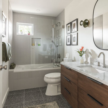
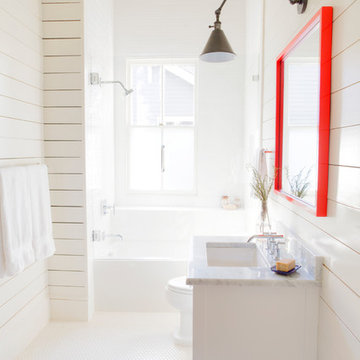
Example of a small minimalist white tile bathroom design in Raleigh with white cabinets
Example of a small minimalist white tile bathroom design in Raleigh with white cabinets
 Studio Steinbomer
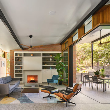
Living room - 1960s brick wall living room idea in Austin with white walls, a standard fireplace and a plaster fireplace
Find the right local pro for your project
 JK Gardening Lawn & Garden Care
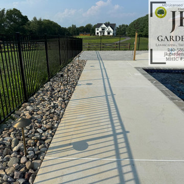
Previously a bare dirt space, it has been filled with Delaware River Jack stone, which adds both aesthetic appeal and functionality. The natural, rounded stones create a clean and sophisticated look, while also serving as a low-maintenance ground cover.
The stone fills the space between the pool deck and a black metal fence, blending seamlessly with the surrounding greenery and the open backyard.
 JK Gardening Lawn & Garden Care
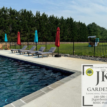
Previously a bare dirt space, it has been filled with Delaware River Jack stone, which adds both aesthetic appeal and functionality. The natural, rounded stones create a clean and sophisticated look, while also serving as a low-maintenance ground cover.
The stone fills the space between the pool deck and a black metal fence, blending seamlessly with the surrounding greenery and the open backyard.
 TKS Design Group
Download our free ebook, Creating the Ideal Kitchen. DOWNLOAD NOW
This homeowner’s daughter originally contacted us on behalf of her parents who were reluctant to begin the remodeling process in their home due to the inconvenience and dust. Once we met and they dipped their toes into the process, we were off to the races. The existing bathroom in this beautiful historical 1920’s home, had not been updated since the 70’/80’s as evidenced by the blue carpeting, mirrored walls and dropped ceilings. In addition, there was very little storage, and some health setbacks had made the bathroom difficult to maneuver with its tub shower.
Once we demoed, we discovered everything we expected to find in a home that had not been updated for many years. We got to work bringing all the electrical and plumbing up to code, and it was just as dusty and dirty as the homeowner’s anticipated! Once the space was demoed, we got to work building our new plan. We eliminated the existing tub and created a large walk-in curb-less shower.
An existing closet was eliminated and in its place, we planned a custom built in with spots for linens, jewelry and general storage. Because of the small space, we had to be very creative with the shower footprint, so we clipped one of the walls for more clearance behind the sink. The bathroom features a beautiful custom mosaic floor tile as well as tiled walls throughout the space. This required lots of coordination between the carpenter and tile setter to make sure that the framing and tile design were all properly aligned. We worked around an existing radiator and a unique original leaded window that was architecturally significant to the façade of the home. We had a lot of extra depth behind the original toilet location, so we built the wall out a bit, moved the toilet forward and then created some extra storage space behind the commode. We settled on mirrored mullioned doors to bounce lots of light around the smaller space.
We also went back and forth on deciding between a single and double vanity, and in the end decided the single vanity allowed for more counter space, more storage below and for the design to breath a bit in the smaller space. I’m so happy with this decision! To build on the luxurious feel of the space, we added a heated towel bar and heated flooring.
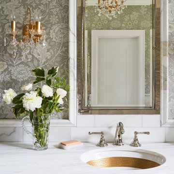
One of the concerns the homeowners had was having a comfortable floor to walk on. They realized that carpet was not a very practical solution but liked the comfort it had provided. Heated floors are the perfect solution. The room is decidedly traditional from its intricate mosaic marble floor to the calacutta marble clad walls. Elegant gold chandelier style fixtures, marble countertops and Morris & Co. beaded wallpaper provide an opulent feel to the space.
The gray monochromatic pallet keeps it feeling fresh and up-to-date. The beautiful leaded glass window is an important architectural feature at the front of the house. In the summertime, the homeowners love having the window open for fresh air and ventilation. We love it too!
The curb-less shower features a small fold down bench that can be used if needed and folded up when not. The shower also features a custom niche for storing shampoo and other hair products. The linear drain is built into the tilework and is barely visible. A frameless glass door that swings both in and out completes the luxurious feel.
Designed by: Susan Klimala, CKD, CBD
Photography by: Michael Kaskel
For more information on kitchen and bath design ideas go to: www.kitchenstudio-ge.com

Sponsored
Columbus, OH
Free consultation for landscape design!

Peabody Landscape Group
Columbus' Reliable Landscape Design & Contracting
 Drury Design
The Setup
When Samantha’s clients purchased their new home, they quickly realized the primary bath and adjacent laundry room weren’t just dated — they were dysfunctional. The bathroom featured a hulking decked-in tub, a cramped pass-through layout, and plumbing fixtures that barely worked. Meanwhile, the nearby laundry room felt more like a closet, lacking both natural light and usable storage. As long-time returning Drury Design clients, these veteran remodeling clients came to us with a clear ask: reimagine these two key spaces with long-term comfort, function, and beauty in mind.
Design objectives:
Create a more functional, spacious layout in the primary bath
Modernize the aesthetic while respecting the home’s transitional character
Eliminate awkward bump-outs and toe-stubbing pinch points
Design a large walk-in shower with thoughtful aging-in-place elements
Incorporate a sculptural standalone tub that feels intentional, not crowded
Improve laundry room utility and bring in natural light
Introduce discreet yet effective storage in both rooms
Make both spaces feel cohesive, light-filled, and livable for years to come
The Remodel
Design challenges to be solved:
A bulky built-in tub jutted into the circulation path, creating toe-stubbing hazards
The bathroom layout was awkwardly L-shaped, limiting flow and flexibility
The shower and toilet were squeezed together in an enclosed room with poor use of space
The linen cabinet in the bathroom was large and clunky, crowding the room
The laundry room was undersized, lacked light, and had limited functionality
The home featured transitional details that didn’t align with the clients’ more contemporary style
The clients wanted both spaces to support future aging-in-place needs
The Renewed Space
Design solutions:
Swapped the oversized tub for a freestanding sculptural version placed on an angle, clearing walkways and preserving window symmetry and light
Reworked the footprint to create a rectangular layout that maximized space in both the primary bath and laundry room
Removed the enclosed toilet/shower room and replaced it with a wide, glass-enclosed shower and a tucked-away toilet — all within a visually open and efficient layout
Tucked a slim, full-height linen cabinet just behind the entry door — easily accessible without cluttering the visual field
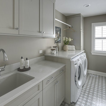
Retooled layout allowed laundry room to extend over the old shower/toilet space, also winning a window – this brightens the laundry space and the hallway beyond. Also added smart storage, a wide sink, folding counter, and broom cabinet with power.
Balanced contemporary materials with transitional details — including a rich color palette, chrome finishes, mosaic accents, and herringbone tile in a larger scale for traditional flair
Integrated aging-in-place features including a wide walk-in shower, large built-in bench with nearby handheld, and plenty of room for easy movement and accessibility
Final Thoughts:
By designing these two rooms in tandem, Samantha was able to create a smooth and thoughtful flow between everyday tasks and everyday comfort. The bathroom now offers generous circulation space, elegant materials, and features designed for longevity — including a large shower with bench seating and open sightlines that support accessibility. Just steps away, the laundry room is no longer a tucked-away closet but a light-filled, functional hub with room to fold, hang, rinse, and more (ex. recharge vacuum in a closet with power outlets). For these longtime Drury Design clients, it’s a two-room transformation built not just for today – but for the years ahead.
 TKS Design Group
Download our free ebook, Creating the Ideal Kitchen. DOWNLOAD NOW
This homeowner’s daughter originally contacted us on behalf of her parents who were reluctant to begin the remodeling process in their home due to the inconvenience and dust. Once we met and they dipped their toes into the process, we were off to the races. The existing bathroom in this beautiful historical 1920’s home, had not been updated since the 70’/80’s as evidenced by the blue carpeting, mirrored walls and dropped ceilings. In addition, there was very little storage, and some health setbacks had made the bathroom difficult to maneuver with its tub shower.
Once we demoed, we discovered everything we expected to find in a home that had not been updated for many years. We got to work bringing all the electrical and plumbing up to code, and it was just as dusty and dirty as the homeowner’s anticipated! Once the space was demoed, we got to work building our new plan. We eliminated the existing tub and created a large walk-in curb-less shower.
An existing closet was eliminated and in its place, we planned a custom built in with spots for linens, jewelry and general storage. Because of the small space, we had to be very creative with the shower footprint, so we clipped one of the walls for more clearance behind the sink. The bathroom features a beautiful custom mosaic floor tile as well as tiled walls throughout the space. This required lots of coordination between the carpenter and tile setter to make sure that the framing and tile design were all properly aligned. We worked around an existing radiator and a unique original leaded window that was architecturally significant to the façade of the home. We had a lot of extra depth behind the original toilet location, so we built the wall out a bit, moved the toilet forward and then created some extra storage space behind the commode. We settled on mirrored mullioned doors to bounce lots of light around the smaller space.
We also went back and forth on deciding between a single and double vanity, and in the end decided the single vanity allowed for more counter space, more storage below and for the design to breath a bit in the smaller space. I’m so happy with this decision! To build on the luxurious feel of the space, we added a heated towel bar and heated flooring.
One of the concerns the homeowners had was having a comfortable floor to walk on. They realized that carpet was not a very practical solution but liked the comfort it had provided. Heated floors are the perfect solution. The room is decidedly traditional from its intricate mosaic marble floor to the calacutta marble clad walls. Elegant gold chandelier style fixtures, marble countertops and Morris & Co. beaded wallpaper provide an opulent feel to the space.
The gray monochromatic pallet keeps it feeling fresh and up-to-date. The beautiful leaded glass window is an important architectural feature at the front of the house. In the summertime, the homeowners love having the window open for fresh air and ventilation. We love it too!
The curb-less shower features a small fold down bench that can be used if needed and folded up when not. The shower also features a custom niche for storing shampoo and other hair products. The linear drain is built into the tilework and is barely visible. A frameless glass door that swings both in and out completes the luxurious feel.
Designed by: Susan Klimala, CKD, CBD
Photography by: Michael Kaskel
For more information on kitchen and bath design ideas go to: www.kitchenstudio-ge.com

 Vivid Interior Design - Danielle Loven
Nor-Son Custom Builders
Alyssa Lee Photography
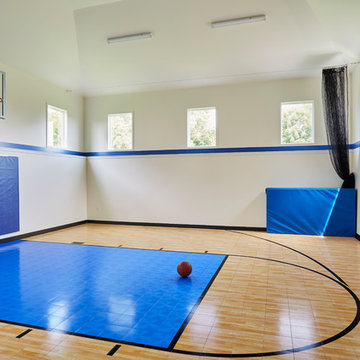
Example of a huge transitional medium tone wood floor and brown floor home climbing wall design in Minneapolis with gray walls
Example of a huge transitional medium tone wood floor and brown floor home climbing wall design in Minneapolis with gray walls
 Michael Nash Design, Build & Homes
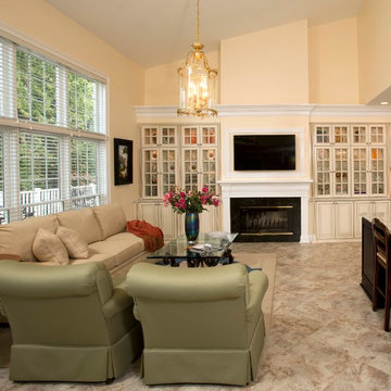
A family of five, who lives in a prestigious McLean neighborhood, was looking to renovate and upgrade their 20-year-old kitchen. Goals of the renovation were to move the cooktop out of the island, install all professional-quality appliances, achieve better traffic flow and update the appearance of the space.
The plan was to give a French country look to this kitchen, by carrying the overall soft and creamy color scheme of main floor furniture in the new kitchen. As such, the adjacent family room had to become a significant part of the remodel.
The back wall of the kitchen is now occupied by 48” professional range under a custom wood hood. A new tower style refrigerator covered in matching wood panels is placed at the end of the run, just create more work space on both sides of the stove.
The large contrasting Island in a dark chocolate finish now offers a second dishwasher, a beverage center and built in microwave. It also serves as a large buffet style counter space and accommodate up to five seats around it.
The far wall of the space used to have a bare wall with a 36” fireplace in it. The goal of this renovation was to include all the surrounding walls in the design. Now the entire wall is made of custom cabinets, including display cabinetry on the upper half. The fireplace is wrapped with a matching color mantel and equipped with a big screen TV.
Smart use of detailed crown and trim molding are highlights of this space and help bring the two rooms together, as does the porcelain tile floor. The attached family room provides a casual, comfortable space for guest to relax. And the entire space is perfect for family gatherings or entertaining.
 Décor Aid
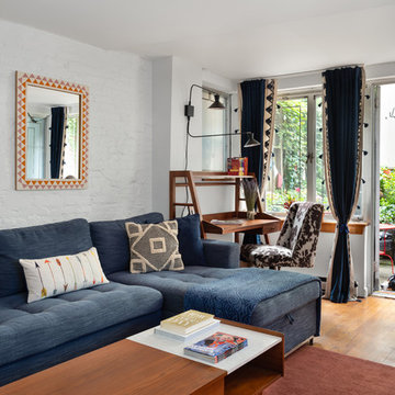
With a restrained hand, out interior designer set about bringing a new life in our clients petite apartment while also introducing easy to maintain, durable surfaces and furnishings as they love to entertain and have a lively St. Bernard. And as they had an extensive book collection and a single three-foot wide closet, the key challenge here was to make the best use of the entire space while injecting it with charming whimsy.
After falling in love with our designer’s presentation, our clients went for a complete apartment overhaul and started from scratch. Since the space is small, our designer Anna S. wanted to create an urgent sense of vibrancy without coming off as too heavy handed. So she worked in expressive colors and decorative extras in small doses for subtle impact.
Starting the project by changing several of the unit’s light fixtures for brighter, more minimal styles, Anna surveyed the apartment room to room to devise clever storage solutions that are easy on the eye.
As they have friends over often, Anna created a warm and inviting living room boasting a slightly feminine take on mid-century modern layered with colorful pillows, patterned rugs, and eclectic art that doesn’t take over the apartment.
In the kitchen, she added a strong yet gender neutral burlap wallpaper, floating wooden shelves, and new plumbing fixtures that were more sophisticated than the original, standard ones in place.
However, our favorite part of the apartment is the moody, statement-making foyer. Though it was a long and narrow barely used, neglected space, Anna brought in wallpaper from Tempaper that features a matte black background covered with gold bird and floral illustrations, and added a long row of black glass cabinets and several large gold mirrors for an added sense of glamorous drama and an extra amount of storage space to boot.


 Dave Fox Design Build Remodelers
This project involved converting a partially finished basement into an ultimate media room with an English pub. The family is big on entertaining and enjoys watching movies and college football. It was important to combine the media area with the pub to create options for guests within the same space. Although the home has a full sized basement the staircase was centrally located, which made it difficult for special configuration. As a result, we were able to work with the existing plan be designing a media area large enough for a sectional sofa and additional seating with the English pub at the far end of the room.
The home owner had a projection screen on a bare wall with the electrical components stacked on boxes. The new plan involved installing new cabinets to accommodate components and surround the screen to give it a built-in finish. Open shelving also allows the homeowner to feature some of their collectible sports memorabilia. As if the 130 inch projection screen wasn’t large enough, the surround sound system makes you feel like you are part of the action. It is as close to the I MAX viewing experience as you are going to get in a home. Sound-deadening insulation was installed in the ceiling and walls to prevent noise from penetrating the second floor.
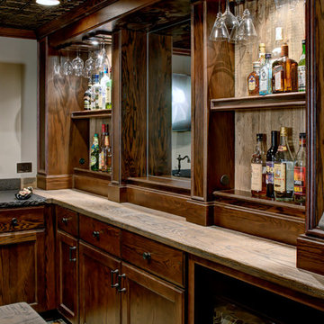
The design of the pub was inspired by the home owner’s favorite local pub, Brazenhead. The bar countertop with lift-top entrance was custom built by our carpenters to simulate aged wood. The finish looks rough, but it is smooth enough to wipe down easily. The top encloses the bar and provides seating for guests. A TV at the bar allows guest to follow along with the game on the big screen or tune into another game. The game table provides even another option for entertainment in the media room. Stacked stone with thick mortar joints was installed on the face of the bar and to an opposite wall containing the entrance to a wine room. Hand scrapped hardwood floors were installed in the pub portion of the media room to provide yet another touch to “Brazenhead” their own pub.
The wet bar is under a soffit area that continues into the media area due to existing duct work. We wanted to creatively find a way to separate the two spaces. Adding trim on the ceiling and front of soffit at the bar defined the area and made a great transition from the drywall soffit to the wet bar. A tin ceiling was installed which added to the ambience of the pub wet bar and further aided in defining the soffit as an intentional part of the design. Custom built wainscoting borders the perimeter of the media room. The end result allows the client to comfortably entertain in a space designed just for them.
 Linden L.A.N.D. Group
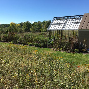
Bare soil areas that were disturbed during construction were seeded with a Northeast native wildflower mix. Photo: Rebecca Lindenmeyr
This is an example of a small transitional full sun backyard stone landscaping in Burlington for summer.
This is an example of a small transitional full sun backyard stone landscaping in Burlington for summer.
 American Landscape
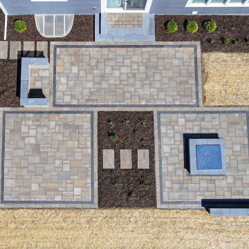
A bare backyard space is transformed with a patio of TechoBloc Blu Smooth HD2 Pavers in Champlain Grey with a Westmount Onyx Black inlay. T
TruScape low-voltage lighting installed under the caps of the wall, grill nook and gas fire pit.
The hardscape is further softened with low maintenance plantings including a variety of perennial grasses and sedums, as well as boxwood, hydrangea and ninebark for shrubs.
 Colorado Vista Landscape Design, Inc.
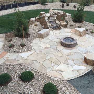
Yesterday we finished this installation for our client in Windsor, CO. I designed this project to provide a wonderful outdoor space complete with flagstone patio, seating boulders, gas fire pit and pondless water feature. The impeccable work of Showcase Landscape & Irrigation, Loveland, CO transforms the bare ground into an amazing outdoor living space. The artistry of the team of Showcase constructs the most beautifully sounding water features. Every piece of flagstone is saw cut for perfect fit with attention given to the texture and placement of the stones. Another wonderful showcase landscape.
Sponsored
Columbus, OH
Free consultation for landscape design!
Peabody Landscape Group
Columbus' Reliable Landscape Design & Contracting
 TREX COMPANY INC
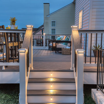
Trex Select railing in Classic White and Pebble Grey cocktail rail. This deck also features Square LED Post Cap Lights and Stair Riser Lights from the Trex Deck Lighting collection.
 Markalunas Architecture and Design, LLC
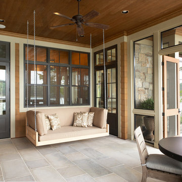
Lake Front Country Estate Sleeping Porch, designed by Tom Markalunas, built by Resort Custom Homes. Photography by Rachael Boling.
Huge elegant stone back porch photo in Other with a roof extension
Huge elegant stone back porch photo in Other with a roof extension
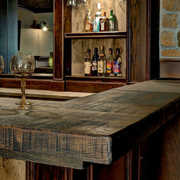 Dave Fox Design Build Remodelers
This project involved converting a partially finished basement into an ultimate media room with an English pub. The family is big on entertaining and enjoys watching movies and college football. It was important to combine the media area with the pub to create options for guests within the same space. Although the home has a full sized basement the staircase was centrally located, which made it difficult for special configuration. As a result, we were able to work with the existing plan be designing a media area large enough for a sectional sofa and additional seating with the English pub at the far end of the room.
The home owner had a projection screen on a bare wall with the electrical components stacked on boxes. The new plan involved installing new cabinets to accommodate components and surround the screen to give it a built-in finish. Open shelving also allows the homeowner to feature some of their collectible sports memorabilia. As if the 130 inch projection screen wasn’t large enough, the surround sound system makes you feel like you are part of the action. It is as close to the I MAX viewing experience as you are going to get in a home. Sound-deadening insulation was installed in the ceiling and walls to prevent noise from penetrating the second floor.
The design of the pub was inspired by the home owner’s favorite local pub, Brazenhead. The bar countertop with lift-top entrance was custom built by our carpenters to simulate aged wood. The finish looks rough, but it is smooth enough to wipe down easily. The top encloses the bar and provides seating for guests. A TV at the bar allows guest to follow along with the game on the big screen or tune into another game. The game table provides even another option for entertainment in the media room. Stacked stone with thick mortar joints was installed on the face of the bar and to an opposite wall containing the entrance to a wine room. Hand scrapped hardwood floors were installed in the pub portion of the media room to provide yet another touch to “Brazenhead” their own pub.
The wet bar is under a soffit area that continues into the media area due to existing duct work. We wanted to creatively find a way to separate the two spaces. Adding trim on the ceiling and front of soffit at the bar defined the area and made a great transition from the drywall soffit to the wet bar. A tin ceiling was installed which added to the ambience of the pub wet bar and further aided in defining the soffit as an intentional part of the design. Custom built wainscoting borders the perimeter of the media room. The end result allows the client to comfortably entertain in a space designed just for them.
19