
Search results for "Bare spaces" in Home Design Ideas
 lavish
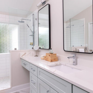
Walking into this reimagined primary bath feels like stepping into a boutique spa. The entire space is wrapped in a soft, barely-there blush-white wall color that reads almost like warm light itself, creating an instantly calming atmosphere that the design then builds upon thoughtfully.
Twin sage blue-gray vanities run along both sides of the room, each finished in a shaker-style painted cabinetry with polished chrome bar pulls and topped with a gorgeous Calacatta-style quartz — the same material flowing seamlessly across countertops and up as a low backsplash. Above each vanity hang individual black rounded-rectangle mirrors with matching chrome picture-light sconces, creating a clean, modern hotel-bath aesthetic that feels crisp without being cold.
The walk-in shower is the undeniable heart of the room — a generous double-entry wet room featuring dual rainfall showerheads, dual handheld wand fixtures, and a natural light source through a privacy glass window that floods the space with soft, diffused daylight. Large format white wall tile set in a simple grid pattern keeps the shower feeling expansive and serene, while large-format Calacatta marble-look porcelain tile on the floor carries the quartz veining language from the vanities underfoot throughout the entire bathroom. A polished chrome heated towel rack mounted on the bathroom wall adds a luxurious, spa-grade detail — warm towels waiting after every shower. A teak wood bath mat on the floor completes the spa atmosphere perfectly.
The Laundry Room
Just steps away, the laundry room received an equally remarkable transformation — one that proves this hardworking space can be just as design-forward as any other room in the house. Deep hunter green painted cabinetry with brushed brass bar pulls commands the room from floor to ceiling, creating a rich, dramatic palette that feels collected and intentional rather than builder-grade.
Upper shaker-style cabinets maximize storage above the machines, while a tall pantry-style column cabinet on the end wall provides floor-to-ceiling concealed storage for supplies. A painted shiplap accent panel between the upper cabinets and the counter is fitted with a row of brass coat hooks — a dual-purpose detail that adds texture and hang space for bags and reusable totes. The counter surface in white quartz sits above the side-by-side front-load washer and dryer, creating a functional folding station. A white square tile backsplash behind the machines adds a clean, easy-care surface that holds its own against the bold green cabinetry. A built-in wood bench with open storage below creates a secondary mudroom function, while a warm-toned live-edge wood floating shelf adds organic contrast. A custom built walnut open bookcase tucked at the room's end provides stylish overflow storage that gives the space personality beyond its utility.
 Walczak Design And Build
When our clients came to us, their master bathroom was doing them no favors. An awkwardly oversized corner tub that hadn't seen a bubble bath in years, a shower barely large enough to turn around in, and a color palette best described as "contractor default." The bones were there — a generously sized footprint — but the space had zero personality and even less function.
Our first move was rethinking how the square footage was being used. Out went the hulking corner tub, and in its place: a spa-worthy walk-in shower that finally earns the space it occupies. Classic white subway tile with soft gray grout lines gives it a timeless foundation, while dual showerheads — a traditional wall-mount and a ceiling-mounted rain shower — turn every morning into something worth waking up for. Built-in niches keep everything organized without interrupting the clean aesthetic.
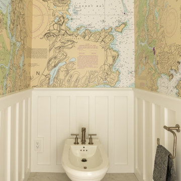
The commode room got a full character transplant. Wainscoting grounds the space with architectural detail, while a custom nautical map wallcovering wraps the room in something deeply personal — a curated cartographic love letter to the waterways and places that matter most to this family. The addition of a traditional pedestal bidet elevates both the function and the feeling of the space.
Back in the main bathroom, the clients' personality finally has a place to live. A bold, saturated blue on the custom double vanity cabinetry makes an unapologetic statement — the kind that makes you smile every time you walk in. Wall-mounted brushed nickel faucets and coordinating hardware keep the look polished and cohesive throughout. A heated towel rack and radiant heated floors are the quiet luxuries that tip this bathroom from "really nice" into "I never want to leave."
New windows flood the space with natural light, making the already generous footprint feel even more expansive and bringing out the best in every finish and material choice.
The result is a bathroom that works as hard as it looks good — and one that finally, unmistakably, feels like them.

 Woodling Landscape Design
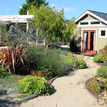
Clients love to entertain! And why wouldn't they, when they have a space like this? When I arrived, this huge space was nothing but bare soil. What a transformation! Project goals primarily focused on the creation of a beautiful space to enjoy with multiple outdoor rooms, space to grow food and space to play outside with guests. We created a regulation-size bocce ball court, large fountain and pond, and used an incredible and diverse selection of drought-tolerant plants including California native selections as well as plants from South Africa, Australia and beyond. Textures and colors form a buzzing, living tapestry which is framed by magnificent views of the fields and distant mountains. All garden elements are connected by winding decomposed granite pathways so the frequent guests, children and grandchildren can roam freely. Raised veggie beds provide a bountiful harvest of veggies and tomatoes. The sound of flowing water and the tranquil garden make it impossible to go inside; this is outdoor living at its finest!
Find the right local pro for your project
 Fiorito Interior Design
My clients approached this kitchen remodel hoping not only for improved functionality but for a space that invited comfort, warmth, and daily enjoyment. Their existing kitchen was limited in both layout and atmosphere where a small island barely larger than a podium offered little utility. An oversized double-width doorway at the rear of the room leading into the adjacent living space disrupted the flow, making furniture placement nearly impossible. They longed for a kitchen where cooking felt easy and intuitive, but also one where they could sit at the table with a book and a cup of tea, or host friends without feeling cramped or awkwardly positioned.
One of the most impactful decisions we made early on was to close off that extra-wide opening to the living room. Doing so allowed us to reclaim the wall, which not only improved circulation but also gave us the freedom to rethink the spacing of the kitchen and eat-in area. With that change, we could introduce a much larger island—truly functional this time—complete with generous workspace and storage. It became a true centerpiece for meal prep, casual dining, and gathering.
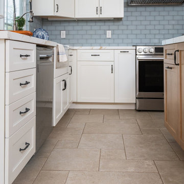
From there I turned my attention to layering in comfort, personality, and style. I curated a color palette of soft white, pale blue, light wood tones, and touches of sunshine yellow. This fresh and uplifting combination feels timeless and relaxed. We chose cabinetry with traditional Shaker-style doors, accented by black forged iron hardware for a subtle hint of contrast and authenticity. For the countertops we chose a Gold Calacatta-look quartz, bringing elegance and warmth with its soft veining and classic appeal.
To elevate the kitchen walls I selected a soft matte glass tile in a moody, sky-blue that blankets the backsplash, providing a gentle wash of color that’s calming and cohesive. On the floors I chose a limestone-look porcelain tile in a classic Versailles pattern as an homage to old English manor houses—bringing character and texture underfoot while remaining durable and low-maintenance for modern life.
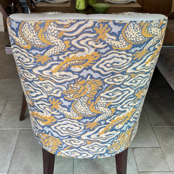
Lastly I transformed the adjacent eat-in area into a cozy, multifunctional space. We added custom built-in bookshelves and a sideboard for serving and display—perfect for entertaining or simply making daily routines feel more special. A black iron picture light softly illuminates the buffet, lending a warm, ambient glow in the evenings. I carefully planned the seating arrangement to include a space-saving banquette along the wall, paired with a trestle-style dining table and side chairs. At either end I placed tufted host chairs upholstered in an exquisite, tonal Chinoiserie dragon pattern that are comfortable enough to sit on for hours. Whether sharing a leisurely meal, reading in the sunlight, or gazing out at the greenery just beyond the windows, this spot now invites my clients to truly enjoy their home in a new, deeper way.
Photo: Bernardo Grijalva
 Rural Birch
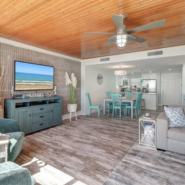
 Finding elements that were not only stylish but also durable was crucial to the overall design and styling of this space as this doubles as a vacation rental for our client. Mixing style with functionality. We kept the original ceiling in the living room as well as the original cement accent wall in the living room. Everything else was changed. A window was added to the stair wall so that as you walk downstairs, you get a view of the ocean. The walls were painted a barely-there minty seafoam color and we stuck with a neutral color palette with pops of various shades of blues. Built-ins were installed to create a working space that doubles as extra storage. The sectional has a chaise that is used to store bedding and the middle part of the sectional pulls out to provide additional sleeping space for guests. The 3 paintings above the sofa were custom painted for the client's space, as well as the dining table and chairs. The rug is a beautiful piece that ties in all of the colors found throughout the downstairs space.
 Walczak Design And Build
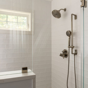
When our clients came to us, their master bathroom was doing them no favors. An awkwardly oversized corner tub that hadn't seen a bubble bath in years, a shower barely large enough to turn around in, and a color palette best described as "contractor default." The bones were there — a generously sized footprint — but the space had zero personality and even less function.
Our first move was rethinking how the square footage was being used. Out went the hulking corner tub, and in its place: a spa-worthy walk-in shower that finally earns the space it occupies. Classic white subway tile with soft gray grout lines gives it a timeless foundation, while dual showerheads — a traditional wall-mount and a ceiling-mounted rain shower — turn every morning into something worth waking up for. Built-in niches keep everything organized without interrupting the clean aesthetic.
The commode room got a full character transplant. Wainscoting grounds the space with architectural detail, while a custom nautical map wallcovering wraps the room in something deeply personal — a curated cartographic love letter to the waterways and places that matter most to this family. The addition of a traditional pedestal bidet elevates both the function and the feeling of the space.
Back in the main bathroom, the clients' personality finally has a place to live. A bold, saturated blue on the custom double vanity cabinetry makes an unapologetic statement — the kind that makes you smile every time you walk in. Wall-mounted brushed nickel faucets and coordinating hardware keep the look polished and cohesive throughout. A heated towel rack and radiant heated floors are the quiet luxuries that tip this bathroom from "really nice" into "I never want to leave."
New windows flood the space with natural light, making the already generous footprint feel even more expansive and bringing out the best in every finish and material choice.
The result is a bathroom that works as hard as it looks good — and one that finally, unmistakably, feels like them.
 My House Design|Build|Team
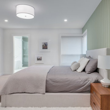
After living in their home for over 18 years, the homeowners loved the architectural potential of their home, and needed a refresh to meet their current family needs.
They now had two kids in college and wanted to focus on entertaining.
The key projects in the home included a new dramatic living room, the white kitchen renovation, a new personalized man-cave for the husband, and a large walk-in closet with custom height drawer storage for the wife.
Throughout the rooms in this renovation, we added pops of gold and glamour, yet kept the home cozy and livable.
We utilized cohesive design elements throughout the home including ship-lap texture and detailing throughout the kitchen, new mudroom, wok kitchen, living room, and master bedroom.
Project Highlights: White Kitchen Renovation
In this white kitchen renovation, we removed the old wooden shaker-style kitchen cabinetry and replaced them with all new white and grey cabinets, and white marble counter tops. Expertly hidden behind some of these cabinets is the family’s new walk-in pantry.
The original space had a small, awkward-shaped kitchen island that was so small it was barely functional or convenient for more than one person to sit at. We gave the homeowners a much larger kitchen island, with a beveled edge, that now has more than enough space for eating, socializing, or doing work. With a large overhang counter top on one side, there is now room for several backless bar stools tucked under the island. You’ll also notice glitters of gold inside the two over-sized lighting fixtures suspended over the island.
We created the homeowners a small wok kitchen just off of their new white kitchen renovation. In the main kitchen, we added a ceramic flat cook top and subtle white exhaust hood with an elegant rose-gold trim. Behind it, a white/grey mosaic back splash acts as a wall accent to provide some dimension to the otherwise solid white space. Surrounding the range hood are two large wall cabinets with clear doors to provide extra storage without adding bulk to the newly opened room.
The adjacent dining room was also updated to include a long, contemporary dining table with comfortable seating for eight (ten if you want to get cozy). We replaced the low-hanging run-of-the-mill chandelier with a higher, more modern style made of gold and glass. Behind it all is a new dark grey accent wall with a paneled design to add dimension and depth to the new brighter room.
Brightening the Living Room
In addition to the white kitchen renovations, the living room got a much needed update too.
The original high ceilings were so high they were unusable for decor or artwork, and a fireplace was mostly unused.
We installed a large dark grey paneled accent wall (to match the new accent wall in the new formal dining room nearby), to make better use of the space in a stylish, artful way.
In the middle of the room, a stunning minimalist hanging chandelier adds a pop of gold and elegance to the new space.
If you’re looking to change up the colour scheme in your home, or make a transformation from dated to like the white kitchen renovation we did in this Surrey home, let us take a look. Schedule a complimentary consultation with the My House Design/Build Team today.
Sponsored
Columbus, OH

Snider & Metcalf Interior Design, LTD
Leading Interior Designers in Columbus, Ohio & Ponte Vedra, Florida
 Woodling Landscape Design
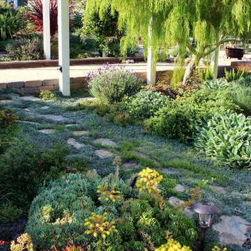
Clients love to entertain! And why wouldn't they, when they have a space like this? When I arrived, this huge space was nothing but bare soil. What a transformation! Project goals primarily focused on the creation of a beautiful space to enjoy with multiple outdoor rooms, space to grow food and space to play outside with guests. We created a regulation-size bocce ball court, large fountain and pond, and used an incredible and diverse selection of drought-tolerant plants including California native selections as well as plants from South Africa, Australia and beyond. Textures and colors form a buzzing, living tapestry which is framed by magnificent views of the fields and distant mountains. All garden elements are connected by winding decomposed granite pathways so the frequent guests, children and grandchildren can roam freely. Raised veggie beds provide a bountiful harvest of veggies and tomatoes. The sound of flowing water and the tranquil garden make it impossible to go inside; this is outdoor living at its finest!
 Woodling Landscape Design
Clients love to entertain! And why wouldn't they, when they have a space like this? When I arrived, this huge space was nothing but bare soil. What a transformation! Project goals primarily focused on the creation of a beautiful space to enjoy with multiple outdoor rooms, space to grow food and space to play outside with guests. We created a regulation-size bocce ball court, large fountain and pond, and used an incredible and diverse selection of drought-tolerant plants including California native selections as well as plants from South Africa, Australia and beyond. Textures and colors form a buzzing, living tapestry which is framed by magnificent views of the fields and distant mountains. All garden elements are connected by winding decomposed granite pathways so the frequent guests, children and grandchildren can roam freely. Raised veggie beds provide a bountiful harvest of veggies and tomatoes. The sound of flowing water and the tranquil garden make it impossible to go inside; this is outdoor living at its finest!
 Fiorito Interior Design
My clients approached this kitchen remodel hoping not only for improved functionality but for a space that invited comfort, warmth, and daily enjoyment. Their existing kitchen was limited in both layout and atmosphere where a small island barely larger than a podium offered little utility. An oversized double-width doorway at the rear of the room leading into the adjacent living space disrupted the flow, making furniture placement nearly impossible. They longed for a kitchen where cooking felt easy and intuitive, but also one where they could sit at the table with a book and a cup of tea, or host friends without feeling cramped or awkwardly positioned.
One of the most impactful decisions we made early on was to close off that extra-wide opening to the living room. Doing so allowed us to reclaim the wall, which not only improved circulation but also gave us the freedom to rethink the spacing of the kitchen and eat-in area. With that change, we could introduce a much larger island—truly functional this time—complete with generous workspace and storage. It became a true centerpiece for meal prep, casual dining, and gathering.
From there I turned my attention to layering in comfort, personality, and style. I curated a color palette of soft white, pale blue, light wood tones, and touches of sunshine yellow. This fresh and uplifting combination feels timeless and relaxed. We chose cabinetry with traditional Shaker-style doors, accented by black forged iron hardware for a subtle hint of contrast and authenticity. For the countertops we chose a Gold Calacatta-look quartz, bringing elegance and warmth with its soft veining and classic appeal.
To elevate the kitchen walls I selected a soft matte glass tile in a moody, sky-blue that blankets the backsplash, providing a gentle wash of color that’s calming and cohesive. On the floors I chose a limestone-look porcelain tile in a classic Versailles pattern as an homage to old English manor houses—bringing character and texture underfoot while remaining durable and low-maintenance for modern life.
Lastly I transformed the adjacent eat-in area into a cozy, multifunctional space. We added custom built-in bookshelves and a sideboard for serving and display—perfect for entertaining or simply making daily routines feel more special. A black iron picture light softly illuminates the buffet, lending a warm, ambient glow in the evenings. I carefully planned the seating arrangement to include a space-saving banquette along the wall, paired with a trestle-style dining table and side chairs. At either end I placed tufted host chairs upholstered in an exquisite, tonal Chinoiserie dragon pattern that are comfortable enough to sit on for hours. Whether sharing a leisurely meal, reading in the sunlight, or gazing out at the greenery just beyond the windows, this spot now invites my clients to truly enjoy their home in a new, deeper way.
Photo: Bernardo Grijalva
 Rural Birch
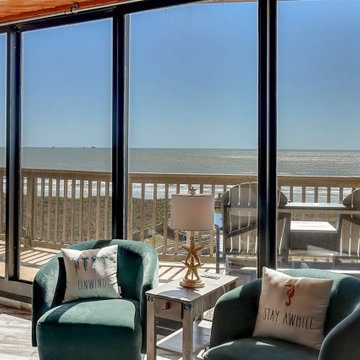
The fourth wall in the living room consists of floor-to-ceiling windows overlooking the ocean. This condo sleeps 8 so providing ample seating was important. One of our favorite features was adding two teal swivel chairs for guests to stare at the ocean while having coffee in the morning that is also just extra seating during gatherings. Finding elements that were not only stylish but also durable was crucial to the overall design and styling of this space as this doubles as a vacation rental for our client. Mixing style with functionality. We kept the original ceiling in the living room as well as the original cement accent wall in the living room. Everything else was changed. A window was added to the stair wall so that as you walk downstairs, you get a view of the ocean. The walls were painted a barely-there minty seafoam color and we stuck with a neutral color palette with pops of various shades of blues. Built-ins were installed to create a working space that doubles as extra storage. The sectional has a chaise that is used to store bedding and the middle part of the sectional pulls out to provide additional sleeping space for guests. The 3 paintings above the sofa were custom painted for the client's space, as well as the dining table and chairs. The rug is a beautiful piece that ties in all of the colors found throughout the downstairs space.
 Zinnia Stetson
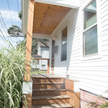
Plantation mahogany decking with cable wire sides to bring a touch of modern to a beautiful deck.
Photo credit: Jennifer Broy
Danish front porch idea in Boston with a roof extension
Danish front porch idea in Boston with a roof extension
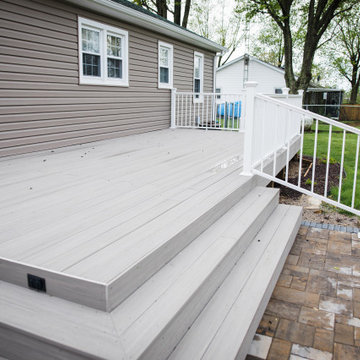

 Cape Associates, Inc.
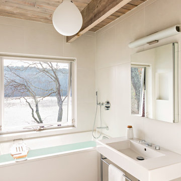
Overthinking a situation isn’t always a bad thing, particularly when the home in question is one in which the past is suddenly meeting the present. Originally designed by Finnish architect Olav Hammarstrom in 1952 for fellow architect Eero Saarinen, this unique home recently received its first transformation in decades. Still in its 1950s skin, it was completely gutted, inside and out. It was a serious undertaking, as the homeowner wanted modern upgrades, while keeping an eye toward retaining the home’s 1950s charm. She had a vision for her home, and she stuck to it from beginning to end.
Perched on a rise of land and overlooking the tranquil Wellfleet Herring Pond, the home initially appears split, with the guest house on the left, and the main house of the right, but both ends are connected with a breezeway. The original home’s bones were in good shape, but many upgrades and replacements were necessary to bring the house up to date.
New siding, roofing, gutters, insulation and mechanical systems were all replaced. Doors and windows with metal frames were custom made by a company in Long Island that fabricates doors for office buildings. Modern heating and cooling systems were added, and the three bathrooms were all updated. The footprint of the home remained unchanged. Inside, the only expansion was more closet space.
The attention to detail in retaining the 50s-style look took a lot of online searching, from handles and knobs to lighting fixtures, with bits and pieces arriving from all over the world, including a doorstop from New Zealand. The homeowner selected many of the fixtures herself, while a very detail-oriented foreman exhaustively researched as well, looking for just the right piece for each and every location.
High-end appliances were purchased to modernize the kitchen and all of the old cabinetry was removed, replaced and refaced with NUVACOR, a versatile surfacing material that not only provided a sleek, modern look, but added convenience and ease of use.
Bare, wood-beamed ceilings throughout give a nod to the home’s natural surroundings, while the main living area (formerly a fisherman’s cabin), with a brick fireplace, was completely trimmed in walnut, while multiple windows of varying sizes welcome sunlight to brighten the home. Here, the sheetrock ceiling with faux rafters provides an interesting and room-brightening feature.
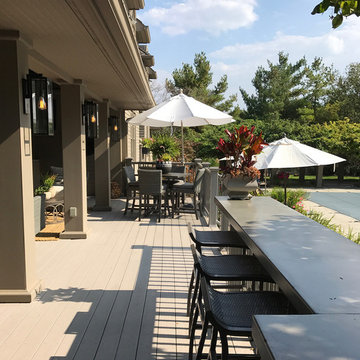
Behind the house sits the serene pond, which can now be enjoyed from the stunning new deck. Here, decking material was not laid out side by side, as it typically is but, instead, meticulously laid out on edge, creating an unusual and eye-catching effect. A railing of tempered glass panels allows unobstructed views of the surrounding natural beauty, and keeps consistent with the open, airy feel of the place. A new outdoor shower is accessible via the deck and left open to the wilderness and the pond below, completing the bold yet sophisticated feeling of this retro-modern home.
 AIBD - American Institute of Building Design
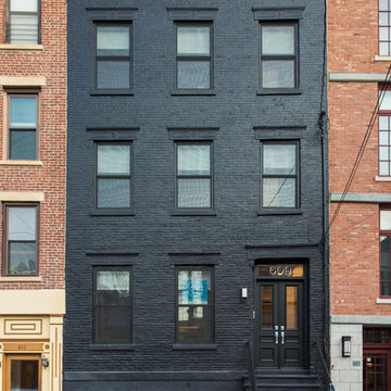
When this non-descript three-story brick row house was purchased by the client, it was stripped completely bare. The owner sought to add additional space, which was achieved by extending the rear of the home by a full 16 feet on the parlor, second and third levels. This not only provided roomier living spaces indoors, it created the opportunity to outfit each reconfigured floor with identical balconies. These outcroppings, finished with matte black railings and full NanaWall folding glass doors, provide the ideal outdoor space for relaxing and entertaining, while creating a harmonious uniformity to the rear façade.
A Grand ARDA for Renovation Design goes to
Dixon Projects
Design: Dixon Projects
From: New York, New York

 Ace of Space
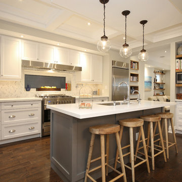
A load baring wall was removed between old dining room and kitchen to allow for a bigger kitchen and an open concept.
Large trendy single-wall medium tone wood floor open concept kitchen photo in Toronto with a single-bowl sink, shaker cabinets, white cabinets, quartzite countertops, multicolored backsplash, stone tile backsplash, stainless steel appliances and an island
Large trendy single-wall medium tone wood floor open concept kitchen photo in Toronto with a single-bowl sink, shaker cabinets, white cabinets, quartzite countertops, multicolored backsplash, stone tile backsplash, stainless steel appliances and an island
Sponsored
Columbus, OH

Hope Restoration & General Contracting
Columbus Design-Build, Kitchen & Bath Remodeling, Historic Renovations
 Mariane Wheatley-Miller
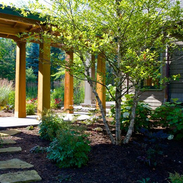
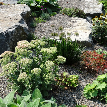
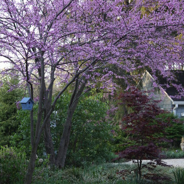
Lots of low growing 'Steppables' were used along the outside edges of the flagstones. Perennials like Monada, Sedums, Epimedium, Stachys, Alchemilla mollis, Rudbeckia, and Echinacea fill the center of the boulder beds. Butterflies, Hummingbirds, Bees and dragonflies are already making this there new home.

 Jami Abbadessa
RUSTIC GLAM
Time Frame: 5 Weeks // Budget: $16,000 // Design Fee: $1,250
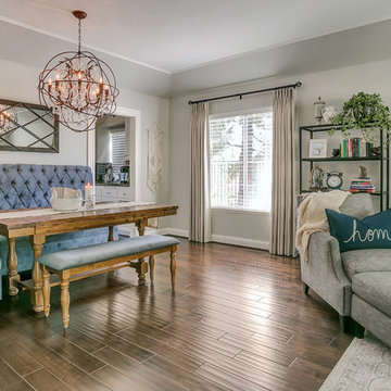
After purchasing a new home in north Upland, this young couple enlisted me to help create a warm, relaxing environment in their living/dining space. They didn’t want anything too fussy or formal. They wanted a comfortable space to entertain, play cards and watch TV. I had a good foundation of dark wood floors and grey walls to work with. Everything else was newly purchased. Instead of a formal dining room, they requested a more relaxed space to hang out with friends. I had a custom L-shaped banquette made in a slate blue velvet and a glamorous statement chandelier installed for a wow factor. The bench came as part of the table set, but I had it reupholstered in the same fabric as the banquette. A ceiling fan and a new entry light were installed to reinforce the rustic vibe. Elegant, yet comfortable furnishings were purchased, custom 2 finger pleat drapes in an oatmeal fabric were hung, and accessories and decor were layered in to create a “lived-in” feeling. Overall, the space is now a great place to relax and hang out with family and friends.
44