
Search results for "Become" in Home Design Ideas
 The Galante Architecture Studio, Inc.
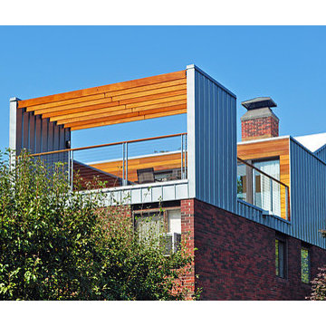
Originally built in 1972, these eight interlocked residential units and the accompanying House Master’s Residence won an AIA award for their unique spatial complexity, balancing standard units of construction with volumetric interplay, all while bringing natural light into living spaces. However, nearly 40 years later
These 1970’s era, interlocked faculty housing units won an AIA award when first completed. They were unique in spatial complexity, By early 2,000’s they were showing signs of age, and had become outdated on many levels. Working with project management for the Faculty of Arts & Sciences, we prepared one prototype design to bring the buildings into the 21st century. New insulated skylights, standing seam metal siding, cedar decks and trellises, exchanging black roofs for well insulated white roofs, were all part of a larger planning program to renovate all nine units. The prototype was implemented in 2012, to great approval and result. In 2013 a few more units were done. In 2014 the “House Masters” unit was done, with the remaining four units planned for future budgets.
Sustainable features include re-use of most materials on site, (former siding was able to become sheathing below metal panels), implementing the Stretch Energy Code for insulation, and putting new white roof membranes in place. Using FSC certified wood for decks and trellises, and using Rheinzink siding, a “200 year material” according to the manufacturer.
After nearly 40 years, Ronald Gourley’s AIA award winning Faculty Housing (1972) was beginning to show its age – plywood siding was delaminating, wooden decks splintering, and custom windows failing. Therefore, the opportunity to reinvent a piece of Mid-Century Modernism presented itself when two of the building’s eight alternating rooftop designs were to be rebuilt as prototypes for the remainder of the structure.
The strength of the original design was its rectilinear and symmetrical arrangement of internal and external spaces, but the difference between the two had become blurred over the decades. New zinc siding, mahogany decking, and stainless steel railings accentuate the defining elements and more clearly articulate the living spaces, breathing new life into the building and reinvigorating the surrounding campus.
Furthermore, the renovation also provided a chance to bring the structure up to modern energy standards and help meet Harvard’s lofty environmental goals. Insulation within the ceilings was more than tripled, white TPO roofing reduces the heat island effect, construction waste was minimized by recasting the siding as sheathing, and materials were selected not only for aesthetics, but for their longevity and ability to be recycled as well.
Harvard’s energy standards brought an uncharacteristic level of environmental care to this building. Roof structures are triple insulated, allowing separating interior from exterior in the most thermally efficient manner. North facing triple insulated skylights and white TPO roofing reduces the heat gain, but allows natural light to pour in. Materials were selected not only for aesthetics, but for their longevity. Zinc, for example, is made of 100% recycled material, and has duration of 200 years. Uncharacteristic levels of environmental care were common on this project.


Find the right local pro for your project
 Berry Outdoor Living, Inc.
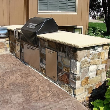
An Outdoor Kitchen truly becomes a social gathering area. Our most common outdoor kitchens are simply a cooking space with a built in grill and some expanded counter space. However, some kansas city outdoor kitchens also include a bar, whether raised, or counter height, a refrigerator, a set of drawers and even an outdoor kitchen with a kegerator and flat-screen tv. As a Landscape Contractor that merges old and new construction into the landscape design, it's difficult to describe, but people just want to spend time in the new area, whether at the bar of the outdoor kitchen, fire pit, patio, or covered porch. When a space becomes a large part of the homeowners' daily life, that's when I know a project has been completed with excellence.
For a space to be relaxing, it must feel easy. A quality landscape design must allow the space to feel like it flows from the adjoining room inside the home out. When accomplished correctly, the patio and outdoor living space feels like an extension of the home, or another "room" of the home and feels wrapped with fresh, low-maintenance landscaping.
Whether traditional or modern, simple, or decked-out, an outdoor kitchen becomes a wonderful hub for entertaining and outdoor living!
 Wesley-Wayne Interiors, LLC
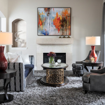
Living room - mid-sized transitional formal and open concept beige floor living room idea in Other with white walls, a standard fireplace and a stone fireplace
 Esther Hershcovich
Photo: Esther Hershcovich © 2017 Houzz
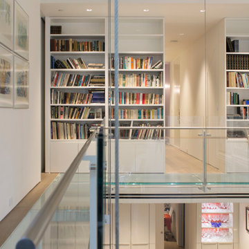
Example of a transitional hallway design in New York
Example of a transitional hallway design in New York
 Floor and Bath Design
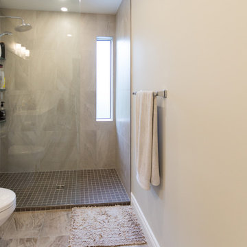
Inspiration for a small country master gray tile and porcelain tile porcelain tile and gray floor bathroom remodel in Toronto with shaker cabinets, white cabinets, a two-piece toilet, white walls, an undermount sink, quartzite countertops and white countertops
 WC Design Center
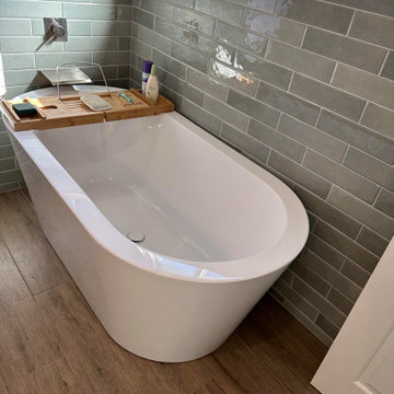
This Primary bathroom was on the smaller side, so we chose to make dramatic updates that would make walking into this room feel like spa retreat everywhere you look! We tiled the walls in a Jade subway tile, used wood floor tile that flowed through into the walk-in shower to keep the space open and continuous. The green vanity is shic and coastal and the freestanding tub is the perfect place to relax after a long day!
 Nip Tuck Remodeling
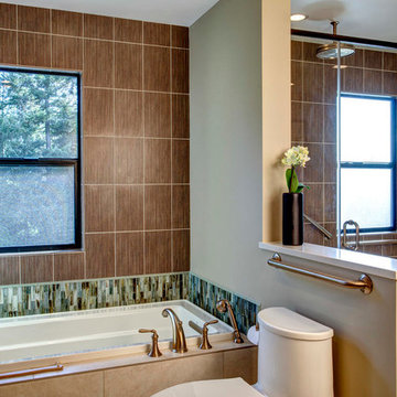
This modern and thoughtfully designed bathroom offers a harmonious blend of textures and finishes. The bathtub area features warm brown, horizontally stacked rectangular tiles extending up the walls, creating a cozy and inviting atmosphere. A decorative border of multi-toned mosaic tiles in shades of green, brown, and beige adds a touch of visual interest above the tub surround.
 Tile Doctor Ltd
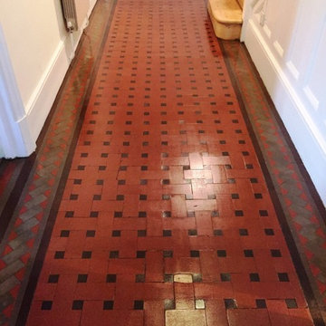
This fantastic Victorian tiled hallway floor in Oxford was in good physical condition for its age; however like any sealed floor the sealer had worn down with use and with dirt becoming trapped in the pores of the tile it was now becoming difficult to clean effectively and had become dull and un-inviting. It was now due a really good deep clean and re-seal. Oxford as I’m sure your aware has a rich history and is home to one of the world’s best universities, so not surprisingly many houses here have interesting floors such as this one.
Upon my arrival at the house, my first task was to protect the skirting boards, as well as the wooden floors leading into the other rooms. I then mixed a solution of Tile Doctor Pro-Clean, a versatile, high alkaline cleaner combined 50:50 with Tile Doctor NanoTech HBU, a particularly strong cleaner that utilises nano-sized particles to penetrate into areas of the stone that standard products simply cannot reach.
I applied the solution to the surface and allowed it to soak for thirty minutes, allowing it to get to work on the ingrained dirt so it could be easily removed. Following this, I agitated the solution with a soft brush attached to a rotary scrubbing machine. I then applied more solution and left it for a further thirty minutes, before scrubbing this into the tiles using a black pad fitted to the rotary machine.
After the clean had been completed, I rinsed the entire floor multiple times and vacuumed up the resulting slurry using a wet-vac machine.
I left the floor overnight, allowing the surface enough time to dry and returned then next day to seal the floor, checking first to ensure the tiles had dried. To seal the floor I used several coatings of Tile Doctor Seal & Go. Seal & Go which is a water-based, topical sealer that is suitable for use on unsealed, porous surfaces such as Victorian tile, textured Quarry, Slate, and Sandstone; being water based you don’t get the smell so it’s much more pleasant to work with.
As you can see from the before and after photos, the result was an aesthetically pleasing and – most importantly – clean, Victorian tiled floor. Needless to say, my client was extremely pleased with my work.
Barry Woodward
Oxfordshire Tile Doctor
 MCDW + Architecture
Kitchen Cube 1
Upper East- Residence
Work: Full Gut renovation- 2 apartments- in the same ‘S’ line
Size: 650 Sq Ft of space in both apartments, 5S and 4S
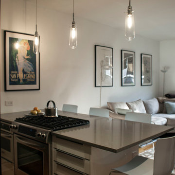
Using the Frankfurt Kitchen of 1926 for inspiration, Ms.Cianfaglione began asking herself how the typology of the NYC kitchenette for her building, in the ‘S’ line, needed to be upgraded to fit today’s physical and aesthetic needs. The Frankfurt Kitchen was the forerunner of modern fitted kitchens and had an unified concept to enable efficient work, consolidating a woman’s efforts and allowing her more time to spend else ware. But unlike the Frankfurt kitchen, Ms. Cianfaglione wanted to take this a step further and open it up rather than concealing it, and its user, inside a room. This would showcase the designer’s evolved notion of “cooking”,that would now become an orchestrated dance to be put on display.
Ms. Cianfaglione had a typical NYC kitchenette, a small room with an air grille for ventilation, and in this case, there was a small window that was currently blocked by a refrigerator. There was also the problem of the foyer space, which was just a waste in an apartment this small, and the structural wall that could not be removed. Ms. Cianfaglione responded to these conditions by designing the kitchen to become a wrap around condition, in an ‘L’ shape, that would use the foyer more effectively and at the same time, face the living area, and all the while concealing the structural wall that separates them.
The interesting thing about the ‘L’ shape was that it allows for a beautifully orchestrated flow that makes cooking look like a beautiful dance that moves back and forth along the’ L.’
The appliances are designed within the cabinetry to give a tailored look that does not allow for distraction, and you instead focus on the user. This renovation made the otherwise small, unused foyer and ineffective kitchen, now a focal point that dictates movement throughout. The kitchen has unified and designed an otherwise standard one bedroom apartment and seeks to become a new standard in this building’s typology.








 Just the Thing Decorating, Staging, and Windows
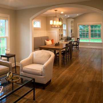
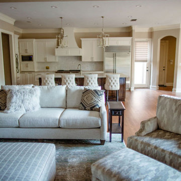
This recent renovation project began with a desire to open up the kitchen to the family room. Today everyone seems to want the big island to live and entertain around, right?
I always recommend taking your time during the planning phase—6 weeks at least! Kitchens and bathrooms are highly functional areas, so you want to give yourself time to think thoughts like, “where am I going to put all my plastic cups?” I ask my clients lots of questions during this phase to help them design a kitchen that truly has a place for everything. Appliances and plumbing are part of this phase as well.
Once the cabinet design was finalized, the demo began! Because that troublesome wall was load bearing, so the GC, Miland Home Construction, had to install a beam to support the second floor. But once that was done, boy we had a lot of space to work with!
Picking your countertops is a little like picking an ice cream flavor: you really want to see all your options! Not only is function important here, but your counter material is really a major element of the kitchen, so pick one you love! This client fell in love with Taj Mahal Quartzite.
The backsplash was the next layer of fun. Now the mood of the kitchen becomes clear. Will it be elegant? Homey? Rustic? Picking the lighting then becomes like the fine tuner on a microscope, adjusting the view to its perfect clarity.
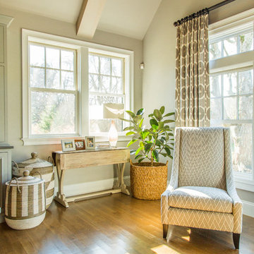
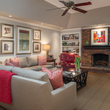
With construction underway, and the mood of the new space established, soft furnishings become the focus. Layering in luxurious, yet durable fabrics are the name of the game for most families. We all want beautiful spaces that can stand up to spouses, kids, and pets! It’s always a lot fun to select a deep and comfy sofa and chairs!
The finishing touches are what really give the project that designer look—so be sure to save room in the budget for art, window treatments, and accessories. In this home I wallpapered the wall behind the tv with a subtle grasscloth, selected a large abstract to center the room, and echoed its colors throughout the accessories. The result is eye-pleasing indeed: soft, textured, interesting and peaceful. This busy family was thrilled with the results.
 Ready?Set,Sell! Home Staging,ReDesign&Color Expert
Laura S. Baker
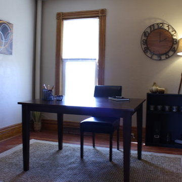
Inspiration for a mid-sized transitional freestanding desk medium tone wood floor home office remodel in Milwaukee with white walls
Inspiration for a mid-sized transitional freestanding desk medium tone wood floor home office remodel in Milwaukee with white walls
 Esther Hershcovich
Photo: Esther Hershcovic © 2014 Houzz
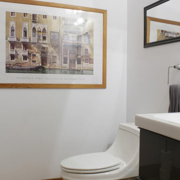
Inspiration for a transitional powder room remodel in Montreal
Inspiration for a transitional powder room remodel in Montreal
49