
Search results for "Blog post" in Home Design Ideas

 Zito Landscape Design, Inc.
Zito Landscape Design South Florida
Inspiration for a large tropical partial sun side yard gravel formal garden in Miami for summer.
Inspiration for a large tropical partial sun side yard gravel formal garden in Miami for summer.
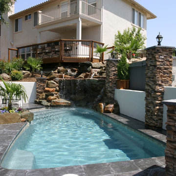
 Latham Pool Products Inc.
How about spending a lovely afternoon listening to the waterfall and chilling next to this cozy fiberglass pool? This pool is the Baja model by Viking Pools. It was installed by Viking Pools of Sacramanto.
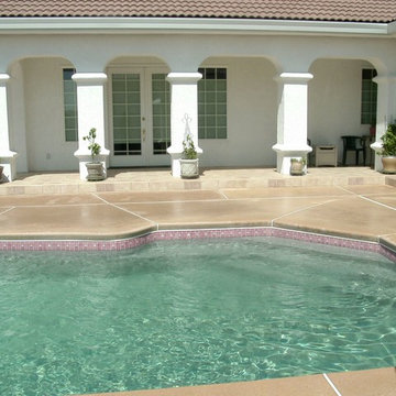 Latham Pool Products Inc.
The color scheme and design of this poolscape screams elegance and we love it! This is a gorgeous example of the Viking Fiberglass Carmel model in the Pebble Beach color. With added custom mosaic tile and a unique decking material, this project is one to remember. This was installed by Viking Pools of Redding in California.
Find the right local pro for your project

 safe ZOnea
If you’re active on GardenWeb sharing plant photos, asking for advice, tracking seasonal progress you already understand how much detail goes into gardening. Soil pH, rainfall, emerging leaves, bloom counts, fertilizer schedules it adds up fast. But all that rich information often remains buried in posts, lists or memory. What if you could visualize that data and turn it into clear quick insights? That’s where a graph maker becomes a game-changer for your gardening workflow.
1. Why garden data belongs on a graph
On GardenWeb, you’ll find forums for everything from perennial care, vegetable gardening, patios, herbs, even cooking and craft projects. While plant lovers share observations and ask questions, many track progress manually in spreadsheets or memory. A graph maker flips that around:
Instead of a list of numbers (e.g., “Soil test: pH 6.4 in May, 6.1 in October”), you get a line graph showing the decline over time.
Instead of guessing which plant bloomed most, you see a bar chart comparing counts across plants.
Instead of manually calculating average rainfall effect, you plot scatter points of bloom count vs. rainfall.
By turning your data into visuals, you’re not just recording—you’re analysing, learning and improving. For GardenWeb users this means smarter decisions: Which fertilizer actually improves bloom count? Which shady spot recovers slower? A graph maker gives clarity.
2. What is a graph maker and how to use one
A graph maker is a web tool or software that lets you input raw data (numbers, dates, categories) and output visual charts like line graphs, bar charts, scatter plots, etc. It might allow you to import a spreadsheet, select chart type, customize colours, label axes, and export the image for your blog, forum post or personal log.
Here’s how you could apply it for gardening:
Log blooms per week for each rose plant.
Using the graph maker, choose line graph to track changes over weeks.
Label your y-axis “Number of Blooms”, x-axis “Week of Year”.
Add colour lines for each plant for easy comparison.
Export as PNG and embed it in a GardenWeb forum post: “See bloom trend for my ‘Peace’ vs ‘Knock Out’ roses”.
This isn’t just pretty-to-look-at: it makes the trend obvious, invites discussion (“Hey, your ‘Knock Out’ line dips after week 28—what changed?”) and helps you refine your routine.
3. Use these specific scenarios on GardenWeb
A. Soil pH and plant health tracking
After multiple tests you have pH values over time and bloom results. Upload both datasets into the graph maker, produce a dual-axis line graph: soil pH on one axis, bloom count on the other. Post your findings in the “Soil, Fertility & Nutrients” forum and get feedback.
B. Seasonal pest or disease appearance
Record number of aphids spotted each month and whether you used treatment. A bar chart via the graph maker can show pre- and post-treatment figures. Then ask the “Insect & Disease Control” forum for advice based on your visual data.
C. Yield comparison between varieties
You grow two zucchini varieties. You keep weekly yield in pounds. Use the graph maker for a side-by-side bar chart. Share in the “Vegetable Gardening” forum: “Which was better this year? See the chart”.
D. Rainfall vs growth rate
You log weekly rainfall and growth (in cm) of your tomato plants. Use scatter plot in graph maker. If a pattern emerges, you’re ready to post: “Is my growth plateau due to drought? Chart shows a clear correlation.”
4. Why this elevates your GardenWeb contributions
When you post with a chart made by a graph maker, you’re doing more than asking or showing off. You’re investigating. You’re analysing. You invite the community to give feedback on data, not just anecdotes. That elevates the discussion. Instead of “My plant died, any ideas?” you post “See this graph of pH drop and bloom count—what might be the limiting factor?” High-quality visuals raise your post’s value and garner more thoughtful responses.
Plus, your posts become useful references for others: someone else can say, “Cool graphic, can you share your data sheet?” You build credibility and help the forum become a learning hub—not just a Q&A board.
5. Tips for using a graph maker effectively in the GardenWeb context
Keep it simple: One chart, one insight. Don’t overcrowd.
Label clearly: Titles, axis labels, units (e.g., cm/week, mg/L, °F).
Use readable colours: Avoid faint tones that vanish on mobile.
Annotate when needed: Add notes like “Fertiliser switched week 12” or “Shade cloth added”.
Provide context in your post: Don’t leave the chart alone—write a few sentences explaining what it shows and what you’re seeking.
Embed carefully: Make sure your image displays properly in GardenWeb; check mobile view.
Share raw data: If possible link to your spreadsheet so others can replicate or comment.
Be open to feedback: The chart invites questions; embrace them.
6. Possible pitfalls and how to avoid them
Bad data = bad chart: If your measurements aren’t consistent, your graph will mislead. Use standardized data collection.
Too much complexity: Multi-axis charts, too many variables—confusing. Stick to one or two variables.
Overlooking mobile viewers: Many GardenWeb users browse via phones. Use large fonts and simple visuals.
Ignoring the narrative: Chart alone won’t answer. Explain what it means and what you need.
Outdated charts: If you update your data annually, keep your visuals current or label them clearly as “2024 data”.
7. Final thoughts
On GardenWeb you’ll find a vibrant community of gardeners, DIYers, cooks and design lovers.Using a graph maker for your posts and progress turns your experience from casual hobby-logging into smart data-driven gardening. You’ll not only learn more—your peers will learn more, too.
So next time you log your plant growth, record your yield, test your soil or track pests—don’t just note it. Plot it. Use a graph maker. Share it in the forum. Let your garden tell the story, and let the community help you write the next chapter.
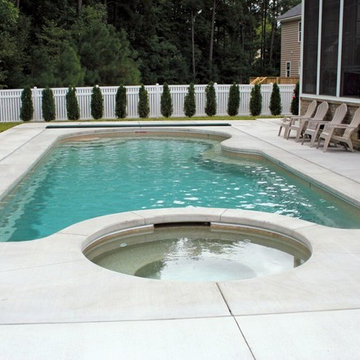 Latham Pool Products Inc.
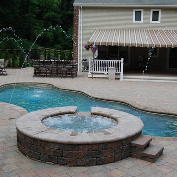
This Viking Fiberglass swim/spa combo was installed by the Pool Guyz in Virginia Beach, VA in 2014. The chosen color, pebble beach, gives the entire backyard a new exotic feel that the family can enjoy in both warm and cold temperatures. The swimming pool also has some great add-ons such as custom bench seating and an automatic safety cover.

 Latham Pool Products Inc.
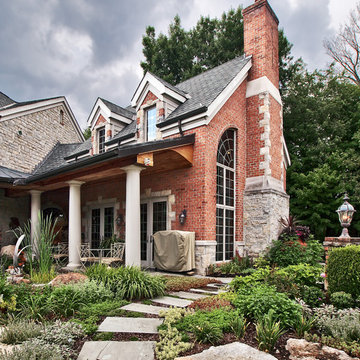
A beautiful backyard now made even better with a Viking Fiberglass Caribbean pool. Not only is the pool great for the summer, but they added a spa so that they can enjoy this investment all year round! The design also sports custom tiling, bubblers, deck jets, and a beautiful brick paver patio. This project was done by Florida Concepts Pools in Mahopac, NY.
Sponsored
Columbus, OH

Structural Remodeling
Franklin County's Heavy Timber Specialists | Best of Houzz 2020!
 Caroline Sharpnack
Photo: Caroline Sharpnack © 2017 Houzz
Living room - modern living room idea in Nashville
Living room - modern living room idea in Nashville
 Lenton Company, Inc.
Modern Minimalism Meets Everyday Life in Lancaster
Project Overview
Challenge:
With three children, two cats, and frequent visits from friends and extended family, the homeowners needed a kitchen that could keep up with their active household. As certified foster parents, [LINK TO THIS MONTH’S BLOG POST] they also required secure, lockable storage for knives, alcohol, and cleaning supplies. While functional, the existing kitchen felt dated and lacked efficiency. Their vision: clean countertops, hidden appliances, and durable finishes with timeless appeal.
Design:
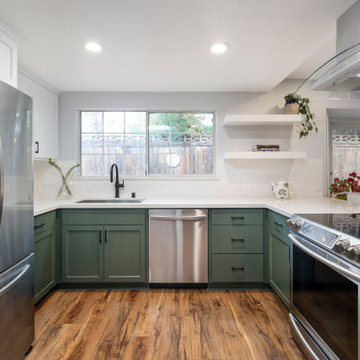
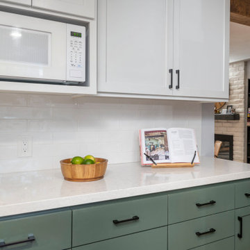
Lenton Company created a tailored plan that honored the family’s budget and priorities. The U-shaped layout was preserved, but the stove was moved to the opposite wall to improve flow for two active cooks. Dark green shaker-style base cabinets were paired with white uppers and quartz countertops, delivering a high-contrast, classic look. Water resistant, wood-tone flooring was installed throughout the kitchen and main living areas for durability and cohesion. The drop ceiling remained due to ductwork but was refinished for a fresh appearance.
Build:
Construction began with a full demo and was carefully sectioned off to maintain a safe environment. The remodel included all-new appliances, lighting, cabinetry, and finishes. Thoughtful features like soft-close drawers, oversized pull-out trash and recycling, locking storage, a hidden microwave, and dedicated space for a toaster oven contributed to a clutter-free and functional kitchen. Under-cabinet lighting, overhead fixtures, and a half lazy Susan further enhanced efficiency and usability.
Reveal:
In the words of our homeowners, “Working with Lenton Company made the process feel seamless and turnkey. Having the designer, project manager, and build team all under one roof was a huge advantage. Our designer really listened to our needs and design preferences, offering thoughtful layout options and guiding us toward choices that fit our style and budget. The build team was efficient, professional, and kept everything on track—and tidy! After the renovation, we knew without a doubt we had made the right decision.”
 Lenton Company, Inc.
Modern Minimalism Meets Everyday Life in Lancaster
Project Overview
Challenge:
With three children, two cats, and frequent visits from friends and extended family, the homeowners needed a kitchen that could keep up with their active household. As certified foster parents, [LINK TO THIS MONTH’S BLOG POST] they also required secure, lockable storage for knives, alcohol, and cleaning supplies. While functional, the existing kitchen felt dated and lacked efficiency. Their vision: clean countertops, hidden appliances, and durable finishes with timeless appeal.
Design:
Lenton Company created a tailored plan that honored the family’s budget and priorities. The U-shaped layout was preserved, but the stove was moved to the opposite wall to improve flow for two active cooks. Dark green shaker-style base cabinets were paired with white uppers and quartz countertops, delivering a high-contrast, classic look. Water resistant, wood-tone flooring was installed throughout the kitchen and main living areas for durability and cohesion. The drop ceiling remained due to ductwork but was refinished for a fresh appearance.
Build:
Construction began with a full demo and was carefully sectioned off to maintain a safe environment. The remodel included all-new appliances, lighting, cabinetry, and finishes. Thoughtful features like soft-close drawers, oversized pull-out trash and recycling, locking storage, a hidden microwave, and dedicated space for a toaster oven contributed to a clutter-free and functional kitchen. Under-cabinet lighting, overhead fixtures, and a half lazy Susan further enhanced efficiency and usability.
Reveal:
In the words of our homeowners, “Working with Lenton Company made the process feel seamless and turnkey. Having the designer, project manager, and build team all under one roof was a huge advantage. Our designer really listened to our needs and design preferences, offering thoughtful layout options and guiding us toward choices that fit our style and budget. The build team was efficient, professional, and kept everything on track—and tidy! After the renovation, we knew without a doubt we had made the right decision.”

 FINNE Architects
The master bath features stunning views of Puget Sound.
The glass walls between the bath and hall have a hand-drawn etched glass pattern.
Photo: Benjamin Benschneider
 Bilotta Kitchen & Home
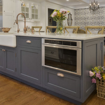
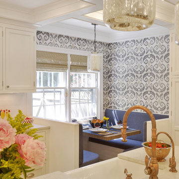
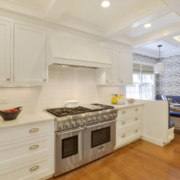
“It’s hard to believe these two sets of photos are actually the same space! The 1950s “modern” kitchen was tiny and dark, and the adjoining family room went largely unused by the family. Yet the owners love to cook and entertain, so this kitchen needed to go! Designer Fabrice Garson removed the wall between the two spaces and created one multi-purpose space: an open kitchen with abundant storage and prep space at the large range and island; a banquette for casual family meals or homework; and a separate table for dinner parties. Because they’d be losing their formal dining room, Fabrice recommended adding the coffered ceiling to lend an air of elegance to the new space. This once-gloomy cave morphed into an airy, luminous room. Pops of dark blue on the island, the banquette upholstery, and the banquette wallpaper add a fun element to temper the traditional tone of the inset cabinetry. And the mixture of stainless appliances with the brushed gold faucet, gold accents on the pendant fixtures, and the bronze crystal chandelier create an eclectic but elegant look.” (This blurb was part of Bilotta’s Blog Post written by Paulette Gambacorta)
The finished space features Signature Custom Cabinetry in a mix of white paint on the perimeter and a custom navy paint on the island. All hardware is a mixed of brushed nickel knobs and cup pulls. The countertops are Ceasarstone’s Bianco Drift and the backsplash is a classic and clean white ceramic subway tile. Appliances are all by Thermador with the exception of the Best hood insert which is hidden by the custom white painted hood. The sink is an apron front by Kohler in cast iron with a white enamel finish and is accented by a brushed copper faucet and water filter. The decorative lighting adding to the elegance of the space is by EuroStyle. The custom-built banquette and coffered ceiling were both designed by Fabrice and brought to life by his long time contractor Breton Contracting.
Designer: Fabrice Garson Photo Credit: After Photos by Peter Krupenye
 Cambria
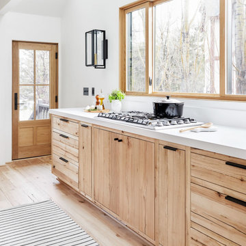
This crisp and clean kitchen by Emily Henderson incorporates smart organization without compromising design.
Eat-in kitchen - rustic eat-in kitchen idea with quartz countertops, white backsplash, an island and white countertops
Eat-in kitchen - rustic eat-in kitchen idea with quartz countertops, white backsplash, an island and white countertops
Sponsored
Columbus, OH
Free consultation for landscape design!

Peabody Landscape Group
Franklin County's Reliable Landscape Design & Contracting

 Bilotta Kitchen & Home
“It’s hard to believe these two sets of photos are actually the same space! The 1950s “modern” kitchen was tiny and dark, and the adjoining family room went largely unused by the family. Yet the owners love to cook and entertain, so this kitchen needed to go! Designer Fabrice Garson removed the wall between the two spaces and created one multi-purpose space: an open kitchen with abundant storage and prep space at the large range and island; a banquette for casual family meals or homework; and a separate table for dinner parties. Because they’d be losing their formal dining room, Fabrice recommended adding the coffered ceiling to lend an air of elegance to the new space. This once-gloomy cave morphed into an airy, luminous room. Pops of dark blue on the island, the banquette upholstery, and the banquette wallpaper add a fun element to temper the traditional tone of the inset cabinetry. And the mixture of stainless appliances with the brushed gold faucet, gold accents on the pendant fixtures, and the bronze crystal chandelier create an eclectic but elegant look.” (This blurb was part of Bilotta’s Blog Post written by Paulette Gambacorta)
The finished space features Signature Custom Cabinetry in a mix of white paint on the perimeter and a custom navy paint on the island. All hardware is a mixed of brushed nickel knobs and cup pulls. The countertops are Ceasarstone’s Bianco Drift and the backsplash is a classic and clean white ceramic subway tile. Appliances are all by Thermador with the exception of the Best hood insert which is hidden by the custom white painted hood. The sink is an apron front by Kohler in cast iron with a white enamel finish and is accented by a brushed copper faucet and water filter. The decorative lighting adding to the elegance of the space is by EuroStyle. The custom-built banquette and coffered ceiling were both designed by Fabrice and brought to life by his long time contractor Breton Contracting.
Designer: Fabrice Garson Photo Credit: After Photos by Peter Krupenye
 Bilotta Kitchen & Home
“It’s hard to believe these two sets of photos are actually the same space! The 1950s “modern” kitchen was tiny and dark, and the adjoining family room went largely unused by the family. Yet the owners love to cook and entertain, so this kitchen needed to go! Designer Fabrice Garson removed the wall between the two spaces and created one multi-purpose space: an open kitchen with abundant storage and prep space at the large range and island; a banquette for casual family meals or homework; and a separate table for dinner parties. Because they’d be losing their formal dining room, Fabrice recommended adding the coffered ceiling to lend an air of elegance to the new space. This once-gloomy cave morphed into an airy, luminous room. Pops of dark blue on the island, the banquette upholstery, and the banquette wallpaper add a fun element to temper the traditional tone of the inset cabinetry. And the mixture of stainless appliances with the brushed gold faucet, gold accents on the pendant fixtures, and the bronze crystal chandelier create an eclectic but elegant look.” (This blurb was part of Bilotta’s Blog Post written by Paulette Gambacorta)
The finished space features Signature Custom Cabinetry in a mix of white paint on the perimeter and a custom navy paint on the island. All hardware is a mixed of brushed nickel knobs and cup pulls. The countertops are Ceasarstone’s Bianco Drift and the backsplash is a classic and clean white ceramic subway tile. Appliances are all by Thermador with the exception of the Best hood insert which is hidden by the custom white painted hood. The sink is an apron front by Kohler in cast iron with a white enamel finish and is accented by a brushed copper faucet and water filter. The decorative lighting adding to the elegance of the space is by EuroStyle. The custom-built banquette and coffered ceiling were both designed by Fabrice and brought to life by his long time contractor Breton Contracting.
Designer: Fabrice Garson Photo Credit: After Photos by Peter Krupenye
 Mottram Architecture
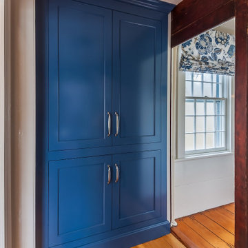
Timber frame homes offer unique challenges during a remodel. What often makes them beautiful and attractive to most homeowners, also makes them challenging for space requirements.
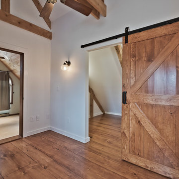
Context: The lovely couple that owned this home were struggling with some interesting floor plan challenges that just didn't work for their family. The loved the beautiful timbers and woodwork of their home, but the dramatically sloping ceilings on the second floor, particularly in the bathroom, just didn't work for this 1 1/2 bath home. Needing to use the skylight to approach the toilet was a less then ideal scenario. Although the bathroom footprint was more then adequate, the sloped ceiling only made half of the space useable. Check out the Before/After post on our blog to see the photos of the house pre-renovation. As much as they loved all the wood features in their home, another challenge they had was light. The wood ceiling made everything inside the house darker, even with a fantastic array of south facing windows, there were spaces in the home that felt dark and small. When they contacted us they wanted to know how could they make their brighter and more inviting, were there solutions to the 2nd floor sloped ceiling issues, and if they were going to do all of this work, how could they make their home more comfortable and efficient. A nagging water leak in the upstairs bathroom spurred them into action and here is how we solved their dilemma.
Conclusion: First, we added a little dormer to the rear of the house so we could get full headroom in nearly all of the upstairs bathroom! Then we decided to extend that dormer one more timber bay over to create a walk in closet with natural light and plenty of space. Since we were contemplating energy efficiency, we resolved a nagging issue that is present in a lot of timber frame construction, air tightness. Commonly found in timber frame construction, fiberglass insulation is installed in the rafter bays and board ceilings are installed over top. Unfortunately, board ceilings are anything but air tight, and fiberglass insulation needs to be in an airtight cavity for maximum effectiveness. So we were able to solve two issues at the same time for this homeowner. We removed the board ceiling and fiberglass insulation, we dense packed the rafter bays with cellulose insulation, and installed sheetrock in place of the boards. The boards were salvaged for re-use by the homeowner, and the space and light quality was dramatically improved. Some may think that losing the board ceiling took something away from the space, but what you'll see in the pictures is that it highly accentuates the heavy timbers and really makes them stand out in a beautiful way. Now with this added airtightness, better insulation, and brighter space, the homeowner hardly runs their wood stove, and it's so quiet in the space, an added bonus from changing the insulation. It became necessary to also add a sheetrock ceiling to the living room to hide the plumbing from the new bathroom layout above. Changing this ceiling gave the homeowner some real quality lighting that was lacking in the living room before. The brighter ceiling and new lighting layout completely transforms the living room into a space you want to hang out, even though the layout didn't change at all. When the homeowner saw the finished spaces she said "I can't believe this is my house, I want to live in this house"
Energy Efficiency: I touched a little on the efficiency above, but like all projects done with Mottram Architecture, we always want to leave you with a little extra. Timber frame construction with board ceilings and fiberglass insulation are notoriously leaky! If you want to know what we think about fiberglass insulation, check our our blog post on Why Fiberglass Insulation Sucks. By installing cellulose insulation and covering it with sheetrock we were able to greatly reduce the heat flowing out of this home. It not only improves cashflow it improves the comfort level in the space. Who wants to sit in their living room and feel a draft? Let us remind you, we are not saying cellulose insulation is an air barrier, we use the sheetrock to help with that, but it does significantly reduce the air flow over fiberglass insulation. And when we reduce the airflow, we reduce the heat flow. And when we reduce the heat flow, we reduce the need to re-heat that drafty air from outside. When it comes to energy efficiency the first and best place to start is air infiltration. We greatly reduced the air infiltration with the new insulation, but we also added a hat and warm boots. What I mean by that is, we improved the insulation in the roof, and we installed insulation in the basement. Maybe it's a silly analogy, but when you think about keeping warm, we always start with the hat and boots! With sustainability in mind, the next project will be to add a deck to the front of this house with rain catchment barrels from the metal roof. They are planning to plant a garden in the spring and the rain catchment system will help to irrigate the new garden.
Builder: East Shore Builders
Photographer: Michael Eric Berube
Sponsored
Columbus, OH
Free consultation for landscape design!
Peabody Landscape Group
Franklin County's Reliable Landscape Design & Contracting
 Bilotta Kitchen & Home
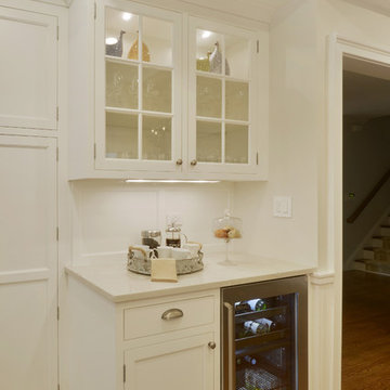
“It’s hard to believe these two sets of photos are actually the same space! The 1950s “modern” kitchen was tiny and dark, and the adjoining family room went largely unused by the family. Yet the owners love to cook and entertain, so this kitchen needed to go! Designer Fabrice Garson removed the wall between the two spaces and created one multi-purpose space: an open kitchen with abundant storage and prep space at the large range and island; a banquette for casual family meals or homework; and a separate table for dinner parties. Because they’d be losing their formal dining room, Fabrice recommended adding the coffered ceiling to lend an air of elegance to the new space. This once-gloomy cave morphed into an airy, luminous room. Pops of dark blue on the island, the banquette upholstery, and the banquette wallpaper add a fun element to temper the traditional tone of the inset cabinetry. And the mixture of stainless appliances with the brushed gold faucet, gold accents on the pendant fixtures, and the bronze crystal chandelier create an eclectic but elegant look.” (This blurb was part of Bilotta’s Blog Post written by Paulette Gambacorta)
The finished space features Signature Custom Cabinetry in a mix of white paint on the perimeter and a custom navy paint on the island. All hardware is a mixed of brushed nickel knobs and cup pulls. The countertops are Ceasarstone’s Bianco Drift and the backsplash is a classic and clean white ceramic subway tile. Appliances are all by Thermador with the exception of the Best hood insert which is hidden by the custom white painted hood. The sink is an apron front by Kohler in cast iron with a white enamel finish and is accented by a brushed copper faucet and water filter. The decorative lighting adding to the elegance of the space is by EuroStyle. The custom-built banquette and coffered ceiling were both designed by Fabrice and brought to life by his long time contractor Breton Contracting.
Designer: Fabrice Garson Photo Credit: After Photos by Peter Krupenye
 F. D. Hodge Interiors
Master Bathroom Renovation
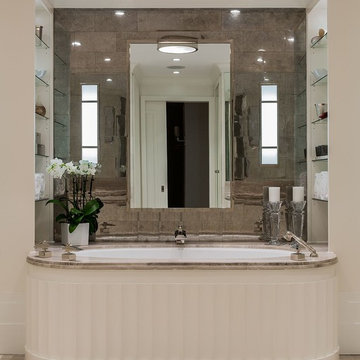
Custom designed tub surround with Lalique wall sconces inset in a pyrite tiled feature wall. Frank Hodge Interiors
Photo:Michael J Lee
 Paintzen, Inc.
When it comes to finding inspiration for your house or apartment design, there are a variety of routes you can take. For some, it is important to dive into the latest trends in fashion and art, using only the most popular decor pieces and embracing the color palettes seen on runways or in home and garden magazines. But for others, it’s simply about discovering what feels most like “home.”
Ashley Steele, the creator of A Styled Affair, was part of the latter group. “Since my husband and I were moving into a space that was previously owned, I needed a way to make it feel like it was truly ours, and unique to us,” she told our team.
A Styled Affair sprang from Ashley’s passion for fashion, and need for a creative outlet. But it soon became more than that. She developed a following, and it quickly became a place where she could share her personal style, travel adventures, and lifestyle tips. “While the blogging industry has become overwhelmed with people sharing their favorite home decor or make-up tips, I think what sets A Styled Affair apart is my commitment to stay true to my unique taste. I have always marched to the beat of my own drum – and that carries through in the clothes I wear, the decor I select for our home, and the travels I plan.”
Paintzen connected with Ashley as she was settling into her new home in Boston’s Seaport District. Although she and her husband have lived in Boston for almost 8 years, they were used to smaller, more traditional spaces. Their new home is much bigger, and more modern, than any place they lived before. “I wanted to select colors of comfort, simplicity, and sophistication so we could elevate the space and make it feel more like a home.” Ashley also accurately pointed out that new construction can sometimes feel a little cold and sterile, almost industrial. “I wanted our home to feel like a peaceful oasis after coming in from the bustling city.”
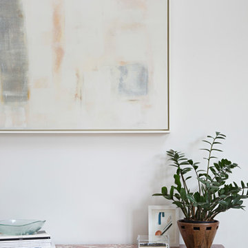
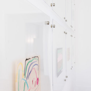
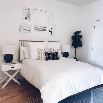
Ashley chose soft white paint for her walls to bring a sense of comfort and zen. With lots of wall decor, art work and carefully selected furniture, the walls serve as a clean and comfortable palette, and allowed her more freedom when making her other design decisions throughout the space. Ashley kept the overall palette fairly neutral, and incorporated “modern bohemian” inspired decor throughout the home; the final product was clean and simple, and catered to her style.
We asked Ashley what she was most excited for now. “I’m most excited to continue to find new decor pieces to compliment the paint colors and decor we’ve already found for the space. We have been really patient with decorating and selected each piece really careful to make sure it is cohesive and flows from room to room. I’m looking forward to enjoying the space with my husband and dog, and entertaining friends and family in the spring and summer!”
A few final questions for Ashley on her experience with Paintzen:
“I would highly recommend Paintzen to anyone, especially those that live in the city. There are so many different paint companies and contractors to choose from but going through Paintzen simplified the process and made me feel comfortable that we had the right team working on our space. Their platform for booking services and choosing paint colors made the process seamless and was a great way to keep track of what we booked and chose for colors. Most importantly, the customer service team was outstanding whenever we had a question or needed to make an adjustment.”
And advice she would give someone repainting their home:
“Patience. I would recommend taking your time and doing your research before selecting paint colors. Lighting changes every color so make sure to bring paint swatches and samples into the space and look at it throughout the day to see the different tones that the light will pick up. I would also recommend researching color trends and recommendations for colors in the family you are looking for. We found our living room color through a blog post listing top-used colors by interior designers and it looks amazing.”
23