
Search results for "Borrowed" in Home Design Ideas

 Adams + Beasley Associates
Richard Mandelkorn
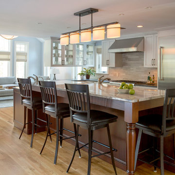
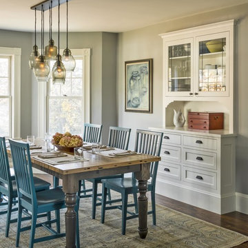
The removal of a large, brick chimney and some disjointed structural beams in the original house allowed the dining room to have spacious access to the new open kitchen. A new built-in china hutch added some much needed storage, borrowing space from the mudroom storage behind the wall. This ingenious solution allowed for extra depth without intruding into the dining room.
 Peregrine Design Build
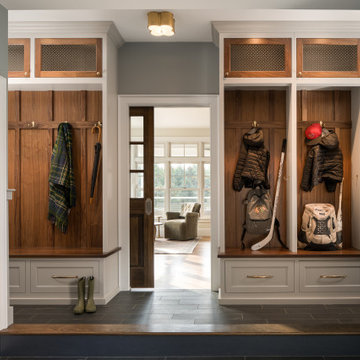
The existing mudroom stopped at the landing, creating a tight and crowded entry point for the family. By borrowing a bit of space from the kitchen, we were able to create a more functional, organized drop zone -perfect for the kids’ gear, dog-walking essentials, and the everyday items that keep a busy household moving.
Find the right local pro for your project

 Andrew Goodwin Designs
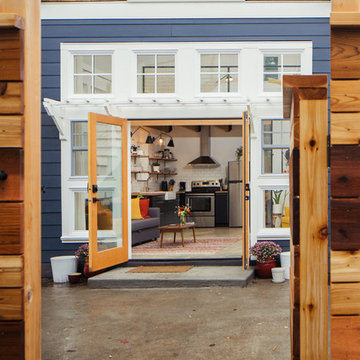
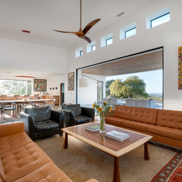
Mid-sized trendy formal and open concept concrete floor and vaulted ceiling living room photo in San Luis Obispo with white walls, a standard fireplace, a tile fireplace and a wall-mounted tv

 Qb3 LLC
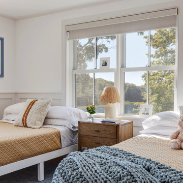
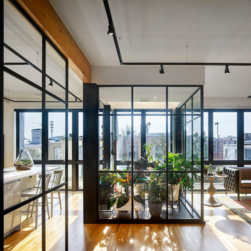
The main spaces of the house, including the kitchen, dining room, and living room, are elevated above the street level to the second floor. It is here that the lush interior winter garden punctuates the otherwise open plan, borrowing light from the floor-to-ceiling windows on the north and south faces of the building.

 James McNeal Architecture and Design
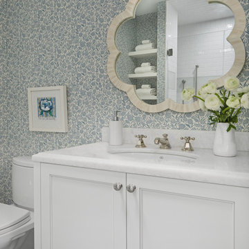
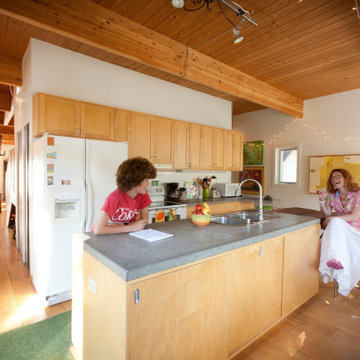
On axis to the island, the kitchen can function as a dinette or formal dining. Each room borrows from one another's volume of space - the light from the dining room floods into the kitchen and the rooms share long views of the prairie.
 CITYDESKSTUDIO, Inc.
Drawing on utility farm buildings, the design of this house is direct in it’s form and organization. Located in a dense St. Paul neighborhood on a narrow 39’ wide lot, the house draws equally from it’s turn of the century neighbors for scale and materiality.
The 20’ wide shotgun structure allowed the house to be pushed to the east, opening up the west wall for large windows and the opportunity for an outdoor room. This changed what is normally “nowhere” space between houses into an active extension of the home used to BBQ, play catch, and afford pleasant transition from front to back.
Life plays out in the home within three space, the living/dining, the kitchen/breakfast, and the porch/outdoor room. All three are used daily either actively or borrowed. Each is clearly defined and connected to the others through the careful placement or absence of walls or corners, and made more expansive by increased height, defined sightlines, and exposed structure
Architect:
Ben Awes AIA
 CITYDESKSTUDIO, Inc.
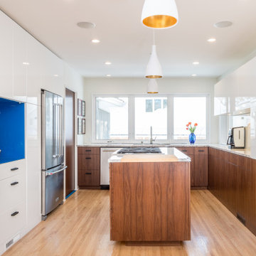
So often our task as residential architects is not to create something out of nothing. Instead, it is to help evolve, or bring forward something that is already there; to see with new eyes the best of what exists and to clarify and expand it, so that the house supports and celebrates how the client lives, and hopes to live, in the home.
So was the case with our House of Blues. The house was already wonderful. There was plenty of space, good views, a functioning floor plan, and the home was in overall good condition. The best features however, were embedded in the time it was built – mid 1960’s. The views were good, but too small. The kitchen location worked well, but is was closed off, cramped, and lacking counter space. The dining room was elegant, but too large and isolated. The graceful central hallway remained the homes most unique feature, but it was dark and the entry to the rooms on either side were accessed via small doorways. The bathrooms were large enough, and in the right locations, but they were tired and dated, and there was no mudroom.
We created something out of something. Beautiful shades of blue permeated the owner’s things and became a central theme in new elements. Daylight was expanded and brought deeper into the space. Doorways were widened and walls removed. The central hallway was fully opened at the end with two-story glass to improve on an already good idea. The kitchen was wholly new and expanded by borrowing space from the dining room. A mudroom was carved out of the garage. All the bathrooms were remodeled with fresh materials and new features. The gracious concrete stoop was reclad in stone and the front door was changed out for a splash of color. Light now permeates all the rooms and spaces flow together without losing their identity or function. The owners no longer feel blue in their House of Blues!
Location: St Paul, MN
Project Team:
Ben Awes, AIA, Principal- in -Charge
Nate Dodge
 Deep River Partners
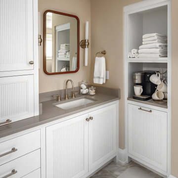
This main bath remodel went from cramped and outdated to calm and spa-inspired. The open layout came from borrowing space from the former laundry and linen closets to give the custom double vanity the breathing room it deserved. Sconce lighting brightens, and a center cabinet adds extra storage. Heated floors, built-in speakers, and a coffee station elevate the everyday.
 Searl Lamaster Howe Architects
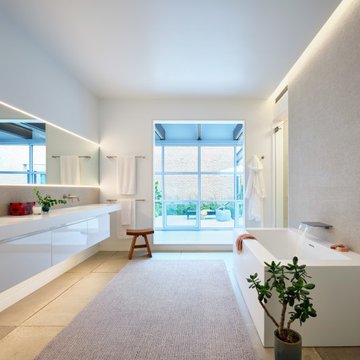
The primary bath borrows views from the courtyard across the primary hall. Shades may be lowered for privacy. The textured tile wall behind the tub is grazed by cove lighting above and flanked by glass doors to the shower and water closet. The vanity also plays with texture, featuring a matte quartz top, gloss quartz drawers below, textured tile above, and a wall to wall mirror that bounces light and views into the space. The sink top with open space below provides a makeup counter next to the opening to the hall, close to natural light.
 Custom Design & Construction
The homeowners had just purchased this home in El Segundo and they had remodeled the kitchen and one of the bathrooms on their own. However, they had more work to do. They felt that the rest of the project was too big and complex to tackle on their own and so they retained us to take over where they left off. The main focus of the project was to create a master suite and take advantage of the rather large backyard as an extension of their home. They were looking to create a more fluid indoor outdoor space.
When adding the new master suite leaving the ceilings vaulted along with French doors give the space a feeling of openness. The window seat was originally designed as an architectural feature for the exterior but turned out to be a benefit to the interior! They wanted a spa feel for their master bathroom utilizing organic finishes. Since the plan is that this will be their forever home a curbless shower was an important feature to them. The glass barn door on the shower makes the space feel larger and allows for the travertine shower tile to show through. Floating shelves and vanity allow the space to feel larger while the natural tones of the porcelain tile floor are calming. The his and hers vessel sinks make the space functional for two people to use it at once. The walk-in closet is open while the master bathroom has a white pocket door for privacy.
Since a new master suite was added to the home we converted the existing master bedroom into a family room. Adding French Doors to the family room opened up the floorplan to the outdoors while increasing the amount of natural light in this room. The closet that was previously in the bedroom was converted to built in cabinetry and floating shelves in the family room. The French doors in the master suite and family room now both open to the same deck space.
The homes new open floor plan called for a kitchen island to bring the kitchen and dining / great room together. The island is a 3” countertop vs the standard inch and a half. This design feature gives the island a chunky look. It was important that the island look like it was always a part of the kitchen. Lastly, we added a skylight in the corner of the kitchen as it felt dark once we closed off the side door that was there previously.
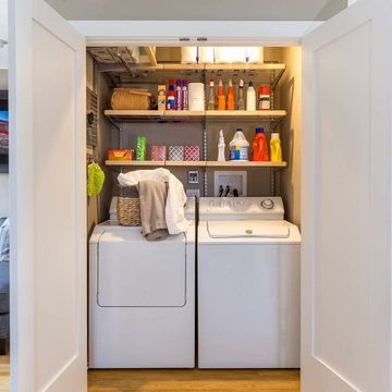
Repurposing rooms and opening the floor plan led to creating a laundry closet out of an old coat closet (and borrowing a small space from the new family room).
The floors become an integral part of tying together an open floor plan like this. The home still had original oak floors and the homeowners wanted to maintain that character. We laced in new planks and refinished it all to bring the project together.
To add curb appeal we removed the carport which was blocking a lot of natural light from the outside of the house. We also re-stuccoed the home and added exterior trim.
 Neumann & Rudy Architecture
## I. Spatial Composition & Architectural Volume
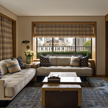
This is a compact urban salon organized with almost Miesian discipline around a single, decisive gesture: the L-configuration of low, tuxedo-armed banquette seating that hugs two perimeter walls and turns the room inward upon itself. The plan reads as a conversation pit without excavation—the seat heights are deliberately suppressed, the backs held low, so that the horizon of upholstery never competes with the aperture behind it. Above, a flat, unadorned plaster soffit-plane is held tight to the wall line, its perimeter reveal drawing a crisp shadow-gap that lets the ceiling appear to float free of the fabric-wrapped walls. The architectural protagonist is the millwork: a deep-jambed picture window recessed within a wide, radiused casing of pale rift-sawn oak, its returns thickened into a continuous window seat and low credenza that transitions seamlessly into flanking cabinetry. This joinery performs double duty as tectonic frame and furniture, resolving the corner where the sofa arm meets the wall with a fitted oak console rather than a leftover void. On the right, a taller oak portal—part case-goods, part passage—houses a monolithic dark media volume, its recessive blackness anchoring the composition's east edge and countering the pull of the glazing. Sightlines are carefully triangulated: the low furniture, the horizontal blind valance, and the parapet railing beyond stack into a series of registers that push the eye out over the rooftops, borrowing the cityscape as a fourth wall.
## II. Materiality, Color & Texture
The palette is a study in warm neutrality calibrated across a very narrow tonal band, where interest is generated by texture rather than chroma. Walls are sheathed in a woven grasscloth or linen-weave wallcovering in oatmeal-taupe, its subtle grain absorbing light and lending the envelope a matte, tactile softness that reads almost suede-like in raking illumination. Against this, the oak millwork supplies a honeyed mid-tone with visible cathedral figure, satin-lacquered rather than glossed, so the wood glows without reflecting. Upholstery is a heavy natural linen in flax, deeply channel-tufted and biscuit-quilted—an insistent geometry of dimples and seams that catches light and prevents the mass from flattening. The textile program is where the room permits itself wit: indigo-and-ecru ikat or resist-dyed pillows introduce the only true saturation and the only irregular, hand-made mark; a wool blanket-stripe cushion in wheat, dove, and slate mediates between them; and the tailored roman shade and pinch-pleat drapery, in a subtly striated ombré weave of bronze, sand, and pewter, act as a tonal bridge between wall and wood. Below, the field shifts cool—an abrasi or silk-and-wool rug in ink and petrol blue, overlaid with a sinuous ogee lattice in muted gold, whose viscose sheen produces directional shimmer against the room's otherwise matte disposition. Leather appears twice, in caramel-toned saddle upholstery on the twin benches and ottoman, its topstitched panels and strap-pull detailing offering the crispest edge in the room; the espresso-stained coffee table and plinths supply the necessary chromatic bass note. A single celadon-and-blush ceramic vessel, with its banded, glazed belly, functions as a deliberate polychrome accent—an object of arrested attention within a rigorously restrained field.
## III. Lighting, Atmosphere & Style Profile
Daylight is the primary luminaire and it is meticulously managed. The roman shade is dropped to roughly one-third, cropping the sky and glare while framing the mid-ground rooftops—a device that converts an ordinary window into a horizontal, cinematic panorama. Concealed cove or integrated LED lighting within the oak jamb washes the reveal from within, so the window surround reads as a self-illuminated frame and the transition from interior brightness to exterior daylight is softened rather than silhouetted; the same strategy grazes the wall panel behind the sofa, producing a gentle vertical gradient. Artificial light is otherwise almost entirely decorative and directional: a swing-arm wall sconce in antiqued brass with a domed, spun-metal shade cantilevers over the corner console, its low placement establishing a task-scaled pool of warmth and reinforcing the room's insistent horizontality. The resultant atmosphere is hushed, enveloping, and distinctly crepuscular—a lounge tuned for late-afternoon light and low conversation. Stylistically, the project synthesizes a mid-century modern armature—low-slung planar seating, tuxedo arms, brass and dark wood—with the tactile restraint of contemporary Warm Minimalism and a discernible strain of Japanese-influenced spatial editing: deep reveals, floating planes, an appreciation for the void, and objects placed with ikebana-like economy. One might classify it as Refined Urban Modernism, or a bespoke Warm Minimalism, in which luxury is expressed not through ornament but through the precision of joinery, the depth of the material palette, and the discipline with which the view is framed.
 Neumann & Rudy Architecture
**Paragraph 1: Spatial Composition & Architectural Volume**
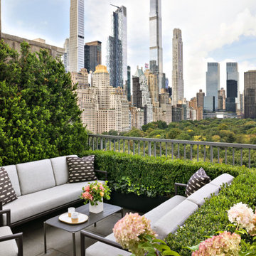
This terrace operates as an outdoor room in the fullest architectural sense — a compressed foreground plane opening onto one of the most consequential borrowed landscapes in the world. The composition is organized along a strong diagonal: an L-shaped seating arrangement anchors the lower left and right quadrants, its low-slung horizontality deliberately calibrated to sit beneath the sightline of the parapet rail so that the vista remains uninterrupted from a seated position. The spatial logic is one of layered thresholds. First, the intimate zone of the furniture group; second, the clipped boxwood hedge set within a matte-dark planter, functioning as a green datum line and soft balustrade; third, the slender vertical picket railing, whose rhythmic cadence reads as a fine-grained screen rather than a barrier; and finally the middle-ground canopy of Central Park and the distant supergraphic of the Billionaires' Row skyline. To the left, a mature juniper mass performs as a living pilaster, terminating the composition and screening the adjacent stone masonry wall — a rough-hewn ashlar remnant of the prewar building envelope that grounds the scheme in its architectural provenance. The stepped stone paving and the raked geometry of the railing as it descends to the right introduce a subtle asymmetry, preventing the picturesque from becoming static.
**Paragraph 2: Materiality, Color & Texture**
The material palette is disciplined to the point of austerity, precisely so the horticulture and the skyline may carry the chromatic load. Powder-coated aluminum in a deep graphite-bronze forms the furniture armature — slender, squared-section framing with an almost Miesian restraint — paired with performance-grade upholstery in a warm dove grey whose greige undertone reads neither cold nor sallow against the surrounding foliage. The single decorative gesture, ikat-patterned scatter cushions in charcoal and ecru, introduces a hand-loomed irregularity that humanizes the machined frames. Underfoot, large-format bluestone or cast-stone pavers in a cool grey provide a matte, granular ground plane, echoed in the honed surface of the low cocktail table. Against this monochrome scaffolding, the botanical register supplies saturation: the dense, glossy, small-leaf texture of the boxwood; the feathery, blue-green needling of the juniper; trailing ivy softening the planter edge; and, in the near foreground, the blowsy, dessicating panicles of hydrangea in blush, sage and antique rose. A ceramic vessel of coral-and-butter garden roses and a pair of banded stoneware cups on a rimmed tray introduce warm terracotta accents — small, deliberate points of chromatic heat within an otherwise tonal field.
**Paragraph 3: Lighting, Atmosphere & Style Profile**
The scheme is lit almost entirely by ambient, high-latitude daylight, diffused through a stratus-laced sky that acts as an enormous softbox. The result is shadowless modeling: the upholstery reads as luminous rather than glaring, the foliage retains full chromatic depth without specular hotspots, and the pale limestone and glass towers beyond are rendered in atmospheric perspective, receding into a silvered haze. No artificial fixtures assert themselves in the frame — a confident editorial choice that keeps the scheme legible as a daytime sanctuary and defers entirely to the natural theatre of the site. The prevailing mood is one of cultivated repose: urbane but unhurried, private without being hermetic. Stylistically, the project synthesizes into what might be termed **Refined Metropolitan Naturalism** — a hybrid of Soft Minimalism's tonal restraint and reductive geometry with the structured horticultural formality of a classical English terrace garden. The vocabulary is contemporary and materially honest, yet it observes the compositional manners of the prewar building it inhabits, treating the skyline not as backdrop but as the primary work of art around which the entire interior architecture of the terrace has been quietly framed.
 Klopf Architecture
From Mid-Century Classic to the Present
An iconic design updated with comfort, function, and flow for today.
A Remodel That Balances Past and Present
What started as a desire to update a classic Eichler soon became an exploration of how Mid-Century Modern design can successfully evolve for today. The client, a tech professional with a passion for scuba diving and underwater photography, wanted a home that would both honor its original character and feel tailored to his daily life. A lifelong technology enthusiast, he still owns the very first Mac desktop he saved up for as a teenager working at Radio Shack, a detail that underscores his appreciation for design that melds function and form.
Honoring Separation While Expanding Possibility
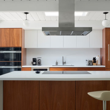
Unlike many contemporary remodels where walls are opened up to create expansive living spaces, this project took a more restrained approach. The client valued the defined rooms of the original plan and wanted to preserve as much wall space as possible for displaying his large-format underwater photography. The emphasis was not on dramatic spatial reinvention, but on thoughtful refinements. Klopf Architecture shaped a gallery-like backdrop while also expanding the primary suite, modernizing materials and fixtures throughout the home, and improving the functionality and layout of the kitchen. The finished home feels at once timeless and renewed, an Eichler that continues to inspire while fully supporting the lifestyle of its present-day owner.
A major turning point came mid-design. The original project brief had not included an addition, but as the reconfiguration of the primary bedroom and bath unfolded, it became clear that an expansion was the best approach to achieve the client’s vision of a more spacious suite. Fortunately, the adjustment came at a stage when revisions were still manageable and was integrated seamlessly, showing how thoughtful course corrections can strengthen a project rather than hinder it.
Navigating Challenges With Precision
The design development included multiple conceptual rounds, balancing preservation with subtle expansion. During construction, an existing post previously thought to be load-bearing turned out not to be. The structural engineer was able to pivot quickly, and both the post and the cross beam that had been intended to replace it could be omitted, allowing the original rhythm of the Eichler beam bays to be preserved.
Sustainability was not just a checklist item, but a way to align the home with the client’s values of simplicity, efficiency, and long-term functionality. R-38 roof insulation reduced energy usage, solar panels with battery storage provided independence and resilience, and passive comfort strategies eliminated the need forenergy-intensive air conditioning. An electric vehicle charger and an on-demand hot water recirculation system (with call buttons as opposed to having constant circulation) add to the home’s long-term efficiency factors. Together, these moves created a home that is quieter, more comfortable, and better equipped for the future, qualities that supported the client’s pragmatic approach to design and living lightly.
Details That Respect the Eichler DNA
The remodel carries forward the Eichler’s original spirit while introducing new layers of modern livability. Originally, the house was approached along a deep, narrow walk, with the garage on one side and the house on the other, leaving the front door tucked far back within this chasm-like space. By pulling the entry forward, the design reshaped the arrival experience, creating a clearer threshold and a natural drop-off zone for bags, shoes, and keys. This shift also made room for a custom bench at the entry that extends seamlessly through the glass sidelight. The bench and drop-off zone now work together as a single, integrated sequence that supports everyday living while offering a tactile reminder of Eichler’s philosophy of connectedness.
At the client’s request, Klopf reintroduced a classic Eichler gesture by extending the exterior siding into the entry and living room. The detail reinforces a sense of indoor/outdoor continuity while providing a subtle architectural surface that allows the client’s photography to take visual precedence.
The signature concrete masonry wall at the front was reconstructed using blocks sourced to match the originals, now strengthened with rebar for seismic resilience while maintaining a private outdoor courtyard, visually extending the kitchen outward. A decorative trellis element, a detail borrowed from a neighboring Eichler, restores a familiar mid-century modern architectural motif. At the courtyard entry door, a custom etched glass sidelight with an ocean-themed design featuring kelp and jellyfish serves as a subtle homage to the client’s passion for deep-sea diving.
Landscaping became an integral part of the overall transformation. The homeowner engaged landscape architect Randi Johnsen of Third Nature Studio to shape a series of calm, inviting outdoor rooms that read as a natural extension of the interiors. While technically outside of the core construction scope, the landscape design proved central to achieving a sense of completeness and connectedness across the property. Such whole-property considerations often emerge as design ideas take shape, underscoring the importance of flexibility in planning and budgeting, as well as close collaboration among the design team starting early in the process.
The Value of Evolving Scope
As with many custom residential projects, the scope evolved during the design process. What began as a targeted remodel grew to include a new/expanded primary suite, a rebuilt CMU patio wall for strength and longevity, and a solar panel array and battery storage for energy resilience and carbon-reduction. Each thoughtful decision represented a conscious investment in the home’s performance and character, rather than a cost overrun.
The result was a project delivered on schedule, tailored precisely to the client’s lifestyle, and positioned to add long-term value both functionally and aesthetically. By embracing scope evolution as an opportunity rather than a challenge, and relying on good design paired with transparent communication, this remodel demonstrates how Eichler homes can be adapted for contemporary living without erasing their DNA.
Klopf Architecture project team: John Klopf, AIA, and Klara Kevane, Elise Webb and Nicholas LaNasa.
Contractor: Golden Cove Construction
Landscape Design: Third Nature Studio
Structural Engineer: Daniel Bastiao Design
Photography: ©2025 Mariko Reed
Year Completed: 2024
Location: Sunnyvale, CA
 Neumann & Rudy Architecture
**I. Spatial Composition & Architectural Volume**
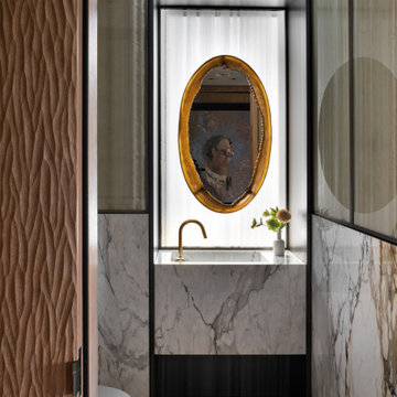
This powder room operates as a compressed, processional vestibule — a jewel-box volume whose narrowness is deliberately weaponized to intensify the encounter with a single focal event. The plan reads as a tight rectilinear corridor, entered obliquely past a pivoting sculptural door leaf at the left foreground, with the sightline funnelling directly to a recessed alcove at the terminal wall. That alcove is the compositional engine of the room: a deep, orthogonal reveal framed in slender blackened-metal profiles, within which a monolithic marble vanity cantilevers as a full-width plinth, its shadow-gap plinth detail dissolving the mass into apparent levitation. The full-height glazed screens flanking both side walls — divided into a disciplined grid of stile-and-rail metal mullions above a stone dado — introduce a Miesian rhythm of verticals that visually widen the space while preserving enclosure. Above, a crisp plaster soffit with a razor-thin perimeter reveal caps the volume, while the mullion grid's continuation across the ceiling plane and door surround creates a cage-like armature, an architectural drawing rendered in three dimensions. The suspended, wall-hung water closet at left is deliberately subordinated, half-concealed by the stone return, ensuring the axial procession terminates not on plumbing but on art.
**II. Materiality, Color & Texture**
The material palette is orchestrated as a controlled dialogue between the geologic, the vegetal, and the metallic. Book-matched Calacatta Viola — or a closely related Paonazzo — sheathes the dado and vanity in slabs whose oxblood, umber, and graphite veining reads as gestural brushwork, its cool bone-white ground counterweighted by the warm ferrous rust of its fissures; the veining on the right-hand wall is sequenced to cascade, treating stone as a continuous painterly field rather than a modular cladding. Against this, the foreground door presents a deeply carved, three-dimensional sculpted timber relief in a mid-tone oak or walnut, its undulating, plaited chevron texture introducing a haptic, almost textile-like tactility that provides the composition's most overtly artisanal register. The glazed screens deploy reeded or fluted glass in a smoky sage-olive cast, their striations diffusing and abstracting whatever lies beyond into vertical striae of light — a translucent counterpoint to the opacity of stone and wood. Blackened bronze or patinated steel mullions supply the graphic scaffolding, while unlacquered brass appears as accent punctuation: the gooseneck spout with exposed swivel collar, and, most emphatically, the flame-patinated bronze oval of the mirror frame, whose molten amber bloom is the single high-saturation event in an otherwise desaturated envelope of greys, greiges, and bone. Underfoot, chevron-laid oak parquet in a soft tobacco stain grounds the palette and repeats the door's zigzag geometry at a domestic scale.
**III. Lighting, Atmosphere & Style Profile**
Lighting is handled with theatrical restraint and a distinctly museological logic. The terminal alcove is backlit by a full-height plane of sheer, pinch-pleated linen sheers washed with daylight — an ambiguous, screened luminance that functions as a lightbox, silhouetting the mirror and reading as a window without conceding a view. Concealed cove or perimeter LED at the soffit reveal lifts the ceiling and grazes the plaster, while the reeded glass side screens capture and refract borrowed light along their flutes, producing a soft vertical shimmer that keeps the narrow volume from collapsing into gloom. The lower register is intentionally darker, the recessed shadow gap beneath the vanity and the bronze toe detail anchoring the composition in a low-key, chiaroscuro base. The atmosphere is hushed, contemplative, and faintly ecclesiastical — the alcove operating as a reredos, the framed portrait glimpsed in the mirror's reflection functioning as an unexpected, wry apparition that injects narrative and humor into an otherwise austere scheme. Stylistically, the room synthesizes into what might be termed *Tactile Luxe Modernism* or Refined Warm Modernism: the structural clarity and metal-gridded transparency of mid-century International Style, tempered by Italian post-war sensuality in the bronze and marble, and finally humanized by contemporary craft-forward texture. The result is a space of considerable discipline that nonetheless privileges touch, patina, and surprise over minimalist abstinence.
 BiglarKinyan Design Planning Inc.
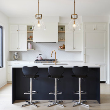
With the goal of creating larger, brighter, and more open spaces within the footprint of an existing house, BiglarKinyan reimagined the flow and proportions of existing rooms with in this house.
In this kitchen space, return walls of an original U shaped kitchen were eliminated to create a long and efficient linear kitchen with island. Rear windows facing a ravine were enlarged to invite more light and views indoors. Space was borrowed from an adjacent dining and living room, which was combined and reproportioned to create a kitchen pantry and bar, larger dining room and a piano lounge.
32