
Search results for "Bot like behavior" in Home Design Ideas
 Renee Condon Group at Keller Williams City Life
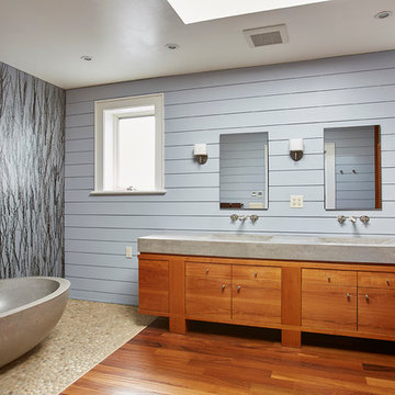
Unique and singular, this home enjoys stunning, direct views of New York City and the Hudson River. Theinnovative Mid Century design features a rear façade of glass that showcases the views. The floor plan is perfect for entertaining with an indoor/outdoor flow to the landscaped patio, terrace and plunge pool. The master suite offers city views, a terrace, lounge, massive spa-like bath and a large walk-in closet. This home features expert use of organic materials and attention to detail throughout. 907castlepoint.com.
 Dura Supreme Cabinetry
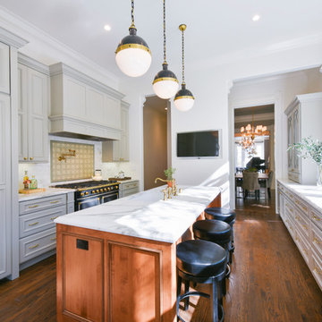
With an ideal location in the Pacific Heights neighborhood of San Francisco, this dated Victorian residence had "beautiful bones" but had been sitting on the market for a year before being purchased with plans to revitalize the interior. Interior designer, Noel Han, explained, "Historical Victorian homes in this area often have beautiful architectural elements that I aim to preserve, but the floor plan and layout tend to be stuffy, not live-able and not light filled. Modern families want bright, light-filled, spacious rooms that take advantage of outdoor views and living spaces, and function well for storage, meals and entertaining."
Preserving the architectural integrity and special features of the home was one of Han's goals but at the same time, she re-designed the space, moving walls and adding windows to create an open floorplan that flowed easily between the kitchen and outdoor living spaces. Where the range once stood in the original design, now an entire wall of windows provides panoramic views of the outdoors and fills the kitchen with light. Below the windows, Han designed a long bank of base cabinets with drawers to provide plenty of storage and work surface. Light now pours into the space even on foggy days. The range was moved to the opposite wall so that beautiful window views could be added to the kitchen.
Han selected a palette of finishes with an eye toward creating a "soft color aesthetic". "White painted finishes are very popular right now but would have felt stark and cold in this space," she explained. "The French grey paint from Dura Supreme was a perfect complement for this vintage Victorian home, to create a classic color scheme".
"This beautiful home already had hardware elements with a vintage brass finish, so I carefully selected antiqued, brushed brass hardware, plumbing and metal finishes to blend with the original elements," said Han. She continued, "The La Cornue French Range adds modern function with a French antique look."
"I appreciate working with Dura Supreme cabinetry because of the quality of the cabinetry, fast delivery and the custom options. I'm able to create beautiful architectural details like the pull-out columns on both sides of the range and the curved mullion doors on the furniture hutch, and they offer a stunning palette of finishes and styles," explained Han. For the bath cabinetry, Han created a similar palette of finishes and styles to create a complementary look throughout the entire home.
Product Details:
Perimeter: Dura Supreme Cabinetry shown in the St. Augustine door style and Mullion Pattern #15 door style with a “Zinc” painted finish.
Kitchen Island: Dura Supreme Cabinetry shown in the St. Augustine door style with a Clove stain and Black Accent finish on Cherry wood.
For more information about Noel Han, Interior Designer, click to her website here www.atelnoel.com.
For more information about Gilmans Kitchens and Baths, click to their website here www.gkandb.com.
Photography by: Ned Bonzi www.nedbonzi.com.
Request a FREE Dura Supreme Brochure Packet:
http://www.durasupreme.com/request-brochure
 Mackenzie Collier Interiors
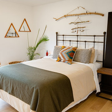
Truth: we like camping more than living our “real lives,” so we decided to take a stab at achieving a campsite feel in the bedroom. Full moon, bonfire, sticks, camp blankets, triangular mirrors that subtly suggest mountain peaks… you get the idea. The sticks are from bigger hikes we’ve done in Olympic National Park and Glacier National Park.
Image: James Stewart
Find the right local pro for your project
 Kathy Kuo Designs Inc
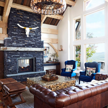
The clients were looking for a modern, rustic ski lodge look that was chic and beautiful while being family-friendly and a great vacation home for the holidays and ski trips. Our goal was to create something family-friendly that had all the nostalgic warmth and hallmarks of a mountain house, while still being modern, sophisticated, and functional as a true ski-in and ski-out house.
To achieve the look our client wanted, we focused on the great room and made sure it cleared all views into the valley. We drew attention to the hearth by installing a glass-back fireplace, which allows guests to see through to the master bedroom. The decor is rustic and nature-inspired, lots of leather, wood, bone elements, etc., but it's tied together will sleek, modern elements like the blue velvet armchair.
 Audry Cordero, NKBA at Design Studio West
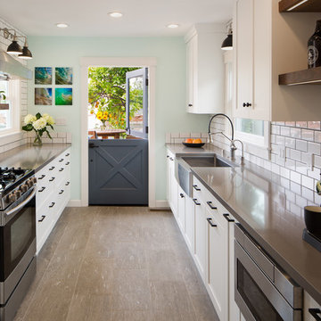
More storage topped the wish list for this 1950's remodel. Since the homeowners both liked to cook, they need storage for their many small cooking appliances and large collection of spices, coffees and teas. The opening to the kitchen was widened, the back door was also replaced with a new wider dutch door, and a new raised Trex deck was added outside. Designed by Audry Cordero
Jim Brady Photography
 MAC Flooring & Interiors
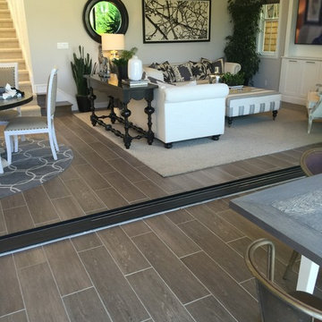
Living room - huge traditional formal and open concept porcelain tile living room idea in Orange County with gray walls and a wall-mounted tv
 Mylands
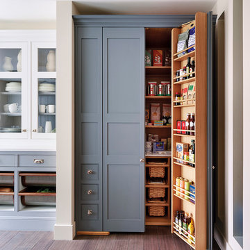
Sloane Square No.92 External Wall Cabinet.
Archway House No.106 External Base Cabinets.
Leadenhall No.118 Larder Exterior.
Kitchen by Smallbone of Devizes.
Smallbone’s Beaconsfield showroom.
Sponsored
Columbus, OH

Hope Restoration & General Contracting
Columbus Design-Build, Kitchen & Bath Remodeling, Historic Renovations
 Ann Lowengart Interiors
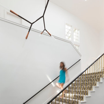
This glamorous stairwell boasts an oversize helix-like Phasmida chandelier designed by Christopher Boots.
Staircase - large contemporary painted straight staircase idea in San Francisco with painted risers
Staircase - large contemporary painted straight staircase idea in San Francisco with painted risers
 Feldman Architecture, Inc.
Joe Fletcher
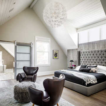
Transitional light wood floor bedroom photo in San Francisco with gray walls
Transitional light wood floor bedroom photo in San Francisco with gray walls
 Jane Ellison
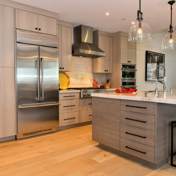
“With the open-concept floor plan, this kitchen needed to have a galley layout,” Ellison says. A large island helps delineate the kitchen from the other rooms around it. These include a dining area directly behind the kitchen and a living room to the right of the dining room. This main floor also includes a small TV lounge, a powder room and a mudroom. The house sits on a slope, so this main level enjoys treehouse-like canopy views out the back. The bedrooms are on the walk-out lower level.“These homeowners liked grays and neutrals, and their style leaned contemporary,” Ellison says. “They also had a very nice art collection.” The artwork is bright and colorful, and a neutral scheme provided the perfect backdrop for it.
They also liked the idea of using durable laminate finishes on the cabinetry. The laminates have the look of white oak with vertical graining. The galley cabinets are lighter and warmer, while the island has the look of white oak with a gray wash for contrast. The countertops and backsplash are polished quartzite. The quartzite adds beautiful natural veining patterns and warm tones to the room.
 Lauren Jacobsen Design
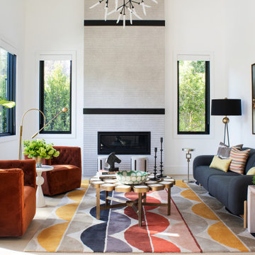
The Living Room is one of the first rooms seen right off the entry so the interior design demanded something unique. Strong color was added and curves in furnishings and patterns to offset all the rectangular shapes so the room is softer. This room sets the stage for what is to come throughout. Not your typical "only neutral colors" seen in most Modern Farmhouse architecture, they are there, but there is a layer of specifically selected colors added. The color palette moves you through the entire house utilizing different percentages of selected colors so each room feels like its own design but holds together with all other rooms.

 Portrait Homes Ltd.
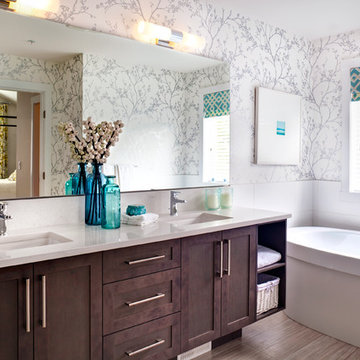
Master Ensuite is tucked away with double sinks and enough counter space for two. Free-standing soaker-tub is situated away from the water closet to create a more spa-like atmosphere.
Sponsored
Sunbury, OH

J.Holderby - Renovations
Franklin County's Leading General Contractors - 2X Best of Houzz!

 AKDO
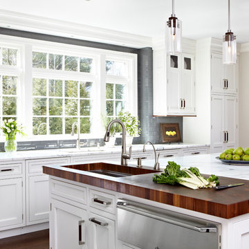
AKDOPhotos by Paul Johnson; Kitchen Design by Veronica Campell, Deane; Interior Design by Karen Perry Designs; Architect by Robert A. Cardello Architects; Builder by Liesegang Building and Remodeling
 TKS Design Group
Download our free ebook, Creating the Ideal Kitchen. DOWNLOAD NOW
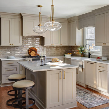
This family from Wheaton was ready to remodel their kitchen, dining room and powder room. The project didn’t call for any structural or space planning changes but the makeover still had a massive impact on their home. The homeowners wanted to change their dated 1990’s brown speckled granite and light maple kitchen. They liked the welcoming feeling they got from the wood and warm tones in their current kitchen, but this style clashed with their vision of a deVOL type kitchen, a London-based furniture company. Their inspiration came from the country homes of the UK that mix the warmth of traditional detail with clean lines and modern updates.
To create their vision, we started with all new framed cabinets with a modified overlay painted in beautiful, understated colors. Our clients were adamant about “no white cabinets.” Instead we used an oyster color for the perimeter and a custom color match to a specific shade of green chosen by the homeowner. The use of a simple color pallet reduces the visual noise and allows the space to feel open and welcoming. We also painted the trim above the cabinets the same color to make the cabinets look taller. The room trim was painted a bright clean white to match the ceiling.
In true English fashion our clients are not coffee drinkers, but they LOVE tea. We created a tea station for them where they can prepare and serve tea. We added plenty of glass to showcase their tea mugs and adapted the cabinetry below to accommodate storage for their tea items. Function is also key for the English kitchen and the homeowners. They requested a deep farmhouse sink and a cabinet devoted to their heavy mixer because they bake a lot. We then got rid of the stovetop on the island and wall oven and replaced both of them with a range located against the far wall. This gives them plenty of space on the island to roll out dough and prepare any number of baked goods. We then removed the bifold pantry doors and created custom built-ins with plenty of usable storage for all their cooking and baking needs.
The client wanted a big change to the dining room but still wanted to use their own furniture and rug. We installed a toile-like wallpaper on the top half of the room and supported it with white wainscot paneling. We also changed out the light fixture, showing us once again that small changes can have a big impact.
As the final touch, we also re-did the powder room to be in line with the rest of the first floor. We had the new vanity painted in the same oyster color as the kitchen cabinets and then covered the walls in a whimsical patterned wallpaper. Although the homeowners like subtle neutral colors they were willing to go a bit bold in the powder room for something unexpected. For more design inspiration go to: www.kitchenstudio-ge.com
 Nature's Perspective Landscaping
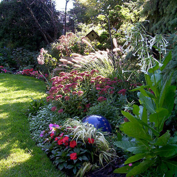
September is an interesting month in the garden, as mild weather permits annuals to continue their colorful display. Meanwhile, fall-blooming perennials like Sedum, Fountain Grass and Joe Pye Weed remind us of the change in season ahead.

 Amodei Designs
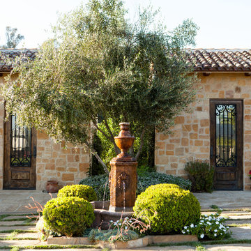
The facade of these cabanas are real sand stone, if budget allows using real stone is always better then a manufactured product. I created a courtyard with a specialty concrete where you overlay with Santa Barbara Sand. This makes the colored stamped concrete feel like real stone but you can control the shape.
 Kristin Hoaglund Design
This beautiful French Provincial home is set on 10 acres, nestled perfectly in the oak trees. The original home was built in 1974 and had two large additions added; a great room in 1990 and a main floor master suite in 2001. This was my dream project: a full gut renovation of the entire 4,300 square foot home! I contracted the project myself, and we finished the interior remodel in just six months. The exterior received complete attention as well. The 1970s mottled brown brick went white to completely transform the look from dated to classic French. Inside, walls were removed and doorways widened to create an open floor plan that functions so well for everyday living as well as entertaining. The white walls and white trim make everything new, fresh and bright. It is so rewarding to see something old transformed into something new, more beautiful and more functional.
 Wright Design
This eclectic mountain home nestled in the Blue Ridge Mountains showcases an unexpected but harmonious blend of design influences. The European-inspired architecture, featuring native stone, heavy timbers and a cedar shake roof, complement the rustic setting. Inside, details like tongue and groove cypress ceilings, plaster walls and reclaimed heart pine floors create a warm and inviting backdrop punctuated with modern rustic fixtures and vibrant splashes of color.
Meechan Architectural Photography
35