
Search results for "Central element" in Home Design Ideas
 TVL Creative Ltd.
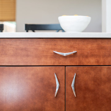
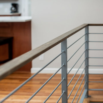
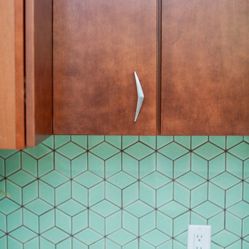
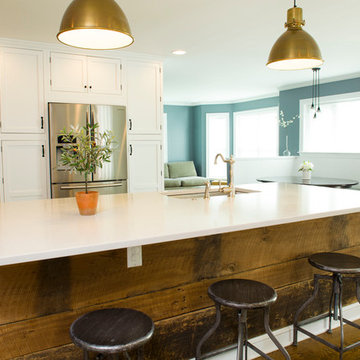
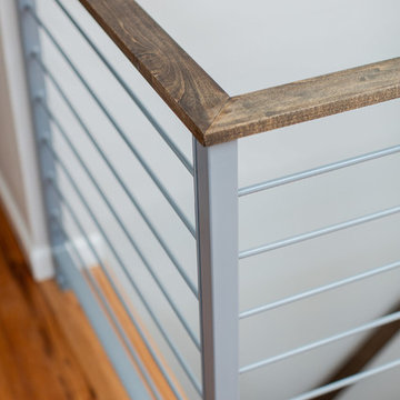
There’s nothing as wonderful as walking into a mid-century gem with clients who love the character of their new home. Our goal for this project was to incorporate the mid-century bones of this home into a new design that would better meet the contemporary needs of our clients. We started by taking down the walls that had separated this kitchen from the rest of the home and creating a welcoming space that blended seamlessly with the new open concept. The new kitchen design was a win for our clients with increased storage, more work surfaces, and a peninsula with plenty of seating. We utilized wood finishes through out this space with light wood flooring, medium-tones on the cabinetry, and darker wood accents throughout giving us a beautiful balance and a calm backdrop. This home had beautiful horizontal lines that we wanted to accentuate, so we selected a dark wood finish for the central beam and tied it in with the dark finish on the wood fireplace mantel and the stair handrail to emphasize the horizontal features. But we never miss an opportunity for a fun mid-century pop, and this home provided plenty of inspiration! The boomerang hardware on the cabinets and escher backsplash tiles give us great geometric elements to break up the clean lines of the rest of the space. One of our favorite features of this home was the original plaster ceilings with the custom hand troweled texture. We knew from the beginning that this was an element we wanted to maintain and accentuate, so when we opened up the kitchen and added recessed lighting we reached out to a local plaster artisan to carry the texture throughout the space, and we couldn’t be happier with the results. This design brings together the mid-century aesthetics of clean lines and fun patterns with the modern-day functionality our clients were looking for in their new kitchen.
 HOC DESIGN ARCH
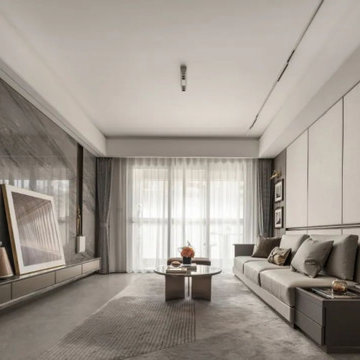
Designed by HOC, a leading interior design studio and recognized as one of the best interior designers in Delhi NCR, this modern minimalist living room perfectly reflects the studio’s signature approach—where elegance meets effortless functionality.
Anchored by a central light beige-gray sofa, the layout is clean and welcoming. Facing a large window dressed in sheer curtains, the space is bathed in soft natural light that enhances its calming ambiance. A sleek, low-profile dark gray coffee table rests in front of the sofa, offering both form and function without disrupting the room’s serene balance.
To the left, a dark gray wall-mounted entertainment unit grounds the space, subtly complementing the light taupe-beige paneled walls on either side. Above the unit, a thoughtfully placed framed artwork adds a refined touch, personalizing the space without overwhelming it.
One of the standout design elements is the stunning stone-effect tile wall that runs behind both the entertainment center and the sofa. In varying shades of gray and taupe, it introduces rich texture and depth while remaining true to the understated elegance of the room.
Underfoot, a soft, neutral gray-beige carpet completes the look, adding warmth and cohesion. The lighting is intentionally soft and diffused, drawing attention to the room’s refined textures and clean architectural lines.
Every element in this space has been curated by HOC to create an environment that feels elevated yet livable—where luxury meets comfort, and design enhances everyday living. It’s a perfect example of how a talented interior designer can transform a vision into a timeless, tranquil reality.

 Donald Lococo Architects
Awarded by the Classical institute of art and architecture , the linnean house has a restrained and simple elevation of doors and windows. Nestled in the Forest Hills neighborhood of Washington, D.C., the Linnean House is classical in both plan and elevation throughout its award-winning house plans. The main mass, comprising of the most formal and public spaces, is a spatial triptych along a symmetrical main axis. Inside the luxury home, the limestone façade, simple but well-proportioned with classical elements, extends itself into both the entry portico and main foyer with consistent proportions and materiality. This introduction allows the flanking living and dining rooms to be perceived as separate pavilions, each equipped with eight equal-proportioned French doors symmetrical of the main axis.
Beyond the classical spaces are two wings which lead to the master suite and a kitchen/family space, respectively. Both of which are situated to queue from the French door axis, a focal feature in the repeatedly published home design. At the entry foyer, the stark stone luxury architecture is warmed by two symmetrical wood armoire-like freestanding sculptural objects, a persistent theme throughout the luxury house. In the kitchen, for instance, stand four similar wood armoire objects at opposite corners that act as columns and help give this space a sense of boundary and enclosure. The master bath vanity, in similar fashion, is introduced as a central free-standing form anchoring itself as a notable presence in the space. Lastly, the wine room is designed as a series of free-standing heavy wood cavity walls spanned only by a hint of glass.
Find the right local pro for your project
 TVL Creative Ltd.
There’s nothing as wonderful as walking into a mid-century gem with clients who love the character of their new home. Our goal for this project was to incorporate the mid-century bones of this home into a new design that would better meet the contemporary needs of our clients. We started by taking down the walls that had separated this kitchen from the rest of the home and creating a welcoming space that blended seamlessly with the new open concept. The new kitchen design was a win for our clients with increased storage, more work surfaces, and a peninsula with plenty of seating. We utilized wood finishes through out this space with light wood flooring, medium-tones on the cabinetry, and darker wood accents throughout giving us a beautiful balance and a calm backdrop. This home had beautiful horizontal lines that we wanted to accentuate, so we selected a dark wood finish for the central beam and tied it in with the dark finish on the wood fireplace mantel and the stair handrail to emphasize the horizontal features. But we never miss an opportunity for a fun mid-century pop, and this home provided plenty of inspiration! The boomerang hardware on the cabinets and escher backsplash tiles give us great geometric elements to break up the clean lines of the rest of the space. One of our favorite features of this home was the original plaster ceilings with the custom hand troweled texture. We knew from the beginning that this was an element we wanted to maintain and accentuate, so when we opened up the kitchen and added recessed lighting we reached out to a local plaster artisan to carry the texture throughout the space, and we couldn’t be happier with the results. This design brings together the mid-century aesthetics of clean lines and fun patterns with the modern-day functionality our clients were looking for in their new kitchen.
 M-Squared Contracting Inc.
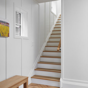
Perched above High Park, this family home is a crisp and clean breath of fresh air! Lovingly designed by the homeowner to evoke a warm and inviting country feel, the interior of this home required a full renovation from the basement right up to the third floor with rooftop deck. Upon arriving, you are greeted with a generous entry and elegant dining space, complemented by a sitting area, wrapped in a bay window.
Central to the success of this home is a welcoming oak/white kitchen and living space facing the backyard. The windows across the back of the house shower the main floor in daylight, while the use of oak beams adds to the impact. Throughout the house, floor to ceiling millwork serves to keep all spaces open and enhance flow from one room to another.
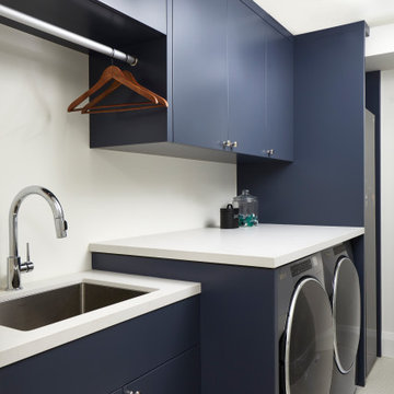
The use of clever millwork continues on the second floor with the highly functional laundry room and customized closets for the children’s bedrooms. The third floor includes extensive millwork, a wood-clad master bedroom wall and an elegant ensuite. A walk out rooftop deck overlooking the backyard and canopy of trees complements the space. Design elements include the use of white, black, wood and warm metals. Brass accents are used on the interior, while a copper eaves serves to elevate the exterior finishes.
 M-Squared Contracting Inc.
Perched above High Park, this family home is a crisp and clean breath of fresh air! Lovingly designed by the homeowner to evoke a warm and inviting country feel, the interior of this home required a full renovation from the basement right up to the third floor with rooftop deck. Upon arriving, you are greeted with a generous entry and elegant dining space, complemented by a sitting area, wrapped in a bay window.
Central to the success of this home is a welcoming oak/white kitchen and living space facing the backyard. The windows across the back of the house shower the main floor in daylight, while the use of oak beams adds to the impact. Throughout the house, floor to ceiling millwork serves to keep all spaces open and enhance flow from one room to another.
The use of clever millwork continues on the second floor with the highly functional laundry room and customized closets for the children’s bedrooms. The third floor includes extensive millwork, a wood-clad master bedroom wall and an elegant ensuite. A walk out rooftop deck overlooking the backyard and canopy of trees complements the space. Design elements include the use of white, black, wood and warm metals. Brass accents are used on the interior, while a copper eaves serves to elevate the exterior finishes.
 TVL Creative Ltd.
There’s nothing as wonderful as walking into a mid-century gem with clients who love the character of their new home. Our goal for this project was to incorporate the mid-century bones of this home into a new design that would better meet the contemporary needs of our clients. We started by taking down the walls that had separated this kitchen from the rest of the home and creating a welcoming space that blended seamlessly with the new open concept. The new kitchen design was a win for our clients with increased storage, more work surfaces, and a peninsula with plenty of seating. We utilized wood finishes through out this space with light wood flooring, medium-tones on the cabinetry, and darker wood accents throughout giving us a beautiful balance and a calm backdrop. This home had beautiful horizontal lines that we wanted to accentuate, so we selected a dark wood finish for the central beam and tied it in with the dark finish on the wood fireplace mantel and the stair handrail to emphasize the horizontal features. But we never miss an opportunity for a fun mid-century pop, and this home provided plenty of inspiration! The boomerang hardware on the cabinets and escher backsplash tiles give us great geometric elements to break up the clean lines of the rest of the space. One of our favorite features of this home was the original plaster ceilings with the custom hand troweled texture. We knew from the beginning that this was an element we wanted to maintain and accentuate, so when we opened up the kitchen and added recessed lighting we reached out to a local plaster artisan to carry the texture throughout the space, and we couldn’t be happier with the results. This design brings together the mid-century aesthetics of clean lines and fun patterns with the modern-day functionality our clients were looking for in their new kitchen.
Sponsored
Columbus, OH

Trish Takacs Design
Award Winning & Highly Skilled Kitchen & Bath Designer in Columbus

 S-Studio
The project «Romantic Classics» (classic interior design of S-Studio, Kyiv) apartments in the heart of Kiev.
Apartments were designed as a harmonious whole space in the classical style, decorated with qualitative materials and fitted out with modern equipment: system of «Smart Light», home cinema, house appliances, central air conditioning, heated floor, etc. Replanning of the apartment was done in accordance with the wishes of customers: combined kitchen and living room have been turned into studio, and a dressing room and a niche have been created for a spacious hallway closet.
The style of design project is a romantic classic. The interior was made in soft pastel colors with elegant decorative ornaments and floral patterns. The traditional stucco elements were applied in the decoration of the classical apartments: cornices, moldings, ceiling rosettes, caissons and a dome decorative motives of which are repeated in the elements of furniture, which are very popular in the classical interior design. Natural walling materials of Lincrusta were used in decorative panels of the bedroom and hall, a wood-panels office were used in the individual design of the study, textile wallpaper of trendy European manufacturers were selected, matching the overall design of the apartment were chosen for the living room and other rooms. Besides, there were elaborated massive parquet floor design and the floor in the living room was decorated with a panno- vignette which was specially created for the classical interior.
The dressing table seperates the bedroom area, which creates a cozy place for a mistress. Daughter’s room was decorated in the style of glamor, selected by her request. Repair work was supervised by Nadiya Samokhina. The following materials were used in the project: Roberto Cavalli, Lincrusta,Versace, Ceracasa,Piemme, Teuco, Eurolegno, Karol Orac Décor, Eijffinger, Monti Napoleone, Sangiordgio
 Donald Lococo Architects
Awarded by the Classical institute of art and architecture , the linnean house has a restrained and simple elevation of doors and windows. Nestled in the Forest Hills neighborhood of Washington, D.C., the Linnean House is classical in both plan and elevation throughout its award-winning house plans. The main mass, comprising of the most formal and public spaces, is a spatial triptych along a symmetrical main axis. Inside the luxury home, the limestone façade, simple but well-proportioned with classical elements, extends itself into both the entry portico and main foyer with consistent proportions and materiality. This introduction allows the flanking living and dining rooms to be perceived as separate pavilions, each equipped with eight equal-proportioned French doors symmetrical of the main axis.
Beyond the classical spaces are two wings which lead to the master suite and a kitchen/family space, respectively. Both of which are situated to queue from the French door axis, a focal feature in the repeatedly published home design. At the entry foyer, the stark stone luxury architecture is warmed by two symmetrical wood armoire-like freestanding sculptural objects, a persistent theme throughout the luxury house. In the kitchen, for instance, stand four similar wood armoire objects at opposite corners that act as columns and help give this space a sense of boundary and enclosure. The master bath vanity, in similar fashion, is introduced as a central free-standing form anchoring itself as a notable presence in the space. Lastly, the wine room is designed as a series of free-standing heavy wood cavity walls spanned only by a hint of glass.

 Bilotta Kitchen & Home
This kitchen by Bilotta’s Fabrice Garson was done in collaboration with Constantin Wickenburg Architects. Featuring Rutt cabinetry the client opted for a Shaker-style door with a step and thinner stiles and rails – a more sophisticated take on a typical Shaker. The perimeter is Super White paint and the island Baltic Grey. The drawers are Rutt’s patented dovetail drawer in walnut – like a jewelry box for your silverware and other accessories. Overall, the space is clean, classic and inviting. It’s a traditional design with transitional elements. The original kitchen had a flat ceiling – a coffered ceiling and central skylight were added to the space to bring in additional natural light. The kitchen is separated into two areas – the prepping, cooking area and the dining area with the custom china cabinet and banquet, both in the Baltic Grey to mimic the island. The cooking area has a lot more natural light with its big open windows on all sides allowing for the client to look out on her garden while preparing meals. The banquette area is a cozy nook, a little more formal than the rest of the space with the beautiful custom curved mullions on the china cabinet that light up inside to show off their serving pieces and stemware. The soft gray fabric on the banquette cushions make for a peaceful corner in which to relax after a long day or preparing a big meal. Appliances are a mix of Gaggenau, Sub-Zero and Marvel. The countertops are Super White quartzite with a square edge and backslash is marble subway tile. The countertop behind the banquette and at the china cabinet are natural walnut by Grothouse Lumber.
Designer: Fabrice Garson
Photographer – Peter Krupenye
 TVL Creative Ltd.
There’s nothing as wonderful as walking into a mid-century gem with clients who love the character of their new home. Our goal for this project was to incorporate the mid-century bones of this home into a new design that would better meet the contemporary needs of our clients. We started by taking down the walls that had separated this kitchen from the rest of the home and creating a welcoming space that blended seamlessly with the new open concept. The new kitchen design was a win for our clients with increased storage, more work surfaces, and a peninsula with plenty of seating. We utilized wood finishes through out this space with light wood flooring, medium-tones on the cabinetry, and darker wood accents throughout giving us a beautiful balance and a calm backdrop. This home had beautiful horizontal lines that we wanted to accentuate, so we selected a dark wood finish for the central beam and tied it in with the dark finish on the wood fireplace mantel and the stair handrail to emphasize the horizontal features. But we never miss an opportunity for a fun mid-century pop, and this home provided plenty of inspiration! The boomerang hardware on the cabinets and escher backsplash tiles give us great geometric elements to break up the clean lines of the rest of the space. One of our favorite features of this home was the original plaster ceilings with the custom hand troweled texture. We knew from the beginning that this was an element we wanted to maintain and accentuate, so when we opened up the kitchen and added recessed lighting we reached out to a local plaster artisan to carry the texture throughout the space, and we couldn’t be happier with the results. This design brings together the mid-century aesthetics of clean lines and fun patterns with the modern-day functionality our clients were looking for in their new kitchen.

 JRP Design & Remodel
Our clients had a cramped and outdated kitchen that lacked flow. They envisioned a space the family could share, including an eat-in kitchen with an island. Their small master bathroom also needed a facelift, more counter space, and storage options. They desired both spaces to be clean with a modern aesthetic.
Thoughtful architectural planning dramatically opened the space in this home to encompass the kitchen, dining, and hallway areas into one unified expanse. JRP removed the soffit and pushed back the appliance wall into the hallway to create the space needed for the central island-a place to hang out while dinner is being made, but also double as an additional food prep area. The cabinetry, along with the quartz backsplash and countertop, made for a clean, modern look.
Upstairs, the master bathroom transformed into a clutter-free zen zone. The tiny closet and outdated vanity were removed and replaced by an integrated counter space with white oak cabinetry, drawers, and open space shelving. The dated round-framed mirrors were swapped out in favor of one large, singular mirror.
The most used areas in this home are now comfortable and polished with surfaces that are both simple and easy to clean. This remodel design embraces modern living at its best. The focus on clean, uncluttered lines, light timber elements, and white countertops came together to give our clients the minimalist esthetics they were looking for.
Photographer: Andrew (Open House VC)

 Visbeen Architects
Function meets fashion in this relaxing retreat inspired by turn-of-the-century cottages. Perfect for a lot with limited space or a water view, this delightful design packs ample living into an open floor plan spread out on three levels. Elements of classic farmhouses and Craftsman-style bungalows can be seen in the updated exterior, which boasts shingles, porch columns, and decorative venting and windows. Inside, a covered front porch leads into an entry with a charming window seat and to the centrally located 17 by 12-foot kitchen. Nearby is an 11 by 15-foot dining and a picturesque outdoor patio. On the right side of the more than 1,500-square-foot main level is the 14 by 18-foot living room with a gas fireplace and access to the adjacent covered patio where you can enjoy the changing seasons. Also featured is a convenient mud room and laundry near the 700-square-foot garage, a large master suite and a handy home management center off the dining and living room. Upstairs, another approximately 1,400 square feet include two family bedrooms and baths, a 15 by 14-foot loft dedicated to music, and another area designed for crafts and sewing. Other hobbies and entertaining aren’t excluded in the lower level, where you can enjoy the billiards or games area, a large family room for relaxing, a guest bedroom, exercise area and bath.
Photographers: Ashley Avila Photography
Pat Chambers
Builder: Bouwkamp Builders, Inc.
Sponsored
Columbus, OH
Trish Takacs Design
Award Winning & Highly Skilled Kitchen & Bath Designer in Columbus
 TVL Creative Ltd.
There’s nothing as wonderful as walking into a mid-century gem with clients who love the character of their new home. Our goal for this project was to incorporate the mid-century bones of this home into a new design that would better meet the contemporary needs of our clients. We started by taking down the walls that had separated this kitchen from the rest of the home and creating a welcoming space that blended seamlessly with the new open concept. The new kitchen design was a win for our clients with increased storage, more work surfaces, and a peninsula with plenty of seating. We utilized wood finishes through out this space with light wood flooring, medium-tones on the cabinetry, and darker wood accents throughout giving us a beautiful balance and a calm backdrop. This home had beautiful horizontal lines that we wanted to accentuate, so we selected a dark wood finish for the central beam and tied it in with the dark finish on the wood fireplace mantel and the stair handrail to emphasize the horizontal features. But we never miss an opportunity for a fun mid-century pop, and this home provided plenty of inspiration! The boomerang hardware on the cabinets and escher backsplash tiles give us great geometric elements to break up the clean lines of the rest of the space. One of our favorite features of this home was the original plaster ceilings with the custom hand troweled texture. We knew from the beginning that this was an element we wanted to maintain and accentuate, so when we opened up the kitchen and added recessed lighting we reached out to a local plaster artisan to carry the texture throughout the space, and we couldn’t be happier with the results. This design brings together the mid-century aesthetics of clean lines and fun patterns with the modern-day functionality our clients were looking for in their new kitchen.
 TVL Creative Ltd.
There’s nothing as wonderful as walking into a mid-century gem with clients who love the character of their new home. Our goal for this project was to incorporate the mid-century bones of this home into a new design that would better meet the contemporary needs of our clients. We started by taking down the walls that had separated this kitchen from the rest of the home and creating a welcoming space that blended seamlessly with the new open concept. The new kitchen design was a win for our clients with increased storage, more work surfaces, and a peninsula with plenty of seating. We utilized wood finishes through out this space with light wood flooring, medium-tones on the cabinetry, and darker wood accents throughout giving us a beautiful balance and a calm backdrop. This home had beautiful horizontal lines that we wanted to accentuate, so we selected a dark wood finish for the central beam and tied it in with the dark finish on the wood fireplace mantel and the stair handrail to emphasize the horizontal features. But we never miss an opportunity for a fun mid-century pop, and this home provided plenty of inspiration! The boomerang hardware on the cabinets and escher backsplash tiles give us great geometric elements to break up the clean lines of the rest of the space. One of our favorite features of this home was the original plaster ceilings with the custom hand troweled texture. We knew from the beginning that this was an element we wanted to maintain and accentuate, so when we opened up the kitchen and added recessed lighting we reached out to a local plaster artisan to carry the texture throughout the space, and we couldn’t be happier with the results. This design brings together the mid-century aesthetics of clean lines and fun patterns with the modern-day functionality our clients were looking for in their new kitchen.
 TVL Creative Ltd.
There’s nothing as wonderful as walking into a mid-century gem with clients who love the character of their new home. Our goal for this project was to incorporate the mid-century bones of this home into a new design that would better meet the contemporary needs of our clients. We started by taking down the walls that had separated this kitchen from the rest of the home and creating a welcoming space that blended seamlessly with the new open concept. The new kitchen design was a win for our clients with increased storage, more work surfaces, and a peninsula with plenty of seating. We utilized wood finishes through out this space with light wood flooring, medium-tones on the cabinetry, and darker wood accents throughout giving us a beautiful balance and a calm backdrop. This home had beautiful horizontal lines that we wanted to accentuate, so we selected a dark wood finish for the central beam and tied it in with the dark finish on the wood fireplace mantel and the stair handrail to emphasize the horizontal features. But we never miss an opportunity for a fun mid-century pop, and this home provided plenty of inspiration! The boomerang hardware on the cabinets and escher backsplash tiles give us great geometric elements to break up the clean lines of the rest of the space. One of our favorite features of this home was the original plaster ceilings with the custom hand troweled texture. We knew from the beginning that this was an element we wanted to maintain and accentuate, so when we opened up the kitchen and added recessed lighting we reached out to a local plaster artisan to carry the texture throughout the space, and we couldn’t be happier with the results. This design brings together the mid-century aesthetics of clean lines and fun patterns with the modern-day functionality our clients were looking for in their new kitchen.
 TVL Creative Ltd.
There’s nothing as wonderful as walking into a mid-century gem with clients who love the character of their new home. Our goal for this project was to incorporate the mid-century bones of this home into a new design that would better meet the contemporary needs of our clients. We started by taking down the walls that had separated this kitchen from the rest of the home and creating a welcoming space that blended seamlessly with the new open concept. The new kitchen design was a win for our clients with increased storage, more work surfaces, and a peninsula with plenty of seating. We utilized wood finishes through out this space with light wood flooring, medium-tones on the cabinetry, and darker wood accents throughout giving us a beautiful balance and a calm backdrop. This home had beautiful horizontal lines that we wanted to accentuate, so we selected a dark wood finish for the central beam and tied it in with the dark finish on the wood fireplace mantel and the stair handrail to emphasize the horizontal features. But we never miss an opportunity for a fun mid-century pop, and this home provided plenty of inspiration! The boomerang hardware on the cabinets and escher backsplash tiles give us great geometric elements to break up the clean lines of the rest of the space. One of our favorite features of this home was the original plaster ceilings with the custom hand troweled texture. We knew from the beginning that this was an element we wanted to maintain and accentuate, so when we opened up the kitchen and added recessed lighting we reached out to a local plaster artisan to carry the texture throughout the space, and we couldn’t be happier with the results. This design brings together the mid-century aesthetics of clean lines and fun patterns with the modern-day functionality our clients were looking for in their new kitchen.
Sponsored
Plain City, OH

The Creative Kitchen Company
Columbus Area Kitchen Remodeling and Refacing Professional
 TVL Creative Ltd.
There’s nothing as wonderful as walking into a mid-century gem with clients who love the character of their new home. Our goal for this project was to incorporate the mid-century bones of this home into a new design that would better meet the contemporary needs of our clients. We started by taking down the walls that had separated this kitchen from the rest of the home and creating a welcoming space that blended seamlessly with the new open concept. The new kitchen design was a win for our clients with increased storage, more work surfaces, and a peninsula with plenty of seating. We utilized wood finishes through out this space with light wood flooring, medium-tones on the cabinetry, and darker wood accents throughout giving us a beautiful balance and a calm backdrop. This home had beautiful horizontal lines that we wanted to accentuate, so we selected a dark wood finish for the central beam and tied it in with the dark finish on the wood fireplace mantel and the stair handrail to emphasize the horizontal features. But we never miss an opportunity for a fun mid-century pop, and this home provided plenty of inspiration! The boomerang hardware on the cabinets and escher backsplash tiles give us great geometric elements to break up the clean lines of the rest of the space. One of our favorite features of this home was the original plaster ceilings with the custom hand troweled texture. We knew from the beginning that this was an element we wanted to maintain and accentuate, so when we opened up the kitchen and added recessed lighting we reached out to a local plaster artisan to carry the texture throughout the space, and we couldn’t be happier with the results. This design brings together the mid-century aesthetics of clean lines and fun patterns with the modern-day functionality our clients were looking for in their new kitchen.
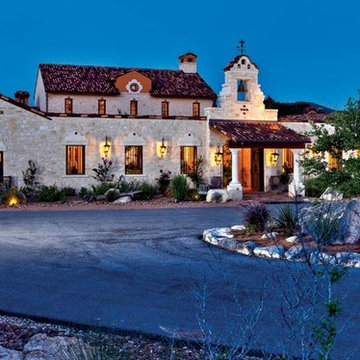
 Catrina's Ranch Interiors
It was in every way, Ramsey says, a once-in-a-lifetime professional and personal experience. “My favorite part of this project was the glow on John and Betty’s faces upon the completion of the hacienda,” she says. “They became not only satisfied clients, but friends for life. It was very challenging but so rewarding.” Helping her and the Martins embrace the home’s challenges was Kendrick, who has been in the design business for more than 40 years. Despite her long career, Kendrick admits to being speechless when she first viewed the ranch’s blueprints and renderings. “The central courtyard had a bell tower over the front entrance gate — a real one,” she says. “The main house had an observation tower that overlooked the dammed-up river and a picturesque view of heaven on earth. There was a magnificent outdoor kitchen off of an enormous porch. This home was to have all the bells and whistles, with unimaginable details, while sparing no expense.”
All three women embraced the challenges of creating the Kemosabe Ranch abode, including designing and building 58 chandeliers and sconces, dozens of custom doors and cabinets, two fully tricked-out kitchens — one inside, one out — and myriad accessories such as candle holders. Regardless of a proposed element’s complexity, like the hammered copper panels in the cabinet doors, Kendrick’s response was the same: “No problem.”
Betty Martin is as apt to talk reverently about all of the craftsmen, contractors and suppliers who worked on her home’s features, from the 10-foot Mexican limestone fountain in the courtyard to the outdoor fossil art wall, as she is to want to bask in the grandeur of the finished project. That’s not surprising, given its scope to rival that of the Taj Mahal. But having been so intimately involved in the process has given her an even greater sense of pride in ownership of her dazzling dwelling. “It’s hard for me to pick out the part of the project that I love the most,” she says.

 Haifa Architects
Duplex Y is located in a multi apartment building, typical to the Carmel mountain neighborhoods. The building has several entrances due to the slope it sits on.
Duplex Y has its own separate entrance and a beautiful view towards Haifa bay and the Golan Heights that can be seen on a clear weather day.
The client - a computer high-tech couple, with their two small daughters asked us for a simple and functional design that could remind them of their frequent visits to central and northern Europe. Their request has been accepted.
Our planning approach was simple indeed, maybe even simple in a radical way:
We followed the principle of clean and ultra minimal spaces, that serve their direct mission only.
Complicated geometry of the rooms has been simplified by implementing built-in wood furniture into numerous niches.
The most 'complicated' room (due to its broken geometry, narrow proportions and sloped ceiling) has been turned into a kid's room shaped as a clean 'wood box' for fun, games and 'edutainment'.
The storage room has been refurbished to maximize it's purpose by creating enough space to store 90% of the entire family's demand.
We've tried to avoid unnecessary decoration. 97% of the design has its functional use in addition to its atmospheric qualities.
Several elements like the structural cylindrical column were exposed to show their original material - concrete.
Photos: Julia Berezina
145