
Search results for "Central element" in Home Design Ideas

 TVL Creative Ltd.
These wonderful clients returned to us for their newest home remodel adventure. Their newly purchased custom built 1970s modern ranch sits in one of the loveliest neighborhoods south of the city but the current conditions of the home were out-dated and not so lovely. Upon entering the front door through the court you were greeted abruptly by a very boring staircase and an excessive number of doors. Just to the left of the double door entry was a large slider and on your right once inside the home was a soldier line up of doors. This made for an uneasy and uninviting entry that guests would quickly forget and our clients would often avoid. We also had our hands full in the kitchen. The existing space included many elements that felt out of place in a modern ranch including a rustic mountain scene backsplash, cherry cabinets with raised panel and detailed profile, and an island so massive you couldn’t pass a drink across the stone. Our design sought to address the functional pain points of the home and transform the overall aesthetic into something that felt like home for our clients.
For the entry, we re-worked the front door configuration by switching from the double door to a large single door with side lights. The sliding door next to the main entry door was replaced with a large window to eliminate entry door confusion. In our re-work of the entry staircase, guesta are now greeted into the foyer which features the Coral Pendant by David Trubridge. Guests are drawn into the home by stunning views of the front range via the large floor-to-ceiling glass wall in the living room. To the left, the staircases leading down to the basement and up to the master bedroom received a massive aesthetic upgrade. The rebuilt 2nd-floor staircase has a center spine with wood rise and run appearing to float upwards towards the master suite. A slatted wall of wood separates the two staircases which brings more light into the basement stairwell. Black metal railings add a stunning contrast to the light wood.
Other fabulous upgrades to this home included new wide plank flooring throughout the home, which offers both modernity and warmth. The once too-large kitchen island was downsized to create a functional focal point that is still accessible and intimate. The old dark and heavy kitchen cabinetry was replaced with sleek white cabinets, brightening up the space and elevating the aesthetic of the entire room. The kitchen countertops are marble look quartz with dramatic veining that offers an artistic feature behind the range and across all horizontal surfaces in the kitchen. As a final touch, cascading island pendants were installed which emphasize the gorgeous ceiling vault and provide warm feature lighting over the central point of the kitchen.
This transformation reintroduces light and simplicity to this gorgeous home, and we are so happy that our clients can reap the benefits of this elegant and functional design for years to come.
 STUDIO TASHIMA
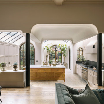
Keyes Road is a two-storey, semi-detached red brick house dating to around 1890-1910. The focus of our work was on the ground floor where we were asked to improve the layout and use of the main living areas of the house, for an active family of four. Important to the design was to maximise the quality and amount of light as well as connection to the garden and flow to the rest of the house.
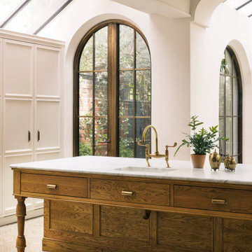
Our proposal introduces three single storey extensions, comprising a central, large space that extends the main outrigger of the house. To each side are smaller volumes, affording a full width kitchen. While defining a series of discrete volumes, it was important for us to ensure that the kitchen, living, family and dining rooms that are interconnecting and continuous. The result is a big space punctuated by a series of differently sized arches, defining spaces to ensure their intimacy.
It was important for our client to have a sense of warmth and comfort - perhaps not dissimilar to the qualities of a hotel lobby. The colour scheme of the rooms are warm white painted plaster, natural wood flooring with black, bronze and brass accents. Indirect and carefully placed light fittings pulls together the atmosphere of the rooms - particularly in the evenings.
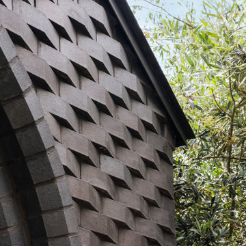
Externally, we felt it important to differentiate the extensions from the main house by using a dark, charcoal grey brick. This sets up a contrasting yet complimentary relationship to the rich red coloured brick house. The facets of the brick play with light and depth as do the graduated brick arches.
During the design process, we grappled with floor levels, the direction of sunlight, and care to not encroach on the neighbouring properties. As the house is in a conservation area, we worked closely with our trusted planning advisor. Throughout, we pursued a sensitive design strategy, using pitched roofs, matching materials and careful detailing. Internally, many of the original details are intact. This has enabled us to create an eclectic ensemble of elements, colours and materials varying in age and period.
 EAG Studio
Refined Continuity: Bridging Classical Architecture and Modern Living
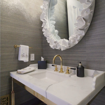
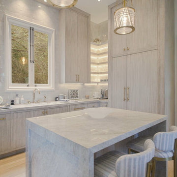
This comprehensive remodel of a grand Cow Hollow residence reimagines a historically expressive envelope through a lens of contemporary livability, precision detailing, and material restraint. The design approach carefully balances the home’s classical proportions and ornamental heritage with a refined, modern sensibility—evident in the disciplined palette of warm neutrals, soft plasters, pale oak flooring, and tailored millwork. Circulation has been clarified and subtly expanded to enhance spatial flow, while openings are leveraged to capture light, garden outlooks, and distant water views. Throughout, architectural interventions are executed with a high level of craft, ensuring that new insertions—whether cabinetry, railings, or apertures—read as seamless continuations of the original structure rather than applied elements.
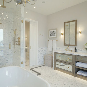
The kitchen serves as the operational and visual anchor of the home, conceived as a sculptural yet highly functional environment. Custom rift-cut cabinetry, softened through a desaturated finish, is paired with honed stone surfaces and integrated brass hardware to create a quiet, tactile richness. A monolithic island establishes a central gathering point, while perimeter work zones are carefully layered with concealed storage, integrated appliances, and open, backlit shelving that elevates everyday objects into curated displays. The adjacent bar and entertaining areas extend this language, reinforcing a cohesive hospitality-driven program. In parallel, the primary bathroom is designed as a serene, spa-like retreat, where bookmatched stone, frameless glass enclosures, and finely detailed metalwork converge. The composition prioritizes symmetry, clarity, and light—balancing generous volumes with intimate moments through integrated lighting, custom vanities, and a restrained material hierarchy.
The library and ancillary living spaces introduce a more intimate scale, anchored by bespoke built-ins that combine closed storage with illuminated display niches, creating depth and rhythm along the walls. Here, material transitions and furniture integration are handled with particular nuance, allowing the architecture to support both quiet retreat and social gathering. A continuous language of custom railings—executed in refined metal profiles—threads through the interior and extends outward, where the exterior gate and garden elements have been reinterpreted to align with the home’s renewed identity. The entry sequence is now defined by a calibrated interplay of solidity and transparency, with sculptural metalwork and landscape integration establishing a sense of arrival that is both secure and elegant. Collectively, the project reflects a holistic transformation—one that elevates performance, livability, and aesthetic clarity while preserving the inherent dignity of the original architecture.
Find the right local pro for your project

 Gallery KBNY
This brownstone renovation was a full gut project in every sense of the word. On top of installing new floors, a kitchen and bath renovation, and all the typical restoration and refinishing involved in a brownstone built in 1899, we also completely updated the exterior, constructed a balcony that was not originally there, and converted the space from a single-family home into an an owner’s triplex. A newly separated studio rental on the garden level offers the opportunity for supplemental income, an uncommon and welcome addition to a New York brownstone.
A TRANSITIONAL GEM
The result is a two-family brownstone that perfectly combines classic townhouse living with today’s modern needs, including SmartHome technology that we installed to control Bluetooth speakers, Nest thermostats, and the security system.
The overall aesthetic goal was to pay homage to the historical periods the brownstone has lived through in a cohesive way that is the hallmark of modern transitional style.
In the kitchen, white Shaker-style cabinetry, a subway tile backsplash, and marble rather than quartz countertops bring a classically upscale sensibility. To modernize the space further, we opened up the back wall to create floor-to-ceiling windows that are also doors, opening up into the newly built balcony.
TIMELY TOUCHES
This brownstone renovation included many quintessential elements, such as millwork like the ceiling medallions. We restored some and custom built others, perfectly recreating their original appearance.
The heated master bathroom is now serene, with a walk-in shower featuring a subtly modern linear drain. A herringbone Carrera marble tiled floor and marble slab sink complete the scene. In the powder room, we embraced a contemporary look by pairing dark hexagonal floors with light chevron tiles, accented with dramatic navy blue wallpaper. With its clear-cut 1920s-style, we selected the wall sconce to reference one of the brownstone’s earlier eras.
DESIGN DETAILS
Natural oak herringbone floors we installed throughout the entire home bring a modern yet warm touch. We restored the wood-burning marble fireplace, which is fully functioning. An elegant staircase with a custom-crafted black wooden banister and white balusters winds up and down alongside a real brick interior wall that we restored and refinished.
In this brownstone renovation, we were also able to create ceiling height, an unexpected yet aesthetically pleasing side benefit. When working on the joists and beams to level out the floors (a common issue in pre-war renovations) we added ceiling height in the main parlor floor by taking the second floor and raising the ceiling an entire foot. The end result is a main floor with stunning 9-foot ceilings.
SOME HIGHLIGHTS
- Solid natural oak herringbone floors throughout
- A fully restored, refinished, and functioning wood burning fireplace with a marble mantle
- Complete exterior renovation of the facade, cornices, windows, mouldings, and even the ironwork, including the railings leading up to the stoop and those facing the street
- A brand new central air and heating system with uniquely modern vents – look above the couch in the living room with the fuzzy rug and large painting
Considering a brownstone renovation? Contact us today! We specialize in brownstone renovations in New York as well as all pre-war apartments. When you work with a design-and-build firm like Gallery to renovate your brownstone, you get the full range of our expertise in working with all the finest details and pre-war architectural elements of these classic New York spaces. We also handle every step of the process, from filing permits and organizing schedules to sourcing custom pieces and building entirely new rooms (or even balconies). Call us for a free initial consultation when you’re ready.
 TVL Creative Ltd.
These wonderful clients returned to us for their newest home remodel adventure. Their newly purchased custom built 1970s modern ranch sits in one of the loveliest neighborhoods south of the city but the current conditions of the home were out-dated and not so lovely. Upon entering the front door through the court you were greeted abruptly by a very boring staircase and an excessive number of doors. Just to the left of the double door entry was a large slider and on your right once inside the home was a soldier line up of doors. This made for an uneasy and uninviting entry that guests would quickly forget and our clients would often avoid. We also had our hands full in the kitchen. The existing space included many elements that felt out of place in a modern ranch including a rustic mountain scene backsplash, cherry cabinets with raised panel and detailed profile, and an island so massive you couldn’t pass a drink across the stone. Our design sought to address the functional pain points of the home and transform the overall aesthetic into something that felt like home for our clients.
For the entry, we re-worked the front door configuration by switching from the double door to a large single door with side lights. The sliding door next to the main entry door was replaced with a large window to eliminate entry door confusion. In our re-work of the entry staircase, guesta are now greeted into the foyer which features the Coral Pendant by David Trubridge. Guests are drawn into the home by stunning views of the front range via the large floor-to-ceiling glass wall in the living room. To the left, the staircases leading down to the basement and up to the master bedroom received a massive aesthetic upgrade. The rebuilt 2nd-floor staircase has a center spine with wood rise and run appearing to float upwards towards the master suite. A slatted wall of wood separates the two staircases which brings more light into the basement stairwell. Black metal railings add a stunning contrast to the light wood.
Other fabulous upgrades to this home included new wide plank flooring throughout the home, which offers both modernity and warmth. The once too-large kitchen island was downsized to create a functional focal point that is still accessible and intimate. The old dark and heavy kitchen cabinetry was replaced with sleek white cabinets, brightening up the space and elevating the aesthetic of the entire room. The kitchen countertops are marble look quartz with dramatic veining that offers an artistic feature behind the range and across all horizontal surfaces in the kitchen. As a final touch, cascading island pendants were installed which emphasize the gorgeous ceiling vault and provide warm feature lighting over the central point of the kitchen.
This transformation reintroduces light and simplicity to this gorgeous home, and we are so happy that our clients can reap the benefits of this elegant and functional design for years to come.
 STUDIO TASHIMA
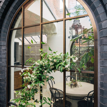
Keyes Road is a two-storey, semi-detached red brick house dating to around 1890-1910. The focus of our work was on the ground floor where we were asked to improve the layout and use of the main living areas of the house, for an active family of four. Important to the design was to maximise the quality and amount of light as well as connection to the garden and flow to the rest of the house.
Our proposal introduces three single storey extensions, comprising a central, large space that extends the main outrigger of the house. To each side are smaller volumes, affording a full width kitchen. While defining a series of discrete volumes, it was important for us to ensure that the kitchen, living, family and dining rooms that are interconnecting and continuous. The result is a big space punctuated by a series of differently sized arches, defining spaces to ensure their intimacy.
It was important for our client to have a sense of warmth and comfort - perhaps not dissimilar to the qualities of a hotel lobby. The colour scheme of the rooms are warm white painted plaster, natural wood flooring with black, bronze and brass accents. Indirect and carefully placed light fittings pulls together the atmosphere of the rooms - particularly in the evenings.
Externally, we felt it important to differentiate the extensions from the main house by using a dark, charcoal grey brick. This sets up a contrasting yet complimentary relationship to the rich red coloured brick house. The facets of the brick play with light and depth as do the graduated brick arches.
During the design process, we grappled with floor levels, the direction of sunlight, and care to not encroach on the neighbouring properties. As the house is in a conservation area, we worked closely with our trusted planning advisor. Throughout, we pursued a sensitive design strategy, using pitched roofs, matching materials and careful detailing. Internally, many of the original details are intact. This has enabled us to create an eclectic ensemble of elements, colours and materials varying in age and period.
 LU Design Build
Designer: Rochelle McAvin
Photographer: Karen Palmer
Welcome to our stunning mid-century kitchen and bath makeover, designed with function and color. This home renovation seamlessly combines the timeless charm of mid-century modern aesthetics with the practicality and functionality required by a busy family. Step into a home where classic meets contemporary and every detail has been carefully curated to enhance both style and convenience.
Kitchen Transformation:
The heart of the home has been revitalized with a fresh, open-concept design.
Sleek Cabinetry: Crisp, clean lines dominate the kitchen's custom-made cabinets, offering ample storage space while maintaining cozy vibes. Rich, warm wood tones complement the overall aesthetic.
Quartz Countertops: Durable and visually stunning, the quartz countertops bring a touch of luxury to the space. They provide ample room for food preparation and family gatherings.
Statement Lighting: 2 central pendant light fixtures, inspired by mid-century design, illuminates the kitchen with a warm, inviting glow.
Bath Oasis:
Our mid-century bath makeover offers a tranquil retreat for the primary suite. It combines retro-inspired design elements with contemporary comforts.
Patterned Tiles: Vibrant, geometric floor tiles create a playful yet sophisticated atmosphere. The black and white motif exudes mid-century charm and timeless elegance.
Floating Vanity: A sleek, vanity with clean lines maximizes floor space and provides ample storage for toiletries and linens.
Frameless Glass Shower: The bath features a modern, frameless glass shower enclosure, offering a spa-like experience for relaxation and rejuvenation.
Natural Light: Large windows in the bathroom allow natural light to flood the space, creating a bright and airy atmosphere.
Storage Solutions: Thoughtful storage solutions, including built-in niches and shelving, keep the bathroom organized and clutter-free.
This mid-century kitchen and bath makeover is the perfect blend of style and functionality, designed to accommodate the needs of a young family. It celebrates the iconic design of the mid-century era while embracing the modern conveniences that make daily life a breeze.
Sponsored
Columbus, OH

Wannemacher Interiors
Customized Award-Winning Interior Design Solutions in Franklin Cnty OH
 STUDIO TASHIMA
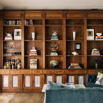
Keyes Road is a two-storey, semi-detached red brick house dating to around 1890-1910. The focus of our work was on the ground floor where we were asked to improve the layout and use of the main living areas of the house, for an active family of four. Important to the design was to maximise the quality and amount of light as well as connection to the garden and flow to the rest of the house.
Our proposal introduces three single storey extensions, comprising a central, large space that extends the main outrigger of the house. To each side are smaller volumes, affording a full width kitchen. While defining a series of discrete volumes, it was important for us to ensure that the kitchen, living, family and dining rooms that are interconnecting and continuous. The result is a big space punctuated by a series of differently sized arches, defining spaces to ensure their intimacy.
It was important for our client to have a sense of warmth and comfort - perhaps not dissimilar to the qualities of a hotel lobby. The colour scheme of the rooms are warm white painted plaster, natural wood flooring with black, bronze and brass accents. Indirect and carefully placed light fittings pulls together the atmosphere of the rooms - particularly in the evenings.
Externally, we felt it important to differentiate the extensions from the main house by using a dark, charcoal grey brick. This sets up a contrasting yet complimentary relationship to the rich red coloured brick house. The facets of the brick play with light and depth as do the graduated brick arches.
During the design process, we grappled with floor levels, the direction of sunlight, and care to not encroach on the neighbouring properties. As the house is in a conservation area, we worked closely with our trusted planning advisor. Throughout, we pursued a sensitive design strategy, using pitched roofs, matching materials and careful detailing. Internally, many of the original details are intact. This has enabled us to create an eclectic ensemble of elements, colours and materials varying in age and period.
 EAG Studio
Refined Continuity: Bridging Classical Architecture and Modern Living
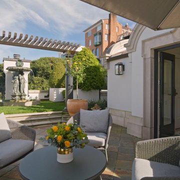
This comprehensive remodel of a grand Cow Hollow residence reimagines a historically expressive envelope through a lens of contemporary livability, precision detailing, and material restraint. The design approach carefully balances the home’s classical proportions and ornamental heritage with a refined, modern sensibility—evident in the disciplined palette of warm neutrals, soft plasters, pale oak flooring, and tailored millwork. Circulation has been clarified and subtly expanded to enhance spatial flow, while openings are leveraged to capture light, garden outlooks, and distant water views. Throughout, architectural interventions are executed with a high level of craft, ensuring that new insertions—whether cabinetry, railings, or apertures—read as seamless continuations of the original structure rather than applied elements.
The kitchen serves as the operational and visual anchor of the home, conceived as a sculptural yet highly functional environment. Custom rift-cut cabinetry, softened through a desaturated finish, is paired with honed stone surfaces and integrated brass hardware to create a quiet, tactile richness. A monolithic island establishes a central gathering point, while perimeter work zones are carefully layered with concealed storage, integrated appliances, and open, backlit shelving that elevates everyday objects into curated displays. The adjacent bar and entertaining areas extend this language, reinforcing a cohesive hospitality-driven program. In parallel, the primary bathroom is designed as a serene, spa-like retreat, where bookmatched stone, frameless glass enclosures, and finely detailed metalwork converge. The composition prioritizes symmetry, clarity, and light—balancing generous volumes with intimate moments through integrated lighting, custom vanities, and a restrained material hierarchy.
The library and ancillary living spaces introduce a more intimate scale, anchored by bespoke built-ins that combine closed storage with illuminated display niches, creating depth and rhythm along the walls. Here, material transitions and furniture integration are handled with particular nuance, allowing the architecture to support both quiet retreat and social gathering. A continuous language of custom railings—executed in refined metal profiles—threads through the interior and extends outward, where the exterior gate and garden elements have been reinterpreted to align with the home’s renewed identity. The entry sequence is now defined by a calibrated interplay of solidity and transparency, with sculptural metalwork and landscape integration establishing a sense of arrival that is both secure and elegant. Collectively, the project reflects a holistic transformation—one that elevates performance, livability, and aesthetic clarity while preserving the inherent dignity of the original architecture.
 STUDIO TASHIMA
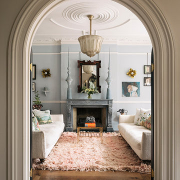
Keyes Road is a two-storey, semi-detached red brick house dating to around 1890-1910. The focus of our work was on the ground floor where we were asked to improve the layout and use of the main living areas of the house, for an active family of four. Important to the design was to maximise the quality and amount of light as well as connection to the garden and flow to the rest of the house.
Our proposal introduces three single storey extensions, comprising a central, large space that extends the main outrigger of the house. To each side are smaller volumes, affording a full width kitchen. While defining a series of discrete volumes, it was important for us to ensure that the kitchen, living, family and dining rooms that are interconnecting and continuous. The result is a big space punctuated by a series of differently sized arches, defining spaces to ensure their intimacy.
It was important for our client to have a sense of warmth and comfort - perhaps not dissimilar to the qualities of a hotel lobby. The colour scheme of the rooms are warm white painted plaster, natural wood flooring with black, bronze and brass accents. Indirect and carefully placed light fittings pulls together the atmosphere of the rooms - particularly in the evenings.
Externally, we felt it important to differentiate the extensions from the main house by using a dark, charcoal grey brick. This sets up a contrasting yet complimentary relationship to the rich red coloured brick house. The facets of the brick play with light and depth as do the graduated brick arches.
During the design process, we grappled with floor levels, the direction of sunlight, and care to not encroach on the neighbouring properties. As the house is in a conservation area, we worked closely with our trusted planning advisor. Throughout, we pursued a sensitive design strategy, using pitched roofs, matching materials and careful detailing. Internally, many of the original details are intact. This has enabled us to create an eclectic ensemble of elements, colours and materials varying in age and period.
 EAG Studio
Refined Continuity: Bridging Classical Architecture and Modern Living
This comprehensive remodel of a grand Cow Hollow residence reimagines a historically expressive envelope through a lens of contemporary livability, precision detailing, and material restraint. The design approach carefully balances the home’s classical proportions and ornamental heritage with a refined, modern sensibility—evident in the disciplined palette of warm neutrals, soft plasters, pale oak flooring, and tailored millwork. Circulation has been clarified and subtly expanded to enhance spatial flow, while openings are leveraged to capture light, garden outlooks, and distant water views. Throughout, architectural interventions are executed with a high level of craft, ensuring that new insertions—whether cabinetry, railings, or apertures—read as seamless continuations of the original structure rather than applied elements.
The kitchen serves as the operational and visual anchor of the home, conceived as a sculptural yet highly functional environment. Custom rift-cut cabinetry, softened through a desaturated finish, is paired with honed stone surfaces and integrated brass hardware to create a quiet, tactile richness. A monolithic island establishes a central gathering point, while perimeter work zones are carefully layered with concealed storage, integrated appliances, and open, backlit shelving that elevates everyday objects into curated displays. The adjacent bar and entertaining areas extend this language, reinforcing a cohesive hospitality-driven program. In parallel, the primary bathroom is designed as a serene, spa-like retreat, where bookmatched stone, frameless glass enclosures, and finely detailed metalwork converge. The composition prioritizes symmetry, clarity, and light—balancing generous volumes with intimate moments through integrated lighting, custom vanities, and a restrained material hierarchy.
The library and ancillary living spaces introduce a more intimate scale, anchored by bespoke built-ins that combine closed storage with illuminated display niches, creating depth and rhythm along the walls. Here, material transitions and furniture integration are handled with particular nuance, allowing the architecture to support both quiet retreat and social gathering. A continuous language of custom railings—executed in refined metal profiles—threads through the interior and extends outward, where the exterior gate and garden elements have been reinterpreted to align with the home’s renewed identity. The entry sequence is now defined by a calibrated interplay of solidity and transparency, with sculptural metalwork and landscape integration establishing a sense of arrival that is both secure and elegant. Collectively, the project reflects a holistic transformation—one that elevates performance, livability, and aesthetic clarity while preserving the inherent dignity of the original architecture.
 TVL Creative Ltd.
We absolutely love the final result of this unique, two-toned kitchen! Our clients came to us with the need for a lot of love in their kitchen. Their home, situated in the Fox Ridge neighboorhood of Centennial, is a lovely and spacious house with lots of potential. The kitchen, while very sizable, contained a number of super dated elements. Our goal was to give the kitchen a complete aesthetic facelift, but to also encourage better function in the kitchen. Our primary concern was disconnecting the existing (huge) peninsula and replacing it with a centralized island. This busy family of four will benefit from the gathering space the island provides. We worked with the existing ceiling condition to create a unique, recessed wood-clad ceiling that offers a gorgeous rustic aesthetic. The existing linoleum flooring was replaced with beautiful walnut hardwood. New cabinets were installed in a two-toned orientation. The upper cabinets are a soft stone gray and the lowers are a painted hazelnut. We've stacked cabinets next to the range to create a secondary pantry storage area, and repaired portions of the existing pantry to optimize shelving space and appearance. The kitchen also includes a new desk area integrated into the cabinet run for homework and to-do lists. A new large, singe-basin sink and pull-down faucet were installed, and the kitchen is brought together by the mini-stacked stone backsplash that brings texture and warmth to the room. We've offered durable and beautiful working surfaces by topping the cabinets with quartz countertops: MSI Boletus against the window wall and MSI Concerto on the island. We love the look the of this final result, but particularly love the optimized function that it offers this wonderful family!

 François Lévy Architecture + Interiors
A 43” diameter heritage pecan guided the plan of this neighborhood-scaled, modestly-priced, single-story, L-shaped house. In Austin’s seemingly perpetual drought, the goal was to create a symbiotic relationship between house and tree: to complement, not combat each other. The roof’s east/west parallel ridges create a valley directly across from the base, where water is collected at a grate, nourishing the tree. The roof also maximizes south facing surfaces, elevated at 15 degrees for future solar collection. The open, public spaces of the home maximize the north-south light. The private zone of the bedrooms and bathrooms include a generous gallery; its angled walls and large sliding doors are faceted about the tree. The pecan becomes a central focus for indoor and outdoor living, participating in the house in both plan and section. The design welcomes and nurtures the tree as integral to its success. Photo Credit: Chris Diaz
Sponsored
Delaware, OH

Buckeye Basements, Inc.
Central Ohio's Basement Finishing ExpertsBest Of Houzz '13-'21
 EAG Studio
Refined Continuity: Bridging Classical Architecture and Modern Living
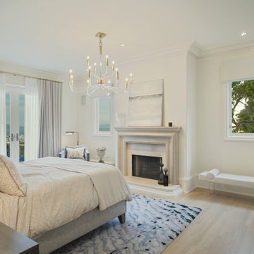
This comprehensive remodel of a grand Cow Hollow residence reimagines a historically expressive envelope through a lens of contemporary livability, precision detailing, and material restraint. The design approach carefully balances the home’s classical proportions and ornamental heritage with a refined, modern sensibility—evident in the disciplined palette of warm neutrals, soft plasters, pale oak flooring, and tailored millwork. Circulation has been clarified and subtly expanded to enhance spatial flow, while openings are leveraged to capture light, garden outlooks, and distant water views. Throughout, architectural interventions are executed with a high level of craft, ensuring that new insertions—whether cabinetry, railings, or apertures—read as seamless continuations of the original structure rather than applied elements.
The kitchen serves as the operational and visual anchor of the home, conceived as a sculptural yet highly functional environment. Custom rift-cut cabinetry, softened through a desaturated finish, is paired with honed stone surfaces and integrated brass hardware to create a quiet, tactile richness. A monolithic island establishes a central gathering point, while perimeter work zones are carefully layered with concealed storage, integrated appliances, and open, backlit shelving that elevates everyday objects into curated displays. The adjacent bar and entertaining areas extend this language, reinforcing a cohesive hospitality-driven program. In parallel, the primary bathroom is designed as a serene, spa-like retreat, where bookmatched stone, frameless glass enclosures, and finely detailed metalwork converge. The composition prioritizes symmetry, clarity, and light—balancing generous volumes with intimate moments through integrated lighting, custom vanities, and a restrained material hierarchy.
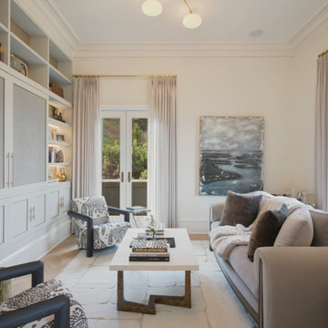
The library and ancillary living spaces introduce a more intimate scale, anchored by bespoke built-ins that combine closed storage with illuminated display niches, creating depth and rhythm along the walls. Here, material transitions and furniture integration are handled with particular nuance, allowing the architecture to support both quiet retreat and social gathering. A continuous language of custom railings—executed in refined metal profiles—threads through the interior and extends outward, where the exterior gate and garden elements have been reinterpreted to align with the home’s renewed identity. The entry sequence is now defined by a calibrated interplay of solidity and transparency, with sculptural metalwork and landscape integration establishing a sense of arrival that is both secure and elegant. Collectively, the project reflects a holistic transformation—one that elevates performance, livability, and aesthetic clarity while preserving the inherent dignity of the original architecture.
 EAG Studio
Refined Continuity: Bridging Classical Architecture and Modern Living
This comprehensive remodel of a grand Cow Hollow residence reimagines a historically expressive envelope through a lens of contemporary livability, precision detailing, and material restraint. The design approach carefully balances the home’s classical proportions and ornamental heritage with a refined, modern sensibility—evident in the disciplined palette of warm neutrals, soft plasters, pale oak flooring, and tailored millwork. Circulation has been clarified and subtly expanded to enhance spatial flow, while openings are leveraged to capture light, garden outlooks, and distant water views. Throughout, architectural interventions are executed with a high level of craft, ensuring that new insertions—whether cabinetry, railings, or apertures—read as seamless continuations of the original structure rather than applied elements.
The kitchen serves as the operational and visual anchor of the home, conceived as a sculptural yet highly functional environment. Custom rift-cut cabinetry, softened through a desaturated finish, is paired with honed stone surfaces and integrated brass hardware to create a quiet, tactile richness. A monolithic island establishes a central gathering point, while perimeter work zones are carefully layered with concealed storage, integrated appliances, and open, backlit shelving that elevates everyday objects into curated displays. The adjacent bar and entertaining areas extend this language, reinforcing a cohesive hospitality-driven program. In parallel, the primary bathroom is designed as a serene, spa-like retreat, where bookmatched stone, frameless glass enclosures, and finely detailed metalwork converge. The composition prioritizes symmetry, clarity, and light—balancing generous volumes with intimate moments through integrated lighting, custom vanities, and a restrained material hierarchy.
The library and ancillary living spaces introduce a more intimate scale, anchored by bespoke built-ins that combine closed storage with illuminated display niches, creating depth and rhythm along the walls. Here, material transitions and furniture integration are handled with particular nuance, allowing the architecture to support both quiet retreat and social gathering. A continuous language of custom railings—executed in refined metal profiles—threads through the interior and extends outward, where the exterior gate and garden elements have been reinterpreted to align with the home’s renewed identity. The entry sequence is now defined by a calibrated interplay of solidity and transparency, with sculptural metalwork and landscape integration establishing a sense of arrival that is both secure and elegant. Collectively, the project reflects a holistic transformation—one that elevates performance, livability, and aesthetic clarity while preserving the inherent dignity of the original architecture.
 EAG Studio
Refined Continuity: Bridging Classical Architecture and Modern Living
This comprehensive remodel of a grand Cow Hollow residence reimagines a historically expressive envelope through a lens of contemporary livability, precision detailing, and material restraint. The design approach carefully balances the home’s classical proportions and ornamental heritage with a refined, modern sensibility—evident in the disciplined palette of warm neutrals, soft plasters, pale oak flooring, and tailored millwork. Circulation has been clarified and subtly expanded to enhance spatial flow, while openings are leveraged to capture light, garden outlooks, and distant water views. Throughout, architectural interventions are executed with a high level of craft, ensuring that new insertions—whether cabinetry, railings, or apertures—read as seamless continuations of the original structure rather than applied elements.
The kitchen serves as the operational and visual anchor of the home, conceived as a sculptural yet highly functional environment. Custom rift-cut cabinetry, softened through a desaturated finish, is paired with honed stone surfaces and integrated brass hardware to create a quiet, tactile richness. A monolithic island establishes a central gathering point, while perimeter work zones are carefully layered with concealed storage, integrated appliances, and open, backlit shelving that elevates everyday objects into curated displays. The adjacent bar and entertaining areas extend this language, reinforcing a cohesive hospitality-driven program. In parallel, the primary bathroom is designed as a serene, spa-like retreat, where bookmatched stone, frameless glass enclosures, and finely detailed metalwork converge. The composition prioritizes symmetry, clarity, and light—balancing generous volumes with intimate moments through integrated lighting, custom vanities, and a restrained material hierarchy.
The library and ancillary living spaces introduce a more intimate scale, anchored by bespoke built-ins that combine closed storage with illuminated display niches, creating depth and rhythm along the walls. Here, material transitions and furniture integration are handled with particular nuance, allowing the architecture to support both quiet retreat and social gathering. A continuous language of custom railings—executed in refined metal profiles—threads through the interior and extends outward, where the exterior gate and garden elements have been reinterpreted to align with the home’s renewed identity. The entry sequence is now defined by a calibrated interplay of solidity and transparency, with sculptural metalwork and landscape integration establishing a sense of arrival that is both secure and elegant. Collectively, the project reflects a holistic transformation—one that elevates performance, livability, and aesthetic clarity while preserving the inherent dignity of the original architecture.
 STUDIO TASHIMA
Keyes Road is a two-storey, semi-detached red brick house dating to around 1890-1910. The focus of our work was on the ground floor where we were asked to improve the layout and use of the main living areas of the house, for an active family of four. Important to the design was to maximise the quality and amount of light as well as connection to the garden and flow to the rest of the house.
Our proposal introduces three single storey extensions, comprising a central, large space that extends the main outrigger of the house. To each side are smaller volumes, affording a full width kitchen. While defining a series of discrete volumes, it was important for us to ensure that the kitchen, living, family and dining rooms that are interconnecting and continuous. The result is a big space punctuated by a series of differently sized arches, defining spaces to ensure their intimacy.
It was important for our client to have a sense of warmth and comfort - perhaps not dissimilar to the qualities of a hotel lobby. The colour scheme of the rooms are warm white painted plaster, natural wood flooring with black, bronze and brass accents. Indirect and carefully placed light fittings pulls together the atmosphere of the rooms - particularly in the evenings.
Externally, we felt it important to differentiate the extensions from the main house by using a dark, charcoal grey brick. This sets up a contrasting yet complimentary relationship to the rich red coloured brick house. The facets of the brick play with light and depth as do the graduated brick arches.
During the design process, we grappled with floor levels, the direction of sunlight, and care to not encroach on the neighbouring properties. As the house is in a conservation area, we worked closely with our trusted planning advisor. Throughout, we pursued a sensitive design strategy, using pitched roofs, matching materials and careful detailing. Internally, many of the original details are intact. This has enabled us to create an eclectic ensemble of elements, colours and materials varying in age and period.
Sponsored
Columbus, OH

Trish Takacs Design
Award Winning & Highly Skilled Kitchen & Bath Designer in Columbus
 STUDIO TASHIMA
Keyes Road is a two-storey, semi-detached red brick house dating to around 1890-1910. The focus of our work was on the ground floor where we were asked to improve the layout and use of the main living areas of the house, for an active family of four. Important to the design was to maximise the quality and amount of light as well as connection to the garden and flow to the rest of the house.
Our proposal introduces three single storey extensions, comprising a central, large space that extends the main outrigger of the house. To each side are smaller volumes, affording a full width kitchen. While defining a series of discrete volumes, it was important for us to ensure that the kitchen, living, family and dining rooms that are interconnecting and continuous. The result is a big space punctuated by a series of differently sized arches, defining spaces to ensure their intimacy.
It was important for our client to have a sense of warmth and comfort - perhaps not dissimilar to the qualities of a hotel lobby. The colour scheme of the rooms are warm white painted plaster, natural wood flooring with black, bronze and brass accents. Indirect and carefully placed light fittings pulls together the atmosphere of the rooms - particularly in the evenings.
Externally, we felt it important to differentiate the extensions from the main house by using a dark, charcoal grey brick. This sets up a contrasting yet complimentary relationship to the rich red coloured brick house. The facets of the brick play with light and depth as do the graduated brick arches.
During the design process, we grappled with floor levels, the direction of sunlight, and care to not encroach on the neighbouring properties. As the house is in a conservation area, we worked closely with our trusted planning advisor. Throughout, we pursued a sensitive design strategy, using pitched roofs, matching materials and careful detailing. Internally, many of the original details are intact. This has enabled us to create an eclectic ensemble of elements, colours and materials varying in age and period.

 Nar Design Group
Part of an extensive home remodel, this kitchen design was born of one man’s love of all things Harley Davidson. Color inspiration came from the client’s own cherished bike which was a stunning combination of matte black and brushed steel. The client’s wish was to have a large open area in which he could “be one with his guests” when hosting large gatherings.
Cabinets, hardware and appliances all in black allow the focus to be on the beauty of the larger architectural elements as a whole. Included along the main storage wall is a hidden 42” refrigerator, dual pull-out pantries, and extra wide drawers below a pair of upper cabinets with matte black glass fold-up doors that open & close automatically via servo-drive technology.
The new island - which measures just shy of 16 ½ feet! - is a true central point around which all action revolves. Wide walkways on either side provide ease of flow for multiple sous chefs and guests alike. A textured cypress soffit above the island was designed to house the modern hood and also create a feeling of unity as it is the same size as the island below. Textured cypress wood also wraps matte black cabinetry and lines the main wall, changing grain direction to provide visual interest.
The 5’ Galley Workstation is a multi-functional marvel, easily transitioning from prep station to serving surface to clean-up with the addition of its built-in accessories. Placing an undercounter wine refrigerator on the back side of the island makes it easy for guests at the bar to help themselves. Close to the bar seating area, a 42” flat screen tv fits perfectly flush in the wall, practically disappearing when not in use.
Unique details include a large display cabinet with a metal framed front & side crafted out of steel by a local artisan. The glass is 2-way mirror so when the interior light is off, the treasure is concealed inside. The interior is painted in the trademark Harley orange.
Above a modern dining table, a one-of-a-kind chandelier was created from 3 bike helmets, painted in Harley orange by a local automobile detail shop. The interiors are finished in metallic silver for extra glow.
Adjacent to the Kitchen, and initially deceiving in its simplicity, the main tv wall was quite complex and challenging to realize. It has a convex curve from left to right and slopes back from floor to ceiling. The interior hollow space created room for a shallow tv niche on top and partially recessed deep media storage cabinets below. The planning and framing involved to create the proper compound miter connections required extra diligence from the designers and builder, but the finished product was worth the effort!
Photo credit: Fred Donham of Photographerlink

 Visbeen Architects
Inspired by historic homes in America’s grand old neighborhoods, the Wainsborough combines the rich character and architectural craftsmanship of the past with contemporary conveniences. Perfect for today’s busy lifestyles, the home is the perfect blend of past and present. Touches of the ever-popular Shingle Style – from the cedar lap siding to the pitched roof – imbue the home with all-American charm without sacrificing modern convenience.
Exterior highlights include stone detailing, multiple entries, transom windows and arched doorways. Inside, the home features a livable open floor plan as well as 10-foot ceilings. The kitchen, dining room and family room flow together, with a large fireplace and an inviting nearby deck. A children’s wing over the garage, a luxurious master suite and adaptable design elements give the floor plan the flexibility to adapt as a family’s needs change. “Right-size” rooms live large, but feel cozy. While the floor plan reflects a casual, family-friendly lifestyle, craftsmanship throughout includes interesting nooks and window seats, all hallmarks of the past.
The main level includes a kitchen with a timeless character and architectural flair. Designed to function as a modern gathering room reflecting the trend toward the kitchen serving as the heart of the home, it features raised panel, hand-finished cabinetry and hidden, state-of-the-art appliances. Form is as important as function, with a central square-shaped island serving as a both entertaining and workspace. Custom-designed features include a pull-out bookshelf for cookbooks as well as a pull-out table for extra seating. Other first-floor highlights include a dining area with a bay window, a welcoming hearth room with fireplace, a convenient office and a handy family mud room near the side entrance. A music room off the great room adds an elegant touch to this otherwise comfortable, casual home.
Upstairs, a large master suite and master bath ensures privacy. Three additional children’s bedrooms are located in a separate wing over the garage. The lower level features a large family room and adjacent home theater, a guest room and bath and a convenient wine and wet bar.
177