
Search results for "Challenged" in Home Design Ideas
 KSI Kitchen & Bath
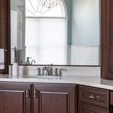
When this client approached us about remodeling their master bath, we knew we had an exciting design challenge ahead of me. They wanted to remodel the space to match their traditional style home and increase functionality. The challenge? The master bath was octagonal with vaulted ceilings, featuring many walls of different sizes and shapes, all intersecting at various angles... angles everywhere. Those angles were going to present a formidable challenge in achieving the client's goals! However, the outcome was absolutely stunning!
 AZL interiors
With tall ceilings, an impressive stone fireplace, and original wooden beams, this home in Glen Ellyn, a suburb of Chicago, had plenty of character and a style that felt coastal. Six months into the purchase of their home, this family of six contacted Alessia Loffredo and Sarah Coscarelli of ReDesign Home to complete their home’s renovation by tackling the kitchen.
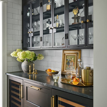
“Surprisingly, the kitchen was the one room in the home that lacked interest due to a challenging layout between kitchen, butler pantry, and pantry,” the designer shared, “the cabinetry was not proportionate to the space’s large footprint and height. None of the house’s architectural features were introduced into kitchen aside from the wooden beams crossing the room throughout the main floor including the family room.” She moved the pantry door closer to the prepping and cooking area while converting the former butler pantry a bar. Alessia designed an oversized hood around the stove to counterbalance the impressive stone fireplace located at the opposite side of the living space.
She then wanted to include functionality, using Trim Tech‘s cabinets, featuring a pair with retractable doors, for easy access, flanking both sides of the range. The client had asked for an island that would be larger than the original in their space – Alessia made the smart decision that if it was to increase in size it shouldn’t increase in visual weight and designed it with legs, raised above the floor. Made out of steel, by Wayward Machine Co., along with a marble-replicating porcelain countertop, it was designed with durability in mind to withstand anything that her client’s four children would throw at it. Finally, she added finishing touches to the space in the form of brass hardware from Katonah Chicago, with similar toned wall lighting and faucet.
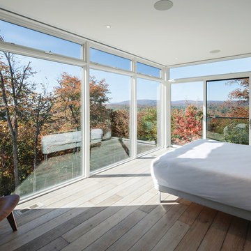
Large minimalist master medium tone wood floor bedroom photo in Montreal with white walls and no fireplace
Find the right local pro for your project
 Challenger Designs
Stephen Long Photography
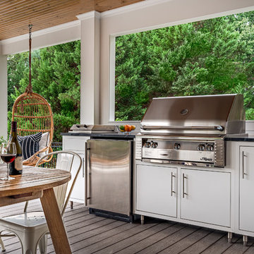
Example of a trendy backyard patio kitchen design in Nashville with decking and a roof extension
Example of a trendy backyard patio kitchen design in Nashville with decking and a roof extension
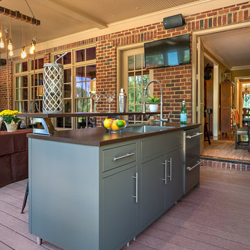 Challenger Designs
Stephen Long Photography
Patio kitchen - rustic backyard patio kitchen idea in Nashville with decking and a roof extension
Patio kitchen - rustic backyard patio kitchen idea in Nashville with decking and a roof extension
 Interiors by Popov
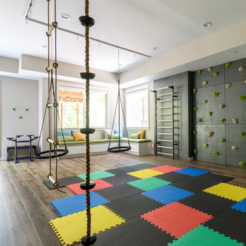
Having two young boys presents its own challenges, and when you have two of their best friends constantly visiting, you end up with four super active action heroes. This family wanted to dedicate a space for the boys to hangout. We took an ordinary basement and converted it into a playground heaven. A basketball hoop, climbing ropes, swinging chairs, rock climbing wall, and climbing bars, provide ample opportunity for the boys to let their energy out, and the built-in window seat is the perfect spot to catch a break. Tall built-in wardrobes and drawers beneath the window seat to provide plenty of storage for all the toys.
You can guess where all the neighborhood kids come to hangout now ☺
 komandor
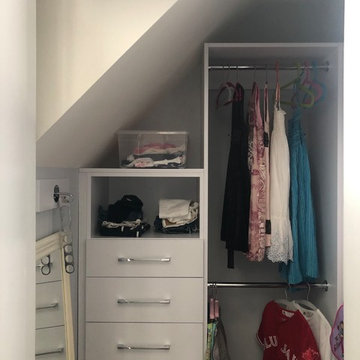
Unique solution to angled walls and ceilings. This closet organizer uses the extra depth of the side walls for more organizational solutions such as pivoting hanger rack and hooks from Richelieu.


 Scenic Sotheby's International Realty
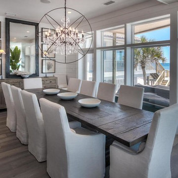
Mid-sized beach style dark wood floor dining room photo in Miami with white walls
 TKS Design Group
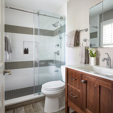
Our clients had been in their home since the early 1980’s and decided it was time for some updates. We took on the kitchen, two bathrooms and a powder room.
This petite master bathroom primarily had storage and space planning challenges. Since the wife uses a larger bath down the hall, this bath is primarily the husband’s domain and was designed with his needs in mind. We started out by converting an existing alcove tub to a new shower since the tub was never used. The custom shower base and decorative tile are now visible through the glass shower door and help to visually elongate the small room. A Kohler tailored vanity provides as much storage as possible in a small space, along with a small wall niche and large medicine cabinet to supplement. “Wood” plank tile, specialty wall covering and the darker vanity and glass accents give the room a more masculine feel as was desired. Floor heating and 1 piece ceramic vanity top add a bit of luxury to this updated modern feeling space.
Designed by: Susan Klimala, CKD, CBD
Photography by: Michael Alan Kaskel
For more information on kitchen and bath design ideas go to: www.kitchenstudio-ge.com
 Challenger Designs
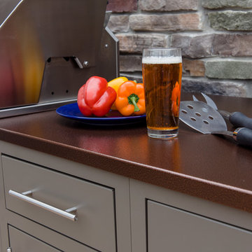
Inspiration for a timeless side yard stamped concrete kitchen remodel with no cover
 FineLine Kitchens, Inc.
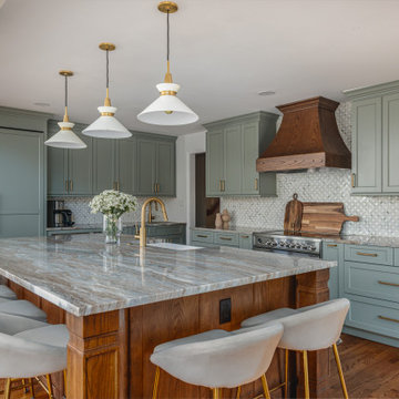
Hi everyone, I'm Sarah and Ogun we are here with fine line kitchens. So we are a couple working together. I do the interior design and remodeling of the space material selection meeting with the clients. And I handled operations outside, you know meaning all the construction work that is taking place the inside. The houses that we work in. I handle all the aspects of the construction, so today's project is very special. We're in Vienna and the client had a very big family. It's a family of seven that lives here. So we had a few aspects that we needed to keep in mind while designing this one. Having everybody be able to sit on the island. So we wanted plenty of seating all the way around. We didn't want anybody standing or anything like that. So what we did is we maximize the space. The center island is the biggest part of the kitchen. We use a natural stone to kind of give it a beautiful texture versus quartz. It's kind of standard white or kind of fabricated, so I wanted something very natural. We did this because I took my inspiration from the outside, so the inspiration if you look at the view right in front of me is there are so many greens there's a lot of brass accents and I wanted to bring this. Into this kitchen while designing it for my clients. She is very warm very. She wanted a very homey, comfy kind of look for the kitchen. So that's what we did today. As you can see, the cabinets are sage green, very light, so I still think it's a neutral, but it's a lighter color that again brings the outside in and we combine that with the oak right behind me so it's a slightly warm oak. It's not very dark. It's not very light. It's a medium brown and the same color went on the island. To kind of tie these two in and the backsplash, my favorite part is where you can see a little bit of design. It is, in my opinion still classic, but includes a pattern so the outside part is as we said in the beginning, is handled by my husband. I'd like him to speak a little bit about that. Thanks, Sarah, I want to talk to you guys a little bit about the construction part of this project. Originally this kitchen was located mostly in this area. They had their stove there sing. It was more of a peninsula layout in Sarah's and the customer vision they wanted. They wanted to get rid of the peninsula and they want to be able to have a huge island that can at least sit seven people because they're familiar with seven. So we wanted to make sure that we can achieve this design and bring it to life so that they can be happy with this layout. Some of the challenges we had, the house, the home being, you know, old home. There were a lot of you know the older electrical and plumbing that had to be replaced. We had to relocate the stove from here to this area. Over here we had put a nice foot fan that we had to relocate all the ductwork and the plumbing. Was being on the peninsula area. We had to relocate it to the center islands. So we achieved all this and kind of like bring it to bring in this kitchen up to date it looks beautiful. That's true, so yes, the old layout did not function for my clients because everything was kind of gathered on one side of the kitchen. So there was like a peninsula right there. So the end of this island kind of continued straight. And that was just the L shape. Kind of where everything was and there used to be another big table here, so they were using only kind of half of the space. So like I said at the beginning, our vision was to kind of feed everybody at the island, create some symmetry. 'cause I love that. So as you can see behind me, this is kind of the focal point symmetrical. Everything is kind of even we wanted to also panel the fridge here so it mimics the pantry and another size. So when you're looking at it, it is bringing again that symmetry back again. I hope you enjoyed this kitchen and this video and I'll see you soon. So how do you think this project turned out? It's nice. I like the color. I think it turned out nice. It's kind of like a little bit different color than what we always do. So I realize. Are you giving me a little bit of credit here that I did something different? Are you proud? I'm so proud of you. Other than that I like it. That they have kind of like a two sink. So if this was our kitchen, if we ever like you can have your own. I can have mine if we ever get into a fight then this can be like my own kitchen. Why are we gonna bring in a fight right now? So I'm cooking anyway. You're grilling most of the time, So what are you even talking about? My kitchen? That's my kitchen. You can just take the small sink. That's fine. It's always good to have your own space right there, so anyways. Thank you guys for watching. We hope to see you soon and if you have any questions please click the link below. It'll lead you to our website, house, YouTube and all of the social media is so nice to have you guys. We'll see you soon. Thanks bye bye-bye.
 Drawn Company
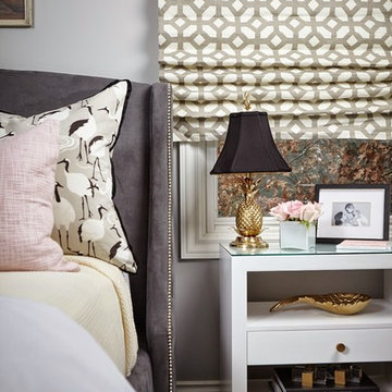
ORC - Bedroom design by Abby M Interiors.
Custom Roman Shade by DrawnCompany.
Photography by Ashley Avila Photography.
Inspiration for a modern bedroom remodel in Detroit
Inspiration for a modern bedroom remodel in Detroit
 Marvin
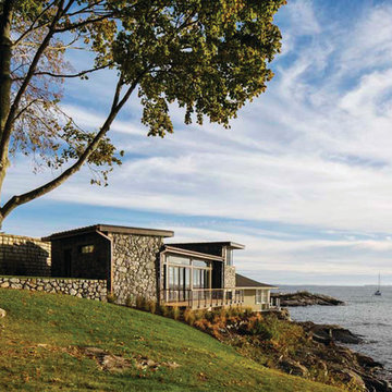
Marvin windows provide uncompromised views and a transparent barrier from the rugged terrain.
Summer Cottage
Massachusetts
Architect: Lian Eoyang
Firm: VIF STUDIO
 Kelly Rogers Interiors
Eric Roth Photography
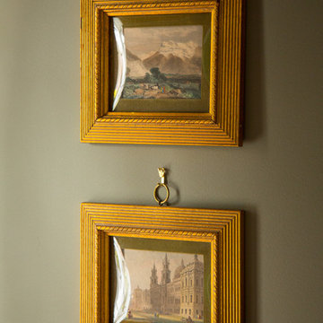
Entryway - small traditional medium tone wood floor entryway idea in Boston with green walls
Entryway - small traditional medium tone wood floor entryway idea in Boston with green walls
 KSI Kitchen & Bath
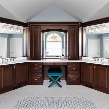
When this client approached us about remodeling their master bath, we knew we had an exciting design challenge ahead of me. They wanted to remodel the space to match their traditional style home and increase functionality. The challenge? The master bath was octagonal with vaulted ceilings, featuring many walls of different sizes and shapes, all intersecting at various angles... angles everywhere. Those angles were going to present a formidable challenge in achieving the client's goals! However, the outcome was absolutely stunning!
 Challenger Designs
Stephen Long Photography
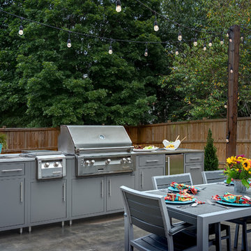
Patio kitchen - contemporary backyard stamped concrete patio kitchen idea in Nashville with no cover
Patio kitchen - contemporary backyard stamped concrete patio kitchen idea in Nashville with no cover
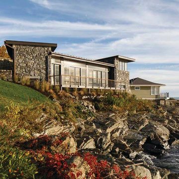 Marvin
Marvin's windows and doors provide a window balanced by modern lines and historic New England heritage.
Summer Cottage
Massachusetts
Architect: Lian Eoyang
Firm: VIF STUDIO
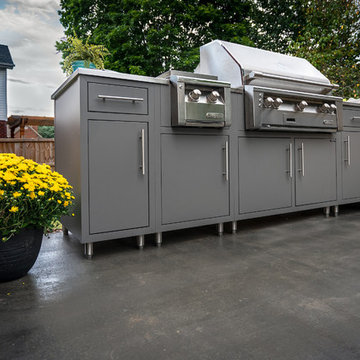 Challenger Designs
Stephen Long Photography
Example of a trendy backyard stamped concrete patio kitchen design in Nashville with no cover
Example of a trendy backyard stamped concrete patio kitchen design in Nashville with no cover
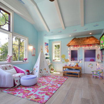
 Wright Jenkins Home Design
This second-story addition to an already 'picture perfect' Naples home presented many challenges. The main tension between adding the many 'must haves' the client wanted on their second floor, but at the same time not overwhelming the first floor. Working with David Benner of Safety Harbor Builders was key in the design and construction process – keeping the critical aesthetic elements in check. The owners were very 'detail oriented' and actively involved throughout the process. The result was adding 924 sq ft to the 1,600 sq ft home, with the addition of a large Bonus/Game Room, Guest Suite, 1-1/2 Baths and Laundry. But most importantly — the second floor is in complete harmony with the first, it looks as it was always meant to be that way.
©Energy Smart Home Plans, Safety Harbor Builders, Glenn Hettinger Photography
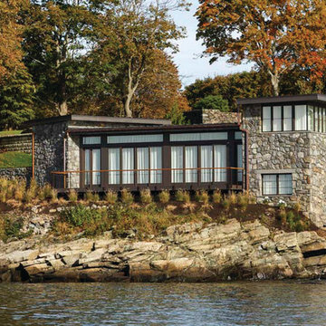 Marvin
This two-story home features raised ceilings and full-length windows, creating beautiful 180-degree panoramas of the harbor and skyline.
Summer Cottage
Massachusetts
Architect: Lian Eoyang
Firm: VIF STUDIO
12