
Search results for "Challenges faced" in Home Design Ideas
 Mottram Architecture
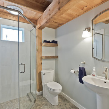
Michael Eric Berube, Maine Virtual Home ToursTimber frame homes offer unique challenges during a remodel. What often makes them beautiful and attractive to most homeowners, also makes them challenging for space requirements.
Context: The lovely couple that owned this home were struggling with some interesting floor plan challenges that just didn't work for their family. The loved the beautiful timbers and woodwork of their home, but the dramatically sloping ceilings on the second floor, particularly in the bathroom, just didn't work for this 1 1/2 bath home. Needing to use the skylight to approach the toilet was a less then ideal scenario. Although the bathroom footprint was more then adequate, the sloped ceiling only made half of the space useable. Check out the Before/After post on our blog to see the photos of the house pre-renovation. As much as they loved all the wood features in their home, another challenge they had was light. The wood ceiling made everything inside the house darker, even with a fantastic array of south facing windows, there were spaces in the home that felt dark and small. When they contacted us they wanted to know how could they make their brighter and more inviting, were there solutions to the 2nd floor sloped ceiling issues, and if they were going to do all of this work, how could they make their home more comfortable and efficient. A nagging water leak in the upstairs bathroom spurred them into action and here is how we solved their dilemma.
Conclusion: First, we added a little dormer to the rear of the house so we could get full headroom in nearly all of the upstairs bathroom! Then we decided to extend that dormer one more timber bay over to create a walk in closet with natural light and plenty of space. Since we were contemplating energy efficiency, we resolved a nagging issue that is present in a lot of timber frame construction, air tightness. Commonly found in timber frame construction, fiberglass insulation is installed in the rafter bays and board ceilings are installed over top. Unfortunately, board ceilings are anything but air tight, and fiberglass insulation needs to be in an airtight cavity for maximum effectiveness. So we were able to solve two issues at the same time for this homeowner. We removed the board ceiling and fiberglass insulation, we dense packed the rafter bays with cellulose insulation, and installed sheetrock in place of the boards. The boards were salvaged for re-use by the homeowner, and the space and light quality was dramatically improved. Some may think that losing the board ceiling took something away from the space, but what you'll see in the pictures is that it highly accentuates the heavy timbers and really makes them stand out in a beautiful way. Now with this added airtightness, better insulation, and brighter space, the homeowner hardly runs their wood stove, and it's so quiet in the space, an added bonus from changing the insulation. It became necessary to also add a sheetrock ceiling to the living room to hide the plumbing from the new bathroom layout above. Changing this ceiling gave the homeowner some real quality lighting that was lacking in the living room before. The brighter ceiling and new lighting layout completely transforms the living room into a space you want to hang out, even though the layout didn't change at all. When the homeowner saw the finished spaces she said "I can't believe this is my house, I want to live in this house"
Energy Efficiency: I touched a little on the efficiency above, but like all projects done with Mottram Architecture, we always want to leave you with a little extra. Timber frame construction with board ceilings and fiberglass insulation are notoriously leaky! If you want to know what we think about fiberglass insulation, check our our blog post on Why Fiberglass Insulation Sucks. By installing cellulose insulation and covering it with sheetrock we were able to greatly reduce the heat flowing out of this home. It not only improves cashflow it improves the comfort level in the space. Who wants to sit in their living room and feel a draft? Let us remind you, we are not saying cellulose insulation is an air barrier, we use the sheetrock to help with that, but it does significantly reduce the air flow over fiberglass insulation. And when we reduce the airflow, we reduce the heat flow. And when we reduce the heat flow, we reduce the need to re-heat that drafty air from outside. When it comes to energy efficiency the first and best place to start is air infiltration. We greatly reduced the air infiltration with the new insulation, but we also added a hat and warm boots. What I mean by that is, we improved the insulation in the roof, and we installed insulation in the basement. Maybe it's a silly analogy, but when you think about keeping warm, we always start with the hat and boots! With sustainability in mind, the next project will be to add a deck to the front of this house with rain catchment barrels from the metal roof. They are planning to plant a garden in the spring and the rain catchment system will help to irrigate the new garden.
Builder: East Shore Builders
Photographer: Michael Eric Berube
 Mottram Architecture
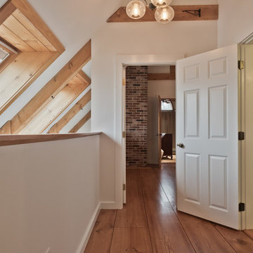
The builder laid custom wide plank flooring in the upstairs hall and flex space stained to match the existing woodwork of the timber frame construction.
Timber frame homes offer unique challenges during a remodel. What often makes them beautiful and attractive to most homeowners, also makes them challenging for space requirements.
Context: The lovely couple that owned this home were struggling with some interesting floor plan challenges that just didn't work for their family. The loved the beautiful timbers and woodwork of their home, but the dramatically sloping ceilings on the second floor, particularly in the bathroom, just didn't work for this 1 1/2 bath home. Needing to use the skylight to approach the toilet was a less then ideal scenario. Although the bathroom footprint was more then adequate, the sloped ceiling only made half of the space useable. Check out the Before/After post on our blog to see the photos of the house pre-renovation. As much as they loved all the wood features in their home, another challenge they had was light. The wood ceiling made everything inside the house darker, even with a fantastic array of south facing windows, there were spaces in the home that felt dark and small. When they contacted us they wanted to know how could they make their brighter and more inviting, were there solutions to the 2nd floor sloped ceiling issues, and if they were going to do all of this work, how could they make their home more comfortable and efficient. A nagging water leak in the upstairs bathroom spurred them into action and here is how we solved their dilemma.
Conclusion: First, we added a little dormer to the rear of the house so we could get full headroom in nearly all of the upstairs bathroom! Then we decided to extend that dormer one more timber bay over to create a walk in closet with natural light and plenty of space. Since we were contemplating energy efficiency, we resolved a nagging issue that is present in a lot of timber frame construction, air tightness. Commonly found in timber frame construction, fiberglass insulation is installed in the rafter bays and board ceilings are installed over top. Unfortunately, board ceilings are anything but air tight, and fiberglass insulation needs to be in an airtight cavity for maximum effectiveness. So we were able to solve two issues at the same time for this homeowner. We removed the board ceiling and fiberglass insulation, we dense packed the rafter bays with cellulose insulation, and installed sheetrock in place of the boards. The boards were salvaged for re-use by the homeowner, and the space and light quality was dramatically improved. Some may think that losing the board ceiling took something away from the space, but what you'll see in the pictures is that it highly accentuates the heavy timbers and really makes them stand out in a beautiful way. Now with this added airtightness, better insulation, and brighter space, the homeowner hardly runs their wood stove, and it's so quiet in the space, an added bonus from changing the insulation. It became necessary to also add a sheetrock ceiling to the living room to hide the plumbing from the new bathroom layout above. Changing this ceiling gave the homeowner some real quality lighting that was lacking in the living room before. The brighter ceiling and new lighting layout completely transforms the living room into a space you want to hang out, even though the layout didn't change at all. When the homeowner saw the finished spaces she said "I can't believe this is my house, I want to live in this house"
Energy Efficiency: I touched a little on the efficiency above, but like all projects done with Mottram Architecture, we always want to leave you with a little extra. Timber frame construction with board ceilings and fiberglass insulation are notoriously leaky! If you want to know what we think about fiberglass insulation, check our our blog post on Why Fiberglass Insulation Sucks. By installing cellulose insulation and covering it with sheetrock we were able to greatly reduce the heat flowing out of this home. It not only improves cashflow it improves the comfort level in the space. Who wants to sit in their living room and feel a draft? Let us remind you, we are not saying cellulose insulation is an air barrier, we use the sheetrock to help with that, but it does significantly reduce the air flow over fiberglass insulation. And when we reduce the airflow, we reduce the heat flow. And when we reduce the heat flow, we reduce the need to re-heat that drafty air from outside. When it comes to energy efficiency the first and best place to start is air infiltration. We greatly reduced the air infiltration with the new insulation, but we also added a hat and warm boots. What I mean by that is, we improved the insulation in the roof, and we installed insulation in the basement. Maybe it's a silly analogy, but when you think about keeping warm, we always start with the hat and boots! With sustainability in mind, the next project will be to add a deck to the front of this house with rain catchment barrels from the metal roof. They are planning to plant a garden in the spring and the rain catchment system will help to irrigate the new garden.
Builder: East Shore Builders
Photographer: Michael Eric Berube
 Spratley & Partners
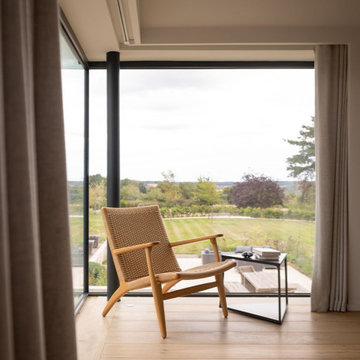
A new-build, replacement dwelling in a sensitive green belt location, designed to take advantage of the countryside setting and views.
By capitalising on volume increases to the existing dwelling through a series of incremental Permitted Development schemes, the home better suits its site and context. By raising a previously ground bearing floor area into a cantilever it can now encapsulate long ranging views from the master bedroom. To create a contemporary rural aesthetic the materials include a zinc roof, pre-weathered burnt timber cladding and brick.
Landscaping has been designed by renowned British Garden Designer Andy Sturgeon who created three distinct gardens: a wild flower walk to the pool, a formal crescent-shaped striped lawn and south-facing gravel garden. The garden takes advantage of views across the Thames valley to Hedsor House and Cliveden, as a result of it being elevated and levelled with excavation material from the basement.
Find the right local pro for your project
 MHM LIVING
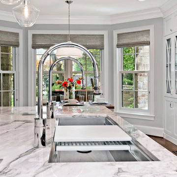
Our client came as a referral. They had seen a kitchen project we had completed where we opened up the kitchen to the living room. They were inspired to do the same in their kitchen. While they initially came to us looking to simply remove a wall to open up the space, in conversation it was clear we could help them really make the space function better for their family and entertaining. Ultimately they wanted to have an open bright space that was family friendly, great for entertaining and satisfied their love of cooking.
By far, the greatest challenge we faced with this project was removing the load bearing wall that started the conversation to begin with. This wall was supporting 2 stories and housed the majority of electricity and plumbing for the kitchen and bathrooms above.
Some of the key features are:
An island enlarged to the maximum size that the beautiful Calacatta Retro slab allowed. The island houses a Galley 5-foot prep station sink with two faucets, dishwasher, two beverage coolers, drawer microwave, trash disposal, and a charging station for all of the family’s digital devices, are all conveniently located in the island.
A vibrant tile from Porcelanosa is installed as the backsplash.
The butler pantry was transformed into a coffee and wine bar.
Installed Mocket pop-up outlets on the island that close flush to the island when not in use, but are easily accessible.
Sonos speakers discreetly concealed in the ceiling for music throughout the space.
The kitchen with dark colors and heavy gothic like style trim is gone, and a light, bright, kitchen with clean lines and an abundance of features has taken its place. The client is beyond delighted with the transformation of their kitchen and now combined living room space.
 SV Design
This historic 1840’s Gothic Revival home perched on the harbor, presented an array of challenges: they included a narrow-restricted lot cozy to the neighboring properties, a sensitive coastal location, and a structure desperately in need of major renovations.
The renovation concept respected the historic notion of individual rooms and connecting hallways, yet wanted to take better advantage of water views. The solution was an expansion of windows on the water siding of the house, and a small addition that incorporates an open kitchen/family room concept, the street face of the home was historically preserved.
The interior of the home has been completely refreshed, bringing in a combined reflection of art and family history with modern fanciful choices.
Adds testament to the successful renovation, the master bathroom has been described as “full of rainbows” in the morning.
 Michael Nash Design, Build & Homes
2011 NARI CAPITAL COTY FINALIST AWARD WINNER
This 1970’s split-level single-family home in an upscale Arlington neighborhood had been neglected for years. With his surrounding neighbors all doing major exterior and interior remodeling, however, the owner decided it was time to renovate his property as well. After several consultation meetings with the design team at Michael Nash Design, Build & Homes, he settled on an exterior layout to create an Art & Craft design for the home.
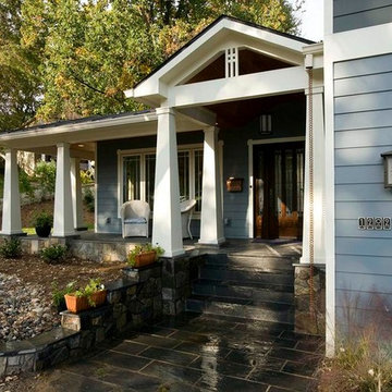
It all got started by excavating the front and left side of the house and attaching a wrap-around stone porch. Key design attributes include a black metal roof, large tapered columns, blue and grey random style flag stone, beaded stain ceiling paneling and an octagonal seating area on the left side of this porch. The front porch has a wide stairway and another set of stairs leads to the back yard.
All exterior walls of the home were modified with new headers to allow much larger custom-made windows, new front doors garage doors, and French side and back doors. A custom-designed mahogany front door with leaded glass provides more light and offers a wider entrance into the home’s living area.
Design challenges included removing the entire face of the home and then adding new insulation, Tyvek and Hardiplank siding. The use of high-efficiency low-e windows makes the home air tight.
The Arts & Crafts design touches include the front gable over the front porch, the prairie-style grill pattern on the windows and doors, the use of tapered columns sitting over stone columns and the leaded glass front door. Decorative exterior lighting provides the finishing touches to this look.
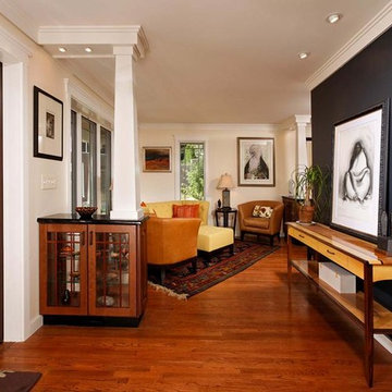
Inside, custom woodwork, crown molding, custom glass cabinets and interior pillars carry the design. Upon entering the space, visitors face a large partition that separates the living area from a gourmet Arts & Crafts kitchen and dining room.
The home’s signature space, the kitchen offers contrasting dark and light cherry cabinets. Wide plank hard wood floors, exotic granite counters and stainless steel professional-grade appliances make this a kitchen fit for any chef.
 Michael Nash Design, Build & Homes
2011 NARI CAPITAL COTY FINALIST AWARD WINNER
This 1970’s split-level single-family home in an upscale Arlington neighborhood had been neglected for years. With his surrounding neighbors all doing major exterior and interior remodeling, however, the owner decided it was time to renovate his property as well. After several consultation meetings with the design team at Michael Nash Design, Build & Homes, he settled on an exterior layout to create an Art & Craft design for the home.
It all got started by excavating the front and left side of the house and attaching a wrap-around stone porch. Key design attributes include a black metal roof, large tapered columns, blue and grey random style flag stone, beaded stain ceiling paneling and an octagonal seating area on the left side of this porch. The front porch has a wide stairway and another set of stairs leads to the back yard.
All exterior walls of the home were modified with new headers to allow much larger custom-made windows, new front doors garage doors, and French side and back doors. A custom-designed mahogany front door with leaded glass provides more light and offers a wider entrance into the home’s living area.
Design challenges included removing the entire face of the home and then adding new insulation, Tyvek and Hardiplank siding. The use of high-efficiency low-e windows makes the home air tight.
The Arts & Crafts design touches include the front gable over the front porch, the prairie-style grill pattern on the windows and doors, the use of tapered columns sitting over stone columns and the leaded glass front door. Decorative exterior lighting provides the finishing touches to this look.
Inside, custom woodwork, crown molding, custom glass cabinets and interior pillars carry the design. Upon entering the space, visitors face a large partition that separates the living area from a gourmet Arts & Crafts kitchen and dining room.
The home’s signature space, the kitchen offers contrasting dark and light cherry cabinets. Wide plank hard wood floors, exotic granite counters and stainless steel professional-grade appliances make this a kitchen fit for any chef.


 Sunspace Design, Inc.
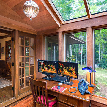
This project’s owner originally contacted Sunspace because they needed to replace an outdated, leaking sunroom on their North Hampton, New Hampshire property. The aging sunroom was set on a fieldstone foundation that was beginning to show signs of wear in the uppermost layer. The client’s vision involved repurposing the ten foot by ten foot area taken up by the original sunroom structure in order to create the perfect space for a new home office. Sunspace Design stepped in to help make that vision a reality.
We began the design process by carefully assessing what the client hoped to achieve. Working together, we soon realized that a glass conservatory would be the perfect replacement. Our custom conservatory design would allow great natural light into the home while providing structure for the desired office space.
Because the client’s beautiful home featured a truly unique style, the principal challenge we faced was ensuring that the new conservatory would seamlessly blend with the surrounding architectural elements on the interior and exterior. We utilized large, Marvin casement windows and a hip design for the glass roof. The interior of the home featured an abundance of wood, so the conservatory design featured a wood interior stained to match.
The end result of this collaborative process was a beautiful conservatory featured at the front of the client’s home. The new space authentically matches the original construction, the leaky sunroom is no longer a problem, and our client was left with a home office space that’s bright and airy. The large casements provide a great view of the exterior landscape and let in incredible levels of natural light. And because the space was outfitted with energy efficient glass, spray foam insulation, and radiant heating, this conservatory is a true four season glass space that our client will be able to enjoy throughout the year.
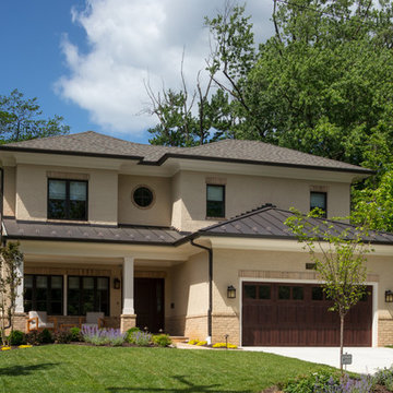
 AV Architects + Builders
AV Architects + Builders
Location: Tysons, VA, USA
The Home for Life project was customized around our client’s lifestyle so that he could enjoy the home for many years to come. Designed with empty nesters and baby boomers in mind, our custom design used a different approach to the disparity of square footage on each floor.
The main level measures out at 2,300 square feet while the lower and upper levels of the home measure out at 1000 square feet each, respectively. The open floor plan of the main level features a master suite and master bath, personal office, kitchen and dining areas, and a two-car garage that opens to a mudroom and laundry room. The upper level features two generously sized en-suite bedrooms while the lower level features an extra guest room with a full bath and an exercise/rec room. The backyard offers 800 square feet of travertine patio with an elegant outdoor kitchen, while the front entry has a covered 300 square foot porch with custom landscape lighting.
The biggest challenge of the project was dealing with the size of the lot, measuring only a ¼ acre. Because the majority of square footage was dedicated to the main floor, we had to make sure that the main rooms had plenty of natural lighting. Our solution was to place the public spaces (Great room and outdoor patio) facing south, and the more private spaces (Bedrooms) facing north.
The common misconception with small homes is that they cannot factor in everything the homeowner wants. With our custom design, we created an open concept space that features all the amenities of a luxury lifestyle in a home measuring a total of 4300 square feet.
Jim Tetro Architectural Photography
 Michael Nash Design, Build & Homes
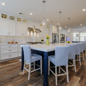
 The new owner of this Centex complex townhomes was about to overhaul there entire first floor. Having a building industries background, he wanted to explore taking all interior walls out and create a much-desired open floor plan with a massive kitchen.
The current home had a front living room followed by a small boxed out dining room. A structure wall separating the back of the house kitchen from the front living space. It was all to chopped up for their daily lives. The floor is concrete slab. the partition wall was bearing. The HVAC system is located on second floor and the supply and return ducts were all boxed in columns in living spaces.
Challenges:
• Eliminating bearing partition walls
• Relocating all supply and return ducts from box columns
• Run 1” gas line from exterior meter for new 48” stove
• Cutting slab concrete to relocate all plumbing and electrical for new island
The plan was to combine the entire first level and create an open space floor-plan, with locating the new large kitchen in front of this town house, implementing a large island in middle of the space which accommodate big group seating.
The old kitchen converted to a casual family room seating space facing a wall coved with linear fireplace and sheep-lap barded wall and embedded Tv.
The old glued down floor was removed and replaced with a more contemporary LVT flooring,
The entire space covered with new LED lighting, floor to ceiling cabinetry on south wall with upgraded appliances and inside lighting cabinetry.
A gorgeous quartz counter top coving the dark blue island with water falls on one end stand tall in middle this amazing kitchen. Three pendent lights over this massive Island brighten up this new space.
This new living space reveals what an amazing total overhaul has been accomplished and how happy this family is spending all their time on this floor.
The design team spent a lot of time with the couple for details such as color scheme, backsplash design, counter top slab and floor design to bring what they desired their new space to look like

 JRP Design & Remodel
Our clients are seasoned home renovators. Their Malibu oceanside property was the second project JRP had undertaken for them. After years of renting and the age of the home, it was becoming prevalent the waterfront beach house, needed a facelift. Our clients expressed their desire for a clean and contemporary aesthetic with the need for more functionality. After a thorough design process, a new spatial plan was essential to meet the couple’s request. This included developing a larger master suite, a grander kitchen with seating at an island, natural light, and a warm, comfortable feel to blend with the coastal setting.
Demolition revealed an unfortunate surprise on the second level of the home: Settlement and subpar construction had allowed the hillside to slide and cover structural framing members causing dangerous living conditions. Our design team was now faced with the challenge of creating a fix for the sagging hillside. After thorough evaluation of site conditions and careful planning, a new 10’ high retaining wall was contrived to be strategically placed into the hillside to prevent any future movements.
With the wall design and build completed — additional square footage allowed for a new laundry room, a walk-in closet at the master suite. Once small and tucked away, the kitchen now boasts a golden warmth of natural maple cabinetry complimented by a striking center island complete with white quartz countertops and stunning waterfall edge details. The open floor plan encourages entertaining with an organic flow between the kitchen, dining, and living rooms. New skylights flood the space with natural light, creating a tranquil seaside ambiance. New custom maple flooring and ceiling paneling finish out the first floor.
Downstairs, the ocean facing Master Suite is luminous with breathtaking views and an enviable bathroom oasis. The master bath is modern and serene, woodgrain tile flooring and stunning onyx mosaic tile channel the golden sandy Malibu beaches. The minimalist bathroom includes a generous walk-in closet, his & her sinks, a spacious steam shower, and a luxurious soaking tub. Defined by an airy and spacious floor plan, clean lines, natural light, and endless ocean views, this home is the perfect rendition of a contemporary coastal sanctuary.
PROJECT DETAILS:
• Style: Contemporary
• Colors: White, Beige, Yellow Hues
• Countertops: White Ceasarstone Quartz
• Cabinets: Bellmont Natural finish maple; Shaker style
• Hardware/Plumbing Fixture Finish: Polished Chrome
• Lighting Fixtures: Pendent lighting in Master bedroom, all else recessed
• Flooring:
Hardwood - Natural Maple
Tile – Ann Sacks, Porcelain in Yellow Birch
• Tile/Backsplash: Glass mosaic in kitchen
• Other Details: Bellevue Stand Alone Tub
Photographer: Andrew, Open House VC
 FK Interior Design
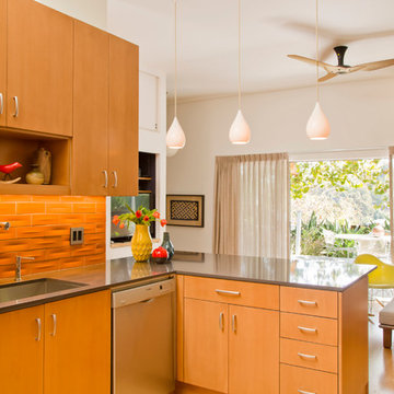
What began as a simple kitchen ‘face-lift’ turned into a more complex kitchen remodel when it was determined that what the client was really seeking was to create a space which evoked the warmth of wood. The challenge was to take a dated (c. 1980’s) white plastic laminate kitchen with a white Formica counter top and transform it into a warmly, wood-clad kitchen without having to demolish the entire kitchen cabinetry. With new door and drawer faces and the careful ‘skinning’ of the existing laminate cabinets with a stained maple veneer; the space became more luxurious and updated. The counter top was replaced with a new quartz slab from Eurostone. The peninsula now accommodates counter-height seating. The Haiku bamboo ceiling fan from Big Ass Fans graces the family room.
Photography: Manolo Langis
 Cochrane Floors & More
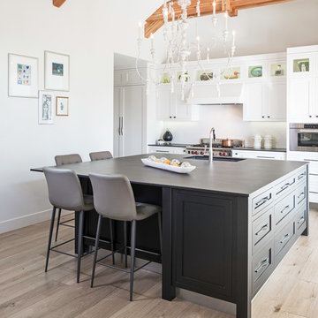
This amazing hardwood is build for the most challenging of climates! Although available in 6" 7"& 8" wide planks as seen here, the meticulous construction provides excellent dimensional stability and a durable surface that easily stands up to normal wear while offering an exquisite finish.
With the large open layout in this home, the soft tones and wide planks really help to warm the space up and add just enough coziness to keep this expansive space from feeling industrial or clinical. Great blend on tone and texture!
 Michael Nash Design, Build & Homes
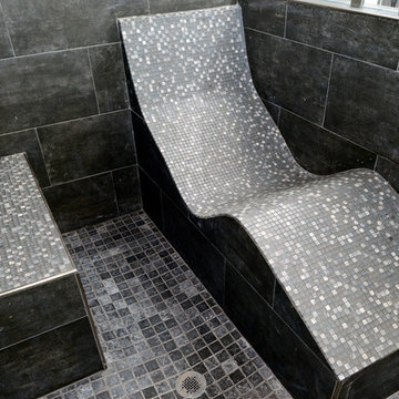
inspired spa style sauna, steam shower, whirlpool tub, locker room to an adjacent gym have been very challenging, to capture all amenities that he was inquiring.
Space was limited and how build partition walls, created a dilemma to achieve our goals. We had to reconstruct and move bearing posts to gain footsteps for our amazing and rejuvenating spa room.
This New Spa was a state of art with a curved tiled bench inside steam room and an Infrared Sauna, soaking whirlpool tub, separate dressing and vanity area just separated from adjacent Gym through pocket doors. New gym with mirrored walls was faced the backyard with a large window.
The main room was separated into an entertaining area with large bar and cabinetry, and some built INS facing the backyard. A new French door & window was added to back wall to allow more natural light. Built ins covered with light color natural maple wood tones, we were capturing his nature lifestyle. Through a double glass French door now you enter the state of the art movie theater room. Ceiling star panels, steps row seating, a large screen panel with black velvet curtains has made this space an Icon’s paradise. We have used embedded high quality speakers and surround sound equipped with all new era of projectors, receivers and multiple playing gadgets.
The staircase to main level and closet space were redesigned allowing him additional hallway and storage space that he required to have,
Intrigued color schemes and fascinating equipment’s has made this basement a place for serenity and excitement
 Reico Kitchen & Bath
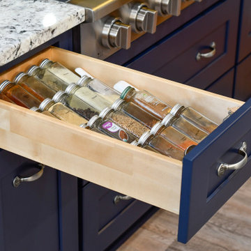
Brad Smith from Reico Kitchen and Bath in Charlottesville, VA designed a kitchen featuring Green Forest cabinetry.
The kitchen cabinets are the Park Place door style in a White finish for the perimeter and Norfolk Blue for the island.
Adding cabinet accessories helped maximize space in the small area, a challenge Brad faced during the project.
Photos courtesy of Tim Snyder Photography.
 Laura Medicus Interiors
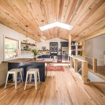
One of the big challenges we faced in this kitchen were the stairs to the basement that are smack dab in the middle of the kitchen - really in the middle of the home. I took this as a design opportunity and designed beetle kill pine posts with steel cables as the stair surround. We took the ceiling up as high as we could to give the room more impact and clad the ceiling with beetle kill pine planks.
 Native Edge Landscape
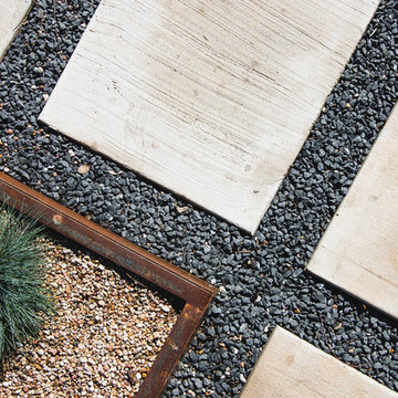
We had a several challenges to face with this project. Not only did we need to update a dated landscape to accommodate two seemingly different design tastes (modern & minimalistic vs natural english garden), we were tasked with improving the property’s drainage, improving the driveway access, reducing water usage and plant maintenance, and fixing a crumbling wall.
To marry the two design tastes, we started with the more modern elements of metal planters and softened the landscape with mass plantings of ornamental grasses and native sedge. These grasses act as a turf replacement that do not need to be mowed and require less regular watering. On each side of the yard we constructed new cedar fences to provide updated and additional privacy. In addition, we poured a new concrete wall to replace the existing retaining wall and play off the new modern vibe.
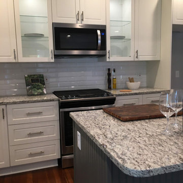
 INSPIRED KITCHEN DESIGN
“After the IKEA boxes were installed, we were able to add the Ricabi custom doors and drawer fronts on our own,” she says.
She continues: “The main challenge we faced was making sure we measured everything in the kitchen area correctly while the house was in the demo stage. There’s definitely a learning curve to putting the first few IKEA cabinets together but it’s much easier after that.”
Andrea concludes with some advice for other IKEA kitchen remodelers.
“You can have a custom-looking kitchen without the huge price tag. If you’re concerned that your kitchen is going to look like those in the IKEA showroom, consider a custom door company like Ricabi and an awesome design service like IKD. Constructing IKEA cabinets yourself will save money but be patient on the first few. It’s a lot smoother if you have a partner to help you.”
 Michael Nash Design, Build & Homes
inspired spa style sauna, steam shower, whirlpool tub, locker room to an adjacent gym have been very challenging, to capture all amenities that he was inquiring.
Space was limited and how build partition walls, created a dilemma to achieve our goals. We had to reconstruct and move bearing posts to gain footsteps for our amazing and rejuvenating spa room.
This New Spa was a state of art with a curved tiled bench inside steam room and an Infrared Sauna, soaking whirlpool tub, separate dressing and vanity area just separated from adjacent Gym through pocket doors. New gym with mirrored walls was faced the backyard with a large window.
The main room was separated into an entertaining area with large bar and cabinetry, and some built INS facing the backyard. A new French door & window was added to back wall to allow more natural light. Built ins covered with light color natural maple wood tones, we were capturing his nature lifestyle. Through a double glass French door now you enter the state of the art movie theater room. Ceiling star panels, steps row seating, a large screen panel with black velvet curtains has made this space an Icon’s paradise. We have used embedded high quality speakers and surround sound equipped with all new era of projectors, receivers and multiple playing gadgets.
The staircase to main level and closet space were redesigned allowing him additional hallway and storage space that he required to have,
Intrigued color schemes and fascinating equipment’s has made this basement a place for serenity and excitement
 McGraw Interiors
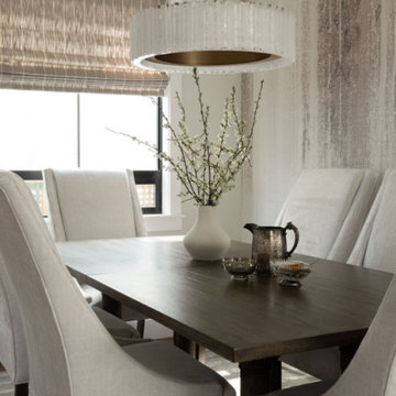
The dining room is an extension of the kitchen, and the challenge we faced was making it feel like its own separate space. We thought adding in a mural wallpaper on the back wall would help create definition and personality. After countless hours spent searching for the perfect choice, we came across the Waterfall mural wallpaper by Philip Jeffries and instantly fell in love. Furniture wise, we paired ivory chenille upholstered dining chairs with a dark wood trestle dining table. The crowing glory of the room is the modern icicle-like round chandelier that casts beautiful ambient lighting onto the idyllic space.
http://www.interiorsbyrobyn.com http://www.interiorsbyrobyn.com
23