
Search results for "Challenges faced" in Home Design Ideas
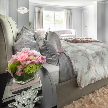
 Interiors by Natasha
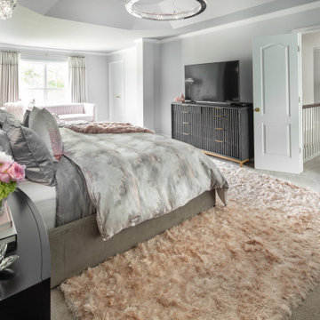
My client hired Interiors by Natasha to redesign her master bedroom, sitting room and master bathroom. She was enthusiastic about having us create a peaceful and glamorous room for her to sleep and lounge in. The scope of the project was as follows: with the exception to the master bed, we purchased new furniture, new bedding, dressers, nightstands, chandeliers, sofa, rugs, mirror and accessories. We also decided to install wallpaper on the walls as a focal point in the room.
The challenges we faced with this project was making sure we designed a room that had some luxe, glitz and glam. We had to design the space around the bed that my client purchased prior to starting the design process. The color scheme within the room included gray, blush, and cream. The other challenge we faced was creating a room around the glam style without over doing it. Although my client was fine with glam, she did not want to much of it represented in the room. I believe we were able to redesign her space creating a luxe atmosphere for her to sleep and lounge in.
Photography Haigwood Studios
 OMNIA Group Architects
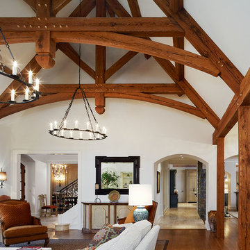
The comfortable elegance of this French-Country inspired home belies the challenges faced during its conception. The beautiful, wooded site was steeply sloped requiring study of the location, grading, approach, yard and views from and to the rolling Pennsylvania countryside. The client desired an old world look and feel, requiring a sensitive approach to the extensive program. Large, modern spaces could not add bulk to the interior or exterior. Furthermore, it was critical to balance voluminous spaces designed for entertainment with more intimate settings for daily living while maintaining harmonic flow throughout.
The result home is wide, approached by a winding drive terminating at a prominent facade embracing the motor court. Stone walls feather grade to the front façade, beginning the masonry theme dressing the structure. A second theme of true Pennsylvania timber-framing is also introduced on the exterior and is subsequently revealed in the formal Great and Dining rooms. Timber-framing adds drama, scales down volume, and adds the warmth of natural hand-wrought materials. The Great Room is literal and figurative center of this master down home, separating casual living areas from the elaborate master suite. The lower level accommodates casual entertaining and an office suite with compelling views. The rear yard, cut from the hillside, is a composition of natural and architectural elements with timber framed porches and terraces accessed from nearly every interior space flowing to a hillside of boulders and waterfalls.
The result is a naturally set, livable, truly harmonious, new home radiating old world elegance. This home is powered by a geothermal heating and cooling system and state of the art electronic controls and monitoring systems.
 Cummings Architecture + Interiors
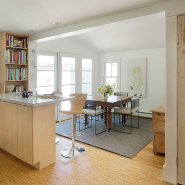
Blending contemporary and historic styles requires innovative design and a well-balanced aesthetic. That was the challenge we faced in creating a modern kitchen for this historic home in Lynnfield, MA. The final design retained the classically beautiful spatial and structural elements of the home while introducing a sleek sophistication. We mixed the two design palettes carefully. For instance, juxtaposing the warm, distressed wood of an original door with the smooth, brightness of non-paneled, maple cabinetry. A cork floor and accent cabinets of white metal add texture while a seated, step-down peninsula and built in bookcase create an open transition from the kitchen proper to an inviting dining space. This is truly a space where the past and present can coexist harmoniously.
Photo Credit: Eric Roth
Find the right local pro for your project
 Mottram Architecture
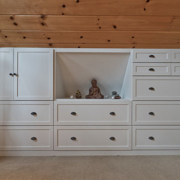
Timber frame homes offer unique challenges during a remodel. What often makes them beautiful and attractive to most homeowners, also makes them challenging for space requirements.
Context: The lovely couple that owned this home were struggling with some interesting floor plan challenges that just didn't work for their family. The loved the beautiful timbers and woodwork of their home, but the dramatically sloping ceilings on the second floor, particularly in the bathroom, just didn't work for this 1 1/2 bath home. Needing to use the skylight to approach the toilet was a less then ideal scenario. Although the bathroom footprint was more then adequate, the sloped ceiling only made half of the space useable. Check out the Before/After post on our blog to see the photos of the house pre-renovation. As much as they loved all the wood features in their home, another challenge they had was light. The wood ceiling made everything inside the house darker, even with a fantastic array of south facing windows, there were spaces in the home that felt dark and small. When they contacted us they wanted to know how could they make their brighter and more inviting, were there solutions to the 2nd floor sloped ceiling issues, and if they were going to do all of this work, how could they make their home more comfortable and efficient. A nagging water leak in the upstairs bathroom spurred them into action and here is how we solved their dilemma.
Conclusion: First, we added a little dormer to the rear of the house so we could get full headroom in nearly all of the upstairs bathroom! Then we decided to extend that dormer one more timber bay over to create a walk in closet with natural light and plenty of space. Since we were contemplating energy efficiency, we resolved a nagging issue that is present in a lot of timber frame construction, air tightness. Commonly found in timber frame construction, fiberglass insulation is installed in the rafter bays and board ceilings are installed over top. Unfortunately, board ceilings are anything but air tight, and fiberglass insulation needs to be in an airtight cavity for maximum effectiveness. So we were able to solve two issues at the same time for this homeowner. We removed the board ceiling and fiberglass insulation, we dense packed the rafter bays with cellulose insulation, and installed sheetrock in place of the boards. The boards were salvaged for re-use by the homeowner, and the space and light quality was dramatically improved. Some may think that losing the board ceiling took something away from the space, but what you'll see in the pictures is that it highly accentuates the heavy timbers and really makes them stand out in a beautiful way. Now with this added airtightness, better insulation, and brighter space, the homeowner hardly runs their wood stove, and it's so quiet in the space, an added bonus from changing the insulation. It became necessary to also add a sheetrock ceiling to the living room to hide the plumbing from the new bathroom layout above. Changing this ceiling gave the homeowner some real quality lighting that was lacking in the living room before. The brighter ceiling and new lighting layout completely transforms the living room into a space you want to hang out, even though the layout didn't change at all. When the homeowner saw the finished spaces she said "I can't believe this is my house, I want to live in this house"
Energy Efficiency: I touched a little on the efficiency above, but like all projects done with Mottram Architecture, we always want to leave you with a little extra. Timber frame construction with board ceilings and fiberglass insulation are notoriously leaky! If you want to know what we think about fiberglass insulation, check our our blog post on Why Fiberglass Insulation Sucks. By installing cellulose insulation and covering it with sheetrock we were able to greatly reduce the heat flowing out of this home. It not only improves cashflow it improves the comfort level in the space. Who wants to sit in their living room and feel a draft? Let us remind you, we are not saying cellulose insulation is an air barrier, we use the sheetrock to help with that, but it does significantly reduce the air flow over fiberglass insulation. And when we reduce the airflow, we reduce the heat flow. And when we reduce the heat flow, we reduce the need to re-heat that drafty air from outside. When it comes to energy efficiency the first and best place to start is air infiltration. We greatly reduced the air infiltration with the new insulation, but we also added a hat and warm boots. What I mean by that is, we improved the insulation in the roof, and we installed insulation in the basement. Maybe it's a silly analogy, but when you think about keeping warm, we always start with the hat and boots! With sustainability in mind, the next project will be to add a deck to the front of this house with rain catchment barrels from the metal roof. They are planning to plant a garden in the spring and the rain catchment system will help to irrigate the new garden.
Builder: East Shore Builders
Photographer: Michael Eric Berube
 Kimberlee Marie Interiors
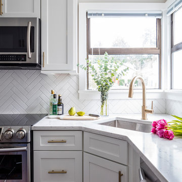
When my clients purchased this charming 1940's home in the Seattle neighborhood of Wedgwood, they were amazed by how intact the original kitchen was. It was like a perfect time capsule. The color palette was avocado green and buttercream yellow. The highlights were an original retro built-in banquette and vintage oven! The challenge we faced (besides the awesome but dated finishes) was the closed floor plan typical in this era of homes and the lack of storage. So, we opened the kitchen to the adjacent dining and living room, bringing it up to speed with modern-day living. In opening it up, we also walled off a doorway that went from the kitchen to the hallway, but it was completely unnecessary and allowed us to gain an entire wall of cabinets that didn't exist previously.
For the finishes, we kept it classic with mostly gray and white but brought in a little flare and interest with the herringbone backsplash and brushed brass finishes because who doesn't love a little gold? Also, we added color with the finishing details like the rug and countertop decor because those things are a great way to add interest and warmth to a space and can be easily changed when it's time for a fresh new look.

 Interiors by Natasha
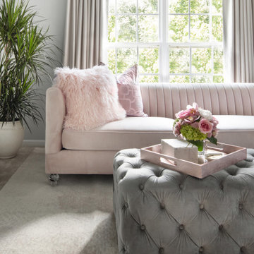
My client hired Interiors by Natasha to redesign her master bedroom, sitting room and master bathroom. She was enthusiastic about having us create a peaceful and glamorous room for her to sleep and lounge in. The scope of the project was as follows: with the exception to the master bed, we purchased new furniture, new bedding, dressers, nightstands, chandeliers, sofa, rugs, mirror and accessories. We also decided to install wallpaper on the walls as a focal point in the room.
The challenges we faced with this project was making sure we designed a room that had some luxe, glitz and glam. We had to design the space around the bed that my client purchased prior to starting the design process. The color scheme within the room included gray, blush, and cream. The other challenge we faced was creating a room around the glam style without over doing it. Although my client was fine with glam, she did not want to much of it represented in the room. I believe we were able to redesign her space creating a luxe atmosphere for her to sleep and lounge in.
Photography Haigwood Studios


 TEW Design Studio
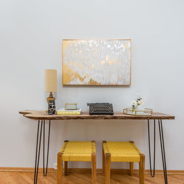
This home is a true gem in the heart of MacGregor Downs community in Cary, NC. Built in the 1980's in true Modernist design and architecture, the new owners wanted to keep the integrity of the original design. We redesigned the Half Bath, created floor plan layouts for new furniture, spec'd out furniture, accessories, flooring material, lighting, and artwork, as well as worked on brightening the wall and ceiling paint colors. One challenge we faced during the design process were the very tall ceilings, the very wide walls, and unusual angles. We chose interesting , engaging, and minimalistic artwork for the walls, which proved a successful solution. Another challenge was having a large open angled living room space; we created the perfect layout with separate functional gathering areas and eliminated unused corners.
Photo credit: Bob Fortner
 Interiors by Natasha
My client hired Interiors by Natasha to redesign her master bedroom, sitting room and master bathroom. She was enthusiastic about having us create a peaceful and glamorous room for her to sleep and lounge in. The scope of the project was as follows: with the exception to the master bed, we purchased new furniture, new bedding, dressers, nightstands, chandeliers, sofa, rugs, mirror and accessories. We also decided to install wallpaper on the walls as a focal point in the room.
The challenges we faced with this project was making sure we designed a room that had some luxe, glitz and glam. We had to design the space around the bed that my client purchased prior to starting the design process. The color scheme within the room included gray, blush, and cream. The other challenge we faced was creating a room around the glam style without over doing it. Although my client was fine with glam, she did not want to much of it represented in the room. I believe we were able to redesign her space creating a luxe atmosphere for her to sleep and lounge in.
Photography Haigwood Studios
 Drewett Works
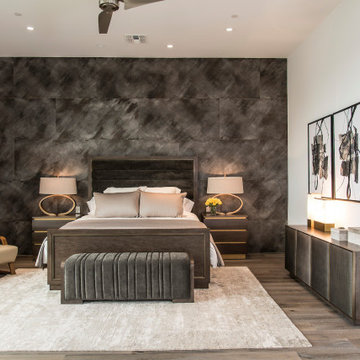
Above and Beyond is the third residence in a four-home collection in Paradise Valley, Arizona. Originally the site of the abandoned Kachina Elementary School, the infill community, appropriately named Kachina Estates, embraces the remarkable views of Camelback Mountain.
Nestled into an acre sized pie shaped cul-de-sac lot, the lot geometry and front facing view orientation created a remarkable privacy challenge and influenced the forward facing facade and massing. An iconic, stone-clad massing wall element rests within an oversized south-facing fenestration, creating separation and privacy while affording views “above and beyond.”
Above and Beyond has Mid-Century DNA married with a larger sense of mass and scale. The pool pavilion bridges from the main residence to a guest casita which visually completes the need for protection and privacy from street and solar exposure.
The pie-shaped lot which tapered to the south created a challenge to harvest south light. This was one of the largest spatial organization influencers for the design. The design undulates to embrace south sun and organically creates remarkable outdoor living spaces.
This modernist home has a palate of granite and limestone wall cladding, plaster, and a painted metal fascia. The wall cladding seamlessly enters and exits the architecture affording interior and exterior continuity.
Kachina Estates was named an Award of Merit winner at the 2019 Gold Nugget Awards in the category of Best Residential Detached Collection of the Year. The annual awards ceremony was held at the Pacific Coast Builders Conference in San Francisco, CA in May 2019.
Project Details: Above and Beyond
Architecture: Drewett Works
Developer/Builder: Bedbrock Developers
Interior Design: Est Est
Land Planner/Civil Engineer: CVL Consultants
Photography: Dino Tonn and Steven Thompson
Awards:
Gold Nugget Award of Merit - Kachina Estates - Residential Detached Collection of the Year
 OMNIA Group Architects
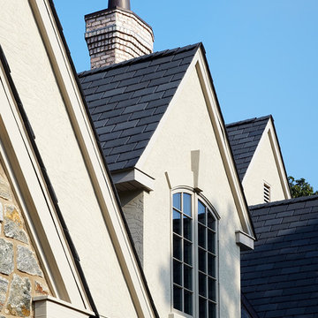
The comfortable elegance of this French-Country inspired home belies the challenges faced during its conception. The beautiful, wooded site was steeply sloped requiring study of the location, grading, approach, yard and views from and to the rolling Pennsylvania countryside. The client desired an old world look and feel, requiring a sensitive approach to the extensive program. Large, modern spaces could not add bulk to the interior or exterior. Furthermore, it was critical to balance voluminous spaces designed for entertainment with more intimate settings for daily living while maintaining harmonic flow throughout.
The result home is wide, approached by a winding drive terminating at a prominent facade embracing the motor court. Stone walls feather grade to the front façade, beginning the masonry theme dressing the structure. A second theme of true Pennsylvania timber-framing is also introduced on the exterior and is subsequently revealed in the formal Great and Dining rooms. Timber-framing adds drama, scales down volume, and adds the warmth of natural hand-wrought materials. The Great Room is literal and figurative center of this master down home, separating casual living areas from the elaborate master suite. The lower level accommodates casual entertaining and an office suite with compelling views. The rear yard, cut from the hillside, is a composition of natural and architectural elements with timber framed porches and terraces accessed from nearly every interior space flowing to a hillside of boulders and waterfalls.
The result is a naturally set, livable, truly harmonious, new home radiating old world elegance. This home is powered by a geothermal heating and cooling system and state of the art electronic controls and monitoring systems.
The roof is simulated slate made from recycled materials. The company for this home is no longer in business but today we specify Inspire by Boral https://www.boralroof.com/product-profile/composite/classic-slate/4IFUE5205/

 Orren Pickell Building Group
**Project Overview**
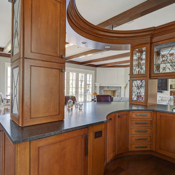
This new construction home is built next to a picturesque lake, and the bar adjacent to the kitchen and living areas is designed to frame the breathtaking view. This custom, curved bar creatively echoes many of the lines and finishes used in other areas of the first floor, but interprets them in a new way.
**What Makes This Project Unique?**
The bar connects visually to other areas of the home custom columns with leaded glass. The same design is used in the mullion detail in the furniture piece across the room. The bar is a flowing curve that lets guests face one another. Curved wainscot panels follow the same line as the stone bartop, as does the custom-designed, strategically implemented upper platform and crown that conceal recessed lighting.
**Design Challenges**
Designing a curved bar with rectangular cabinets is always a challenge, but the greater challenge was to incorporate a large wishlist into a compact space, including an under-counter refrigerator, sink, glassware and liquor storage, and more. The glass columns take on much of the storage, but had to be engineered to support the upper crown and provide space for lighting and wiring that would not be seen on the interior of the cabinet. Our team worked tirelessly with the trim carpenters to ensure that this was successful aesthetically and functionally. Another challenge we created for ourselves was designing the columns to be three sided glass, and the 4th side to be mirrored. Though it accomplishes our aesthetic goal and allows light to be reflected back into the space this had to be carefully engineered to be structurally sound.
Photo by MIke Kaskel
 Foran Interior Design
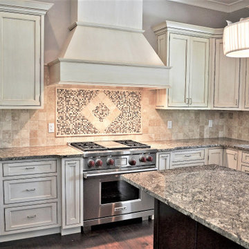
Based on extensive interviews with our clients, our challenges were to create an environment that was an artistic mix of traditional and clean lines. They wanted it
dramatic and sophisticated. They also wanted each piece to be special and unique, as well as artsy. Because our clients were young and have an active son, they wanted their home to be comfortable and practical, as well as beautiful. The clients wanted a sophisticated and up-to-date look. They loved brown, turquoise and orange. The other challenge we faced, was to give each room its own identity while maintaining a consistent flow throughout the home. Each space shared a similar color palette and uniqueness, while the furnishings, draperies, and accessories provided individuality to each room.
We incorporated comfortable and stylish furniture with artistic accents in pillows, throws, artwork and accessories. Each piece was selected to not only be unique, but to create a beautiful and sophisticated environment. We hunted the markets for all the perfect accessories and artwork that are the jewelry in this artistic living area.
Some of the selections included clean moldings, walnut floors and a backsplash with mosaic glass tile. In the living room we went with a cleaner look, but used some traditional accents such as the embroidered casement fabric and the paisley fabric on the chair and pillows. A traditional bow front chest with a crackled turquoise lacquer was used in the foyer.
 Interiors by Natasha
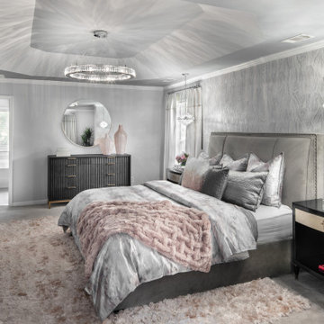
My client hired Interiors by Natasha to redesign her master bedroom, sitting room and master bathroom. She was enthusiastic about having us create a peaceful and glamorous room for her to sleep and lounge in. The scope of the project was as follows: with the exception to the master bed, we purchased new furniture, new bedding, dressers, nightstands, chandeliers, sofa, rugs, mirror and accessories. We also decided to install wallpaper on the walls as a focal point in the room.
The challenges we faced with this project was making sure we designed a room that had some luxe, glitz and glam. We had to design the space around the bed that my client purchased prior to starting the design process. The color scheme within the room included gray, blush, and cream. The other challenge we faced was creating a room around the glam style without over doing it. Although my client was fine with glam, she did not want to much of it represented in the room. I believe we were able to redesign her space creating a luxe atmosphere for her to sleep and lounge in.
Photography by Haigwood Studios
 Interiors by Natasha
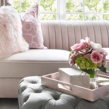
My client hired Interiors by Natasha to redesign her master bedroom, sitting room and master bathroom. She was enthusiastic about having us create a peaceful and glamorous room for her to sleep and lounge in. The scope of the project was as follows: with the exception to the master bed, we purchased new furniture, new bedding, dressers, nightstands, chandeliers, sofa, rugs, mirror and accessories. We also decided to install wallpaper on the walls as a focal point in the room.
The challenges we faced with this project was making sure we designed a room that had some luxe, glitz and glam. We had to design the space around the bed that my client purchased prior to starting the design process. The color scheme within the room included gray, blush, and cream. The other challenge we faced was creating a room around the glam style without over doing it. Although my client was fine with glam, she did not want to much of it represented in the room. I believe we were able to redesign her space creating a luxe atmosphere for her to sleep and lounge in.
Photography by Haigwood Studios
 June Scott Design
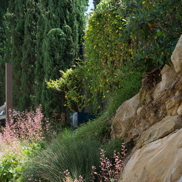
Rock outcroppings make a striking background for new lounge areas in this compact Los Angeles hillside garden. Working with the attributes of the site, we added native plants to drape over the stone, and converted hollowed stone planters into a firepit and water feature. New built-in seating and a cozy hammock complete the relaxing space, and dramatic lighting makes it come alive at night.
Photo by Martin Cox Photography.
 Interiors by Natasha
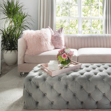
My client hired Interiors by Natasha to redesign her master bedroom, sitting room and master bathroom. She was enthusiastic about having us create a peaceful and glamorous room for her to sleep and lounge in. The scope of the project was as follows: with the exception to the master bed, we purchased new furniture, new bedding, dressers, nightstands, chandeliers, sofa, rugs, mirror and accessories. We also decided to install wallpaper on the walls as a focal point in the room.
The challenges we faced with this project was making sure we designed a room that had some luxe, glitz and glam. We had to design the space around the bed that my client purchased prior to starting the design process. The color scheme within the room included gray, blush, and cream. The other challenge we faced was creating a room around the glam style without over doing it. Although my client was fine with glam, she did not want to much of it represented in the room. I believe we were able to redesign her space creating a luxe atmosphere for her to sleep and lounge in.
Photography Haigwood Studios
 Cummings Architecture + Interiors
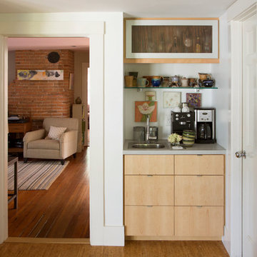
Blending contemporary and historic styles requires innovative design and a well-balanced aesthetic. That was the challenge we faced in creating a modern kitchen for this historic home in Lynnfield, MA. The final design retained the classically beautiful spatial and structural elements of the home while introducing a sleek sophistication. We mixed the two design palettes carefully. For instance, juxtaposing the warm, distressed wood of an original door with the smooth, brightness of non-paneled, maple cabinetry. A cork floor and accent cabinets of white metal add texture while a seated, step-down peninsula and built in bookcase create an open transition from the kitchen proper to an inviting dining space. This is truly a space where the past and present can coexist harmoniously.
Photo Credit: Eric Roth
 Lauren Smyth
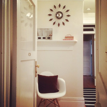
Small trendy medium tone wood floor entryway photo in Boise with white walls and a white front door
6