
Search results for "Challenging" in Home Design Ideas
 b. van hecke
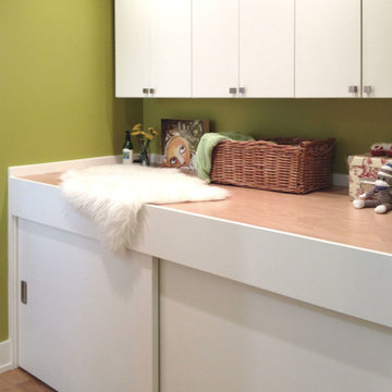
The SATO1 project was a 1000 square foot condo remodel. The focus of the project was on small home space planning. Designer Bethany Pearce / Van Hecke was challenged with creating solutions for a home office, baby's room as well as improved flow in dining/kitchen and living room.
Designed by Bethany Pearce / Van Hecke of Capstone Dwellings Design-Build
Carpentry by Greg of AusCan Fine Carpentry on Vancouver Island.
 Casework Inter Design
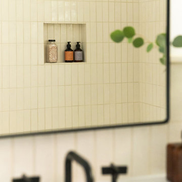
Varaluz - Kye Rounded Rectangle Mirror
MIRROR: Varaluz
When selecting a vanity mirror, I started by considering style and size once the vanity is finalized. As a rule, an every day mirror should measure smaller than the vanity and be at least 6’ high. For my bath, I selected the Kye Black Rounded Corner Mirror from Varaluz. It’s narrow enough for two sconces to sit on each side without being wider than my vanity and tall enough for someone over 6’ to look into it without ducking. The rounded corners and the matte black steel frame compliment the gentle curved lines of the Watermark faucet.
 DesignARC
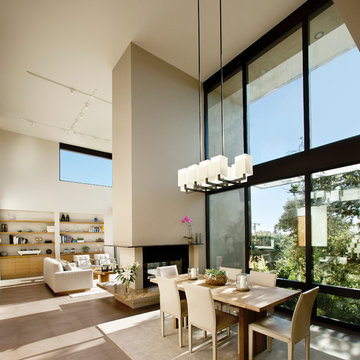
The Tice Residences replace a run-down and aging duplex with two separate, modern, Santa Barbara homes. Although the unique creek-side site (which the client’s original home looked toward across a small ravine) proposed significant challenges, the clients were certain they wanted to live on the lush “Riviera” hillside.
The challenges presented were ultimately overcome through a thorough and careful study of site conditions. With an extremely efficient use of space and strategic placement of windows and decks, privacy is maintained while affording expansive views from each home to the creek, downtown Santa Barbara and Pacific Ocean beyond. Both homes appear to have far more openness than their compact lots afford.
The solution strikes a balance between enclosure and openness. Walls and landscape elements divide and protect two private domains, and are in turn, carefully penetrated to reveal views.
Both homes are variations on one consistent theme: elegant composition of contemporary, “warm” materials; strong roof planes punctuated by vertical masses; and floating decks. The project forms an intimate connection with its setting by using site-excavated stone, terracing landscape planters with native plantings, and utilizing the shade provided by its ancient Riviera Oak trees.
2012 AIA Santa Barbara Chapter Merit Award
Jim Bartsch Photography
Find the right local pro for your project
 Zieba Builders, Inc.
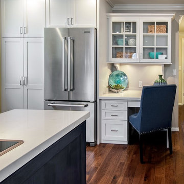
Our clients loved the location of their duplex home with its peak-a-boo ocean view, but their existing kitchen was not suited for their growing family. They wanted a kitchen with a coastal vibe, plenty of storage space, and an eat-in area.
We started by bringing the far wall into the kitchen space to accommodate a large panty and communication center for the family. Doing this allowed us to move the refrigerator out of the main traffic area and doubled the amount of storage space. Several new windows were added to bring in natural light. A half wall was moved to allow more countertop area and open up sight lines. The previously awkwardly shaped island was slimmed down to create better flow.
There were a few venting challenges to overcome; gas lines and plumbing had to be re-routed without disturbing the unit below. To open up sight lines, soffits were eliminated which allowed the extension of cabinets to the ceiling. To stay within the homeowner’s budget, we match existing scraped flooring by lacing in and repairing patches.
The old dining area was too small for table, so we designed and built a custom banquette to maximize the space and take advantage of the outdoor views. The overall space works for family meals as well as entertaining.
A light summer palette was used to reflect the shades of the sand, sea and sky. Even though the new kitchen is actually smaller than the original space, its now far more functional and open.
 Ecoscape Environmental Design
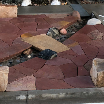
Eco-Products reached out to Ecoscape with a new project in the spring of 2019. They were looking for help with water/drainage diversion challenge at their commercial property in central Boulder. The company's employee break room is adjacent to this parking area, so there was hope to make an outside 'break room' as part of the scope of work. End result is a robust drainage channel for the rooftop gutter water to flow-thru, and a low-maintenance patio space for the employees to enjoy!
 Kimberlee Marie Interiors
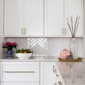
When my clients purchased this charming 1940's home in the Seattle neighborhood of Wedgwood, they were amazed by how intact the original kitchen was. It was like a perfect time capsule. The color palette was avocado green and buttercream yellow. The highlights were an original retro built-in banquette and vintage oven! The challenge we faced (besides the awesome but dated finishes) was the closed floor plan typical in this era of homes and the lack of storage. So, we opened the kitchen to the adjacent dining and living room, bringing it up to speed with modern-day living. In opening it up, we also walled off a doorway that went from the kitchen to the hallway, but it was completely unnecessary and allowed us to gain an entire wall of cabinets that didn't exist previously.
For the finishes, we kept it classic with mostly gray and white but brought in a little flare and interest with the herringbone backsplash and brushed brass finishes because who doesn't love a little gold? Also, we added color with the finishing details like the rug and countertop decor because those things are a great way to add interest and warmth to a space and can be easily changed when it's time for a fresh new look.
 Nathan Taylor for Obelisk Home
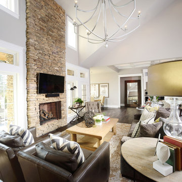
Preliminary architecture renderings were given to Obelisk Home with a challenge. The homeowners needed us to create an unusual but family friendly home, but also a home-based business functioning environment. Working with the architect, modifications were made to incorporate the desired functions for the family. Starting with the exterior, including landscape design, stone, brick and window selections a one-of-a-kind home was created. Every detail of the interior was created with the homeowner and the Obelisk Home design team.
Furnishings, art, accessories, and lighting were provided through Obelisk Home. We were challenged to incorporate existing furniture. So the team repurposed, re-finished and worked these items into the new plan. Custom paint colors and upholstery were purposely blended to add cohesion. Custom light fixtures were designed and manufactured for the main living areas giving the entire home a unique and personal feel.
Photos by Jeremy Mason McGraw


 DesignARC
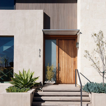
The Tice Residences replace a run-down and aging duplex with two separate, modern, Santa Barbara homes. Although the unique creek-side site (which the client’s original home looked toward across a small ravine) proposed significant challenges, the clients were certain they wanted to live on the lush “Riviera” hillside.
The challenges presented were ultimately overcome through a thorough and careful study of site conditions. With an extremely efficient use of space and strategic placement of windows and decks, privacy is maintained while affording expansive views from each home to the creek, downtown Santa Barbara and Pacific Ocean beyond. Both homes appear to have far more openness than their compact lots afford.
The solution strikes a balance between enclosure and openness. Walls and landscape elements divide and protect two private domains, and are in turn, carefully penetrated to reveal views.
Both homes are variations on one consistent theme: elegant composition of contemporary, “warm” materials; strong roof planes punctuated by vertical masses; and floating decks. The project forms an intimate connection with its setting by using site-excavated stone, terracing landscape planters with native plantings, and utilizing the shade provided by its ancient Riviera Oak trees.
2012 AIA Santa Barbara Chapter Merit Award
Jim Bartsch Photography
 TKS Design Group
Free ebook, Creating the Ideal Kitchen. DOWNLOAD NOW
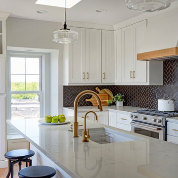
Our clients came to us looking to do some updates to their new condo unit primarily in the kitchen and living room. The couple has a lifelong love of Arts and Crafts and Modernism, and are the co-founders of PrairieMod, an online retailer that offers timeless modern lifestyle through American made, handcrafted, and exclusively designed products. So, having such a design savvy client was super exciting for us, especially since the couple had many unique pieces of pottery and furniture to provide inspiration for the design.
The condo is a large, sunny top floor unit, with a large open feel. The existing kitchen was a peninsula which housed the sink, and they wanted to change that out to an island, relocating the new sink there as well. This can sometimes be tricky with all the plumbing for the building potentially running up through one stack. After consulting with our contractor team, it was determined that our plan would likely work and after confirmation at demo, we pushed on.
The new kitchen is a simple L-shaped space, featuring several storage devices for trash, trays dividers and roll out shelving. To keep the budget in check, we used semi-custom cabinetry, but added custom details including a shiplap hood with white oak detail that plays off the oak “X” endcaps at the island, as well as some of the couple’s existing white oak furniture. We also mixed metals with gold hardware and plumbing and matte black lighting that plays well with the unique black herringbone backsplash and metal barstools. New weathered oak flooring throughout the unit provides a nice soft backdrop for all the updates. We wanted to take the cabinets to the ceiling to obtain as much storage as possible, but an angled soffit on two of the walls provided a bit of a challenge. We asked our carpenter to field modify a few of the wall cabinets where necessary and now the space is truly custom.
Part of the project also included a new fireplace design including a custom mantle that houses a built-in sound bar and a Panasonic Frame TV, that doubles as hanging artwork when not in use. The TV is mounted flush to the wall, and there are different finishes for the frame available. The TV can display works of art or family photos while not in use. We repeated the black herringbone tile for the fireplace surround here and installed bookshelves on either side for storage and media components.
Designed by: Susan Klimala, CKD, CBD
Photography by: Michael Alan Kaskel
For more information on kitchen and bath design ideas go to: www.kitchenstudio-ge.com
 Kathleen Jacobson, The Couture Closet
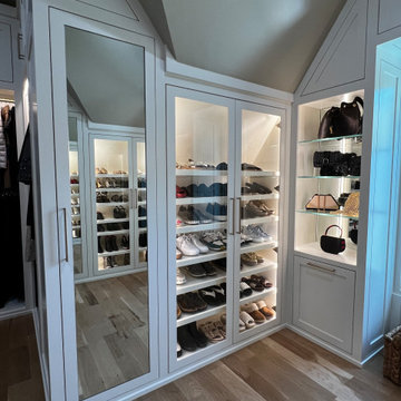
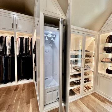
Built right below the pitched roof line, we turned this challenging closet into a beautiful walk-in sanctuary. It features tall custom cabinetry with a shaker profile, built in shoe units behind glass inset doors and two handbag display cases. A long island with 15 drawers and another built-in dresser provide plenty of storage. A steamer unit is built behind a mirrored door.
 Caliper Farms Nursery and Landscape Services
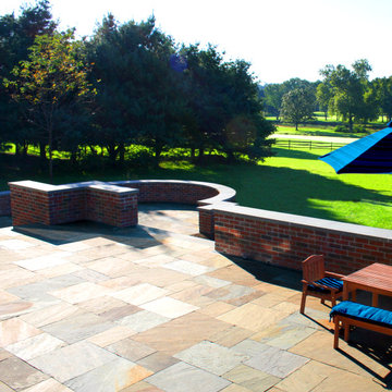
Ahhh. A heavenly house high up in the hills that you happily call home. But, what about the massive grade change that the builder left behind? Terracing your landscape and hardscape is the answer and a challenge that we will always readily accept!
Contact us today for fresh ideas and inspiration! Proudly serving Central New Jersey for over 35 years! 908.904.9446
#caliperfarms #calipercare #terracing #masonry #brickandbluestone #landscaping #hardscaping #gardening #montgomerynj #bellemeadnj #princetonnj #hopewellnj #penningtonnj #skillmannj #lawrencevillenj
 Casework Inter Design
Varaluz - Kye Rounded Rectangle Mirror
MIRROR: Varaluz
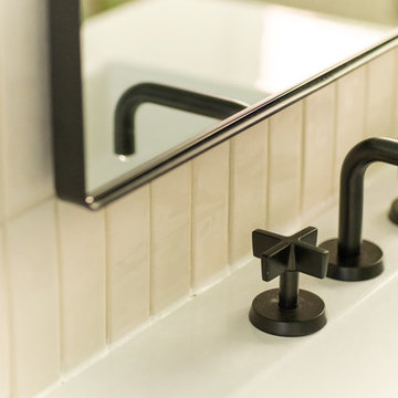
When selecting a vanity mirror, I started by considering style and size once the vanity is finalized. As a rule, an every day mirror should measure smaller than the vanity and be at least 6’ high. For my bath, I selected the Kye Black Rounded Corner Mirror from Varaluz. It’s narrow enough for two sconces to sit on each side without being wider than my vanity and tall enough for someone over 6’ to look into it without ducking. The rounded corners and the matte black steel frame compliment the gentle curved lines of the Watermark faucet.
 Kathleen Jacobson, The Couture Closet
Built right below the pitched roof line, we turned this challenging closet into a beautiful walk-in sanctuary. It features tall custom cabinetry with a shaker profile, built in shoe units behind glass inset doors and two handbag display cases. A long island with 15 drawers and another built-in dresser provide plenty of storage. A steamer unit is built behind a mirrored door.
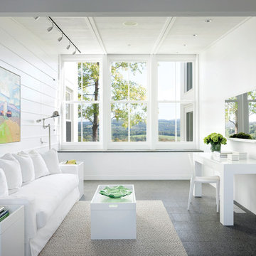
Example of a mid-sized country freestanding desk home office design in New York with white walls and no fireplace



 Bon Brise Design, Inc.
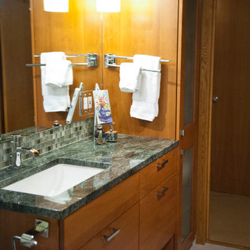
A challenge with this bath was the sloping ceiling... it was a real trick to properly spec and install the floor-to-ceiling cabinet.
Photo by: Ruben Cantu Media
 Casework Inter Design
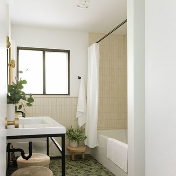
Pratt & Larson - Custom Blend Tile - Green Variation with custom matte black vanity
P&L has hundreds of simple to highly detailed tile patterns and their color palette is expansive. The colors range from classic Craftsman to contemporary and they have the ability to customize glaze colors as well as a custom blend of colors like the one I selected for my floor tile (shown above). For the floor, I chose a mix of the matte Craftsman color palette - C50 - 50%, C60 - 25%, C350 - 25%, in the 5” diamond shape. Because these tiles are hand glazed, there is a subtle variation that makes each piece unique.
This tile has so much personality and character. It adds a rich layer which P&L calls rustic but when used with a contemporary shape the combination is that perfect blend of old and new.
17