
Search results for "Changing" in Home Design Ideas
 FINNE Architects
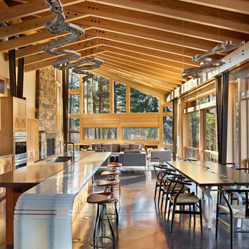
The Mazama house is located in the Methow Valley of Washington State, a secluded mountain valley on the eastern edge of the North Cascades, about 200 miles northeast of Seattle.
The house has been carefully placed in a copse of trees at the easterly end of a large meadow. Two major building volumes indicate the house organization. A grounded 2-story bedroom wing anchors a raised living pavilion that is lifted off the ground by a series of exposed steel columns. Seen from the access road, the large meadow in front of the house continues right under the main living space, making the living pavilion into a kind of bridge structure spanning over the meadow grass, with the house touching the ground lightly on six steel columns. The raised floor level provides enhanced views as well as keeping the main living level well above the 3-4 feet of winter snow accumulation that is typical for the upper Methow Valley.
To further emphasize the idea of lightness, the exposed wood structure of the living pavilion roof changes pitch along its length, so the roof warps upward at each end. The interior exposed wood beams appear like an unfolding fan as the roof pitch changes. The main interior bearing columns are steel with a tapered “V”-shape, recalling the lightness of a dancer.
The house reflects the continuing FINNE investigation into the idea of crafted modernism, with cast bronze inserts at the front door, variegated laser-cut steel railing panels, a curvilinear cast-glass kitchen counter, waterjet-cut aluminum light fixtures, and many custom furniture pieces. The house interior has been designed to be completely integral with the exterior. The living pavilion contains more than twelve pieces of custom furniture and lighting, creating a totality of the designed environment that recalls the idea of Gesamtkunstverk, as seen in the work of Josef Hoffman and the Viennese Secessionist movement in the early 20th century.
The house has been designed from the start as a sustainable structure, with 40% higher insulation values than required by code, radiant concrete slab heating, efficient natural ventilation, large amounts of natural lighting, water-conserving plumbing fixtures, and locally sourced materials. Windows have high-performance LowE insulated glazing and are equipped with concealed shades. A radiant hydronic heat system with exposed concrete floors allows lower operating temperatures and higher occupant comfort levels. The concrete slabs conserve heat and provide great warmth and comfort for the feet.
Deep roof overhangs, built-in shades and high operating clerestory windows are used to reduce heat gain in summer months. During the winter, the lower sun angle is able to penetrate into living spaces and passively warm the exposed concrete floor. Low VOC paints and stains have been used throughout the house. The high level of craft evident in the house reflects another key principle of sustainable design: build it well and make it last for many years!
Photo by Benjamin Benschneider

 Chango
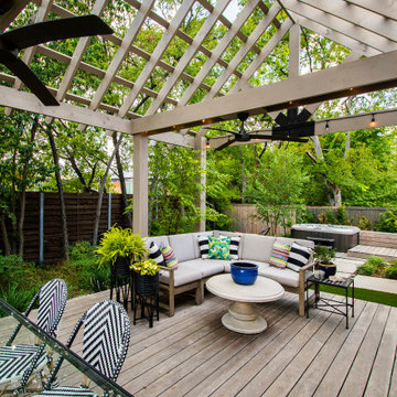
Interior Design, Custom Furniture Design, & Art Curation by Chango & Co.
Photography by Raquel Langworthy
See the project in Architectural Digest
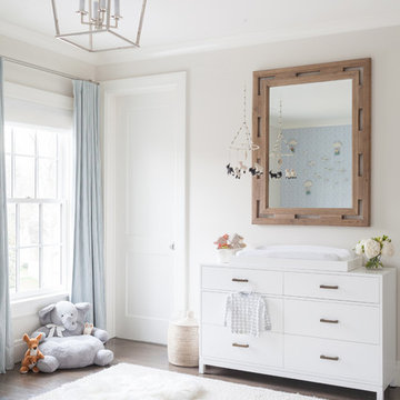
Huge transitional boy dark wood floor nursery photo in New York with blue walls
Huge transitional boy dark wood floor nursery photo in New York with blue walls
Find the right local pro for your project
 J & J Design Group, LLC.
Photos by John Woodcock
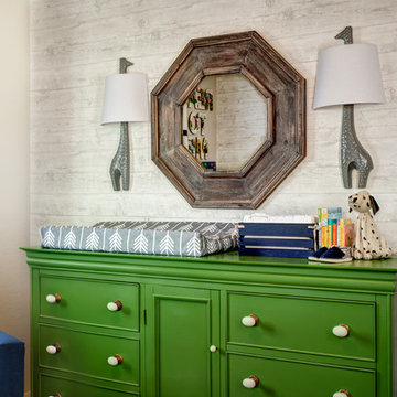
Inspiration for a transitional kids' room remodel in Phoenix
Inspiration for a transitional kids' room remodel in Phoenix
 User
UserStacy Zarin Photography
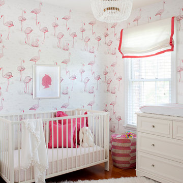
Inspiration for a mid-sized transitional girl medium tone wood floor nursery remodel in New York with multicolored walls
Inspiration for a mid-sized transitional girl medium tone wood floor nursery remodel in New York with multicolored walls
 N-Hance
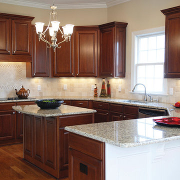
Rethink Refinishing® with a complete cabinet Color Change. This process involves a much more dramatic effect than the other cabinet services such as traditional refinishing, refacing or even replacement. Often the change will involve going from a golden oak or whitewash finish to a cherry, walnut or black tone. You will love the result of this transformation. It’s a great way to give your kitchen a new look and change the entire feel of a room. At 1/3rd the cost of refacing and 1/5th the cost of replacement, you'll love the brilliant results and the cost savings.
All of our processes use our Lightspeed Plus® refinishing process which cures instantly with a powerful U.V. light. Our process requires no sanding and all our solutions are virtually odorless – so there’s No Dust. No Mess. No Odor®. With Lightspeed, expect a beautifully refinished kitchen with little to no down time.
 Holly Bender Interiors
Scott Hargis Photography
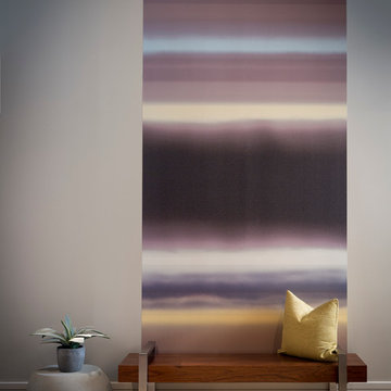
Home design - modern home design idea in San Francisco
Home design - modern home design idea in San Francisco
Sponsored
Fredericksburg, OH

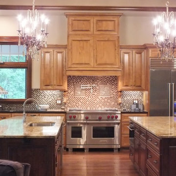
High Point Cabinets
Columbus' Experienced Custom Cabinet Builder | 4x Best of Houzz Winner
 CG&S Design-Build
Kids Room
Photo by Tre Dunham
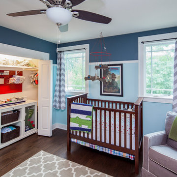
Mid-sized transitional boy dark wood floor and brown floor nursery photo in Austin with blue walls
Mid-sized transitional boy dark wood floor and brown floor nursery photo in Austin with blue walls
 Tim Barber Architects
Karyn Millet Photography
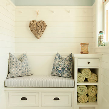
Inspiration for a coastal entryway remodel in Los Angeles with blue walls
Inspiration for a coastal entryway remodel in Los Angeles with blue walls
 Andrew Mikhael Architect
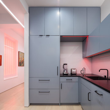
House parties are a regular event here and inspired many of our design decisions. The front door opens directly into the kitchen - the center of party action. I designed the cabinetry as a geometric composition that plays off the art and the feel of a gallery home.
Photos by Brad Dickson
 Advance Design Studio, Ltd.
After six years of living in their Huntley IL home, Chris and Meghan were tired of their dark, dingy, outdated kitchen and it was finally time for a long-anticipated change. “The kitchen is the place where we live, it’s where we do everything,” Meghan said. “It was important that it be a space where we wanted to be.” Meghan loves cooking and enjoys including their girls in healthy meal prepping, this led them to want a brighter, more enjoyable kitchen with increased functionality and improved storage.
For Chris especially, the laundry room was an entirely dysfunctional eyesore. “We had a washer and a dryer, but it was all kind-of cobbled together!” Chris said. “There were always laundry piles everywhere, we weren’t really sure what we wanted to do in there, but it was time for us to make a change.” The mess of the space was stressful every time they walked in the door from the garage each day. Kids’ backpacks and shoes piled up haphazardly in the makeshift boot-bench closet left the family feeling disorganized and stressed. They needed space for folding clothes and locker cubbies to help keep the family organized.
Having known Christine and Todd in the Huntley community for years, Chris and Meghan were familiar with their work. “We already trusted them personally and having seen their projects for years we knew they did top notch work. After we reviewed the initial round of designs, we knew that hiring them was definitely the right choice,” Meghan and Chris said. Although Chris had done a lot of work in their home himself, the kitchen and laundry room renovation was such a large undertaking that he didn’t want to steal time away from his family to spend what would surely be many long weekends doing the job himself. “That would not have been a wise choice for us,” Chris laughed.
“Our designer, Michelle was very, very, easy to work with; anything we wanted to see or weren’t sure about, she went above and beyond to make this easy for us. She was easy to get hold of and always quick to respond,” the couple said. Michelle pulled ideas that mirrored the couple’s taste and style and was adept at directing the couple to limited choices that didn’t overwhelm them and kept the process moving. “I have a hard time making decisions. Michelle made the decision-making process so easy. I loved how she listened to what I liked and then presented three great options for me to choose from,” Meghan said.
The main objectives for the kitchen were better storage solutions, they wanted the space to reflect their lifestyle and taste, and they wanted it to last for years with low maintenance. One of the first steps in creating a more functional kitchen was relocating the refrigerator, creating an improved workflow for the busy family.
“We didn’t know that we could even move the refrigerator to a new location where it is now, that was something that we never would have thought of,” Chris said. “The new refrigerator location makes the kitchen feel so much bigger. We didn’t add any space, but our whole kitchen with the new design just seems like it’s so much larger than before!” Meghan said.
The perimeter mist colored cabinets helped warm and brighten the entire room, while the graphite colored cabinets on the island added contrast. Using this fresh, clean color palette satisfied the couple’s desire for a bright space that was the exact opposite of what they had before. Organization accessories were also added to the cabinets such as a spice drawer tray and roll outs to create hidden convenience.
“I absolutely love the hidden spices – it makes cooking so much more enjoyable!” Chris said. “And all the pull outs, and the double trash bin, who would think you could get so excited about organization!” the couple said in unison.
One thing they hated in their original kitchen was how dark the space felt. Added lighting on the ceiling with the new light fixtures combined with the lighter cabinetry colors throughout solved this problem. “Our new kitchen has this warm, almost cozy feeling that our old kitchen never had, it’s just a space that I love spending my time in now,” Meghan said. The light airy feeling was accentuated with the use of floating white shelves on either side of the decorative range hood. “We have so much cabinetry space, the new design is amazing we actually have more storage space than we will ever need,” Meghan said.
The island was extended to create more work surface and added space for stool seating. “The new island changes how we live. Now the kids can be in the kitchen with us, doing homework, eating breakfast, and the three of us have special dinners there when Chris is working late,” Meghan said.
The Carrara Marmi Quartz countertops were chosen because they are, not only beautiful, but are made from hard-working material that doesn’t require maintenance. The white subway tile backsplash that wraps to the ceiling behind the focal point cooktop range/hood compliments the crisp white countertops perfectly, while brushed brass hardware and light fixtures keep the design fresh and new.
The couple had a few fears at the beginning of the project, as most homeowners do. Their biggest fear was being out of their kitchen and laundry room for an extended time. The crew made it very easy for the family to work in a limited space keeping the washer and dryer hooked up the majority of the time, and also getting appliances working with minimal downtime.
“They above and beyond accommodated us to get us through the process,” Meghan said. “They did a great job making sure we were as comfortable as possible throughout the process,” Chris added.
“Our project manager DJ did a great job. He was very good at updating us on schedule changes, getting guys in as quickly as possible. Everyone that stepped in the house was nice and did great work,” said Chris. They thought Advance’s carpenter was phenomenal and were impressed when he took a conceptual idea from a photograph and worked with designer Michelle to create a one of a kind range/hood that has become the topic of conversation with friends and family who visit the new kitchen. “He was in our house literally every day for several weeks. He was easy to work with and good at what he did,” Meghan and Chris said.
The focal point of the kitchen; a hand-crafted, custom-built ventilation hood was clad with handpicked reclaimed barnwood. Advance Design’s carpenter built the framework and the cladding to create a one-of-a-kind design element that the couple loves.
“I think it was especially fun for him to create something unique from scratch, showcasing his talent in this area,” Meghan said. “I love that my kitchen is not like everyone else’s. I got to pick out the wood on my hood and watch it being built and was able to choose what pieces of wood went where on it. It’s totally unique.”
Red Oak flooring was toothed-in throughout the kitchen and the rest of the first floor anywhere changes were made. Then the whole floor was refinished to tone down the orange undertones in the existing floor stain, ultimately changing the color complexion of the entire first floor. The result is a completely new feeling to the entire home.
Renovating the laundry room was extremely important to Meghan and Chris, but they had trouble visualizing what the possibilities were for the seemingly small space. Michelle produced beautiful 3D illustrations that helped them envision the space in a whole new way.
“I must have told Michelle 100 times that I am a visual person, seeing the designs in 3D made it so easy to make decisions and see what we could really do with our space,” Meghan said.
A dividing wall and doorway were removed between the existing laundry room and hallway formerly containing a coat closet, providing space to design specialized graphite colored cabinetry matching the kitchen island to house custom storage cubbies for each family member. Adding the tall utility cabinetry in the new laundry area helped solve the storage issue, tucking away cleaning supplies, household items, and even the cat got its own cubby.
“I love how everything is now hidden in its own space. I can’t tell you how much I hated coming home and seeing everything sitting around on counters,” Chris said.
Electrical outlets were planned for the inside of utility cabinets, so devices could charge in hidden locations. Stacking the washer and dryer allowed for wider countertop space to provide a folding area and a special space for clothes to hang. “The way I do laundry has been completely transformed! I can actually fold clothes and hang them now right out of the washer and dryer,” Meghan said.
“The end result in the kitchen and the laundry/mud room was an updated light and bright space, with a smarter work flow that better meets the needs of this family,” Michelle said.
“I would totally recommend Advance Design,” Meghan said. “Sometimes I sit and just look at my kitchen and laundry room and think ‘Wow, I can’t believe I get to live here!’ It’s an understatement to say we love our new space.”
 Adrienne DeRosa
Adrienne DeRosa © 2014 Houzz Inc.
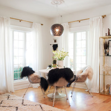
Along with the living room, this dining area has received a style overhaul. "Everything in the informal dining space as well as the living room is new," Jennifer explains. "I changed it all; the walls used to be grey and the furniture used to be off white. I had antique chippy paint cabinets and all kinds of french decor ... I have evolved from that and now want simple, fun and bright."
Starting with painting the walls white, Jennifer let the room evolve as she went. "Then I started to move the furniture around to see what I had, to make sure it worked," she describes. From there it became a process of eliminating and adding back in. The brass shelving was a "picking" find that Jennifer retrieved from the side of the road.
By emphasizing the large windows with white drapery, and adding in soft textural elements, Jennifer created a fresh space that exudes depth and comfort. "I would never want anyone to ever come in and say they don't feel comfortable. I feel I have created that chic, fun, eclectic style space that anyone of any age can enjoy and feel comfortable in."
Curtain rods, pendant lamp: West Elm; chairs: vintage Russell Woodard, Etsy
Adrienne DeRosa © 2014 Houzz
 Adrienne DeRosa
Photo: Adrienne DeRosa © 2015 Houzz
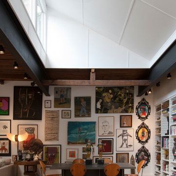
Save for a few refinements, the layout of the space took shape exactly as Weiss had envisioned it from day one. Knowing that they were looking to design a loft-like environment, the couple kept to an open layout for the majority of the living space.
One of the most fantastic features of the space is a bank of clerestory windows that flood the interior with seemingly endless amounts of daylight. Originally added back when the building served as an artist studio, Weiss and Carpenter agreed that keeping them was a must. "The only original part of the house is the ceiling and the existing skylights and clerestory," Weiss describes. "We basically changed everything else."
The ceiling compliments the contents of the environment, but also continues the story of the homeowners' design philosophy. "We loved the original wood and steel ceiling, including steel beams forged at the Carnegie Steel Works," Carpenter explains. "In coming up with our design approach, we wanted to reflect some of the previous uses of the structure ... Keeping elements from the past not only
interested us aesthetically." he says, "It was important to us to reuse structures and objects in ways that are close to their originally intended use."
 TKS Design Group
Free ebook, Creating the Ideal Kitchen. DOWNLOAD NOW
Designed by: Susan Klimala, CKD, CBD
Photography by: LOMA Studios
For more information on kitchen and bath design ideas go to: www.kitchenstudio-ge.com
 Pool Environments, Inc.
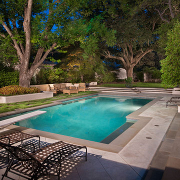
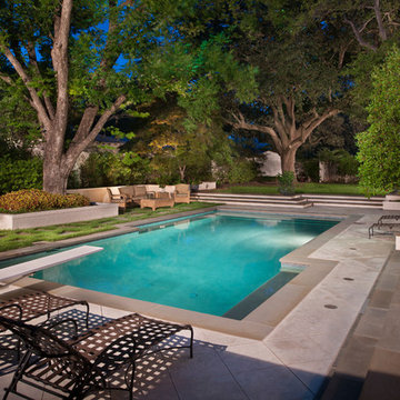
Originally designed by one of the most notable landscape architects in town, this once impressive project had faltered in recent years. The pool and spa still functioned well, and the client wanted to keep it intact. In addition, they wanted to keep as much of the existing landscaping as possible. The surrounding decks, walls, and steps were fair game. At first glance, one might think that our changes were simple material changes. Upon closer inspection, however, one can see the subtle, yet transformative changes that come together to update this classic pool in a tasteful, timeless manner, and improve the flow and usability of the deck areas, while softening the feel of the massive hardscape.
The subtle changes begin as soon as you walk out the back door of the house. The existing decking had a lot of what we call “tweeners”; areas that are overly generous walkways, yet not large enough to house furniture. The awkwardly small bluestone patio was expanded to accommodate a generous seating area, by pushing the step-down closer to the pool. Our talented stone mason carefully married the new bluestone into the existing, resulting in an imperceptible difference between the two. As you descend the new bluestone steps to the pool level, your bare feet will be thankful for the new smooth-finished limestone colored concrete, with a hand cut pattern carefully etched into its surface. The old red brick decking was so hot that the owners could not walk around the pool in bare feet. The brick coping was also replaced with an eased edge Pennsylvania Premier Stone which matches the new step treads throughout the project. Between the house and the pool, a large raised planter was reconfigured, giving additional space to the pool deck for a shaded lounge chair area.
Across the pool, a bank of rather tall painted brick retaining walls were cut down, shortened, and moved. This lessened the visual impact of the walls, which were rather overwhelming in the space, as well as opening up a new seating area, nestled under the arms of the massive pecan at the back of the property. Rather than continuing solid decking around the entire pool, the area near these walls has been transformed to large stone stepper pads set in a sea of beautiful St. Augustine lawn. This creates a visually softened area that is still suited to setting tables and chairs when the guest list calls for additional seating.
The spa area is quite possibly the most dramatic change on this project. Yet more raised planter walls divided this area into awkward spaces, unsuited to proper furniture placement. The planters were removed, new stone decks, once again expertly married into the existing, opening the area to house a large dining table and new built in bbq area. The spa itself was re-imagined with the bluestone coping, and painted brick veneer. The most impressive addition though is the new handmade glazed tiles that surround the existing cast stone water feature. This water feature was almost unnoticeable against the painted brick wall, but now the dramatic arch and pop of color draw the eye to this quaint little corner of the property.
 Randy Angell Designs
The subtle changes begin as soon as you walk out the back door of the house. The existing decking had a lot of what we call "tweeners"; areas that are overly generous walkways, yet not large enough to house furniture. The awkwardly small bluestone patio was expanded to accommodate a generous seating area. This was done by pushing the step-down closer to the pool.
Our talented stone mason carefully married the new bluestone into the existing portion of the patio, resulting in an imperceptible difference between the two.
As you descend the new bluestone steps to the pool level, your bare feet will be thankful for the new smooth-finished, limestone-colored concrete, with a hand cut pattern carefully etched into it's surface.
The old red brick decking was so hot that the owners could not walk around the pool with their bare feet. The brick coping was also replaced with an eased edge, Pennsylvania Premier Stone which matches the new step treads throughout the project.
Between the house and the pool, a large raised planter was reconfigured, giving additional space to the pool deck for a shaded lounge chair area. Across the pool, a bank of rather tall painted brick retaining walls were cut down, shortened and moved. This lessened the visual impact of the walls (which were overwhelming in the space) and also opened up a new seating area, nestled under the arms of the massive Pecan tree at the back of the property.
Rather than continuing solid decking around the entire pool, the area near these walls has been transformed to large stone stepper pads set in a sea of beautiful St. Augustine lawn. This creates a visually softened area that is still suited to setting tables and chairs when the guest list calls for additional seating.
The spa area is possibly the most dramatic change on this project. Yet more raised planter walls divided this area into awkward spaces, unsuited for proper furniture placement. The planters were removed, new stone decks added, and once again expertly married into the existing decks, opening the area to house a large dining table and a newly built-in BBQ area.
The spa itself was re-imagined with the bluestone coping and painted brick veneer. The most impressive addition though is the new handmade glazed tiles that surround the existing cast stone water feature. This water feature was almost unnoticeable against the painted brick wall, but now the dramatic arch and pop of color draw the eye to this quaint little corner of the property.
Originally designed by one of the most notable landscape architects in town, this once impressive project had faltered in recent years. The pool and spa still functioned well, and the client wanted to keep it intact. In addition, they wanted to keep as much of the existing landscape as possible. But, the surrounding decks, walls and steps were fair game.
At first glance, one might think that our changes were simple material changes. However, upon closer inspection, one can see the subtle-yet-transformative changes that came together to update this classic pool in a tasteful, timeless manner, as well as to improve the flow and usability of the deck areas, while softening the feel of this massive hardscape.
 Nanette Wong
Photo: Nanette Wong © 2014 Houzz
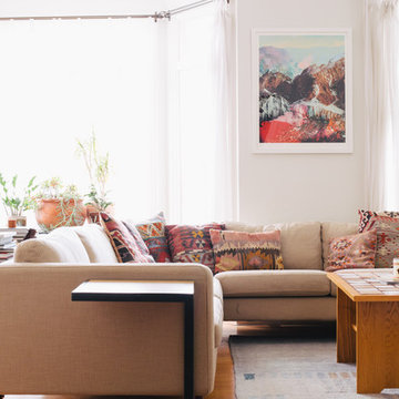
Inspiration for a small eclectic living room remodel in San Francisco
Inspiration for a small eclectic living room remodel in San Francisco
 Finnleo Sauna
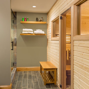
Beautiful Finnleo custom sauna project. The sauna includes the Himalaya rock tower heater with mobile app and BWT (BioWater Technique) and Nordic Spruce and Abachi interior. Adjacent to the sauna is a fitness room with great views to the outdoors, a roomy changing area, shower & bathroom.

 Hamilburg Interiors
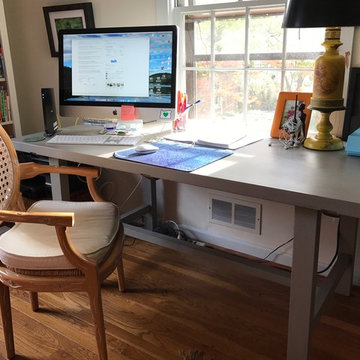
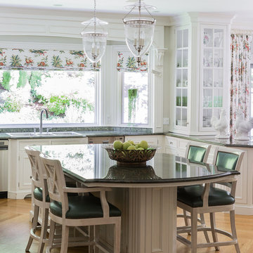
Inspiration for a mid-sized timeless l-shaped light wood floor and beige floor eat-in kitchen remodel in Boston with an island, beaded inset cabinets, white cabinets, granite countertops, stainless steel appliances, window backsplash and green countertops
21