
Search results for "Cleaning solution" in Home Design Ideas
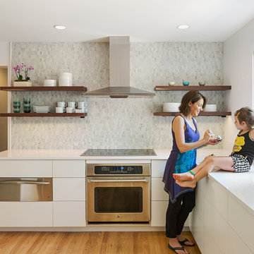
 Osborne Construction
GC: Osborne Construction
Architect: C2 Architecture
Design: Kole Made.
Custom Woodwork + Cabinetry: Loubier Design.
http://www.kolemade.com/ http://www.c2-architecture.com/ http://kirk-loubier.squarespace.com/
Photo Credit: http://www.samoberter.com/

 Organized Living
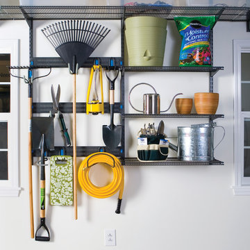
Organized Living freedomRail provides endless possibilities to organize work and gardening tools. Shelves, racks and hooks are all adjustable which is important when it comes to customizing storage to your needs. Perfect for garages, sheds and workshops. See more ways to use freedomRail here: http://www.organizedliving.com/home/products/freedomrail-garage
Find the right local pro for your project
 In Situ Architecture
jeremy bittermann
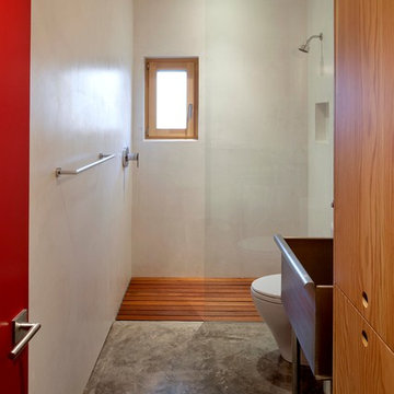
Walk-in shower - contemporary concrete floor walk-in shower idea in Portland with beige walls
Walk-in shower - contemporary concrete floor walk-in shower idea in Portland with beige walls
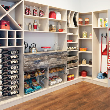
 Diamante Storage Solutions
This pantry design shows how two different cabinetry colors work together to create and unique and beautiful space.
Custom Closets Sarasota County Manatee County Custom Storage Sarasota County Manatee County
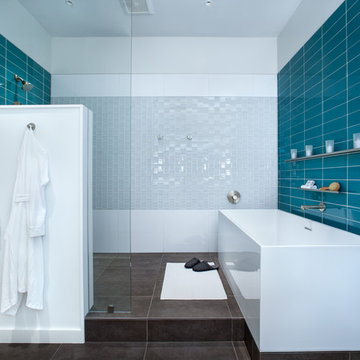
 CG&S Design-Build
• American Olean “Color Appeal” 4” x 12” glass tile in “Fountain Blue” • Interceramic 10” x 24” “Spa” white glazed tile • Daltile “Color Wave” mosaic tile “Ice White Block Random Mosaic” • Stonepeak 12” x 24 “Infinite Brown” ceramic tile, Land series • glass by Anchor Ventana at shower • Slik Mode acrylic freestanding tub • Grohe Concetto tub spout • photography by Paul Finkel



 ABC Closets
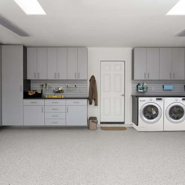
Inspiration for a mid-sized contemporary attached two-car garage workshop remodel in Philadelphia
 Equilibrium Interior Design Inc
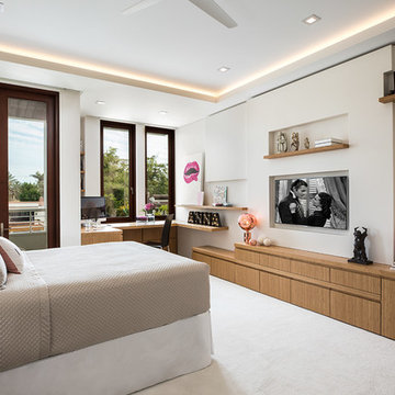
What do teenager’s need most in their bedroom? Personalized space to make their own, a place to study and do homework, and of course, plenty of storage!
This teenage girl’s bedroom not only provides much needed storage and built in desk, but does it with clever interplay of millwork and three-dimensional wall design which provide niches and shelves for books, nik-naks, and all teenage things.
What do teenager’s need most in their bedroom? Personalized space to make their own, a place to study and do homework, and of course, plenty of storage!
This teenage girl’s bedroom not only provides much needed storage and built in desk, but does it with clever interplay of three-dimensional wall design which provide niches and shelves for books, nik-naks, and all teenage things. While keeping the architectural elements characterizing the entire design of the house, the interior designer provided millwork solution every teenage girl needs. Not only aesthetically pleasing but purely functional.
Along the window (a perfect place to study) there is a custom designed L-shaped desk which incorporates bookshelves above countertop, and large recessed into the wall bins that sit on wheels and can be pulled out from underneath the window to access the girl’s belongings. The multiple storage solutions are well hidden to allow for the beauty and neatness of the bedroom and of the millwork with multi-dimensional wall design in drywall. Black out window shades are recessed into the ceiling and prepare room for the night with a touch of a button, and architectural soffits with led lighting crown the room.
Cabinetry design by the interior designer is finished in bamboo material and provides warm touch to this light bedroom. Lower cabinetry along the TV wall are equipped with combination of cabinets and drawers and the wall above the millwork is framed out and finished in drywall. Multiple niches and 3-dimensional planes offer interest and more exposed storage. Soft carpeting complements the room giving it much needed acoustical properties and adds to the warmth of this bedroom. This custom storage solution is designed to flow with the architectural elements of the room and the rest of the house.
Photography: Craig Denis
 Nar Design Group
This client grew up in this 1950’s family home and has now become owner in his adult life. Designing and remodeling this childhood home that the client was very bonded and familiar with was a tall order. This modern twist of original mid-century style combined with an eclectic fusion of modern day materials and concepts fills the room with a powerful presence while maintaining its clean lined austerity and elegance. The kitchen was part of a grander complete home re-design and remodel.
A modern version of a mid-century His and Hers grand master bathroom was created to include all the amenities and nothing left behind! This bathroom has so much noticeable and hidden “POW” that commands its peaceful spa feeling with a lot of attitude. Maintaining ultra-clean lines yet delivering ample design interest at every detail, This bathroom is eclectically a one of a kind luxury statement.
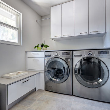
The concept in the laundry room was to create a simple, easy to use and clean space with ample storage and a place removed from the central part of the home to house the necessity of the cats and their litter box needs. There was no need for glamour in the laundry room yet we were able to create a simple highly utilitarian space.
If there is one room in the home that requires frequent visitors to thoroughly enjoy with a huge element of surprise, it’s the powder room! This is a room where you know that eventually, every guest will visit. Knowing this, we created a bold statement with layers of intrigue that would leave ample room for fun conversation with your guests upon their prolonged exit. We kept the lights dim here for that intriguing experience of crafted elegance and created ambiance. The walls of peeling metallic rust are the welcoming gesture to a powder room experience of defiance and elegant mystical complexity.
It's a lucky house guest indeed who gets to stay in this newly remodeled home. This on-suite bathroom allows them their own space and privacy. Both Bedroom and Bathroom offer plenty of storage for an extended stay. Rift White Oak cabinets and sleek Silestone counters make a lovely combination in the bathroom while the bedroom showcases textured white cabinets with a dark walnut wrap.
Photo credit: Fred Donham of PhotographerLink
 CG&S Design-Build
Design by Joanna Hartman
Photography by Ryann Ford
Styling by Adam Fortner
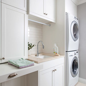
This space features shaker-style cabinets by Amazonia Cabinetry, hardware from Restoration Hardware and Pottery Barn selected by PPOC, Crema Marfil Honed 12x12 floor tile and Rittenhouse 3x6 white gloss backsplash tile, and Benjamin Moore "Stonington Gray" for the accent wall.



Sponsored
Columbus, OH

Wannemacher Interiors
Customized Award-Winning Interior Design Solutions in Franklin Cnty OH

 mdt design
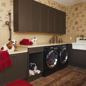
Elegant brown floor laundry room photo in Detroit with a farmhouse sink, shaker cabinets, dark wood cabinets, beige walls and a side-by-side washer/dryer
 Eneia White Interiors
Photo by Jordan Powers
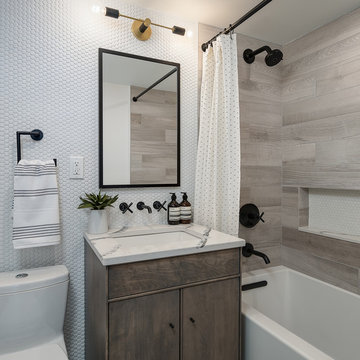
Example of a mid-sized transitional 3/4 gray tile, white tile and mosaic tile bathroom design in New York with flat-panel cabinets, dark wood cabinets, a one-piece toilet, an undermount sink and white countertops
Example of a mid-sized transitional 3/4 gray tile, white tile and mosaic tile bathroom design in New York with flat-panel cabinets, dark wood cabinets, a one-piece toilet, an undermount sink and white countertops
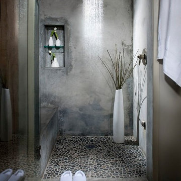
 Melissa Winn Interiors
Urban gray tile pebble tile floor alcove shower photo in San Francisco with gray walls
Sponsored
Columbus, OH

Hope Restoration & General Contracting
Columbus Design-Build, Kitchen & Bath Remodeling, Historic Renovations
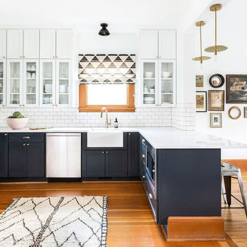
 Heidi Caillier Design
Open concept kitchen - mid-sized farmhouse u-shaped medium tone wood floor and brown floor open concept kitchen idea in Seattle with a farmhouse sink, shaker cabinets, gray cabinets, white backsplash, subway tile backsplash, stainless steel appliances, a peninsula and quartzite countertops
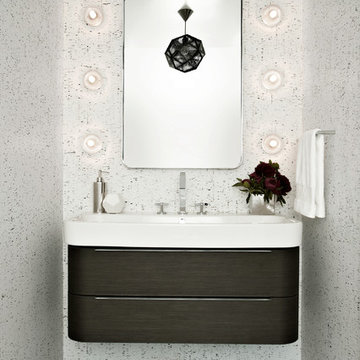


 TKS Design Group
Download our free ebook, Creating the Ideal Kitchen. DOWNLOAD NOW
This client was referred to us from a past client. They are a busy 2-career household with young children and enjoy entertaining friends and family in their home. They have a beautiful open concept home but unfortunately the kitchen was not fitting for the rest of the home. They were not quite sure what to do with the space. We talked about trying to refresh it or do more of a minor remodel, but in the end they decided a full gut would get them to where they wanted to be.
One problem was there was no place for guests to hang out other than the large and awkward banquette area. The brick wall and tiled hood area were feeling a bit dated and tired. The space was just not functional for their lifestyle. There was no prep space near the cooktop and no landing area for items coming out of the ovens or refrigerator, plus a big dead zone in the center of the room.
Banquettes, like the one they previously had in the space, are great for small spaces, but when they get really large like this one, it makes getting in and out of the seating area awkward and uncomfortable. Plus, there was room for a large table, so we eliminated the awkward built in.
We started by removing the faux brick wall between the kitchen and back entry. We relocated the entry to the garage over a couple feet in order to get every last inch out of the new kitchen. We also made the decision to close up the primary window that faced the pretty ho hum brick wall of the neighbor’s house. There was plenty of light coming in from the seating area, so we just didn’t feel the window was adding much to the room.
Construction went smoothy. There was a bit of rework with electrical, flooring and HVAC, but in the end, we think it was well worth it.
The clients really wanted a sleek contemporary look, and we originally had planned for a full height slab backsplash, but due to it’s size, it was a budget buster. Instead, we got creative and settled on large format porcelain tiles that have a similar feel but were a fraction of the cost. We made sure the wall was plumb and level so that the fit and finish would mimic that of slab material.
The final space was quite a change. A large prep sink sits directly across from the new pro-style range with plenty additional prep space on the large island. The refrigerator and ovens now have miles of landing space, and a nice tight work triangle makes cooking a breeze.
Since we wanted a more contemporary feel, not many wall cabinets were included. Instead, we outfitted some of the drawers for dish storage with a peg system. Two large pantries flanking the refrigerator hold baking supplies and small appliances. Large drawers by the cooktop hold pots and pans, and an appliance garage tucked away to the left of the range hides away miscellaneous items. The large island also houses a microwave drawer and tons of storage, most of which is drawers offering maximum convenience.
The island now seats 5-6 people comfortably along with the new table in the seating area which can seat up to 8. Entertaining will be a breeze in this space. With such a clean backdrop, we knew we would need some drama with the lighting, so we chose two sets of staggered pendants, which we adjusted for the right visual balance above the island.
We also included a small coffee station to the right of the main kitchen, which helps keep the coffee clutter out of the kitchen proper. Two tones of complimentary gray are featured in this kitchen. The perimeter is a light gray that reads almost white. The island is a gray stain that adds some depth and interest with the visible wood texture. The countertops are clean white quartz, and the hardware, barstools and light fixtures add warm brass tones. I see lots of cooking and entertaining with family and friends in the near future in this bright and airy new space.
Designed by: Susan Klimala, CKD, CBD
Photography by: Michael Kaskel
For more information on kitchen and bath design ideas go to: www.kitchenstudio-ge.com
1