
Search results for "Client support" in Home Design Ideas
 Living with Lolo
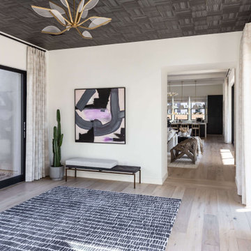
Entry in Bronco | Key Feature: A Scottsdale new-build rooted in sculptural modernism, Bronco Revival balances bold black-and-white contrast with organic textures, natural wood elements, and statement lighting. As a groundbreaking “Live Lab” designer residence, it’s a first-of-its-kind space where luxury furnishings are tested in real-world conditions before being introduced into high-profile client homes.
Challenge: Because Bronco Revival was the designer’s personal residence, the project carried a unique level of pressure and intention. The challenge was creating a Scottsdale new-build that felt elevated and editorial while still functioning as a true family home. Every selection had to balance bold sculptural modernism (high contrast, statement lighting, architectural furnishings) with durability, comfort, and day-to-day livability. In addition, the home served as a “Live Lab,” meaning new vendors, materials, and luxury furnishings needed to be tested in real-life conditions before being trusted for future high-profile client projects.
Solution: We approached the project with a highly curated, test-and-refine design strategy, treating each space as both a finished interior and a real-world evaluation environment. Key furnishings, textiles, and materials were selected to support the modern organic vision while also standing up to the demands of everyday family life. We worked through selections intentionally, layering in bold contrast, natural woods, and sculptural statement pieces, while prioritizing performance materials, pet-friendly durability, and timeless foundational elements. By using the home as a lived-in showroom, we were able to validate what truly performs beautifully, refine our vendor relationships, and confidently carry those proven selections into future client designs.
Materials: MadeGoods: Sculptural Davion coffee tables |
Loloi: Custom performance rug collection |
Schumacher: Bespoke drapery fabrication |
Aesthetic Wall Coverings: Pioneering wallpaper application on ceiling beams |
Zac + Fox: Exclusive textile collaboration via Made Resource Group |
Budget ($ Range): $300K |
Timeline (Duration): 4 MONTHS
 Reico Kitchen & Bath
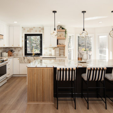
Lauren Hunt from Reico Kitchen and Bath in Charlotte, NC, worked with The Atta Group to design a transitional-inspired kitchen and bar using Masterpiece cabinetry. The kitchen features Masterpiece cabinets in the Martel Evercore doorstyle in a Frost finish on the perimeter.
The kitchen island and bar area both features the same doorstyle with a combination of two different finishes, Riverbed and Shortbread. The countertops are Calacatta Macchia Vecchia Sapien Stone Porcelain.
The client shared their experience, saying, “I love the range hood and the slatted island decor. Riverbed is a beautiful color in both sun and shade. Lauren’s advice to get samples and lay them out in different lighting was invaluable. She went above and beyond, even coming out in the parking lot on a hot summer day to help us. We truly couldn’t have done this without her. Lauren was always patient and supportive as we made decisions, and she never pressured us. Any future projects we have, we’ll 100% reach out to Lauren. She even welcomed our newborn to the showroom!”
Lauren shared, “The clients came with a clear aesthetic vision and plenty of inspiration photos, but they gave me the freedom to recommend and create a space that worked for their growing family while still looking great. We added design details like two-toned dining room cabinets, dark accent shelves in glass towers, an arched valance to match the doorways, and a custom hood that pulls from the island finishes. My favorite element is the slatted accent on the island, which the installers executed perfectly.
This renovation was a big project, starting with a blank slate, which can be overwhelming with so many options. But it was incredibly rewarding to work with these clients who had such a creative vision. We really worked together to create a space that met their needs while showcasing their style. It was a team effort, and I hope that comes through in the final design.”
Photos courtesy of Six Cents Media.
 Living with Lolo
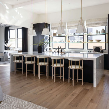
Kitchen in Bronco | Key Feature: A Scottsdale new-build rooted in sculptural modernism, Bronco Revival balances bold black-and-white contrast with organic textures, natural wood elements, and statement lighting. As a groundbreaking “Live Lab” designer residence, it’s a first-of-its-kind space where luxury furnishings are tested in real-world conditions before being introduced into high-profile client homes.
Challenge: Because Bronco Revival was the designer’s personal residence, the project carried a unique level of pressure and intention. The challenge was creating a Scottsdale new-build that felt elevated and editorial while still functioning as a true family home. Every selection had to balance bold sculptural modernism (high contrast, statement lighting, architectural furnishings) with durability, comfort, and day-to-day livability. In addition, the home served as a “Live Lab,” meaning new vendors, materials, and luxury furnishings needed to be tested in real-life conditions before being trusted for future high-profile client projects.
Solution: We approached the project with a highly curated, test-and-refine design strategy, treating each space as both a finished interior and a real-world evaluation environment. Key furnishings, textiles, and materials were selected to support the modern organic vision while also standing up to the demands of everyday family life. We worked through selections intentionally, layering in bold contrast, natural woods, and sculptural statement pieces, while prioritizing performance materials, pet-friendly durability, and timeless foundational elements. By using the home as a lived-in showroom, we were able to validate what truly performs beautifully, refine our vendor relationships, and confidently carry those proven selections into future client designs.
Materials: MadeGoods: Sculptural Davion coffee tables |
Loloi: Custom performance rug collection |
Schumacher: Bespoke drapery fabrication |
Aesthetic Wall Coverings: Pioneering wallpaper application on ceiling beams |
Zac + Fox: Exclusive textile collaboration via Made Resource Group |
Budget ($ Range): $300K |
Timeline (Duration): 4 MONTHS
Find the right local pro for your project
 Living with Lolo
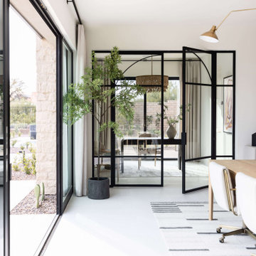
Home Office in Bronco | Key Feature: A Scottsdale new-build rooted in sculptural modernism, Bronco Revival balances bold black-and-white contrast with organic textures, natural wood elements, and statement lighting. As a groundbreaking “Live Lab” designer residence, it’s a first-of-its-kind space where luxury furnishings are tested in real-world conditions before being introduced into high-profile client homes.
Challenge: Because Bronco Revival was the designer’s personal residence, the project carried a unique level of pressure and intention. The challenge was creating a Scottsdale new-build that felt elevated and editorial while still functioning as a true family home. Every selection had to balance bold sculptural modernism (high contrast, statement lighting, architectural furnishings) with durability, comfort, and day-to-day livability. In addition, the home served as a “Live Lab,” meaning new vendors, materials, and luxury furnishings needed to be tested in real-life conditions before being trusted for future high-profile client projects.
Solution: We approached the project with a highly curated, test-and-refine design strategy, treating each space as both a finished interior and a real-world evaluation environment. Key furnishings, textiles, and materials were selected to support the modern organic vision while also standing up to the demands of everyday family life. We worked through selections intentionally, layering in bold contrast, natural woods, and sculptural statement pieces, while prioritizing performance materials, pet-friendly durability, and timeless foundational elements. By using the home as a lived-in showroom, we were able to validate what truly performs beautifully, refine our vendor relationships, and confidently carry those proven selections into future client designs.
Materials: MadeGoods: Sculptural Davion coffee tables |
Loloi: Custom performance rug collection |
Schumacher: Bespoke drapery fabrication |
Aesthetic Wall Coverings: Pioneering wallpaper application on ceiling beams |
Zac + Fox: Exclusive textile collaboration via Made Resource Group |
Budget ($ Range): $300K |
Timeline (Duration): 4 MONTHS
 Renovisions
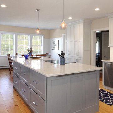
These South Shore of Boston homeowners desired a larger kitchen as their existing had limited space to host family events and entertain guests – they turned to Renovisions to help transform their small, outdated kitchen with separate walk-in pantry into a beautiful, open and spacious inspirational room.
Choosing the right cabinetry for the room and how to meet the needs of the client was critical to the overall success of this design. A traditional style was the framework of the home and the flat paneled doors on the white painted cabinetry support this aspect. Going vertical as possible with cabinets is a trend here to stay; keeping with that idea, we recommended the graceful tall pantry cabinet that flanks one side of the kitchen. This not only lends to an eye-appealing furniture-look, but adds significant storage space, allowing the cabinets to store items they may not use on a regular basis. In this case, the clients are amazed with the amount of storage they’ve gained and one that provides easy access to all interior items. Every inch of space was key to create this optimally functional kitchen. Must-haves such as tray dividers above the refrigerator are handy and the double pull-out trash/recycling bins on the right side of the sink were a simple and clean way to gain floor space and conceal unsightly trash.
The focal point of this kitchen is the expansive, soft-grey colored contrasting island with larger, deeper drawers for pots, pans and platters. The client was excited to switch to an induction chef-series range that featured a divided oven that can accommodate two different temperatures.
Fit and finish is important in any renovation and this certainly holds true in this kitchen project to personalize their space. The custom recessed panel columns with wainscot details add an architectural element that ties into the kitchen cabinet design and Carrera-look quartz countertops which provide a stunning classical look that ties nicely with the overall traditional style. These homeowners are excited to show off their open and spacious Renovision!
“We really enjoyed our new kitchen and it’s amazing improvement over the holidays. We got rave reviews from all of our guests!”
Steve & Mary S. (Duxbury)
 Living with Lolo
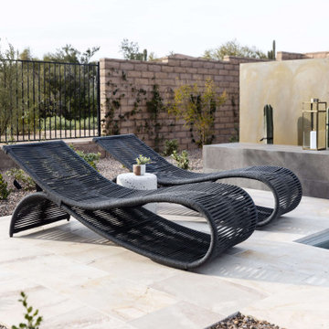
Outdoor Furnishings in Bronco | Key Feature: A Scottsdale new-build rooted in sculptural modernism, Bronco Revival balances bold black-and-white contrast with organic textures, natural wood elements, and statement lighting. As a groundbreaking “Live Lab” designer residence, it’s a first-of-its-kind space where luxury furnishings are tested in real-world conditions before being introduced into high-profile client homes.
Challenge: Because Bronco Revival was the designer’s personal residence, the project carried a unique level of pressure and intention. The challenge was creating a Scottsdale new-build that felt elevated and editorial while still functioning as a true family home. Every selection had to balance bold sculptural modernism (high contrast, statement lighting, architectural furnishings) with durability, comfort, and day-to-day livability. In addition, the home served as a “Live Lab,” meaning new vendors, materials, and luxury furnishings needed to be tested in real-life conditions before being trusted for future high-profile client projects.
Solution: We approached the project with a highly curated, test-and-refine design strategy, treating each space as both a finished interior and a real-world evaluation environment. Key furnishings, textiles, and materials were selected to support the modern organic vision while also standing up to the demands of everyday family life. We worked through selections intentionally, layering in bold contrast, natural woods, and sculptural statement pieces, while prioritizing performance materials, pet-friendly durability, and timeless foundational elements. By using the home as a lived-in showroom, we were able to validate what truly performs beautifully, refine our vendor relationships, and confidently carry those proven selections into future client designs.
Materials: MadeGoods: Sculptural Davion coffee tables |
Loloi: Custom performance rug collection |
Schumacher: Bespoke drapery fabrication |
Aesthetic Wall Coverings: Pioneering wallpaper application on ceiling beams |
Zac + Fox: Exclusive textile collaboration via Made Resource Group |
Budget ($ Range): $300K |
Timeline (Duration): 4 MONTHS
 Living with Lolo
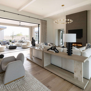
Living Room in Bronco | Key Feature: A Scottsdale new-build rooted in sculptural modernism, Bronco Revival balances bold black-and-white contrast with organic textures, natural wood elements, and statement lighting. As a groundbreaking “Live Lab” designer residence, it’s a first-of-its-kind space where luxury furnishings are tested in real-world conditions before being introduced into high-profile client homes.
Challenge: Because Bronco Revival was the designer’s personal residence, the project carried a unique level of pressure and intention. The challenge was creating a Scottsdale new-build that felt elevated and editorial while still functioning as a true family home. Every selection had to balance bold sculptural modernism (high contrast, statement lighting, architectural furnishings) with durability, comfort, and day-to-day livability. In addition, the home served as a “Live Lab,” meaning new vendors, materials, and luxury furnishings needed to be tested in real-life conditions before being trusted for future high-profile client projects.
Solution: We approached the project with a highly curated, test-and-refine design strategy, treating each space as both a finished interior and a real-world evaluation environment. Key furnishings, textiles, and materials were selected to support the modern organic vision while also standing up to the demands of everyday family life. We worked through selections intentionally, layering in bold contrast, natural woods, and sculptural statement pieces, while prioritizing performance materials, pet-friendly durability, and timeless foundational elements. By using the home as a lived-in showroom, we were able to validate what truly performs beautifully, refine our vendor relationships, and confidently carry those proven selections into future client designs.
Materials: MadeGoods: Sculptural Davion coffee tables |
Loloi: Custom performance rug collection |
Schumacher: Bespoke drapery fabrication |
Aesthetic Wall Coverings: Pioneering wallpaper application on ceiling beams |
Zac + Fox: Exclusive textile collaboration via Made Resource Group |
Budget ($ Range): $300K |
Timeline (Duration): 4 MONTHS

Sponsored
Delaware, OH

Buckeye Basements, Inc.
Central Ohio's Basement Finishing ExpertsBest Of Houzz '13-'21
 AMB2 Architects, LLC
This fast pace second level addition in Lakeview has received a lot of attention in this quite neighborhood by neighbors and house visitors. Ana Borden designed the second level addition on this previous one story residence and drew from her experience completing complicated multi-million dollar institutional projects. The overall project, including designing the second level addition included tieing into the existing conditions in order to preserve the remaining exterior lot for a new pool. The Architect constructed a three dimensional model in Revit to convey to the Clients the design intent while adhering to all required building codes. The challenge also included providing roof slopes within the allowable existing chimney distances, stair clearances, desired room sizes and working with the structural engineer to design connections and structural member sizes to fit the constraints listed above. Also, extensive coordination was required for the second addition, including supports designed by the structural engineer in conjunction with the existing pre and post tensioned slab. The Architect’s intent was also to create a seamless addition that appears to have been part of the existing residence while not impacting the remaining lot. Overall, the final construction fulfilled the Client’s goals of adding a bedroom and bathroom as well as additional storage space within their time frame and, of course, budget.
Smart Media

 TKS Design Group
Download our free ebook, Creating the Ideal Kitchen. DOWNLOAD NOW
This family from Wheaton was ready to remodel their kitchen, dining room and powder room. The project didn’t call for any structural or space planning changes but the makeover still had a massive impact on their home. The homeowners wanted to change their dated 1990’s brown speckled granite and light maple kitchen. They liked the welcoming feeling they got from the wood and warm tones in their current kitchen, but this style clashed with their vision of a deVOL type kitchen, a London-based furniture company. Their inspiration came from the country homes of the UK that mix the warmth of traditional detail with clean lines and modern updates.
To create their vision, we started with all new framed cabinets with a modified overlay painted in beautiful, understated colors. Our clients were adamant about “no white cabinets.” Instead we used an oyster color for the perimeter and a custom color match to a specific shade of green chosen by the homeowner. The use of a simple color pallet reduces the visual noise and allows the space to feel open and welcoming. We also painted the trim above the cabinets the same color to make the cabinets look taller. The room trim was painted a bright clean white to match the ceiling.
In true English fashion our clients are not coffee drinkers, but they LOVE tea. We created a tea station for them where they can prepare and serve tea. We added plenty of glass to showcase their tea mugs and adapted the cabinetry below to accommodate storage for their tea items. Function is also key for the English kitchen and the homeowners. They requested a deep farmhouse sink and a cabinet devoted to their heavy mixer because they bake a lot. We then got rid of the stovetop on the island and wall oven and replaced both of them with a range located against the far wall. This gives them plenty of space on the island to roll out dough and prepare any number of baked goods. We then removed the bifold pantry doors and created custom built-ins with plenty of usable storage for all their cooking and baking needs.
The client wanted a big change to the dining room but still wanted to use their own furniture and rug. We installed a toile-like wallpaper on the top half of the room and supported it with white wainscot paneling. We also changed out the light fixture, showing us once again that small changes can have a big impact.
As the final touch, we also re-did the powder room to be in line with the rest of the first floor. We had the new vanity painted in the same oyster color as the kitchen cabinets and then covered the walls in a whimsical patterned wallpaper. Although the homeowners like subtle neutral colors they were willing to go a bit bold in the powder room for something unexpected. For more design inspiration go to: www.kitchenstudio-ge.com
 Living with Lolo
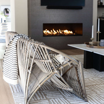
Living Room in Bronco | Key Feature: A Scottsdale new-build rooted in sculptural modernism, Bronco Revival balances bold black-and-white contrast with organic textures, natural wood elements, and statement lighting. As a groundbreaking “Live Lab” designer residence, it’s a first-of-its-kind space where luxury furnishings are tested in real-world conditions before being introduced into high-profile client homes.
Challenge: Because Bronco Revival was the designer’s personal residence, the project carried a unique level of pressure and intention. The challenge was creating a Scottsdale new-build that felt elevated and editorial while still functioning as a true family home. Every selection had to balance bold sculptural modernism (high contrast, statement lighting, architectural furnishings) with durability, comfort, and day-to-day livability. In addition, the home served as a “Live Lab,” meaning new vendors, materials, and luxury furnishings needed to be tested in real-life conditions before being trusted for future high-profile client projects.
Solution: We approached the project with a highly curated, test-and-refine design strategy, treating each space as both a finished interior and a real-world evaluation environment. Key furnishings, textiles, and materials were selected to support the modern organic vision while also standing up to the demands of everyday family life. We worked through selections intentionally, layering in bold contrast, natural woods, and sculptural statement pieces, while prioritizing performance materials, pet-friendly durability, and timeless foundational elements. By using the home as a lived-in showroom, we were able to validate what truly performs beautifully, refine our vendor relationships, and confidently carry those proven selections into future client designs.
Materials: MadeGoods: Sculptural Davion coffee tables |
Loloi: Custom performance rug collection |
Schumacher: Bespoke drapery fabrication |
Aesthetic Wall Coverings: Pioneering wallpaper application on ceiling beams |
Zac + Fox: Exclusive textile collaboration via Made Resource Group |
Budget ($ Range): $300K |
Timeline (Duration): 4 MONTHS
 Living with Lolo
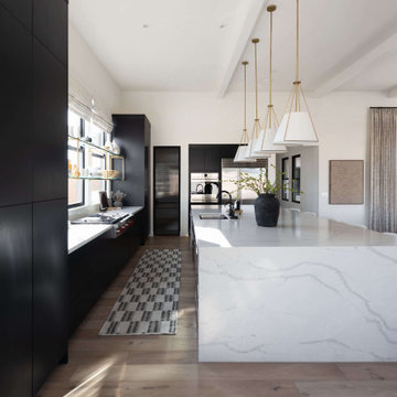
Kitchen in Bronco | Key Feature: A Scottsdale new-build rooted in sculptural modernism, Bronco Revival balances bold black-and-white contrast with organic textures, natural wood elements, and statement lighting. As a groundbreaking “Live Lab” designer residence, it’s a first-of-its-kind space where luxury furnishings are tested in real-world conditions before being introduced into high-profile client homes.
Challenge: Because Bronco Revival was the designer’s personal residence, the project carried a unique level of pressure and intention. The challenge was creating a Scottsdale new-build that felt elevated and editorial while still functioning as a true family home. Every selection had to balance bold sculptural modernism (high contrast, statement lighting, architectural furnishings) with durability, comfort, and day-to-day livability. In addition, the home served as a “Live Lab,” meaning new vendors, materials, and luxury furnishings needed to be tested in real-life conditions before being trusted for future high-profile client projects.
Solution: We approached the project with a highly curated, test-and-refine design strategy, treating each space as both a finished interior and a real-world evaluation environment. Key furnishings, textiles, and materials were selected to support the modern organic vision while also standing up to the demands of everyday family life. We worked through selections intentionally, layering in bold contrast, natural woods, and sculptural statement pieces, while prioritizing performance materials, pet-friendly durability, and timeless foundational elements. By using the home as a lived-in showroom, we were able to validate what truly performs beautifully, refine our vendor relationships, and confidently carry those proven selections into future client designs.
Materials: MadeGoods: Sculptural Davion coffee tables |
Loloi: Custom performance rug collection |
Schumacher: Bespoke drapery fabrication |
Aesthetic Wall Coverings: Pioneering wallpaper application on ceiling beams |
Zac + Fox: Exclusive textile collaboration via Made Resource Group |
Budget ($ Range): $300K |
Timeline (Duration): 4 MONTHS
 San Luis Kitchen Co.
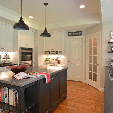
Classic black and white styling is prevalent throughout this home and is carried through into the kitchen with Nordic white cabinets in a simple ‘Shaker-esque’ style and a soft black island. These contrast beautifully with the rich wood floors. Glass doors in the top portion of the sink wall cabinets let the homeowner display a collection of red and white stoneware. The client used red accents throughout, including red-bound cookbooks and dish towels to add that country flavor and create a happy, playful look.
The centerpiece of this kitchen is the Cottage Black Island - stout chamfered posts support a French Country shelf, open on both sides and front. A carved top valance and French Country trim around the bottom give a handcrafted look, and the bun feet are a playful addition. Many of the drawers have specific inserts calculated exactly to fit the clients various items, from placemats to knives, to spices and utensils. Reminiscent of times past, the client chose hot-rolled and waxed steel for the island top, giving it a rustic-industrial look, and setting it apart from the leathered black granite of the perimeter.
 Drury Design
THE SETUP
Multiple ovens, multiple workspaces, multiple sinks – when you think about it, non-jewish kitchens have been adapting the criteria of kosher kitchens for years.
Gladys’ clients in West Rogers Park are Orthodox Jewish. The house they bought already had a kosher kitchen – it just wasn’t done that well. It needed some more things to be duplicated for the dairy side and the meat side. Plus, it was dark and the configuration wasn’t very conducive for a family of eight.
It was time for a remodel.
Design Objectives
Improve kosher kitchen
Add more storage in the island
Better lighting
More open, lighter feel
Change the wood floor in the kitchen to tile
THE REMODEL
Design Challenges
- We had originally planned on removing a wing wall by the breakfast area. During demolition, we learned it contained a support beam.
- The kitchen is a substantial size, but having two sinks, dishwashers, and ovens presented a challenge – how do we fit it all in and make it flow with the storage still accessible near the work areas?
Where do you stop the materials for the new space? - -- The right tile, paint, lighting, etc. would be needed to make the remodeled area cohesive with the rest of the main floor.
- An existing column limited cabinet options and thus, storage capacity. Could we conceal it without disrupting the cabinetry flow?
Design Solutions
- We had to keep the wing wall, but decided to continue the tile on the sides of the cabinets and maintain the height of the tile to line up with the rest of the backsplash. This actually presented a very nice and cohesive look, especially since the opposite side has a wing wall to the left of the refrigerator.
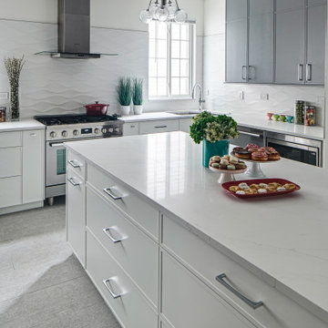
- We used “L-shaped” corner sinks instead of the rectangular ones set on an angle. This gave us more of the legs of the triangles versus the hypotenuse, which allowed for the two dishwashers, and the pullout utensil canisters and spice pullouts while still keeping the 3-drawer cabinets on either side of the range (by the sinks). The old island had the recess for stools which the family never used. By extending the width of the island 6” and utilizing this leg space, we were able to fit 18”-deep cabinets on this side – adding lots of accessible storage. The family can now work simultaneously on the dairy side (the side with the fridge) and the meat side (opposite) without getting in each other’s way. We separated the cooking by using the range oven for the meat and a built-in microwave in the base cabinet. The wall oven with built-in microwave on top is for dairy.
- Corner sinks opened up the middle area for a wider range – we went from a 30” to a 36”. Removing all the wall cabinets (on the range wall) made a big difference. That opened up the entire space while adding some visual impact. (Not pictured: We also made the cabinets directly opposite the range wall tall and removed the countertop, resulting in more room for rollouts and even more storage!) The kitchen now has more storage than it did before.
- We ended up painting the ceiling of the kitchen into the hallway that leads to the foyer. The living and dining rooms were separated by a soffit, so that became a natural boundary. We kept the tile in the kitchen by stopping it short of the hallway and lining it up with the pantry wall. This creates a border between the breakfast area and family room. The rest of the existing wood floors were refinished to refresh and make the hue darker. We also painted a dark accent wall and carried it into the breakfast area to make the rooms look deeper.
- The in-the-way column housed plumbing and couldn’t be moved. We still built cabinets in that spot – we just had to build a chase inside it to conceal the pipes. There was still plenty of room for new storage. We also took the cabinets all the way to the ceiling. The continuous tall cabinets added a functional elegance to the space.
THE RENEWED SPACE
The client’s long-awaited dream of a better kosher kitchen has finally been achieved, beautifully combining enhanced storage solutions with adherence to the family’s orthodox dietary laws. The kitchen’s standout feature, an expanded island, now offers a spacious and efficient workspace. This allows several family members to cook together comfortably, without the inconvenience of bumping into each other, ensuring a harmonious and productive cooking environment.
Sponsored
Columbus, OH

Snider & Metcalf Interior Design, LTD
Leading Interior Designers in Columbus, Ohio & Ponte Vedra, Florida
 Drury Design
THE SETUP
Multiple ovens, multiple workspaces, multiple sinks – when you think about it, non-jewish kitchens have been adapting the criteria of kosher kitchens for years.
Gladys’ clients in West Rogers Park are Orthodox Jewish. The house they bought already had a kosher kitchen – it just wasn’t done that well. It needed some more things to be duplicated for the dairy side and the meat side. Plus, it was dark and the configuration wasn’t very conducive for a family of eight.
It was time for a remodel.
Design Objectives
Improve kosher kitchen
Add more storage in the island
Better lighting
More open, lighter feel
Change the wood floor in the kitchen to tile
THE REMODEL
Design Challenges
- We had originally planned on removing a wing wall by the breakfast area. During demolition, we learned it contained a support beam.
- The kitchen is a substantial size, but having two sinks, dishwashers, and ovens presented a challenge – how do we fit it all in and make it flow with the storage still accessible near the work areas?
Where do you stop the materials for the new space? - -- The right tile, paint, lighting, etc. would be needed to make the remodeled area cohesive with the rest of the main floor.
- An existing column limited cabinet options and thus, storage capacity. Could we conceal it without disrupting the cabinetry flow?
Design Solutions
- We had to keep the wing wall, but decided to continue the tile on the sides of the cabinets and maintain the height of the tile to line up with the rest of the backsplash. This actually presented a very nice and cohesive look, especially since the opposite side has a wing wall to the left of the refrigerator.
- We used “L-shaped” corner sinks instead of the rectangular ones set on an angle. This gave us more of the legs of the triangles versus the hypotenuse, which allowed for the two dishwashers, and the pullout utensil canisters and spice pullouts while still keeping the 3-drawer cabinets on either side of the range (by the sinks). The old island had the recess for stools which the family never used. By extending the width of the island 6” and utilizing this leg space, we were able to fit 18”-deep cabinets on this side – adding lots of accessible storage. The family can now work simultaneously on the dairy side (the side with the fridge) and the meat side (opposite) without getting in each other’s way. We separated the cooking by using the range oven for the meat and a built-in microwave in the base cabinet. The wall oven with built-in microwave on top is for dairy.
- Corner sinks opened up the middle area for a wider range – we went from a 30” to a 36”. Removing all the wall cabinets (on the range wall) made a big difference. That opened up the entire space while adding some visual impact. (Not pictured: We also made the cabinets directly opposite the range wall tall and removed the countertop, resulting in more room for rollouts and even more storage!) The kitchen now has more storage than it did before.
- We ended up painting the ceiling of the kitchen into the hallway that leads to the foyer. The living and dining rooms were separated by a soffit, so that became a natural boundary. We kept the tile in the kitchen by stopping it short of the hallway and lining it up with the pantry wall. This creates a border between the breakfast area and family room. The rest of the existing wood floors were refinished to refresh and make the hue darker. We also painted a dark accent wall and carried it into the breakfast area to make the rooms look deeper.
- The in-the-way column housed plumbing and couldn’t be moved. We still built cabinets in that spot – we just had to build a chase inside it to conceal the pipes. There was still plenty of room for new storage. We also took the cabinets all the way to the ceiling. The continuous tall cabinets added a functional elegance to the space.
THE RENEWED SPACE
The client’s long-awaited dream of a better kosher kitchen has finally been achieved, beautifully combining enhanced storage solutions with adherence to the family’s orthodox dietary laws. The kitchen’s standout feature, an expanded island, now offers a spacious and efficient workspace. This allows several family members to cook together comfortably, without the inconvenience of bumping into each other, ensuring a harmonious and productive cooking environment.
 Living with Lolo
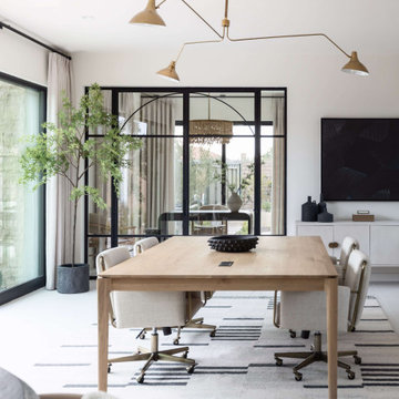
Home Office in Bronco | Key Feature: A Scottsdale new-build rooted in sculptural modernism, Bronco Revival balances bold black-and-white contrast with organic textures, natural wood elements, and statement lighting. As a groundbreaking “Live Lab” designer residence, it’s a first-of-its-kind space where luxury furnishings are tested in real-world conditions before being introduced into high-profile client homes.
Challenge: Because Bronco Revival was the designer’s personal residence, the project carried a unique level of pressure and intention. The challenge was creating a Scottsdale new-build that felt elevated and editorial while still functioning as a true family home. Every selection had to balance bold sculptural modernism (high contrast, statement lighting, architectural furnishings) with durability, comfort, and day-to-day livability. In addition, the home served as a “Live Lab,” meaning new vendors, materials, and luxury furnishings needed to be tested in real-life conditions before being trusted for future high-profile client projects.
Solution: We approached the project with a highly curated, test-and-refine design strategy, treating each space as both a finished interior and a real-world evaluation environment. Key furnishings, textiles, and materials were selected to support the modern organic vision while also standing up to the demands of everyday family life. We worked through selections intentionally, layering in bold contrast, natural woods, and sculptural statement pieces, while prioritizing performance materials, pet-friendly durability, and timeless foundational elements. By using the home as a lived-in showroom, we were able to validate what truly performs beautifully, refine our vendor relationships, and confidently carry those proven selections into future client designs.
Materials: MadeGoods: Sculptural Davion coffee tables |
Loloi: Custom performance rug collection |
Schumacher: Bespoke drapery fabrication |
Aesthetic Wall Coverings: Pioneering wallpaper application on ceiling beams |
Zac + Fox: Exclusive textile collaboration via Made Resource Group |
Budget ($ Range): $300K |
Timeline (Duration): 4 MONTHS
 Silent Rivers Design+Build
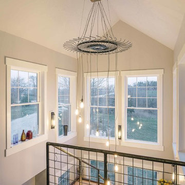
The custom light fixture hanging above the stairs in this new custom home uses a hay wheel implement. Salvaged barn beams support the light on the ceiling.
 Revival House
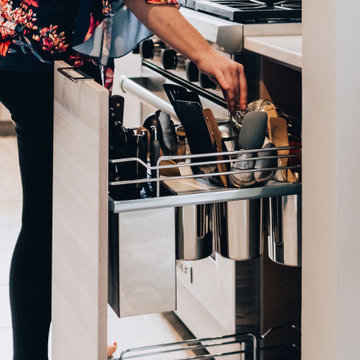
Designer Danielle Lardani's clients love to cook, so they desired a new kitchen that appealed to them stylistically, while also supporting their passion for cooking. They wanted to include features that would make cooking together both efficient and enjoyable. Danielle fulfilled their dreams by creating a stunning, contemporary design that seamlessly matched the style of the rest of their home. She selected a horizontal, textured laminate by Wynnbrooke Cabinetry for the base perimeter cabinets, with a contrasting prep zone featuring Décor Cabinets in a Behr custom color, Adirondack Blue.
To increase the efficiency of the space, the layout of the kitchen was reconfigured to create a more functional work triangle between the range, the refrigerator, and the sink. The new layout allows the homeowners to prep, cook and serve food with ease. To further enhance the modern look of the kitchen and accommodate her clients’ wishes, she chose floating shelves and a full-height backsplash to give the space a more open feel.
Notable Design Details:
- Danielle designed the new layout to include ample counter space for food prep.
- She installed integrated lighting under the floating shelves and the upper cabinets in the prep-zone area to brighten these work spaces.
- Danielle included a custom dish drawer in her cabinetry design. This optimized storage and allowed dinnerware to be easily accessible.
- The knife block and utensil pull-out organizer keeps the clients’ cooking tools neat while also keeping them at arms reach.


 e4 Interior Design, LLC
e4 Interior Design
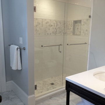
This farmhouse was purchased by the clients in the end of 2015. The timeframe for the renovation was tight, as the home is a hot summer rental in the historic district of Kennebunkport. This antique colonial home had been expanded over the years. The intention behind the renovation was quite simple; to remove wall paper, apply fresh paint, change out some light fixtures and renovate the kitchen. A somewhat small project turned into a massive renovation, with the renovation of 3 bathrooms and a powder room, a kitchen, adding a staircase, plumbing, floors, changing windows, not to mention furnishing the entire house afterwords. The finished product really speaks for itself!
The aesthetic is "coastal farmhouse". We did not want to make it too coastal (as it is not on the water, but rather in a coastal town) or too farmhouse-y (while still trying to maintain some of the character of the house.) Old floors on both the first and second levels were made plumb (reused as vertical supports), and the old wood beams were repurposed as well - both in the floors and in the architectural details. For example - in the fireplace in the kitchen and around the door openings into the dining room you can see the repurposed wood! The newel post and balusters on the mudroom stairs were also from the repurposed lot of wood, but completely refinished for a new use.
The clients were young and savvy, with a very hands on approach to the design and construction process. A very skilled bargain hunter, the client spent much of her free time when she was not working, going to estate sales and outlets to outfit the house. Their builder, as stated earlier, was very savvy in reusing wood where he could as well as salvaging things such as the original doors and door hardware while at the same time bringing the house up to date.
 Living with Lolo
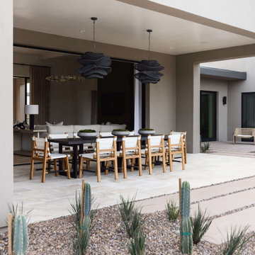
Patio in Bronco | Key Feature: A Scottsdale new-build rooted in sculptural modernism, Bronco Revival balances bold black-and-white contrast with organic textures, natural wood elements, and statement lighting. As a groundbreaking “Live Lab” designer residence, it’s a first-of-its-kind space where luxury furnishings are tested in real-world conditions before being introduced into high-profile client homes.
Challenge: Because Bronco Revival was the designer’s personal residence, the project carried a unique level of pressure and intention. The challenge was creating a Scottsdale new-build that felt elevated and editorial while still functioning as a true family home. Every selection had to balance bold sculptural modernism (high contrast, statement lighting, architectural furnishings) with durability, comfort, and day-to-day livability. In addition, the home served as a “Live Lab,” meaning new vendors, materials, and luxury furnishings needed to be tested in real-life conditions before being trusted for future high-profile client projects.
Solution: We approached the project with a highly curated, test-and-refine design strategy, treating each space as both a finished interior and a real-world evaluation environment. Key furnishings, textiles, and materials were selected to support the modern organic vision while also standing up to the demands of everyday family life. We worked through selections intentionally, layering in bold contrast, natural woods, and sculptural statement pieces, while prioritizing performance materials, pet-friendly durability, and timeless foundational elements. By using the home as a lived-in showroom, we were able to validate what truly performs beautifully, refine our vendor relationships, and confidently carry those proven selections into future client designs.
Materials: MadeGoods: Sculptural Davion coffee tables |
Loloi: Custom performance rug collection |
Schumacher: Bespoke drapery fabrication |
Aesthetic Wall Coverings: Pioneering wallpaper application on ceiling beams |
Zac + Fox: Exclusive textile collaboration via Made Resource Group |
Budget ($ Range): $300K |
Timeline (Duration): 4 MONTHS
 Infinite Home
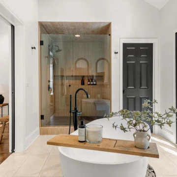
The most transformative part of the project was the addition of the primary suite. Our clients wanted this space to be more than just a bedroom—it needed to become an integral part of their daily routine, where they could truly unwind after a long day and start each morning with intention. Because they worked from home, we connected the suite to their lounge office through a private seating room, allowing them to ease into the workday feeling refreshed and retreat just as easily afterward without ever leaving their sanctuary.
Designed as a retreat, the suite features exposed wood beams that add character and warmth, while the walls are painted in White Flour by Sherwin-Williams for a soft, airy backdrop. Overhead, a Williams Sonoma Ingrid chandelier serves as a warm focal point, bringing elegance with a modern edge. A walk-in closet with glass-and-iron doors provides a boutique-like entrance, while the bedroom flows seamlessly into the spa bathroom.
The bathroom walls are painted in that same Swiss Coffee by Sherwin-Williams, creating a light and calming foundation for the warm wood tones of the floating double vanity. At the heart of the room, the freestanding Kohler tub rests on a bed of smooth river stones, creating a grounding focal point that welcomes our clients to truly unwind. The zero-entry shower, finished with Kenridge Ribbon Maple Matte porcelain tile, adds an organic warmth, while Kohler matte black fixtures provide a modern contrast.
This balance of natural warmth and modern refinement turned the suite into more than just a functional addition—it became the personal retreat our clients had envisioned, perfectly supporting their lifestyle of working, resting, and recharging at home.
74