
Search results for "Clients desire" in Home Design Ideas

 Architectural Resource LLC
Our Clients, the proud owners of a landmark 1860’s era Italianate home, desired to greatly improve their daily ingress and egress experience. With a growing young family, the lack of a proper entry area and attached garage was something they wanted to address. They also needed a guest suite to accommodate frequent out-of-town guests and visitors. But in the homeowner’s own words, “He didn’t want to be known as the guy who ‘screwed up’ this beautiful old home”. Our design challenge was to provide the needed space of a significant addition, but do so in a manner that would respect the historic home. Our design solution lay in providing a “hyphen”: a multi-functional daily entry breezeway connector linking the main house with a new garage and in-law suite above.

 Dona Rosene Interiors
FIRST PLACE 2018 ASID DESIGN OVATION AWARD / MASTER BATH OVER $50,000. In addition to a much-needed update, the clients desired a spa-like environment for their Master Bath. Sea Pearl Quartzite slabs were used on an entire wall and around the vanity and served as this ethereal palette inspiration. Luxuries include a soaking tub, decorative lighting, heated floor, towel warmers and bidet. Michael Hunter

 Vetter Architects
The client’s request was quite common - a typical 2800 sf builder home with 3 bedrooms, 2 baths, living space, and den. However, their desire was for this to be “anything but common.” The result is an innovative update on the production home for the modern era, and serves as a direct counterpoint to the neighborhood and its more conventional suburban housing stock, which focus views to the backyard and seeks to nullify the unique qualities and challenges of topography and the natural environment.
The Terraced House cautiously steps down the site’s steep topography, resulting in a more nuanced approach to site development than cutting and filling that is so common in the builder homes of the area. The compact house opens up in very focused views that capture the natural wooded setting, while masking the sounds and views of the directly adjacent roadway. The main living spaces face this major roadway, effectively flipping the typical orientation of a suburban home, and the main entrance pulls visitors up to the second floor and halfway through the site, providing a sense of procession and privacy absent in the typical suburban home.
Clad in a custom rain screen that reflects the wood of the surrounding landscape - while providing a glimpse into the interior tones that are used. The stepping “wood boxes” rest on a series of concrete walls that organize the site, retain the earth, and - in conjunction with the wood veneer panels - provide a subtle organic texture to the composition.
The interior spaces wrap around an interior knuckle that houses public zones and vertical circulation - allowing more private spaces to exist at the edges of the building. The windows get larger and more frequent as they ascend the building, culminating in the upstairs bedrooms that occupy the site like a tree house - giving views in all directions.
The Terraced House imports urban qualities to the suburban neighborhood and seeks to elevate the typical approach to production home construction, while being more in tune with modern family living patterns.
Overview:
Elm Grove
Size:
2,800 sf,
3 bedrooms, 2 bathrooms
Completion Date:
September 2014
Services:
Architecture, Landscape Architecture
Interior Consultants: Amy Carman Design
Find the right local pro for your project

 David Charlez Designs
Space Crafting
Inspiration for a transitional light wood floor living room remodel in Minneapolis with gray walls, a ribbon fireplace, a tile fireplace and a wall-mounted tv
Inspiration for a transitional light wood floor living room remodel in Minneapolis with gray walls, a ribbon fireplace, a tile fireplace and a wall-mounted tv

 Jami Abbadessa
After completing their son’s room, we decided to continue the designing in my client’s master bathroom in Rancho Cucamonga, CA. Not only were the finishes completely overhauled, but the space plan was reconfigured too. They no longer wanted their soaking tub and requested a larger shower with a rain head and more counter top space and cabinetry. The couple wanted something that was not too trendy and desired a space that would look classic and stand the test of time. What better way to give them that than with marble, white cabinets and a chandelier to boot? This newly renovated master bath now features Cambria quartz counters, custom white cabinetry, marble flooring in a diamond pattern with mini-mosaic accents, a classic subway marble shower surround, frameless glass, new recessed and accent lighting, chrome fixtures, a coat of fresh grey paint on the walls and a few accessories to make the space feel complete.

 MMI Design
These clients retained MMI to assist with a full renovation of the 1st floor following the Harvey Flood. With 4 feet of water in their home, we worked tirelessly to put the home back in working order. While Harvey served our city lemons, we took the opportunity to make lemonade. The kitchen was expanded to accommodate seating at the island and a butler's pantry. A lovely free-standing tub replaced the former Jacuzzi drop-in and the shower was enlarged to take advantage of the expansive master bathroom. Finally, the fireplace was extended to the two-story ceiling to accommodate the TV over the mantel. While we were able to salvage much of the existing slate flooring, the overall color scheme was updated to reflect current trends and a desire for a fresh look and feel. As with our other Harvey projects, our proudest moments were seeing the family move back in to their beautifully renovated home.

 Vartanian Custom Cabinets
Enclosed kitchen - large shabby-chic style l-shaped light wood floor and brown floor enclosed kitchen idea in Boston with a farmhouse sink, beaded inset cabinets, white cabinets, marble countertops, gray backsplash, mosaic tile backsplash, paneled appliances and an island
Sponsored
Columbus, OH

Trish Takacs Design
Award Winning & Highly Skilled Kitchen & Bath Designer in Columbus

 Knutson Residential Design, LLC
Troy Thies Photography
Bathroom - transitional bathroom idea in Minneapolis
Bathroom - transitional bathroom idea in Minneapolis

 Cantoni
A tech-savvy family looks to Cantoni designer George Saba and architect Keith Messick to engineer the ultimate modern marvel in Houston’s Bunker Hill neighborhood.
Photos By: Michael Hunter & Taggart Sorensen

 Tammara Stroud Design
Warm grey tones create the backdrop for this cozy living room with a palette of blue and green accents. The painting anchors the room setting a quiet, peaceful mood.
John Granen Photography

 Building Solutions and Design, Inc
Photo Credit: Unlimited Style Real Estate Photography
Architect: Nadav Rokach
Interior Design: Eliana Rokach
Contractor: Building Solutions and Design, Inc
Staging: Carolyn Grecco/ Meredit Baernc

Inspiration for a mid-sized coastal backyard custom-shaped and concrete paver hot tub remodel in Miami

 Dig Your Garden Landscape Design
Lagoon-side property in the Bel Marin Keys, Novato, CA. Entertaining and enjoying the views were a primary design goal for this project along with replacing the lawn with CA native and low water plants and a total renovation. The project includes a large camaru deck with built-in seating. The concrete steps and pavers lead down to the water's edge. I included a sunken patio on one side and a beautiful Buddha statue on the other, surrounded by succulents and other low-water, contemporary plantings. I also used Dymondia ground cover to create a natural pathways within the garden.
Photo: © Eileen Kelly, Dig Your Garden Landscape Design. Design Eileen Kelly
Sponsored
Columbus, OH

Wannemacher Interiors
Customized Award-Winning Interior Design Solutions in Franklin Cnty OH

 Classic Home Improvements
These beautiful bathrooms located in Rancho Santa Fe were in need of a major upgrade. Once having dated dark cabinets, the desired bright design was wanted. Beautiful white cabinets with modern pulls and classic faucets complete the double vanity. The shower with long subway tiles and black grout! Colored grout is a trend and it looks fantastic in this bathroom. The walk in shower has beautiful tiles and relaxing shower heads. Both of these bathrooms look fantastic and look modern and complementary to the home.

 50 Degrees North Architects
Overview
Extension and complete refurbishment.
The Brief
The existing house had very shallow rooms with a need for more depth throughout the property by extending into the rear garden which is large and south facing. We were to look at extending to the rear and to the end of the property, where we had redundant garden space, to maximise the footprint and yield a series of WOW factor spaces maximising the value of the house.
The brief requested 4 bedrooms plus a luxurious guest space with separate access; large, open plan living spaces with large kitchen/entertaining area, utility and larder; family bathroom space and a high specification ensuite to two bedrooms. In addition, we were to create balconies overlooking a beautiful garden and design a ‘kerb appeal’ frontage facing the sought-after street location.
Buildings of this age lend themselves to use of natural materials like handmade tiles, good quality bricks and external insulation/render systems with timber windows. We specified high quality materials to achieve a highly desirable look which has become a hit on Houzz.
Our Solution
One of our specialisms is the refurbishment and extension of detached 1930’s properties.
Taking the existing small rooms and lack of relationship to a large garden we added a double height rear extension to both ends of the plan and a new garage annex with guest suite.
We wanted to create a view of, and route to the garden from the front door and a series of living spaces to meet our client’s needs. The front of the building needed a fresh approach to the ordinary palette of materials and we re-glazed throughout working closely with a great build team.

 Marvin
Architect: Blaine Bonadies, Bonadies Architect
Photography By: Jean Allsopp Photography
“Just as described, there is an edgy, irreverent vibe here, but the result has an appropriate stature and seriousness. Love the overscale windows. And the outdoor spaces are so great.”
Situated atop an old Civil War battle site, this new residence was conceived for a couple with southern values and a rock-and-roll attitude. The project consists of a house, a pool with a pool house and a renovated music studio. A marriage of modern and traditional design, this project used a combination of California redwood siding, stone and a slate roof with flat-seam lead overhangs. Intimate and well planned, there is no space wasted in this home. The execution of the detail work, such as handmade railings, metal awnings and custom windows jambs, made this project mesmerizing.
Cues from the client and how they use their space helped inspire and develop the initial floor plan, making it live at a human scale but with dramatic elements. Their varying taste then inspired the theme of traditional with an edge. The lines and rhythm of the house were simplified, and then complemented with some key details that made the house a juxtaposition of styles.
The wood Ultimate Casement windows were all standard sizes. However, there was a desire to make the windows have a “deep pocket” look to create a break in the facade and add a dramatic shadow line. Marvin was able to customize the jambs by extruding them to the exterior. They added a very thin exterior profile, which negated the need for exterior casing. The same detail was in the stone veneers and walls, as well as the horizontal siding walls, with no need for any modification. This resulted in a very sleek look.
MARVIN PRODUCTS USED:
Marvin Ultimate Casement Window

 Milgard Windows & Doors
The Kiguchi family moved into their Austin, Texas home in 1994. Built in the 1980’s as part of a neighborhood development, they happily raised their family here but longed for something more contemporary. Once they became empty nesters, they decided it was time for a major remodel. After spending many years visiting Austin AIA Home Tours that highlight contemporary residential architecture, they had a lot of ideas and in 2013 were ready to interview architects and get their renovation underway.
The project turned into a major remodel due to an unstable foundation. Architects Ben Arbib and Ed Hughey, of Arbib Hughey Design were hired to solve the structural issue and look for inspiration in the bones of the house, which sat on top of a hillside and was surrounded by great views.
Unfortunately, with the old floor plan, the beautiful views were hidden by small windows that were poorly placed. In order to bring more natural light into the house the window sizes and configurations had to be addressed, all while keeping in mind the homeowners desire for a modern look and feel.
To achieve a more contemporary and sophisticated front of house, a new entry was designed that included removing a two-story bay window and porch. The entrance of the home also became more integrated with the landscape creating a template for new foliage to be planted. Older exterior materials were updated to incorporate a more muted palette of colors with a metal roof, dark grey siding in the back and white stucco in the front. Deep eaves were added over many of the new large windows for clean lines and sun protection.
“Inside it was about opening up the floor plan, expanding the views throughout the house, and updating the material palette to get a modern look that was also warm and inviting,” said Ben from Arbib Hughey Design. “Prior to the remodel, the house had the typical separation of rooms. We removed the walls between them and changed all of the windows to Milgard Thermally Improved Aluminum to connect the inside with the outside. No matter where you are you get nice views and natural light.”
The architects wanted to create some drama, which they accomplished with the window placement and opening up the interior floor plan to an open concept approach. Cabinetry was used to help delineate intimate spaces. To add warmth to an all-white living room, white-washed oak wood floors were installed and pine planks were used around the fireplace. The large windows served as artwork bringing the color of nature into the space.
An octagon shaped, elevated dining room, (named “the turret”), had a big impact on the design of the house. They architects rounded the corners and added larger window openings overlooking a new sunken garden. The great room was also softened by rounding out the corners and that circular theme continued throughout the house, being picked up in skylight wells and kitchen cabinetry. A staircase leading to a catwalk was added and the result was a two-story window wall that flooded the home with natural light.
When asked why Milgard® Thermally Improved Aluminum windows were selected, the architectural team listed many reasons:
1) Aesthetics: “We liked the slim profiles and narrow sightlines. The window frames never get in the way of the view and that was important to us. They also have a very contemporary look that went well with our design.”
2) Options: “We liked that we could get large sliding doors that matched the windows, giving us a very cohesive look and feel throughout the project.”
3) Cost Effective: “Milgard windows are affordable. You get a good product at a good price.”
4) Custom Sizes: “Milgard windows are customizable, which allowed us to get the right window for each location.”
Ready to take on your own traditional to modern home remodeling project? Arbib Hughey Design advises, “Work with a good architect. That means picking a team that is creative, communicative, listens well and is responsive. We think it’s important for an architect to listen to their clients and give them something they want, not something the architect thinks they should have. At the same time you want an architect who is willing and able to think outside the box and offer up design options that you may not have considered. Design is about a lot of back and forth, trying out ideas, getting feedback and trying again.”
The home was completely transformed into a unique, contemporary house perfectly integrated with its site. Internally the home has a natural flow for the occupants and externally it is integrated with the surroundings taking advantage of great natural light. As a side note, it was highly praised as part of the Austin AIA homes tour.
Sponsored
Delaware, OH

Buckeye Basements, Inc.
Central Ohio's Basement Finishing ExpertsBest Of Houzz '13-'21

 HEYDT DESIGNS
David Duncan Livingston
Example of a small classic kids' gray tile and stone tile marble floor claw-foot bathtub design in San Francisco with white cabinets, a wall-mount toilet and white walls
Example of a small classic kids' gray tile and stone tile marble floor claw-foot bathtub design in San Francisco with white cabinets, a wall-mount toilet and white walls
 J.P. Hoffman Design Build
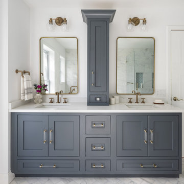
Located right off the Primary bedroom – this bathroom is located in the far corners of the house. It should be used as a retreat, to rejuvenate and recharge – exactly what our homeowners asked for. We came alongside our client – listening to the pain points and hearing the need and desire for a functional, calming retreat, a drastic change from the disjointed, previous space with exposed pipes from a previous renovation. We worked very closely through the design and materials selections phase, hand selecting the marble tile on the feature wall, sourcing luxe gold finishes and suggesting creative solutions (like the shower’s linear drain and the hidden niche on the inside of the shower’s knee wall). The Maax Tosca soaker tub is a main feature and our client's #1 request. Add the Toto Nexus bidet toilet and a custom double vanity with a countertop tower for added storage, this luxury retreat is a must for busy, working parents.

 TVL Creative Ltd.
This project is an incredible transformation and the perfect example of successful style mixing! This client, and now a good friend of TVL (as they all become), is a wonderfully eclectic and adventurous one with immense interest in texture play, pops of color, and unique applications. Our scope in this home included a full kitchen renovation, main level powder room renovation, and a master bathroom overhaul. Taking just over a year to complete from the first design phases to final photos, this project was so insanely fun and packs an amazing amount of fun details and lively surprises. The original kitchen was large and fairly functional. However, the cabinetry was dated, the lighting was inefficient and frankly ugly, and the space was lacking personality in general. Our client desired maximized storage and a more personalized aesthetic. The existing cabinets were short and left the nice height of the space under-utilized. We integrated new gray shaker cabinets from Waypoint Living Spaces and ran them to the ceiling to really exaggerate the height of the space and to maximize usable storage as much as possible. The upper cabinets are glass and lit from within, offering display space or functional storage as the client needs. The central feature of this space is the large cobalt blue range from Viking as well as the custom made reclaimed wood range hood floating above. The backsplash along this entire wall is vertical slab of marble look quartz from Pental Surfaces. This matches the expanse of the same countertop that wraps the room. Flanking the range, we installed cobalt blue lantern penny tile from Merola Tile for a playful texture that adds visual interest and class to the entire room. We upgraded the lighting in the ceiling, under the cabinets, and within cabinets--we also installed accent sconces over each window on the sink wall to create cozy and functional illumination. The deep, textured front Whitehaven apron sink is a dramatic nod to the farmhouse aesthetic from KOHLER, and it's paired with the bold and industrial inspired Tournant faucet, also from Kohler. We finalized this space with other gorgeous appliances, a super sexy dining table and chair set from Room & Board, the Paxton dining light from Pottery Barn and a small bar area and pantry on the far end of the space. In the small powder room on the main level, we converted a drab builder-grade space into a super cute, rustic-inspired washroom. We utilized the Bonner vanity from Signature Hardware and paired this with the cute Ashfield faucet from Pfister. The most unique statements in this room include the water-drop light over the vanity from Shades Of Light, the copper-look porcelain floor tile from Pental Surfaces and the gorgeous Cashmere colored Tresham toilet from Kohler. Up in the master bathroom, elegance abounds. Using the same footprint, we upgraded everything in this space to reflect the client's desire for a more bright, patterned and pretty space. Starting at the entry, we installed a custom reclaimed plank barn door with bold large format hardware from Rustica Hardware. In the bathroom, the custom slate blue vanity from Tharp Cabinet Company is an eye catching statement piece. This is paired with gorgeous hardware from Amerock, vessel sinks from Kohler, and Purist faucets also from Kohler. We replaced the old built-in bathtub with a new freestanding soaker from Signature Hardware. The floor tile is a bold, graphic porcelain tile with a classic color scheme. The shower was upgraded with new tile and fixtures throughout: new clear glass, gorgeous distressed subway tile from the Castle line from TileBar, and a sophisticated shower panel from Vigo. We finalized the space with a small crystal chandelier and soft gray paint. This project is a stunning conversion and we are so thrilled that our client can enjoy these personalized spaces for years to come. Special thanks to the amazing Ian Burks of Burks Wurks Construction for bringing this to life!
5