
Search results for "Cloud based solutions" in Home Design Ideas
 Custom Surface Solutions
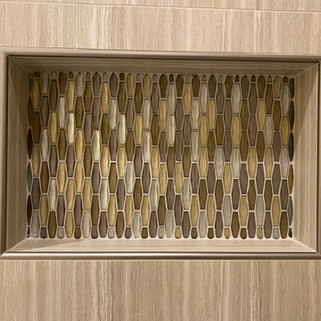
Custom Surface Solutions (www.css-tile.com) - Owner Craig Thompson (512) 966-8296. This project shows master bath shower / toile room remodel with before and after pictures. Remodel included tub-to-shower conversion with 12" x 24" tile set vertically aligned / on-grid on walls and floor. Custom wall floor base tile. Pebble tile shower floor. Vertical accent stripe on plumbing control wall and back of 22" x 14" niche using Harlequin shaped mosaic glass file. Schluter Rondec Satin Nickel finish profile edging. Delta plumbing fixtures.
 TVL Creative Ltd.
Cramped kitchen be gone! That was the project motto and top priority. The goal was to transform the current layout from multiple smaller spaces into a connected whole that would activate the main level for our clients, a young family of four.
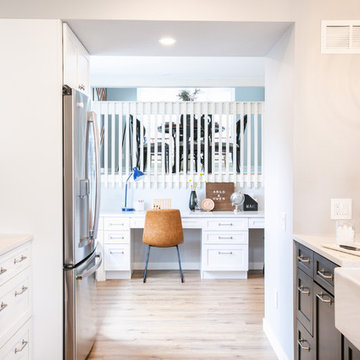
The biggest obstacle was the wall dividing the kitchen and the dining room. Removing this wall was central to opening up and integrating the main living spaces, but the existing ductwork that ran right through the center of the wall posed a design challenge, er design opportunity. The resulting design solution features a central pantry that captures the ductwork and provides valuable storage- especially when compared to the original kitchen's 18" wide pantry cabinet. The pantry also anchors the kitchen island and serves as a visual separation of space between the kitchen and homework area.
Through our design development process, we learned the formal living room was of no service to their lifestyle and therefore space they rarely spent time in. With that in mind, we proposed to eliminate the unused living room and make it the new dining room. Relocating the dining room to this space inherently felt right given the soaring ceiling and ample room for holiday dinners and celebrations. The new dining room was spacious enough for us to incorporate a conversational seating area in the warm, south-facing window alcove.
Now what to do with the old dining room?! To answer that question we took inspiration from our clients' shared profession in education and developed a craft area/homework station for both of their boys. The semi-custom cabinetry of the desk area carries over to the adjacent wall and forms window bench base with storage that we topped with butcher block for a touch of warmth. While the boys are young, the bench drawers are the perfect place for a stash of toys close to the kitchen.
The kitchen begins just beyond the window seat with their refrigerator enclosure. Opposite the refrigerator is the new pantry with twenty linear feet of shelving and space for brooms and a stick vacuum. Extending from the backside of the pantry the kitchen island design incorporates counter seating on the family room side and a cabinetry configuration on the kitchen side with drawer storage, a trashcan center, farmhouse sink, and dishwasher.
We took careful time in design and execution to align the range and sink because while it might seem like a small detail, it plays an important role in supporting the symmetrical configuration of the back wall of the kitchen. The rear wall design utilizes an appliance garage mirrors the visual impact of the refrigerator enclosure and helps keep the now open kitchen tidy. Between the appliance garage and refrigerator enclosure is the cooking zone with 30" of cabinetry and work surface on either side of the range, a chimney style vent hood, and a bold graphic tile backsplash.
The backsplash is just one of many personal touches we added to the space to reflect our client's modern eclectic style and love of color. Swooping lines of the mid-mod style barstools compliment the pendants and backsplash pattern. A pop of vibrant green on the frame of the pantry door adds a fresh wash of color to an otherwise neutral space. The big show stopper is the custom charcoal gray and copper chevron wall installation in the dining room. This was an idea our clients softly suggested, and we excitedly embraced the opportunity. It is also a kickass solution to the head-scratching design dilemma of how to fill a large and lofty wall.
We are so grateful to bring this design to life for our clients and now dear friends.
 Innovate Building Solutions
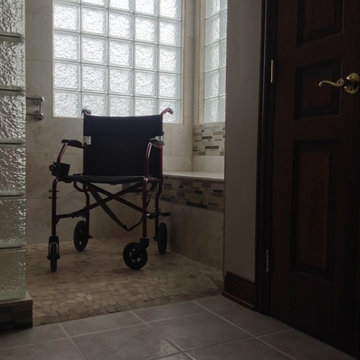
This shower was created to assist an aging in law - but yet to look stylish. The glass block windows in this first floor master bathroom provide lots of natural light.
Find the right local pro for your project
 Crafted Custom Homes + Renovations
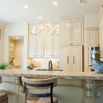
This home is a typical suburban home in a planned community in Katy, Texas (outside of Houston). We took the existing pre-fab builder-grade stained cabinets and refaced them with poplar raised panel doors and drawer fronts. We extended the island and added the spindles. We added decorative feet to the cabinet bases. We installed custom panels on the new Jenn-Air appliances. We added decorative corbels under the bar and in the butler's pantry. The cabinets were painted with a base color of Sherwin Williams Macadamia (SW 6142) and then glazed with Van Dyke Brown (SW 70471). A clear sealer coat was then applied. The island was painted Storm Cloud (SW 6249) and then faux-finished with the same technique. The backsplash tile is from Arizona Tile and is called San Mateo Split Face.
 Kitchen Solvers of Spring Hill
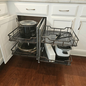
These homeowners didn’t feel the need for a whole remodel and liked the color of their cabinets but really wanted a few upgrades… and then ended up doing a little more once we showed them how we can improve efficiency and storage in their kitchen!
Their biggest issue is having a microwave over their stove since they tend to an elderly parent and that the exhaust is not vented outside. Andy figured out the perfect solution to vent out their new matching range hood and since they never liked their countertops or backsplash, they added that to the mix. With standard cabinet that have deep or half shelves it is hard to maximize storage and accessibility so Marty suggested roll-out trays in 3 cabinets, a pull-out trash so they don’t have to walk around the one at the end of their island, a blind corner pull-out so they don’t have to get down on their hands and knees to access things, and then their favorite… hinge out spice rack! Let’s be honest, it’s EVERYONE’s favorite!
Needless to say, we more than solved this kitchen for these homeowners. Where is the microwave now? Well, he is a handy guy so he decided to tackle a simple cabinet modification and is installing it himself in a base cabinet!
 Kitchen Solvers of Spring Hill
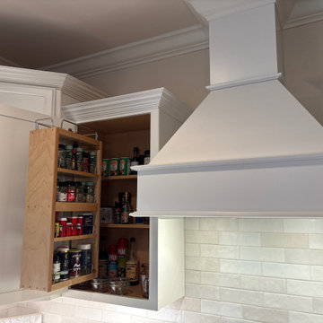
These homeowners didn’t feel the need for a whole remodel and liked the color of their cabinets but really wanted a few upgrades… and then ended up doing a little more once we showed them how we can improve efficiency and storage in their kitchen!
Their biggest issue is having a microwave over their stove since they tend to an elderly parent and that the exhaust is not vented outside. Andy figured out the perfect solution to vent out their new matching range hood and since they never liked their countertops or backsplash, they added that to the mix. With standard cabinet that have deep or half shelves it is hard to maximize storage and accessibility so Marty suggested roll-out trays in 3 cabinets, a pull-out trash so they don’t have to walk around the one at the end of their island, a blind corner pull-out so they don’t have to get down on their hands and knees to access things, and then their favorite… hinge out spice rack! Let’s be honest, it’s EVERYONE’s favorite!
Needless to say, we more than solved this kitchen for these homeowners. Where is the microwave now? Well, he is a handy guy so he decided to tackle a simple cabinet modification and is installing it himself in a base cabinet!
 Germano Creative Interior Contracting Ltd
This renovation included work on both the main floor and basement. We started in the basement, where we replaced the floors with a luxury vinyl plank, replaced the baseboards and door casing, and installed wall sconces. We also added an additional 3 piece washroom in the basement, which included a vanity and top, toilet, shower base with sliding glass door system and shower faucet kit.
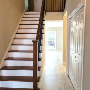
On the main floor, the kitchen was fully gutted, and the dividing wall between the dining room and kitchen was moved back, to expand the kitchen further; this was a load bearing wall. Due to this, we also enclosed the doorway to the dining room from the kitchen. An entirely new kitchen was installed in an MDF finish with a Michigan door style, featuring brushed nickel accents. The flooring throughout the main floor, including the kitchen was replaced with a luxury vinyl plank. A beautiful porcelain tile was installed for the kitchen backsplash with a quartz countertop. The client opted for a hooded fan with tile going up the surrounding walls, with decorative pendant lights and pot lights to brighten the space. The kitchen includes multiple storage solutions, including: 2 magic corners, a garbage/recycling system, and pull out drawer systems in the pantry. On the main floor, we also updated the powder room with a new vanity and top and toilet and installed a new laundry sink base unit in the laundry room. The railings and treads on the stairs were repainted, as well as all of the walls on the main floor. Due to the height of the new floor, the casing also had to be replaced on all of the doors on the main floor, and additional doorstop had to be added to each door.

 360 Designs Kitchen and Bath
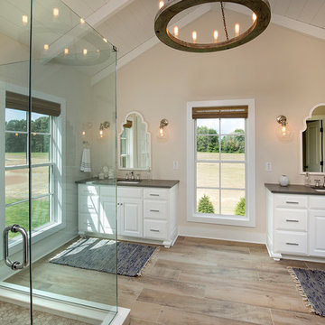
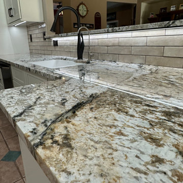
Challenge: Increase storage capacity within the existing space.
Solution: We achieved this by replacing standard bases with drawer bases and installing taller wall cabinets.
 Beds At Home LTD
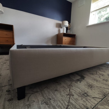
The oversized headboard, manufactured with great care and upholstered in a resistant beige plain fabric brings an exquisite and comfortable atmosphere to any bedroom. It represents an easy solution for any ensemble, creating a fashionable focal point that elevates any bedroom interior. It is designed to mount right on the wall, being perfect for a modern and contemporary look. You can add a splash of strong colours and heavy fabric for drama and a bigger impact. The bed has the benefit of being both comfortable and stylish, whilst also providing an efficient storage solution as a lift up storage bed base. Both the headboard and the bed are crafted from solid wood, creating a lasting impression.
 Drury Design
THE SETUP
Multiple ovens, multiple workspaces, multiple sinks – when you think about it, non-jewish kitchens have been adapting the criteria of kosher kitchens for years.
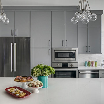
Gladys’ clients in West Rogers Park are Orthodox Jewish. The house they bought already had a kosher kitchen – it just wasn’t done that well. It needed some more things to be duplicated for the dairy side and the meat side. Plus, it was dark and the configuration wasn’t very conducive for a family of eight.
It was time for a remodel.
Design Objectives
Improve kosher kitchen
Add more storage in the island
Better lighting
More open, lighter feel
Change the wood floor in the kitchen to tile
THE REMODEL
Design Challenges
- We had originally planned on removing a wing wall by the breakfast area. During demolition, we learned it contained a support beam.
- The kitchen is a substantial size, but having two sinks, dishwashers, and ovens presented a challenge – how do we fit it all in and make it flow with the storage still accessible near the work areas?
Where do you stop the materials for the new space? - -- The right tile, paint, lighting, etc. would be needed to make the remodeled area cohesive with the rest of the main floor.
- An existing column limited cabinet options and thus, storage capacity. Could we conceal it without disrupting the cabinetry flow?
Design Solutions
- We had to keep the wing wall, but decided to continue the tile on the sides of the cabinets and maintain the height of the tile to line up with the rest of the backsplash. This actually presented a very nice and cohesive look, especially since the opposite side has a wing wall to the left of the refrigerator.
- We used “L-shaped” corner sinks instead of the rectangular ones set on an angle. This gave us more of the legs of the triangles versus the hypotenuse, which allowed for the two dishwashers, and the pullout utensil canisters and spice pullouts while still keeping the 3-drawer cabinets on either side of the range (by the sinks). The old island had the recess for stools which the family never used. By extending the width of the island 6” and utilizing this leg space, we were able to fit 18”-deep cabinets on this side – adding lots of accessible storage. The family can now work simultaneously on the dairy side (the side with the fridge) and the meat side (opposite) without getting in each other’s way. We separated the cooking by using the range oven for the meat and a built-in microwave in the base cabinet. The wall oven with built-in microwave on top is for dairy.
- Corner sinks opened up the middle area for a wider range – we went from a 30” to a 36”. Removing all the wall cabinets (on the range wall) made a big difference. That opened up the entire space while adding some visual impact. (Not pictured: We also made the cabinets directly opposite the range wall tall and removed the countertop, resulting in more room for rollouts and even more storage!) The kitchen now has more storage than it did before.
- We ended up painting the ceiling of the kitchen into the hallway that leads to the foyer. The living and dining rooms were separated by a soffit, so that became a natural boundary. We kept the tile in the kitchen by stopping it short of the hallway and lining it up with the pantry wall. This creates a border between the breakfast area and family room. The rest of the existing wood floors were refinished to refresh and make the hue darker. We also painted a dark accent wall and carried it into the breakfast area to make the rooms look deeper.
- The in-the-way column housed plumbing and couldn’t be moved. We still built cabinets in that spot – we just had to build a chase inside it to conceal the pipes. There was still plenty of room for new storage. We also took the cabinets all the way to the ceiling. The continuous tall cabinets added a functional elegance to the space.
THE RENEWED SPACE
The client’s long-awaited dream of a better kosher kitchen has finally been achieved, beautifully combining enhanced storage solutions with adherence to the family’s orthodox dietary laws. The kitchen’s standout feature, an expanded island, now offers a spacious and efficient workspace. This allows several family members to cook together comfortably, without the inconvenience of bumping into each other, ensuring a harmonious and productive cooking environment.
 Dream Coast Builders
Welcome to our Houzz profile! We’re excited to share our passion for transforming spaces with innovative remodeling and interior design ideas. At Jon Cancellino, based in Clearwater, FL, and serving Tampa and the surrounding areas, we specialize in modern home improvements and custom homes.
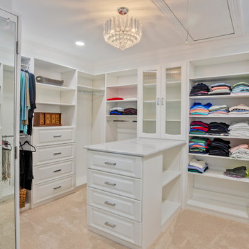
Our expertise includes everything from sleek, modern ceiling lights to stylish chalinders that enhance the ambiance of your spaces. We focus on practical and elegant solutions such as close shelves, closet cabinets, and clothes racks to keep your home organized and beautiful. Our designs feature stunning marble flooring, efficient shoes racks, and versatile clothes shelves that blend seamlessly with your white ceiling and contemporary decor.
Explore our range of interior ideas, including glass and wooden shelf doors, cabinet tables, and smart storage solutions. Whether you're interested in remodeling, general contracting, or home additions, we bring your vision to life with exceptional craftsmanship and attention to detail. Let’s create a home that’s uniquely yours!
 MD Flooring Solutions, LLC
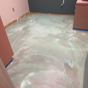
- To move furniture: 12x huge and heavy pieces of furniture out and back in from Main floor: break room, one bathroom, 6 exam rooms, lab room
To move Appliances out and back in: Fridge and mini fridge
- Take Up, Remove & Haul Away 12x12 Glued Down VCT (Vinyl Composition Tile) from floors from Main floor: break room, one bathroom, 6 exam rooms, lab room - 849.72 sqft
- Take Up, Remove & Haul Away vinyl cove base baseboards from Main floor: kitchen, one bathroom, 6 exam rooms, kitchenette - 849.72 sqft
- To Install glued down Luxury Vinyl Planks on floors on Main floor: break room, one bathroom, 6 exam rooms, lab room - 849.72 sqft
- To install Glued Down 4" Cove Base Baseboards on Main floor: break room, one bathroom, 6 exam rooms, lab room (292 LNFT)
- To install 6x black rubber T- moldings transition pieces - 3.5 LFT each
 TVL Creative Ltd.
Cramped kitchen be gone! That was the project motto and top priority. The goal was to transform the current layout from multiple smaller spaces into a connected whole that would activate the main level for our clients, a young family of four.
The biggest obstacle was the wall dividing the kitchen and the dining room. Removing this wall was central to opening up and integrating the main living spaces, but the existing ductwork that ran right through the center of the wall posed a design challenge, er design opportunity. The resulting design solution features a central pantry that captures the ductwork and provides valuable storage- especially when compared to the original kitchen's 18" wide pantry cabinet. The pantry also anchors the kitchen island and serves as a visual separation of space between the kitchen and homework area.
Through our design development process, we learned the formal living room was of no service to their lifestyle and therefore space they rarely spent time in. With that in mind, we proposed to eliminate the unused living room and make it the new dining room. Relocating the dining room to this space inherently felt right given the soaring ceiling and ample room for holiday dinners and celebrations. The new dining room was spacious enough for us to incorporate a conversational seating area in the warm, south-facing window alcove.
Now what to do with the old dining room?! To answer that question we took inspiration from our clients' shared profession in education and developed a craft area/homework station for both of their boys. The semi-custom cabinetry of the desk area carries over to the adjacent wall and forms window bench base with storage that we topped with butcher block for a touch of warmth. While the boys are young, the bench drawers are the perfect place for a stash of toys close to the kitchen.
The kitchen begins just beyond the window seat with their refrigerator enclosure. Opposite the refrigerator is the new pantry with twenty linear feet of shelving and space for brooms and a stick vacuum. Extending from the backside of the pantry the kitchen island design incorporates counter seating on the family room side and a cabinetry configuration on the kitchen side with drawer storage, a trashcan center, farmhouse sink, and dishwasher.
We took careful time in design and execution to align the range and sink because while it might seem like a small detail, it plays an important role in supporting the symmetrical configuration of the back wall of the kitchen. The rear wall design utilizes an appliance garage mirrors the visual impact of the refrigerator enclosure and helps keep the now open kitchen tidy. Between the appliance garage and refrigerator enclosure is the cooking zone with 30" of cabinetry and work surface on either side of the range, a chimney style vent hood, and a bold graphic tile backsplash.
The backsplash is just one of many personal touches we added to the space to reflect our client's modern eclectic style and love of color. Swooping lines of the mid-mod style barstools compliment the pendants and backsplash pattern. A pop of vibrant green on the frame of the pantry door adds a fresh wash of color to an otherwise neutral space. The big show stopper is the custom charcoal gray and copper chevron wall installation in the dining room. This was an idea our clients softly suggested, and we excitedly embraced the opportunity. It is also a kickass solution to the head-scratching design dilemma of how to fill a large and lofty wall.
We are so grateful to bring this design to life for our clients and now dear friends.
 The Design Gallery
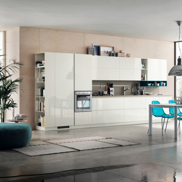
Foodshelf is the innovative response to contemporary home design solutions in which the kitchen and living area become more "fluid" and multifunctional and their characteristics tend to merge.
Like a latest-generation bookshelf, the Foodshelf kitchen - in which the French designer’s creativity of genius and Scavolini’s vast experience combine to perfection - features a "new horizontal linearity". It is centered on a series of wood look shelves that run the entire kitchen and living area length, acquiring different functions at various points (worktop, strip underneath the base units, or as shelves fitted below and above the wall units.)
This design concept also combines base and wall units of different colors, subdividing the kitchen into "graphic" blocks while retaining its modular structure.
For creating innovative compositions, with unusual, attractive chromatic and architectural effects every time.
#designerkitchenexperience #scavolinifoodshelf #creativity #designerkitchens #scavolinikitchens #madeinitaly #availableinkenya #custommade
 Imagine That Kitchens + Baths
Client desire:
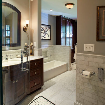
Bring back the original splendor of the master bathroom in her 1905 four-square mansion, including a low profile bathtub for her mother, a separate shower for herself, and plenty of storage.
Design challenges:
The bathroom had been part of a poorly constructed 1960’s addition with a narrow passage and a substandard foundation resulting in a room that was always too cold. The original part of the house had a foot of concrete for the sub-flooring so we were unsure about the ability to move fixtures. The window size and location had to remain fixed due to architectural details on the outside of the home.
Solutions:
We removed the addition subfloor to repair the weak footings and added closed cell insulation. We widened the passage and added a floor to ceiling armoire and shallow base cabinets with a curved end for storage. Inside one of the base cabinets we concealed a new larger radiator and we added in-floor heat. Functionality and flow were improved by switching the placement of the vanity and bathtub. The arched doors throughout the house were the inspiration for the curved glass shower door, arched medicine cabinet, and curved cabinetry. The antique wall sconces were purchased by the homeowner on her quest to find lighting in keeping with the era of the home. But the pièce de résistance is the beautiful Carrera marble and basket weave tile flooring achieved by a master tilesetter who worked meticulously to create the perfect result from my design.
 Centoni Restoration & Development, Inc.
CLIENT GOALS
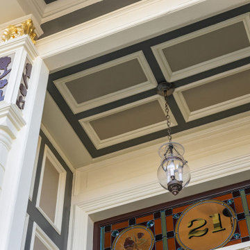
This spectacular Victorian was built in 1890 for Joseph Budde, an inventor, patent holder, and major manufacturer of the flush toilet. Through its more than 130-year life, this home evolved with the many incarnations of the Haight District. The most significant was the street modification that made way for the Haight Street railway line in the early 1920s. At that time, streets and sidewalks widened, causing the straight-line, two-story staircase to take a turn.
In the 1920s, stucco and terrazzo were considered modern and low-maintenance materials and were often used to replace the handmade residential carpentry that would have graced this spectacular staircase. Sometime during the 1990s, the entire entry door assembly was removed and replaced with another “modern” solution. Our clients challenged Centoni to recreate the original staircase and entry.
OUR DESIGN SOLUTION
Through a partnership with local artisans and support from San Francisco Historical Planners, team Centoni sourced information from the public library that included original photographs, writings on Cranston and Keenan, and the history of the Haight. Though no specific photo has yet to be sourced, we are confident the design choices are in the spirit of the original and are based on remnants of the original porch discovered under the 1920s stucco.
Through this journey, the staircase foundation was reengineered, the staircase designed and built, the original entry doors recreated, the stained glass transom created (including replication of the original hand-painted bird-theme rondels, many rotted decorated elements hand-carved, new and historic lighting installed, and a new iron handrail designed and fabricated.
 Cipriani Remodeling Solutions
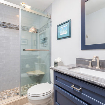
Bathroom - Voorhees (Blue vanity, pebble stone shower base)
Inspiration for a mid-sized contemporary bathroom remodel in Philadelphia
Inspiration for a mid-sized contemporary bathroom remodel in Philadelphia

 Innovate Building Solutions
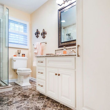
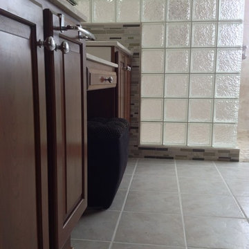
These original cherry vanity cabinets looks excellent around the glass block and glass tile accents
Inspiration for a large transitional master pebble tile ceramic tile doorless shower remodel in Columbus with recessed-panel cabinets, dark wood cabinets, solid surface countertops and beige walls
Inspiration for a large transitional master pebble tile ceramic tile doorless shower remodel in Columbus with recessed-panel cabinets, dark wood cabinets, solid surface countertops and beige walls
 Drury Design
THE SETUP
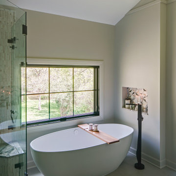
While the existing layout wasn’t inherently flawed, this primary bathroom felt outdated and lacked the desired aesthetic appeal for our client. The goal was to revitalize the space, catering to her refined taste while ensuring a bright, inviting ambiance. The client wanted a comfortable and classy gender-neutral design that would retain its updated look and have broad appeal for eventual resale.
Design Objectives:
Create a spacious, luxurious shower enclosure
Incorporate ample storage for towels, linens and an extensive hair care collection
Embrace a transitional design style that blends contemporary and classic elements
Establish a harmonious color palette that complements the home’s new black window frames
Ensure a future-proof design to maximize resale potential
Design Challenges:
Integrating a spacious shower within the existing layout
Ensuring accessible towel and robe storage near the shower and tub areas
Providing ample lighting and mirror space without cluttering the vanity area
Finding dedicated storage for hair care essentials and accessories
Maximizing linen storage while minimizing clutter
Decluttering the tub niche area
Tall angled ceiling almost too dramatic
THE RENEWED SPACE
Design Solutions:
Frameless glass shower enclosure with a recessed niche (in the half wall) for body care products
Strategically placed robe/towel hooks on shower glass facing shower and tub
Illuminated, oversized mirrors with integrated lighting
Multiple large pull-out drawers with electrical outlets in the vanity
Dedicated base cabinet with countertop for towel/linen storage and decor
Single, spacious tub niche for products and decorative accents
Subtle horizontal trim lines at standard ceiling height to visually ground the space
This primary bathroom remodel seamlessly blends style and functionality, catering to the client’s discerning taste while ensuring adaptability for future needs. The harmonious fusion of contemporary and classic design elements, coupled with innovative storage solutions and thoughtful lighting choices, creates a timeless sanctuary that exudes elegance and comfort.
 Custom Storage Solutions
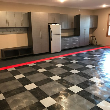
This 3 car garage was in desperate need for organization for a family of 6. THis design included two base cabinets with drawers for tool storage, two tall cabinets and upper cabinets with a hook board and a bench. A utility sink was included as well, we also installed our PVC flooring in a unique pattern using four colors and some carpet tiles near the cabinetry as well as a bike rack. New efficient LED lightning was also added and a fresh coat of paint on the walls and ceiling to finish it off.
77