
Search results for "Collector" in Home Design Ideas

 Axis Mundi | SF
Modernism’s most sacred tenets—simplicity, utility, order, rationalism, form following function—were nothing new to the Shakers who settled New York’s Columbia County. This house, located in Chatham and not far from Hancock Shaker Village, therefore picks up on these parallel precedents to embrace both Shaker ideals and their natural outgrowth in the architecture of today. Here, a 16-foot entrance gallery lined with clerestory windows serves to separate principle living areas from bedrooms, while also functioning as exhibition space for a perpetually evolving collection of contemporary art and design objects. The house, raised on a concrete plinth, is clad in wood, while a separate studio showcases exterior surfaces covered in Cor-ten steel shingles. Yet the forms are unified by a continuous copper roofline. The interrelationship creates juxtapositions between urban and rural aesthetics, a sense of lofty volume grounded by humble materials and finishes, and an interplay between intimate rooms and the rolling wide-open landscape outside.
Design: John Beckmann
© Axis Mundi Design LLC

 Katie Rosenfeld Design
Michael J Lee
Transitional freestanding desk home office photo in Boston with gray walls
Transitional freestanding desk home office photo in Boston with gray walls
 Axis Mundi | SF
Modernism’s most sacred tenets—simplicity, utility, order, rationalism, form following function—were nothing new to the Shakers who settled New York’s Columbia County. This house, located in Chatham and not far from Hancock Shaker Village, therefore picks up on these parallel precedents to embrace both Shaker ideals and their natural outgrowth in the architecture of today. Here, a 16-foot entrance gallery lined with clerestory windows serves to separate principle living areas from bedrooms, while also functioning as exhibition space for a perpetually evolving collection of contemporary art and design objects. The house, raised on a concrete plinth, is clad in wood, while a separate studio showcases exterior surfaces covered in Cor-ten steel shingles. Yet the forms are unified by a continuous copper roofline. The interrelationship creates juxtapositions between urban and rural aesthetics, a sense of lofty volume grounded by humble materials and finishes, and an interplay between intimate rooms and the rolling wide-open landscape outside.
Design: John Beckmann
© Axis Mundi Design LLC
Find the right local pro for your project

 Mitchel Berman Cabinetmakers Inc.
Contemporary Office Cabinetry for a San Francisco Art Collector's home.
Interior Design by Sabra Ballon Studio.
Cabinetry by Mitchel Berman Cabinetmakers.
Photograpy by Mitchel Berman.
Sleek Contemporary Style Cabinets fabricated of Rift Grain White Oak with a light grey wash finish. Lots of Drawers for Files, Office Supplies and storage.
Central "Standing Desk" with pull out tray for Keyboard and wall mounted monitor for computer work while standing to reduce fatigue.

 Quality Custom Cabinetry, Inc
Photography by Garrett Rowland Photography
Designed by Pete Cardamone
Mountain style u-shaped medium tone wood floor eat-in kitchen photo in Philadelphia with a farmhouse sink, recessed-panel cabinets, gray cabinets, stainless steel appliances, beige walls and multicolored backsplash
Mountain style u-shaped medium tone wood floor eat-in kitchen photo in Philadelphia with a farmhouse sink, recessed-panel cabinets, gray cabinets, stainless steel appliances, beige walls and multicolored backsplash
 Amuneal Manufacturing Corp.
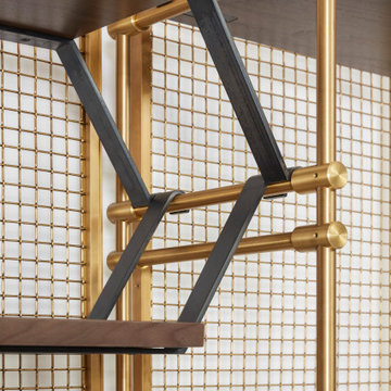
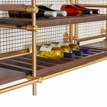
Amuneal’s Collectors’ Shelving System is infinitely flexible and can be customized to fit the look and style of your space. This configuration features solid machined brass fittings and posts with a wire mesh surround in a warm brass finish. The unit mounts to the wall, supporting silvered walnut hanging and hook shelves with carved sections for a small wine bottle collection.

 Simply Home Decorating
The homeowners of this condo sought our assistance when downsizing from a large family home on Howe Sound to a small urban condo in Lower Lonsdale, North Vancouver. They asked us to incorporate many of their precious antiques and art pieces into the new design. Our challenges here were twofold; first, how to deal with the unconventional curved floor plan with vast South facing windows that provide a 180 degree view of downtown Vancouver, and second, how to successfully merge an eclectic collection of antique pieces into a modern setting. We began by updating most of their artwork with new matting and framing. We created a gallery effect by grouping like artwork together and displaying larger pieces on the sections of wall between the windows, lighting them with black wall sconces for a graphic effect. We re-upholstered their antique seating with more contemporary fabrics choices - a gray flannel on their Victorian fainting couch and a fun orange chenille animal print on their Louis style chairs. We selected black as an accent colour for many of the accessories as well as the dining room wall to give the space a sophisticated modern edge. The new pieces that we added, including the sofa, coffee table and dining light fixture are mid century inspired, bridging the gap between old and new. White walls and understated wallpaper provide the perfect backdrop for the colourful mix of antique pieces. Interior Design by Lori Steeves, Simply Home Decorating. Photos by Tracey Ayton Photography
 Amuneal Manufacturing Corp.
Amuneal’s Collectors’ Shelving System is infinitely flexible and can be customized to fit the look and style of your space. This configuration features solid machined brass fittings and posts with a wire mesh surround in a warm brass finish. The unit mounts to the wall, supporting silvered walnut hanging and hook shelves with carved sections for a small wine bottle collection.

 Gail Green
The Kitchen entity of this large Art Collector's home is a compilation of several contiguous rooms that were gutted, forming one large family nexus area. Made to provide enough space to suit the needs of the gourmet cook for whom it was designed, it is particularly large yet efficient.
 River Woodcraft
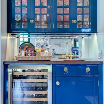
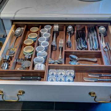
This kitchen was designed for the MAXIMALIST in mind. A homeowner who enjoys displaying all their antiques and chosen novelties from all over the world. No space was to be left untouched. Special attention was designed around custom detail beaded inset cabinetry, walnut countertops, polished lacquered bar with a tribute to their Naval background. Even the refrigerator is to be displayed through the glass

 Janet Patterson Interior Design (JPID)
Modern bathroom with paper recycled wallpaper, backlit semi-circle floating mirror, floating live-edge top and marble vessel sink.
Example of a mid-sized beach style light wood floor, beige floor and wallpaper powder room design in Miami with white cabinets, a two-piece toilet, gray walls, a vessel sink, wood countertops, brown countertops and a floating vanity
Example of a mid-sized beach style light wood floor, beige floor and wallpaper powder room design in Miami with white cabinets, a two-piece toilet, gray walls, a vessel sink, wood countertops, brown countertops and a floating vanity
 River Woodcraft
This kitchen was designed for the MAXIMALIST in mind. A homeowner who enjoys displaying all their antiques and chosen novelties from all over the world. No space was to be left untouched. Special attention was designed around custom detail beaded inset cabinetry, walnut countertops, polished lacquered bar with a tribute to their Naval background. Even the refrigerator is to be displayed through the glass

 Thyme & Place Design LLC
When my client had to move from her company office to work at home, she set up in the dining room. Despite her best efforts, this was not the long-term solution she was looking for. My client realized she needed a dedicated space not on the main floor of the home. On one hand, having your office space right next to the kitchen is handy. On the other hand, it made separating work and home life was not that easy.
The house was a ranch. In essence, the basement would run entire length of the home. As we came down the steps, we entered a time capsule. The house was built in the 1950’s. The walls were covered with original knotty pine paneling. There was a wood burning fireplace and considering this was a basement, high ceilings. In addition, there was everything her family could not store at their own homes. As we wound though the space, I though “wow this has potential”, Eventually, after walking through the laundry room we came to a small nicely lit room. This would be the office.
My client looked at me and asked what I thought. Undoubtedly, I said, this can be a great workspace, but do you really want to walk through this basement and laundry to get here? Without reservation, my client said where do we start?
Once the design was in place, we started the renovation. The knotty pine paneling had to go. Specifically, to add some insulation and control the dampness and humidity. The laundry room wall was relocated to create a hallway to the office.
At the far end of the room, we designated a workout zone. Weights, mats, exercise bike and television are at the ready for morning or afternoon workouts. The space can be concealed by a folding screen for party time. Doors to an old closet under the stairs were relocated to the workout area for hidden storage. Now we had nice wall for a beautiful console and mirror for storage and serving during parties.
In order to add architectural details, we covered the old ugly support columns with simple recessed millwork panels. This detail created a visual division between the bar area and the seating area in front of the fireplace. The old red brick on the fireplace surround was replaced with stack stone. A mantle was made from reclaimed wood. Additional reclaimed wood floating shelves left and right of the fireplace provides decorative display while maintaining a rustic element balancing the copper end table and leather swivel rocker.
We found an amazing rug which tied all of the colors together further defining the gathering space. Russet and burnt orange became the accent color unifying each space. With a bit of whimsy, a rather unusual light fixture which looks like roots from a tree growing through the ceiling is a conversation piece.
The office space is quite and removed from the main part of the basement. There is a desk large enough for multiple screens, a small bookcase holding office supplies and a comfortable chair for conference calls. Because working from home requires many online meetings, we added a shiplap wall painted in Hale Navy to contrast with the orange fabric on the chair. We finished the décor with a painting from my client’s father. This is the background online visitors will see.
The last and best part of the renovation is the beautiful bar. My client is an avid collector of wine. She already had the EuroCave refrigerator, so I incorporated it into the design. The cabinets are painted Temptation Grey from Benjamin Moore. The counter tops are my favorite hard working quartzite Brown Fantasy. The backsplash is a combination of rustic wood and old tin ceiling like porcelain tiles. Together with the textures of the reclaimed wood and hide poofs balanced against the smooth finish of the cabinets, we created a comfortable luxury for relaxing.
There is ample storage for bottles, cans, glasses, and anything else you can think of for a great party. In addition to the wine storage, we incorporated a beverage refrigerator, an ice maker, and a sink. Floating shelves with integrated lighting illuminate the back bar. The raised height of the front bar provides the perfect wine tasting and paring spot. I especially love the pendant lights which look like wine glasses.
Finally, I selected carpet for the stairs and office. It is perfect for noise reduction. Meanwhile for the overall flooring, I specifically selected a high-performance vinyl plank floor. We often use this product as it is perfect to install on a concrete floor. It is soft to walk on, easy to clean and does not reduce the overall height of the space.


 Simply Home Decorating
The homeowners of this condo sought our assistance when downsizing from a large family home on Howe Sound to a small urban condo in Lower Lonsdale, North Vancouver. They asked us to incorporate many of their precious antiques and art pieces into the new design. Our challenges here were twofold; first, how to deal with the unconventional curved floor plan with vast South facing windows that provide a 180 degree view of downtown Vancouver, and second, how to successfully merge an eclectic collection of antique pieces into a modern setting. We began by updating most of their artwork with new matting and framing. We created a gallery effect by grouping like artwork together and displaying larger pieces on the sections of wall between the windows, lighting them with black wall sconces for a graphic effect. We re-upholstered their antique seating with more contemporary fabrics choices - a gray flannel on their Victorian fainting couch and a fun orange chenille animal print on their Louis style chairs. We selected black as an accent colour for many of the accessories as well as the dining room wall to give the space a sophisticated modern edge. The new pieces that we added, including the sofa, coffee table and dining light fixture are mid century inspired, bridging the gap between old and new. White walls and understated wallpaper provide the perfect backdrop for the colourful mix of antique pieces. Interior Design by Lori Steeves, Simply Home Decorating. Photos by Tracey Ayton Photography
 River Woodcraft
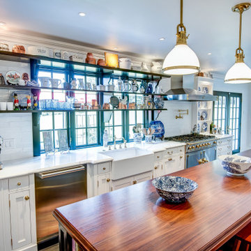
This kitchen was designed for the MAXIMALIST in mind. A homeowner who enjoys displaying all their antiques and chosen novelties from all over the world. No space was to be left untouched. Special attention was designed around custom detail beaded inset cabinetry, walnut countertops, polished lacquered bar with a tribute to their Naval background. Even the refrigerator is to be displayed through the glass

 Drewett Works
Designed to embrace an extensive and unique art collection including sculpture, paintings, tapestry, and cultural antiquities, this modernist home located in north Scottsdale’s Estancia is the quintessential gallery home for the spectacular collection within. The primary roof form, “the wing” as the owner enjoys referring to it, opens the home vertically to a view of adjacent Pinnacle peak and changes the aperture to horizontal for the opposing view to the golf course. Deep overhangs and fenestration recesses give the home protection from the elements and provide supporting shade and shadow for what proves to be a desert sculpture. The restrained palette allows the architecture to express itself while permitting each object in the home to make its own place. The home, while certainly modern, expresses both elegance and warmth in its material selections including canterra stone, chopped sandstone, copper, and stucco.
Project Details | Lot 245 Estancia, Scottsdale AZ
Architect: C.P. Drewett, Drewett Works, Scottsdale, AZ
Interiors: Luis Ortega, Luis Ortega Interiors, Hollywood, CA
Publications: luxe. interiors + design. November 2011.
Featured on the world wide web: luxe.daily
Photo by Grey Crawford.


 Landmark Construction
Inspiration for a farmhouse dark wood floor great room remodel in Santa Barbara with white walls
 River Woodcraft
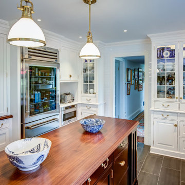
This kitchen was designed for the MAXIMALIST in mind. A homeowner who enjoys displaying all their antiques and chosen novelties from all over the world. No space was to be left untouched. Special attention was designed around custom detail beaded inset cabinetry, walnut countertops, polished lacquered bar with a tribute to their Naval background. Even the refrigerator is to be displayed through the glass
18