Search results for "Compared" in Home Design Ideas
Stefanie Rawlinson Photography
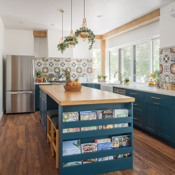
Example of a large transitional u-shaped light wood floor open concept kitchen design in Other with shaker cabinets, green cabinets, quartz countertops, white backsplash, stainless steel appliances and an island

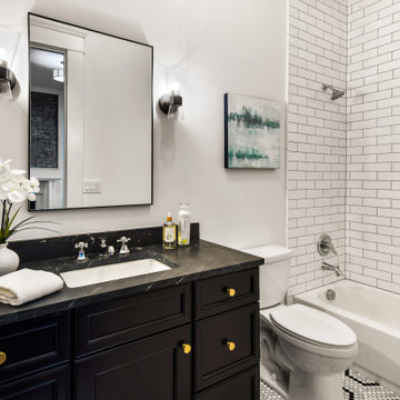
Example of a small trendy 3/4 gray tile, white tile and porcelain tile cement tile floor and multicolored floor corner shower design in Dallas with shaker cabinets, white cabinets, gray walls, an undermount sink, marble countertops, a hinged shower door and gray countertops
Find the right local pro for your project
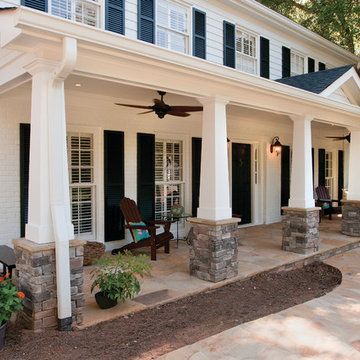
Lovely two story home in the heart of the low country in South Carolina. We have a nice, wide front porch - very traditional in the South - with a connecting walk-way to the garage, which also has an apartment above. The shell driveway is also very popular in the south. The exterior lighting really shows off this home with its beautiful and low maintenance landscaping.

Kitchen open to Family Room, Home Office, and Breakfast Area
Inspiration for a mid-century modern u-shaped terrazzo floor, white floor and shiplap ceiling open concept kitchen remodel in San Francisco with an undermount sink, flat-panel cabinets, medium tone wood cabinets, quartz countertops, white backsplash, quartz backsplash, stainless steel appliances, an island and white countertops

This Sonoma steam shower is a luxurious usage of our Listone D wood-look porcelain that is imported straight from Italy.
CTD is a family owned business with a showroom and warehouse in both San Rafael and San Francisco.
Our showrooms are staffed with talented teams of Design Consultants. Whether you already know exactly what you want or have no knowledge of what's possible we can help your project exceed your expectations. To achieve this we stock the best Italian porcelain lines in a variety of styles and work with the most creative American art tile companies to set your project apart from the rest.
Our warehouses not only provide a safe place for your order to arrive, but also stock a complete array of all the setting materials your contractor will need to complete your project saving him time and you money. The warehouse staff is knowledgeable and friendly to help make sure your project goes smoothly.
[Jeff Rumans Photography]

Our clients, a couple with four children, wanted to update their 1952 home with a mid-century feel, focusing on the main floor. The renovation emphasized enhancing finishes, optimizing storage, and maximizing seating in the dining and living areas. The entryway was designed to be inviting and practical, while the living room featured a statement sectional and a stunning terrazzo fireplace. The kitchen and dining area were transformed to be both functional and elegant, with playful touches like “Drunk Monkeys” wallpaper in the powder room.

Inspiration for a craftsman front yard concrete paver landscaping in Portland.

A 1927 colonial home in Shaker Heights, Ohio, received a breathtaking renovation that required extensive work, transforming it from a tucked away, utilitarian space, to an all-purpose gathering room, a role that most kitchens embrace in a home today. The scope of work changed over the course of the project, starting more minimalistically and then quickly becoming the main focus of the house's remodeling, resulting in a staircase being relocated and walls being torn down to create an inviting focal point to the home where family and friends could connect. The focus of the functionality was to allow for multiple prep areas with the inclusion of two islands and sinks, two eating areas (one for impromptu snacking and small meals of younger family members and friends on island no. two and a built-in bench seat for everyday meals in the immediate family). The kitchen was equipped with all Subzero and Wolf appliances, including a 48" range top with a 12" griddle, two double ovens, a 42" built-in side by side refrigerator and freezer, a microwave drawer on island no. one and a beverage center and icemaker in island no. two. The aesthetic feeling embraces the architectural feel of the home while adding a modern sensibility with the revamped layout and graphic elements that tie the color palette of whites, chocolate and charcoal. The cabinets were custom made and outfitted with beaded inset doors with a Shaker panel frame and finished in Benjamin Moore's OC-17 White Dove, a soft white that allowed for the kitchen to feel warm while still maintaining its brightness. Accents of walnut were added to create a sense of warmth, including a custom premium grade walnut countertop on island no. one from Brooks Custom and a TV cabinet with a doggie feeding station beneath. Bringing the cabinet line to the 8'6" ceiling height helps the room feel taller and bold light fixtures at the islands and eating area add detail to an otherwise simpler ceiling detail. The 1 1/4" countertops feature Calacatta Gold Marble with an ogee edge detail. Special touches on the interiors include secret storage panels, an appliance garage, breadbox, pull-out drawers behind the cabinet doors and all soft-close hinges and drawer glides. A kneading area was made as a part of island no. one for the homeowners' love of baking, complete with a stone top allowing for dough to stay cool. Baskets beneath store kitchen essentials that need air circulation. The room adjacent to the kitchen was converted to a hearth room (from a formal dining room) to extend the kitchen's living space and allow for a natural spillover for family and guests to spill into.
Jason Miller, Pixelate

Inspiration for a modern l-shaped eat-in kitchen remodel in Miami with an undermount sink, shaker cabinets, dark wood cabinets, quartzite countertops, multicolored backsplash and stainless steel appliances

Discerning, intelligent, European. A staff favorite, Noret captures the depth of color and texture that is expected with premium European Oak. A slight tan with a whitewash brush, Noret provides a luxurious template for any refined space.
The most important specification for determining the durability of vinyl flooring is the thickness of the wear-layer. The best wear-layers are made of thick, clear virgin PVC, which covers the paper print-film that gives the floor its unique appearance. Once the wear-layer wears through, the paper is damaged and the floor will need replacement.
Most vinyl floors come with a 8-12 mil wear-layer (0.2-3 mm). The top commercial specs in the industry are higher, at 20-22 mil (0.5 mm). A select few manufacturers offer a “super” commercial spec of 28 mil (0.7 mm).
For Modin, we decided to set a new standard: 40 mil (1.0 mm) of premium virgin PVC. This allows us to offer an industry-leading 20 year Commercial Warranty (Lifetime Residential), compared to nearly all other commercial vinyl floors’ 10 year Commercial Warranty.
Beyond our superior wear-layer, we also use a patented click mechanism for superior hold, and a ceramic-bead coating.
SIZE MATTERS
Wider and longer planks create a sense of space and luxury. Most vinyl floors come in 6” or 7” widths, and 36” or 48” lengths.
For Modin, we designed our planks to be 9” wide, and 60” long. This extra large size allows our gorgeous designs to be fully expressed.
DETAILS THAT COUNT
We made sure to get all the details right. Real texture, to create the feel of wire-brushed wood. Low sheen level, to ensure a natural look that wears well over time. 4-sided bevels, to more accurately emulate the look of real planks. When added together they help create the unique look that is Modin.
DESIGNS THAT INSPIRE
We spent nearly a year just focusing on our designs, to ensure they provide the right mix of color and depth. Focusing on timeless wire-brush and European Oak styles, as well as more contemporary modern washes, our collection offers truly beautiful design that is both functional and inspiring.

Cramped kitchen be gone! That was the project motto and top priority. The goal was to transform the current layout from multiple smaller spaces into a connected whole that would activate the main level for our clients, a young family of four.
The biggest obstacle was the wall dividing the kitchen and the dining room. Removing this wall was central to opening up and integrating the main living spaces, but the existing ductwork that ran right through the center of the wall posed a design challenge, er design opportunity. The resulting design solution features a central pantry that captures the ductwork and provides valuable storage- especially when compared to the original kitchen's 18" wide pantry cabinet. The pantry also anchors the kitchen island and serves as a visual separation of space between the kitchen and homework area.
Through our design development process, we learned the formal living room was of no service to their lifestyle and therefore space they rarely spent time in. With that in mind, we proposed to eliminate the unused living room and make it the new dining room. Relocating the dining room to this space inherently felt right given the soaring ceiling and ample room for holiday dinners and celebrations. The new dining room was spacious enough for us to incorporate a conversational seating area in the warm, south-facing window alcove.
Now what to do with the old dining room?! To answer that question we took inspiration from our clients' shared profession in education and developed a craft area/homework station for both of their boys. The semi-custom cabinetry of the desk area carries over to the adjacent wall and forms window bench base with storage that we topped with butcher block for a touch of warmth. While the boys are young, the bench drawers are the perfect place for a stash of toys close to the kitchen.
The kitchen begins just beyond the window seat with their refrigerator enclosure. Opposite the refrigerator is the new pantry with twenty linear feet of shelving and space for brooms and a stick vacuum. Extending from the backside of the pantry the kitchen island design incorporates counter seating on the family room side and a cabinetry configuration on the kitchen side with drawer storage, a trashcan center, farmhouse sink, and dishwasher.
We took careful time in design and execution to align the range and sink because while it might seem like a small detail, it plays an important role in supporting the symmetrical configuration of the back wall of the kitchen. The rear wall design utilizes an appliance garage mirrors the visual impact of the refrigerator enclosure and helps keep the now open kitchen tidy. Between the appliance garage and refrigerator enclosure is the cooking zone with 30" of cabinetry and work surface on either side of the range, a chimney style vent hood, and a bold graphic tile backsplash.
The backsplash is just one of many personal touches we added to the space to reflect our client's modern eclectic style and love of color. Swooping lines of the mid-mod style barstools compliment the pendants and backsplash pattern. A pop of vibrant green on the frame of the pantry door adds a fresh wash of color to an otherwise neutral space. The big show stopper is the custom charcoal gray and copper chevron wall installation in the dining room. This was an idea our clients softly suggested, and we excitedly embraced the opportunity. It is also a kickass solution to the head-scratching design dilemma of how to fill a large and lofty wall.
We are so grateful to bring this design to life for our clients and now dear friends.

Sand Creek Post & Beam traditional wood barn used as a garage with a party loft / guest house. For more photos visit us at www.sandcreekpostandbeam.com or check us out on Facebook at www.facebook.com/SandCreekPostandBeam

ZeroEnergy Design (ZED) created this modern home for a progressive family in the desirable community of Lexington.
Thoughtful Land Connection. The residence is carefully sited on the infill lot so as to create privacy from the road and neighbors, while cultivating a side yard that captures the southern sun. The terraced grade rises to meet the house, allowing for it to maintain a structured connection with the ground while also sitting above the high water table. The elevated outdoor living space maintains a strong connection with the indoor living space, while the stepped edge ties it back to the true ground plane. Siting and outdoor connections were completed by ZED in collaboration with landscape designer Soren Deniord Design Studio.
Exterior Finishes and Solar. The exterior finish materials include a palette of shiplapped wood siding, through-colored fiber cement panels and stucco. A rooftop parapet hides the solar panels above, while a gutter and site drainage system directs rainwater into an irrigation cistern and dry wells that recharge the groundwater.
Cooking, Dining, Living. Inside, the kitchen, fabricated by Henrybuilt, is located between the indoor and outdoor dining areas. The expansive south-facing sliding door opens to seamlessly connect the spaces, using a retractable awning to provide shade during the summer while still admitting the warming winter sun. The indoor living space continues from the dining areas across to the sunken living area, with a view that returns again to the outside through the corner wall of glass.
Accessible Guest Suite. The design of the first level guest suite provides for both aging in place and guests who regularly visit for extended stays. The patio off the north side of the house affords guests their own private outdoor space, and privacy from the neighbor. Similarly, the second level master suite opens to an outdoor private roof deck.
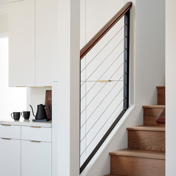
Light and Access. The wide open interior stair with a glass panel rail leads from the top level down to the well insulated basement. The design of the basement, used as an away/play space, addresses the need for both natural light and easy access. In addition to the open stairwell, light is admitted to the north side of the area with a high performance, Passive House (PHI) certified skylight, covering a six by sixteen foot area. On the south side, a unique roof hatch set flush with the deck opens to reveal a glass door at the base of the stairwell which provides additional light and access from the deck above down to the play space.
Energy. Energy consumption is reduced by the high performance building envelope, high efficiency mechanical systems, and then offset with renewable energy. All windows and doors are made of high performance triple paned glass with thermally broken aluminum frames. The exterior wall assembly employs dense pack cellulose in the stud cavity, a continuous air barrier, and four inches exterior rigid foam insulation. The 10kW rooftop solar electric system provides clean energy production. The final air leakage testing yielded 0.6 ACH 50 - an extremely air tight house, a testament to the well-designed details, progress testing and quality construction. When compared to a new house built to code requirements, this home consumes only 19% of the energy.
Architecture & Energy Consulting: ZeroEnergy Design
Landscape Design: Soren Deniord Design
Paintings: Bernd Haussmann Studio
Photos: Eric Roth Photography

© Daniel Bowman Ashe
www.visuocreative.com
Dal-Rich Construction, Inc.
Example of a large classic backyard concrete paver patio kitchen design in Dallas with a gazebo

Reclaimed and weathered. Rustic and full of personality, Wychwood brings the grey and aged tones of reclaimed wood to your space.
REDEFINING DURABILITY
The most important specification for determining the durability of vinyl flooring is the thickness of the wear-layer. The best wear-layers are made of thick, clear virgin PVC, which covers the paper print-film that gives the floor its unique appearance. Once the wear-layer wears through, the paper is damaged and the floor will need replacement.
Most vinyl floors come with a 8-12 mil wear-layer (0.2-3 mm). The top commercial specs in the industry are higher, at 20-22 mil (0.5 mm). A select few manufacturers offer a “super” commercial spec of 28 mil (0.7 mm).
For Modin, we decided to set a new standard: 40 mil (1.0 mm) of premium virgin PVC. This allows us to offer an industry-leading 20 year Commercial Warranty (Lifetime Residential), compared to nearly all other commercial vinyl floors’ 10 year Commercial Warranty.
Beyond our superior wear-layer, we also use a patented click mechanism for superior hold, and a ceramic-bead coating.
SIZE MATTERS
Wider and longer planks create a sense of space and luxury. Most vinyl floors come in 6” or 7” widths, and 36” or 48” lengths.
For Modin, we designed our planks to be 9” wide, and 60” long. This extra large size allows our gorgeous designs to be fully expressed.
DETAILS THAT COUNT
We made sure to get all the details right. Real texture, to create the feel of wire-brushed wood. Low sheen level, to ensure a natural look that wears well over time. 4-sided bevels, to more accurately emulate the look of real planks. When added together they help create the unique look that is Modin.
DESIGNS THAT INSPIRE
We spent nearly a year just focusing on our designs, to ensure they provide the right mix of color and depth. Focusing on timeless wire-brush and European Oak styles, as well as more contemporary modern washes, our collection offers truly beautiful design that is both functional and inspiring.

Inspiration for a mid-sized contemporary concrete paver landscaping in Orange County with a fireplace.

12'x12' Studio shed with 4' roof overhang and paired French doors
Inspiration for a small craftsman shed remodel in Tampa
63