
Search results for "Competent" in Home Design Ideas
 Native Edge Landscape
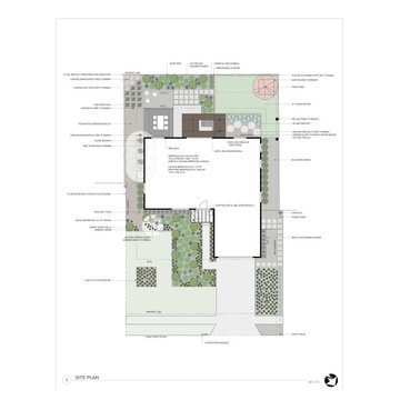
At Native Edge Landscape, we believe that outdoor spaces are canvases for artistic expression and harmonious design. In one of our recent projects, we had the opportunity to create a breathtaking pergola that seamlessly blended with the surrounding environment while showcasing the unique artful taste of our clients. Join us as we explore the captivating details of this design and the meticulous craftsmanship that went into creating a truly remarkable outdoor space.
The Pergola: A Perfect Fusion of Steel and Cedar
The focal point of this project is undoubtedly the large pergola, which we carefully constructed from steel C-channel and rough cedar purlins. The combination of these materials resulted in a striking aesthetic that effortlessly marries strength and natural beauty. The warm tones of each play off one another and come alive in the sunlight, while the alternating basketweave layout of the slats offer even more visual interest as well as variation in the provided shade. The design concept was carefully planned to ensure the purlins fit snugly into the channel, cleverly concealing any visible fasteners. This attention to detail adds to the sleek and streamlined appearance of the pergola, elevating its visual appeal and rustic elegance.
Working in Harmony with Nature
One of the most remarkable aspects of this project is how the pergola and the clam shell-colored Trex deck were thoughtfully designed to complement and highlight the existing large red oak tree. Rather than overshadowing or competing with its natural beauty, the design gracefully worked around the tree, creating a harmonious coexistence between human craftsmanship and nature's elegance.
Mid-Century Modern Charm with an Artful Twist
While the overall design of the space exudes mid-century modern aesthetics, what truly makes this project stand out is the clients' unique and artful taste. Their personal touch can be seen in the selection of decor, furniture, and subtle embellishments that add character and personality to the space. The result is a stunning blend of timeless design principles and the clients' individual artistic expression, creating a truly one-of-a-kind outdoor sanctuary.
Craftsmanship that Inspires
Every element of this project, from the pergola's construction to the careful integration of existing natural features, is a testament to the exceptional craftsmanship of the Native Edge Landscape team. With an unwavering commitment to excellence, our designers and craftsmen brought the clients' vision to life, transforming their outdoor space into a work of art.
The large pergola in this project serves as a striking centerpiece, combining the remarkable simplicity of steel and cedar to create a visually striking structure that harmonizes with the surrounding environment. Through careful design and meticulous craftsmanship, we successfully incorporated the clients' artful taste, resulting in a space that reflects their unique style while embracing mid-century modern charm. At Native Edge Landscape, we take pride in creating outdoor spaces that are not only aesthetically stunning but also deeply personal and reflective of our clients' individuality.
If you're seeking to transform your own yard into a captivating art space, we invite you to contact Native Edge Landscape. Our team of experts is ready to bring your vision to life, combining artistry, sustainability, and conscientious craftsmanship to create an outdoor sanctuary that is truly extraordinary. Let us inspire and elevate your outdoor living experience today.
 Decorating Den Interiors-Barbara Tabak
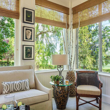
The inspiration for this room’s design was inspired by the beautiful view found outside the windows. Not wanting to compete with Mother Nature I selected neutral color pallet to blend with the idyllic surroundings. The clean sleek lines of the upholstered furnishings sit in juxtaposition to the natural elements—the woven wood blinds, the driftwood coffee table, the slate and copper wall fountain and other accessories— that are scattered throughout the room. Altogether, the room’s design creates a wonderful area to relax, entertain or simply enjoy the scenery.
 Tracy Tesmer Design Remodeling
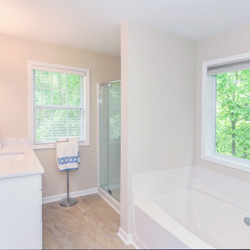
In our recently remodeled Migration Point master bath, we made changes to fixtures, countertops, cabinetry, and flooring that has helped give the space a more fresh, crisp and overall updated feel. The color choices are more subtle in this bathroom, as to not compete with the natural light and scenery that is showcased through the beautiful picture window. The shower was also completely re -equipped with a new glass front, shower surround, plumbing fixtures and grab bars to better meet the client’s needs.
Find the right local pro for your project
 lavish
This Raleigh, NC home was reimagined from the ground up — not room by room, but as a single, cohesive expression of how a family lives, gathers, and rests.
The architecture drove every decision. Custom millwork and panel molding were carried through every space, creating a visual language that connects the entry to the living room, the dining room to the primary suite. It's what makes the home feel complete — not like a collection of individually finished rooms.
In the kitchen, a full marble slab backsplash reads as one uninterrupted surface — giving the room its presence without competing with the custom white inset cabinetry and brushed nickel hardware. The dining room lives in deliberate contrast: deep-toned oak table, delicate botanical wallpaper, antique mirror. Light and organic, yet entirely considered.
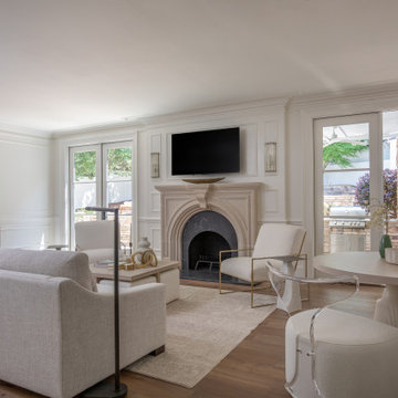
The living room was designed around its connection to the outside — French doors that open directly to a substantial outdoor kitchen and entertaining space, anchored on the interior by a cast stone fireplace with an arched surround that commands the room.
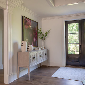
The entry sets the expectation for everything that follows: a double-height foyer, geometric pendants cascading from above, large-scale original artwork, and a carved console that makes the first impression without overstating it.
Designed and executed by Lavish — Raleigh, NC's full-service interior design and remodeling firm.
 Fabulous Finishes by Michelle
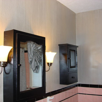
This gold and silver strié finish coordinates well with this pink and black tile without competing
Example of a small 1950s bathroom design in Raleigh with raised-panel cabinets and black cabinets
Example of a small 1950s bathroom design in Raleigh with raised-panel cabinets and black cabinets
 lavish
This Raleigh, NC home was reimagined from the ground up — not room by room, but as a single, cohesive expression of how a family lives, gathers, and rests.
The architecture drove every decision. Custom millwork and panel molding were carried through every space, creating a visual language that connects the entry to the living room, the dining room to the primary suite. It's what makes the home feel complete — not like a collection of individually finished rooms.
In the kitchen, a full marble slab backsplash reads as one uninterrupted surface — giving the room its presence without competing with the custom white inset cabinetry and brushed nickel hardware. The dining room lives in deliberate contrast: deep-toned oak table, delicate botanical wallpaper, antique mirror. Light and organic, yet entirely considered.
The living room was designed around its connection to the outside — French doors that open directly to a substantial outdoor kitchen and entertaining space, anchored on the interior by a cast stone fireplace with an arched surround that commands the room.
The entry sets the expectation for everything that follows: a double-height foyer, geometric pendants cascading from above, large-scale original artwork, and a carved console that makes the first impression without overstating it.
Designed and executed by Lavish — Raleigh, NC's full-service interior design and remodeling firm.
 Make Your Place Livable LLC
This home office refresh focused on transforming a large multipurpose space into an organized, functional environment that reflects the homeowner's personality and interests.
The room contained an extensive collection of books, family photographs, memorabilia, keepsakes, and personal mementos gathered over many years. Rather than minimizing these meaningful items, the design approach centered on showcasing them in a cohesive and intentional way.
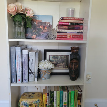
Bookshelves were thoughtfully styled to balance books, decorative accessories, framed photographs, and collectibles, creating visual interest while maintaining organization. Strategic furniture placement and improved space planning helped open circulation paths and reduce visual clutter, allowing the room's architectural features and personal collections to take center stage.
The result is a home office that feels spacious, organized, and deeply personal—a space where meaningful belongings contribute to the design rather than compete with it.
Services Provided:
• Space Planning
• Home Office Refresh
• Bookshelf Styling
• Decorative Styling
• Organization & Display Planning
• Furniture & Décor Arrangement
 Bilotta Kitchen & Home
Designer Janet Villafane of Villafane Design, LLC of Chester, New Jersey designed and executed this contemporary kitchen with Aston Smith of Bilotta Kitchens of New York. According to Villafane, “from the moment you meet this family you understand their priority in life is family and friends. We were looking for a design that, first and foremost, emphasized the occupants’ request to have a home that was inviting to all that entered. We continued to focus on that request throughout the design phase.” In addition, the design team needed to satisfy the needs of a disabled family member. They wanted him to be able to flow through all areas of the space and feel as if he could comfortably use the open kitchen and family room without any hindrance.
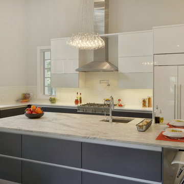
The clients were inspired by clean lines and simplicity. When they spoke about their modern Florida home, one could hear and see their enthusiasm and excitement to bring that simplicity into their new home. It became evident early on that their new space should be contemporary but the home’s exterior, as well as the neighboring community, had an old world, traditional charm. The goal was to avoid competing aesthetics while respecting both looks. The resulting interior design incorporated slab doors with both semi-gloss white lacquer and grey stain on horizontal grained oak. The rich dark oak base cabinets perfectly balanced the ceiling beams. The use of a stainless channel system, in place of traditional hardware, and the stainless toe kick completed the design. The Bertazzoni cooktop and wall ovens in stainless steel, Sub-Zero refrigeration paneled in white semi-gloss, and a stainless steel chimney hood enhanced the clean, uninterrupted lines. The island countertop is Thunder White granite in a leathered finish; the perimeter is Super White Quartz; and the nook table is Virginia Mist honed granite. The backsplash is a frosted glass tile.
The clients hope for quality, simplicity and functionality were beautifully achieved by the designers. Closed, solid front cabinets provide a “home” for everything in the kitchen. A seating nook with a large screen TV, as well as additional TVs visible throughout the kitchen and family room, satisfied the demand of watching multiple sporting events at one time. To finish it all off decorative lighting was carefully selected to make a “wow” statement.
Designer: Janet Villafane of Villafane Design LLC
Bilotta Designer: Aston Smith
Photo Credit: Peter Krupenye
 Adam Gibson Design
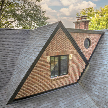
This renovation carefully reinterprets a 1920s Tudor home, balancing preservation with meaningful expansion. New additions and dormers are composed as if original to the house, using matching brickwork, slate-toned roofing, and traditionally proportioned gables to maintain architectural continuity. Subtle half-timbering, thoughtfully detailed masonry arches, and deeply set windows reinforce the Tudor vocabulary while allowing for significantly improved interior volume and natural light. On the rear elevation, the architecture opens to the landscape with a restrained, contemporary deck and generous glazing, creating a seamless indoor–outdoor connection without competing with the historic character. The result is a cohesive composition that feels timeless—one that respects the home’s origins while quietly elevating it for modern living.
 Century Stair Company
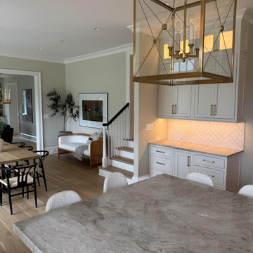
From the first step, this staircase sets the tone. A double bullnose starting step eases the entry with quiet confidence, leading into white oak treads that bring natural warmth to the climb. Slender white balusters hold a light, open rhythm alongside a sleek painted handrail that wraps the structure cleanly from bottom to top. Nothing here competes for attention. Each element defers to the whole, and the whole makes a lasting impression.
1976-2026 © Century Stair Company
 Susan Yeley Homes
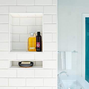
White kitchens are, truly, not for everyone. These clients, settling in Bloomington with a newborn and collections of quilts, fiestaware and jam band tour posters, were drawn to how bright and clean a white kitchen can be, but reluctant to lose color and interest. At SYI, we agreed! It would have felt like too sudden a drain of intensity to go from so much vibrancy to a complete white out. At the same time, all that vibrancy needed a backdrop that didn't compete. Enter the bright green island! And yellow sconces! And red bird runner! And upstairs, in a complete makeover of an awkward ensuite, the turquoise ceiling and door! (You really can't speak of these things without exclamation marks, we find.) True to its 1960s era colonial bones, the kitchen was formerly a tight U of wood stained cabinetry, adjacent to but cut off from an eating nook (where, if it's like most households, previous occupants likely ate most if not all of their meals, leaving the nearby dining room awfully lonely and unused). The eating nook's picture window became a door to a new deck, and one side of the U went away, leaving room for one of the most functional types of kitchen layouts we know of: an L with big windows to the back yard and a nice big island.
Contractor: Loren Wood Builders
Cabinetry: Stoll's Woodworking
Photography: Gina Rogers and Michiko Owaki
 Eden LA Furniture and Interiors
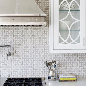
This large, devout family in West LA hired us to make their new construction, storybook traditional home dreams come true. And we had such a joy in working with them and love the end result. Small touches of contemporary lighting and art make the space feel updated and fresh, while materials and forms of the furnishings lent themselves to a truly timeless result. The basketweave backsplash lends beautiful interest while not competing with the cabinet design. We love a good traditional design, and had a wonderful time with this project and these clients.
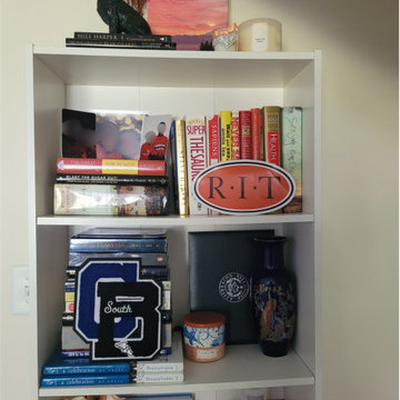 Make Your Place Livable LLC
This home office refresh focused on transforming a large multipurpose space into an organized, functional environment that reflects the homeowner's personality and interests.
The room contained an extensive collection of books, family photographs, memorabilia, keepsakes, and personal mementos gathered over many years. Rather than minimizing these meaningful items, the design approach centered on showcasing them in a cohesive and intentional way.
Bookshelves were thoughtfully styled to balance books, decorative accessories, framed photographs, and collectibles, creating visual interest while maintaining organization. Strategic furniture placement and improved space planning helped open circulation paths and reduce visual clutter, allowing the room's architectural features and personal collections to take center stage.
The result is a home office that feels spacious, organized, and deeply personal—a space where meaningful belongings contribute to the design rather than compete with it.
Services Provided:
• Space Planning
• Home Office Refresh
• Bookshelf Styling
• Decorative Styling
• Organization & Display Planning
• Furniture & Décor Arrangement
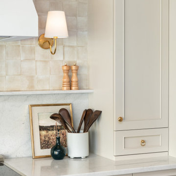
 MAC Reno Design Build LTD ( MAC Renovations)
A shallow ledge creates a useful place for a few everyday objects without competing with the working countertop below. The softly varied tile adds texture up close while remaining quiet within the larger kitchen.
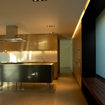
 MJ Neal Architects
The American Institute of Architects in Austin has awarded MJ Neal Architects a 2009 Design Award for the Wolfe Den. We started competing for these city design awards in 2003 and we’ve won every year except for 2006, when we didn’t enter.
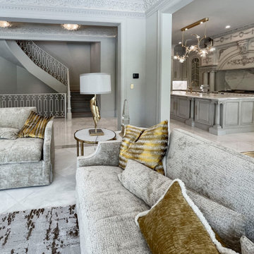 Century Stair Company
This 18th-century French-inspired mansion features three magnificent, curved staircases that complement the home's luxurious character. Each staircase blends forged iron railings with contemporary white oak components, creating a transitional aesthetic that bridges classical elegance and modern refinement. The staircases rise through grand spaces adorned with custom crystal chandeliers and surrounded by exceptional architectural finishes. Large windows frame outdoor views, while the curved forms of the stairs add graceful movement to the grand interiors. Together, these three staircases demonstrate how thoughtful craftsmanship can enhance rather than compete with a home's opulent surroundings.
1976-2026 © Century Stair Company
 Rocky Tops Granite & Marble LLC
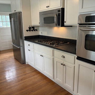
This kitchen in Forest Acres came together around a solid granite countertop, and it's the kind of stone that does the quiet work of holding a whole room together. Granite's been the go-to for kitchen counters for decades because it earns it. It's igneous rock, formed under heat and pressure, and that history is why it laughs off the stuff a real kitchen throws at it. Hot pans, knife work, everyday spills, granite takes it and keeps looking good.
We went with an eased edge on this one, which is the clean, simple line that a lot of Midlands homeowners want. It's not flashy, but that's the point. An eased edge softens the sharp corner just enough to be comfortable to lean against and easy to wipe down, and it lets the granite itself, the movement, the flecks, the depth in the stone, do the talking instead of a fussy edge profile competing for attention.
Getting a countertop like this right starts before the stone ever gets cut. We template the kitchen precisely, accounting for the cabinets, the appliances, and any out-of-square walls that always show up in real houses. Then it's cut, the edges are worked by hand to get that eased profile even and consistent around every corner, and the seams, if there are any, get lined up so the pattern reads as close to continuous as we can get it. Granite doesn't forgive sloppy fabrication. Every joint and cutout has to be tight because the stone's not going anywhere once it's set.
Day to day, this is a countertop that's built for actual cooking and actual life, not just for photos. Granite resists scratching, it handles heat better than almost anything else you'd put in a kitchen, and with a good sealer it shrugs off staining from wine, oil, or lemon juice. It's low maintenance once it's in, just a wipe down and, depending on the specific granite, a reseal every year or two to keep it performing at its best.
Forest Acres has a good mix of older homes getting updated and newer builds going in, and granite fits both. It's a material that's stood the test of time in kitchens across the Midlands, and this one's a solid, honest example of why. Clean lines, real stone, and a countertop that's going to outlast most everything else in that kitchen.
 Brandi Renee Designs
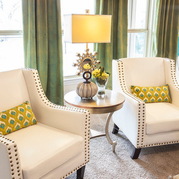
Crisp, white armchairs with nail head detail is a classic way to make a standout statement. Its an embellishment that won't compete with the style of the room. Bright green peacock inspired lumbar pillows come to life on the white chairs and add spontaneity to the space.Photo Credit: Samantha Day
 Restoration Coston
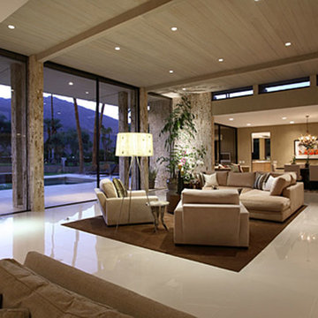
Stan Sachley design circa "1980" The architect clearly understood the proper use of space and light, while still respecting earlier mid-century desert architecture. The floors were kept clean and polished, as not to compete with the existing split travertine which ran through glass walls. This effect, blurred the indoor/outdoor living spaces. Finishes selected, were chosen to highlight a more refined and modern environment.
 George Ocampo
Central El Paso Backyard Renovation:
Fifteen years is a long time for a backyard to quietly wait.
At first, it was full of intention—a pool that promised summers, laughter, and long evenings. But time has a way of settling in. The water turned still, then green. Edges cracked. The space became less of a destination and more of something you looked past. Life moved forward, but the backyard stayed behind.
Then came the decision: it was time.
Not a patch job. Not a quick fix. A complete reset.
The transformation didn’t begin beautifully—it began with demolition. The old pool was drained, exposing years of neglect etched into its surface. Crews stepped in, breaking, clearing, reshaping. What once held stagnant water became an open cavity of possibility. Steel rebar formed a new skeleton, precise and intentional. Every line measured. Every elevation reconsidered.
This wasn’t just construction—it was rethinking how the space should live.
The shell was rebuilt. Surfaces were refined. Plumbing, structure, and flow were corrected at their core. What had once been outdated and failing was now engineered to last.
Then the shift happened.
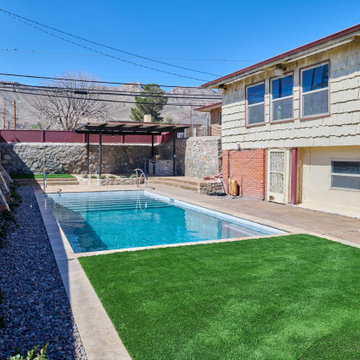
Hardscape came in—clean, warm-toned concrete replacing worn decking. Stone walls, once just boundaries, were elevated into features. Subtle textures, intentional lines. A visual language that matched the architecture of the home instead of competing with it.
The pool returned—but not as it was.
Now it was sharp, modern, and inviting. A long, clean body of water with a shallow tanning ledge that catches the sun just right. Stainless steel scuppers arc water into the pool—movement, sound, life. Steps are crisp, geometry is balanced, and the water reflects clarity instead of neglect.
Around it, the yard found purpose.
Artificial turf introduced contrast—green, controlled, low-maintenance. A pergola structure rose in the corner, creating a destination within the destination. Beneath it, a built-in outdoor kitchen turned the backyard into a place to gather, not just pass through. Lighting stitched everything together, making the space just as alive at dusk as it is under the midday sun.
By the end, nothing felt accidental.
What was once forgotten is now deliberate. What was once avoided is now the center of attention.
Fifteen years later, the backyard didn’t just come back—it finally became what it was always supposed to be.
54