
Search results for "Competent" in Home Design Ideas
 Crystal Kitchen + Bath
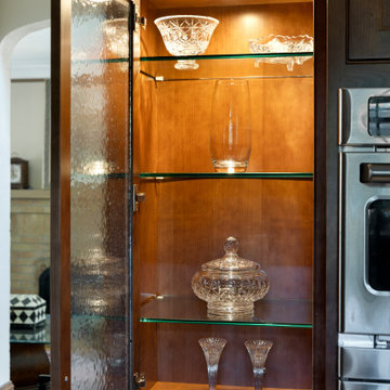
The goal for this 1939 Tudor-style story-and-a-half home was to create a kitchen that offered the conveniences, storage, and performance of a modern workspace while preserving the warmth, craftsmanship, and vintage charm that made the home special. The client, an avid home cook, wanted the room to feel as though it had always belonged to the house, with thoughtful upgrades that respected the original architecture rather than competing with it. Just as important, she needed a more efficient layout with enough storage for small appliances, so everyday cooking would no longer require carrying items up from the lower level.
Several existing conditions shaped the design approach. The kitchen retained original, amber-stained birch woodwork that the client wished to keep, and the compact footprint was interrupted by six doorways and two windows, none of which were to be moved, altered, or replaced. A previous flooring update had left the door casings undercut too short, creating visible gaps where the casing met the floor. The existing vintage 40-inch range also lacked proper ventilation, yet the client wished to accommodate a refrigerator, dishwasher, cooktop, double ovens, built-in microwave, and effective venting above the cooktop into the new kitchen layout.
To honor the original millwork, beaded inset-style cherry cabinetry was selected in a soft, hand-rubbed finish that will deepen over time and develop a natural patina. Charcoal-gray soapstone countertops complement the cabinetry while reinforcing the historic character of the home with an organic, timeworn texture. The former breakfast nook was transformed into a butler’s pantry, adding valuable base cabinet storage and expanded work surfaces for frequently used small appliances. Also in the butler’s pantry, a single upper cabinet was paired with open shelves to give an open, airy feeling while adding character and practical storage. A classic single-bowl apron-front workstation sink contributes both period-appropriate character and practical prep and cleanup function.
Because the home’s openings were such a defining feature, the design worked within the existing architecture instead of altering it. Custom plinth blocks were created for each doorway to extend the original casing gracefully down to the new natural red oak flooring, resolving the earlier construction issue while adding a detail that feels authentic to the age of the house. Despite the number of door and window openings, the new layout provides a significantly more functional, built-in kitchen with an improved work triangle for serious cooking.
Appliance placement was carefully planned to deliver the requested performance without overwhelming the small room. Three cooking functions (double ovens & microwave) were consolidated into one location with a GE Café double oven featuring Advantium Technology, while the client’s compact 31-inch refrigerator was reused to preserve space. A sleek 30-inch induction cooktop provides efficient cooking, and a Vent-A-Hood ARS ductless vent hood supplies needed ventilation without requiring a duct run to the exterior.
The finish palette balances richness, texture, and historical sensitivity. A deeply textured navy backsplash tile adds depth and dramatic shadow play against the soapstone, while wallpaper in the back entry echoes the tile’s geometric pattern to visually connect the adjoining spaces. Oil-rubbed bronze cabinet hardware and light fixtures enhance the warmth of the cherry cabinetry and complete the antique-inspired feel.
Lighting was layered to make the compact kitchen brighter, more useful, and more inviting. Vintage-style semi-flush ceiling fixtures establish the overall tone, while dimmable puck lights highlight select areas and undercabinet task lighting keeps work surfaces well illuminated.
The completed kitchen now feels both highly functional and deeply rooted in the home’s history. Rich cherry cabinetry, velvety soapstone, natural red oak flooring, navy tile, bronze accents, and carefully preserved birch trim work together to create a warm, cohesive space that celebrates timeless craftsmanship. By increasing storage, improving workflow, integrating modern appliances, and respecting the Tudor home’s original character, the design achieves the client’s vision: a kitchen that feels personal, practical, historically appropriate, and as though it has always been there.
 Rosborough Partners Inc.
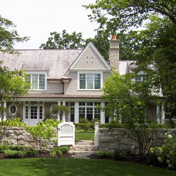
This monochromatic landscape makes sure the charm of the home's architecture takes center stage by highlighting the lines and details, and not competing with them visually. The result is gracious and welcoming.
 Home and Hearth Outfitters
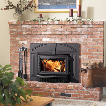
The Jotul C 450 Kennebec incorporates the company's unique Gothic Arch double door design. This model offers a 20% larger viewing area than competing products. Suitable for medium-to-large applications, this classic unit with its cast iron surround panel fits in with a range of décor.
Find the right local pro for your project
 Century Stair Company
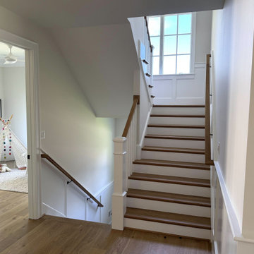
Traditional design elements have survived generations of shifting trends for a reason. This switchback staircase makes that case quietly. Box newels anchor the design with stateliness, while white painted risers and square balusters add definition to the natural white oak treads and handrail. Nothing here competes. Each element makes room for the next.
Set against a modern interior, the staircase doesn't feel out of place. It grounds it. A reminder that classic and contemporary don't have to choose sides.
1976-2026 © Century Stair Company
 Patio Lane
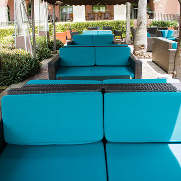
Located in the heart of Downtown St. Petersburg, the Vinoy Renaissance Resort & Golf Club is one of the city's most iconic hotels. This downtown gem can easily be distinguished by its salmon color and Mediterranean Revival style architecture. Situated right on the bay, this luxury resort is just a short walk from all of the area’s major attractions such as the Dali Museum, Beach Drive, and the Mahaffey Theater.
The Vinoy was constructed in 1925 and has been through a long history of renovations and construction within its lifetime. Efforts are constantly being made to preserve the hotel’s historic past while still providing guests with a unique, comfortable, and luxurious experience. With that being said, it was recently announced that the hotel will undergo a three-year $50 million plan to improve several aspects of the property.
Patio Lane took part in these upgrades by designing and producing custom cushions for two locations on the property: the veranda and smoking area seating. We fabricated a total of 187 custom cushions with 13 different configurations for the hotel: dining chair seat, lounge chair, love seat, center sectional, end sectionals, as well as ottomans. Patio Lane directly competed with the original furniture and cushion manufacturer for this project. However, being an essential part of St. Petersburg, the resort appreciated a local vendor with strong initiative to earn their business.
As far as the project requirements, the Vinoy needed something that will hold up through the harsh sun and storms of Central Florida. Typically, cushions in a commercial setting will last a few years depending on the human traffic. For a luxury hotel, such as the Vinoy, these cushions should have been replaced within 3 years.
To ensure that they would have high performing seating for their guests, they chose cushions fabricated with Sunbrella Rain performance fabric. This fabric is 100% waterproof and specifically made for outdoor spaces that endure heavy rainfall or any kind of moisture. Sunbrella Rain eliminates drying time after wet weather. Resort staff can simply wipe the cushions down and their guests are ready to continue lounging and relaxing.
The Vinoy’s original cushions used a polyurethane foam that had since lost its strength and was no longer providing a comfortable seat. (When we initially surveyed the Vinoy, we witnessed many customers doubling up on cushions to place behind their backs!) Numerous cushions had ripped at the seams and the zippers were non-functional. Dry-fast foam, the preferred option for cushions fabricated with Sunbrella Rain, was the perfect choice with the 4 in. thick seats & 5 in. thick backs because it will provide a firm seat and support for years to come.
 lavish
These two adjoining girls' rooms — a show-stopping nursery and a dreamy toddler bedroom — are among the most enchanting children's spaces imaginable. Each room has its own distinct personality while sharing a thread of botanical wonder, soft femininity, and elevated design that refuses to talk down to its young inhabitants. These are spaces designed not just for children, but with genuine artistry — rooms that will inspire wonder for years to come.
The Nursery
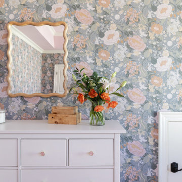
Step into this nursery and feel immediately transported into a secret garden at dusk. The design decision that sets the entire room apart is breathtakingly bold: a large-scale dark floral wallpaper — blooming with oversized peonies, roses, and wildflowers in dusty pink, peach, sage, and cream against a deep slate blue ground — wraps every wall from chair rail to ceiling, creating an immersive, almost painterly environment that feels simultaneously dramatic and deeply soft.
The ceiling is painted a warm, powdery pink that picks up the blush tones within the wallpaper perfectly — a "fifth wall" design moment that makes the room feel like a complete, considered installation rather than a decorated room. The transition from wallpapered walls to pink ceiling at the crown molding line is seamless and intentional, wrapping the baby in a floral garden overhead and all around.
Anchoring the room with genuine design authority is a spectacular gold and crystal chandelier — its circular brass frame hung with vertical crystal rods that catch and scatter light like a garden in rain — elevating the nursery from charming to genuinely luxurious. Beneath it, a natural oak arched spindle crib sits against the wallpapered feature wall, its warm honey wood grain providing organic contrast to the moody floral backdrop. Pink velvet pillows and a soft crib mobile of plush clouds and moons complete the crib vignette with gentle whimsy.
A boucle glider chair and matching stacked ottoman in cream provide the nursing corner, paired with a small brass side table for midnight essentials. A soft blush pink area rug anchors the seating area and echoes the ceiling color. Linen drapery panels in soft ivory frame the windows without competing with the wallpaper, their pinch-pleat heading adding a refined tailoring detail.
The Toddler Bedroom
The connecting bedroom takes the botanical theme in a softer, sunnier direction — all blush pink walls (matching ceiling and walls in the same warm rose tone for a cocooning effect), botanical print drapery in cream with red and green wildflowers, and brass curtain hardware that ties to the nursery's gold palette. A gold spindle crib — the metallic version of the nursery's wooden one — grounds the room with warmth, while a sage green upholstered glider provides a reading corner. A white dresser with brass hardware doubles as a changing table, topped with art prints and a Matisse-inspired framed poster in a gold frame that adds a touch of grown-up gallery sensibility.
Floating acrylic shelves hold a curated collection of board books at child-height — a detail that communicates that this room was designed for a child who will love and use it, not just admire it. A whimsical wicker llama toy basket, an indoor olive tree, and a fluffy white boucle child's armchair complete a room that balances magic with livability.
 Century Stair Company
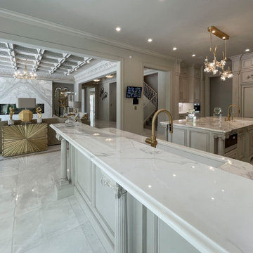
This 18th-century French-inspired mansion features three magnificent, curved staircases that complement the home's luxurious character. Each staircase blends forged iron railings with contemporary white oak components, creating a transitional aesthetic that bridges classical elegance and modern refinement. The staircases rise through grand spaces adorned with custom crystal chandeliers and surrounded by exceptional architectural finishes. Large windows frame outdoor views, while the curved forms of the stairs add graceful movement to the grand interiors. Together, these three staircases demonstrate how thoughtful craftsmanship can enhance rather than compete with a home's opulent surroundings.
1976-2026 © Century Stair Company
 Century Stair Company
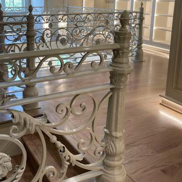
This 18th-century French-inspired mansion features three magnificent, curved staircases that complement the home's luxurious character. Each staircase blends forged iron railings with contemporary white oak components, creating a transitional aesthetic that bridges classical elegance and modern refinement. The staircases rise through grand spaces adorned with custom crystal chandeliers and surrounded by exceptional architectural finishes. Large windows frame outdoor views, while the curved forms of the stairs add graceful movement to the grand interiors. Together, these three staircases demonstrate how thoughtful craftsmanship can enhance rather than compete with a home's opulent surroundings.
1976-2026 © Century Stair Company
 Century Stair Company
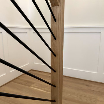
Metal and wood are often treated as opposites, but this staircase makes the case for partnership. White oak treads, chamfer-top newels, and a coordinating handrail bring the warmth and texture that only natural wood can offer. Against that, a satin black horizontal bar balustrade introduces rigid geometric precision, its clean lines and matte finish defining the oak rather than competing with it. The result is a staircase that feels both welcoming and sophisticated. Neither material overwhelms the other. Each one makes the other more defined.
1976-2026 © Century Stair Company
 Century Stair Company
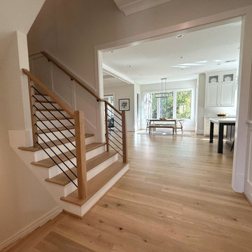
Metal and wood are often treated as opposites, but this staircase makes the case for partnership. White oak treads, chamfer-top newels, and a coordinating handrail bring the warmth and texture that only natural wood can offer. Against that, a satin black horizontal bar balustrade introduces rigid geometric precision, its clean lines and matte finish defining the oak rather than competing with it. The result is a staircase that feels both welcoming and sophisticated. Neither material overwhelms the other. Each one makes the other more defined.
1976-2026 © Century Stair Company
 Michael Nash Design, Build & Homes
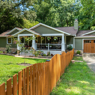
This run of the mills 1950 Rambler in Fairfax city area is in a desired need of a facelift.
The retiring homeowner wanted to stay in their old neighborhood while desiring to uplift their droopy front elevation and compete with rest of new comers in their neighborhood.
Through several design consultation and lots of changes, our design staff has presented her with a final draft.
They wanted to hang out in front porch and enjoy their front yard and walking neighbors more their backyard.
• We designed implemented a new covered front porch with trex flooring and stone columns with tarped tops, beaded panel ceiling, recess lights and ceiling fan, perfect place for couple rockers to hang outdoor and enjoy the view.
• The entire three sides of the house were covered with veneer water table stone and hardie plank siding with a jade green and a complementary shaker siding on the gables.
• Adding tow gable over the garage and the left elevation has changed the entire front elevation
• The new arts & Craft wooden garage door and front door uplifted the street appearance and given it a much-desired country look
• The entire roofing was changed up with Architectural shingles and trimmed and new gable, then painted the old brick walls to compliment the new Hardie sidings.
• Rain drop gutters and soft landscaping brought the look together
 Cabane
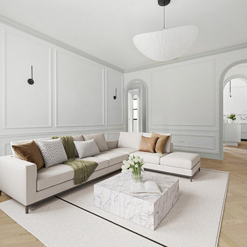
A generously scaled pre-war living room restored and reinterpreted with a full-height raised panel molding system painted in a soft warm white, running continuously across all four elevations and lending the room a quiet architectural grandeur. Herringbone oak flooring — a consistent thread throughout the residence — grounds the space, while a sculptural organic-form pendant anchors the ceiling without competing with the molding. A low cream sectional and a solid marble block coffee table furnish the room with restraint. An arched opening at the far end frames an axial view through the apartment, reinforcing the pre-war enfilade layout the renovation was designed around.
 N Sabella Inc
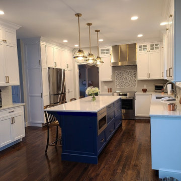
Inspired by Cape styles, this new Natick client desired an updated look with a better traffic pattern that was more open with smarter storage. By removing the peninsula, island seating reduced their sons fighting because now they weren’t competing for stools. They also fulfilled their dream of a coffee bar. The stove, backsplash and attractive hood are now a beautiful focal point from the family room view. They worked with our partner, Amany Design Studio, to select a clean, seamless look. This busy family now has a hidden command central and charging station. Custom-designed, pull-out shelving created organization and maximum storage within the new cabinets.
 Kerri Ann Thomas Interiors
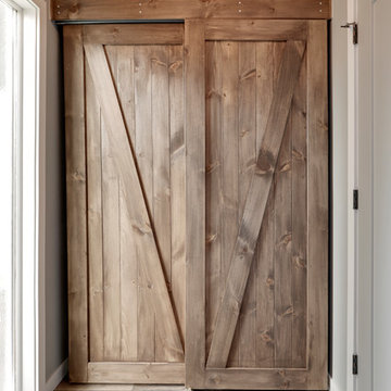
Can't do this open concept with out updating this entry. Sliding barn doors don't compete for space when the entry and storage room doors are open.
Inspiration for a small country medium tone wood floor entryway remodel in Calgary with gray walls and a gray front door
Inspiration for a small country medium tone wood floor entryway remodel in Calgary with gray walls and a gray front door
 Hamish Murray Construction, Inc.
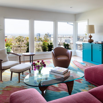
The wall between the kitchen, dining room and living room was removed to open up the space and create a great room, providing a more light, airy and cohesive feel. Hardwood flooring and quarter-sawn white oak cabinets were extended to this room and a new fireplace was added.
Colorful accents combined with a muted backdrop create interest without competing with the impeccable view of the city, elegantly showcased through multiple large windows.
 Klopf Architecture
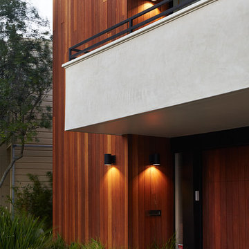
The owners came to Klopf Architecture with a clear vision: Create a brighter home with clean lines and visual surprises – but that enhances the Eichler vernacular – that blurs the boundaries between inside and outside and supports “modern living”.
Renovating a 1962 Eichler home into a contemporary, higher-quality home required more than a few changes. However, love of the Eichler style and respect for the house's history required keeping many elements. Klopf Architecture partnered with the owners of this Eichler home in San Francisco's Diamond Heights to balance these two competing desires while significantly updating their 2-story courtyard home on a hill.
Appropriate to the style of the house, the owners have a clean, minimal aesthetic – free of clutter but filled with carefully placed art and whimsical collectibles. With white walls, warm mahogany and rich grays throughout, the home is bathed in light and feels both elegant and welcoming.
Klopf Architecture Project Team: John Klopf, AIA, Jackie Detamore, AIA, Klara Kevane, and Yegvenia Torres-Zavala
Landscape Architect: Outer Space Landscape Architects
Contractor: San Francisco Design and Construction
Cabinetry: Benchmarc Woodworking
Zinc Panels: Product and Design Metalwork
Photography ©2015 Mariko Reed
 Fava Design Group
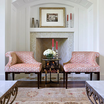
This fireplace is more than a centerpiece; it is grand, elegant, and able to compliment - rather than compete with the arched beams.
Example of a classic living room design in Miami
Example of a classic living room design in Miami
 User
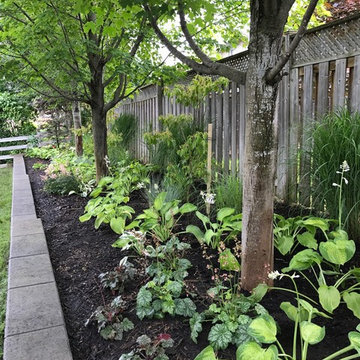
UserAll plants were removed. The existing soil was heavily amended with composted cattle manure and worm castings to add much needed nutrients and hold moisture closer to the surface. Rain water was redirected into the garden to provide natural irrigation and give the new plantings a chance to compete with the Maple Trees. Updated photos to come in 2018 as this garden fills in and blooms.
 Michelle Masone
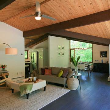
On the main level, a wide plank, uniform gray Jasper engineered oak flooring replaced the worn-out carpeting, providing contrast against the warm wood tones while not competing with the existing pine ceiling and mahogany windows.
Design by: Michelle Masone
Photo credit: Michelle Masone
 Century Stair Company
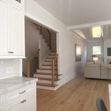
Metal and wood are often treated as opposites, but this staircase makes the case for partnership. White oak treads, chamfer-top newels, and a coordinating handrail bring the warmth and texture that only natural wood can offer. Against that, a satin black horizontal bar balustrade introduces rigid geometric precision, its clean lines and matte finish defining the oak rather than competing with it. The result is a staircase that feels both welcoming and sophisticated. Neither material overwhelms the other. Each one makes the other more defined.
1976-2026 © Century Stair Company
56