Search results for "Conceivable" in Home Design Ideas
Open concept kitchen - mid-sized contemporary l-shaped porcelain tile open concept kitchen idea in Seattle with a double-bowl sink, flat-panel cabinets, medium tone wood cabinets, granite countertops, beige backsplash, porcelain backsplash, stainless steel appliances, an island and black countertops

When an international client moved from Brazil to Stamford, Connecticut, they reached out to Decor Aid, and asked for our help in modernizing a recently purchased suburban home. The client felt that the house was too “cookie-cutter,” and wanted to transform their space into a highly individualized home for their energetic family of four.
In addition to giving the house a more updated and modern feel, the client wanted to use the interior design as an opportunity to segment and demarcate each area of the home. They requested that the downstairs area be transformed into a media room, where the whole family could hang out together. Both of the parents work from home, and so their office spaces had to be sequestered from the rest of the house, but conceived without any disruptive design elements. And as the husband is a photographer, he wanted to put his own artwork on display. So the furniture that we sourced had to balance the more traditional elements of the house, while also feeling cohesive with the husband’s bold, graphic, contemporary style of photography.
The first step in transforming this house was repainting the interior and exterior, which were originally done in outdated beige and taupe colors. To set the tone for a classically modern design scheme, we painted the exterior a charcoal grey, with a white trim, and repainted the door a crimson red. The home offices were placed in a quiet corner of the house, and outfitted with a similar color palette: grey walls, a white trim, and red accents, for a seamless transition between work space and home life.
The house is situated on the edge of a Connecticut forest, with clusters of maple, birch, and hemlock trees lining the property. So we installed white window treatments, to accentuate the natural surroundings, and to highlight the angular architecture of the home.
In the entryway, a bold, graphic print, and a thick-pile sheepskin rug set the tone for this modern, yet comfortable home. While the formal room was conceived with a high-contrast neutral palette and angular, contemporary furniture, the downstairs media area includes a spiral staircase, comfortable furniture, and patterned accent pillows, which creates a more relaxed atmosphere. Equipped with a television, a fully-stocked bar, and a variety of table games, the downstairs media area has something for everyone in this energetic young family.

Conceived more similar to a loft type space rather than a traditional single family home, the homeowner was seeking to challenge a normal arrangement of rooms in favor of spaces that are dynamic in all 3 dimensions, interact with the yard, and capture the movement of light and air.
As an artist that explores the beauty of natural objects and scenes, she tasked us with creating a building that was not precious - one that explores the essence of its raw building materials and is not afraid of expressing them as finished.
We designed opportunities for kinetic fixtures, many built by the homeowner, to allow flexibility and movement.
The result is a building that compliments the casual artistic lifestyle of the occupant as part home, part work space, part gallery. The spaces are interactive, contemplative, and fun.
More details to come.
credits:
design: Matthew O. Daby - m.o.daby design /
construction: Cellar Ridge Construction /
structural engineer: Darla Wall - Willamette Building Solutions /
photography: Erin Riddle - KLIK Concepts
Find the right local pro for your project
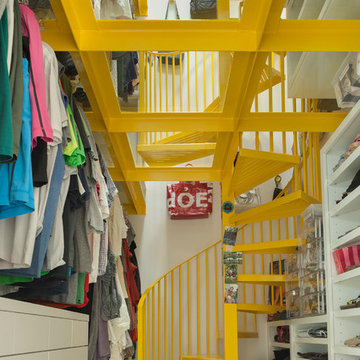
GUT-2: Den area, custom 2 sided, corner fireplace with fully integrated & interlocking floating millwork cabinet surround. FP floating limestone ledge (w steel frame) w/ accent lighting beneath ledge and a floating desk. This piece was commissioned and is uniquely conceived / designed for this space and client by GVD. Custom white leather chaise lounge and abstract ethereal featured rug.

This classic 1970's rambler was purchased by our clients as their 'forever' retirement home and as a gathering place for their large, extended family. Situated on a large, verdant lot, the house was burdened with extremely dated finishes and poorly conceived spaces. These flaws were more than offset by the overwhelming advantages of a single level plan and spectacular sunset views. Weighing their options, our clients executed their purchase fully intending to hire us to immediately remodel this structure for them.
Our first task was to open up this plan and give the house a fresh, contemporary look that emphasizes views toward Lake Washington and the Olympic Mountains in the distance. Our initial response was to recreate our favorite Great Room plan. This started with the elimination of a large, masonry fireplace awkwardly located in the middle of the plan and to then tear out all the walls. We then flipped the Kitchen and Dining Room and inserted a walk-in pantry between the Garage and new Kitchen location.
While our clients' initial intention was to execute a simple Kitchen remodel, the project scope grew during the design phase. We convinced them that the original ill-conceived entry needed a make-over as well as both bathrooms on the main level. Now, instead of an entry sequence that looks like an afterthought, there is a formal court on axis with an entry art wall that arrests views before moving into the heart of the plan. The master suite was updated by sliding the wall between the bedroom and Great Room into the family area and then placing closets along this wall - in essence, using these closets as an acoustical buffer between the Master Suite and the Great Room. Moving these closets then freed up space for a 5-piece master bath, a more efficient hall bath and a stacking washer/dryer in a closet at the top of the stairs.

When an international client moved from Brazil to Stamford, Connecticut, they reached out to Decor Aid, and asked for our help in modernizing a recently purchased suburban home. The client felt that the house was too “cookie-cutter,” and wanted to transform their space into a highly individualized home for their energetic family of four.
In addition to giving the house a more updated and modern feel, the client wanted to use the interior design as an opportunity to segment and demarcate each area of the home. They requested that the downstairs area be transformed into a media room, where the whole family could hang out together. Both of the parents work from home, and so their office spaces had to be sequestered from the rest of the house, but conceived without any disruptive design elements. And as the husband is a photographer, he wanted to put his own artwork on display. So the furniture that we sourced had to balance the more traditional elements of the house, while also feeling cohesive with the husband’s bold, graphic, contemporary style of photography.
The first step in transforming this house was repainting the interior and exterior, which were originally done in outdated beige and taupe colors. To set the tone for a classically modern design scheme, we painted the exterior a charcoal grey, with a white trim, and repainted the door a crimson red. The home offices were placed in a quiet corner of the house, and outfitted with a similar color palette: grey walls, a white trim, and red accents, for a seamless transition between work space and home life.
The house is situated on the edge of a Connecticut forest, with clusters of maple, birch, and hemlock trees lining the property. So we installed white window treatments, to accentuate the natural surroundings, and to highlight the angular architecture of the home.
In the entryway, a bold, graphic print, and a thick-pile sheepskin rug set the tone for this modern, yet comfortable home. While the formal room was conceived with a high-contrast neutral palette and angular, contemporary furniture, the downstairs media area includes a spiral staircase, comfortable furniture, and patterned accent pillows, which creates a more relaxed atmosphere. Equipped with a television, a fully-stocked bar, and a variety of table games, the downstairs media area has something for everyone in this energetic young family.

When an international client moved from Brazil to Stamford, Connecticut, they reached out to Decor Aid, and asked for our help in modernizing a recently purchased suburban home. The client felt that the house was too “cookie-cutter,” and wanted to transform their space into a highly individualized home for their energetic family of four.
In addition to giving the house a more updated and modern feel, the client wanted to use the interior design as an opportunity to segment and demarcate each area of the home. They requested that the downstairs area be transformed into a media room, where the whole family could hang out together. Both of the parents work from home, and so their office spaces had to be sequestered from the rest of the house, but conceived without any disruptive design elements. And as the husband is a photographer, he wanted to put his own artwork on display. So the furniture that we sourced had to balance the more traditional elements of the house, while also feeling cohesive with the husband’s bold, graphic, contemporary style of photography.
The first step in transforming this house was repainting the interior and exterior, which were originally done in outdated beige and taupe colors. To set the tone for a classically modern design scheme, we painted the exterior a charcoal grey, with a white trim, and repainted the door a crimson red. The home offices were placed in a quiet corner of the house, and outfitted with a similar color palette: grey walls, a white trim, and red accents, for a seamless transition between work space and home life.
The house is situated on the edge of a Connecticut forest, with clusters of maple, birch, and hemlock trees lining the property. So we installed white window treatments, to accentuate the natural surroundings, and to highlight the angular architecture of the home.
In the entryway, a bold, graphic print, and a thick-pile sheepskin rug set the tone for this modern, yet comfortable home. While the formal room was conceived with a high-contrast neutral palette and angular, contemporary furniture, the downstairs media area includes a spiral staircase, comfortable furniture, and patterned accent pillows, which creates a more relaxed atmosphere. Equipped with a television, a fully-stocked bar, and a variety of table games, the downstairs media area has something for everyone in this energetic young family.

This classic 1970's rambler was purchased by our clients as their 'forever' retirement home and as a gathering place for their large, extended family. Situated on a large, verdant lot, the house was burdened with extremely dated finishes and poorly conceived spaces. These flaws were more than offset by the overwhelming advantages of a single level plan and spectacular sunset views. Weighing their options, our clients executed their purchase fully intending to hire us to immediately remodel this structure for them.
Our first task was to open up this plan and give the house a fresh, contemporary look that emphasizes views toward Lake Washington and the Olympic Mountains in the distance. Our initial response was to recreate our favorite Great Room plan. This started with the elimination of a large, masonry fireplace awkwardly located in the middle of the plan and to then tear out all the walls. We then flipped the Kitchen and Dining Room and inserted a walk-in pantry between the Garage and new Kitchen location.
While our clients' initial intention was to execute a simple Kitchen remodel, the project scope grew during the design phase. We convinced them that the original ill-conceived entry needed a make-over as well as both bathrooms on the main level. Now, instead of an entry sequence that looks like an afterthought, there is a formal court on axis with an entry art wall that arrests views before moving into the heart of the plan. The master suite was updated by sliding the wall between the bedroom and Great Room into the family area and then placing closets along this wall - in essence, using these closets as an acoustical buffer between the Master Suite and the Great Room. Moving these closets then freed up space for a 5-piece master bath, a more efficient hall bath and a stacking washer/dryer in a closet at the top of the stairs.

This classic 1970's rambler was purchased by our clients as their 'forever' retirement home and as a gathering place for their large, extended family. Situated on a large, verdant lot, the house was burdened with extremely dated finishes and poorly conceived spaces. These flaws were more than offset by the overwhelming advantages of a single level plan and spectacular sunset views. Weighing their options, our clients executed their purchase fully intending to hire us to immediately remodel this structure for them.
Our first task was to open up this plan and give the house a fresh, contemporary look that emphasizes views toward Lake Washington and the Olympic Mountains in the distance. Our initial response was to recreate our favorite Great Room plan. This started with the elimination of a large, masonry fireplace awkwardly located in the middle of the plan and to then tear out all the walls. We then flipped the Kitchen and Dining Room and inserted a walk-in pantry between the Garage and new Kitchen location.
While our clients' initial intention was to execute a simple Kitchen remodel, the project scope grew during the design phase. We convinced them that the original ill-conceived entry needed a make-over as well as both bathrooms on the main level. Now, instead of an entry sequence that looks like an afterthought, there is a formal court on axis with an entry art wall that arrests views before moving into the heart of the plan. The master suite was updated by sliding the wall between the bedroom and Great Room into the family area and then placing closets along this wall - in essence, using these closets as an acoustical buffer between the Master Suite and the Great Room. Moving these closets then freed up space for a 5-piece master bath, a more efficient hall bath and a stacking washer/dryer in a closet at the top of the stairs.

Conceived of as a C-shaped house with a small private courtyard and a large private rear yard, this new house maximizes the floor area available to build on this smaller Palo Alto lot. An Accessory Dwelling Unit (ADU) integrated into the main structure gave a floor area bonus. For now, it will be used for visiting relatives. One challenge of this design was keeping a low profile and proportional design while still meeting the FEMA flood plain requirement that the finished floor start about 3′ above grade.
The new house has four bedrooms (including the attached ADU), a separate family room with a window seat, a music room, a prayer room, and a large living space that opens to the private small courtyard as well as a large covered patio at the rear. Mature trees around the perimeter of the lot were preserved, and new ones planted, for private indoor-outdoor living.
C-shaped house, New home, ADU, Palo Alto, CA, courtyard,
KA Project Team: John Klopf, AIA, Angela Todorova, Lucie Danigo
Structural Engineer: ZFA Structural Engineers
Landscape Architect: Outer Space Landscape Architects
Contractor: Coast to Coast Development
Photography: ©2023 Mariko Reed
Year Completed: 2022
Location: Palo Alto, CA

This classic 1970's rambler was purchased by our clients as their 'forever' retirement home and as a gathering place for their large, extended family. Situated on a large, verdant lot, the house was burdened with extremely dated finishes and poorly conceived spaces. These flaws were more than offset by the overwhelming advantages of a single level plan and spectacular sunset views. Weighing their options, our clients executed their purchase fully intending to hire us to immediately remodel this structure for them.
Our first task was to open up this plan and give the house a fresh, contemporary look that emphasizes views toward Lake Washington and the Olympic Mountains in the distance. Our initial response was to recreate our favorite Great Room plan. This started with the elimination of a large, masonry fireplace awkwardly located in the middle of the plan and to then tear out all the walls. We then flipped the Kitchen and Dining Room and inserted a walk-in pantry between the Garage and new Kitchen location.
While our clients' initial intention was to execute a simple Kitchen remodel, the project scope grew during the design phase. We convinced them that the original ill-conceived entry needed a make-over as well as both bathrooms on the main level. Now, instead of an entry sequence that looks like an afterthought, there is a formal court on axis with an entry art wall that arrests views before moving into the heart of the plan. The master suite was updated by sliding the wall between the bedroom and Great Room into the family area and then placing closets along this wall - in essence, using these closets as an acoustical buffer between the Master Suite and the Great Room. Moving these closets then freed up space for a 5-piece master bath, a more efficient hall bath and a stacking washer/dryer in a closet at the top of the stairs.

Stunning views and the exceptional weather allowed us to conceive a pavilion like living area with sliding glass walls dissipating any barrier between interior and exterior and maximizing the livable area. Ceilings were carefully conceived to accentuate areas with increased volume and cove lighting, in addition to concealing building infrastructure systems seamlessly.
https://www.makearch.com/residential-projects/sunset-plaza
MAKE Architecture | www.makearch.com

Lucas Fladzinski
Bathroom - mid-sized contemporary master porcelain tile porcelain tile bathroom idea in San Francisco with an undermount sink, flat-panel cabinets, granite countertops and brown cabinets

SDH Studio - Architecture and Design
Location: Bal Harbour, Florida, USA
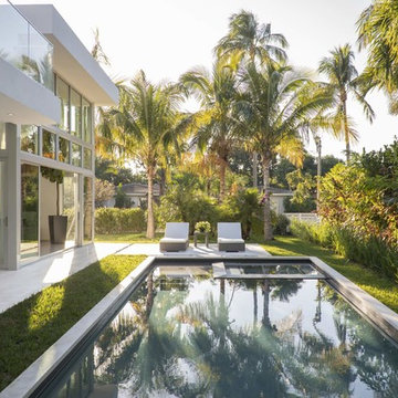
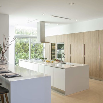
Set in a magnificent corner lot in Bal Harbour Village the site is filled with natural light. This contemporary home is conceived as an open floor plan that integrates indoor with outdoor maximizing family living and entertaining.
SDH Studio - Architecture and Design
Location: Bal Harbour, Florida, USA
Set in a magnificent corner lot in Bal Harbour Village the site is filled with natural light. This contemporary home is conceived as an open floor plan that integrates indoor with outdoor maximizing family living and entertaining.
SDH Studio - Architecture and Design
Location: Golden Beach, Florida, USA
The Architecture is conceived as an ensemble of vertical and horizontal planes that guide the user through a sequence of spatial and visual experiences. Our clients’ passion for the outdoors is embedded in the entire project. Also, the use of color is an important feature that highlights certain accents along the design.
Conceived by architect Rafael Viñoly—432 Park Avenue is the tallest residential skyscraper in the Western Hemisphere. This apartment designed by John Beckmann and his design firm Axis Mundi has some of the most breathtaking views in Manhattan.
Known for their glamorous low-slung aesthetic, Axis Mundi took the challenge to design the residence for an American client living in China with a family of four, and an important art collection (including the likes of Cy Twombly, Gerhard Richter, Susan Frecon, Vik Muniz and Lisette Schumacher, among others).
In the dining room, a Bocci “28 Chandelier” hangs above an intricate marble and brass table by Henge, with ceramics by John Born. Entering the main living area, a monumental “Let it Be” sectional from Poltrona Frau sits on a silver custom-designed Joseph Carini wool and silk rug. A ‘Surface” coffee table designed by Vincent Van Duysen and “Fulgens” armchairs in saddle leather by Antonio Citterio for B&B Italia create the penultimate space for entertaining.
The sensuous red library features custom-designed bookshelves in burnished brass and walnut, as a “Wing Sofa” in red velvet from Flexform floats atop a “Ponti” area rug from the Rug Company. “JJ Chairs” in Mongolian lamb fur from B&B Italia add a rock and roll swagger to the space.
The kitchen accentuates the grey marble flooring and all-white color palette, with the exception of a few light wood and marble details. A dramatic pendant in hand-burnished brass, designed by Henge, hovers above the kitchen island, while a floating marble counter spans the window opening. It is a serene spot to enjoy a morning cappuccino while pondering the ever-changing skyline of the Metropolis.
In a counterintuitive move, Beckmann decided to make the gallery dark by finishing the walls in a smoked lacquered plaster with hints of mica, which add sparkle and glitter.
John Beckmann made sure to include extravagant fabrics from Christopher Hyland and a deft mix of textures and colors to the design. In the master bedroom is a wall-length headboard system in leather and velvet panels from Poliform, with luxurious bedding from Frette. Dupre Lafon lounge chairs in a buttery leather rest on a custom golden silk carpet by Joseph Carini, while a pair of parchment bedside lamps by Jean Michel Frank complete the design.
The facade is treated with an LED lighting system which changes colors and can be controlled by the client with their iPhone from the street.
Design: John Beckmann, with Hannah LaSota
Photography: Durston Saylor
Contractor: Cardinal Construction
Size: 4000 sf
© Axis Mundi Design LLC

SDH Studio - Architecture and Design
Location: Golden Beach, Florida, USA
The Architecture is conceived as an ensemble of vertical and horizontal planes that guide the user through a sequence of spatial and visual experiences. Our clients’ passion for the outdoors is embedded in the entire project. Also, the use of color is an important feature that highlights certain accents along the design.

This classic 1970's rambler was purchased by our clients as their 'forever' retirement home and as a gathering place for their large, extended family. Situated on a large, verdant lot, the house was burdened with extremely dated finishes and poorly conceived spaces. These flaws were more than offset by the overwhelming advantages of a single level plan and spectacular sunset views. Weighing their options, our clients executed their purchase fully intending to hire us to immediately remodel this structure for them.
Our first task was to open up this plan and give the house a fresh, contemporary look that emphasizes views toward Lake Washington and the Olympic Mountains in the distance. Our initial response was to recreate our favorite Great Room plan. This started with the elimination of a large, masonry fireplace awkwardly located in the middle of the plan and to then tear out all the walls. We then flipped the Kitchen and Dining Room and inserted a walk-in pantry between the Garage and new Kitchen location.
While our clients' initial intention was to execute a simple Kitchen remodel, the project scope grew during the design phase. We convinced them that the original ill-conceived entry needed a make-over as well as both bathrooms on the main level. Now, instead of an entry sequence that looks like an afterthought, there is a formal court on axis with an entry art wall that arrests views before moving into the heart of the plan. The master suite was updated by sliding the wall between the bedroom and Great Room into the family area and then placing closets along this wall - in essence, using these closets as an acoustical buffer between the Master Suite and the Great Room. Moving these closets then freed up space for a 5-piece master bath, a more efficient hall bath and a stacking washer/dryer in a closet at the top of the stairs.
7