
Search results for "Confuse" in Home Design Ideas
 Fusion Cabinets, Inc.
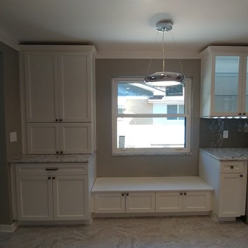
This is the old dining room. Now we created a bench that is awaiting a new custom cushion, table and chairs flanked by an adorable mini bar with wine cooler, stemware holder, glass display cabinet for the fancy glasses ( with LED lights of course!) on the right side and a convenient appliance garage and even more store on the left side. So cool. I will post more photos when it is completed.
 TVL Creative Ltd.
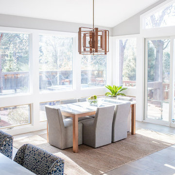
These wonderful clients returned to us for their newest home remodel adventure. Their newly purchased custom built 1970s modern ranch sits in one of the loveliest neighborhoods south of the city but the current conditions of the home were out-dated and not so lovely. Upon entering the front door through the court you were greeted abruptly by a very boring staircase and an excessive number of doors. Just to the left of the double door entry was a large slider and on your right once inside the home was a soldier line up of doors. This made for an uneasy and uninviting entry that guests would quickly forget and our clients would often avoid. We also had our hands full in the kitchen. The existing space included many elements that felt out of place in a modern ranch including a rustic mountain scene backsplash, cherry cabinets with raised panel and detailed profile, and an island so massive you couldn’t pass a drink across the stone. Our design sought to address the functional pain points of the home and transform the overall aesthetic into something that felt like home for our clients.
For the entry, we re-worked the front door configuration by switching from the double door to a large single door with side lights. The sliding door next to the main entry door was replaced with a large window to eliminate entry door confusion. In our re-work of the entry staircase, guesta are now greeted into the foyer which features the Coral Pendant by David Trubridge. Guests are drawn into the home by stunning views of the front range via the large floor-to-ceiling glass wall in the living room. To the left, the staircases leading down to the basement and up to the master bedroom received a massive aesthetic upgrade. The rebuilt 2nd-floor staircase has a center spine with wood rise and run appearing to float upwards towards the master suite. A slatted wall of wood separates the two staircases which brings more light into the basement stairwell. Black metal railings add a stunning contrast to the light wood.
Other fabulous upgrades to this home included new wide plank flooring throughout the home, which offers both modernity and warmth. The once too-large kitchen island was downsized to create a functional focal point that is still accessible and intimate. The old dark and heavy kitchen cabinetry was replaced with sleek white cabinets, brightening up the space and elevating the aesthetic of the entire room. The kitchen countertops are marble look quartz with dramatic veining that offers an artistic feature behind the range and across all horizontal surfaces in the kitchen. As a final touch, cascading island pendants were installed which emphasize the gorgeous ceiling vault and provide warm feature lighting over the central point of the kitchen.
This transformation reintroduces light and simplicity to this gorgeous home, and we are so happy that our clients can reap the benefits of this elegant and functional design for years to come.
 TVL Creative Ltd.
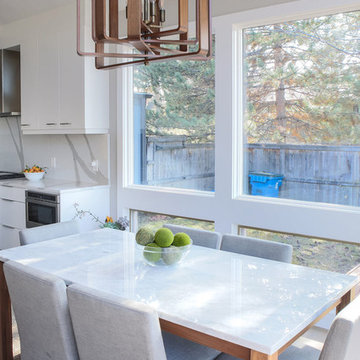
These wonderful clients returned to us for their newest home remodel adventure. Their newly purchased custom built 1970s modern ranch sits in one of the loveliest neighborhoods south of the city but the current conditions of the home were out-dated and not so lovely. Upon entering the front door through the court you were greeted abruptly by a very boring staircase and an excessive number of doors. Just to the left of the double door entry was a large slider and on your right once inside the home was a soldier line up of doors. This made for an uneasy and uninviting entry that guests would quickly forget and our clients would often avoid. We also had our hands full in the kitchen. The existing space included many elements that felt out of place in a modern ranch including a rustic mountain scene backsplash, cherry cabinets with raised panel and detailed profile, and an island so massive you couldn’t pass a drink across the stone. Our design sought to address the functional pain points of the home and transform the overall aesthetic into something that felt like home for our clients.
For the entry, we re-worked the front door configuration by switching from the double door to a large single door with side lights. The sliding door next to the main entry door was replaced with a large window to eliminate entry door confusion. In our re-work of the entry staircase, guesta are now greeted into the foyer which features the Coral Pendant by David Trubridge. Guests are drawn into the home by stunning views of the front range via the large floor-to-ceiling glass wall in the living room. To the left, the staircases leading down to the basement and up to the master bedroom received a massive aesthetic upgrade. The rebuilt 2nd-floor staircase has a center spine with wood rise and run appearing to float upwards towards the master suite. A slatted wall of wood separates the two staircases which brings more light into the basement stairwell. Black metal railings add a stunning contrast to the light wood.
Other fabulous upgrades to this home included new wide plank flooring throughout the home, which offers both modernity and warmth. The once too-large kitchen island was downsized to create a functional focal point that is still accessible and intimate. The old dark and heavy kitchen cabinetry was replaced with sleek white cabinets, brightening up the space and elevating the aesthetic of the entire room. The kitchen countertops are marble look quartz with dramatic veining that offers an artistic feature behind the range and across all horizontal surfaces in the kitchen. As a final touch, cascading island pendants were installed which emphasize the gorgeous ceiling vault and provide warm feature lighting over the central point of the kitchen.
This transformation reintroduces light and simplicity to this gorgeous home, and we are so happy that our clients can reap the benefits of this elegant and functional design for years to come.
Find the right local pro for your project
 TVL Creative Ltd.
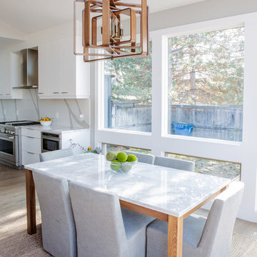
These wonderful clients returned to us for their newest home remodel adventure. Their newly purchased custom built 1970s modern ranch sits in one of the loveliest neighborhoods south of the city but the current conditions of the home were out-dated and not so lovely. Upon entering the front door through the court you were greeted abruptly by a very boring staircase and an excessive number of doors. Just to the left of the double door entry was a large slider and on your right once inside the home was a soldier line up of doors. This made for an uneasy and uninviting entry that guests would quickly forget and our clients would often avoid. We also had our hands full in the kitchen. The existing space included many elements that felt out of place in a modern ranch including a rustic mountain scene backsplash, cherry cabinets with raised panel and detailed profile, and an island so massive you couldn’t pass a drink across the stone. Our design sought to address the functional pain points of the home and transform the overall aesthetic into something that felt like home for our clients.
For the entry, we re-worked the front door configuration by switching from the double door to a large single door with side lights. The sliding door next to the main entry door was replaced with a large window to eliminate entry door confusion. In our re-work of the entry staircase, guesta are now greeted into the foyer which features the Coral Pendant by David Trubridge. Guests are drawn into the home by stunning views of the front range via the large floor-to-ceiling glass wall in the living room. To the left, the staircases leading down to the basement and up to the master bedroom received a massive aesthetic upgrade. The rebuilt 2nd-floor staircase has a center spine with wood rise and run appearing to float upwards towards the master suite. A slatted wall of wood separates the two staircases which brings more light into the basement stairwell. Black metal railings add a stunning contrast to the light wood.
Other fabulous upgrades to this home included new wide plank flooring throughout the home, which offers both modernity and warmth. The once too-large kitchen island was downsized to create a functional focal point that is still accessible and intimate. The old dark and heavy kitchen cabinetry was replaced with sleek white cabinets, brightening up the space and elevating the aesthetic of the entire room. The kitchen countertops are marble look quartz with dramatic veining that offers an artistic feature behind the range and across all horizontal surfaces in the kitchen. As a final touch, cascading island pendants were installed which emphasize the gorgeous ceiling vault and provide warm feature lighting over the central point of the kitchen.
This transformation reintroduces light and simplicity to this gorgeous home, and we are so happy that our clients can reap the benefits of this elegant and functional design for years to come.
 Adobe Interiors
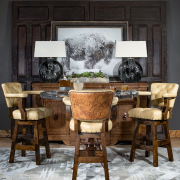
The Chisum Quill Barstool is stunning, not only for its solid hardwood framing, but particularly for its hand burnished-tufted leather with a contrasting ostrich pattern leather on the outback. Crafted to be either bar or counter height, this fine rustic barstool will make a statement in any home dining room or living area. Brass-studded accents and solid hardwood framing provide the perfect motif for this accent piece. The armrests' gentle sloping feature is a juxtaposition to the sturdily squared hard lines of the base of the barstool. All handcrafted and designed, the Chisum Quill Stool provides a uniquely authentic experience and rustic elegant charm to any space. If beauty and charm along with a stand alone character are what you seek, dive into the experience with our Chisum Quill Barstool and bring life to your home. Best as a dynamic set, these barstools are hand made classics for you. 100% American Made to the highest standards of quality and craftsmanship.
Overall Barstool Dimensions: 43" H x 26" W x 22" D
Seat Height: 30"
Top of Arm Height: 40"
Overall Counter Stool Dimension: 38" H x 26" W x 22" D
Seat Height: 25"
Top of Arm Height: 35"
Leather Description: Dyes and waxes are hand applied to South American raw material to impart a transparent clarity. This coupled with substrate gives the leather a sophisticated, pebble grain appearance. All of the aniline dyes applied to the hides are hand rubbed in North Carolina by skilled artisans drawing from years of creative experience creating an impressive patina. The absence of pigments adds to the natural softness of the hides. A light protective top, utilizing a proprietary formulation developed by the tannery creates the exquisite touch Legends is know for and makes the leather suitable for active family homes. Because of the depth and transparency of this leather, natural markings will be exposed and should not be confused as defects or deficiencies, but appreciated as Nature's Autograph of Authenticity found in the finest full grain leathers.
Embossed Leather Description: The leather hide is first embossed with an ostrich pattern and then colored by applying two base color coats of micro pigments. The leather is then wiped-off to give it a contrast of colors utilizing the base color combination. This color contrast is further accented by two additional top coat colors that are wiped-on by hand to give the leather a beautiful antique look. The last step is to slightly protect the hand work of the leather hide with a lacquer topcoat that provides great depth and warmth to the finished product.
100% top grain cowhide leather is characterized by variations in shade, texture, color and grain. Healed marks and scars are to be expected and enhance the natural beauty of the hides. These variations should not be considered defects as they are normal and unique features of genuine 100% top grain cowhide leather.
Frame Construction: Made with American Alder Wood, our frames are glued, screwed and dowelled at the joints. Two coats of high quality stain is hand rubbed on the wood finish and then sealed with industrial grade clear coat.
 J Design Group - Interior Designers Miami - Modern
J Design Group
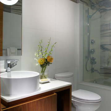
The Interior Design of your Bathroom is a very important part of your home dream project.
There are many ways to bring a small or large bathroom space to one of the most pleasant and beautiful important areas in your daily life.
You can go over some of our award winner bathroom pictures and see all different projects created with most exclusive products available today.
Your friendly Interior design firm in Miami at your service.
Contemporary - Modern Interior designs.
Top Interior Design Firm in Miami – Coral Gables.
Bathroom,
Bathrooms,
House Interior Designer,
House Interior Designers,
Home Interior Designer,
Home Interior Designers,
Residential Interior Designer,
Residential Interior Designers,
Modern Interior Designers,
Miami Beach Designers,
Best Miami Interior Designers,
Miami Beach Interiors,
Luxurious Design in Miami,
Top designers,
Deco Miami,
Luxury interiors,
Miami modern,
Interior Designer Miami,
Contemporary Interior Designers,
Coco Plum Interior Designers,
Miami Interior Designer,
Sunny Isles Interior Designers,
Pinecrest Interior Designers,
Interior Designers Miami,
J Design Group interiors,
South Florida designers,
Best Miami Designers,
Miami interiors,
Miami décor,
Miami Beach Luxury Interiors,
Miami Interior Design,
Miami Interior Design Firms,
Beach front,
Top Interior Designers,
top décor,
Top Miami Decorators,
Miami luxury condos,
Top Miami Interior Decorators,
Top Miami Interior Designers,
Modern Designers in Miami,
modern interiors,
Modern,
Pent house design,
white interiors,
Miami, South Miami, Miami Beach, South Beach, Williams Island, Sunny Isles, Surfside, Fisher Island, Aventura, Brickell, Brickell Key, Key Biscayne, Coral Gables, CocoPlum, Coconut Grove, Pinecrest, Miami Design District, Golden Beach, Downtown Miami, Miami Interior Designers, Miami Interior Designer, Interior Designers Miami, Modern Interior Designers, Modern Interior Designer, Modern interior decorators, Contemporary Interior Designers, Interior decorators, Interior decorator, Interior designer, Interior designers, Luxury, modern, best, unique, real estate, decor
J Design Group – Miami Interior Design Firm – Modern – Contemporary
Contact us: (305) 444-4611
www.JDesignGroup.com
 Matthew Murrey Design
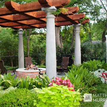
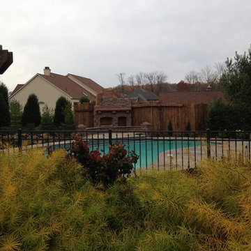
Inspired by the Louisiana architecture of A. Hays Town, this client set out to replicate a Louisiana courtyard in the midst of this creekside estate. A pool was the centerpiece of the design, and it was anchored by an antique brick clad spa. The spa, strategically placed on the home's main axis, was specifically purposed to replicate a courtyard fountain.
The vegetation includes a mixture of trimmed boxwood hedges, ferns, and azaleas, as well as a variety of other broad leafed plants. The potted plants add seasonal interest and year-round decor.
This project also features the best in outdoor living. A copper screened cabana house includes an outdoor kitchen, fireplace, and temperature controls for year round comfort. There is an outdoor firepit and seating area, sheltered by a vine covered trellis.
 San Luis Kitchen Co.
So to begin, we start with an existing kitchen that is outdated and just too neutral for the homeowners. They wanted unity and drama in their space, not mundane confusion! Mismatched appliances – white refrigerator, stainless range, black dishwasher – give a disjointed and unplanned vibe to the room and are crammed together in less than half of the available kitchen space. The beautiful wood floor extends throughout the house, but in the kitchen it falls flat – as the medium gold cabinets and almond tile counters provide no contrast and no interest.
A bank of floor to ceiling cabinets separates the dining area from the kitchen, confining the space in both rooms. Note the massive blank end of the cabinets – in desperation to reduce the scale of this monolith, the homeowners decorated it with a clock and small nick-knacks, but it didn’t help. This is not a welcoming entrance to the kitchen. On the dining side, there is a hutch (with mirrored back), which ostensibly could serve as a buffet, however it is inconvenient to the prep area of the kitchen as it is tucked behind the tall pantry cabinets. And on the opposite wall is a separate wet bar which could serve more conveniently with a more unified kitchen and dining space.
You would think that the large pantry cabinets would be a plus in a kitchen, however their placement and the deep fixed shelves belie any positive contribution.
The looming wall of cabinetry confines the space and is a claustrophobe’s nightmare. Then note the clutter and chaos of storing small food items (normally most of your daily supplies don’t come in giant bulk quantities and sizes) on deep fixed shelves. Nothing really fits and canned goods become lost behind cereal boxes while baking supplies are piled on top of the snacks!
The decision to remodel – the lady of the house wanted her kitchen to reflect the couples’ modern lifestyle. They are passionate people who love to entertain their friends and family – they need an open and accessible space that is both dramatic in bearing and easy to use on a daily basis.
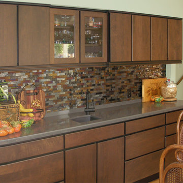
San Luis Kitchen began design by helping the homeowners choose a style and color scheme for their kitchen. The decision was made – a slab style cabinet door in a “Dark Lager” stain on maple wood. Because the homeowners did not want handles on their cabinets, we used a face frame cabinet construction to allow for “finger-pull” opening of the doors and drawers. The face frame is colored black as a contrast to the doors for a bold finish. Dark gray engineered-quartz counters and full height backsplash complete the picture.
Kitchen layout and design is next. The sink remains at the corner window with the dishwasher moved to the left wall – giving space for a 36” range-top and dramatic 42” rectilinear hood. The refrigerator remains in place but is replaced with a black model. The cabinet above it is now 24” deep for a custom look and a built-in microwave/oven combo are placed to the right. Simple-line contemporary trim and uniform black and stainless modern appliances reinforce the linear aesthetic created by the doorstyle and face frame detailing.
In place of the pantry, San Luis Kitchen designed a true buffet – accessible from both kitchen and dining sides. The storage needs are met by upper cabinets, base corner swing-out shelves and drawers, and a tall (adjustable) roll-out shelf unit on the dining side. We added an end wall (with niches) and extended the cabinetry and counter beyond as a welcome to the kitchen. In the dining room glass doors for display items grace the buffet. The wet bar is now visually and functionally joined to the kitchen – matching cabinetry and the more open overall plan tie everything together as a whole.
Now in their new kitchen, the homeowners can prepare, serve, and enjoy a meal with their guests. The mosaic glass backsplash used at the bar adds pizzazz for fun gatherings and an evening’s entertainment.
Wood-Mode Fine Custom Cabinetry: Brookhaven's Fairfield
 River Valley Landscapes
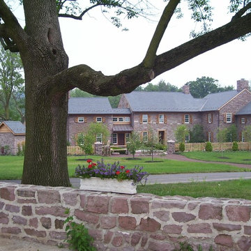
 This project presented unique opportunities that are not often found in residential landscaping. The homeowners were not only restoring their 1840's era farmhouse, a piece of their family’s history, but also enlarging and updating the home for modern living. The landscape designers continued this idea by creating a space that is a modern day interpretation of an 1840s era farm rather then a strict recreation. The resulting design combines elements of farm living from that time, as well as acknowledging the property’s history as a horse farm, with staples of 21st century landscapes such as space for outdoor living, lighting, and newer plant varieties.
Guests approach from the main driveway which winds through the property and ends at the main barn. There is secondary gated driveway just for the homeowners. Connected to this main driveway is a narrower gravel lane which leads directly to the residence. The lane passes near fruit trees planted in broken rows to give the illusion that they are the remains of an orchard that once existed on the site. The lane widens at the entrance to the gardens where there is a hitching post built into the fence that surrounds the gardens and a watering trough. The widened section is intended as a place to park a golf cart or, in a nod to the home’s past, tie up horses before entering. The gravel lane passes between two stone pillars and then ends at a square gravel court edged in cobblestones. The gravel court transitions into a wide flagstone walk bordered with yew hedges and lavender leading to the front door.
Directly to the right, upon entering the gravel court, is located a gravel and cobblestone edged walk leading to a secondary entrance into the residence. The walk is gated where it connects with the gravel court to close it off so as not to confuse visitors and guests to the main residence and to emphasize the primary entrance. An area for a bench is provided along this walk to encourage stopping to view and enjoy the gardens.
On either side of the front door, gravel and cobblestone walks branch off into the garden spaces. The one on the right leads to a flagstone with cobblestone border patio space. Since the home has no designated backyard like most modern suburban homes the outdoor living space had to be placed in what would traditionally be thought of as the front of the house. The patio is separated from the entrance walk by the yew hedge and further enclosed by three Amelanchiers and a variety of plantings including modern cultivars of old fashioned plants such as Itea and Hydrangea. A third entrance, the original front door to the 1840’s era section, connects to the patio from the home’s kitchen, making the space ideal for outdoor dining.
The gravel and cobblestone walk branching off to the left of the front door leads to the vegetable and perennial gardens. The idea for the vegetable garden was to recreate the tradition of a kitchen garden which would have been planted close to the residence for easy access. The vegetable garden is surrounded by mixed perennial beds along the inside of the wood picket fence which surrounds the entire garden space. Another area designated for a bench is provided here to encourage stopping and viewing. The home’s original smokehouse, completely restored and used as a garden shed, provides a strong architectural focal point to the vegetable garden. Behind the smokehouse is planted lilacs and other plants to give mass and balance to the corner and help screen the garden from the neighboring subdivision. At the rear corner of the garden a wood arbor was constructed to provide a structure on which to grow grapes or other vines should the homeowners choose to.
The landscape and gardens for this restored farmhouse and property are a thoughtfully designed and planned recreation of a historic landscape reinterpreted for modern living. The idea was to give a sense of timelessness when walking through the gardens as if they had been there for years but had possibly been updated and rejuvenated as lifestyles changed. The attention to materials and craftsmanship blend seamlessly with the residence and insure the gardens and landscape remain an integral part of the property. The farm has been in the homeowner’s family for many years and they are thrilled at the results and happy to see respect given to the home’s history and to its meticulous restoration.
 River Valley Landscapes
After - This project presented unique opportunities that are not often found in residential landscaping. The homeowners were not only restoring their 1840s era farmhouse, a piece of their family’s history, but also enlarging and updating the home for modern living. The landscape designers continued this idea by creating a space that is a modern day interpretation of an 1840s era farm rather then a strict recreation. The resulting design combines elements of farm living from that time, as well as acknowledging the property’s history as a horse farm, with staples of 21st century landscapes such as space for outdoor living, lighting, and newer plant varieties.
Guests approach from the main driveway which winds through the property and ends at the main barn. There is secondary gated driveway just for the homeowners. Connected to this main driveway is a narrower gravel lane which leads directly to the residence. The lane passes near fruit trees planted in broken rows to give the illusion that they are the remains of an orchard that once existed on the site. The lane widens at the entrance to the gardens where there is a hitching post built into the fence that surrounds the gardens and a watering trough. The widened section is intended as a place to park a golf cart or, in a nod to the home’s past, tie up horses before entering. The gravel lane passes between to stone pillars and then ends at a square gravel court edged in cobblestones. The gravel court transitions into a wide flagstone walk bordered with yew hedges and lavender leading to the front door.
Directly to the right, upon entering the gravel court, is located a gravel and cobblestone edged walk leading to a secondary entrance into the residence. The walk is gated where it connects with the gravel court to close it off so as not to confuse visitors and guests to the main residence and to emphasize the primary entrance. An area for a bench is provided along this walk to encourage stopping to view and enjoy the gardens.
On either side of the front door gravel and cobblestone walks branch off into the garden spaces. The one on the right leads to a flagstone with cobblestone border patio space. Since the home has no designated backyard like most modern suburban homes the outdoor living space had to be placed in what would traditionally be thought of as the front of the house. The patio is separated from the entrance walk by the yew hedge and further enclosed by three Amelanchiers and a variety of plantings including modern cultivars of old fashioned plants such as Itea and Hydrangea. A third entrance, the original front door to the 1840’s era section, connects to the patio from the home’s kitchen, making the space ideal for outdoor dining. .
The gravel and cobblestone walk branching off to the left of the front door leads to the vegetable and perennial gardens. The idea for the vegetable garden was to recreate the tradition of a kitchen garden which would have been planted close to the residence for easy access. The vegetable garden is surrounded by mixed perennial beds along the inside of the wood picket fence which surrounds the entire garden space. Another area designated for a bench is provided here to encourage stopping and viewing. The home’s original smokehouse, completely restored and used as a garden shed, provides a strong architectural focal point to the vegetable garden. Behind the smokehouse is planted lilacs and other plants to give mass and balance to the corner and help screen the garden from the neighboring subdivision. At the rear corner of the garden a wood arbor was constructed to provide a structure on which to grow grapes or other vines should the homeowners choose to.
The landscape and gardens for this restored farmhouse and property are a thoughtfully designed and planned recreation of a historic landscape reinterpreted for modern living. The idea was to give a sense of timelessness when walking through the gardens as if they had been there for years but had possibly been updated and rejuvenated as lifestyles changed. The attention to materials and craftsmanship blend seamlessly with the residence and insure the gardens and landscape remain an integral part of the property. The farm has been in the homeowner’s family for many years and they are thrilled at the results and happy to see respect given to the home’s history and to its meticulous restoration.


 Adobe Interiors
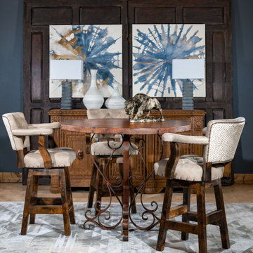
We are thrilled to introduce our exquisite Chisum Socorro Barstool, a captivating addition to any home dining or living area. The barstool boasts a robust hardwood framing that exudes the essence of rustic western charm, while the hand-sanded leather, accentuated by a contrasting ostrich pattern leather on the outback, enhances the stool's overall appeal. The seat and back are beautifully button-tufted, adding a touch of sophistication to the design. The stool is available in both bar and counter height options, and features a full 360 degree swivel, making it an ideal choice for any space.
The carefully crafted design features brass-studded accents and a solid hardwood framing that elevate the stool's motif, while the armrests' gentle sloping feature contrasts the sturdily squared hard lines of the base of the barstool, creating a perfect blend of elegance and authenticity. The Chisum Socorro Barstool is exclusively handcrafted and designed to provide a unique and authentic experience, adding rustic and elegant charm to any space.
We are confident that our Chisum Socorro Barstool will not only meet but exceed your expectations with its stand-alone character, beauty, and charm. Whether as a dynamic set or a standalone piece, this classic barstool is 100% American-made to the highest standards of quality and craftsmanship, offering exceptional durability and longevity. Experience the epitome of rustic elegance with our Chisum Socorro Barstool, available in both bar and counter height options, and featuring a full 360 degree swivel and beautiful button-tufted seat and back. Add a touch of sophistication to your home today.
Overall Barstool Dimensions: 43" H x 26" W x 22" D
Seat Height: 30"
Top of Arm Height: 40"
Overall Counter Stool Dimension: 38" H x 26" W x 22" D
Seat Height: 25"
Top of Arm Height: 35"
Leather Description: Dyes and waxes are hand applied to South American raw material to impart a transparent clarity. This coupled with substrate gives the leather a sophisticated, pebble grain appearance. All of the aniline dyes applied to the hides are hand rubbed in North Carolina by skilled artisans drawing from years of creative experience creating an impressive patina. The absence of pigments adds to the natural softness of the hides. A light protective top, utilizing a proprietary formulation developed by the tannery creates the exquisite touch Legends is know for and makes the leather suitable for active family homes. Because of the depth and transparency of this leather, natural markings will be exposed and should not be confused as defects or deficiencies, but appreciated as Nature's Autograph of Authenticity found in the finest full grain leathers.
Embossed Leather Description: The leather hide is first embossed with an ostrich pattern and then colored by applying two base color coats of micro pigments. The leather is then wiped-off to give it a contrast of colors utilizing the base color combination. This color contrast is further accented by two additional top coat colors that are wiped-on by hand to give the leather a beautiful antique look. The last step is to slightly protect the hand work of the leather hide with a lacquer topcoat that provides great depth and warmth to the finished product.
100% top grain cowhide leather is characterized by variations in shade, texture, color and grain. Healed marks and scars are to be expected and enhance the natural beauty of the hides. These variations should not be considered defects as they are normal and unique features of genuine 100% top grain cowhide leather.
Frame Construction: Made with American Alder Wood, our frames are glued, screwed and dowelled at the joints. Two coats of high quality stain is hand rubbed on the wood finish and then sealed with industrial grade clear coat.
 Star Furniture
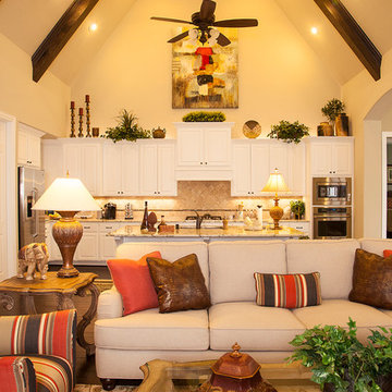
This gorgeous home interior was designed by our professional interior designers in North Houston. Please contact us with any questions and don't forget to ask about your free interior design consultation. We would love to help you make your house uniquely yours!
Star Furniture
18107 North Freeway, Houston, TX 77090
281-440-3330
 GS Construction
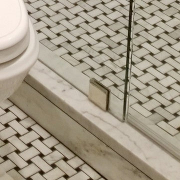
Example of a small classic 3/4 white tile and stone tile mosaic tile floor alcove shower design in Chicago with an undermount sink, recessed-panel cabinets, black cabinets, quartzite countertops, a two-piece toilet and gray walls
 Spire North
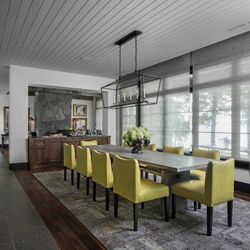
Tucked away in the backwoods of Torch Lake, this home marries “rustic” with the sleek elegance of modern. The combination of wood, stone and metal textures embrace the charm of a classic farmhouse. Although this is not your average farmhouse. The home is outfitted with a high performing system that seamlessly works with the design and architecture.
The tall ceilings and windows allow ample natural light into the main room. Spire Integrated Systems installed Lutron QS Wireless motorized shades paired with Hartmann & Forbes windowcovers to offer privacy and block harsh light. The custom 18′ windowcover’s woven natural fabric complements the organic esthetics of the room. The shades are artfully concealed in the millwork when not in use.
Spire installed B&W in-ceiling speakers and Sonance invisible in-wall speakers to deliver ambient music that emanates throughout the space with no visual footprint. Spire also installed a Sonance Landscape Audio System so the homeowner can enjoy music outside.
Each system is easily controlled using Savant. Spire personalized the settings to the homeowner’s preference making controlling the home efficient and convenient.
 California Doors and Windows
The Evolution of the Bathtub Ends Here…
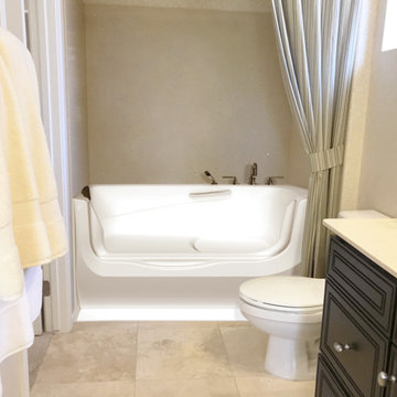
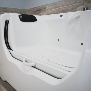
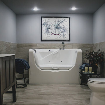
The Ultimate Healing Bathtub is a Brand-New Revolutionary Slide-In Bathtub, designed and engineered by the most brilliant minds on the Planet and in the Industry. This incredible Bathtub, took 5-long hard years, along with millions of dollars to invent, engineer and develop. No safety or ease of use features have been taken for granted or overlooked. This Amazing Bathtub will help people of all ages, ethnic cultures and backgrounds to relax and enjoy life, while they are cleansing themselves from the toxins of the world, safely along with shouting their pain and discomforts. The beautiful, sleek, aerodynamic design is not only practical, it is Gorgeous.
Can you Imagine, Owning the Safest, Most Revolutionary and Luxurious Bathtub in the World?
How would that increase the Quality of Your Life?
You Can own this Awesome Bathtub…and You Deserve To have One...or Two… Or maybe Three…
The Sky is the Limit…
It is Affordable…
And I’m going to help and assist you, on how to get this Ultra-Unique Invention into Your Home.
So, you can rest assured, that when you get home, after working a long hard day, tired, sore, stressed and confused.
Call today to learn more about the amazing features and opportunities that were offering!
The ”Ultimate Healing Bathtub”, will be waiting for you…
With Wide Open Doors… Strong, Powerful Air Jets…. along with Soft Hot Water and Chromotherapy, to help and assist you to:
Reduce the Swelling and Inflammation in your Sore Muscles, Tenons and Bones
Decrease your Muscle Tension
Improve the Circulation of your Blood
Give you Satisfying Relief of Seasonal Affective Disorder (SAD)
Increase your Ligaments Range of Motion
Release Toxins Out of your Body
Revitalize Loose and Wrinkled Skin
Enjoy a Gentle but Powerful Message
Regulate Your Mood Swings
Improve your Sleeping Patterns
Gain Tremendous Anti-Aging Benefits
Live a Higher Quality of Life
Live More Comfortable
Live Happier
Live Longer
Get all this…. and more, along with the Safest and Most Technical Bathtub on the Planet…
The Benefits and Features on this Miraculous Bathtub are Astounding.
The Ultimate Healing Bathtub comes standard with:
4-Computers (YES -I said Four CPU’s)
Drains in 10-15 Seconds
Equipped with a Catch Basin Reservoir underneath the bathtub to allow for quick drainage
The Pressurized Door Seal is the same seal the United States Air Force uses on the F-18 Fighter Jet Plane to seal the Canopy to the top of the Cockpit
Medical Grade Stainless Steel Main Frame that will stay 99% Bacterial Free
Removable Medical Grade Stainless Steel Drain Filter for easy maintenance along with access to the main floor drain
2-12 Volt Back-Up Batteries in case of a power failure
Numerous Fail -Safe Features-In case of Power Failure this bathtub automatically Drains in 10-15 seconds, then the door drops so you can get out of the bathtub
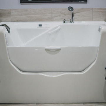
The door rises from underneath the bathtub for maximum immersion and has 3-positions (Down, Center and Top)
Weight of less that one (1) pound of force to open and close the door
Door Automatically Latches
Easy Ingress and egress from a walker or a wheelchair
The bathtub is at chair level for easy positioning
Extra foot drain so you can add more hot water without emptying the bathtub water too fast
Consumption of less than 40 Gallons of Water
Ships in 2-different pieces, that weigh 160 LBS each, for easy installation and attaches together with 4-screws
Low Voltage Heated Backrest (Low and High Heat positions)
Soft Gel Pillow
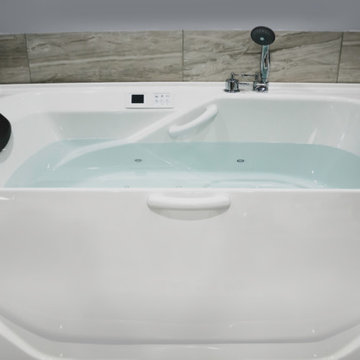
Numerous Self-Cleaning and Self-Drying Air Jets placed along the entire length of the bathtub that shoot millions of gentle massaging bubbles
No chance of contamination and residue buildup from use of soaps and oils
Upper Control Panel so you can control all of the benefits and features of the Ultimate Healing Bathtub with a push of a button
Hand Held Sprayer for simple caregiving and easy cleaning
Dual-Temperature Water Control Valve
Anti-Scald Valve so the hot water can’t burn you
Water Volume Valve
Door latches in center position for easy usage for a care giver or to bathe children and pets
Requires 1-110 -20-amp Duplex Receptacle
Water and Drain lines come equipped with quick connecting couplings for easy installation
Shell is made of Acrylic not Fiberglass for easy patching in case bathtub gets damaged
Back and Foot Message Air Jets
Grab Bar inside bathtub for Safety Access and Egress
At no point is the user standing in the Bathtub, so there is no chance of slipping or falling
Ultimate Healing Bathtub dimensions fit easily into existing bathrooms (60” X 32” X 42”)
Extra Long Ultimate Healing Bathtub Dimensions (72” X 32” X 42”)
Chromotherapy
Bring dignity, autonomy and relaxation back into the bathing experience with this remarkable Ultimate Healing Bathtub.
 California Doors and Windows
The Evolution of the Bathtub Ends Here…
The Ultimate Healing Bathtub is a Brand-New Revolutionary Slide-In Bathtub, designed and engineered by the most brilliant minds on the Planet and in the Industry. This incredible Bathtub, took 5-long hard years, along with millions of dollars to invent, engineer and develop. No safety or ease of use features have been taken for granted or overlooked. This Amazing Bathtub will help people of all ages, ethnic cultures and backgrounds to relax and enjoy life, while they are cleansing themselves from the toxins of the world, safely along with shouting their pain and discomforts. The beautiful, sleek, aerodynamic design is not only practical, it is Gorgeous.
Can you Imagine, Owning the Safest, Most Revolutionary and Luxurious Bathtub in the World?
How would that increase the Quality of Your Life?
You Can own this Awesome Bathtub…and You Deserve To have One...or Two… Or maybe Three…
The Sky is the Limit…
It is Affordable…
And I’m going to help and assist you, on how to get this Ultra-Unique Invention into Your Home.
So, you can rest assured, that when you get home, after working a long hard day, tired, sore, stressed and confused.
Call today to learn more about the amazing features and opportunities that were offering!
The ”Ultimate Healing Bathtub”, will be waiting for you…
With Wide Open Doors… Strong, Powerful Air Jets…. along with Soft Hot Water and Chromotherapy, to help and assist you to:
Reduce the Swelling and Inflammation in your Sore Muscles, Tenons and Bones
Decrease your Muscle Tension
Improve the Circulation of your Blood
Give you Satisfying Relief of Seasonal Affective Disorder (SAD)
Increase your Ligaments Range of Motion
Release Toxins Out of your Body
Revitalize Loose and Wrinkled Skin
Enjoy a Gentle but Powerful Message
Regulate Your Mood Swings
Improve your Sleeping Patterns
Gain Tremendous Anti-Aging Benefits
Live a Higher Quality of Life
Live More Comfortable
Live Happier
Live Longer
Get all this…. and more, along with the Safest and Most Technical Bathtub on the Planet…
The Benefits and Features on this Miraculous Bathtub are Astounding.
The Ultimate Healing Bathtub comes standard with:
4-Computers (YES -I said Four CPU’s)
Drains in 10-15 Seconds
Equipped with a Catch Basin Reservoir underneath the bathtub to allow for quick drainage
The Pressurized Door Seal is the same seal the United States Air Force uses on the F-18 Fighter Jet Plane to seal the Canopy to the top of the Cockpit
Medical Grade Stainless Steel Main Frame that will stay 99% Bacterial Free
Removable Medical Grade Stainless Steel Drain Filter for easy maintenance along with access to the main floor drain
2-12 Volt Back-Up Batteries in case of a power failure
Numerous Fail -Safe Features-In case of Power Failure this bathtub automatically Drains in 10-15 seconds, then the door drops so you can get out of the bathtub
The door rises from underneath the bathtub for maximum immersion and has 3-positions (Down, Center and Top)
Weight of less that one (1) pound of force to open and close the door
Door Automatically Latches
Easy Ingress and egress from a walker or a wheelchair
The bathtub is at chair level for easy positioning
Extra foot drain so you can add more hot water without emptying the bathtub water too fast
Consumption of less than 40 Gallons of Water
Ships in 2-different pieces, that weigh 160 LBS each, for easy installation and attaches together with 4-screws
Low Voltage Heated Backrest (Low and High Heat positions)
Soft Gel Pillow
Numerous Self-Cleaning and Self-Drying Air Jets placed along the entire length of the bathtub that shoot millions of gentle massaging bubbles
No chance of contamination and residue buildup from use of soaps and oils
Upper Control Panel so you can control all of the benefits and features of the Ultimate Healing Bathtub with a push of a button
Hand Held Sprayer for simple caregiving and easy cleaning
Dual-Temperature Water Control Valve
Anti-Scald Valve so the hot water can’t burn you
Water Volume Valve
Door latches in center position for easy usage for a care giver or to bathe children and pets
Requires 1-110 -20-amp Duplex Receptacle
Water and Drain lines come equipped with quick connecting couplings for easy installation
Shell is made of Acrylic not Fiberglass for easy patching in case bathtub gets damaged
Back and Foot Message Air Jets
Grab Bar inside bathtub for Safety Access and Egress
At no point is the user standing in the Bathtub, so there is no chance of slipping or falling
Ultimate Healing Bathtub dimensions fit easily into existing bathrooms (60” X 32” X 42”)
Extra Long Ultimate Healing Bathtub Dimensions (72” X 32” X 42”)
Chromotherapy
Bring dignity, autonomy and relaxation back into the bathing experience with this remarkable Ultimate Healing Bathtub.
 California Doors and Windows
The Evolution of the Bathtub Ends Here…
The Ultimate Healing Bathtub is a Brand-New Revolutionary Slide-In Bathtub, designed and engineered by the most brilliant minds on the Planet and in the Industry. This incredible Bathtub, took 5-long hard years, along with millions of dollars to invent, engineer and develop. No safety or ease of use features have been taken for granted or overlooked. This Amazing Bathtub will help people of all ages, ethnic cultures and backgrounds to relax and enjoy life, while they are cleansing themselves from the toxins of the world, safely along with shouting their pain and discomforts. The beautiful, sleek, aerodynamic design is not only practical, it is Gorgeous.
Can you Imagine, Owning the Safest, Most Revolutionary and Luxurious Bathtub in the World?
How would that increase the Quality of Your Life?
You Can own this Awesome Bathtub…and You Deserve To have One...or Two… Or maybe Three…
The Sky is the Limit…
It is Affordable…
And I’m going to help and assist you, on how to get this Ultra-Unique Invention into Your Home.
So, you can rest assured, that when you get home, after working a long hard day, tired, sore, stressed and confused.
Call today to learn more about the amazing features and opportunities that were offering!
The ”Ultimate Healing Bathtub”, will be waiting for you…
With Wide Open Doors… Strong, Powerful Air Jets…. along with Soft Hot Water and Chromotherapy, to help and assist you to:
Reduce the Swelling and Inflammation in your Sore Muscles, Tenons and Bones
Decrease your Muscle Tension
Improve the Circulation of your Blood
Give you Satisfying Relief of Seasonal Affective Disorder (SAD)
Increase your Ligaments Range of Motion
Release Toxins Out of your Body
Revitalize Loose and Wrinkled Skin
Enjoy a Gentle but Powerful Message
Regulate Your Mood Swings
Improve your Sleeping Patterns
Gain Tremendous Anti-Aging Benefits
Live a Higher Quality of Life
Live More Comfortable
Live Happier
Live Longer
Get all this…. and more, along with the Safest and Most Technical Bathtub on the Planet…
The Benefits and Features on this Miraculous Bathtub are Astounding.
The Ultimate Healing Bathtub comes standard with:
4-Computers (YES -I said Four CPU’s)
Drains in 10-15 Seconds
Equipped with a Catch Basin Reservoir underneath the bathtub to allow for quick drainage
The Pressurized Door Seal is the same seal the United States Air Force uses on the F-18 Fighter Jet Plane to seal the Canopy to the top of the Cockpit
Medical Grade Stainless Steel Main Frame that will stay 99% Bacterial Free
Removable Medical Grade Stainless Steel Drain Filter for easy maintenance along with access to the main floor drain
2-12 Volt Back-Up Batteries in case of a power failure
Numerous Fail -Safe Features-In case of Power Failure this bathtub automatically Drains in 10-15 seconds, then the door drops so you can get out of the bathtub
The door rises from underneath the bathtub for maximum immersion and has 3-positions (Down, Center and Top)
Weight of less that one (1) pound of force to open and close the door
Door Automatically Latches
Easy Ingress and egress from a walker or a wheelchair
The bathtub is at chair level for easy positioning
Extra foot drain so you can add more hot water without emptying the bathtub water too fast
Consumption of less than 40 Gallons of Water
Ships in 2-different pieces, that weigh 160 LBS each, for easy installation and attaches together with 4-screws
Low Voltage Heated Backrest (Low and High Heat positions)
Soft Gel Pillow
Numerous Self-Cleaning and Self-Drying Air Jets placed along the entire length of the bathtub that shoot millions of gentle massaging bubbles
No chance of contamination and residue buildup from use of soaps and oils
Upper Control Panel so you can control all of the benefits and features of the Ultimate Healing Bathtub with a push of a button
Hand Held Sprayer for simple caregiving and easy cleaning
Dual-Temperature Water Control Valve
Anti-Scald Valve so the hot water can’t burn you
Water Volume Valve
Door latches in center position for easy usage for a care giver or to bathe children and pets
Requires 1-110 -20-amp Duplex Receptacle
Water and Drain lines come equipped with quick connecting couplings for easy installation
Shell is made of Acrylic not Fiberglass for easy patching in case bathtub gets damaged
Back and Foot Message Air Jets
Grab Bar inside bathtub for Safety Access and Egress
At no point is the user standing in the Bathtub, so there is no chance of slipping or falling
Ultimate Healing Bathtub dimensions fit easily into existing bathrooms (60” X 32” X 42”)
Extra Long Ultimate Healing Bathtub Dimensions (72” X 32” X 42”)
Chromotherapy
Bring dignity, autonomy and relaxation back into the bathing experience with this remarkable Ultimate Healing Bathtub.
 California Doors and Windows
The Evolution of the Bathtub Ends Here…
The Ultimate Healing Bathtub is a Brand-New Revolutionary Slide-In Bathtub, designed and engineered by the most brilliant minds on the Planet and in the Industry. This incredible Bathtub, took 5-long hard years, along with millions of dollars to invent, engineer and develop. No safety or ease of use features have been taken for granted or overlooked. This Amazing Bathtub will help people of all ages, ethnic cultures and backgrounds to relax and enjoy life, while they are cleansing themselves from the toxins of the world, safely along with shouting their pain and discomforts. The beautiful, sleek, aerodynamic design is not only practical, it is Gorgeous.
Can you Imagine, Owning the Safest, Most Revolutionary and Luxurious Bathtub in the World?
How would that increase the Quality of Your Life?
You Can own this Awesome Bathtub…and You Deserve To have One...or Two… Or maybe Three…
The Sky is the Limit…
It is Affordable…
And I’m going to help and assist you, on how to get this Ultra-Unique Invention into Your Home.
So, you can rest assured, that when you get home, after working a long hard day, tired, sore, stressed and confused.
Call today to learn more about the amazing features and opportunities that were offering!
The ”Ultimate Healing Bathtub”, will be waiting for you…
With Wide Open Doors… Strong, Powerful Air Jets…. along with Soft Hot Water and Chromotherapy, to help and assist you to:
Reduce the Swelling and Inflammation in your Sore Muscles, Tenons and Bones
Decrease your Muscle Tension
Improve the Circulation of your Blood
Give you Satisfying Relief of Seasonal Affective Disorder (SAD)
Increase your Ligaments Range of Motion
Release Toxins Out of your Body
Revitalize Loose and Wrinkled Skin
Enjoy a Gentle but Powerful Message
Regulate Your Mood Swings
Improve your Sleeping Patterns
Gain Tremendous Anti-Aging Benefits
Live a Higher Quality of Life
Live More Comfortable
Live Happier
Live Longer
Get all this…. and more, along with the Safest and Most Technical Bathtub on the Planet…
The Benefits and Features on this Miraculous Bathtub are Astounding.
The Ultimate Healing Bathtub comes standard with:
4-Computers (YES -I said Four CPU’s)
Drains in 10-15 Seconds
Equipped with a Catch Basin Reservoir underneath the bathtub to allow for quick drainage
The Pressurized Door Seal is the same seal the United States Air Force uses on the F-18 Fighter Jet Plane to seal the Canopy to the top of the Cockpit
Medical Grade Stainless Steel Main Frame that will stay 99% Bacterial Free
Removable Medical Grade Stainless Steel Drain Filter for easy maintenance along with access to the main floor drain
2-12 Volt Back-Up Batteries in case of a power failure
Numerous Fail -Safe Features-In case of Power Failure this bathtub automatically Drains in 10-15 seconds, then the door drops so you can get out of the bathtub
The door rises from underneath the bathtub for maximum immersion and has 3-positions (Down, Center and Top)
Weight of less that one (1) pound of force to open and close the door
Door Automatically Latches
Easy Ingress and egress from a walker or a wheelchair
The bathtub is at chair level for easy positioning
Extra foot drain so you can add more hot water without emptying the bathtub water too fast
Consumption of less than 40 Gallons of Water
Ships in 2-different pieces, that weigh 160 LBS each, for easy installation and attaches together with 4-screws
Low Voltage Heated Backrest (Low and High Heat positions)
Soft Gel Pillow
Numerous Self-Cleaning and Self-Drying Air Jets placed along the entire length of the bathtub that shoot millions of gentle massaging bubbles
No chance of contamination and residue buildup from use of soaps and oils
Upper Control Panel so you can control all of the benefits and features of the Ultimate Healing Bathtub with a push of a button
Hand Held Sprayer for simple caregiving and easy cleaning
Dual-Temperature Water Control Valve
Anti-Scald Valve so the hot water can’t burn you
Water Volume Valve
Door latches in center position for easy usage for a care giver or to bathe children and pets
Requires 1-110 -20-amp Duplex Receptacle
Water and Drain lines come equipped with quick connecting couplings for easy installation
Shell is made of Acrylic not Fiberglass for easy patching in case bathtub gets damaged
Back and Foot Message Air Jets
Grab Bar inside bathtub for Safety Access and Egress
At no point is the user standing in the Bathtub, so there is no chance of slipping or falling
Ultimate Healing Bathtub dimensions fit easily into existing bathrooms (60” X 32” X 42”)
Extra Long Ultimate Healing Bathtub Dimensions (72” X 32” X 42”)
Chromotherapy
Bring dignity, autonomy and relaxation back into the bathing experience with this remarkable Ultimate Healing Bathtub.
 California Doors and Windows
The Evolution of the Bathtub Ends Here…
The Ultimate Healing Bathtub is a Brand-New Revolutionary Slide-In Bathtub, designed and engineered by the most brilliant minds on the Planet and in the Industry. This incredible Bathtub, took 5-long hard years, along with millions of dollars to invent, engineer and develop. No safety or ease of use features have been taken for granted or overlooked. This Amazing Bathtub will help people of all ages, ethnic cultures and backgrounds to relax and enjoy life, while they are cleansing themselves from the toxins of the world, safely along with shouting their pain and discomforts. The beautiful, sleek, aerodynamic design is not only practical, it is Gorgeous.
Can you Imagine, Owning the Safest, Most Revolutionary and Luxurious Bathtub in the World?
How would that increase the Quality of Your Life?
You Can own this Awesome Bathtub…and You Deserve To have One...or Two… Or maybe Three…
The Sky is the Limit…
It is Affordable…
And I’m going to help and assist you, on how to get this Ultra-Unique Invention into Your Home.
So, you can rest assured, that when you get home, after working a long hard day, tired, sore, stressed and confused.
Call today to learn more about the amazing features and opportunities that were offering!
The ”Ultimate Healing Bathtub”, will be waiting for you…
With Wide Open Doors… Strong, Powerful Air Jets…. along with Soft Hot Water and Chromotherapy, to help and assist you to:
Reduce the Swelling and Inflammation in your Sore Muscles, Tenons and Bones
Decrease your Muscle Tension
Improve the Circulation of your Blood
Give you Satisfying Relief of Seasonal Affective Disorder (SAD)
Increase your Ligaments Range of Motion
Release Toxins Out of your Body
Revitalize Loose and Wrinkled Skin
Enjoy a Gentle but Powerful Message
Regulate Your Mood Swings
Improve your Sleeping Patterns
Gain Tremendous Anti-Aging Benefits
Live a Higher Quality of Life
Live More Comfortable
Live Happier
Live Longer
Get all this…. and more, along with the Safest and Most Technical Bathtub on the Planet…
The Benefits and Features on this Miraculous Bathtub are Astounding.
The Ultimate Healing Bathtub comes standard with:
4-Computers (YES -I said Four CPU’s)
Drains in 10-15 Seconds
Equipped with a Catch Basin Reservoir underneath the bathtub to allow for quick drainage
The Pressurized Door Seal is the same seal the United States Air Force uses on the F-18 Fighter Jet Plane to seal the Canopy to the top of the Cockpit
Medical Grade Stainless Steel Main Frame that will stay 99% Bacterial Free
Removable Medical Grade Stainless Steel Drain Filter for easy maintenance along with access to the main floor drain
2-12 Volt Back-Up Batteries in case of a power failure
Numerous Fail -Safe Features-In case of Power Failure this bathtub automatically Drains in 10-15 seconds, then the door drops so you can get out of the bathtub
The door rises from underneath the bathtub for maximum immersion and has 3-positions (Down, Center and Top)
Weight of less that one (1) pound of force to open and close the door
Door Automatically Latches
Easy Ingress and egress from a walker or a wheelchair
The bathtub is at chair level for easy positioning
Extra foot drain so you can add more hot water without emptying the bathtub water too fast
Consumption of less than 40 Gallons of Water
Ships in 2-different pieces, that weigh 160 LBS each, for easy installation and attaches together with 4-screws
Low Voltage Heated Backrest (Low and High Heat positions)
Soft Gel Pillow
Numerous Self-Cleaning and Self-Drying Air Jets placed along the entire length of the bathtub that shoot millions of gentle massaging bubbles
No chance of contamination and residue buildup from use of soaps and oils
Upper Control Panel so you can control all of the benefits and features of the Ultimate Healing Bathtub with a push of a button
Hand Held Sprayer for simple caregiving and easy cleaning
Dual-Temperature Water Control Valve
Anti-Scald Valve so the hot water can’t burn you
Water Volume Valve
Door latches in center position for easy usage for a care giver or to bathe children and pets
Requires 1-110 -20-amp Duplex Receptacle
Water and Drain lines come equipped with quick connecting couplings for easy installation
Shell is made of Acrylic not Fiberglass for easy patching in case bathtub gets damaged
Back and Foot Message Air Jets
Grab Bar inside bathtub for Safety Access and Egress
At no point is the user standing in the Bathtub, so there is no chance of slipping or falling
Ultimate Healing Bathtub dimensions fit easily into existing bathrooms (60” X 32” X 42”)
Extra Long Ultimate Healing Bathtub Dimensions (72” X 32” X 42”)
Chromotherapy
Bring dignity, autonomy and relaxation back into the bathing experience with this remarkable Ultimate Healing Bathtub.
40