
Search results for "Connecting individuals" in Home Design Ideas
 PEDINI NY
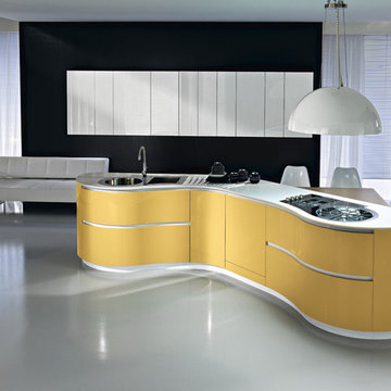
The inspiration for the Dune began with the simple idea to seamlessly connect the kitchen to the living space. Dune is a unique contemporary kitchen cabinet design without handles. It is defined by asymmetrically curved base units and echoing flowing forms found in nature. Opening is achieved by a groove on the edge of the extra thick 23mm front panel (base units) or by a vertical aluminum profile (tall units). Drawers in the curved units allow Pedini to offer this remarkable Italian kitchen design without compromising the environment, ergonomics or functionality.
Dune contemporary kitchens offer a high component of adaptability and individual variations, which allows room for harmony between the functional aspects of the house. Dune truly adapts to the nature of it’s surrounding.
Soft technology. Pedini makes daily living more practical thanks to the quality of the opening systems of doors and drawers, and with an automated closing mechanism, great storage capacity, and the total personalization of the spaces. Dune aesthetics provide attractive contrasts between wood veneers, steel, and quartz worktops. Modern kitchen designs like Dune are a perfect fit in any home. Dune, like all of Pedini’s contemporary kitchens, was designed with ease of function in mind. Dune is a flexible product for diversified solutions. Among the various possibilities of Dune, the option of the island allows complete access from more sides of the working area. Deep drawers are also a staple of the Dune line.
Dune is available in natural or stained eco friendly walnut as well as matte, high gloss and textured lacquer in any color. Aluminum profiles and plinths are available in white, gray, black or matte silver. Complementary glass fronts available with walnut frame and 6 colors of mirror glass.

 Cape Associates, Inc.
This 1,200 square-foot Provincetown condominium lives large, both functionally and aesthetically, thanks to its recent renovation. The waterfront home, overlooking Cape Cod Bay, is part of an historic grouping of three individual buildings on Commercial Street that have been combined into condominiums.
Begun in November 2014 and completed just in time for summer in May 2016, b Architecture Studios and Cape Associates Builders worked with a budget of $366,000 to transform this prosaic dwelling into a stunning light-flooded space—designed to maximize both the living space and the mesmerizing views of the bay.
“The space was totally reconfigured,” said project manager Jon Ziperman. “It was a total gut job requiring leveling of floors, straightening of walls, removing a chimney and fireplace that ran up to the above neighbors’ unit.” The renovation also required a complete rewiring and plumbing system that involved wires and pipes that were integrated into the surrounding units. From wall to wall and floor to ceiling, there was nothing that could be salvaged from the original space.
One of the most prominent changes was moving the stairway from its original placement, where it originally broke up the living and dining space and blocked views to the bay beyond. The stairway now sits on the opposite side of the condominium. With the stairs tucked to the left side of the living area, the sightline now extends from the entry straight through the living and dining areas to the water. The new design allowed for storage space beneath the stairs, which lead to an airy sleeping loft, and room for a desk niche. A light well, where the former sleeping area was, and new windows bring abundant natural light to the central living area.
Innovative features in the entry room include a Murphy bed and sliding glass door separating it from the living area, so that the space can double as a guest room.
“The Murphy bed fit in nicely, allowing for a flush wall at the entry/guest room and a desk niche in the adjacent room,” Brown said. “Convincing the client to create the wrap-around chair rail, lined up with the divided lights of the sliding glass door, makes a purposeful connection in a small space.”
Neolith countertops in the open kitchen and details like the flush minimal baseboard contribute to the sleek, modern aesthetic, now complemented by the owner’s contemporary furnishings. This complete renovation has rendered this compact home worthy of its beautiful setting.
 Cape Associates, Inc.
This 1,200 square-foot Provincetown condominium lives large, both functionally and aesthetically, thanks to its recent renovation. The waterfront home, overlooking Cape Cod Bay, is part of an historic grouping of three individual buildings on Commercial Street that have been combined into condominiums.
Begun in November 2014 and completed just in time for summer in May 2016, b Architecture Studios and Cape Associates Builders worked with a budget of $366,000 to transform this prosaic dwelling into a stunning light-flooded space—designed to maximize both the living space and the mesmerizing views of the bay.
“The space was totally reconfigured,” said project manager Jon Ziperman. “It was a total gut job requiring leveling of floors, straightening of walls, removing a chimney and fireplace that ran up to the above neighbors’ unit.” The renovation also required a complete rewiring and plumbing system that involved wires and pipes that were integrated into the surrounding units. From wall to wall and floor to ceiling, there was nothing that could be salvaged from the original space.
One of the most prominent changes was moving the stairway from its original placement, where it originally broke up the living and dining space and blocked views to the bay beyond. The stairway now sits on the opposite side of the condominium. With the stairs tucked to the left side of the living area, the sightline now extends from the entry straight through the living and dining areas to the water. The new design allowed for storage space beneath the stairs, which lead to an airy sleeping loft, and room for a desk niche. A light well, where the former sleeping area was, and new windows bring abundant natural light to the central living area.
Innovative features in the entry room include a Murphy bed and sliding glass door separating it from the living area, so that the space can double as a guest room.
“The Murphy bed fit in nicely, allowing for a flush wall at the entry/guest room and a desk niche in the adjacent room,” Brown said. “Convincing the client to create the wrap-around chair rail, lined up with the divided lights of the sliding glass door, makes a purposeful connection in a small space.”
Neolith countertops in the open kitchen and details like the flush minimal baseboard contribute to the sleek, modern aesthetic, now complemented by the owner’s contemporary furnishings. This complete renovation has rendered this compact home worthy of its beautiful setting.
Find the right local pro for your project
 PEDINI NY
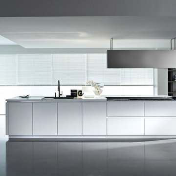
The inspiration for the Dune began with the simple idea to seamlessly connect the kitchen to the living space. Dune is a unique contemporary kitchen cabinet design without handles. It is defined by asymmetrically curved base units and echoing flowing forms found in nature. Opening is achieved by a groove on the edge of the extra thick 23mm front panel (base units) or by a vertical aluminum profile (tall units). Drawers in the curved units allow Pedini to offer this remarkable Italian kitchen design without compromising the environment, ergonomics or functionality.
Dune contemporary kitchens offer a high component of adaptability and individual variations, which allows room for harmony between the functional aspects of the house. Dune truly adapts to the nature of it’s surrounding.
Soft technology. Pedini makes daily living more practical thanks to the quality of the opening systems of doors and drawers, and with an automated closing mechanism, great storage capacity, and the total personalization of the spaces. Dune aesthetics provide attractive contrasts between wood veneers, steel, and quartz worktops. Modern kitchen designs like Dune are a perfect fit in any home. Dune, like all of Pedini’s contemporary kitchens, was designed with ease of function in mind. Dune is a flexible product for diversified solutions. Among the various possibilities of Dune, the option of the island allows complete access from more sides of the working area. Deep drawers are also a staple of the Dune line.
Dune is available in natural or stained eco friendly walnut as well as matte, high gloss and textured lacquer in any color. Aluminum profiles and plinths are available in white, gray, black or matte silver. Complementary glass fronts available with walnut frame and 6 colors of mirror glass.
 IAm-Ness
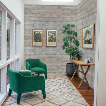
Iam-ness, based in Queens, New York, is pioneering a new era in the realm of Decorative Plaster, setting a gold standard in the industry. Our expertise lies in transforming spaces – from small accents to extensive areas – into realms of exquisite beauty and unparalleled elegance. Specializing in Venetian Plaster, Faux Venetian Plaster, and Decorative Painting, we cater to a clientele that seeks nothing but extraordinary.
Decorative plaster, in our skilled hands, transcends traditional boundaries, offering an array of textures and finishes that bring walls to life. Be it border accents, fireplace surrounds, or statement accent walls, our work is tailored to resonate with the soul and style of your space, ensuring a unique, personalized touch.
What truly sets Venetian Plaster apart is its rich history, dating back to Roman times, and its resurgence during the Italian Renaissance. It embodies classical aesthetics, now reinterpreted by Iam-ness to suit the modern luxury interior design. Our Venetian Plaster is not just a wall finish; it is a statement of class, a reflection of timeless elegance in your exclusive living spaces.
At Iam-ness, we invite collaborations with industry professionals - painters, interior designers, architects, and remodelers - to create unparalleled experiences in luxury interior design. Together, we can transform visions into reality, creating spaces that are not just seen but felt.
Connect with us at Iam-ness, where every project is a journey towards creating something truly magnificent, a celebration of your individual taste and the epitome of luxury living. Let us redefine the ambiance of your home or commercial space with our artisanal craftsmanship.
Your space deserves the touch of luxury that only Iam-ness can provide. Reach out to us and embark on a journey of transformation, where your vision meets our expertise to create something truly extraordinary.
Interested in elevating your space with unparalleled luxury? Contact Iam-ness today to collaborate and bring your vision to life. Let's create something exceptional together.
 Geddes Ulinskas Architects
Blake Marvin Photography
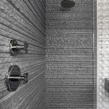
Example of a trendy home design design in San Francisco
Example of a trendy home design design in San Francisco
 Cape Associates, Inc.
This 1,200 square-foot Provincetown condominium lives large, both functionally and aesthetically, thanks to its recent renovation. The waterfront home, overlooking Cape Cod Bay, is part of an historic grouping of three individual buildings on Commercial Street that have been combined into condominiums.
Begun in November 2014 and completed just in time for summer in May 2016, b Architecture Studios and Cape Associates Builders worked with a budget of $366,000 to transform this prosaic dwelling into a stunning light-flooded space—designed to maximize both the living space and the mesmerizing views of the bay.
“The space was totally reconfigured,” said project manager Jon Ziperman. “It was a total gut job requiring leveling of floors, straightening of walls, removing a chimney and fireplace that ran up to the above neighbors’ unit.” The renovation also required a complete rewiring and plumbing system that involved wires and pipes that were integrated into the surrounding units. From wall to wall and floor to ceiling, there was nothing that could be salvaged from the original space.
One of the most prominent changes was moving the stairway from its original placement, where it originally broke up the living and dining space and blocked views to the bay beyond. The stairway now sits on the opposite side of the condominium. With the stairs tucked to the left side of the living area, the sightline now extends from the entry straight through the living and dining areas to the water. The new design allowed for storage space beneath the stairs, which lead to an airy sleeping loft, and room for a desk niche. A light well, where the former sleeping area was, and new windows bring abundant natural light to the central living area.
Innovative features in the entry room include a Murphy bed and sliding glass door separating it from the living area, so that the space can double as a guest room.
“The Murphy bed fit in nicely, allowing for a flush wall at the entry/guest room and a desk niche in the adjacent room,” Brown said. “Convincing the client to create the wrap-around chair rail, lined up with the divided lights of the sliding glass door, makes a purposeful connection in a small space.”
Neolith countertops in the open kitchen and details like the flush minimal baseboard contribute to the sleek, modern aesthetic, now complemented by the owner’s contemporary furnishings. This complete renovation has rendered this compact home worthy of its beautiful setting.
Sponsored
Columbus, OH

Wannemacher Interiors
Customized Award-Winning Interior Design Solutions in Franklin Cnty OH
 Cape Associates, Inc.
This 1,200 square-foot Provincetown condominium lives large, both functionally and aesthetically, thanks to its recent renovation. The waterfront home, overlooking Cape Cod Bay, is part of an historic grouping of three individual buildings on Commercial Street that have been combined into condominiums.
Begun in November 2014 and completed just in time for summer in May 2016, b Architecture Studios and Cape Associates Builders worked with a budget of $366,000 to transform this prosaic dwelling into a stunning light-flooded space—designed to maximize both the living space and the mesmerizing views of the bay.
“The space was totally reconfigured,” said project manager Jon Ziperman. “It was a total gut job requiring leveling of floors, straightening of walls, removing a chimney and fireplace that ran up to the above neighbors’ unit.” The renovation also required a complete rewiring and plumbing system that involved wires and pipes that were integrated into the surrounding units. From wall to wall and floor to ceiling, there was nothing that could be salvaged from the original space.
One of the most prominent changes was moving the stairway from its original placement, where it originally broke up the living and dining space and blocked views to the bay beyond. The stairway now sits on the opposite side of the condominium. With the stairs tucked to the left side of the living area, the sightline now extends from the entry straight through the living and dining areas to the water. The new design allowed for storage space beneath the stairs, which lead to an airy sleeping loft, and room for a desk niche. A light well, where the former sleeping area was, and new windows bring abundant natural light to the central living area.
Innovative features in the entry room include a Murphy bed and sliding glass door separating it from the living area, so that the space can double as a guest room.
“The Murphy bed fit in nicely, allowing for a flush wall at the entry/guest room and a desk niche in the adjacent room,” Brown said. “Convincing the client to create the wrap-around chair rail, lined up with the divided lights of the sliding glass door, makes a purposeful connection in a small space.”
Neolith countertops in the open kitchen and details like the flush minimal baseboard contribute to the sleek, modern aesthetic, now complemented by the owner’s contemporary furnishings. This complete renovation has rendered this compact home worthy of its beautiful setting.

 Studio Dearborn
A classic victorian in Larchmont Manor near Long Island Sound received a facelift with a fresh white kitchen with soaring 9 foot ceilings. Cabinetry by Schrocks of Walnut Creek. Countertops quartz composite. Light fixtures, Restoration Hardware. Hardware, Top Knobs. Photography by Timothy Lenz.
 Michael Shannon Designs
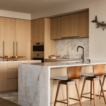
Created by combining two units, this 3,000+ square foot condominium residence offered expansive proportions and spectacular city views. While the builder's finishes were state-of-the-art when the building opened in 2009, they had not aged well. The original cherry floors had faded unevenly, the kitchen felt undersized in relation to the apartment, and a dark, enclosed library/den was disconnected from the main living spaces. We reconfigured the floor plan to better suit the scale of the residence and the way the owners live. The former laundry room was relocated, and its space was incorporated into an enlarged kitchen, allowing for two full-size refrigeration units, a walk-in pantry, additional counter space, and a generous island. The enclosed den was opened to the main living area and transformed into a spacious dining room, improving circulation and creating greater openness. Light-toned flooring replaced the original cherry and takes its cue from the new kitchen cabinetry, creating a lighter, brighter, and more cohesive interior. Matching custom cabinetry extends into the main living room, providing integrated storage and space for media components while visually connecting the rooms. In the primary bedroom, a smaller-scale interpretation of the living room millwork, this time in warmer walnut, creates a cozy nook with an integrated television, storage, and shelving designed to display the owners’ collections. The residence is flooded with natural light during the day, but the views become equally dramatic after sunset, when the illuminated figure of William Penn atop City Hall becomes an unexpected decorative feature just outside the windows. To make the interiors equally successful at night, we added decorative lighting and repositioned the architectural lighting throughout, using it to highlight the new cabinetry, the owners’ artwork, and seating areas while creating a warmer atmosphere after dark. Decorative metal screens were introduced in several locations to subtly define individual spaces without sacrificing the openness of the reconfigured plan or interrupting views through the apartment. The result is a sophisticated, highly functional home—distinctive in its own right, framed by remarkable views of Philadelphia.
 All Under One Roof, Inc.
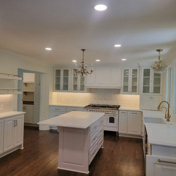
Completed Kitchen & Interior Renovation | Kansas City Metro
What appears effortless in a finished renovation often represents months of careful planning, structural work, trade coordination, craftsmanship, and finishing.
For this project, All Under One Roof, Inc. completed a substantial interior transformation centered around creating a brighter, more functional, and more connected kitchen and living environment.
The project included modifications to a structural wall and corresponding support adjustments, along with extensive electrical upgrades throughout multiple areas of the home. New electrical work supported wafer lighting, under cabinet illumination, the kitchen island, and dedicated circuits serving several rooms.
The kitchen and pantry received extensive cabinetry, hardware, and custom island corbels. Approximately 692 square feet of new red oak flooring was installed throughout the entry, kitchen, and great room. Areas affected by relocated walls were carefully patched before the new and existing hardwood flooring, along with 15 stairs, was sanded, stained, and finished for a cohesive appearance.
Pella 250 Series vinyl windows were also incorporated into the renovation, including fixed, double hung, and casement configurations.
The completed kitchen brings these individual elements together through white cabinetry, warm hardwood flooring, detailed millwork, statement lighting, gold toned hardware and fixtures, extensive storage, and a central island.
At All Under One Roof, Inc., we believe a successful remodel should do more than photograph beautifully. It should function beautifully for the people who call the house home.
For more than 30 years, Bryan and our team have been trusted with remodeling and construction projects throughout the Kansas City Metro.
Considering your own kitchen or whole home transformation?
? 913 205 5848
? auorkc.com
Request a consultation and start planning your project with All Under One Roof, Inc.
 Cape Associates, Inc.
This 1,200 square-foot Provincetown condominium lives large, both functionally and aesthetically, thanks to its recent renovation. The waterfront home, overlooking Cape Cod Bay, is part of an historic grouping of three individual buildings on Commercial Street that have been combined into condominiums.
Begun in November 2014 and completed just in time for summer in May 2016, b Architecture Studios and Cape Associates Builders worked with a budget of $366,000 to transform this prosaic dwelling into a stunning light-flooded space—designed to maximize both the living space and the mesmerizing views of the bay.
“The space was totally reconfigured,” said project manager Jon Ziperman. “It was a total gut job requiring leveling of floors, straightening of walls, removing a chimney and fireplace that ran up to the above neighbors’ unit.” The renovation also required a complete rewiring and plumbing system that involved wires and pipes that were integrated into the surrounding units. From wall to wall and floor to ceiling, there was nothing that could be salvaged from the original space.
One of the most prominent changes was moving the stairway from its original placement, where it originally broke up the living and dining space and blocked views to the bay beyond. The stairway now sits on the opposite side of the condominium. With the stairs tucked to the left side of the living area, the sightline now extends from the entry straight through the living and dining areas to the water. The new design allowed for storage space beneath the stairs, which lead to an airy sleeping loft, and room for a desk niche. A light well, where the former sleeping area was, and new windows bring abundant natural light to the central living area.
Innovative features in the entry room include a Murphy bed and sliding glass door separating it from the living area, so that the space can double as a guest room.
“The Murphy bed fit in nicely, allowing for a flush wall at the entry/guest room and a desk niche in the adjacent room,” Brown said. “Convincing the client to create the wrap-around chair rail, lined up with the divided lights of the sliding glass door, makes a purposeful connection in a small space.”
Neolith countertops in the open kitchen and details like the flush minimal baseboard contribute to the sleek, modern aesthetic, now complemented by the owner’s contemporary furnishings. This complete renovation has rendered this compact home worthy of its beautiful setting.
 Cast Glass Images Inc.
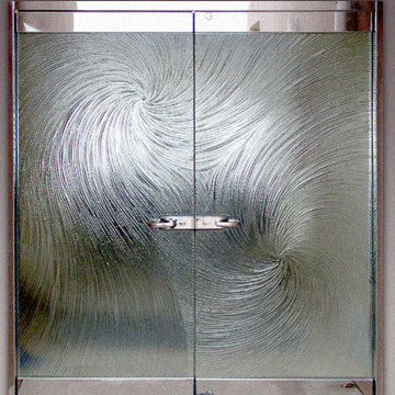
Cast Glass front doors add character and absolutely make an impression. The texture and design of double entry doors utilizing cast glass can be dramatic or simple - both options can still provide the desired privacy. Featured texture is "Oceanwave" on clear glass.
Sponsored
Columbus, OH
Wannemacher Interiors
Customized Award-Winning Interior Design Solutions in Franklin Cnty OH

 Natural Stone Institute
Tucker Design Awards celebrate the innovation and vision that designers bring to their projects through the specification and use of natural stone materials. For members of the Natural Stone Institute, acknowledgement as a contributor to a Tucker Design Awards winning project is a genuine tribute to their traditional values, physicality of work and dedication to precise specifications required in the realization of such accomplished architectural design.
Landscape Architect
Design Workshop, Aspen, CO
Architect
Poss Architecture, Aspen, CO
Landscape Contractor
Landscape Workshop, Carbondale, CO
Stone Supplier/Installer
Gallegos Corporation, Wolcott, CO
Stone Quarry
Arkins Park Stone, Loveland, CO
Within walled boundaries, Woody Creek Garden embraces its high alpine environment through explorations of stone and water that serve as unifying elements of form in the design of the various outdoor spaces. Through striking and distinctively detailed stonework, water is portrayed in its various states and forms – atmospheric mist, single rivulets, cascades, and still pools. Two courtyards interlink the residence allowing each room to enjoy the visual landscape. In the entrance courtyard, the sound from a carved 24”x 24” cut-granite fountain reverberates throughout the walled space. Placed for gathering and quiet contemplation, a pin-wheel arrangement of sculptural, granite slabs provide a honed surface for sitting while providing year-round interest. Each stone was individually specified with intentionally spaced core fractures, utilizing the extraction method to serve as sculpted details. Large sandstone pavers, set in sand and cut in an irregular, but geometric fashion bring a sense of modernity to the space. Throughout the property, stone detailing seek to heighten one’s experience of the landscape and views. Upon the home’s entry, an 18” rectilinear cut in the freestanding stone wall frames a distant peak, creating a singular reference to the outside world in this encased space. Emerging from the center of an organically-shaped carved sandstone slab, water is carried along a narrow 2” runnel sandstone cap, disappearing into the framed horizon. This glimpse to the west is the only opening in the tightly enclosed courtyard. From its opposite aspect, the feature creates a welcoming gesture at the home’s front entrance. The slender rivulet of water trickles from the sandstone slab above onto a honed granite plane, set within a sandstone terrace In contrast, a second promontory courtyard commands a strong presence over its alpine setting, leaving the steeply sloping site undisturbed. A 12’x 40’ reflecting pool – a thin sheet of water over honed black granite – captures the form and silence of the everchanging natural environment on its taut surface. Along its edge, water flows over a ½” radius edge, disappearing into a recirculating slot. Commissioned by Italian artist Bruno Romeda, a bronze sculpture rests upon an elevated granite plinth. Along its western edge, designers crafted a two-tiered, infinity edge detail. In the first vertical drop, water flows between the pool and perimeter stone walls, landing onto an intermediate bench, while the second drop introduces a chamfered edge, allowing water to embrace the vertical relief without splashing. Sandstone terraces provide continuous access to the various landscape features of the garden. At the base of the battered perimeter walls, a sandstone path leads to a fire pit, encircled by lichen-covered boulders. Along the courtyard’s eastern perimeter, water appears to emerge from the hillside, fracturing and falling against the irregular vertical stone wall, melting in a curtain-like formation behind the spa. The colors, distinctive detailing and striking stonework were selected based on their appropriateness to the context. From above, a rectilinear pool lies behind the wall, silently mirroring the sky above and offering no ostensible connection to the structure or to its source.
 SM Design
York Mills Residence | Layered Contemporary Elegance
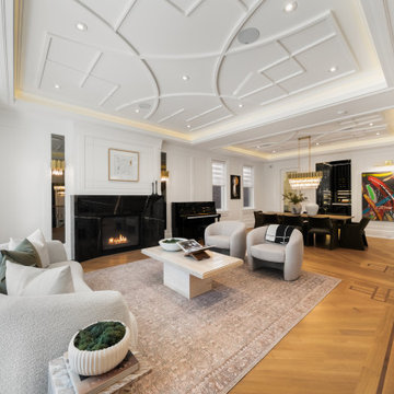
This York Mills residence was designed around the idea of quiet luxury expressed through architectural detail rather than excess. The interior combines classical residential proportions with contemporary forms, creating a sophisticated environment that feels highly curated while remaining comfortable and inviting for everyday living.
A key design strategy was to establish a continuous architectural language across the connected living, dining, and circulation spaces. Rather than designing each zone independently, the spaces are visually tied together through consistent wall paneling, warm oak flooring, carefully controlled neutral tones, and a coordinated lighting strategy. This creates a strong sense of continuity and allows the eye to move naturally through the home.
The ceiling design plays an important role in defining the character of the interior. Elaborate geometric and curved coffering introduces a sculptural element overhead, transforming the ceiling into a fifth architectural surface. The integrated perimeter illumination emphasizes these forms after dark, while recessed lighting provides functional illumination without competing with the decorative architecture.
The black stone fireplace provides a deliberate counterpoint to the predominantly light interior. Its strong visual weight anchors the living area and establishes a dramatic focal point, while the softer curved seating and neutral upholstery balance its intensity. This contrast between monumental architectural elements and tactile, rounded furnishings gives the room a contemporary character without losing its residential warmth.
Furniture planning was approached as an exercise in conversation, proportion, and movement. The seating arrangement creates an intimate conversational zone while maintaining a clear visual and physical connection to the dining area. The curved forms soften the geometry of the architecture and introduce a more relaxed human scale within the larger room.
The dining area extends the social function of the space and is visually framed by the architectural detailing and artwork. A sculptural chandelier establishes a focal point above the dining table, while the large-scale artwork introduces color, energy, and individuality into the otherwise restrained palette. This balance between a controlled architectural background and expressive art allows the homeowner's personality to become part of the design.
The flooring contributes another layer of craftsmanship. The warm wood surface establishes continuity throughout the open interior, while geometric floor detailing and directional patterns subtly define zones without relying on physical partitions. This allows the architecture to remain open while still providing a sense of hierarchy and spatial organization.
Artwork, decorative objects, greenery, and furnishings were intentionally selected to introduce moments of color, texture, softness, and visual contrast. The result is not a purely minimalist interior; instead, it is a layered composition in which restraint provides the foundation for carefully selected moments of expression.
Overall, the project reflects a contemporary approach to traditional luxury, architectural, highly detailed, and timeless, but never overly formal. The design prioritizes proportion, craftsmanship, material relationships, natural light, and the experience of moving through the home, creating an interior that functions as both an elegant entertaining environment and a comfortable everyday living space.

 CB Conlin Landscapes Inc.
ipe staircase leading down to upper patio. View shows the three different levels of entertainment, ending with a decomposed granite petanque court on the lowest level.

 Skill Construction & Design, LLC
If you are looking for twice your normal bath experience, look no more. This master bath has plenty of room for two with double the storage, double the mirrors, sinks and faucets, and bathing is done two-way. The colors are warm and inviting, but it’s the subtle patterning that caught my eye. The overall effect is of a soft wash, yet on closer examination, the striations travel across the walls and criss-cross on the floor.
This expansive vanity was created with our homeowner’s needs in mind. Each “side” has a bank of drawers and under sink cabinet storage. A large undermount sink dips below the gorgeous stone counter top. Gently arching faucets in brushed nickel adorn each sink with a framed mirror above for reflection. Individual task lighting shine upon each sink and is reflected back into the room. For additional storage and to keep elbows from connecting, a large shared bank of drawers separate the two areas.
The vanities are rich with color and texture, from the swirling grain of the wood, to the raised panels and beading. The subtle beading is repeated on the drawers for a custom look. Our wood color is a deeper, more intense tone of the colors in our tiling.
Whether in a hurry or needing to relax and unwind, this bath can do both. Despite having two substantial pieces in the same area, the open glass panel that separate leaves each feeling open and airy.
This tub was made for soaking. The sides and back gently mold into arm and neck support for a truly relaxing experience. The lineal movement in the tile backsplash lend a long and lean feeling. For easy reach, toiletries are stored in a niche with accent multicolored mosaics.
On the other side of the half wall a roomy shower awaits. The long tiles were installed in a brick pattern with striations of color wrapping the walls. The oversized tiles reduce the amount of grout, for a cleaner look. Here too we added a niche for maximum storage and a sprinkle more of the accenting mosaic. We capped the half wall and the generous bench with our vanity’s stone for a rich contrast.
We installed the tile up to the ceiling, which adds to the visual height of the room. We went with clean simple controls and showerhead, enhanced in a brushed nickel finish. So as to not obscure the view, we went frameless on our shower door and panels, using brushed nickel hinges and a simple handle.
At the end of our vanity, a half wall adds backsplash on the vanity side and a bit of privacy on the other. A simple toilet in crisp white is out of sight but functional in its own “alcove”.
Despite all the patterning, there is nothing busy about the room. For the floor we decided to change things up, using a large square version of the wall tiles. To keep the room from feeling too long, we installed them on the diagonal and then criss-crossed the lines for a dramatic look.
This bath is twice as nice and ready to be shared!
http://www.designsbyskill.com/
http://www.rjkconstructioninc.com/
Sponsored
Columbus, OH
Wannemacher Interiors
Customized Award-Winning Interior Design Solutions in Franklin Cnty OH
 Skill Construction & Design, LLC
If you are looking for twice your normal bath experience, look no more. This master bath has plenty of room for two with double the storage, double the mirrors, sinks and faucets, and bathing is done two-way. The colors are warm and inviting, but it’s the subtle patterning that caught my eye. The overall effect is of a soft wash, yet on closer examination, the striations travel across the walls and criss-cross on the floor.
This expansive vanity was created with our homeowner’s needs in mind. Each “side” has a bank of drawers and under sink cabinet storage. A large undermount sink dips below the gorgeous stone counter top. Gently arching faucets in brushed nickel adorn each sink with a framed mirror above for reflection. Individual task lighting shine upon each sink and is reflected back into the room. For additional storage and to keep elbows from connecting, a large shared bank of drawers separate the two areas.
The vanities are rich with color and texture, from the swirling grain of the wood, to the raised panels and beading. The subtle beading is repeated on the drawers for a custom look. Our wood color is a deeper, more intense tone of the colors in our tiling.
Whether in a hurry or needing to relax and unwind, this bath can do both. Despite having two substantial pieces in the same area, the open glass panel that separate leaves each feeling open and airy.
This tub was made for soaking. The sides and back gently mold into arm and neck support for a truly relaxing experience. The lineal movement in the tile backsplash lend a long and lean feeling. For easy reach, toiletries are stored in a niche with accent multicolored mosaics.
On the other side of the half wall a roomy shower awaits. The long tiles were installed in a brick pattern with striations of color wrapping the walls. The oversized tiles reduce the amount of grout, for a cleaner look. Here too we added a niche for maximum storage and a sprinkle more of the accenting mosaic. We capped the half wall and the generous bench with our vanity’s stone for a rich contrast.
We installed the tile up to the ceiling, which adds to the visual height of the room. We went with clean simple controls and showerhead, enhanced in a brushed nickel finish. So as to not obscure the view, we went frameless on our shower door and panels, using brushed nickel hinges and a simple handle.
At the end of our vanity, a half wall adds backsplash on the vanity side and a bit of privacy on the other. A simple toilet in crisp white is out of sight but functional in its own “alcove”.
Despite all the patterning, there is nothing busy about the room. For the floor we decided to change things up, using a large square version of the wall tiles. To keep the room from feeling too long, we installed them on the diagonal and then criss-crossed the lines for a dramatic look.
This bath is twice as nice and ready to be shared!
http://www.designsbyskill.com/
http://www.rjkconstructioninc.com/
 Skill Construction & Design, LLC
If you are looking for twice your normal bath experience, look no more. This master bath has plenty of room for two with double the storage, double the mirrors, sinks and faucets, and bathing is done two-way. The colors are warm and inviting, but it’s the subtle patterning that caught my eye. The overall effect is of a soft wash, yet on closer examination, the striations travel across the walls and criss-cross on the floor.
This expansive vanity was created with our homeowner’s needs in mind. Each “side” has a bank of drawers and under sink cabinet storage. A large undermount sink dips below the gorgeous stone counter top. Gently arching faucets in brushed nickel adorn each sink with a framed mirror above for reflection. Individual task lighting shine upon each sink and is reflected back into the room. For additional storage and to keep elbows from connecting, a large shared bank of drawers separate the two areas.
The vanities are rich with color and texture, from the swirling grain of the wood, to the raised panels and beading. The subtle beading is repeated on the drawers for a custom look. Our wood color is a deeper, more intense tone of the colors in our tiling.
Whether in a hurry or needing to relax and unwind, this bath can do both. Despite having two substantial pieces in the same area, the open glass panel that separate leaves each feeling open and airy.
This tub was made for soaking. The sides and back gently mold into arm and neck support for a truly relaxing experience. The lineal movement in the tile backsplash lend a long and lean feeling. For easy reach, toiletries are stored in a niche with accent multicolored mosaics.
On the other side of the half wall a roomy shower awaits. The long tiles were installed in a brick pattern with striations of color wrapping the walls. The oversized tiles reduce the amount of grout, for a cleaner look. Here too we added a niche for maximum storage and a sprinkle more of the accenting mosaic. We capped the half wall and the generous bench with our vanity’s stone for a rich contrast.
We installed the tile up to the ceiling, which adds to the visual height of the room. We went with clean simple controls and showerhead, enhanced in a brushed nickel finish. So as to not obscure the view, we went frameless on our shower door and panels, using brushed nickel hinges and a simple handle.
At the end of our vanity, a half wall adds backsplash on the vanity side and a bit of privacy on the other. A simple toilet in crisp white is out of sight but functional in its own “alcove”.
Despite all the patterning, there is nothing busy about the room. For the floor we decided to change things up, using a large square version of the wall tiles. To keep the room from feeling too long, we installed them on the diagonal and then criss-crossed the lines for a dramatic look.
This bath is twice as nice and ready to be shared!
http://www.designsbyskill.com/
http://www.rjkconstructioninc.com/


53