
Search results for "Considerable trend" in Home Design Ideas

 Amity Worrel & Co.
This was a dream project! The clients purchased this 1880s home and wanted to renovate it for their family to live in. It was a true labor of love, and their commitment to getting the details right was admirable. We rehabilitated doors and windows and flooring wherever we could, we milled trim work to match existing and carved our own door rosettes to ensure the historic details were beautifully carried through.
Every finish was made with consideration of wanting a home that would feel historic with integrity, yet would also function for the family and extend into the future as long possible. We were not interested in what is popular or trendy but rather wanted to honor what was right for the home.

 Interiors Joan and Associates
Example of a trendy carpeted living room design in Omaha with a ribbon fireplace, a wall-mounted tv and beige walls

Living room - country light wood floor, brown floor and shiplap wall living room idea in Seattle with white walls
Find the right local pro for your project

 Haven Design and Construction
Matthew Niemann Photography
Example of a transitional u-shaped light wood floor and beige floor kitchen design in Austin with a farmhouse sink, raised-panel cabinets, gray backsplash, paneled appliances, an island, white countertops, quartz countertops, white cabinets and stone tile backsplash
Example of a transitional u-shaped light wood floor and beige floor kitchen design in Austin with a farmhouse sink, raised-panel cabinets, gray backsplash, paneled appliances, an island, white countertops, quartz countertops, white cabinets and stone tile backsplash
 Carpenter & MacNeille
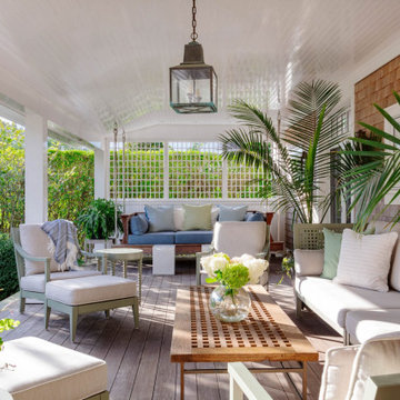
This is an example of a coastal porch design in Boston with decking and a roof extension.

 SHELTER Custom-Built Living
Inspiration for a transitional white tile gray floor freestanding bathtub remodel in Charleston with shaker cabinets, white cabinets, white walls and an undermount sink

 Dura Supreme Cabinetry
This nautical styled bathroom features Sherwin-Williams “Cyberspace” SW 7076 on Dura Supreme’s Craftsman Beaded Panel cabinet door style. This dark navy blue is subtle, neutral, and dramatic all at the same time. This color was selected for Dura Supreme’s 2017-2018 Curated Color Collection. Dura Supreme’s Curated Color Collection is a collection of cabinet paint colors that are always fresh, current and reflective of popular color trends for home interiors and cabinetry. This offering of colors is continuously updated as color trends shift.
Painted cabinetry is more popular than ever before and the color you select for your home should be a reflection of your personal taste and style. Our Personal Paint Match Program offers the entire Sherwin-William’s paint palette and Benjamin Moore’s paint palette, over 5,000 colors, for your new kitchen or bath cabinetry.
Color is a highly personal preference for most people and although there are specific colors that are considered “on trend” or fashionable, color choices should ultimately be based on what appeals to you personally. Homeowners often ask about color trends and how to incorporate them into newly designed or renovated interiors. And although trends and fashion should be taken into consideration, that should not be the only deciding factor. If you love a specific shade of green, select complementing neutrals and coordinating colors to create an entire palette that will remain an everlasting classic. It could be something as simple as being able to select the perfect shade of white that complements the countertop and tile and works well in a specific lighting situation. Our new Personal Paint Match system makes that process so much easier.
Request a FREE Dura Supreme Brochure Packet:
http://www.durasupreme.com/request-brochure
 Dura Supreme Cabinetry
This fun and stylish kitchen remodel features a color match to “Gale Force” SW 7605 from Sherwin-Williams on Dura Supreme’s Chroma door style. This stunning deep blue paint color is sophisticated, fun, and creative. It’s a stunning statement-making color that’s sure to be a classic for years to come and represents the latest in color trends. It’s no surprise this beautiful navy blue has been selected for Dura Supreme’s Curated Color Collection for 2018-2020.
Painted cabinetry is more popular than ever before and the color you select for your home should be a reflection of your personal taste and style. Our Personal Paint Match Program offers the entire Sherwin-William’s paint palette and Benjamin Moore’s paint palette, over 5,000 colors, for your new kitchen or bath cabinetry.
Color is a highly personal preference for most people and although there are specific colors that are considered “on trend” or fashionable, color choices should ultimately be based on what appeals to you personally. Homeowners often ask about color trends and how to incorporate them into newly designed or renovated interiors. And although trends and fashion should be taken into consideration, that should not be the only deciding factor. If you love a specific shade of green, select complementing neutrals and coordinating colors to create an entire palette that will remain an everlasting classic. It could be something as simple as being able to select the perfect shade of white that complements the countertop and tile and works well in a specific lighting situation. Our new Personal Paint Match system makes that process so much easier.
Request a FREE Dura Supreme Brochure Packet: http://www.durasupreme.com/request-brochure
 Dura Supreme Cabinetry
This savvy wet bar area in the dining room of this newly remodeled home features Sherwin-Williams “Jasper” SW 6216 on Dura Supreme’s Craftsman door style. This deep, sophisticated green color is green-black paint that’s sure to be a long-lasting classic. This color was selected for Dura Supreme’s 2017-2018 Curated Color Collection. Dura Supreme’s Curated Color Collection is a collection of cabinet paint colors that are always fresh, current and reflective of popular color trends for home interiors and cabinetry. This offering of colors is continuously updated as color trends shift.
Painted cabinetry is more popular than ever before and the color you select for your home should be a reflection of your personal taste and style. Our Personal Paint Match Program offers the entire Sherwin-William’s paint palette and Benjamin Moore’s paint palette, over 5,000 colors, for your new kitchen or bath cabinetry.
Color is a highly personal preference for most people and although there are specific colors that are considered “on trend” or fashionable, color choices should ultimately be based on what appeals to you personally. Homeowners often ask about color trends and how to incorporate them into newly designed or renovated interiors. And although trends and fashion should be taken into consideration, that should not be the only deciding factor. If you love a specific shade of green, select complementing neutrals and coordinating colors to create an entire palette that will remain an everlasting classic. It could be something as simple as being able to select the perfect shade of white that complements the countertop and tile and works well in a specific lighting situation. Our new Personal Paint Match system makes that process so much easier.
Request a FREE Dura Supreme Brochure Packet:
http://www.durasupreme.com/request-brochure
 Dura Supreme Cabinetry
This fun and stylish bathroom features Sherwin-Williams “Slate Tile" SW 7624 on Dura Supreme’s Hawthorne door style. This elegant blue/gray paint color is subtle, calm, and inspiring. This color was selected for Dura Supreme’s 2017-2018 Curated Color Collection. Dura Supreme’s Curated Color Collection is a collection of cabinet paint colors that are always fresh, current and reflective of popular color trends for home interiors and cabinetry. This offering of colors is continuously updated as color trends shift.
Painted cabinetry is more popular than ever before and the color you select for your home should be a reflection of your personal taste and style. Our Personal Paint Match Program offers the entire Sherwin-William’s paint palette and Benjamin Moore’s paint palette, over 5,000 colors, for your new kitchen or bath cabinetry.
Color is a highly personal preference for most people and although there are specific colors that are considered “on trend” or fashionable, color choices should ultimately be based on what appeals to you personally. Homeowners often ask about color trends and how to incorporate them into newly designed or renovated interiors. And although trends and fashion should be taken into consideration, that should not be the only deciding factor. If you love a specific shade of green, select complementing neutrals and coordinating colors to create an entire palette that will remain an everlasting classic. It could be something as simple as being able to select the perfect shade of white that complements the countertop and tile and works well in a specific lighting situation. Our new Personal Paint Match system makes that process so much easier.
Request a FREE Dura Supreme Brochure Packet:
http://www.durasupreme.com/request-brochure
 Dura Supreme Cabinetry
This fun and stylish bathroom features Sherwin-Williams “Lemon Meringue” SW 7561 on Dura Supreme's Homestead door style. This off-white color warms up a space like bright yellow sun rays on a summer’s day. This color was selected for Dura Supreme’s 2017-2018 Curated Color Collection. Dura Supreme’s Curated Color Collection is a collection of cabinet paint colors that are always fresh, current and reflective of popular color trends for home interiors and cabinetry. This offering of colors is continuously updated as color trends shift.
Painted cabinetry is more popular than ever before and the color you select for your home should be a reflection of your personal taste and style. Our Personal Paint Match Program offers the entire Sherwin-William’s paint palette and Benjamin Moore’s paint palette, over 5,000 colors, for your new kitchen or bath cabinetry.
Color is a highly personal preference for most people and although there are specific colors that are considered “on trend” or fashionable, color choices should ultimately be based on what appeals to you personally. Homeowners often ask about color trends and how to incorporate them into newly designed or renovated interiors. And although trends and fashion should be taken into consideration, that should not be the only deciding factor. If you love a specific shade of green, select complementing neutrals and coordinating colors to create an entire palette that will remain an everlasting classic. It could be something as simple as being able to select the perfect shade of white that complements the countertop and tile and works well in a specific lighting situation. Our new Personal Paint Match system makes that process so much easier.
Request a FREE Dura Supreme Brochure Packet:
http://www.durasupreme.com/request-brochure

 Julie Moir Messervy Design Studio (JMMDS)
After flowing down the slope alongside the staircase, the handrill pours into another round basin.
Architect: Wolf Architects, Inc.
General Contractor: GF Rhode Construction, Inc.
Landscape Contractor: Robert Hanss, Inc.
Steel Fabrication: Wovensteel and Richard Duca
Water Systems: Pond Creations by Sean
Photo by Susan Teare.

 O’Hara Interiors
Martha O'Hara Interiors, Interior Design & Photo Styling | John Kraemer & Sons, Remodel | Troy Thies, Photography
Please Note: All “related,” “similar,” and “sponsored” products tagged or listed by Houzz are not actual products pictured. They have not been approved by Martha O’Hara Interiors nor any of the professionals credited. For information about our work, please contact design@oharainteriors.com.

 Haus Interior Design
Photography by Stacy Zarin
Example of a huge transitional formal and open concept dark wood floor living room design in DC Metro with gray walls, a standard fireplace and no tv
Example of a huge transitional formal and open concept dark wood floor living room design in DC Metro with gray walls, a standard fireplace and no tv

 The Pool Boss
The classic timeless, highly desired Hampton shape pool with LED lightning and dramatic stage steps. This yard displays a Hampton like feel with a small-scale Bluestone patio surrounded by a considerable amount of grass. This backyard includes multiple entertainment zones including the custom pool house, the sunbathing area, the raised conversational lounge seating, the elevated dining area, and the grass area for children to run and play. This backyard flaunts the Bergen County, New Jersey outdoor living trend.

 Buckminster Green LLC
Courtney Apple
Eat-in kitchen - mid-sized contemporary l-shaped porcelain tile and multicolored floor eat-in kitchen idea in Philadelphia with a farmhouse sink, gray cabinets, white backsplash, ceramic backsplash, stainless steel appliances, no island, shaker cabinets and gray countertops
Eat-in kitchen - mid-sized contemporary l-shaped porcelain tile and multicolored floor eat-in kitchen idea in Philadelphia with a farmhouse sink, gray cabinets, white backsplash, ceramic backsplash, stainless steel appliances, no island, shaker cabinets and gray countertops

 Coats Homes
Small trendy dark wood floor and brown floor wine cellar photo in Dallas with storage racks

 Valentini Kids Furniture Brooklyn NY
Modern Italian Curio Trend 217 by Artigian Mobili
Made in Italy
Trend 217 by ArtigianMobili is a stylish Italian curio that charms with its a bit rounded shape and eternal design that perfectly matches both modern and contemporary styled interiors. The vitrine features Solid Wood frame finished in Cherry. Two doors and both sides are made of clear glass giving a wide view on collectibles exhibited inside the showcase. The internal space of the display unit is smartly organized with five thick and strong clear glass shelves, making the curio very spacious and gorgeous. Moreover, this Italian glass vitrine comes with two built-in LED Lights that will illuminate your collectibles when it is required. Optionally, the curio Trend 226 can be ordered with Cherry finished back panel or a mirrored one for the extra charge.
The starting price is for the Trend 217 Curio with Cherry finished back panel.
Dimensions:
Curio: W35.4" x D16"/21.3" x H87.4"

 LEIVARS
Nick Smith
Transitional 3/4 white tile and subway tile corner shower photo in London with flat-panel cabinets and gray cabinets
Transitional 3/4 white tile and subway tile corner shower photo in London with flat-panel cabinets and gray cabinets
 Madeleine Design Group Inc.
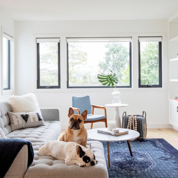
Example of a large trendy open concept beige floor living room design in Vancouver with white walls, a standard fireplace and a metal fireplace
1