
Search results for "Consolidating" in Home Design Ideas
 Crystal Kitchen + Bath
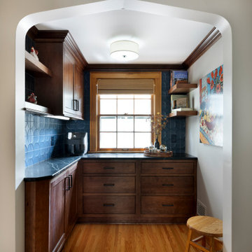
The goal for this 1939 Tudor-style story-and-a-half home was to create a kitchen that offered the conveniences, storage, and performance of a modern workspace while preserving the warmth, craftsmanship, and vintage charm that made the home special. The client, an avid home cook, wanted the room to feel as though it had always belonged to the house, with thoughtful upgrades that respected the original architecture rather than competing with it. Just as important, she needed a more efficient layout with enough storage for small appliances, so everyday cooking would no longer require carrying items up from the lower level.
Several existing conditions shaped the design approach. The kitchen retained original, amber-stained birch woodwork that the client wished to keep, and the compact footprint was interrupted by six doorways and two windows, none of which were to be moved, altered, or replaced. A previous flooring update had left the door casings undercut too short, creating visible gaps where the casing met the floor. The existing vintage 40-inch range also lacked proper ventilation, yet the client wished to accommodate a refrigerator, dishwasher, cooktop, double ovens, built-in microwave, and effective venting above the cooktop into the new kitchen layout.
To honor the original millwork, beaded inset-style cherry cabinetry was selected in a soft, hand-rubbed finish that will deepen over time and develop a natural patina. Charcoal-gray soapstone countertops complement the cabinetry while reinforcing the historic character of the home with an organic, timeworn texture. The former breakfast nook was transformed into a butler’s pantry, adding valuable base cabinet storage and expanded work surfaces for frequently used small appliances. Also in the butler’s pantry, a single upper cabinet was paired with open shelves to give an open, airy feeling while adding character and practical storage. A classic single-bowl apron-front workstation sink contributes both period-appropriate character and practical prep and cleanup function.
Because the home’s openings were such a defining feature, the design worked within the existing architecture instead of altering it. Custom plinth blocks were created for each doorway to extend the original casing gracefully down to the new natural red oak flooring, resolving the earlier construction issue while adding a detail that feels authentic to the age of the house. Despite the number of door and window openings, the new layout provides a significantly more functional, built-in kitchen with an improved work triangle for serious cooking.
Appliance placement was carefully planned to deliver the requested performance without overwhelming the small room. Three cooking functions (double ovens & microwave) were consolidated into one location with a GE Café double oven featuring Advantium Technology, while the client’s compact 31-inch refrigerator was reused to preserve space. A sleek 30-inch induction cooktop provides efficient cooking, and a Vent-A-Hood ARS ductless vent hood supplies needed ventilation without requiring a duct run to the exterior.
The finish palette balances richness, texture, and historical sensitivity. A deeply textured navy backsplash tile adds depth and dramatic shadow play against the soapstone, while wallpaper in the back entry echoes the tile’s geometric pattern to visually connect the adjoining spaces. Oil-rubbed bronze cabinet hardware and light fixtures enhance the warmth of the cherry cabinetry and complete the antique-inspired feel.
Lighting was layered to make the compact kitchen brighter, more useful, and more inviting. Vintage-style semi-flush ceiling fixtures establish the overall tone, while dimmable puck lights highlight select areas and undercabinet task lighting keeps work surfaces well illuminated.
The completed kitchen now feels both highly functional and deeply rooted in the home’s history. Rich cherry cabinetry, velvety soapstone, natural red oak flooring, navy tile, bronze accents, and carefully preserved birch trim work together to create a warm, cohesive space that celebrates timeless craftsmanship. By increasing storage, improving workflow, integrating modern appliances, and respecting the Tudor home’s original character, the design achieves the client’s vision: a kitchen that feels personal, practical, historically appropriate, and as though it has always been there.
 Talie Jane Interiors & Construction
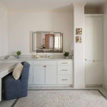
The existing layout presented challenges, particularly the acute angles and centrally placed glass block feature, while also accommodating an ambitious program: a full laundry area, separate his-and-hers vanities and closets, a private toilet room, and a spacious shower with dual shower heads alongside a tub. To resolve this, the design introduces a wet room that consolidates the bathing functions and frees up the central footprint. This approach opens the space and allows for a functional laundry island with a washer and dryer, generous countertop space for folding, and integrated storage for cleaning supplies and household equipment, improving both flow and usability.
 BKC Kitchen and Bath
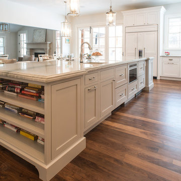
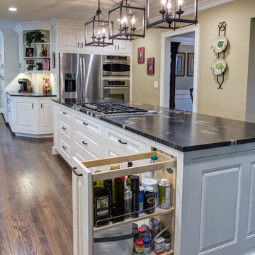
Nothing says grand like a large, open kitchen with a spacious center island and bright white cabinetry.
Perimeter Cabinetry: Crystal Cabinet Works, Hampstead inset bead door style, Designer White.
Island and Butler's Cabinetry: Crystal Cabinet Works, Hampstead inset bead door style, Overcast.
Design by: Mary Jenkins, BKC Kitchen and Bath, in partnership with Consolidated Construction Management.
Photo credit: Philip Wegener
Find the right local pro for your project
 Friel Lumber Company
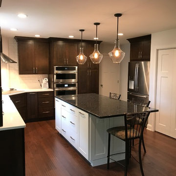
The homeowners chose to install perimeter cabinets using Dynasty by Omega. They chose the Madrid door style, Cherry wood, and a truffle stain. As for the island cabinets, they wanted the Madrid door style and Maple wood and then opted for the Pearl paint. The countertops are quartz and the island is granite.
Before the renovation started, the homeowners selected Jenn-Air appliances, including an induction cooktop and built-in microwave oven with speed cook. Once the construction was underway, we removed the bulkheads to allow new cabinets that extended to the ceiling with two PC crown molding. This provided a cleaner, more modern look along with added storage for items that are occasionally used.
We also swapped the pantry and refrigerator location to open up space as you enter the kitchen from the garage. The redesign also gave the refrigerator a built-in look. Then, we moved the cooktop to the corner and installed stainless steel Zephyr range hood and beveled subway tile in a herringbone pattern. The backsplash and new cooktop turned the most used area of the kitchen into a design feature.
The addition of an enlarged island allows extra seating for up to four people. Moreover, island cabinets include two full-sized waste baskets for recycling and standard waste. The new farmhouse sink from Kohler not only looks and functions well but the drain is positioned at the rear corner. The plumbing in the cabinet below is consolidated to the back corner providing much more storage. Last, the built-in TV not only looks great but also reduces counter clutter. Plus, the drawer below the TV contains USB outlet for small personal device charging.
 Powell Construction
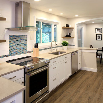
We enlarged the work area by expanding into the formerly wasted space, consolidated cooking and cleanup functions into roomy work areas, and installed all new custom cabinets.
The sink window was enlarged, and wall cabinets were replaced by cantilevered open shelves—giving the kitchen an airy, contemporary flavor. White shaker cabinets lend a fresh feeling as well.
 Michael Nash Design, Build & Homes
2011 NARI CAPITAL COTY FINALIST AWARD WINNER
Project Scope--
The owners of this 1990’s colonial home were seeking to convert the existing space-constricted builder-grade kitchen into a generously-apportioned Tuscan-style country kitchen with lots of natural light, high-end appointments and a warmly textured interior design concept. Among other features they sought a mid-room island that would house critical appliances, complete the work triangle and provide dining counter space for three. They also wanted to include a professional-grade gas range.
Challenges--
Situated between dining room and family room, the existing kitchen was small and poorly planned. The sink faced a blank wall and the appliances were inadequate for the owner’s gourmet cooking ambitions.
To create the desired footprint, the contractor, Michael Nash Design, Build & Homes, created a plan that called for consolidating square footage in several rooms adjacent to the kitchen. This entailed removing two load bearing walls– one between the kitchen and dining room, a second separating the kitchen and family room– and shifting loads to newly installed structural supports carefully concealed within the resultant “open” floor plan.
To accommodate new appliances (and work efficiencies) called for by this radically altered space plan, the design located the new professional gas range and other key features in the footprint formerly occupied by the breakfast room, a change that takes advantage of opportunities for a higher cathedral ceiling, better natural lighting and greater space.
Solutions--
With this space plan resolved, the design team could now eliminate a picture window on the west elevation, designing a new elevation to accommodate a stucco cooktop flanked by a pair of custom Palladium windows. A side elevation slider was replaced with a French door.
Infrastructure considerations included introducing gas lines needed for the 48” Viking cooktop range and re-routing plumbing. The 5’ x 9’ granite-surfaced custom designed island includes the primary kitchen sink, a dishwasher, microwave and dining overhang that provided seating for up to four.
On another wall, the design called for installing ceiling flush “beaded” display pantries with open bookcases, and routed-in plumbing for a water fountain, a faucet and an ice-making machine.
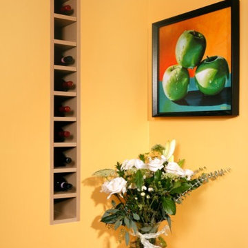
Glazed maple and cherry cabinetry increased available storage by over 50%. A recessed space was also created for a built-in vertical wine rack. Style-appropriate terra cotta tiling with mosaic bordering detailing extends into the home’s foyer. Other finishing work elements include crown molding with rounded turn posts and corbels.
 Future Construction Specialties
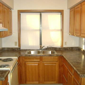
U-shaped kitchen pantry photo in Omaha with a double-bowl sink, raised-panel cabinets, light wood cabinets, white appliances and no island

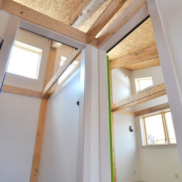
 Cochran Associates Architects, Pittsburgh
Mark Knobil
Inspiration for a contemporary home design remodel in Other
Inspiration for a contemporary home design remodel in Other
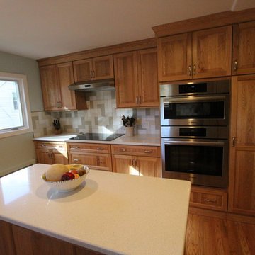
 Design 1 Kitchen & Bath
We tightened up and consolidated the space for the homeowner.
Inspiration for a mid-sized timeless galley medium tone wood floor eat-in kitchen remodel in Boston with a double-bowl sink, raised-panel cabinets, light wood cabinets, quartz countertops, beige backsplash, ceramic backsplash, stainless steel appliances and an island
Inspiration for a mid-sized timeless galley medium tone wood floor eat-in kitchen remodel in Boston with a double-bowl sink, raised-panel cabinets, light wood cabinets, quartz countertops, beige backsplash, ceramic backsplash, stainless steel appliances and an island
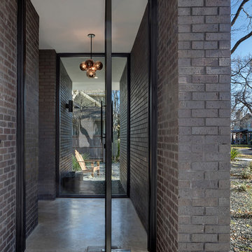
 Matt Fajkus Architecture
The Main Stay House exists as a straightforward proposal on an urban infill lot, paring down the components of a house to a minimal amount of planes and openings. The scheme is anchored by a modern entry sequence and a staircase volume, both clad in iron spot masonry externally and internally, creating thresholds between the respective realms of public, common and private, by minimal means. The masonry contrasts with an otherwise muted interior atmosphere of smooth, desaturated surfaces.
The entry sequence is a twist upon the conventional domestic front door, front facade, and fence. The front masonry wall replaces the typical residential fence and frames an indirect access to the front door, functioning as a privacy barrier while revealing slices of the interior to the public street.
The staircase bifurcates the layout to provide a clear division between the common and private zones of the house, while clearly reading as a mass from all outside view. Brick and glass become portals between common and private zones.
The design consolidates the service core along the west façade, allowing the structure to fully open the living zone to the pool court and existing trees. This directly connects interior and exterior, as well as human and nature. Freedom to vary the program or functional use of the area is enabled and strongly encouraged.
Photography: Charles Davis Smith
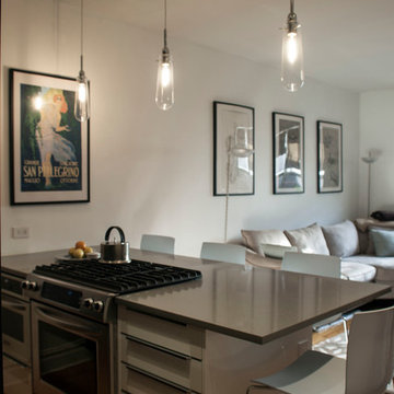
 MCDW + Architecture
Kitchen Cube 1
Upper East- Residence
Work: Full Gut renovation- 2 apartments- in the same ‘S’ line
Size: 650 Sq Ft of space in both apartments, 5S and 4S
Using the Frankfurt Kitchen of 1926 for inspiration, Ms.Cianfaglione began asking herself how the typology of the NYC kitchenette for her building, in the ‘S’ line, needed to be upgraded to fit today’s physical and aesthetic needs. The Frankfurt Kitchen was the forerunner of modern fitted kitchens and had an unified concept to enable efficient work, consolidating a woman’s efforts and allowing her more time to spend else ware. But unlike the Frankfurt kitchen, Ms. Cianfaglione wanted to take this a step further and open it up rather than concealing it, and its user, inside a room. This would showcase the designer’s evolved notion of “cooking”,that would now become an orchestrated dance to be put on display.
Ms. Cianfaglione had a typical NYC kitchenette, a small room with an air grille for ventilation, and in this case, there was a small window that was currently blocked by a refrigerator. There was also the problem of the foyer space, which was just a waste in an apartment this small, and the structural wall that could not be removed. Ms. Cianfaglione responded to these conditions by designing the kitchen to become a wrap around condition, in an ‘L’ shape, that would use the foyer more effectively and at the same time, face the living area, and all the while concealing the structural wall that separates them.
The interesting thing about the ‘L’ shape was that it allows for a beautifully orchestrated flow that makes cooking look like a beautiful dance that moves back and forth along the’ L.’
The appliances are designed within the cabinetry to give a tailored look that does not allow for distraction, and you instead focus on the user. This renovation made the otherwise small, unused foyer and ineffective kitchen, now a focal point that dictates movement throughout. The kitchen has unified and designed an otherwise standard one bedroom apartment and seeks to become a new standard in this building’s typology.
 Weidmann Remodeling
As needs have changed, new home construction in Atlanta has trended towards more open floor plans. Weidmann helps owners of older residences to investigate and achieve these same open objectives by consolidating and reconfiguring the available space on both levels. This home was opened up with a little creative organization, which included relocating the powder room, changing traffic patterns and repurposing rooms for a renewed lifetime of living.
FotoGrafik Arts
 Crystal Kitchen + Bath
The goal for this 1939 Tudor-style story-and-a-half home was to create a kitchen that offered the conveniences, storage, and performance of a modern workspace while preserving the warmth, craftsmanship, and vintage charm that made the home special. The client, an avid home cook, wanted the room to feel as though it had always belonged to the house, with thoughtful upgrades that respected the original architecture rather than competing with it. Just as important, she needed a more efficient layout with enough storage for small appliances, so everyday cooking would no longer require carrying items up from the lower level.
Several existing conditions shaped the design approach. The kitchen retained original, amber-stained birch woodwork that the client wished to keep, and the compact footprint was interrupted by six doorways and two windows, none of which were to be moved, altered, or replaced. A previous flooring update had left the door casings undercut too short, creating visible gaps where the casing met the floor. The existing vintage 40-inch range also lacked proper ventilation, yet the client wished to accommodate a refrigerator, dishwasher, cooktop, double ovens, built-in microwave, and effective venting above the cooktop into the new kitchen layout.
To honor the original millwork, beaded inset-style cherry cabinetry was selected in a soft, hand-rubbed finish that will deepen over time and develop a natural patina. Charcoal-gray soapstone countertops complement the cabinetry while reinforcing the historic character of the home with an organic, timeworn texture. The former breakfast nook was transformed into a butler’s pantry, adding valuable base cabinet storage and expanded work surfaces for frequently used small appliances. Also in the butler’s pantry, a single upper cabinet was paired with open shelves to give an open, airy feeling while adding character and practical storage. A classic single-bowl apron-front workstation sink contributes both period-appropriate character and practical prep and cleanup function.
Because the home’s openings were such a defining feature, the design worked within the existing architecture instead of altering it. Custom plinth blocks were created for each doorway to extend the original casing gracefully down to the new natural red oak flooring, resolving the earlier construction issue while adding a detail that feels authentic to the age of the house. Despite the number of door and window openings, the new layout provides a significantly more functional, built-in kitchen with an improved work triangle for serious cooking.
Appliance placement was carefully planned to deliver the requested performance without overwhelming the small room. Three cooking functions (double ovens & microwave) were consolidated into one location with a GE Café double oven featuring Advantium Technology, while the client’s compact 31-inch refrigerator was reused to preserve space. A sleek 30-inch induction cooktop provides efficient cooking, and a Vent-A-Hood ARS ductless vent hood supplies needed ventilation without requiring a duct run to the exterior.
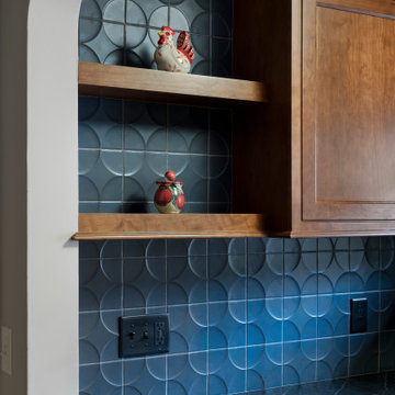
The finish palette balances richness, texture, and historical sensitivity. A deeply textured navy backsplash tile adds depth and dramatic shadow play against the soapstone, while wallpaper in the back entry echoes the tile’s geometric pattern to visually connect the adjoining spaces. Oil-rubbed bronze cabinet hardware and light fixtures enhance the warmth of the cherry cabinetry and complete the antique-inspired feel.
Lighting was layered to make the compact kitchen brighter, more useful, and more inviting. Vintage-style semi-flush ceiling fixtures establish the overall tone, while dimmable puck lights highlight select areas and undercabinet task lighting keeps work surfaces well illuminated.
The completed kitchen now feels both highly functional and deeply rooted in the home’s history. Rich cherry cabinetry, velvety soapstone, natural red oak flooring, navy tile, bronze accents, and carefully preserved birch trim work together to create a warm, cohesive space that celebrates timeless craftsmanship. By increasing storage, improving workflow, integrating modern appliances, and respecting the Tudor home’s original character, the design achieves the client’s vision: a kitchen that feels personal, practical, historically appropriate, and as though it has always been there.

 Coral Classics by A&P
Waterfront home in Miami Beach that we supplied the authentic florida keystone tiles. notice the natural patina that occurs over time, now this is what a coral stone pool deck is suppose to look like NICE.
The islands of the Lower Keys in the Florida Keys, as well as some barrier islands east of Miami bordering Biscayne Bay, are mainly oolitic limestone, which was formed by deposition when shallow seas covered the area between periods of glaciation. The material consolidated and eroded during later exposure above the ocean surface.
 Marlene Zeiger Design
A BIG Transformation ON A modest BUDGET:
This is the first phase of our work, which involves real deal transformation. Yes, the entry was in need of some love, along with some consolidating and simplifying. The client wanted to express her East Coast beach-y roots, and we wanted to do this without getting super theme-y.
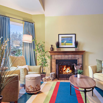
We utilized sunny yellow and yellow-greens, along with colors of the sea. We created a cozy, warm and uber-inviting sitting area. The drapes were sewn through Warehouse Fabrics, Inc., doing a fabulous job creating custom treatments (a teal linen weave with yellow brush trim), within a very tight budget.
The seating was custom (Castellano Furniture of Portland); lime green chairs and a curvy sofa in yellow with that lime green welting & pillows. Also some playful Blue and yellow pillow fabric (Kravet) was the genuine inspiration for character and color scheme.
The rug, by FLOR of Portland (thanks Shaina) is meant to evoke a beach blanket. Oh, and the glass jar filled with sand and sand dollars. . . well, ok, we are giving a nod to the sea.
 Connecticut Appliance & Fireplace Distributors
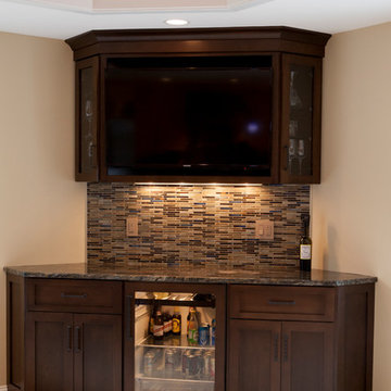
Custom made Beverage Center cabinet built by Consolidated Millwork with Subzero beverage refrigerator. Photography by Amber Jones of Studio Pura, www.studiopura.com.
 Michael Nash Design, Build & Homes
2011 NARI CAPITAL COTY FINALIST AWARD WINNER
Project Scope--
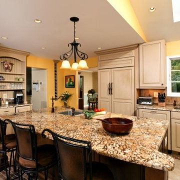
The owners of this 1990’s colonial home were seeking to convert the existing space-constricted builder-grade kitchen into a generously-apportioned Tuscan-style country kitchen with lots of natural light, high-end appointments and a warmly textured interior design concept. Among other features they sought a mid-room island that would house critical appliances, complete the work triangle and provide dining counter space for three. They also wanted to include a professional-grade gas range.
Challenges--
Situated between dining room and family room, the existing kitchen was small and poorly planned. The sink faced a blank wall and the appliances were inadequate for the owner’s gourmet cooking ambitions.
To create the desired footprint, the contractor, Michael Nash Design, Build & Homes, created a plan that called for consolidating square footage in several rooms adjacent to the kitchen. This entailed removing two load bearing walls– one between the kitchen and dining room, a second separating the kitchen and family room– and shifting loads to newly installed structural supports carefully concealed within the resultant “open” floor plan.
To accommodate new appliances (and work efficiencies) called for by this radically altered space plan, the design located the new professional gas range and other key features in the footprint formerly occupied by the breakfast room, a change that takes advantage of opportunities for a higher cathedral ceiling, better natural lighting and greater space.
Solutions--
With this space plan resolved, the design team could now eliminate a picture window on the west elevation, designing a new elevation to accommodate a stucco cooktop flanked by a pair of custom Palladium windows. A side elevation slider was replaced with a French door.
Infrastructure considerations included introducing gas lines needed for the 48” Viking cooktop range and re-routing plumbing. The 5’ x 9’ granite-surfaced custom designed island includes the primary kitchen sink, a dishwasher, microwave and dining overhang that provided seating for up to four.
On another wall, the design called for installing ceiling flush “beaded” display pantries with open bookcases, and routed-in plumbing for a water fountain, a faucet and an ice-making machine.
Glazed maple and cherry cabinetry increased available storage by over 50%. A recessed space was also created for a built-in vertical wine rack. Style-appropriate terra cotta tiling with mosaic bordering detailing extends into the home’s foyer. Other finishing work elements include crown molding with rounded turn posts and corbels.
28