Search results for "Constraint" in Home Design Ideas
 
Free ebook, Creating the Ideal Kitchen. DOWNLOAD NOW
 
This young family of four came in right after closing on their house and with a new baby on the way. Our goal was to complete the project prior to baby’s arrival so this project went on the expedite track. The beautiful 1920’s era brick home sits on a hill in a very picturesque neighborhood, so we were eager to give it the kitchen it deserves. The clients’ dream kitchen included pro-style appliances, a large island with seating for five and a kitchen that feels appropriate to the home’s era but that also is fresh and modern. They explicitly stated they did not want a “cookie cutter” design, so we took that to heart.
The key challenge was to fit in all of the items on their wish given the room’s constraints. We eliminated an existing breakfast area and bay window and incorporated that area into the kitchen. The bay window was bricked in, and to compensate for the loss of seating, we widened the opening between the kitchen and formal dining room for more of an open concept plan.
The ceiling in the original kitchen is about a foot lower than the rest of the house, and once it was determined that it was to hide pipes and other mechanicals, we reframed a large tray over the island and left the rest of the ceiling as is. Clad in walnut planks, the tray provides an interesting feature and ties in with the custom walnut and plaster hood.
The space feels modern yet appropriate to its Tudor roots. The room boasts large family friendly appliances, including a beverage center and cooktop/double oven combination. Soft white inset cabinets paired with a slate gray island provide a gentle backdrop to the multi-toned island top, a color echoed in the backsplash tile. The handmade subway tile has a textured pattern at the cooktop, and large pendant lights add more than a bit of drama to the room.
Designed by: Susan Klimala, CKD, CBD
Photography by: Mike Kaskel
For more information on kitchen and bath design ideas go to: www.kitchenstudio-ge.com

 
Free ebook, Creating the Ideal Kitchen. DOWNLOAD NOW
 
This young family of four came in right after closing on their house and with a new baby on the way. Our goal was to complete the project prior to baby’s arrival so this project went on the expedite track. The beautiful 1920’s era brick home sits on a hill in a very picturesque neighborhood, so we were eager to give it the kitchen it deserves. The clients’ dream kitchen included pro-style appliances, a large island with seating for five and a kitchen that feels appropriate to the home’s era but that also is fresh and modern. They explicitly stated they did not want a “cookie cutter” design, so we took that to heart.
The key challenge was to fit in all of the items on their wish given the room’s constraints. We eliminated an existing breakfast area and bay window and incorporated that area into the kitchen. The bay window was bricked in, and to compensate for the loss of seating, we widened the opening between the kitchen and formal dining room for more of an open concept plan.
The ceiling in the original kitchen is about a foot lower than the rest of the house, and once it was determined that it was to hide pipes and other mechanicals, we reframed a large tray over the island and left the rest of the ceiling as is. Clad in walnut planks, the tray provides an interesting feature and ties in with the custom walnut and plaster hood.
The space feels modern yet appropriate to its Tudor roots. The room boasts large family friendly appliances, including a beverage center and cooktop/double oven combination. Soft white inset cabinets paired with a slate gray island provide a gentle backdrop to the multi-toned island top, a color echoed in the backsplash tile. The handmade subway tile has a textured pattern at the cooktop, and large pendant lights add more than a bit of drama to the room.
Designed by: Susan Klimala, CKD, CBD
Photography by: Mike Kaskel
For more information on kitchen and bath design ideas go to: www.kitchenstudio-ge.com

Modern farmohouse interior with T&G cedar cladding; exposed steel; custom motorized slider; cement floor; vaulted ceiling and an open floor plan creates a unified look
Find the right local pro for your project
Sommerhus is a private retreat for two empty-nesters. The clients purchased the previous cabin after falling in love with its location on a private, lakefront peninsula. However, this beautiful site was a challenging site to build on, due to its position sandwiched between the lake and protected wet land. The clients disliked the old cabin because it could only be used in the summer months, due to its lack of both insulation and heat. In addition, it was too small for their needs. They wanted to build a new, larger retreat, but were met with yet another constraint: the new cabin would be limited to the previous cabin’s small footprint. Thus, they decided to approach an architect to design their dream cabin.
As the clients described, “We visited Denmark for a family wedding in 2015, and while biking near Gilleleje, a fishing village on the Baltic Sea, we fell in love with the aesthetic of ‘Sommerhus’: dark exteriors, clean, simple lines, and lots of windows.” We set out to design a cabin that fit this aesthetic while also meeting the site’s constraints.
The clients were committed to keeping all existing trees on their site. In addition, zoning codes required the new retreat to stay within the previous cabin's small footprint. Thus, to maximize the square footage of the cabin without removing trees or expanding the footprint, the new structure had to grow vertically. At the same time, the clients wanted to be good neighbors. To them, this meant that their cabin should disappear into the woods, especially when viewed from the lake. To accomplish both these requests, the architect selected a dark exterior metal façade that would visually retreat into the trees. The metal siding is a modern, low-maintenance, and cost-effective solution, especially when compared to traditional wood siding. Warm wood on the soffits of the large roof overhang contrast with the metal siding. Sommerhus's resulting exterior is just as the clients’ requested: boldly modern yet respectful of the serene surroundings.
The homeowners desired a beach-house-inspired interior, full of light and warmth, in contrast to the dark exterior. As the homeowner explained, “I wanted it to feel like a porch inside.” To achieve this, the living room has two walls of sliding glass doors that connect to the wrap-around porch. This creates a beautiful, indoor-outdoor living space. The crisp and bright kitchen also connects to the porch with the window that opens to an outdoor counter - perfect for passing food and drinks to those lounging on the porch. The kitchen is open to the rest of the first-floor entertaining space, and brings a playful, beach-house feel to the cabin.
After the completion of the project, the homeowners remarked, “Working with Christopher and Eric [of CSA] was a wonderful experience. We absolutely love our home, and each season on the lake is more special than the last.”

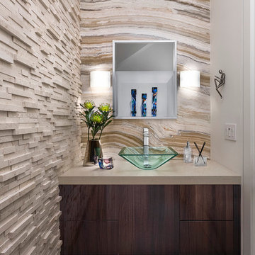
New construction offers an opportunity to design without existing constraints, and this powder room is an example of drama in a relatively small space. The movement of the stone suits the homes' location, on a lake, and the finish of the wood cabinet adds warmth. We love the underlighting, for a softness when one enters.
Photo by Allan Zepeda
Small trendy guest medium tone wood floor and brown floor bedroom photo in New York with white walls and no fireplace

waterfront outdoor dining
Inspiration for a mid-sized coastal side yard ground level cable railing deck remodel in Boston with a pergola

Eric Rorer Photographer
Inspiration for a mid-sized contemporary gray two-story concrete fiberboard house exterior remodel in San Francisco with a shed roof and a shingle roof

Sommerhus is a private retreat for two empty-nesters. The clients purchased the previous cabin after falling in love with its location on a private, lakefront peninsula. However, this beautiful site was a challenging site to build on, due to its position sandwiched between the lake and protected wet land. The clients disliked the old cabin because it could only be used in the summer months, due to its lack of both insulation and heat. In addition, it was too small for their needs. They wanted to build a new, larger retreat, but were met with yet another constraint: the new cabin would be limited to the previous cabin’s small footprint. Thus, they decided to approach an architect to design their dream cabin.
As the clients described, “We visited Denmark for a family wedding in 2015, and while biking near Gilleleje, a fishing village on the Baltic Sea, we fell in love with the aesthetic of ‘Sommerhus’: dark exteriors, clean, simple lines, and lots of windows.” We set out to design a cabin that fit this aesthetic while also meeting the site’s constraints.
The clients were committed to keeping all existing trees on their site. In addition, zoning codes required the new retreat to stay within the previous cabin's small footprint. Thus, to maximize the square footage of the cabin without removing trees or expanding the footprint, the new structure had to grow vertically. At the same time, the clients wanted to be good neighbors. To them, this meant that their cabin should disappear into the woods, especially when viewed from the lake. To accomplish both these requests, the architect selected a dark exterior metal façade that would visually retreat into the trees. The metal siding is a modern, low-maintenance, and cost-effective solution, especially when compared to traditional wood siding. Warm wood on the soffits of the large roof overhang contrast with the metal siding. Sommerhus's resulting exterior is just as the clients’ requested: boldly modern yet respectful of the serene surroundings.
The homeowners desired a beach-house-inspired interior, full of light and warmth, in contrast to the dark exterior. As the homeowner explained, “I wanted it to feel like a porch inside.” To achieve this, the living room has two walls of sliding glass doors that connect to the wrap-around porch. This creates a beautiful, indoor-outdoor living space. The crisp and bright kitchen also connects to the porch with the window that opens to an outdoor counter - perfect for passing food and drinks to those lounging on the porch. The kitchen is open to the rest of the first-floor entertaining space, and brings a playful, beach-house feel to the cabin.
After the completion of the project, the homeowners remarked, “Working with Christopher and Eric [of CSA] was a wonderful experience. We absolutely love our home, and each season on the lake is more special than the last.”

Sommerhus is a private retreat for two empty-nesters. The clients purchased the previous cabin after falling in love with its location on a private, lakefront peninsula. However, this beautiful site was a challenging site to build on, due to its position sandwiched between the lake and protected wet land. The clients disliked the old cabin because it could only be used in the summer months, due to its lack of both insulation and heat. In addition, it was too small for their needs. They wanted to build a new, larger retreat, but were met with yet another constraint: the new cabin would be limited to the previous cabin’s small footprint. Thus, they decided to approach an architect to design their dream cabin.
As the clients described, “We visited Denmark for a family wedding in 2015, and while biking near Gilleleje, a fishing village on the Baltic Sea, we fell in love with the aesthetic of ‘Sommerhus’: dark exteriors, clean, simple lines, and lots of windows.” We set out to design a cabin that fit this aesthetic while also meeting the site’s constraints.
The clients were committed to keeping all existing trees on their site. In addition, zoning codes required the new retreat to stay within the previous cabin's small footprint. Thus, to maximize the square footage of the cabin without removing trees or expanding the footprint, the new structure had to grow vertically. At the same time, the clients wanted to be good neighbors. To them, this meant that their cabin should disappear into the woods, especially when viewed from the lake. To accomplish both these requests, the architect selected a dark exterior metal façade that would visually retreat into the trees. The metal siding is a modern, low-maintenance, and cost-effective solution, especially when compared to traditional wood siding. Warm wood on the soffits of the large roof overhang contrast with the metal siding. Sommerhus's resulting exterior is just as the clients’ requested: boldly modern yet respectful of the serene surroundings.
The homeowners desired a beach-house-inspired interior, full of light and warmth, in contrast to the dark exterior. As the homeowner explained, “I wanted it to feel like a porch inside.” To achieve this, the living room has two walls of sliding glass doors that connect to the wrap-around porch. This creates a beautiful, indoor-outdoor living space. The crisp and bright kitchen also connects to the porch with the window that opens to an outdoor counter - perfect for passing food and drinks to those lounging on the porch. The kitchen is open to the rest of the first-floor entertaining space, and brings a playful, beach-house feel to the cabin.
After the completion of the project, the homeowners remarked, “Working with Christopher and Eric [of CSA] was a wonderful experience. We absolutely love our home, and each season on the lake is more special than the last.”

Sommerhus is a private retreat for two empty-nesters. The clients purchased the previous cabin after falling in love with its location on a private, lakefront peninsula. However, this beautiful site was a challenging site to build on, due to its position sandwiched between the lake and protected wet land. The clients disliked the old cabin because it could only be used in the summer months, due to its lack of both insulation and heat. In addition, it was too small for their needs. They wanted to build a new, larger retreat, but were met with yet another constraint: the new cabin would be limited to the previous cabin’s small footprint. Thus, they decided to approach an architect to design their dream cabin.
As the clients described, “We visited Denmark for a family wedding in 2015, and while biking near Gilleleje, a fishing village on the Baltic Sea, we fell in love with the aesthetic of ‘Sommerhus’: dark exteriors, clean, simple lines, and lots of windows.” We set out to design a cabin that fit this aesthetic while also meeting the site’s constraints.
The clients were committed to keeping all existing trees on their site. In addition, zoning codes required the new retreat to stay within the previous cabin's small footprint. Thus, to maximize the square footage of the cabin without removing trees or expanding the footprint, the new structure had to grow vertically. At the same time, the clients wanted to be good neighbors. To them, this meant that their cabin should disappear into the woods, especially when viewed from the lake. To accomplish both these requests, the architect selected a dark exterior metal façade that would visually retreat into the trees. The metal siding is a modern, low-maintenance, and cost-effective solution, especially when compared to traditional wood siding. Warm wood on the soffits of the large roof overhang contrast with the metal siding. Sommerhus's resulting exterior is just as the clients’ requested: boldly modern yet respectful of the serene surroundings.
The homeowners desired a beach-house-inspired interior, full of light and warmth, in contrast to the dark exterior. As the homeowner explained, “I wanted it to feel like a porch inside.” To achieve this, the living room has two walls of sliding glass doors that connect to the wrap-around porch. This creates a beautiful, indoor-outdoor living space. The crisp and bright kitchen also connects to the porch with the window that opens to an outdoor counter - perfect for passing food and drinks to those lounging on the porch. The kitchen is open to the rest of the first-floor entertaining space, and brings a playful, beach-house feel to the cabin.
After the completion of the project, the homeowners remarked, “Working with Christopher and Eric [of CSA] was a wonderful experience. We absolutely love our home, and each season on the lake is more special than the last.”

Malibu Glass Box House by Klopf Architecture
Following the devastating Woolsey Fire of 2018, the site in Malibu offered a unique opportunity to rebuild not just a home, but a new architectural composition that highlighted the property’s potential while navigating strict fire-rebuild codes in the area. Designed by Klopf Architecture, this project embraced a set of limitations and translated them into an architectural asset.
The city’s fire-rebuild process required the new structure to remain close to the original footprint, size and bulk, a constraint that ultimately clarified the architectural direction. Perched near the front of a long, narrow lot, the new home frames and overlooks a private, park-like rear expanse, an uncommon luxury especially in this part of Malibu .
Without a fixed program, the design process allowed for a different kind of creative focus allowing Klopf Architecture the opportunity to explore how a modernist home could best respond to this site. The team approached the project not with a list of requirements, but with a question: How might a modernist live here? What spatial qualities would inspire calm, connection, and a sense of wonder in this setting? The process became less about problem-solving and more about architectural storytelling—letting the site, the light, and the principles of modern design guide the form and flow of the home.
The response emerged in the form of a glass-box pavilion, an open, Mid-Century Modern inspired living, dining, and kitchen space that floats at the edge of the property’s natural descent. Connected to the more enclosed, private areas of the home by a glass-walled hallway, the living pavilion becomes a distinct centerpiece of the design. It opens on all four sides to the landscape with decks and patios on the flanks, an internal garden and water feature to the north, and a dramatic unguarded view of the expansive backyard and ocean horizon to the south.
Because of the mandated footprint, careful planning was required to ensure every space could still engage with light, landscape, or both. Strategic voids in the form of atriums and courtyards allow daylight to filter deep into the home’s core, while offering moments of surprise and retreat. These design gestures allow natural light to filter deep into the interior, creating a sense of brightness and openness throughout the day. At the same time, they expand the perceptual boundaries between inside and out, making the home feel more expansive while anchoring its connection to the surrounding landscape.
The siting of the house is what gives it its unique character. Rather than receding into the backyard like the neighboring homes, the house holds a slight prominence. From the central living pavilion, stepping down into the landscape feels more like entering a secluded park where a separate existing accessory structure, trail, and recreational areas await. The home’s modest street presence gives way to this unfolding drama of space, view, and nature.
Fire-resilient materials and assemblies are integrated seamlessly throughout including triple-pane glazing, under-slab and roof insulation, and locally sourced fire-rated cladding ensure the house not only meets Calfornia’s rigorous wildland-urban interface (WUI) standards, but feels effortlessly aligned with them. While technical decisions like fire-hardening and mechanical systems presented some construction challenges, particularly around the cantilevered glass box, the team found a functional compromise that preserved the integrity of the design.
Inside, a restrained palette and exposed post and beam design celebrate the ethos of mid-century modernism. A central circulation spine extends from the entry to the rear glass wall, offering a continuous visual link from street to ocean. Spaces such as the library and office, though more intimate in scale, are never cut off from nature as each opens to its own unique courtyard or garden view.
Though born out of a strict regulatory framework and developed without a specific client, the rebuild design unfolded with remarkable clarity. Grounded in site logic, refined by limitations and an emphasis on timeless spatial relationships – light, proportion, and a strong connection to nature, the resulting design feels both effortless and uplifting. The home lives lightly on the land, opens generously to its surroundings, and strikes a careful balance between privacy, openness, and calm. For Klopf Architecture, it stands as a compelling case study in how site, code, and circumstantial constraints can inspire enduring, modernist architecture. With years of experience reimagining mid-century modern design for how people live today, the firm took the project’s limitations as an opportunity. The result is a home shaped by open, flowing spaces, strong indoor-outdoor connections, and a calm, clear sense of structure. It’s a good reminder that even with strict constraints, there’s still room for architecture to breathe—and for modernism to keep moving forward.
Klopf Architecture project team: Geoff Campen, John Klopf, AIA, and Sherry Tan
Structural Engineer: ZFA
Contractor: Maison D’Artiste
Photography: ©2025 Mariko Reed
Year Completed: 2023

Screened, covered porch with eating area and gathering space
Large transitional porch idea in Charlotte

Paul Dyer
Tub/shower combo - mid-sized modern master green tile and mosaic tile mosaic tile floor tub/shower combo idea in San Francisco with an undermount sink and white walls

Malibu Glass Box House by Klopf Architecture
Following the devastating Woolsey Fire of 2018, the site in Malibu offered a unique opportunity to rebuild not just a home, but a new architectural composition that highlighted the property’s potential while navigating strict fire-rebuild codes in the area. Designed by Klopf Architecture, this project embraced a set of limitations and translated them into an architectural asset.
The city’s fire-rebuild process required the new structure to remain close to the original footprint, size and bulk, a constraint that ultimately clarified the architectural direction. Perched near the front of a long, narrow lot, the new home frames and overlooks a private, park-like rear expanse, an uncommon luxury especially in this part of Malibu .
Without a fixed program, the design process allowed for a different kind of creative focus allowing Klopf Architecture the opportunity to explore how a modernist home could best respond to this site. The team approached the project not with a list of requirements, but with a question: How might a modernist live here? What spatial qualities would inspire calm, connection, and a sense of wonder in this setting? The process became less about problem-solving and more about architectural storytelling—letting the site, the light, and the principles of modern design guide the form and flow of the home.
The response emerged in the form of a glass-box pavilion, an open, Mid-Century Modern inspired living, dining, and kitchen space that floats at the edge of the property’s natural descent. Connected to the more enclosed, private areas of the home by a glass-walled hallway, the living pavilion becomes a distinct centerpiece of the design. It opens on all four sides to the landscape with decks and patios on the flanks, an internal garden and water feature to the north, and a dramatic unguarded view of the expansive backyard and ocean horizon to the south.
Because of the mandated footprint, careful planning was required to ensure every space could still engage with light, landscape, or both. Strategic voids in the form of atriums and courtyards allow daylight to filter deep into the home’s core, while offering moments of surprise and retreat. These design gestures allow natural light to filter deep into the interior, creating a sense of brightness and openness throughout the day. At the same time, they expand the perceptual boundaries between inside and out, making the home feel more expansive while anchoring its connection to the surrounding landscape.
The siting of the house is what gives it its unique character. Rather than receding into the backyard like the neighboring homes, the house holds a slight prominence. From the central living pavilion, stepping down into the landscape feels more like entering a secluded park where a separate existing accessory structure, trail, and recreational areas await. The home’s modest street presence gives way to this unfolding drama of space, view, and nature.
Fire-resilient materials and assemblies are integrated seamlessly throughout including triple-pane glazing, under-slab and roof insulation, and locally sourced fire-rated cladding ensure the house not only meets Calfornia’s rigorous wildland-urban interface (WUI) standards, but feels effortlessly aligned with them. While technical decisions like fire-hardening and mechanical systems presented some construction challenges, particularly around the cantilevered glass box, the team found a functional compromise that preserved the integrity of the design.
Inside, a restrained palette and exposed post and beam design celebrate the ethos of mid-century modernism. A central circulation spine extends from the entry to the rear glass wall, offering a continuous visual link from street to ocean. Spaces such as the library and office, though more intimate in scale, are never cut off from nature as each opens to its own unique courtyard or garden view.
Though born out of a strict regulatory framework and developed without a specific client, the rebuild design unfolded with remarkable clarity. Grounded in site logic, refined by limitations and an emphasis on timeless spatial relationships – light, proportion, and a strong connection to nature, the resulting design feels both effortless and uplifting. The home lives lightly on the land, opens generously to its surroundings, and strikes a careful balance between privacy, openness, and calm. For Klopf Architecture, it stands as a compelling case study in how site, code, and circumstantial constraints can inspire enduring, modernist architecture. With years of experience reimagining mid-century modern design for how people live today, the firm took the project’s limitations as an opportunity. The result is a home shaped by open, flowing spaces, strong indoor-outdoor connections, and a calm, clear sense of structure. It’s a good reminder that even with strict constraints, there’s still room for architecture to breathe—and for modernism to keep moving forward.
Klopf Architecture project team: Geoff Campen, John Klopf, AIA, and Sherry Tan
Structural Engineer: ZFA
Contractor: Maison D’Artiste
Photography: ©2025 Mariko Reed
Year Completed: 2023

Mid-century modern living room with open plan and floor to ceiling windows for indoor-outdoor ambiance, redwood paneled walls, exposed wood beam ceiling, wood flooring and mid-century modern style furniture, in Berkeley, California. - Photo by Bruce Damonte.

This charming Lyon Park house was built in 1925, when the typical kitchen was small, modest and closed-off from the rest of the home. For a family that loves to cook and bake, the cramped, outdated and dysfunctional kitchen was a source of constant frustration. Our new design expanded the kitchen into an adjacent sunroom, opening it up to the rest of the home and creating a spacious, light and updated kitchen that now serves as the heart of the home. We more than doubled the amount of countertop space and added much needed pantry storage as well as a dedicated coffee nook. The bold blue herringbone backsplash, honed black granite, white shaker cabinets and substantial matte black pulls complement the rustic modern style of the adjoining living space.

Malibu Glass Box House by Klopf Architecture
Following the devastating Woolsey Fire of 2018, the site in Malibu offered a unique opportunity to rebuild not just a home, but a new architectural composition that highlighted the property’s potential while navigating strict fire-rebuild codes in the area. Designed by Klopf Architecture, this project embraced a set of limitations and translated them into an architectural asset.
The city’s fire-rebuild process required the new structure to remain close to the original footprint, size and bulk, a constraint that ultimately clarified the architectural direction. Perched near the front of a long, narrow lot, the new home frames and overlooks a private, park-like rear expanse, an uncommon luxury especially in this part of Malibu .
Without a fixed program, the design process allowed for a different kind of creative focus allowing Klopf Architecture the opportunity to explore how a modernist home could best respond to this site. The team approached the project not with a list of requirements, but with a question: How might a modernist live here? What spatial qualities would inspire calm, connection, and a sense of wonder in this setting? The process became less about problem-solving and more about architectural storytelling—letting the site, the light, and the principles of modern design guide the form and flow of the home.
The response emerged in the form of a glass-box pavilion, an open, Mid-Century Modern inspired living, dining, and kitchen space that floats at the edge of the property’s natural descent. Connected to the more enclosed, private areas of the home by a glass-walled hallway, the living pavilion becomes a distinct centerpiece of the design. It opens on all four sides to the landscape with decks and patios on the flanks, an internal garden and water feature to the north, and a dramatic unguarded view of the expansive backyard and ocean horizon to the south.
Because of the mandated footprint, careful planning was required to ensure every space could still engage with light, landscape, or both. Strategic voids in the form of atriums and courtyards allow daylight to filter deep into the home’s core, while offering moments of surprise and retreat. These design gestures allow natural light to filter deep into the interior, creating a sense of brightness and openness throughout the day. At the same time, they expand the perceptual boundaries between inside and out, making the home feel more expansive while anchoring its connection to the surrounding landscape.
The siting of the house is what gives it its unique character. Rather than receding into the backyard like the neighboring homes, the house holds a slight prominence. From the central living pavilion, stepping down into the landscape feels more like entering a secluded park where a separate existing accessory structure, trail, and recreational areas await. The home’s modest street presence gives way to this unfolding drama of space, view, and nature.
Fire-resilient materials and assemblies are integrated seamlessly throughout including triple-pane glazing, under-slab and roof insulation, and locally sourced fire-rated cladding ensure the house not only meets Calfornia’s rigorous wildland-urban interface (WUI) standards, but feels effortlessly aligned with them. While technical decisions like fire-hardening and mechanical systems presented some construction challenges, particularly around the cantilevered glass box, the team found a functional compromise that preserved the integrity of the design.
Inside, a restrained palette and exposed post and beam design celebrate the ethos of mid-century modernism. A central circulation spine extends from the entry to the rear glass wall, offering a continuous visual link from street to ocean. Spaces such as the library and office, though more intimate in scale, are never cut off from nature as each opens to its own unique courtyard or garden view.
Though born out of a strict regulatory framework and developed without a specific client, the rebuild design unfolded with remarkable clarity. Grounded in site logic, refined by limitations and an emphasis on timeless spatial relationships – light, proportion, and a strong connection to nature, the resulting design feels both effortless and uplifting. The home lives lightly on the land, opens generously to its surroundings, and strikes a careful balance between privacy, openness, and calm. For Klopf Architecture, it stands as a compelling case study in how site, code, and circumstantial constraints can inspire enduring, modernist architecture. With years of experience reimagining mid-century modern design for how people live today, the firm took the project’s limitations as an opportunity. The result is a home shaped by open, flowing spaces, strong indoor-outdoor connections, and a calm, clear sense of structure. It’s a good reminder that even with strict constraints, there’s still room for architecture to breathe—and for modernism to keep moving forward.
Klopf Architecture project team: Geoff Campen, John Klopf, AIA, and Sherry Tan
Structural Engineer: ZFA
Contractor: Maison D’Artiste
Photography: ©2025 Mariko Reed
Year Completed: 2023
1