
Search results for "Constraints" in Home Design Ideas
 Urbanomic Interiors
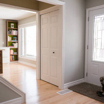
This photo shows the transition between the front entrance, living room and the kitchen. Due to budget constraints the plans to add on an enclosed front porch has to be postponed for the time being.
Melanie Rebane Photographhy
 Drury Design
THE SETUP
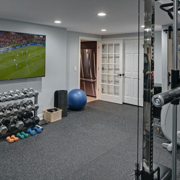
When we first encountered this basement for a family with three boys, we saw a space with untapped potential. Though previously remodeled, it lacked a cohesive design strategy. The expansive area housed various entertainment pieces (a shuffleboard table, air hockey, foosball, etc.) scattered haphazardly throughout the space.
While the basement included a workout room and a rudimentary kitchen area, it lacked a dedicated game room or proper bar. Excessive storage closets along the back wall consumed valuable real estate that could be repurposed for more engaging uses.
In essence, the basement was spacious but disjointed—functional for family use but falling short as an entertainment hub. It didn’t align with the sophistication of the rest of the home. Our clients envisioned a transformation: a fresh, organized space that would not only serve their family’s needs but also shine as an inviting arena for entertaining friends and hosting gatherings – especially sports-focused gatherings!
Design Objectives:
Reimagine the basement layout, creating distinct zones for varied activities.
Expand the workout area to accommodate new equipment, including a Smith machine.
Implement a multi-screen setup inspired by high-end sports bars, allowing guests to follow multiple games while socializing.
Enhance existing features while developing new areas:
Optimize a workout space for all equipment needs
Establish a dedicated children’s space with guest room capabilities
Create an integrated bar and entertainment area
Retain and incorporate the existing projector setup
Design Challenges:
Navigate layout constraints in the new workout room due to fixed utility areas.
Carve out a distinct space for kids within the open plan.
Revitalize an underutilized section of the basement.
Elevate the existing big screen area with purposeful design elements.
Develop a full-fledged bar area while maintaining kitchen functions applicable for hangout snacking.
Work around immovable structural elements (soffits, load-bearing support columns)
THE RENEWED SPACE
Design Solutions:
Install a stylish barn door for the utility area of the new workout space, improving aesthetics and accessibility.
Repurpose the former workout room into a dedicated game room for kids, utilizing couches with pull-out beds so the area can double as overflow guest accommodations.
Transform the unused area into a vibrant pub-style area for card and table games.
Enhance the big screen area with elegant wainscoting and ambient theatre-style lighting.
Design a multi-functional wet bar area featuring varied seating, prep areas, and a microwave.
Base the bar sink area width off the soffit above it.
In the big screen area, use the soffit to inform the width of a wainscoting section.
For the immovable support columns, dress one up to match the wainscoting of the nearby big screen wall. Hide the other one in a new wall.
Final Thoughts:
The reimagined basement has exceeded our clients’ expectations, evolving into the ultimate entertainment hub. With seven strategically placed screens, it’s perfect for gatherings focused on major sporting events and casual gatherings, as well. The space strikes a balance between adult sophistication and family-friendly functionality, featuring distinct zones for various activities.
The new design not only maximizes functionality for modern, multi-screen entertainment but also elevates the aesthetic appeal. It integrates flawlessly with the rest of the home’s transitional style while allowing each basement section to maintain its unique character. The result is a versatile space that caters to both intimate family time and large-scale entertaining.
 SRA Design + Build Architects Corp.
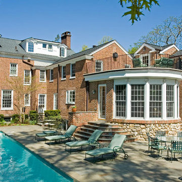
This historic 1910 Federal style house was carefully renovated and decorated by SRA in phases while the family - including five children - lived there. Flow issues created by haphazard additions by previous owners were eliminated with a clear-cut circulation path. Today, perfectly proportioned rooms and open spaces are elegantly connected within the constraints of the existing 7-bedroom, 6-bathroom structure.
Find the right local pro for your project
 Melissa Sharp, Designer at Kitchen & Bath Concepts
The clients are empty nesters in a bustling urban area, with a growing family, who visits often. We worked closely to achieve sophisticated spaces within the constraints of a community townhome. Their eclectic European design aesthetic was influential on the finish selections. The Kitchen is the centerpiece of the second-floor open floorplan. Optimizing the limited storage was imperative. Custom storage for the Kitchen and Pantry were taken to the ceiling, accessible with a ladder.
Some challenges were:
Working with the builder in a community townhome project, while trying to give the client a custom designed home.
Also, since this is a townhome, storage space is limited.
The clients wanted guests to be sitting in the kitchen visiting with them while they cooked.
The kitchen and pantry need a ladder for the tall and stacked cabinets.
After designing and estimating all spaces, just as cabinetry was being ordered, the entire house burned down. So, this job was measured, drawn and estimated twice.
 123 Remodeling Inc.
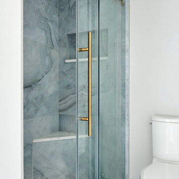
This bathroom in Chicago's Rush & Division high-rise condo was in need of an update due to its outdated features and lack of cohesive storage solutions. While the layout of the bathroom couldn't be drastically altered due to site constraints, the space was opened up as much as possible to create a more open and inviting feel. One of the major changes in the bathroom was the addition of a freestanding tub, which not only adds a touch of luxury but also creates a more cohesive look in line with the overall aesthetic of the home. In addition, the use of a luxurious bronze finishes helps to elevate the space and create a more sophisticated and high-end looking bathroom. The end result is a bathroom that is not only more visually appealing but also more functional and efficient in its use of space.
 Turnstyle Design
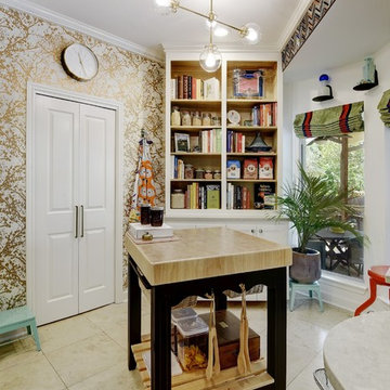
A long overdue renovation was needed for this kitchen. Belonging to a chef, it was cramped, inefficient and difficult to work in. Turnstyle came in and opened up walls, bringing in much more natural light, improving flow and removing previous space constraints. With floor to ceiling glass tile in a gorgeous palette and herringbone pattern, we emphasized the extra-large pass-through we created, with now full view to the pool and what we turned into the now dining room. Custom cabinetry and countertops, feel easy for kids to find their place and wallpaper adds whimsy surrounding a wonderful open pantry area – perfect for any chef to feel fully inspired. | Twist Tours Photography
 Reico Kitchen & Bath
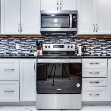
Designed by Bryan Hunt of Reico Kitchen & Bath in Frederick MD in collaboration with Walker Works, this transitional style inspired design of a kitchen with a bar area just outside the kitchen features Merillat Classic cabinets in Rowan 5-piece door style in two finishes. The kitchen features a Mist finish with the bar area in a Pecan finish. The kitchen also features Silestone Tebas Black countertops and Whirlpool appliances.
The tile backsplash is Bliss Linear Glass Midnight and Elon Ledgerstone Ordino Beige.
“My biggest challenge in designing the space was to optimize it for functionality that would fit some of the constraints like the large window and small doorway,” said Hunt. “My favorite aspect is the boldness of the black counter top and the backsplash. I liked how the customer wasn’t afraid to be bold with darker colors.”
Photos courtesy of BTW Images LLC.
 Drury Design
The Setup
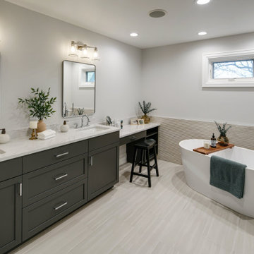
When our clients decided to remodel their primary bathroom, the goal was to transform the space into a brighter, more open retreat tailored to their needs. The previous layout, with its enclosed zones and limited functionality, no longer met their needs. By reimagining the layout and introducing thoughtful design choices, we created a modern, elegant bathroom that serves their current and future lifestyle.
Design objectives:
- Create a brighter, more open bathroom while maintaining privacy.
- Provide functional storage solutions without relying on the old linen closet.
- Incorporate a freestanding tub, large shower, and a makeup area for added versatility.
- Retain natural light from existing windows.
- Introduce elegant finishes and accents for a timeless aesthetic.
The Remodel
Design challenges to be solved:
- Reconfiguring the layout while keeping the existing plumbing for the toilet.
- Creating storage that houses everything that resided within the linen closet.
- Designing clearance and functionality for a freestanding tub, shower, and makeup area within the limited space.
- Accommodating the client’s desire for a pocket door in the commode room despite spatial constraints.
Introducing accent tile and cabinetry colors that align with the client’s vision yet maintain a cohesive look with the rest of the home.
The Renewed Space
Design solutions:
- Reimagined Layout: Moved the shower from the back of the room, creating a more open feel with additional glass while preserving privacy with a wing wall and bench. The freestanding tub was angled to optimize space and enhance circulation, with textured tile behind it adding visual interest.
- Efficient Storage: Eliminated the original linen closet and incorporated functional base cabinet storage and a designated makeup area for added utility.
- Optimized Access: Adjusted the depth of the makeup vanity to provide sufficient walkway clearance, ensuring a comfortable flow around the tub.
- Tailored Features: Installed a smaller pocket door in the commode room to resolve framing and plumbing limitations.
- Elegant Accents: Introduced a subtle marble herringbone mosaic tile in the shower and textured tile behind the tub to enhance the monochromatic palette. Painted cabinetry in a dark gray finish provided a bold yet refined contrast to the light countertops.
Final Thoughts:
The reimagined primary bathroom is a true reflection of the client’s needs and style preferences. By thoughtfully reworking the layout and incorporating functional yet elegant design elements, we created a serene and practical space that serves as a personal retreat. The result is a timeless bathroom that supports their busy lifestyle while providing moments of tranquility.
 Century Stair Company
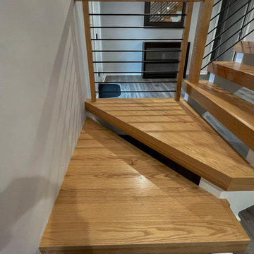
Space constraints and the homeowners' desire for a sleek, sturdy staircase drove the design of this highly custom solution. Instead of a traditional landing at the corner, the first two steps are winders that navigate the turn while meeting code requirements and conserving space. The open-riser design maintains visual lightness, while horizontal metal balusters, thick oak treads, white painted double stringers, and a modern oak handrail complete the clean, contemporary aesthetic. The result is a staircase that proves spatial challenges can inspire elegant solutions.
1976-2026 © Century Stair Company
 Rheir Home
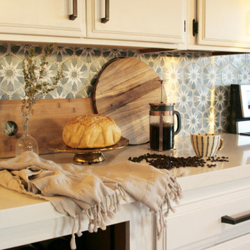
The kitchen blue print is the same as when the home was first purchased. Tile countertops were replaced with quartz, and a custom backsplash was added. Appliances were updated and replaced with a higher end line, and the divided sink was replaced with an undercount, complete with pull down faucet and push button disposal.
The florescent lighting had been partially removed, and to work with budgetary constraints, we replaced them with recessed cans and lined the box with reclaimed wood. This decision would allows us to warm up an otherwise cold room and create an area of visual interest, drawing the eye up.
With budgetary restraints in mind, we painted the original cabinets and added hardware. The upper cabinets, lower drawers, and wine rack to the left of the oven however, were custom made to match the rest of the kitchen, so we could elongate the countertop and additional work space could be created.
 Modulor
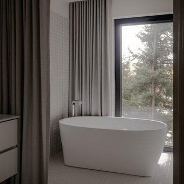
Built on a steep lakeside terrain, the Tsuga residence by Appareil Architecture is an ambitious project that required meticulous planning and flawless execution. Nestled within the rugged landscapes of Brownsburg-Chatham, Tsuga elevates a complex site to offer a seamless immersion in nature. Balancing the site’s constraints with a high level of finish, every phase of the project was designed to reconcile technical challenges with precision. Modulor expertly managed all collaborators, ensuring a level of detail that defines a project of this scale.
On the exterior, the building envelope combines durability with refinement. Carefully selected natural wood cladding interacts with a perforated screen that filters light and adds depth to the façade. The integration of openings was strategically planned to maximize views while maintaining a cohesive architectural expression.
Inside, the materials and finishes reflect the same commitment to quality. Wooden paneling wraps the spaces, creating visual continuity and a warm atmosphere. The stainless steel kitchen, with its clean lines and custom design, introduces a striking contrast between modernity and natural textures. Every junction, every material transition was meticulously crafted to ensure a flawless result, with no compromises on durability or functionality.
Designed for an architectural historian and a musician and opera singer, Tsuga is the result of meticulous craftsmanship. A home built to stand the test of time, with an unwavering attention to detail.
 Century Stair Company
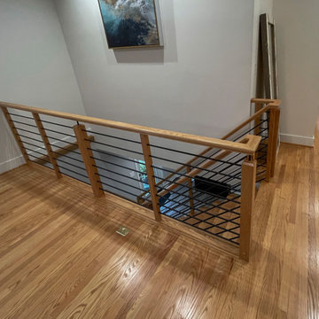
Space constraints and the homeowners' desire for a sleek, sturdy staircase drove the design of this highly custom solution. Instead of a traditional landing at the corner, the first two steps are winders that navigate the turn while meeting code requirements and conserving space. The open-riser design maintains visual lightness, while horizontal metal balusters, thick oak treads, white painted double stringers, and a modern oak handrail complete the clean, contemporary aesthetic. The result is a staircase that proves spatial challenges can inspire elegant solutions.
1976-2026 © Century Stair Company
 Sweet Smiling Landscape Design
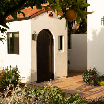
Located on a steep hill above downtown Ventura, this modern Spanish house features panoramic views of town with the ocean and Channel Islands beyond. While the views are amazing from a large front deck, the steep slope presented some constraints on the landscape design.
Although the property is about a third-of-an-acre, the only useable and open garden space is a small (about 500 square feet) area to the West of the house. The house sits at the back of the property, and another steep hill on the neighboring property behind is held back by a tall retaining wall, leaving just enough room for a narrow, hardscaped patio in the back yard.
Bright plantings along the back of the property delineate the home from the neighboring property, and we chose plantings to help stabilize the soil and further develop the Spanish garden look while creating a lush, inviting feel. Additionally, we added 52 pieces of pottery to soften and add interest to the back garden and patio areas. Succulents, herbs, and California natives fill the pottery along with bright, sweet-smelling, tropical-looking, and climate-appropriate plants.
Slope stabilization was paramount for the front hill. Beyond that, finding plants that would thrive on the steep slope was the next obstacle. Finally, the aesthetics could be addressed, and we worked to find plants that meshed with the architecture—blending plants with white and orange to play off the red-tiled roofs and white-plastered walls that are emblematic of the Spanish style of this house as well as the predominate style of the neighborhood.
The flattish area to the West was designed with the idea of creating a contemporary take on the parterre garden. Reminiscent of Mediterranean gardens, this vegetable and herb garden substitutes formal hedges with formal Corten steel planters to honor the modern Spanish architecture of the house. The citrus, herbs, and vegetables serve the foodie clients well.
 Sturman Architects
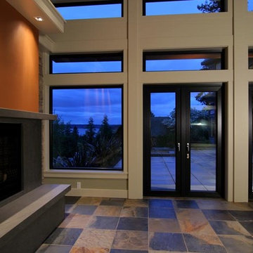
This modern style house was a speculative venture creating a dynamic project which maximized the site constraints and zoning limits. The low pitched lofty roof lines focus on the site views and allow clear story windows for soft filtered light. The stained cedar trim and soffits, stone veneer and metal railings blend the modern architectural design with a northwest flair.
 Watkins Concrete Block Company, Inc.
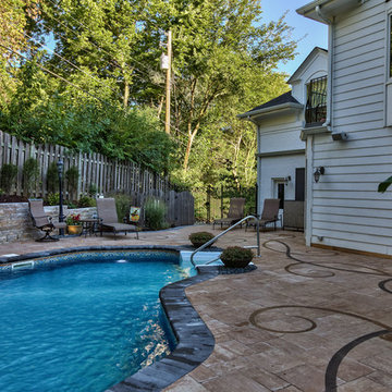
Working with space constraints, this backyard has a grill built into bar area. Along with a gorgeous pool and a utility shed, the backyard still has plenty of room for relaxation and sun tanning. Paver Designs made an intricate, flowing pattern on the stone floor to bring every element of this backyard together.
 Renovisions
Perectly balanced, this dramatic black and white bathroom is a stunner. Thoughtful design was top of mind for these clients as they approached the Renovisions team to help narrow down their choices and bring it to life. Finding balance while mixing darker, heavier black finishes and lighter, white finishes was the task at hand and the goal was to create a modern look with an industrial/rustic feel.
The challenge on this project was incorporating all the desired elements and products in a tight spatial constraint of 9’ x 7.5’. The clients biggest concern in the old bathroom was inadequate storage, tired and under-utilized bathtub and they also needed an additional sink for their two daughters who often share this space. Renovisions recommended removing the wall between the shower and closet to gain additional floor space as you enter the bath, while providing wall space for the three towel bars.
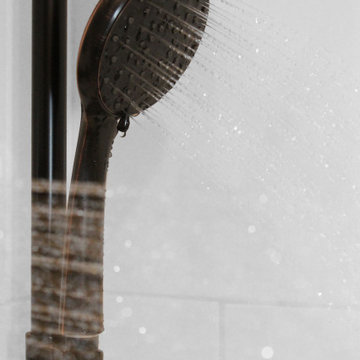
Collaborating with the clients and searching to find the right fixtures paid off nicely. This newly remodeled Renovision accommodated two rectangular sinks, a walk-in shower with hand-held shower, wall-mounted shower head and two soft spray body jets. The oil-rubbed bronze fixtures not only provided a luxurious spa experience, but also added warmth and softness to the vintage feel. The glass shower enclosure is trimmed in a matte black grid that boasts an industrial aesthetic with retro feel while delivering modernistic function. It’s unique in appearance while allowing the chic white subway and black and white diamond tile to peek through.
The beautifully designed cabinetry in a matte black painted finish provides plenty of storage. This smart configuration included two banks of three drawers for toiletries and accessories, two towers with adjustable shelves for towels and two ‘garage’ doors for hair dryers.
Another unique design detail to capture attention was the black and white curvy geometric floor tile which plays off the straight lines of the cabinets and square grids of the shower enclosure.
The clients are thrilled with the results and their modern, high-contrast styled digs – a true customized relaxation sanctuary for the entire family.
 Unidé Design
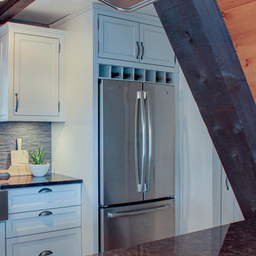
Les clients possèdent un chalet dans le Nord, situé à La Macaza. Ce magnifique petit chalet à style Suisse, qui comportait quelques contraintes au niveau du mur en angle.
Les clients désiraient refaire leur cuisine en améliorant le rangement et le design de celle-ci. Ils désiraient rester dans un style classique et intemporel. Nous avons ajouté une petite touche classique avec ses pentures apparentes, avec un évier de style ''farmhouse'', mais en stainless, ce qui donne un style plus contemporain à la cuisine.
Customers have a chalet in the North, located at La Macaza. This beautiful little Swiss style chalet, which had some constraints with a corner wall.
Customers wanted to redo their kitchen by improving its storage and design. They wanted to stay in a classic and timeless style. We have added a classic touch with its visible hinges, with a sink in the style of '' farmhouse '', but in stainless, which gives a more contemporary style to the kitchen.
 Jarrett Design
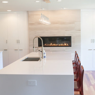
Our clients are always teaching us. In this case, our clients had a vision that changed the direction of the design process midstream. Often our clients tell us they have trouble visualizing. This time, we must admit, we had a little trouble visualizing how their big idea was better than what we were planning. And then, it clicked!
This young family of five had outgrown their dark and dated kitchen. Food prep, cooking and baking play a large daily role in this home. Pantry storage was overflowing to the point where bulk ingredients, small appliances and other daily necessities were stored in a nearby closet and the laundry room at the end of the house. Counter space was scarce. The kitchen also served as an office area for the husband, who works from home, and a study area for the three school age children. Given some constraints and a fixed budget, our inclination was to work with the existing kitchen to design a much more efficient space, keeping it close to the laundry room/pantry, which could be maximized for convenient storage and access. We would create an organized work area within the kitchen as well. Our clients were happy with the design. Then, out of the blue, they announced that they would like to move the kitchen into the family room space! Our first reaction was to question how this could work being so far from the pantry storage areas, and the other living spaces of the home. The flow seemed as though it would be odd, but we heard them out and allowed some time for the idea to blossom. And blossom, it did. The existing kitchen and eating space became the new study and family room with enlarged windows and an added sliding door bringing their beautiful gardens into clear sight. The pantry dilemma was solved by adding a full wall of tall cabinetry with roll out storage flanking a beautiful fireplace. A large island with waterfall sides provides copious counter space and seating for the whole family. Dark, dated traditional styling of the past kitchen gave way to contemporary high gloss white and warm rosewood elements. The dramatic Dekton Aura backsplash is the icing on the cake!
Matt Villano Photography
 Turnstyle Design
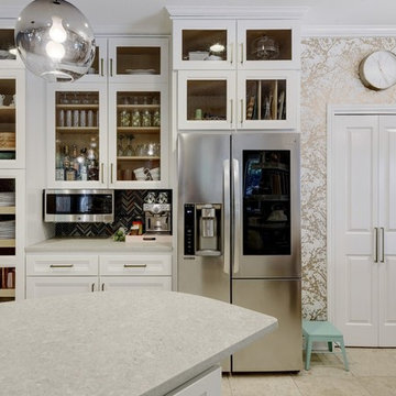
A long overdue renovation was needed for this kitchen. Belonging to a chef, it was cramped, inefficient and difficult to work in. Turnstyle came in and opened up walls, bringing in much more natural light, improving flow and removing previous space constraints. With floor to ceiling glass tile in a gorgeous palette and herringbone pattern, we emphasized the extra-large pass-through we created, with now full view to the pool and what we turned into the now dining room. Custom cabinetry and countertops, feel easy for kids to find their place and wallpaper adds whimsy surrounding a wonderful open pantry area – perfect for any chef to feel fully inspired. | Twist Tours Photography
 Vetter Architects
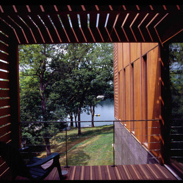
In early 2002 Vetter Denk Architects undertook the challenge to create a highly designed affordable home. Working within the constraints of a narrow lake site, the Aperture House utilizes a regimented four-foot grid and factory prefabricated panels. Construction was completed on the home in the Fall of 2002.
The Aperture House derives its name from the expansive walls of glass at each end framing specific outdoor views – much like the aperture of a camera. It was featured in the March 2003 issue of Milwaukee Magazine and received a 2003 Honor Award from the Wisconsin Chapter of the AIA. Vetter Denk Architects is pleased to present the Aperture House – an award-winning home of refined elegance at an affordable price.
Overview
Moose Lake
Size
2 bedrooms, 3 bathrooms, recreation room
Completion Date
2004
Services
Architecture, Interior Design, Landscape Architecture
29