
Search results for "Construction zone" in Home Design Ideas
 Poythress Construction Company Inc.
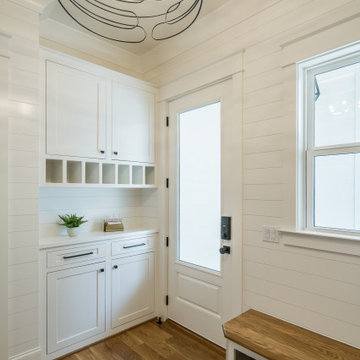
Inspiration for a large country medium tone wood floor and brown floor mudroom remodel in Raleigh with white walls
 Covenant Construction
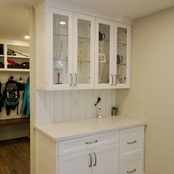
As. you enter from the garage, the house is set up to receive everything you need to drop before you enter the tranquility of the main space. First this classy drop zone, with charging centres and file storage for that bit of household paperwork. We repeated the vertical ship lap and added glass cabinets because this cabinet is actually at the end of the hall and you can see it through the whole house. Then the mudroom for coats/backpacks etc. To the left of this picture is a butlers pantry for all the shopping goods, and then as you walk into the kitchen you can open that bottle of wine :-). My point is everything needs a place and space and to be organized because our lives are busy enough. It took a lot of planning with the client to understand how their family functions, what activities do they do now, or t think they will be doing in the future. There is nothing like getting to know your client for the best possible outcome.
 Synergy Design & Construction
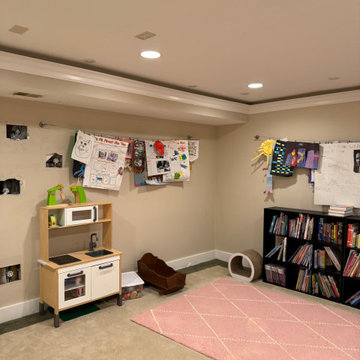
Before: The space served more as a storage zone with a small bookshelf and scattered toys. Partition walls limited the usable area, and dated chair molding gave it a tired look.
Before: The space served more as a storage zone with a small bookshelf and scattered toys. Partition walls limited the usable area, and dated chair molding gave it a tired look.
Find the right local pro for your project
 Synergy Design & Construction
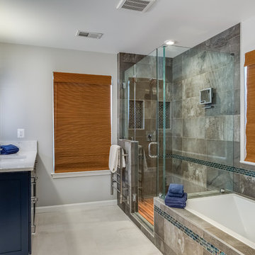
The bathroom highlights the "bathing zones", with an accent tile band that wraps through the shower and bathtub areas. The tile is a 1"x2", iridescent glass tile with pops of color that coordinate with the deep-ocean-blue of the vanity. The "bathing zone" tile work is balanced by a calm, neutral, light gray tile on the floor.
 TOC design & construction inc.
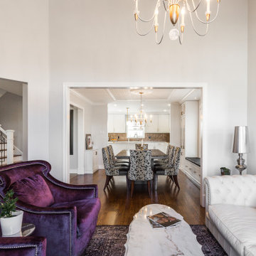
1.Unified Color Scheme: Choose a cohesive color palette that flows seamlessly throughout the space. Opt for neutral tones, such as cream, beige, or soft gray, to create a sophisticated and elegant backdrop.
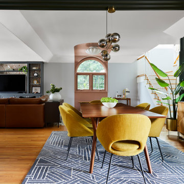
2.Defined Zones: Use furniture placement and area rugs to define distinct zones for the living and dining areas within the open concept space. Position the seating area and dining table in a way that creates a natural flow and allows for easy conversation and movement.
3.Formal Seating: Select elegant and comfortable seating options for the living area, such as tailored sofas, upholstered armchairs, or a combination of both. Incorporate luxurious fabrics, such as velvet or silk, in neutral or muted tones. Arrange the furniture to encourage conversation and provide a focal point, such as a fireplace or a statement piece of artwork.


 Skill Construction & Design, LLC
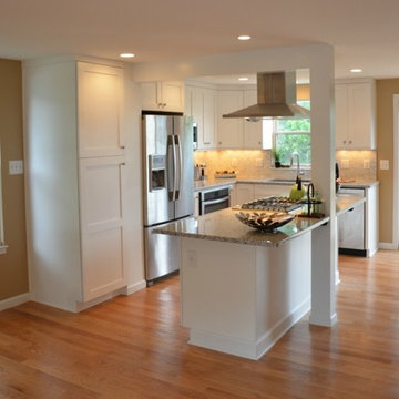
There are so many design elements to this kitchen, I almost don’t know where to start. Bright and airy with crisp clean white cabinets, the kitchen is open and welcoming. Still crisp but gently contrasting, the stainless steel appliance add depth amid the white. To keep this kitchen warm, natural oak covers the floors and a toasted wheat color washes the walls. And then there is the architectural elements. You know. That post and beam in the middle of the room. It’s the center of attention.
When you walk into a room your eyes roam around, establishing the size and shape of the room as your feet take you forward. From the front door of this home straight ahead you encountered this wall. The dining area to the right gives you a glimpse of things to come. Where there is a dining room you will usually find a kitchen.
The architecture of years gone by consistently hides the kitchen, the heart of the home, behind walls. I sympathize with my Mom, and all the other Moms, who have had to spend so much time tucked into a tight kitchen, away from the family. This wall had to go, but it was structural. We needed its support but not its bulk.
So we got rid of the bulk and only the bulk. Instead of a wall we have a post and beam, offering all of the structure we need. We could have installed a huge steel beam and reconfigure the joists to upset the beam, but why? The small beam and post add an incredible architectural element. It’s turning lemons into lemon, we simply made the most of what we had. It may be functional but it’s so fantastic. It looks like we created the effect just for the drama.
The original kitchen may have had a working triangle and some counter space, but it was fairly small, with each area only a step or two away. The dark cabinets made the space feel even smaller and the butcher block patterned laminate counter tops were very dated. The appliances were feeling their age as well, from a coil burner electric stove to a top freezer refrigerator. To keep this kitchen within its space, a half wall separated it from the dining area.
With the wall gone we borrowed some space from the living room and extended what was a U shaped kitchen into an L. At the living room window we start our new kitchen. We kept a small part of the wall to support the other end of our decorative beam. Sandwiched between a large pantry and our new French door refrigerator, the wall disappears. With our new open floor plan a sizable island was in order.
We split our cooking areas and installed a continuous grill gas cooktop into the island. A sleek island hood takes care of exhaust and adds an extra element to our architectural feature. Under the cooktop we added over-sized drawers for pots and pan storage. The frameless cabinets from New River Cabinetry are maple, painted white, with the Herndon door style. With the cooktop safely nestled into our island, we still had to add an oven.
We used the space where the old range sat for a large single oven of stainless steel and glass. If it worked for one, why not two? We created a home for a microwave in the wall cabinets. It’s perfect for heating leftovers so close to the refrigerator.
An important consideration for hot spots in your kitchen is landing zones. Each of our cooking areas have generous landing zones, one on each side of the cooktop and an entire counter area above or below the ovens, depending on which one you’re using.
We wanted to give the sink area more room so the half wall had to come out. We moved the trash and recycle cans into a cabinet, removed the heavy soffits and kept the sink under the window.
With that little bit of extra space we were able to add a larger cabinet above the dishwasher and slide it all down. This used to be where the carpeting met the vinyl floor, but all of it is gone. Long oak planks eliminate that final divide between the kitchen and the dining area, while adding visual length to the area. White wall cabinets on each side of the window reflect the sunlight for a brighter view.
With all of the darker cabinetry the backsplash walls had been painted white. Even still, there was a darkness in the corners and it wasn’t very exciting. We wanted to add visual interest and reflect the new under-cabinet lighting, eliminating the shadows in this corner.
With 1″x 2″ Arabescato Honed marble mosaics and those under-cabinet lights, we achieved the perfect balance. The marble has subtle swirls in gray and beige on a clean white background, but with the honed finish the light is softly reflected instead of glaring. For granite, we chose the soft gray tones of Luna Pearl. The speckles of gray and beige are a gentle contrast to the white cabinets and emulate the color of the stainless steel.
Between the carpet, red half wall, dark railing and dated light fixture, the dining area felt tired. Since the kitchen lacked sufficient storage, a large utility cabinet crowded the table space without adding any decorate elements.
Although it didn’t get any bigger, our dining area feels fresher and more open too. With the oak flooring joining the area to the rest of our space and the toasted wheat on the walls, the white table and chairs compliment the cabinetry while contrasting the warmer colors. We replaced the chandelier with recessed lighting and changed that railing too.
With our new open floor plan, we ended up with a fairly open area in between our foyer closet and the living room window. Not one to miss an opportunity, we filled the space with a multi-functional work space.
With the sunlight streaming in this bright corner works for anything this family needs.
There’s plenty of space for a chair under this large desk drawer. A closed cabinet below, glass doors above and lots of open shelving let you store and or showcase your belongings. We added a lite area at the top to keep away the darker corners.
The transformation is complete. This kitchen and all of its features are truly the center of attention in this home.
http://www.designsbyskill.com/
http://www.rjkconstructioninc.com/
 Skill Construction & Design, LLC
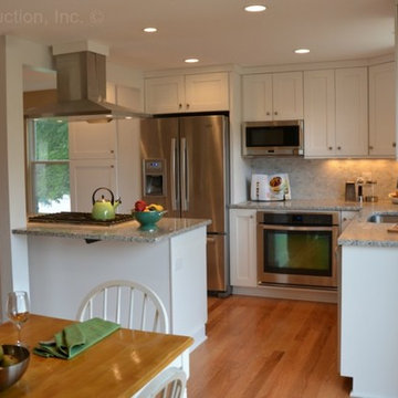
There are so many design elements to this kitchen, I almost don’t know where to start. Bright and airy with crisp clean white cabinets, the kitchen is open and welcoming. Still crisp but gently contrasting, the stainless steel appliance add depth amid the white. To keep this kitchen warm, natural oak covers the floors and a toasted wheat color washes the walls. And then there is the architectural elements. You know. That post and beam in the middle of the room. It’s the center of attention.
When you walk into a room your eyes roam around, establishing the size and shape of the room as your feet take you forward. From the front door of this home straight ahead you encountered this wall. The dining area to the right gives you a glimpse of things to come. Where there is a dining room you will usually find a kitchen.
The architecture of years gone by consistently hides the kitchen, the heart of the home, behind walls. I sympathize with my Mom, and all the other Moms, who have had to spend so much time tucked into a tight kitchen, away from the family. This wall had to go, but it was structural. We needed its support but not its bulk.
So we got rid of the bulk and only the bulk. Instead of a wall we have a post and beam, offering all of the structure we need. We could have installed a huge steel beam and reconfigure the joists to upset the beam, but why? The small beam and post add an incredible architectural element. It’s turning lemons into lemon, we simply made the most of what we had. It may be functional but it’s so fantastic. It looks like we created the effect just for the drama.
The original kitchen may have had a working triangle and some counter space, but it was fairly small, with each area only a step or two away. The dark cabinets made the space feel even smaller and the butcher block patterned laminate counter tops were very dated. The appliances were feeling their age as well, from a coil burner electric stove to a top freezer refrigerator. To keep this kitchen within its space, a half wall separated it from the dining area.
With the wall gone we borrowed some space from the living room and extended what was a U shaped kitchen into an L. At the living room window we start our new kitchen. We kept a small part of the wall to support the other end of our decorative beam. Sandwiched between a large pantry and our new French door refrigerator, the wall disappears. With our new open floor plan a sizable island was in order.
We split our cooking areas and installed a continuous grill gas cooktop into the island. A sleek island hood takes care of exhaust and adds an extra element to our architectural feature. Under the cooktop we added over-sized drawers for pots and pan storage. The frameless cabinets from New River Cabinetry are maple, painted white, with the Herndon door style. With the cooktop safely nestled into our island, we still had to add an oven.
We used the space where the old range sat for a large single oven of stainless steel and glass. If it worked for one, why not two? We created a home for a microwave in the wall cabinets. It’s perfect for heating leftovers so close to the refrigerator.
An important consideration for hot spots in your kitchen is landing zones. Each of our cooking areas have generous landing zones, one on each side of the cooktop and an entire counter area above or below the ovens, depending on which one you’re using.
We wanted to give the sink area more room so the half wall had to come out. We moved the trash and recycle cans into a cabinet, removed the heavy soffits and kept the sink under the window.
With that little bit of extra space we were able to add a larger cabinet above the dishwasher and slide it all down. This used to be where the carpeting met the vinyl floor, but all of it is gone. Long oak planks eliminate that final divide between the kitchen and the dining area, while adding visual length to the area. White wall cabinets on each side of the window reflect the sunlight for a brighter view.
With all of the darker cabinetry the backsplash walls had been painted white. Even still, there was a darkness in the corners and it wasn’t very exciting. We wanted to add visual interest and reflect the new under-cabinet lighting, eliminating the shadows in this corner.
With 1″x 2″ Arabescato Honed marble mosaics and those under-cabinet lights, we achieved the perfect balance. The marble has subtle swirls in gray and beige on a clean white background, but with the honed finish the light is softly reflected instead of glaring. For granite, we chose the soft gray tones of Luna Pearl. The speckles of gray and beige are a gentle contrast to the white cabinets and emulate the color of the stainless steel.
Between the carpet, red half wall, dark railing and dated light fixture, the dining area felt tired. Since the kitchen lacked sufficient storage, a large utility cabinet crowded the table space without adding any decorate elements.
Although it didn’t get any bigger, our dining area feels fresher and more open too. With the oak flooring joining the area to the rest of our space and the toasted wheat on the walls, the white table and chairs compliment the cabinetry while contrasting the warmer colors. We replaced the chandelier with recessed lighting and changed that railing too.
With our new open floor plan, we ended up with a fairly open area in between our foyer closet and the living room window. Not one to miss an opportunity, we filled the space with a multi-functional work space.
With the sunlight streaming in this bright corner works for anything this family needs.
There’s plenty of space for a chair under this large desk drawer. A closed cabinet below, glass doors above and lots of open shelving let you store and or showcase your belongings. We added a lite area at the top to keep away the darker corners.
The transformation is complete. This kitchen and all of its features are truly the center of attention in this home.
http://www.designsbyskill.com/
http://www.rjkconstructioninc.com/
 St. Pierre Construction
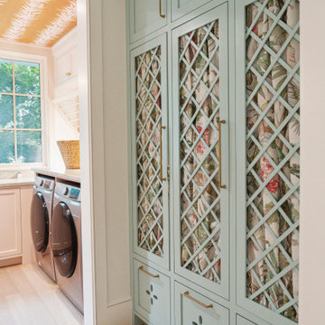
Bright hallway drop zone with custom inset cabinetry featuring decorative cut-outs below for shoe storage, beautiful curtained storage
Example of a beach style hallway design in Charleston
Example of a beach style hallway design in Charleston
 Melissa Hill Home Design
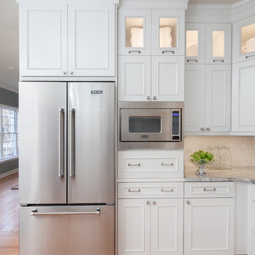
A design for a busy, active family longing for order and a central place for the family to gather. Optimizing a small space with organization and classic elements has them ready to entertain and welcome family and friends.
Custom designed by Hartley and Hill Design
All materials and furnishings in this space are available through Hartley and Hill Design. www.hartleyandhilldesign.com
888-639-0639
Neil Landino Photography
 DSDG Architects
Architect: Mark Sultana
Builder: Voigt Brothers Construction
Photographer: Ryan Gamma
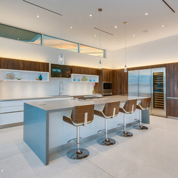
Example of a trendy kitchen design in Tampa
Example of a trendy kitchen design in Tampa
 Michael Nash Design, Build & Homes
2010 NATIONAL NARI REGIONAL AWARD WINNER
Project Scope
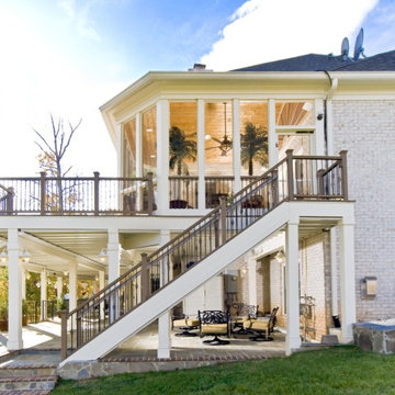
The owners of this 7,000 square foot colonial in Oakton, Virginia, were seeking a multi-level Mediterranean-style indoor/outdoor living space off the back of their home. They turned to Michael Nash Design, Build & Homes for a design solution that would include a stone patio, a second-story deck, a screened-in porch and linking staircases.
While the structure was designed primarily for family dining and entertaining, it also had to accommodate periodic social gatherings of one hundred guests or more. To meet these needs, the project would include a fully-equipped outdoor kitchen, several serving counters with permanent refrigeration, and well-delineated socializing and dining zones.
The existing home’s setting offered several impressive assets the new outdoor living area was designed to exploit. The sprawling acreage features old stand trees, wooded paths and a private lake. Beautifully landscaped, it unfolds as an idyllic panorama that naturally draws people to the outdoors.
Challenges
Since the rear elevation was situated on a slope that drops away from the house, the Michael Nash team had to raise the grade two feet within in a 2,000 square foot area extending out from the back of the house. Infrastructure plans also called for a sophisticated drainage system that had to accommodate a whole series of water “runoff” considerations to be integrated into the decking itself. Excavation included constructing retaining walls to bolster the elevated grade—which also had to support a concrete slab, the primary foundation for the entire complex.
Solutions
The ground level decking consists of a 2,000 square foot flagstone patio level with the home’s lower level doors. There is a decorative water fountain mid-patio—an ornate collectible acquired in Florida. Food preparation is concentrated within a specially designed semi-circular wall that creates an “outdoor kitchen” equipped with a 60” Viking barbecue grill, a prep sink, a warming drawer, refrigerator and appropriate storage. There is a granite surfaced dining counter with seating for eight.
Wrought iron railing and approximately 20 decorative columns (some encasing steel vertical supports) are incorporated into the design scheme. Many of the columns house accent lights.
The top level—supported by horizontal steel beams– is a 2,500 square foot deck constructed entirely of Trex decking. The open air decking is, again, directly accessible from rooms on the second level of the house including the kitchen, sunroom and family room.
The platform’s most prominent feature is a U-shaped “kitchenette” with cedar shake shingle roofing. Like its counterpart one level below, the facility is equipped with grill, refrigerator and stainless steel cabinetry.
One portion of the deck has been allocated for a 16’ x 16’ octagonal screened-in porch crowned by a pair of 2’ x 4’ skylights. The porch can be accessed from the home’s conservatory via a set of French doors. With its mosaic tile flooring, stained cedar panel ceiling and honed granite counters, the interior is elegant and calming. Hand-painted stenciling and a wall-mounted water feature provide distinctive detailing.
Finally, the design introduced elements to highlight and reinforce an awareness of the lovely bucolic setting. Fountains and water features combined with textured surfaces and mosaic tiling and backsplashes to present a villa-like ambiance well-suited to the Virginia countryside.
Sponsored
Fredericksburg, OH

High Point Cabinets
Columbus' Experienced Custom Cabinet Builder | 4x Best of Houzz Winner

 Amy A. Alper, Architect
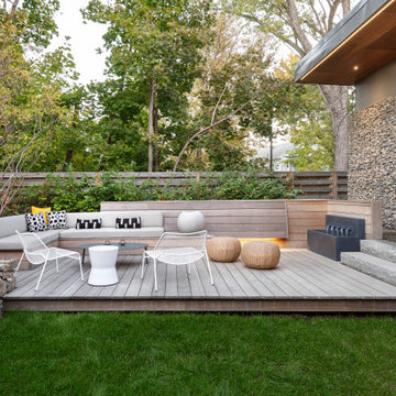
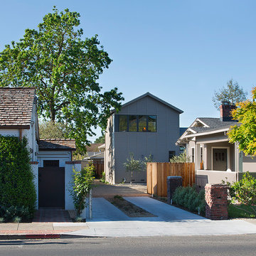
Inspiration for a mid-sized transitional gray two-story stucco exterior home remodel in San Francisco

 Wolstenholme Associates, LLC
Builder: Chris McGinn Construction
Photography: Juan Vidal
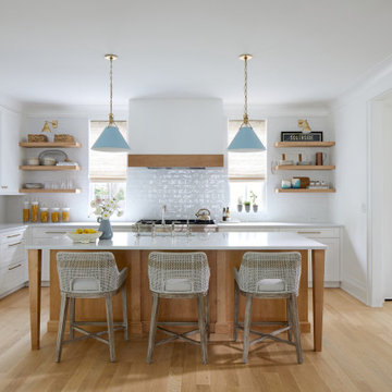
Example of a country kitchen design in Philadelphia
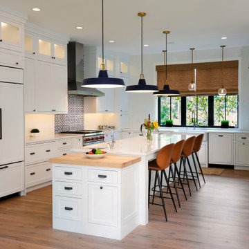
Example of a country kitchen design in Philadelphia

 ZeroEnergy Design
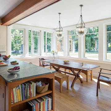
Lincoln Farmhouse
LEED-H Platinum, Net-Positive Energy
OVERVIEW. This LEED Platinum certified modern farmhouse ties into the cultural landscape of Lincoln, Massachusetts - a town known for its rich history, farming traditions, conservation efforts, and visionary architecture. The goal was to design and build a new single family home on 1.8 acres that respects the neighborhood’s agrarian roots, produces more energy than it consumes, and provides the family with flexible spaces to live-play-work-entertain. The resulting 2,800 SF home is proof that families do not need to compromise on style, space or comfort in a highly energy-efficient and healthy home.
CONNECTION TO NATURE. The attached garage is ubiquitous in new construction in New England’s cold climate. This home’s barn-inspired garage is intentionally detached from the main dwelling. A covered walkway connects the two structures, creating an intentional connection with the outdoors between auto and home.
FUNCTIONAL FLEXIBILITY. With a modest footprint, each space must serve a specific use, but also be flexible for atypical scenarios. The Mudroom serves everyday use for the couple and their children, but is also easy to tidy up to receive guests, eliminating the need for two entries found in most homes. A workspace is conveniently located off the mudroom; it looks out on to the back yard to supervise the children and can be closed off with a sliding door when not in use. The Away Room opens up to the Living Room for everyday use; it can be closed off with its oversized pocket door for secondary use as a guest bedroom with en suite bath.
NET POSITIVE ENERGY. The all-electric home consumes 70% less energy than a code-built house, and with measured energy data produces 48% more energy annually than it consumes, making it a 'net positive' home. Thick walls and roofs lack thermal bridging, windows are high performance, triple-glazed, and a continuous air barrier yields minimal leakage (0.27ACH50) making the home among the tightest in the US. Systems include an air source heat pump, an energy recovery ventilator, and a 13.1kW photovoltaic system to offset consumption and support future electric cars.
ACTUAL PERFORMANCE. -6.3 kBtu/sf/yr Energy Use Intensity (Actual monitored project data reported for the firm’s 2016 AIA 2030 Commitment. Average single family home is 52.0 kBtu/sf/yr.)
o 10,900 kwh total consumption (8.5 kbtu/ft2 EUI)
o 16,200 kwh total production
o 5,300 kwh net surplus, equivalent to 15,000-25,000 electric car miles per year. 48% net positive.
WATER EFFICIENCY. Plumbing fixtures and water closets consume a mere 60% of the federal standard, while high efficiency appliances such as the dishwasher and clothes washer also reduce consumption rates.
FOOD PRODUCTION. After clearing all invasive species, apple, pear, peach and cherry trees were planted. Future plans include blueberry, raspberry and strawberry bushes, along with raised beds for vegetable gardening. The house also offers a below ground root cellar, built outside the home's thermal envelope, to gain the passive benefit of long term energy-free food storage.
RESILIENCY. The home's ability to weather unforeseen challenges is predictable - it will fare well. The super-insulated envelope means during a winter storm with power outage, heat loss will be slow - taking days to drop to 60 degrees even with no heat source. During normal conditions, reduced energy consumption plus energy production means shelter from the burden of utility costs. Surplus production can power electric cars & appliances. The home exceeds snow & wind structural requirements, plus far surpasses standard construction for long term durability planning.
ARCHITECT: ZeroEnergy Design http://zeroenergy.com/lincoln-farmhouse
CONTRACTOR: Thoughtforms http://thoughtforms-corp.com/
PHOTOGRAPHER: Chuck Choi http://www.chuckchoi.com/
 KitchenLab Interiors
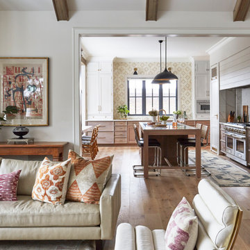
KitchenLab Interiors’ first, entirely new construction project in collaboration with GTH architects who designed the residence. KLI was responsible for all interior finishes, fixtures, furnishings, and design including the stairs, casework, interior doors, moldings and millwork. KLI also worked with the client on selecting the roof, exterior stucco and paint colors, stone, windows, and doors. The homeowners had purchased the existing home on a lakefront lot of the Valley Lo community in Glenview, thinking that it would be a gut renovation, but when they discovered a host of issues including mold, they decided to tear it down and start from scratch. The minute you look out the living room windows, you feel as though you're on a lakeside vacation in Wisconsin or Michigan. We wanted to help the homeowners achieve this feeling throughout the house - merging the causal vibe of a vacation home with the elegance desired for a primary residence. This project is unique and personal in many ways - Rebekah and the homeowner, Lorie, had grown up together in a small suburb of Columbus, Ohio. Lorie had been Rebekah's babysitter and was like an older sister growing up. They were both heavily influenced by the style of the late 70's and early 80's boho/hippy meets disco and 80's glam, and both credit their moms for an early interest in anything related to art, design, and style. One of the biggest challenges of doing a new construction project is that it takes so much longer to plan and execute and by the time tile and lighting is installed, you might be bored by the selections of feel like you've seen them everywhere already. “I really tried to pull myself, our team and the client away from the echo-chamber of Pinterest and Instagram. We fell in love with counter stools 3 years ago that I couldn't bring myself to pull the trigger on, thank god, because then they started showing up literally everywhere", Rebekah recalls. Lots of one of a kind vintage rugs and furnishings make the home feel less brand-spanking new. The best projects come from a team slightly outside their comfort zone. One of the funniest things Lorie says to Rebekah, "I gave you everything you wanted", which is pretty hilarious coming from a client to a designer.
 Allegretti Architects, Inc.
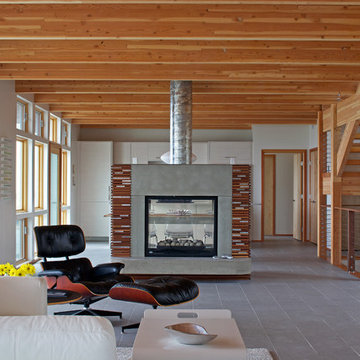
The Owners of a home that had been consumed by the moving dunes of Lake Michigan wanted a home that would not only stand the test of aesthetic time, but survive the vicissitudes of the environment.
With the assistance of the Michigan Department of Environmental Quality as well as the consulting civil engineer and the City of Grand Haven Zoning Department, a soil stabilization site plan was developed based on raising the new home’s main floor elevation by almost three feet, implementing erosion studies, screen walls and planting indigenous, drought tolerant xeriscaping. The screen walls, as well as the low profile of the home and the use of sand trapping marrum beachgrass all help to create a wind shadow buffer around the home and reduce blowing sand erosion and accretion.
The Owners wanted to minimize the stylistic baggage which consumes most “cottage” residences, and with the Architect created a home with simple lines focused on the view and the natural environment. Sustainable energy requirements on a budget directed the design decisions regarding the SIPs panel insulation, energy systems, roof shading, other insulation systems, lighting and detailing. Easily constructed and linear, the home harkens back to mid century modern pavilions with present day environmental sensitivities and harmony with the site.
James Yochum
49