
Search results for "Context" in Home Design Ideas
 Shannon Ggem Design
Bel Air Photography
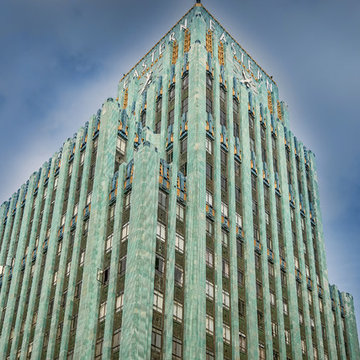
this is the Iconic 1932 Art Deco Eastern Columbia building exterior, just for context of the project. Look how gorgeous~!
Inspiration for an eclectic exterior home remodel in Los Angeles
Inspiration for an eclectic exterior home remodel in Los Angeles
 Bianchi Design
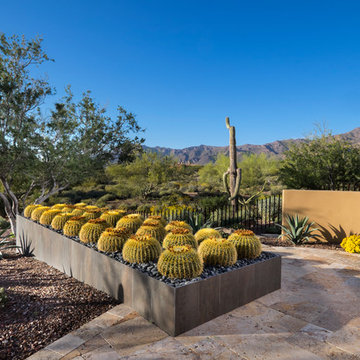
Kirk Bianchi created the design for this residential resort next to a desert preserve. The overhang of the homes patio suggested a pool with a sweeping curve shape. Kirk positioned a raised vanishing edge pool to work with the ascending terrain and to also capture the reflections of the scenery behind. The fire pit and bbq areas are situated to capture the best views of the superstition mountains, framed by the architectural pergola that creates a window to the vista beyond. A raised glass tile spa, capturing the colors of the desert context, serves as a jewel and centerpiece for the outdoor living space.
 Bianchi Design
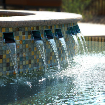
Kirk Bianchi created the design for this residential resort next to a desert preserve. The overhang of the homes patio suggested a pool with a sweeping curve shape. Kirk positioned a raised vanishing edge pool to work with the ascending terrain and to also capture the reflections of the scenery behind. The fire pit and bbq areas are situated to capture the best views of the superstition mountains, framed by the architectural pergola that creates a window to the vista beyond. A raised glass tile spa, capturing the colors of the desert context, serves as a jewel and centerpiece for the outdoor living space.
Find the right local pro for your project

 AoDK Inc.
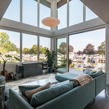
A couple wanted a weekend retreat without spending a majority of their getaway in an automobile. Therefore, a lot was purchased along the Rocky River with the vision of creating a nearby escape less than five miles away from their home. This 1,300 sf 24’ x 24’ dwelling is divided into a four square quadrant with the goal to create a variety of interior and exterior experiences while maintaining a rather small footprint.
Typically, when going on a weekend retreat one has the drive time to decompress. However, without this, the goal was to create a procession from the car to the house to signify such change of context. This concept was achieved through the use of a wood slatted screen wall which must be passed through. After winding around a collection of poured concrete steps and walls one comes to a wood plank bridge and crosses over a Japanese garden leaving all the stresses of the daily world behind.
The house is structured around a nine column steel frame grid, which reinforces the impression one gets of the four quadrants. The two rear quadrants intentionally house enclosed program space but once passed through, the floor plan completely opens to long views down to the mouth of the river into Lake Erie.
On the second floor the four square grid is stacked with one quadrant removed for the two story living area on the first floor to capture heightened views down the river. In a move to create complete separation there is a one quadrant roof top office with surrounding roof top garden space. The rooftop office is accessed through a unique approach by exiting onto a steel grated staircase which wraps up the exterior facade of the house. This experience provides an additional retreat within their weekend getaway, and serves as the apex of the house where one can completely enjoy the views of Lake Erie disappearing over the horizon.
Visually the house extends into the riverside site, but the four quadrant axis also physically extends creating a series of experiences out on the property. The Northeast kitchen quadrant extends out to become an exterior kitchen & dining space. The two-story Northwest living room quadrant extends out to a series of wrap around steps and lounge seating. A fire pit sits in this quadrant as well farther out in the lawn. A fruit and vegetable garden sits out in the Southwest quadrant in near proximity to the shed, and the entry sequence is contained within the Southeast quadrant extension. Internally and externally the whole house is organized in a simple and concise way and achieves the ultimate goal of creating many different experiences within a rationally sized footprint.
Photo: Sergiu Stoian
 Wiedemann Architects LLC
Our client was drawn to the property in Wesley Heights as it was in an established neighborhood of stately homes, on a quiet street with views of park. They wanted a traditional home for their young family with great entertaining spaces that took full advantage of the site.
The site was the challenge. The natural grade of the site was far from traditional. The natural grade at the rear of the property was about thirty feet above the street level. Large mature trees provided shade and needed to be preserved.
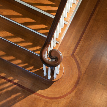
The solution was sectional. The first floor level was elevated from the street by 12 feet, with French doors facing the park. We created a courtyard at the first floor level that provide an outdoor entertaining space, with French doors that open the home to the courtyard.. By elevating the first floor level, we were able to allow on-grade parking and a private direct entrance to the lower level pub "Mulligans". An arched passage affords access to the courtyard from a shared driveway with the neighboring homes, while the stone fountain provides a focus.
A sweeping stone stair anchors one of the existing mature trees that was preserved and leads to the elevated rear garden. The second floor master suite opens to a sitting porch at the level of the upper garden, providing the third level of outdoor space that can be used for the children to play.
The home's traditional language is in context with its neighbors, while the design allows each of the three primary levels of the home to relate directly to the outside.
Builder: Peterson & Collins, Inc
Photos © Anice Hoachlander
 G Squared Design
Photo Credits: Pixil Studios
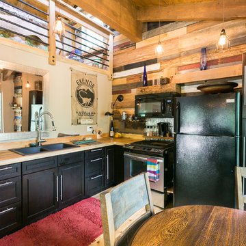
Example of a small mountain style l-shaped medium tone wood floor eat-in kitchen design in Denver with a double-bowl sink, shaker cabinets, black cabinets, wood countertops, wood backsplash, black appliances and no island
Example of a small mountain style l-shaped medium tone wood floor eat-in kitchen design in Denver with a double-bowl sink, shaker cabinets, black cabinets, wood countertops, wood backsplash, black appliances and no island
 catlin stothers design
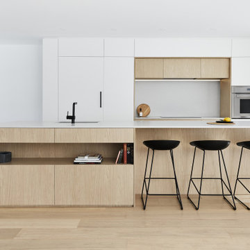
The decision to either renovate the upper and lower units of a duplex or convert them into a single-family home was a no-brainer. Situated on a quiet street in Montreal, the home was the childhood residence of the homeowner, where many memories were made and relationships formed within the neighbourhood. The prospect of living elsewhere wasn’t an option.
A complete overhaul included the re-configuration of three levels to accommodate the dynamic lifestyle of the empty nesters. The potential to create a luminous volume was evident from the onset. With the home backing onto a park, westerly views were exploited by oversized windows and doors. A massive window in the stairwell allows morning sunlight to filter in and create stunning reflections in the open concept living area below.
The staircase is an architectural statement combining two styles of steps, with the extended width of the lower staircase creating a destination to read, while making use of an otherwise awkward space.
White oak dominates the entire home to create a cohesive and natural context. Clean lines, minimal furnishings and white walls allow the small space to breathe.
 G Squared Design
Photo Credits: Pixil Studios
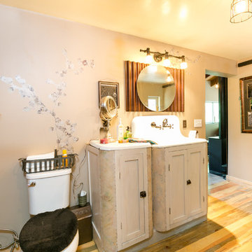
Example of a small mountain style master medium tone wood floor bathroom design in Denver with shaker cabinets, distressed cabinets, a two-piece toilet, beige walls and a drop-in sink
Example of a small mountain style master medium tone wood floor bathroom design in Denver with shaker cabinets, distressed cabinets, a two-piece toilet, beige walls and a drop-in sink
 The Englander Building Company
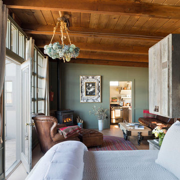
A savvy upgrade of a 1930’s fishing shack on Tomales Bay in Inverness.
The 700-square-foot rental cabin is envisioned as a cozy gentleman’s fishing cabin, reflecting the area’s nautical history, built to fit the context of its surroundings. The cottage is meant to feel like a snapshot in time, where bird watching and reading trump television and technology.
www.seastarcottage.com
Design and Construction by The Englander Building Company
Photography by David Duncan Livingston
 Granit Architects + Interiors
The brief:
Our clients own an apartment in a mansion block overlooking Clapham Common. They wanted to modernise and bring the apartment up to date and had a few goals:
To change the existing small cellular spaces in the apartment to create a new open-plan room
To extend into the loft and create a new master bedroom suite
To create a roof terrace for some much-needed private outdoor space
The key to the brief was to ensure a good connection between the different levels of the apartment and ensure natural light could flood into all spaces. The apartment is in a conservation area, which was an important consideration.
The solution:
We changed the primary room space to run from the front to the back of the building. This change created the large kitchen dining living space our clients wanted, an area with good natural light throughout and at all times of the day.
We created a master bedroom suite in the loft space, with generous room size and lots of natural light.
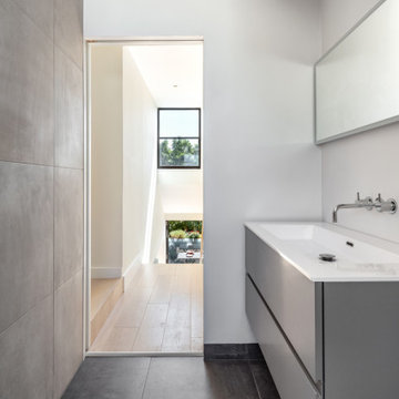
The limitations of the building’s form meant that a critical aspect to creating these larger living spaces was carefully considered smaller areas, including the bathrooms and a pocket utility room. The circulation space was carefully considered, too, with the landings used for storage in the form of new joinery.
The stairs were vital in the design. Creating an in-between/half level meant we made the most of the flat roof extension for a bedroom suite and terrace. It also helped natural light get into the centre of the apartment, creating a clear connection between the different floors.
The stairs also help to mark the difference between the existing and the new. We shifted the design from a minimalist take on traditional metal balustraded stairs to open tread steel stairs with a glazed balustrade.
Externally, we kept the design quite simple and in keeping with the context. By adding dormers to the front and back, we created a sculptural and fun loft space.
The result:
A spacious, light and luxurious apartment for our clients Gareth and Mary in a Clapham Common Conservation area.
We asked about their experience with Granit, and we are pleased with their response:
Our experience overall is very good, even with the unexpected difficulties created by Covid.
If you are thinking of appointing an architect and interior design firm, Granit should be seriously considered.
 Lean Lens Architects
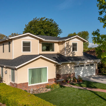
A young growing family was looking for more space to house their needs and decided to add square footage to their home. They loved their neighborhood and location and wanted to add to their single story home with sensitivity to their neighborhood context and yet maintain the traditional style their home had. After multiple design iterations we landed on a design the clients loved. It required an additional planning review process since the house exceeded the maximum allowable square footage. The end result is a beautiful home that accommodates their needs and fits perfectly on their street.
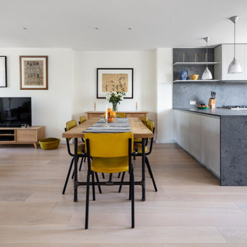 Granit Architects + Interiors
The brief:
Our clients own an apartment in a mansion block overlooking Clapham Common. They wanted to modernise and bring the apartment up to date and had a few goals:
To change the existing small cellular spaces in the apartment to create a new open-plan room
To extend into the loft and create a new master bedroom suite
To create a roof terrace for some much-needed private outdoor space
The key to the brief was to ensure a good connection between the different levels of the apartment and ensure natural light could flood into all spaces. The apartment is in a conservation area, which was an important consideration.
The solution:
We changed the primary room space to run from the front to the back of the building. This change created the large kitchen dining living space our clients wanted, an area with good natural light throughout and at all times of the day.
We created a master bedroom suite in the loft space, with generous room size and lots of natural light.
The limitations of the building’s form meant that a critical aspect to creating these larger living spaces was carefully considered smaller areas, including the bathrooms and a pocket utility room. The circulation space was carefully considered, too, with the landings used for storage in the form of new joinery.
The stairs were vital in the design. Creating an in-between/half level meant we made the most of the flat roof extension for a bedroom suite and terrace. It also helped natural light get into the centre of the apartment, creating a clear connection between the different floors.
The stairs also help to mark the difference between the existing and the new. We shifted the design from a minimalist take on traditional metal balustraded stairs to open tread steel stairs with a glazed balustrade.
Externally, we kept the design quite simple and in keeping with the context. By adding dormers to the front and back, we created a sculptural and fun loft space.
The result:
A spacious, light and luxurious apartment for our clients Gareth and Mary in a Clapham Common Conservation area.
We asked about their experience with Granit, and we are pleased with their response:
Our experience overall is very good, even with the unexpected difficulties created by Covid.
If you are thinking of appointing an architect and interior design firm, Granit should be seriously considered.
 HR DESIGN DEPT
For years, early morning walks past this 1910 Craftsman in Houston's historic Avondale neighborhood left the new owners with lingering fantasies of making it their future home. When it became available, they acquired a home rich with history, but one nearly abolished. The home was once inhabited by Texas Governor (1931-1932) and founder of Humble Oil, Ross Sterling. But, renovations subdivided the home into multi-family rentals and destroyed original finishes. The developer driven modifications were abruptly halted by city red tags in 2018 after original windows were demolished and replaced with vinyl substitutes.
With a nearly clean slate on the interior, the HRDD renovation aims to be respectful to the original context while providing coplimentary modern surprises atypical to the era. One such example is a new opening that punctures through the second floor, extending to a roof skylight. Situated at the transition between formal and informal rooms on the first floor and common space on the second floor, this subtraction is lined with a scalloped wood screen. The screen is one of multiple moments within the home where texture will combine with minimal white surfaces, providing a backdrop to the owners' collection of antique Indian furniture pieces.
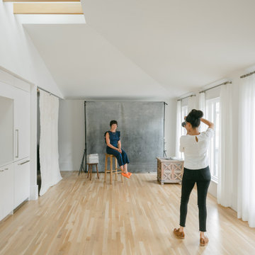
Additionally, a new detached replaced an existing dilapidated garage apartment and contains the owner's photography studio. Windows and a skylight are placed to capture coveted north light, ideal for photographing and editing. The main room remains an austere slate, with ceiling vaulting to a single aperture to create a dynamic moment that carries a dialogue to the opening in the main home.
 The Englander Building Company
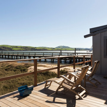
A savvy upgrade of a 1930’s fishing shack on Tomales Bay in Inverness.
The 700-square-foot rental cabin is envisioned as a cozy gentleman’s fishing cabin, reflecting the area’s nautical history, built to fit the context of its surroundings. The cottage is meant to feel like a snapshot in time, where bird watching and reading trump television and technology.
www.seastarcottage.com
Design and Construction by The Englander Building Company
Photography by David Duncan Livingston
 John Lum Architecture, Inc. AIA
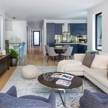
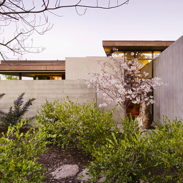
This single-family plus ADU project started out as a remodel. Through a very difficult and contentious planning process (over three years), it became a demolition and rebuild to appease neighbors, yielding a three-bedroom main house and a two-bedroom basement ADU. The design responds to the context using a sloped anterior roof that aligns with the neighbor’s to accentuate the dramatic views of downtown San Francisco.
 American Institute of Architects, San Francisco
Conceived as a series of interconnected pavilions enclosing a garden, the courtyard-house typology is utilized to achieve private interiority within the suburban context. The strategic interplay of light and shadow, expansion and contraction, solidity and lightness is used to derive spatial richness. The house incorporates fuel cell and solar panel technologies, passive cooling, greywater reclamation, and extensive use of reclaimed finish materials. Photography by Matthew Millman

 CITYDESKSTUDIO, Inc.
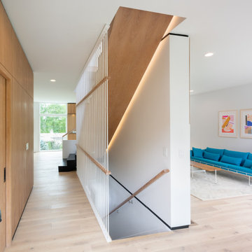
Aspect 221 is a multi-experiential home designed for a multi-generational family. Set on a sloping corner property in a 1960's Golden Valley neighborhood, this home offers a variety of ways to connect to the immediate landscapes and distant views. The house itself is divided vertically with interaction between families occurring through the centrally located sculptural stair. Horizontal movement in each direction leads to distinct environments provided for the families; multiple habitats offering variety of space, light, and privacy.
Expanding towards the west, the property takes advantage of the sweeping views and provides a perfect opportunity for a walk-out lower level and tuck under garage. The young family occupies the middle and upper floors, while the parents occupy the lower level. Each family has their own private entry and dedicated outdoor space. The home has 4 distinct outdoor spaces; a north shade deck and south sun deck, as well as an upper east lawn and lower west lawn. These spaces provide multiple habitats for the families to come together or move apart, offering variety and privacy.
We designed Aspect 221 with a nod to the various “aspects” offered by the site and its natural context. The base of the house is a black monolithic plinth anchored into the hillside, containing the garage and older parent’s home. This allows the upper two floors, enclosed in a fractured white and wood box, to remain humanly scaled and to move and gesture freely by twisting the middle floor off axis, and then twisting the upper floor off axis again. Each level offers views in varied directions revealing the site in different ways as you rise in elevation.
Location: Golden Valley, MN
Project Team:
Ben Awes, AIA, Principal-In-Charge
Chris Bach
Nate Dodge
 Ground One Landscape Design + Build
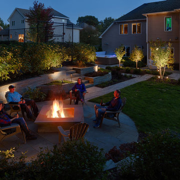
This visually simple, modern solution is unique within its suburban context, and gives this family the custom landscape of their dreams. The homeowners’ wish list included a modern design and clearly defined spaces: a larger dining patio, firepit patio, hot tub, and a 4-season sport court (which gets flooded for ice hockey in the winter).
Circulation and screening were key in Ground One’s landscape design. A sport court could overwhelm the entire backyard, so it was raised three feet above the primary backyard to physically separate different spaces, and minimize its visual impact. Rectangular bluestone in a running bond pattern was used in all the gathering spaces (dining, firepit, hot tub). Bluestone walls reinforce a simple material palette.
A larger dining patio was installed near the house for greater entertaining flexibility. Plank paver paths connect to a private hot tub area and allow kids to don hockey gear and enter the sport court without messing up the house. The firepit patio is at the back of the property, nestled into the existing hillside under a large oak and below the sport court terrace.
Plantings reinforce the geometry of each gathering space, provide focal points, and create layers of screening and separation from any given vantage point. Hardy species were selected for their low-maintenance requirements and various seasons of interest. Landscape lighting was incorporated to provide way finding between the patios, accent various hardscape elements, and highlight the trees.
42