
Search results for "Continually enhance" in Home Design Ideas

 7th House Interiors
Example of a small danish master white tile and subway tile ceramic tile, black floor and double-sink alcove shower design in Tampa with flat-panel cabinets, brown cabinets, a one-piece toilet, white walls, a vessel sink, quartz countertops, a hinged shower door, white countertops and a freestanding vanity

 DANIELLE Interior Design & Decor
Embark on a culinary crave with this classic gray and white family kitchen. We chose a warm neutral color for the cabinetry and enhanced this warmth with champagne gold cabinet hardware. These warm gray cabinets can be found at your neighborhood Lowes while the champagne hardware are designed by Atlas. Add another accent of shine to your kitchen and check out the mother of pearl diamond mosaic tile backsplash by Jeffrey Court, as seen here. Adding this hint of sparkle to your small space will allow your kitchen to stay bright and chic. Don't be afraid to mix metals or color. This island houses the glass cook top with a stainless steel hood above the island, and we added a matte black as our finish for the Edison lighting as well as black bar stool seating to tie it all together. The Taj Mahal white Quartzite counter tops are a beauty. The contrast in color creates dimension to your small kitchen layout and will continually catch your eye.
Designed by Dani Perkins @ DANIELLE Interior Design & Decor
Taylor Abeel Photography

 Klopf Architecture
Klopf Architecture, Arterra Landscape Architects and Henry Calvert of Calvert Ventures Designed and built a new warm, modern, Eichler-inspired, open, indoor-outdoor home on a deeper-than-usual San Mateo Highlands property where an original Eichler house had burned to the ground.
The owners wanted multi-generational living and larger spaces than the original home offered, but all parties agreed that the house should respect the neighborhood and blend in stylistically with the other Eichlers. At first the Klopf team considered re-using what little was left of the original home and expanding on it. But after discussions with the owner and builder, all parties agreed that the last few remaining elements of the house were not practical to re-use, so Klopf Architecture designed a new home that pushes the Eichler approach in new directions.
One disadvantage of Eichler production homes is that the house designs were not optimized for each specific lot. A new custom home offered the team a chance to start over. In this case, a longer house that opens up sideways to the south fit the lot better than the original square-ish house that used to open to the rear (west). Accordingly, the Klopf team designed an L-shaped “bar” house with a large glass wall with large sliding glass doors that faces sideways instead of to the rear like a typical Eichler. This glass wall opens to a pool and landscaped yard designed by Arterra Landscape Architects.
Driving by the house, one might assume at first glance it is an Eichler because of the horizontality, the overhanging flat roof eaves, the dark gray vertical siding, and orange solid panel front door, but the house is designed for the 21st Century and is not meant to be a “Likeler.” You won't see any posts and beams in this home. Instead, the ceiling decking is a western red cedar that covers over all the beams. Like Eichlers, this cedar runs continuously from inside to out, enhancing the indoor / outdoor feeling of the house, but unlike Eichlers it conceals a cavity for lighting, wiring, and insulation. Ceilings are higher, rooms are larger and more open, the master bathroom is light-filled and more generous, with a separate tub and shower and a separate toilet compartment, and there is plenty of storage. The garage even easily fits two of today's vehicles with room to spare.
A massive 49-foot by 12-foot wall of glass and the continuity of materials from inside to outside enhance the inside-outside living concept, so the owners and their guests can flow freely from house to pool deck to BBQ to pool and back.
During construction in the rough framing stage, Klopf thought the front of the house appeared too tall even though the house had looked right in the design renderings (probably because the house is uphill from the street). So Klopf Architecture paid the framer to change the roofline from how we had designed it to be lower along the front, allowing the home to blend in better with the neighborhood. One project goal was for people driving up the street to pass the home without immediately noticing there is an "imposter" on this lot, and making that change was essential to achieve that goal.
This 2,606 square foot, 3 bedroom, 3 bathroom Eichler-inspired new house is located in San Mateo in the heart of the Silicon Valley.
Klopf Architecture Project Team: John Klopf, AIA, Klara Kevane
Landscape Architect: Arterra Landscape Architects
Contractor: Henry Calvert of Calvert Ventures
Photography ©2016 Mariko Reed
Location: San Mateo, CA
Year completed: 2016
Find the right local pro for your project

 David R. Lamb, Landscape Architect
This propery is situated on the south side of Centre Island at the edge of an oak and ash woodlands. orignally, it was three properties having one house and various out buildings. topographically, it more or less continually sloped to the water. Our task was to creat a series of terraces that were to house various functions such as the main house and forecourt, cottage, boat house and utility barns.
The immediate landscape around the main house was largely masonry terraces and flower gardens. The outer landscape was comprised of heavily planted trails and intimate open spaces for the client to preamble through. As the site was largely an oak and ash woods infested with Norway maple and japanese honey suckle we essentially started with tall trees and open ground. Our planting intent was to introduce a variety of understory tree and a heavy shrub and herbaceous layer with an emphisis on planting native material. As a result the feel of the property is one of graciousness with a challenge to explore.

 FINNE Architects
The Mazama house is located in the Methow Valley of Washington State, a secluded mountain valley on the eastern edge of the North Cascades, about 200 miles northeast of Seattle.
The house has been carefully placed in a copse of trees at the easterly end of a large meadow. Two major building volumes indicate the house organization. A grounded 2-story bedroom wing anchors a raised living pavilion that is lifted off the ground by a series of exposed steel columns. Seen from the access road, the large meadow in front of the house continues right under the main living space, making the living pavilion into a kind of bridge structure spanning over the meadow grass, with the house touching the ground lightly on six steel columns. The raised floor level provides enhanced views as well as keeping the main living level well above the 3-4 feet of winter snow accumulation that is typical for the upper Methow Valley.
To further emphasize the idea of lightness, the exposed wood structure of the living pavilion roof changes pitch along its length, so the roof warps upward at each end. The interior exposed wood beams appear like an unfolding fan as the roof pitch changes. The main interior bearing columns are steel with a tapered “V”-shape, recalling the lightness of a dancer.
The house reflects the continuing FINNE investigation into the idea of crafted modernism, with cast bronze inserts at the front door, variegated laser-cut steel railing panels, a curvilinear cast-glass kitchen counter, waterjet-cut aluminum light fixtures, and many custom furniture pieces. The house interior has been designed to be completely integral with the exterior. The living pavilion contains more than twelve pieces of custom furniture and lighting, creating a totality of the designed environment that recalls the idea of Gesamtkunstverk, as seen in the work of Josef Hoffman and the Viennese Secessionist movement in the early 20th century.
The house has been designed from the start as a sustainable structure, with 40% higher insulation values than required by code, radiant concrete slab heating, efficient natural ventilation, large amounts of natural lighting, water-conserving plumbing fixtures, and locally sourced materials. Windows have high-performance LowE insulated glazing and are equipped with concealed shades. A radiant hydronic heat system with exposed concrete floors allows lower operating temperatures and higher occupant comfort levels. The concrete slabs conserve heat and provide great warmth and comfort for the feet.
Deep roof overhangs, built-in shades and high operating clerestory windows are used to reduce heat gain in summer months. During the winter, the lower sun angle is able to penetrate into living spaces and passively warm the exposed concrete floor. Low VOC paints and stains have been used throughout the house. The high level of craft evident in the house reflects another key principle of sustainable design: build it well and make it last for many years!
Photo by Benjamin Benschneider


 FINNE Architects
The Mazama house is located in the Methow Valley of Washington State, a secluded mountain valley on the eastern edge of the North Cascades, about 200 miles northeast of Seattle.
The house has been carefully placed in a copse of trees at the easterly end of a large meadow. Two major building volumes indicate the house organization. A grounded 2-story bedroom wing anchors a raised living pavilion that is lifted off the ground by a series of exposed steel columns. Seen from the access road, the large meadow in front of the house continues right under the main living space, making the living pavilion into a kind of bridge structure spanning over the meadow grass, with the house touching the ground lightly on six steel columns. The raised floor level provides enhanced views as well as keeping the main living level well above the 3-4 feet of winter snow accumulation that is typical for the upper Methow Valley.
To further emphasize the idea of lightness, the exposed wood structure of the living pavilion roof changes pitch along its length, so the roof warps upward at each end. The interior exposed wood beams appear like an unfolding fan as the roof pitch changes. The main interior bearing columns are steel with a tapered “V”-shape, recalling the lightness of a dancer.
The house reflects the continuing FINNE investigation into the idea of crafted modernism, with cast bronze inserts at the front door, variegated laser-cut steel railing panels, a curvilinear cast-glass kitchen counter, waterjet-cut aluminum light fixtures, and many custom furniture pieces. The house interior has been designed to be completely integral with the exterior. The living pavilion contains more than twelve pieces of custom furniture and lighting, creating a totality of the designed environment that recalls the idea of Gesamtkunstverk, as seen in the work of Josef Hoffman and the Viennese Secessionist movement in the early 20th century.
The house has been designed from the start as a sustainable structure, with 40% higher insulation values than required by code, radiant concrete slab heating, efficient natural ventilation, large amounts of natural lighting, water-conserving plumbing fixtures, and locally sourced materials. Windows have high-performance LowE insulated glazing and are equipped with concealed shades. A radiant hydronic heat system with exposed concrete floors allows lower operating temperatures and higher occupant comfort levels. The concrete slabs conserve heat and provide great warmth and comfort for the feet.
Deep roof overhangs, built-in shades and high operating clerestory windows are used to reduce heat gain in summer months. During the winter, the lower sun angle is able to penetrate into living spaces and passively warm the exposed concrete floor. Low VOC paints and stains have been used throughout the house. The high level of craft evident in the house reflects another key principle of sustainable design: build it well and make it last for many years!
Photo by Benjamin Benschneider

 Smith & Ragsdale Interior Design
While this new home had an architecturally striking exterior, the home’s interior fell short in terms of true functionality and overall style. The most critical element in this renovation was the kitchen and dining area, which needed careful attention to bring it to the level that suited the home and the homeowners.
As a graduate of Culinary Institute of America, our client wanted a kitchen that “feels like a restaurant, with the warmth of a home kitchen,” where guests can gather over great food, great wine, and truly feel comfortable in the open concept home. Although it follows a typical chef’s galley layout, the unique design solutions and unusual materials set it apart from the typical kitchen design.
Polished countertops, laminated and stainless cabinets fronts, and professional appliances are complemented by the introduction of wood, glass, and blackened metal – materials introduced in the overall design of the house. Unique features include a wall clad in walnut for dangling heavy pots and utensils; a floating, sculptural walnut countertop piece housing an herb garden; an open pantry that serves as a coffee bar and wine station; and a hanging chalkboard that hides a water heater closet and features different coffee offerings available to guests.
The dining area addition, enclosed by windows, continues to vivify the organic elements and brings in ample natural light, enhancing the darker finishes and creating additional warmth.
Photography by Ira Montgomery

 FineLine Kitchens, Inc.
Hi everyone, I'm Sarah and Ogun we are here with fine line kitchens. So we are a couple working together. I do the interior design and remodeling of the space material selection meeting with the clients. And I handled operations outside, you know meaning all the construction work that is taking place the inside. The houses that we work in. I handle all the aspects of the construction, so today's project is very special. We're in Vienna and the client had a very big family. It's a family of seven that lives here. So we had a few aspects that we needed to keep in mind while designing this one. Having everybody be able to sit on the island. So we wanted plenty of seating all the way around. We didn't want anybody standing or anything like that. So what we did is we maximize the space. The center island is the biggest part of the kitchen. We use a natural stone to kind of give it a beautiful texture versus quartz. It's kind of standard white or kind of fabricated, so I wanted something very natural. We did this because I took my inspiration from the outside, so the inspiration if you look at the view right in front of me is there are so many greens there's a lot of brass accents and I wanted to bring this. Into this kitchen while designing it for my clients. She is very warm very. She wanted a very homey, comfy kind of look for the kitchen. So that's what we did today. As you can see, the cabinets are sage green, very light, so I still think it's a neutral, but it's a lighter color that again brings the outside in and we combine that with the oak right behind me so it's a slightly warm oak. It's not very dark. It's not very light. It's a medium brown and the same color went on the island. To kind of tie these two in and the backsplash, my favorite part is where you can see a little bit of design. It is, in my opinion still classic, but includes a pattern so the outside part is as we said in the beginning, is handled by my husband. I'd like him to speak a little bit about that. Thanks, Sarah, I want to talk to you guys a little bit about the construction part of this project. Originally this kitchen was located mostly in this area. They had their stove there sing. It was more of a peninsula layout in Sarah's and the customer vision they wanted. They wanted to get rid of the peninsula and they want to be able to have a huge island that can at least sit seven people because they're familiar with seven. So we wanted to make sure that we can achieve this design and bring it to life so that they can be happy with this layout. Some of the challenges we had, the house, the home being, you know, old home. There were a lot of you know the older electrical and plumbing that had to be replaced. We had to relocate the stove from here to this area. Over here we had put a nice foot fan that we had to relocate all the ductwork and the plumbing. Was being on the peninsula area. We had to relocate it to the center islands. So we achieved all this and kind of like bring it to bring in this kitchen up to date it looks beautiful. That's true, so yes, the old layout did not function for my clients because everything was kind of gathered on one side of the kitchen. So there was like a peninsula right there. So the end of this island kind of continued straight. And that was just the L shape. Kind of where everything was and there used to be another big table here, so they were using only kind of half of the space. So like I said at the beginning, our vision was to kind of feed everybody at the island, create some symmetry. 'cause I love that. So as you can see behind me, this is kind of the focal point symmetrical. Everything is kind of even we wanted to also panel the fridge here so it mimics the pantry and another size. So when you're looking at it, it is bringing again that symmetry back again. I hope you enjoyed this kitchen and this video and I'll see you soon. So how do you think this project turned out? It's nice. I like the color. I think it turned out nice. It's kind of like a little bit different color than what we always do. So I realize. Are you giving me a little bit of credit here that I did something different? Are you proud? I'm so proud of you. Other than that I like it. That they have kind of like a two sink. So if this was our kitchen, if we ever like you can have your own. I can have mine if we ever get into a fight then this can be like my own kitchen. Why are we gonna bring in a fight right now? So I'm cooking anyway. You're grilling most of the time, So what are you even talking about? My kitchen? That's my kitchen. You can just take the small sink. That's fine. It's always good to have your own space right there, so anyways. Thank you guys for watching. We hope to see you soon and if you have any questions please click the link below. It'll lead you to our website, house, YouTube and all of the social media is so nice to have you guys. We'll see you soon. Thanks bye bye-bye.
 Klopf Architecture
Klopf Architecture, Arterra Landscape Architects and Henry Calvert of Calvert Ventures Designed and built a new warm, modern, Eichler-inspired, open, indoor-outdoor home on a deeper-than-usual San Mateo Highlands property where an original Eichler house had burned to the ground.
The owners wanted multi-generational living and larger spaces than the original home offered, but all parties agreed that the house should respect the neighborhood and blend in stylistically with the other Eichlers. At first the Klopf team considered re-using what little was left of the original home and expanding on it. But after discussions with the owner and builder, all parties agreed that the last few remaining elements of the house were not practical to re-use, so Klopf Architecture designed a new home that pushes the Eichler approach in new directions.
One disadvantage of Eichler production homes is that the house designs were not optimized for each specific lot. A new custom home offered the team a chance to start over. In this case, a longer house that opens up sideways to the south fit the lot better than the original square-ish house that used to open to the rear (west). Accordingly, the Klopf team designed an L-shaped “bar” house with a large glass wall with large sliding glass doors that faces sideways instead of to the rear like a typical Eichler. This glass wall opens to a pool and landscaped yard designed by Arterra Landscape Architects.
Driving by the house, one might assume at first glance it is an Eichler because of the horizontality, the overhanging flat roof eaves, the dark gray vertical siding, and orange solid panel front door, but the house is designed for the 21st Century and is not meant to be a “Likeler.” You won't see any posts and beams in this home. Instead, the ceiling decking is a western red cedar that covers over all the beams. Like Eichlers, this cedar runs continuously from inside to out, enhancing the indoor / outdoor feeling of the house, but unlike Eichlers it conceals a cavity for lighting, wiring, and insulation. Ceilings are higher, rooms are larger and more open, the master bathroom is light-filled and more generous, with a separate tub and shower and a separate toilet compartment, and there is plenty of storage. The garage even easily fits two of today's vehicles with room to spare.
A massive 49-foot by 12-foot wall of glass and the continuity of materials from inside to outside enhance the inside-outside living concept, so the owners and their guests can flow freely from house to pool deck to BBQ to pool and back.
During construction in the rough framing stage, Klopf thought the front of the house appeared too tall even though the house had looked right in the design renderings (probably because the house is uphill from the street). So Klopf Architecture paid the framer to change the roofline from how we had designed it to be lower along the front, allowing the home to blend in better with the neighborhood. One project goal was for people driving up the street to pass the home without immediately noticing there is an "imposter" on this lot, and making that change was essential to achieve that goal.
This 2,606 square foot, 3 bedroom, 3 bathroom Eichler-inspired new house is located in San Mateo in the heart of the Silicon Valley.
Klopf Architecture Project Team: John Klopf, AIA, Klara Kevane
Landscape Architect: Arterra Landscape Architects
Contractor: Henry Calvert of Calvert Ventures
Photography ©2016 Mariko Reed
Location: San Mateo, CA
Year completed: 2016

 Drury Design
The homeowners were seeking a major renovation from their original master bath. The young family had completed several remodeling projects on the first floor of their 1980’s era home and the time had finally come where they wanted to focus on the second floor, particularly their master bath which was cramped and overpowered by a Jacuzzi-style tub.
After multiple design meetings spent choosing the right hardware and materials, everything was set, and the transformation began! Drury designer, Diana Burton, began by borrowing some space from the bedroom this way they were able to reconfigure the whole layout, which made a big difference to the homeowner. The floating vanity cabinets paired with quartz counters, wall-mounted fixtures, and mirrors featuring built-in lighting enhance the room’s sleek, clean look.

 Kamm Architecture
This historic, 19th mansion, located in Washington, DC's Dupont Circle, was redesigned to house four modern, luxury condominiums.
Photo: Anice Hoachlander
www.hdphoto.com
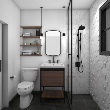
 daniStudio
The black and white palette is paired with the warmth of the wood tones to create a “spa-like” feeling in this urban design concept.
Salient features:
free-standing vanity
medicine cabinet
decorative pendant lights
3 dimensional accent tiles

 Jess Cooney Interiors
The master bathroom was expanded into a bright modern space complete with a custom double vanity. Concrete-like quartz continues up the backsplash and complements the brass finishes.

 The Works
Inspiration for a mid-sized transitional dark wood floor and brown floor powder room remodel in Portland with white walls and a console sink

 Sergio Mercado Design
Joshua McHugh
Inspiration for a mid-sized modern master gray tile and travertine tile travertine floor and gray floor corner shower remodel in New York with flat-panel cabinets, light wood cabinets, a wall-mount toilet, gray walls, an undermount sink, limestone countertops, a hinged shower door and gray countertops
Inspiration for a mid-sized modern master gray tile and travertine tile travertine floor and gray floor corner shower remodel in New York with flat-panel cabinets, light wood cabinets, a wall-mount toilet, gray walls, an undermount sink, limestone countertops, a hinged shower door and gray countertops

 Equilibrium Interior Design Inc
The layout of the master bathroom was created to be perfectly symmetrical which allowed us to incorporate his and hers areas within the same space. The bathtub crates a focal point seen from the hallway through custom designed louvered double door and the shower seen through the glass towards the back of the bathroom enhances the size of the space. Wet areas of the floor are finished in honed marble tiles and the entire floor was treated with any slip solution to ensure safety of the homeowners. The white marble background give the bathroom a light and feminine backdrop for the contrasting dark millwork adding energy to the space and giving it a complimentary masculine presence.
Storage is maximized by incorporating the two tall wood towers on either side of each vanity – it provides ample space needed in the bathroom and it is only 12” deep which allows you to find things easier that in traditional 24” deep cabinetry. Manmade quartz countertops are a functional and smart choice for white counters, especially on the make-up vanity. Vanities are cantilevered over the floor finished in natural white marble with soft organic pattern allow for full appreciation of the beauty of nature.
This home has a lot of inside/outside references, and even in this bathroom, the large window located inside the steam shower uses electrochromic glass (“smart” glass) which changes from clear to opaque at the push of a button. It is a simple, convenient, and totally functional solution in a bathroom.
The center of this bathroom is a freestanding tub identifying his and hers side and it is set in front of full height clear glass shower enclosure allowing the beauty of stone to continue uninterrupted onto the shower walls.
Photography: Craig Denis
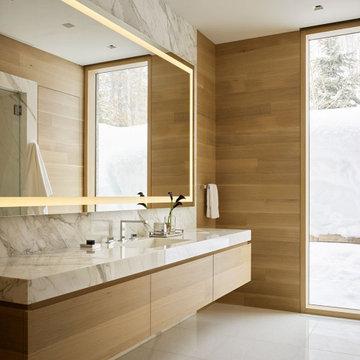
 CLB Architects
The formal proportions, material consistency, and painstaking craftsmanship in Five Shadows were all deliberately considered to enhance privacy, serenity, and a profound connection to the outdoors.
Architecture by CLB – Jackson, Wyoming – Bozeman, Montana. Interiors by Philip Nimmo Design.
 Smith & Ragsdale Interior Design
While this new home had an architecturally striking exterior, the home’s interior fell short in terms of true functionality and overall style. The most critical element in this renovation was the kitchen and dining area, which needed careful attention to bring it to the level that suited the home and the homeowners.
As a graduate of Culinary Institute of America, our client wanted a kitchen that “feels like a restaurant, with the warmth of a home kitchen,” where guests can gather over great food, great wine, and truly feel comfortable in the open concept home. Although it follows a typical chef’s galley layout, the unique design solutions and unusual materials set it apart from the typical kitchen design.
Polished countertops, laminated and stainless cabinets fronts, and professional appliances are complemented by the introduction of wood, glass, and blackened metal – materials introduced in the overall design of the house. Unique features include a wall clad in walnut for dangling heavy pots and utensils; a floating, sculptural walnut countertop piece housing an herb garden; an open pantry that serves as a coffee bar and wine station; and a hanging chalkboard that hides a water heater closet and features different coffee offerings available to guests.
The dining area addition, enclosed by windows, continues to vivify the organic elements and brings in ample natural light, enhancing the darker finishes and creating additional warmth.
Photography by Ira Montgomery

 Krueger Architects
Ulimited Style Photography
Inspiration for a mid-sized modern tile patio fountain remodel in Los Angeles with an awning
Inspiration for a mid-sized modern tile patio fountain remodel in Los Angeles with an awning
1