
Search results for "Continue reading" in Home Design Ideas
 Advance Design Studio, Ltd.
Jennifer and Dan have lived in their Deer Park Illinois home for 15 years, slowly making minor fixes like painting and decorating; but they had a new plan for their kitchen the entire time. An awkwardly placed garage door, and an island cooktop with a terrible downdraft made a full-scale kitchen remodel an absolute must. Jennifer had many ideas in mind and wanted to work with a company that could provide high-end work, while partnering with a designer that would tailor the kitchen to her ideas.
She was intrigued by the phrase “Common Sense Remodeling” in Advance Design’s feature she discovered while perusing an issue of the community’s Quintessential Barrington Magazine. Doing further research on the company’s website, as she looked through project profiles and read about Advance Design’s “Common Sense Remodeling” philosophy, she promptly scheduled an appointment to see if the people and ideas she read about were truly who they said they were. The more she read, the more she knew that the “Common Sense” approach to remodeling they described was exactly the type of company she was looking for.
The partnership was sealed after an initial consultation with Owner Todd Jurs and Project Designer Michelle Lecinski. They displayed a combination of friendliness, professionalism and respect that was unmatched by any of the other companies Jennifer talked to. She knew that with Advance Design, she would be able to retain the vision that she had in mind with high-quality craftsmanship.
“I reached out to Advance Design because of the ‘Common Sense Remodeling’ tagline,” Jennifer said. “That’s what lingered for me”. “Advance Design was the most respectful- of the house and of my design ideas, and the most professional of the handful of companies that looked at my project”.
Soon after the meeting Jennifer began working with Michelle on the project design. They quickly developed chemistry. Jennifer loved how Michelle researched and located every detail that Jennifer wanted for the kitchen. Between the two of them, every concept and idea was worked through and perfected. “Jennifer had definite ideas about what she wanted the new kitchen to look like, she just didn’t know how to bring it all together. We worked together really well to make her ideas into the practical reality necessary for a well-functioning kitchen, with the look and feel that she had envisioned”, says Michelle.
“Michelle was wonderful in using the CAD system she would show me new drawings every time we changed the layout while working through the design,” Jennifer said. “She was a really wonderful partner in execution, she made sure everything happened quickly and easily.”
The finished design drew out elements of Jennifer’s style and personality. The pair call the look “sophisticated farmhouse” to describe the kitchen renovation to family and friends. The result was a beautifully crafted, authentic-feeling space that satisfied Jennifer’s dreams 15 years in the making. The whole project consisted of a kitchen remodel, mudroom upgrade with powder room, and garage entry relocation. “The projects I personally like the best, are the ones that put the client’s dreams on display,” Project Designer Michelle said. “And this is one of those projects.”
The main focal point of the kitchen is custom zinc and brass ventilation hood with a vintage sheen, which was hand made to order by a small company in Indiana named Vogler Metalworking. “It’s like sculpture, a true work of art”, says Jennifer. Your eye is immediately drawn towards this elegant yet practical hood that eliminated the home’s downdraft problem and added a striking conversation piece at the same time. The carpenters had to use special gloves when transporting and installing it, so they didn’t smudge it with fingerprints. The beautiful hood centers proudly over the stunning black enamel and brass LaCornue Range. “I had a friend who had a LaCornue range and after learning how easy it was to cook perfect meals, I was convinced I wanted to have one”, says Jennifer. This unique, breathtaking combination anchors the entire kitchen and is apparent immediately as you walk into the great room the surrounds the space.
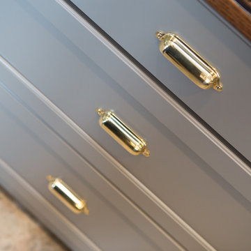
DuraSupreme Crestwood cabinets with a Kendall Panel add function and sophistication. A custom gray paint color paired with a storm blue was developed so that the new kitchen looked like it belonged to the existing space. Unlacquered brass faucets and hardware were important to Jennifer because she wanted the living finishes to age over time. Remarkable brass diamond mesh cabinet door inserts imported from the UK continue to add this one-of-a-kind kitchen renovation; giving it a “you won’t see this everywhere” quality. The use of old railcar flooring for the coffee bar countertop and reclaimed oak for the open shelving gives an authenticity to the space uncommon in kitchens today.
Jennifer and Michelle fell in love with the Limestone Grey Stone while they were investigating unique island countertop ideas. They liked the fact that the limestone as a living finish will age and change over time. Calcutta Miel Quartz countertops made for an excellent pairing around the perimeter, as it’s durable and perfect for cooking preparations. A textured white subway tile backsplash that runs to the ceiling keeps your eye moving towards the open shelving, and to the main focal point of the stunning range hood combination.
“The kitchen functions beautifully, and it’s gorgeous,” beams Jennifer as she gestures with both hands while smiling ear to ear. “The most important thing was I wanted a kitchen that had a wonderful flow, cooked beautiful meals and was a great gathering place for family and friends, and this space does that perfectly! Beauty wise, it turned out exactly how I had envisioned. I felt the function part was the hardest part, and that was nailed”!
Relocating the garage entry to the new mudroom was a huge priority and has finally separated the family’s arriving home functions from their kitchen. Now coats and shoes and bags have their own area for dropping once members arrive home. Matching gray DuraSupreme cabinetry helped create gorgeous, purposeful lockers for the family. A reclaimed vintage sink and custom wall paper were added to the tiny powder room to beautify the once previously only functional space. Advance Design was even able to create a custom space for their dog to sleep while the family is away.
“It was unbelievable that a project of this size was completed in such a short time, and I think that’s because of the large amount of planning and preparation that went into it,” Jennifer marveled, “When we started, we were ready, and everything was prepared”.
When it came to execution, Project Manager Justin Davis and his crew were quick, accessible, and organized. Projects like this kitchen are typically completed in as little as 8-10 weeks. Jennifer’s kitchen however despite the relocation of some challenging HVAC in a soffit and moving of an exterior door was completed remarkably fast in part because the team was working with an existing tile floor that ran throughout the first floor that the client really loved.
“You get to know these people really well because they’re living in your house while you’re living in your house. They were so fast and really good, it didn’t take as long as even planned” reported Jennifer. “I would text Justin and he always responded almost immediately. I got to know all the guys who were working in our house and they were all wonderful people”.
Details in a customized kitchen like this one require skill and care from the people who install it. “All the guys on the job were skilled at what the did. I wanted small details like little feet to look like furniture, that is where their carpentry skill came in to make these all perfect”, said Jennifer. “The tile guys were wonderful. They even let me determine how I wanted the texture with the grout to appear for a salt and pepper look; now that is a very skilled trade person making it custom”.
In Jennifer’s interview, she continued to reference Advance Design’s “Common Sense Remodeling”, so I took a minute to ask her exactly what that phrase meant to her and how it played out in her experience with her project and the Advance Design team. Here is what she said: “I was intrigued about Common Sense Remodeling and in my head that there would be clear costs and prices, great communication between the design team, the execution team and me”, said Jennifer. They did deliver on that, it was so clear about the cost breakdown, what I could expect from everyone who came to my house, and everything that we had ordered. That to me is the Common Sense”!
It’s great to see a client take literally our assertion that a well-planned remodeling project is simply “Common Sense”! She anticipated each step of the way would be clear, concise, and predictable, all the while protecting the outcome due to the careful upfront planning. “Advance Design delivered on their ‘Common Sense Remodeling’ promise,” Jennifer said. “From the design team, to the execution team - everything was straight forward like I imagined. The project turned out exactly how I envisioned, I enjoyed this process and absolutely would recommend Advance Design Studio to anyone.”
 Kitchen Design Concepts
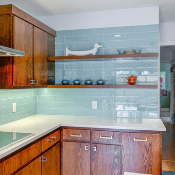
we wanted to preserve the mid-century modern feel (talk about a real flashback!), and boy, do we love the results! This kitchen is another perfect example of a project where we did the “lipstick and make-up” – another term for replacing the more cosmetic features such as countertops, backsplash, and the door and drawer fronts. Even doing so, the resulting kitchen leaves us with a breath of fresh air! To learn more about this space, continue reading below:
Cabinetry
To start, we removed the soffit in the kitchen making the space look taller. Next, we did not rip out the cabinetry boxes, because we were inspired by the finish and look of what existed. Maintaining the finish of the cabinets helped preserve the retro feel and is a good example of repurposing what you already have! As a result, we replaced the door and drawer fronts with a new slab style in a matching medium stain. In addition to the cabinetry fronts, we installed floating shelves – a perfect spot to display!
Countertops
For countertops we wanted something light and bright, and also something that would look good with the other finishes. As a result, we kept it simple with a light and bright surface from Caesarstone in the color “Blizzard”
Backsplash
Now for a little fun and a pop of color, the tile. The tile we selected is fresh, exciting, and also ties everything together giving that mid-century modern feel. In a brick-lay installation, we have a Glazzio Crystile Series, in a 4×12 size, with a finish of Soft Mint.
Fixtures and Fittings
Completing the space, we finished the cabinetry with U-Turn knob’s on the doors, and U-turn pulls on the drawers. Then from Blanco, we have a Quatrus stainless steel sink and a Culina mini faucet in satin nickel.
 Kitchen Design Concepts
We introduce to you one of our newer services we are providing here at Kitchen Design Concepts: spaces that just need a little reviving! As of recent, we are taking on projects that are in need of minimal updating, as in, spaces that don’t need a full-on remodel. Yes, you heard right! If your space has good bones, you like the layout of your kitchen, and you just need a few cosmetic changes, then today’s feature is for you! Recently, we updated a space where we did just this! The kitchen was in need of a little love, some fresh paint, and new finishes. And if we’re being honest here, the result looks almost as if the kitchen had a full-on remodel! To learn more about this space and how we did our magic, continue reading below:
The Before and After
First, see what an impact new finishes can make! The “before” image shows a kitchen with outdated finishes such as the tile countertops, backsplash, and cabinetry finish. The “after” image, is a kitchen that looks almost as if its brand new, the image speaks for itself!
Cabinetry
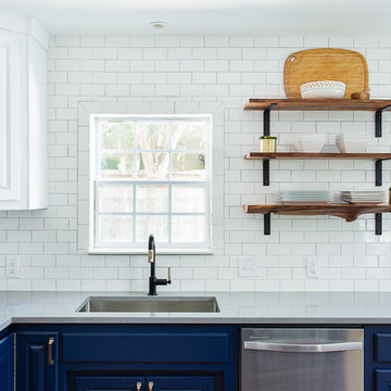
With the wooden cabinetry in this kitchen already having great bones, all we needed to do was our refinishing process that involved removing door and drawer fronts, sanding, priming, and painting. The main color of the cabinetry is white (Sherwin Williams Pure White 7005) and as an accent, we applied a deep navy blue that really pops in this space (Sherwin Willaims Naval 6244). As a special design element, we incorporated a natural wooden band across the hood which is subtle but adds an element of surprise.
Countertops
The original countertops in this space were a 12×12 tile with cracks and discolored grout from all the wear and tear. To replace the countertops, we installed a clean and crisp quartz that is not only durable but easy to maintain (no grout here!). The 3cm countertops are a Cambria quartz in a grey-tone color (Carrick).
Backsplash
Keeping things simple, yet classic, we installed a 3×6 subway tile from Interceramic. The crisp white pairs well with all the other finishes of the space and really brighten the space up! To spice things up, we paired the white tile with a contrasting grout color (Cape Grey) that matches the countertop. This is a simple method to add interest to your white backsplash!
Fixtures and Fittings
For the fixtures and fittings of the kitchen, we wanted pieces that made a statement. That’s why we selected this industrial style faucet from Brizo! The faucet is a Brizo LITZE™ PULL-DOWN FAUCET WITH ARC SPOUT AND INDUSTRIAL HANDLE (63044LF-BLGL). The matte black paired with the luxe gold elements really make a statement! To match the gold elements of the faucet, we installed cabinetry hardware from Topknobs in the same gold finish. The hardware is a Channing pull TK743HB. Lastly, the large single bowl sink (who doesn’t want a large sink?!) is a great functional touch to the kitchen. The sink is a Blanco Precision 16″ R10 super single with 16″ Drainer in stainless steel (516216).
Find the right local pro for your project
 Kitchen Design Concepts
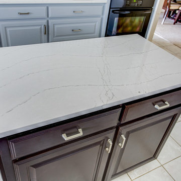
Many times, a kitchen does not need a complete gut, rather more of a cosmetic redo. Which is exactly what we’ve done here! This particular kitchen already had great bones and beautiful sky blue cabinetry, it just needed some finishing touches to get that make-over look. To learn more, continue reading below!
Countertops
With cabinetry already having a fresh sky blue color, we didn’t have to touch the cabinets. However, by lowering the pony wall, and dropping it to cabinet-height, really helped to open up the kitchen. The original countertops were a dark and outdated tile application that needed a redo. So out with the old and in with the new 3 cm Cambria Quartz in Ella. The brightness of the new countertops was a much-needed cosmetic change for this kitchen space to liven up!
Backsplash
The original backsplash was an outdated light-brown 4×4″ square installed in a mixture of straight and diamond lay. The new backsplash was a Daltile Artigiano 3×6 glazed ceramic wall tile in Italian Alps. This tile has a hand-painted look with irregular edges, giving it a hand-made look.
Fixtures and Fittings
To complete this kitchen, a new sink, faucet, and hardware is a must! From Blanco, we have a Diamond super single bowl in a granite composite sink in the color Truffle (441765), and Meridian semi-professional faucet in Satin Nickel (440557). Lastly, the new hardware on the cabinetry are Amerock Blackrock pulls in Satin Nickel (BP55276-G10).
 RAJ Kitchen and Bath, LLC
 “Full apartment design”.
IF you have not yet seen this apartment conversion before, we strongly urge you to go to the bottom left of this page and click on the short 2-minutes video. It would put a lot of things into perspective when you come back and continue reading this.
It is true we were literally handed the keys and told a list of things that they wanted to have happen and we were to go into the apartment, look at the space and come up with a design that would satisfy all of that need. UNTIL we showed up! The unit had really seen some better days but we knew we had to look past that and come up with a concept that would work for them.
The immediate challenges were centered around 3 big ideas:
1. Adding a second bedroom to the already small footprint
2. Figuring out a way to make the kitchen bigger, better and brighter
3. Creating a master room walk in closet
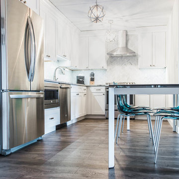
It’s always difficult to add new rooms into existing footprint without expanding out or up and not incurring any opportunity cost. In this case, that was exactly what we had to do. Item one and two above had to be tackled as one. We went ahead and switched out the location of the dining room and eliminating an area where there was a “nook” type eat-in area. By doing so, we were able to cut right into that footprint and change the layout of the kitchen.
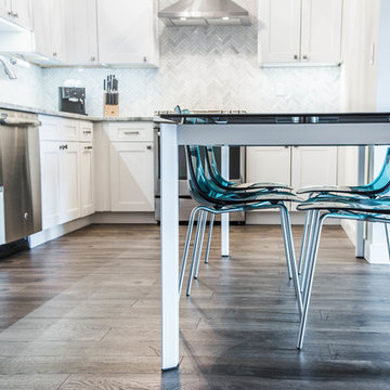
That one move allowed us to dig into the kitchen design because it was now the main focal point in the apartment. It was no longer an option to keep it in that tiny hole where it was, so we had to ensure that this design was functional and aesthetically pleasing at the same time. By adding the table into the space where an Island typically would go, we were able to both cut cost and still provide a dining experience. The Table serves as an Island as well when cooking.
We then proceeded to block in the existing doorway to the dining room. By doing this, we were able to create a full room which allowed us to put a door on the other side and called that room Bedroom #2. This was easier to do because all of the mechanicals were already in that space (light, heater and windows). By shifting things around, we also achieved a huge wall to wall closet from inside. PERFECT!
Then we moved into the Single bedroom. We thought it was a big room with a small closet, so by creatively adding an L shaped wall and steal some footprint into the bedroom side, we were able to put a door on that new room and design it for the walk-in closet. Even after this, the bedroom still holds a queen size bed with 2 night stands, a TV on the wall, a sitting chair and plenty of room to walk around. This was done by rethinking the location for the bed and night stands.
The bathroom was gutted to make sure there was no leaks and rebuild from the ground up. We kept all of the plumbing where it was, added a new vanity, medicine cabinet, tiles and lighting and it was done.
From there, the rest of the unit had new flooring all throughout, paint, and lighting. After completion and walk through, this project was handed over back to the clients.
Execution and collaboration between all the trades were: Reggie and his team from Premier Interiors and Rohan from RD Mechanical Services.
p.s. Please see our website to see the video.
 Castro Lighting
Surroundings have the power to significantly impact the perception of reality and influence whether or not we return to it, and cafés and restaurants are no different. Commercial design plays a fundamental role in creating a complete and memorable experience for the consumer, which can often influence the customer's decision to buy or whether they will return to your space.
If you’re the owner of a café or bistro and want to remodel your space continue reading this article so that you can be inspired by this aesthetic, which draws a little from French café vibes, and which will make even the most demanding coffee lovers not want to leave your café.
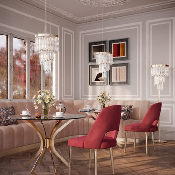
To provide you with the maximum comfort and bring you the unique feelings that autumn provides, the Anna Chair is customised in scarlet tones, just like the leaves that fall delicately in the street it’s the perfect bistro chair. This sumptuous upholstery piece is inspired by the classic style up-to-date influences to create a furniture masterpiece of timeless elegance. The bespoke Anna chair brings a feeling of mystery and irresistible luxury, providing maximum cosiness and allure to the most exquisite spaces.
Keeping up with the Art Déco Style, the Haring Table is in this space to serve as a support for the hot drinks typical of this season, which will be followed by the long conversations between friends, lovers or family members that will be shared in this space. With a delicate nature, Haring is the perfect decorative piece to a luxurious place like this one, giving an exclusive touch to the surrounding area. Surrender to this gorgeous statement piece as it will make any room complete.
Immediately above the table is the Royal Pendant. As Belgium is a country linked to royal customs, we wanted to bring a little of this heritage to this space by incorporating this lighting collection into it. Composed of brass and glass, the different levels of this handmade pendant are a remarkable display of how a modern touch can elevate a traditional design.
In order to complement the space, bringing a cosy ambient light, much needed now that the days are getting shorter, the Floor Lamp, from the same collection, was also incorporated to make the space comfier for those who visit it.
Be inspired to decorate your own aesthetic café inspired by the French café vibes, while incorporating the colours of this magical season and creating a welcoming space that is sure to catch the eye of everyone who passes by, making them come back again and again.
 Glow Lighting
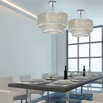
Crystal Dining Room Chandeliers
Summer is just around the corner, now is the time to spring into action and update your dining space.
Be it a classic dining room or a modern open concept great room, the ideas are endless in lighting design. Styles range from elegant crystal arm chandeliers to contemporary drum shade crystal chandeliers to coastal Capiz shell fixtures...
**Continue reading by clicking the link above**


 Glow Lighting
How To Clean Your Crystal Chandelier....So Easy.
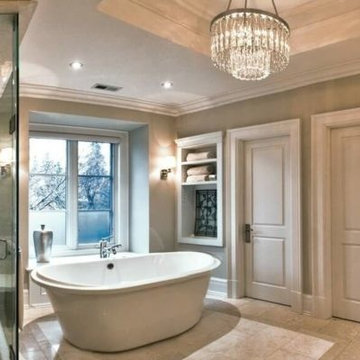
A stunning crystal chandelier is a joy to behold. There is nothing more beautiful than the brilliant sparkle of crystal. By taking proper care for your crystal chandelier it will dazzle you forever.
After you install and trim all the crystal on your light fixture it’s a good idea to keep the trimming instructions in a safe place for future reference. After your chandelier is trimmed we suggest taking a picture of your chandelier so you remember the completed look...
**Continue reading by clicking the link above**
 Kitchen Design Concepts
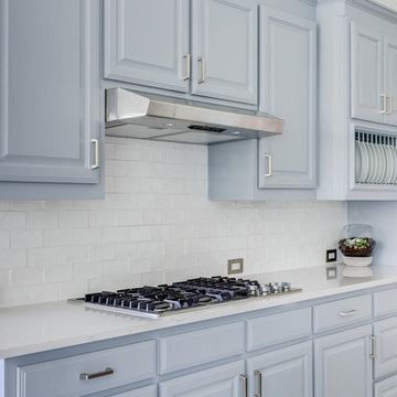
Many times, a kitchen does not need a complete gut, rather more of a cosmetic redo. Which is exactly what we’ve done here! This particular kitchen already had great bones and beautiful sky blue cabinetry, it just needed some finishing touches to get that make-over look. To learn more, continue reading below!
Countertops
With cabinetry already having a fresh sky blue color, we didn’t have to touch the cabinets. However, by lowering the pony wall, and dropping it to cabinet-height, really helped to open up the kitchen. The original countertops were a dark and outdated tile application that needed a redo. So out with the old and in with the new 3 cm Cambria Quartz in Ella. The brightness of the new countertops was a much-needed cosmetic change for this kitchen space to liven up!
Backsplash
The original backsplash was an outdated light-brown 4×4″ square installed in a mixture of straight and diamond lay. The new backsplash was a Daltile Artigiano 3×6 glazed ceramic wall tile in Italian Alps. This tile has a hand-painted look with irregular edges, giving it a hand-made look.
Fixtures and Fittings
To complete this kitchen, a new sink, faucet, and hardware is a must! From Blanco, we have a Diamond super single bowl in a granite composite sink in the color Truffle (441765), and Meridian semi-professional faucet in Satin Nickel (440557). Lastly, the new hardware on the cabinetry are Amerock Blackrock pulls in Satin Nickel (BP55276-G10).
 RAJ Kitchen and Bath, LLC
 “Full apartment design”.
IF you have not yet seen this apartment conversion before, we strongly urge you to go to the bottom left of this page and click on the short 2-minutes video. It would put a lot of things into perspective when you come back and continue reading this.
It is true we were literally handed the keys and told a list of things that they wanted to have happen and we were to go into the apartment, look at the space and come up with a design that would satisfy all of that need. UNTIL we showed up! The unit had really seen some better days but we knew we had to look past that and come up with a concept that would work for them.
The immediate challenges were centered around 3 big ideas:
1. Adding a second bedroom to the already small footprint
2. Figuring out a way to make the kitchen bigger, better and brighter
3. Creating a master room walk in closet
It’s always difficult to add new rooms into existing footprint without expanding out or up and not incurring any opportunity cost. In this case, that was exactly what we had to do. Item one and two above had to be tackled as one. We went ahead and switched out the location of the dining room and eliminating an area where there was a “nook” type eat-in area. By doing so, we were able to cut right into that footprint and change the layout of the kitchen.
That one move allowed us to dig into the kitchen design because it was now the main focal point in the apartment. It was no longer an option to keep it in that tiny hole where it was, so we had to ensure that this design was functional and aesthetically pleasing at the same time. By adding the table into the space where an Island typically would go, we were able to both cut cost and still provide a dining experience. The Table serves as an Island as well when cooking.
We then proceeded to block in the existing doorway to the dining room. By doing this, we were able to create a full room which allowed us to put a door on the other side and called that room Bedroom #2. This was easier to do because all of the mechanicals were already in that space (light, heater and windows). By shifting things around, we also achieved a huge wall to wall closet from inside. PERFECT!
Then we moved into the Single bedroom. We thought it was a big room with a small closet, so by creatively adding an L shaped wall and steal some footprint into the bedroom side, we were able to put a door on that new room and design it for the walk-in closet. Even after this, the bedroom still holds a queen size bed with 2 night stands, a TV on the wall, a sitting chair and plenty of room to walk around. This was done by rethinking the location for the bed and night stands.
The bathroom was gutted to make sure there was no leaks and rebuild from the ground up. We kept all of the plumbing where it was, added a new vanity, medicine cabinet, tiles and lighting and it was done.
From there, the rest of the unit had new flooring all throughout, paint, and lighting. After completion and walk through, this project was handed over back to the clients.
Execution and collaboration between all the trades were: Reggie and his team from Premier Interiors and Rohan from RD Mechanical Services.
p.s. Please see our website to see the video.
 Kitchen Design Concepts
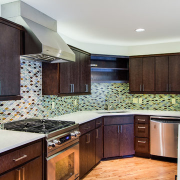
With a home on the lake, our clients were looking for a kitchen revival to match their love of a coastal modern look. Their original kitchen was monotone and bland with cabinets matching their flooring, and no pops of color. But with views overlooking the lake, bringing some of those natural elements inside along with a pop of color is just what this kitchen needed. As a result, we did a little minor demo, replaced door and drawer fronts, and incorporated new appliances, countertops, and backsplash. To learn more about this kitchen, continue reading below!
Cabinets
To revive this kitchen, we replaced the door and drawer fronts with brand new oak slab fronts from Woodmont to give it a modern look. We then incorporated new cabinetry on the island from Crestwood in a Metro door style and Ebony stain finish giving this kitchen a unified look and great functionality.
Appliances
New appliances include a Zephyr Tempest II hood in stainless steel, a 24" Dacor microwave drawer, and a 30" Dacor Distinctive dual-fuel range.
Countertops
As a contrast to the new darker stained cabinetry, we installed a bright quartz countertop from Caesarstone in the color Blizzard, giving this kitchen a balanced feel.
Backsplash
The backsplash is a reflection of the beautiful views our clients have of the lake. The shimmering and vibrant backsplash is a Hirsch Glass, in hourglass shape, and iridescent finish (XM0006).
Fixtures and Finishes
To complete this space, a new sink from Blanco (515824), a new pull-down faucet, also from Blanco (440616), and cabinet hardware from Top Knobs in brushed nickel (M1158) become the last elements that tie this space together.
 Kitchen Design Concepts
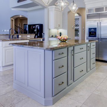
One of the biggest investments you can make in your home is in your kitchen. Now with the Revive model, you don’t have to break the bank to get an updated kitchen with new finishes and a whole new look! This powder blue kitchen we are sharing today is a classic example of such a space! The kitchen had a great layout, the cabinets had good bones, and all it needed were some simple updates. To learn more about what we did, continue reading below!
Cabinets
As previously mentioned, the kitchen cabinetry already had great bones. So, in this case, we were able to refinish them to a painted cream on the perimeter. As for the island, we created a new design where new cabinetry was installed. New cabinets are from WWWoods Shiloh, with a raised panel door style, and a custom painted finish for these powder blue cabinets.
Countertops
The existing kitchen countertops were able to remain because they were already in great condition. Plus, it matched the new finishes perfectly. This is a classic case of “don’t fix it if it ain’t broke”!
Backsplash
For the backsplash, we kept it simple with subway tile but played around with different sizes, colors, and patterns. The main backsplash tile is a Daltile Modern Dimensions, in a 4.5×8.5 size, in the color Elemental Tan, and installed in a brick-lay formation. The splash over the cooktop is a Daltile Rittenhouse Square, in a 3×6 size, in the color Arctic White, and installed in a herringbone pattern.
Fixtures and Finishes
The plumbing fixtures we planned to reuse from the start since they were in great condition. In addition, the oil-rubbed bronze finish went perfectly with the new finishes of the kitchen. We did, however, install new hardware because the original kitchen did not have any. So, from Amerock we selected Muholland pulls which were installed on all the doors and drawers.
 Kitchen Design Concepts
One of the biggest investments you can make in your home is in your kitchen. Now with the Revive model, you don’t have to break the bank to get an updated kitchen with new finishes and a whole new look! This powder blue kitchen we are sharing today is a classic example of such a space! The kitchen had a great layout, the cabinets had good bones, and all it needed were some simple updates. To learn more about what we did, continue reading below!
Cabinets
As previously mentioned, the kitchen cabinetry already had great bones. So, in this case, we were able to refinish them to a painted cream on the perimeter. As for the island, we created a new design where new cabinetry was installed. New cabinets are from WWWoods Shiloh, with a raised panel door style, and a custom painted finish for these powder blue cabinets.
Countertops
The existing kitchen countertops were able to remain because they were already in great condition. Plus, it matched the new finishes perfectly. This is a classic case of “don’t fix it if it ain’t broke”!
Backsplash
For the backsplash, we kept it simple with subway tile but played around with different sizes, colors, and patterns. The main backsplash tile is a Daltile Modern Dimensions, in a 4.5×8.5 size, in the color Elemental Tan, and installed in a brick-lay formation. The splash over the cooktop is a Daltile Rittenhouse Square, in a 3×6 size, in the color Arctic White, and installed in a herringbone pattern.
Fixtures and Finishes
The plumbing fixtures we planned to reuse from the start since they were in great condition. In addition, the oil-rubbed bronze finish went perfectly with the new finishes of the kitchen. We did, however, install new hardware because the original kitchen did not have any. So, from Amerock we selected Muholland pulls which were installed on all the doors and drawers.

Sponsored
Sunbury, OH

J.Holderby - Renovations
Franklin County's Leading General Contractors - 2X Best of Houzz!
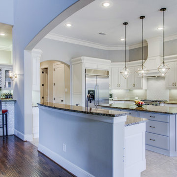 Kitchen Design Concepts
One of the biggest investments you can make in your home is in your kitchen. Now with the Revive model, you don’t have to break the bank to get an updated kitchen with new finishes and a whole new look! This powder blue kitchen we are sharing today is a classic example of such a space! The kitchen had a great layout, the cabinets had good bones, and all it needed were some simple updates. To learn more about what we did, continue reading below!
Cabinets
As previously mentioned, the kitchen cabinetry already had great bones. So, in this case, we were able to refinish them to a painted cream on the perimeter. As for the island, we created a new design where new cabinetry was installed. New cabinets are from WWWoods Shiloh, with a raised panel door style, and a custom painted finish for these powder blue cabinets.
Countertops
The existing kitchen countertops were able to remain because they were already in great condition. Plus, it matched the new finishes perfectly. This is a classic case of “don’t fix it if it ain’t broke”!
Backsplash
For the backsplash, we kept it simple with subway tile but played around with different sizes, colors, and patterns. The main backsplash tile is a Daltile Modern Dimensions, in a 4.5×8.5 size, in the color Elemental Tan, and installed in a brick-lay formation. The splash over the cooktop is a Daltile Rittenhouse Square, in a 3×6 size, in the color Arctic White, and installed in a herringbone pattern.
Fixtures and Finishes
The plumbing fixtures we planned to reuse from the start since they were in great condition. In addition, the oil-rubbed bronze finish went perfectly with the new finishes of the kitchen. We did, however, install new hardware because the original kitchen did not have any. So, from Amerock we selected Muholland pulls which were installed on all the doors and drawers.
 The Turett Collaborative
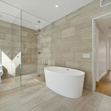
Rustic and luxurious blends in West Village townhouse. Aged oak flooring runs through the master suite. Warm gray marble lines the floors and walls of this master bath. The clear glass partitions allow the continuous read of stone on all walls of the bathroom, heightening the sense of open space.
 RAJ Kitchen and Bath, LLC
 “Full apartment design”.
IF you have not yet seen this apartment conversion before, we strongly urge you to go to the bottom left of this page and click on the short 2-minutes video. It would put a lot of things into perspective when you come back and continue reading this.
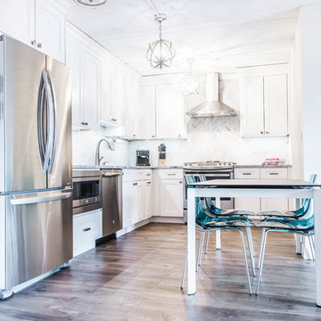
It is true we were literally handed the keys and told a list of things that they wanted to have happen and we were to go into the apartment, look at the space and come up with a design that would satisfy all of that need. UNTIL we showed up! The unit had really seen some better days but we knew we had to look past that and come up with a concept that would work for them.
The immediate challenges were centered around 3 big ideas:
1. Adding a second bedroom to the already small footprint
2. Figuring out a way to make the kitchen bigger, better and brighter
3. Creating a master room walk in closet
It’s always difficult to add new rooms into existing footprint without expanding out or up and not incurring any opportunity cost. In this case, that was exactly what we had to do. Item one and two above had to be tackled as one. We went ahead and switched out the location of the dining room and eliminating an area where there was a “nook” type eat-in area. By doing so, we were able to cut right into that footprint and change the layout of the kitchen.
That one move allowed us to dig into the kitchen design because it was now the main focal point in the apartment. It was no longer an option to keep it in that tiny hole where it was, so we had to ensure that this design was functional and aesthetically pleasing at the same time. By adding the table into the space where an Island typically would go, we were able to both cut cost and still provide a dining experience. The Table serves as an Island as well when cooking.
We then proceeded to block in the existing doorway to the dining room. By doing this, we were able to create a full room which allowed us to put a door on the other side and called that room Bedroom #2. This was easier to do because all of the mechanicals were already in that space (light, heater and windows). By shifting things around, we also achieved a huge wall to wall closet from inside. PERFECT!
Then we moved into the Single bedroom. We thought it was a big room with a small closet, so by creatively adding an L shaped wall and steal some footprint into the bedroom side, we were able to put a door on that new room and design it for the walk-in closet. Even after this, the bedroom still holds a queen size bed with 2 night stands, a TV on the wall, a sitting chair and plenty of room to walk around. This was done by rethinking the location for the bed and night stands.
The bathroom was gutted to make sure there was no leaks and rebuild from the ground up. We kept all of the plumbing where it was, added a new vanity, medicine cabinet, tiles and lighting and it was done.
From there, the rest of the unit had new flooring all throughout, paint, and lighting. After completion and walk through, this project was handed over back to the clients.
Execution and collaboration between all the trades were: Reggie and his team from Premier Interiors and Rohan from RD Mechanical Services.
p.s. Please see our website to see the video.
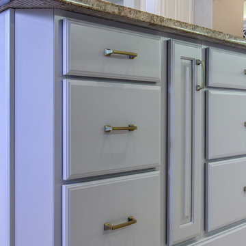 Kitchen Design Concepts
One of the biggest investments you can make in your home is in your kitchen. Now with the Revive model, you don’t have to break the bank to get an updated kitchen with new finishes and a whole new look! This powder blue kitchen we are sharing today is a classic example of such a space! The kitchen had a great layout, the cabinets had good bones, and all it needed were some simple updates. To learn more about what we did, continue reading below!
Cabinets
As previously mentioned, the kitchen cabinetry already had great bones. So, in this case, we were able to refinish them to a painted cream on the perimeter. As for the island, we created a new design where new cabinetry was installed. New cabinets are from WWWoods Shiloh, with a raised panel door style, and a custom painted finish for these powder blue cabinets.
Countertops
The existing kitchen countertops were able to remain because they were already in great condition. Plus, it matched the new finishes perfectly. This is a classic case of “don’t fix it if it ain’t broke”!
Backsplash
For the backsplash, we kept it simple with subway tile but played around with different sizes, colors, and patterns. The main backsplash tile is a Daltile Modern Dimensions, in a 4.5×8.5 size, in the color Elemental Tan, and installed in a brick-lay formation. The splash over the cooktop is a Daltile Rittenhouse Square, in a 3×6 size, in the color Arctic White, and installed in a herringbone pattern.
Fixtures and Finishes
The plumbing fixtures we planned to reuse from the start since they were in great condition. In addition, the oil-rubbed bronze finish went perfectly with the new finishes of the kitchen. We did, however, install new hardware because the original kitchen did not have any. So, from Amerock we selected Muholland pulls which were installed on all the doors and drawers.
Sponsored
Sunbury, OH
J.Holderby - Renovations
Franklin County's Leading General Contractors - 2X Best of Houzz!
 RAJ Kitchen and Bath, LLC
 “Full apartment design”.
IF you have not yet seen this apartment conversion before, we strongly urge you to go to the bottom left of this page and click on the short 2-minutes video. It would put a lot of things into perspective when you come back and continue reading this.
It is true we were literally handed the keys and told a list of things that they wanted to have happen and we were to go into the apartment, look at the space and come up with a design that would satisfy all of that need. UNTIL we showed up! The unit had really seen some better days but we knew we had to look past that and come up with a concept that would work for them.
The immediate challenges were centered around 3 big ideas:
1. Adding a second bedroom to the already small footprint
2. Figuring out a way to make the kitchen bigger, better and brighter
3. Creating a master room walk in closet
It’s always difficult to add new rooms into existing footprint without expanding out or up and not incurring any opportunity cost. In this case, that was exactly what we had to do. Item one and two above had to be tackled as one. We went ahead and switched out the location of the dining room and eliminating an area where there was a “nook” type eat-in area. By doing so, we were able to cut right into that footprint and change the layout of the kitchen.
That one move allowed us to dig into the kitchen design because it was now the main focal point in the apartment. It was no longer an option to keep it in that tiny hole where it was, so we had to ensure that this design was functional and aesthetically pleasing at the same time. By adding the table into the space where an Island typically would go, we were able to both cut cost and still provide a dining experience. The Table serves as an Island as well when cooking.
We then proceeded to block in the existing doorway to the dining room. By doing this, we were able to create a full room which allowed us to put a door on the other side and called that room Bedroom #2. This was easier to do because all of the mechanicals were already in that space (light, heater and windows). By shifting things around, we also achieved a huge wall to wall closet from inside. PERFECT!
Then we moved into the Single bedroom. We thought it was a big room with a small closet, so by creatively adding an L shaped wall and steal some footprint into the bedroom side, we were able to put a door on that new room and design it for the walk-in closet. Even after this, the bedroom still holds a queen size bed with 2 night stands, a TV on the wall, a sitting chair and plenty of room to walk around. This was done by rethinking the location for the bed and night stands.
The bathroom was gutted to make sure there was no leaks and rebuild from the ground up. We kept all of the plumbing where it was, added a new vanity, medicine cabinet, tiles and lighting and it was done.
From there, the rest of the unit had new flooring all throughout, paint, and lighting. After completion and walk through, this project was handed over back to the clients.
Execution and collaboration between all the trades were: Reggie and his team from Premier Interiors and Rohan from RD Mechanical Services.
p.s. Please see our website to see the video.
 Dezinerwallz
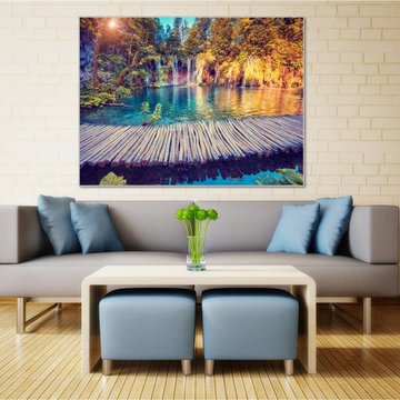
While a great deal of the research that has been conducted to measure the physical and emotional benefits of incorporating biophilic design elements as part of the interior design of a space has been done in the healthcare environment , and to a lesser degree, in the corporate environment, it is completely reasonable to assume that the extraordinary benefits that are experienced by patients, doctors, nurses and support staff working in the healthcare environment, as well as by employees working in a corporate environment will extend to families that introduce biophilic design elements into their own personal spaces.
Click on the next picture to continue reading………..
 Inspiria Interiors
Design and 3D Visualisation by Galya Itzkowich.
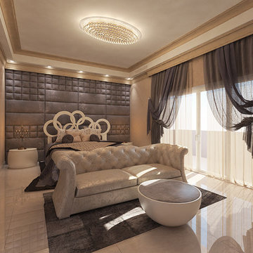
For this high-end, elegant design we have combined the classic luxury of the Arab style with the clean-cut decisions of Italian modern design. The lavishness of the used materials is balanced perfectly by the achromatic, calm color palette of the interior. The characteristic for the Arab style intense color combinations are replaced by a variety of beige hues, cream, white and different shades of grey and taupe. All natural sand colors that are typical for the desert, are actually assembled to create an oasis and safe place for its residents.
Continue reading here: http://www.inspiria-interiors.com/portfolio/italian-design-meets-the-middle-east-in-this-luxurious-master-bedroom-in-oman/
10