
Search results for "Continue reading" in Home Design Ideas
 Page 2 Design
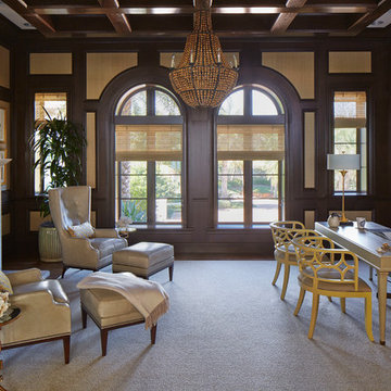
The open study is arguably one of the most stunning rooms in Vero Beach. Not a single design detail was overlooked. The wrought-iron 44" tall chandelier boasts a stately, old bronze finish with hand-carved beads. It immediately commands attention. Wingback chairs covered in dove gray leather are perfect transitional pieces while the custom desk chairs in soft yellow attract attention to their exquisite silk fabric.
Continue reading here: https://issuu.com/taac/docs/elements_summerfall_2016_digital?e=3252448/40095581

 Kitchen Design Concepts
Many times, a kitchen does not need a complete gut, rather more of a cosmetic redo. Which is exactly what we’ve done here! This particular kitchen already had great bones and beautiful sky blue cabinetry, it just needed some finishing touches to get that make-over look. To learn more, continue reading below!
Countertops
With cabinetry already having a fresh sky blue color, we didn’t have to touch the cabinets. However, by lowering the pony wall, and dropping it to cabinet-height, really helped to open up the kitchen. The original countertops were a dark and outdated tile application that needed a redo. So out with the old and in with the new 3 cm Cambria Quartz in Ella. The brightness of the new countertops was a much-needed cosmetic change for this kitchen space to liven up!
Backsplash
The original backsplash was an outdated light-brown 4×4″ square installed in a mixture of straight and diamond lay. The new backsplash was a Daltile Artigiano 3×6 glazed ceramic wall tile in Italian Alps. This tile has a hand-painted look with irregular edges, giving it a hand-made look.
Fixtures and Fittings
To complete this kitchen, a new sink, faucet, and hardware is a must! From Blanco, we have a Diamond super single bowl in a granite composite sink in the color Truffle (441765), and Meridian semi-professional faucet in Satin Nickel (440557). Lastly, the new hardware on the cabinetry are Amerock Blackrock pulls in Satin Nickel (BP55276-G10).
 Kitchen Design Concepts
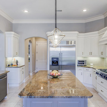
One of the biggest investments you can make in your home is in your kitchen. Now with the Revive model, you don’t have to break the bank to get an updated kitchen with new finishes and a whole new look! This powder blue kitchen we are sharing today is a classic example of such a space! The kitchen had a great layout, the cabinets had good bones, and all it needed were some simple updates. To learn more about what we did, continue reading below!
Cabinets
As previously mentioned, the kitchen cabinetry already had great bones. So, in this case, we were able to refinish them to a painted cream on the perimeter. As for the island, we created a new design where new cabinetry was installed. New cabinets are from WWWoods Shiloh, with a raised panel door style, and a custom painted finish for these powder blue cabinets.
Countertops
The existing kitchen countertops were able to remain because they were already in great condition. Plus, it matched the new finishes perfectly. This is a classic case of “don’t fix it if it ain’t broke”!
Backsplash
For the backsplash, we kept it simple with subway tile but played around with different sizes, colors, and patterns. The main backsplash tile is a Daltile Modern Dimensions, in a 4.5×8.5 size, in the color Elemental Tan, and installed in a brick-lay formation. The splash over the cooktop is a Daltile Rittenhouse Square, in a 3×6 size, in the color Arctic White, and installed in a herringbone pattern.
Fixtures and Finishes
The plumbing fixtures we planned to reuse from the start since they were in great condition. In addition, the oil-rubbed bronze finish went perfectly with the new finishes of the kitchen. We did, however, install new hardware because the original kitchen did not have any. So, from Amerock we selected Muholland pulls which were installed on all the doors and drawers.
Find the right local pro for your project
 Kitchen Design Concepts
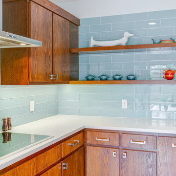
we wanted to preserve the mid-century modern feel (talk about a real flashback!), and boy, do we love the results! This kitchen is another perfect example of a project where we did the “lipstick and make-up” – another term for replacing the more cosmetic features such as countertops, backsplash, and the door and drawer fronts. Even doing so, the resulting kitchen leaves us with a breath of fresh air! To learn more about this space, continue reading below:
Cabinetry
To start, we removed the soffit in the kitchen making the space look taller. Next, we did not rip out the cabinetry boxes, because we were inspired by the finish and look of what existed. Maintaining the finish of the cabinets helped preserve the retro feel and is a good example of repurposing what you already have! As a result, we replaced the door and drawer fronts with a new slab style in a matching medium stain. In addition to the cabinetry fronts, we installed floating shelves – a perfect spot to display!
Countertops
For countertops we wanted something light and bright, and also something that would look good with the other finishes. As a result, we kept it simple with a light and bright surface from Caesarstone in the color “Blizzard”
Backsplash
Now for a little fun and a pop of color, the tile. The tile we selected is fresh, exciting, and also ties everything together giving that mid-century modern feel. In a brick-lay installation, we have a Glazzio Crystile Series, in a 4×12 size, with a finish of Soft Mint.
Fixtures and Fittings
Completing the space, we finished the cabinetry with U-Turn knob’s on the doors, and U-turn pulls on the drawers. Then from Blanco, we have a Quatrus stainless steel sink and a Culina mini faucet in satin nickel.
 RAJ Kitchen and Bath, LLC
 “Full apartment design”.
IF you have not yet seen this apartment conversion before, we strongly urge you to go to the bottom left of this page and click on the short 2-minutes video. It would put a lot of things into perspective when you come back and continue reading this.
It is true we were literally handed the keys and told a list of things that they wanted to have happen and we were to go into the apartment, look at the space and come up with a design that would satisfy all of that need. UNTIL we showed up! The unit had really seen some better days but we knew we had to look past that and come up with a concept that would work for them.
The immediate challenges were centered around 3 big ideas:
1. Adding a second bedroom to the already small footprint
2. Figuring out a way to make the kitchen bigger, better and brighter
3. Creating a master room walk in closet
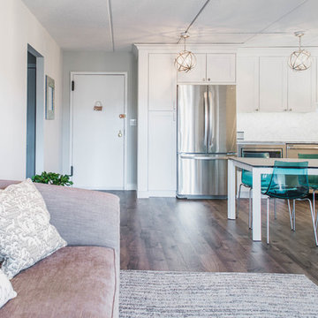
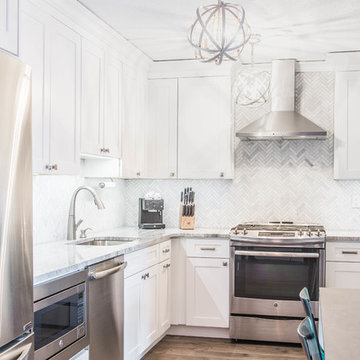
It’s always difficult to add new rooms into existing footprint without expanding out or up and not incurring any opportunity cost. In this case, that was exactly what we had to do. Item one and two above had to be tackled as one. We went ahead and switched out the location of the dining room and eliminating an area where there was a “nook” type eat-in area. By doing so, we were able to cut right into that footprint and change the layout of the kitchen.
That one move allowed us to dig into the kitchen design because it was now the main focal point in the apartment. It was no longer an option to keep it in that tiny hole where it was, so we had to ensure that this design was functional and aesthetically pleasing at the same time. By adding the table into the space where an Island typically would go, we were able to both cut cost and still provide a dining experience. The Table serves as an Island as well when cooking.
We then proceeded to block in the existing doorway to the dining room. By doing this, we were able to create a full room which allowed us to put a door on the other side and called that room Bedroom #2. This was easier to do because all of the mechanicals were already in that space (light, heater and windows). By shifting things around, we also achieved a huge wall to wall closet from inside. PERFECT!
Then we moved into the Single bedroom. We thought it was a big room with a small closet, so by creatively adding an L shaped wall and steal some footprint into the bedroom side, we were able to put a door on that new room and design it for the walk-in closet. Even after this, the bedroom still holds a queen size bed with 2 night stands, a TV on the wall, a sitting chair and plenty of room to walk around. This was done by rethinking the location for the bed and night stands.
The bathroom was gutted to make sure there was no leaks and rebuild from the ground up. We kept all of the plumbing where it was, added a new vanity, medicine cabinet, tiles and lighting and it was done.
From there, the rest of the unit had new flooring all throughout, paint, and lighting. After completion and walk through, this project was handed over back to the clients.
Execution and collaboration between all the trades were: Reggie and his team from Premier Interiors and Rohan from RD Mechanical Services.
p.s. Please see our website to see the video.
 RAJ Kitchen and Bath, LLC
 “Full apartment design”.
IF you have not yet seen this apartment conversion before, we strongly urge you to go to the bottom left of this page and click on the short 2-minutes video. It would put a lot of things into perspective when you come back and continue reading this.
It is true we were literally handed the keys and told a list of things that they wanted to have happen and we were to go into the apartment, look at the space and come up with a design that would satisfy all of that need. UNTIL we showed up! The unit had really seen some better days but we knew we had to look past that and come up with a concept that would work for them.
The immediate challenges were centered around 3 big ideas:
1. Adding a second bedroom to the already small footprint
2. Figuring out a way to make the kitchen bigger, better and brighter
3. Creating a master room walk in closet
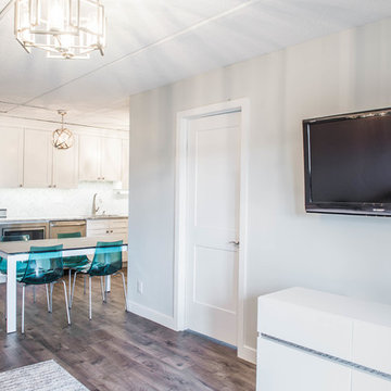
It’s always difficult to add new rooms into existing footprint without expanding out or up and not incurring any opportunity cost. In this case, that was exactly what we had to do. Item one and two above had to be tackled as one. We went ahead and switched out the location of the dining room and eliminating an area where there was a “nook” type eat-in area. By doing so, we were able to cut right into that footprint and change the layout of the kitchen.
That one move allowed us to dig into the kitchen design because it was now the main focal point in the apartment. It was no longer an option to keep it in that tiny hole where it was, so we had to ensure that this design was functional and aesthetically pleasing at the same time. By adding the table into the space where an Island typically would go, we were able to both cut cost and still provide a dining experience. The Table serves as an Island as well when cooking.
We then proceeded to block in the existing doorway to the dining room. By doing this, we were able to create a full room which allowed us to put a door on the other side and called that room Bedroom #2. This was easier to do because all of the mechanicals were already in that space (light, heater and windows). By shifting things around, we also achieved a huge wall to wall closet from inside. PERFECT!
Then we moved into the Single bedroom. We thought it was a big room with a small closet, so by creatively adding an L shaped wall and steal some footprint into the bedroom side, we were able to put a door on that new room and design it for the walk-in closet. Even after this, the bedroom still holds a queen size bed with 2 night stands, a TV on the wall, a sitting chair and plenty of room to walk around. This was done by rethinking the location for the bed and night stands.
The bathroom was gutted to make sure there was no leaks and rebuild from the ground up. We kept all of the plumbing where it was, added a new vanity, medicine cabinet, tiles and lighting and it was done.
From there, the rest of the unit had new flooring all throughout, paint, and lighting. After completion and walk through, this project was handed over back to the clients.
Execution and collaboration between all the trades were: Reggie and his team from Premier Interiors and Rohan from RD Mechanical Services.
p.s. Please see our website to see the video.
 RAJ Kitchen and Bath, LLC
 “Full apartment design”.
IF you have not yet seen this apartment conversion before, we strongly urge you to go to the bottom left of this page and click on the short 2-minutes video. It would put a lot of things into perspective when you come back and continue reading this.
It is true we were literally handed the keys and told a list of things that they wanted to have happen and we were to go into the apartment, look at the space and come up with a design that would satisfy all of that need. UNTIL we showed up! The unit had really seen some better days but we knew we had to look past that and come up with a concept that would work for them.
The immediate challenges were centered around 3 big ideas:
1. Adding a second bedroom to the already small footprint
2. Figuring out a way to make the kitchen bigger, better and brighter
3. Creating a master room walk in closet
It’s always difficult to add new rooms into existing footprint without expanding out or up and not incurring any opportunity cost. In this case, that was exactly what we had to do. Item one and two above had to be tackled as one. We went ahead and switched out the location of the dining room and eliminating an area where there was a “nook” type eat-in area. By doing so, we were able to cut right into that footprint and change the layout of the kitchen.
That one move allowed us to dig into the kitchen design because it was now the main focal point in the apartment. It was no longer an option to keep it in that tiny hole where it was, so we had to ensure that this design was functional and aesthetically pleasing at the same time. By adding the table into the space where an Island typically would go, we were able to both cut cost and still provide a dining experience. The Table serves as an Island as well when cooking.
We then proceeded to block in the existing doorway to the dining room. By doing this, we were able to create a full room which allowed us to put a door on the other side and called that room Bedroom #2. This was easier to do because all of the mechanicals were already in that space (light, heater and windows). By shifting things around, we also achieved a huge wall to wall closet from inside. PERFECT!
Then we moved into the Single bedroom. We thought it was a big room with a small closet, so by creatively adding an L shaped wall and steal some footprint into the bedroom side, we were able to put a door on that new room and design it for the walk-in closet. Even after this, the bedroom still holds a queen size bed with 2 night stands, a TV on the wall, a sitting chair and plenty of room to walk around. This was done by rethinking the location for the bed and night stands.
The bathroom was gutted to make sure there was no leaks and rebuild from the ground up. We kept all of the plumbing where it was, added a new vanity, medicine cabinet, tiles and lighting and it was done.
From there, the rest of the unit had new flooring all throughout, paint, and lighting. After completion and walk through, this project was handed over back to the clients.
Execution and collaboration between all the trades were: Reggie and his team from Premier Interiors and Rohan from RD Mechanical Services.
p.s. Please see our website to see the video.


 MSA ARCHITECTURE + INTERIORS
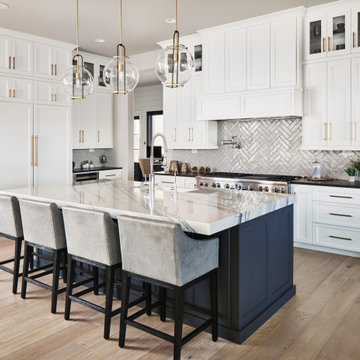
Inspiration for a transitional light wood floor and beige floor kitchen remodel in Austin with a farmhouse sink, white cabinets, gray backsplash, ceramic backsplash, an island, shaker cabinets, paneled appliances and black countertops
 Revision LLC
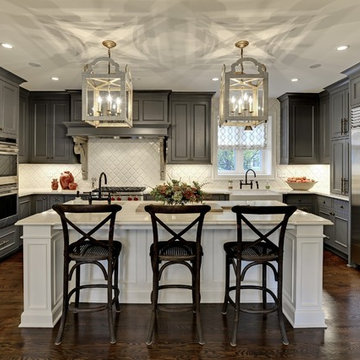
Large transitional u-shaped dark wood floor and brown floor kitchen photo in Minneapolis with gray cabinets, white backsplash, stainless steel appliances, an island, raised-panel cabinets, a farmhouse sink, solid surface countertops, white countertops and ceramic backsplash
 Jonathan Raith Inc.
Nantucket Architectural Photography
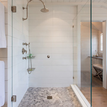
Bathroom - large coastal master white tile and ceramic tile light wood floor bathroom idea in Boston with white walls
Bathroom - large coastal master white tile and ceramic tile light wood floor bathroom idea in Boston with white walls
 Duet Design Group
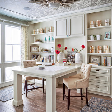
Example of a classic built-in desk medium tone wood floor home office design in Denver
 Rogue Home Interiors
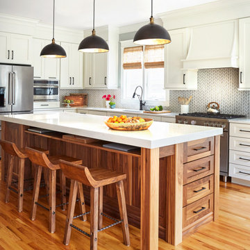
A cozy and functional farmhouse kitchen with warm white cabinets and a rustic walnut island.
Mid-sized country l-shaped medium tone wood floor and brown floor open concept kitchen photo in DC Metro with an undermount sink, shaker cabinets, white cabinets, quartz countertops, gray backsplash, porcelain backsplash, stainless steel appliances, an island and white countertops
Mid-sized country l-shaped medium tone wood floor and brown floor open concept kitchen photo in DC Metro with an undermount sink, shaker cabinets, white cabinets, quartz countertops, gray backsplash, porcelain backsplash, stainless steel appliances, an island and white countertops

 JNMRustic Designs
JNMRustic Designs Reclaimed Wood Headboard with Lexington Clothing Co. Bedding and Linens.
Example of a large beach style guest bedroom design in Minneapolis with white walls
Example of a large beach style guest bedroom design in Minneapolis with white walls

Sponsored
Sunbury, OH

J.Holderby - Renovations
Franklin County's Leading General Contractors - 2X Best of Houzz!
 Rosewood Custom Builders
Jenn Baker
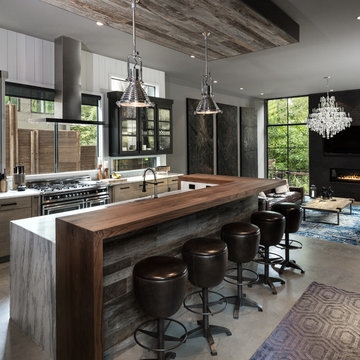
Inspiration for a large industrial galley concrete floor and gray floor open concept kitchen remodel in Dallas with flat-panel cabinets, light wood cabinets, marble countertops, white backsplash, wood backsplash, an island and black appliances
Inspiration for a large industrial galley concrete floor and gray floor open concept kitchen remodel in Dallas with flat-panel cabinets, light wood cabinets, marble countertops, white backsplash, wood backsplash, an island and black appliances
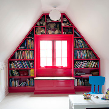
 J.P. Franzen Associates Architects, P.C.
Stacy Bass
Second floor hideaway for children's books and toys. Game area. Study area. Seating area. Red color calls attention to custom built-in bookshelves and storage space. Reading nook beneath sunny window invites readers of all ages.
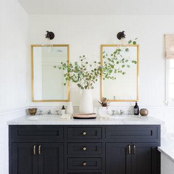
 JDP Interiors
Transitional master multicolored floor bathroom photo in Los Angeles with shaker cabinets, black cabinets, white walls, an undermount sink and gray countertops
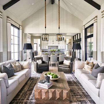
 Keith Wing Custom Builders
Matthew Niemann Photography
www.matthewniemann.com
Example of a transitional open concept carpeted and gray floor living room design in Other with gray walls
Example of a transitional open concept carpeted and gray floor living room design in Other with gray walls
Sponsored
Sunbury, OH
J.Holderby - Renovations
Franklin County's Leading General Contractors - 2X Best of Houzz!
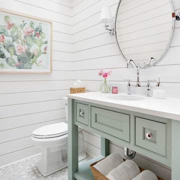
 Kimberlee Marie Interiors
It’s always a blessing when your clients become friends - and that’s exactly what blossomed out of this two-phase remodel (along with three transformed spaces!). These clients were such a joy to work with and made what, at times, was a challenging job feel seamless. This project consisted of two phases, the first being a reconfiguration and update of their master bathroom, guest bathroom, and hallway closets, and the second a kitchen remodel.
In keeping with the style of the home, we decided to run with what we called “traditional with farmhouse charm” – warm wood tones, cement tile, traditional patterns, and you can’t forget the pops of color! The master bathroom airs on the masculine side with a mostly black, white, and wood color palette, while the powder room is very feminine with pastel colors.
When the bathroom projects were wrapped, it didn’t take long before we moved on to the kitchen. The kitchen already had a nice flow, so we didn’t need to move any plumbing or appliances. Instead, we just gave it the facelift it deserved! We wanted to continue the farmhouse charm and landed on a gorgeous terracotta and ceramic hand-painted tile for the backsplash, concrete look-alike quartz countertops, and two-toned cabinets while keeping the existing hardwood floors. We also removed some upper cabinets that blocked the view from the kitchen into the dining and living room area, resulting in a coveted open concept floor plan.
Our clients have always loved to entertain, but now with the remodel complete, they are hosting more than ever, enjoying every second they have in their home.
 McElroy Architecture, AIA
Eric Rorer
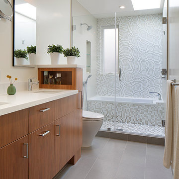
Inspiration for a contemporary white tile and mosaic tile bathroom remodel in San Francisco with flat-panel cabinets, medium tone wood cabinets and quartz countertops
Inspiration for a contemporary white tile and mosaic tile bathroom remodel in San Francisco with flat-panel cabinets, medium tone wood cabinets and quartz countertops

13