
Search results for "Continuing accessibility" in Home Design Ideas

 Advance Design Studio, Ltd.
Jackie and Sean loved the Algonquin neighborhood they lived in with the peaceful neighborhood and the close proximity to work and school. What they didn’t love was how outdated their home had become. With a cramped kitchen and an unused dining room, they decided a remodel was the perfect solution to their problem. They would be able to continue to live in the area they loved, while at the same time they could have the dream home they envisioned.
After a thorough search, Jackie came across Advance Design Studio. She was impressed by all of the positive reviews she saw on the internet and saw herself identifying with all of the project stories she saw on the website. Once they met with designer Scott Christensen and owner Todd Jurs, they knew Advance Design was the right company to make their dreams a reality.
The project consisted of four main areas: the kitchen/dining/powder room, the laundry room, the master bathroom, and the kid’s bathroom. They wanted to expand the kitchen into the seldom used dining room and add a large island for hosting parties and family gatherings. They also wanted new hardwood flooring throughout the first level. The laundry room needed to be more functional, and all three bathrooms were in dire need of updating.
The closed off kitchen was opened up to create a sweeping space between the new eating area and the much larger kitchen. A handsome dry bar complete with a beverage refrigerator and lighted glass door cabinetry makes an elegant transition across from a peninsula area filled with storage. An additional decorative cabinet lighting up elegant dishware through the mullioned glass sits directly across from the drybar.
An expansive island was critical to the kitchen plans. Jackie, Sean and Scott worked closely together to create just the right details for their design. They wanted the island to be functional in addition to being the centerpiece of the room. Added storage for the kid’s school supplies was hidden behind cabinet doors so the children could do their schoolwork right at the island, and a microwave drawer glides open with the touch of a finger hidden inconspicuously within the island space. The easy to care for Cambria Britannica Quartz island top with its sweeping grey and white marble look perched atop hand-carved Craftsman corbels was absolutely what they were hoping for, blending both beauty and function perfectly.
Adding a nice contrast to the brightness of the quartz and the white cabinetry, Kodiak - Leather granite countertops were used to balance the light and dark tones of the space. Dura Supreme Classic White painted cabinets grace the perimeter, while Maple Poppy Seed stained cabinets with a beautiful soft grey woodgrain were used in the beverage center and island. The two tones compliment the large space balancing it out nicely creating interest and elegance with the simple Craftsman style full overlay doors.
A deep warm Barnwood White Oak flooring was added throughout the lower level. The new floor brings additional contrast to the bright kitchen and provides unity with the now open floorplan as it rolls in to the foyer and family room. Final details like the show-stopping lunar like duo light fixtures complete the space and intermix expertly with crisscross details of the glass door mullions, the island bar seating and even accessories in the space.
The small cluttered laundry room needed more space and more storage. With a busy family it seemed to overflow daily and did not have anywhere to hide the families “in and out stuff.” Scott designed the new space with a stackable washer and dryer and much more efficiently organized cabinetry. Doing laundry is now (almost!) a pleasure and keeping everyone’s “stuff” hidden, but readily accessible is now a snap.
The master bath was not a place where the couple enjoyed spending time getting ready for their day. The tub almost never was used, so removing it made it possible to build an extra-large shower, replacing the small cramped cube of the previous shower they hated. Clean, horizontal lines softly draw your eye around the space with porcelain tile called Driftwood Sea spray. Full overlay cabinetry in a soft white vanity with double sinks makes getting ready for the day much more convenient for the busy couple.
Long floor planks made of porcelain tile mimic real hardwood floors in a soft grey to compliment the shower, but with the ease and care of a tile surface. Cambrian Black Granite counters with a matte finish and under mount porcelain sinks with handsome brushed chrome hardware complete the handsome space. A real bonus in any master bath; a custom built in storage nook was tucked in the corner of the space for linens and heavenly storage.
The kid’s bath was in sad shape because it was original to the house. To keep the budget in control, the tub which was in great condition was retained, but focus was on the new large brick style porcelain charcoal tile on the floor, crisp white new Craftsman style cabinetry with pretty furniture details on the corner base, a striking granite top with white under mount porcelain sinks and fresh hardware and faucets. Some beautiful soft grey wood mirrors to match mom and dads were custom sized and placed under new lighting, and 4 hooks were smartly arranged down the wall for kids’ towels.
This couple was determined not to move, and made their house their dream home. Not only does their home function greatly now, but Jackie says, “When the neighbors come to visit, they’re asking if they can “steal” the design”! The added functionality, elegance, and open floor plan were exactly what this family needed in order to stay.
Advance Design Studio, Joe Nowak

 E_ Designs
2015 Home Tour Participant
Looking to add more living space for this growing family, Homeowners of this 1923 St Paul home made the decision to finish their basement. A full new floor plan was designed to include a long list of must haves. The new space included: a new bedroom, family room for the kids to play, an additional room for guests and/or study, new 3/4 bath, easy access for bicycle storage in laundry, low pile carpet that is comfortable for the kids to play, and warmth for the MN winters! A great floor plan was designed that integrated the family room and guest bed/study that also creates wonderful sight lines and a great flow. The basement was updated with all new windows including two egress windows. Beautiful rainglass pocket doors were installed to the bath and laundry to continue the flow of natural light from room to room. Custom natural oak millwork and beautiful door knobs by Rejuvenation Hardware were installed throughout. To match the charm of the home, subway tile and hex tile floors were installed in the new bath and shower. The bath was finished with a stock vanity, mirror, lighting, and Kohler plumbing fixtures. Modern features were also integrated throughout including Hudson Reed wall mount radiators and a NEST thermostat. One of our favorite features of this project, is the original support header and column that we decided to keep exposed. The homeowners took it upon themselves to sand the aged wood down to its natural color and it truly creates a unique piece of art. Castle and the Homeowners couldn’t be happier with the finished product.
Photographer: Lisa Brunnel
 Lagois Design Build Renovate
Living in place with flex:
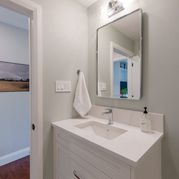
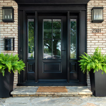
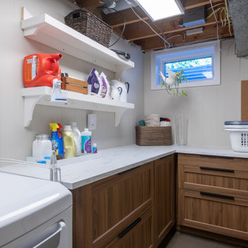
The mother of the homeowner needed a home that is fully accessible for living in place, so we created a barrier-free entry and installed grab bars. The new suite contains a full bedroom and bath and a small living room with a kitchenette.
One of the homeowners especially loves to cook. Now he has a new kitchen with more space, more storage, and better functionality.
Fresh paint, wallpaper and a new look:
We refinished the hardwood floors throughout and gave the whole home a fresh new look. We updated a powder room with paint, new tile, new fixtures, new lighting, and wallpaper.
Kitchen with space, flow, and storage:
The kitchen was cut off from the rest of the home. It had a long peninsula with awkward flow around the kitchen that just didn’t work. We removed the peninsula and instead created a large island with seating for three. With the new island, counter space is much more usable now. We put hidden cupboards underneath for added storage. The island also holds the built-in microwave with a steel drawer front below for continuity. We used banked drawers rather than cupboards for ease of access. We also installed new large appliances.
Coffee station, cookbooks, and spices:
We removed two clumsy closed pantries and an unused main door, and this allowed space for more cabinetry. We added an open shelf section with herringbone tile and a counter for a coffee station and cookbooks. Other features were a waste bin pullout with garbage bag storage and a tall spice pullout drawer.
The kitchen now has a big double-wide appliance garage where all small appliances are stored and organized in a big pantry with a light inside. All the appliances are front and centre (rather than buried in the back somewhere), yet hidden behind a door.
Flex space means other new spaces for everyone:
In creating a flex space for the mother on the main floor, the homeowners lost their space for a family room, although there is still a formal living and dining room on that floor. We solved it by creating a new finished basement with a family room to replace the one upstairs. This gives the family and the mother their own spaces and at the same time comfortable places for all of them.
Find the right local pro for your project
 Lagois Design Build Renovate
Living in place with flex:
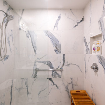
The mother of the homeowner needed a home that is fully accessible for living in place, so we created a barrier-free entry and installed grab bars. The new suite contains a full bedroom and bath and a small living room with a kitchenette.
One of the homeowners especially loves to cook. Now he has a new kitchen with more space, more storage, and better functionality.
Fresh paint, wallpaper and a new look:
We refinished the hardwood floors throughout and gave the whole home a fresh new look. We updated a powder room with paint, new tile, new fixtures, new lighting, and wallpaper.
Kitchen with space, flow, and storage:
The kitchen was cut off from the rest of the home. It had a long peninsula with awkward flow around the kitchen that just didn’t work. We removed the peninsula and instead created a large island with seating for three. With the new island, counter space is much more usable now. We put hidden cupboards underneath for added storage. The island also holds the built-in microwave with a steel drawer front below for continuity. We used banked drawers rather than cupboards for ease of access. We also installed new large appliances.
Coffee station, cookbooks, and spices:
We removed two clumsy closed pantries and an unused main door, and this allowed space for more cabinetry. We added an open shelf section with herringbone tile and a counter for a coffee station and cookbooks. Other features were a waste bin pullout with garbage bag storage and a tall spice pullout drawer.
The kitchen now has a big double-wide appliance garage where all small appliances are stored and organized in a big pantry with a light inside. All the appliances are front and centre (rather than buried in the back somewhere), yet hidden behind a door.
Flex space means other new spaces for everyone:
In creating a flex space for the mother on the main floor, the homeowners lost their space for a family room, although there is still a formal living and dining room on that floor. We solved it by creating a new finished basement with a family room to replace the one upstairs. This gives the family and the mother their own spaces and at the same time comfortable places for all of them.
 MATHISON | MATHISON ARCHITECTS
With a desire to stay close to friends and family, the owners of this 1984 home spent several years searching for property near their neighborhood to build a new, more modern, energy-conscious home tailored to their empty-nest lifestyle. They eventually concluded that their current site was the perfect location for them, but the home needed to be updated and reorganized to create fresh, open, unified spaces to comfortably welcome gatherings of family, friends, and guests.
Before renovation, the floor plan included small rooms, dedicated hallways, a step-down living room, a heavy and dark corner fireplace, and limited opportunities for natural light and visual connections from space to space. Exterior deck areas were narrow, long, and used infrequently.
Primary goals of this project included accessibility of space, more natural light, better connectivity between spaces, and a focus on sustainable performance. The updated main floor plan included the selective removal of walls to reallocate dedicated hall space to usable, open living area. The step-down living room was leveled for full accessibility, safety, furniture flexibility and overall space use. The removal of a half-height wall between the living area and the kitchen created continuity between the spaces. Reorganizing the primary entry and stair and eliminating walls between the entry and dining room created new visual connections between the kitchen and the entry. The new central concrete hearth and fireplace provides a strong, modern focal point for the living area. Large sliding glass doors on each side of the fireplace allow the TV area beyond to be separated from the living area as needed.
In several strategic locations, the footprint of the house was expanded to enhance function and flow at the kitchen, dining room, and mudroom. The new outdoor deck area is now large and singular and includes a grille area, dining space and open seating overlooking the newly landscaped pool below.
The exterior envelope of the house includes new insulation, siding, and energy-efficient windows, as well as two large roof-mounted solar arrays, to increase thermal performance and to offset energy costs. Inside, the new HVAC system maximizes energy efficiency while using a fraction of its former footprint. As a result, a portion of the former mechanical space was added back to the lower level family room area and expands into a cozy library nook.
MMA partnered with the owner’s interior designer and kitchen designer to achieve a softer, contemporary palette of finishes that complement this newly configured, light-filled home.
 Lagois Design Build Renovate
Living in place with flex:
The mother of the homeowner needed a home that is fully accessible for living in place, so we created a barrier-free entry and installed grab bars. The new suite contains a full bedroom and bath and a small living room with a kitchenette.
One of the homeowners especially loves to cook. Now he has a new kitchen with more space, more storage, and better functionality.
Fresh paint, wallpaper and a new look:
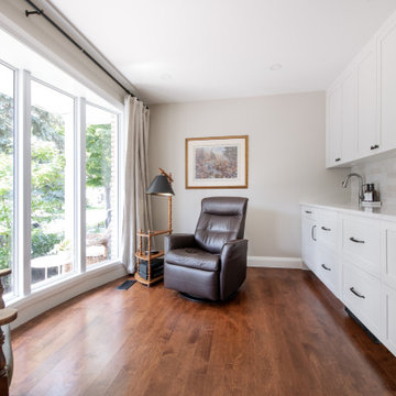
We refinished the hardwood floors throughout and gave the whole home a fresh new look. We updated a powder room with paint, new tile, new fixtures, new lighting, and wallpaper.
Kitchen with space, flow, and storage:
The kitchen was cut off from the rest of the home. It had a long peninsula with awkward flow around the kitchen that just didn’t work. We removed the peninsula and instead created a large island with seating for three. With the new island, counter space is much more usable now. We put hidden cupboards underneath for added storage. The island also holds the built-in microwave with a steel drawer front below for continuity. We used banked drawers rather than cupboards for ease of access. We also installed new large appliances.
Coffee station, cookbooks, and spices:
We removed two clumsy closed pantries and an unused main door, and this allowed space for more cabinetry. We added an open shelf section with herringbone tile and a counter for a coffee station and cookbooks. Other features were a waste bin pullout with garbage bag storage and a tall spice pullout drawer.
The kitchen now has a big double-wide appliance garage where all small appliances are stored and organized in a big pantry with a light inside. All the appliances are front and centre (rather than buried in the back somewhere), yet hidden behind a door.
Flex space means other new spaces for everyone:
In creating a flex space for the mother on the main floor, the homeowners lost their space for a family room, although there is still a formal living and dining room on that floor. We solved it by creating a new finished basement with a family room to replace the one upstairs. This gives the family and the mother their own spaces and at the same time comfortable places for all of them.
 Lagois Design Build Renovate
Living in place with flex:
The mother of the homeowner needed a home that is fully accessible for living in place, so we created a barrier-free entry and installed grab bars. The new suite contains a full bedroom and bath and a small living room with a kitchenette.
One of the homeowners especially loves to cook. Now he has a new kitchen with more space, more storage, and better functionality.
Fresh paint, wallpaper and a new look:
We refinished the hardwood floors throughout and gave the whole home a fresh new look. We updated a powder room with paint, new tile, new fixtures, new lighting, and wallpaper.
Kitchen with space, flow, and storage:
The kitchen was cut off from the rest of the home. It had a long peninsula with awkward flow around the kitchen that just didn’t work. We removed the peninsula and instead created a large island with seating for three. With the new island, counter space is much more usable now. We put hidden cupboards underneath for added storage. The island also holds the built-in microwave with a steel drawer front below for continuity. We used banked drawers rather than cupboards for ease of access. We also installed new large appliances.
Coffee station, cookbooks, and spices:
We removed two clumsy closed pantries and an unused main door, and this allowed space for more cabinetry. We added an open shelf section with herringbone tile and a counter for a coffee station and cookbooks. Other features were a waste bin pullout with garbage bag storage and a tall spice pullout drawer.
The kitchen now has a big double-wide appliance garage where all small appliances are stored and organized in a big pantry with a light inside. All the appliances are front and centre (rather than buried in the back somewhere), yet hidden behind a door.
Flex space means other new spaces for everyone:
In creating a flex space for the mother on the main floor, the homeowners lost their space for a family room, although there is still a formal living and dining room on that floor. We solved it by creating a new finished basement with a family room to replace the one upstairs. This gives the family and the mother their own spaces and at the same time comfortable places for all of them.
Sponsored
Columbus, OH
Free consultation for landscape design!

Peabody Landscape Group
Columbus' Reliable Landscape Design & Contracting
 Lagois Design Build Renovate
Living in place with flex:
The mother of the homeowner needed a home that is fully accessible for living in place, so we created a barrier-free entry and installed grab bars. The new suite contains a full bedroom and bath and a small living room with a kitchenette.
One of the homeowners especially loves to cook. Now he has a new kitchen with more space, more storage, and better functionality.
Fresh paint, wallpaper and a new look:
We refinished the hardwood floors throughout and gave the whole home a fresh new look. We updated a powder room with paint, new tile, new fixtures, new lighting, and wallpaper.
Kitchen with space, flow, and storage:
The kitchen was cut off from the rest of the home. It had a long peninsula with awkward flow around the kitchen that just didn’t work. We removed the peninsula and instead created a large island with seating for three. With the new island, counter space is much more usable now. We put hidden cupboards underneath for added storage. The island also holds the built-in microwave with a steel drawer front below for continuity. We used banked drawers rather than cupboards for ease of access. We also installed new large appliances.
Coffee station, cookbooks, and spices:
We removed two clumsy closed pantries and an unused main door, and this allowed space for more cabinetry. We added an open shelf section with herringbone tile and a counter for a coffee station and cookbooks. Other features were a waste bin pullout with garbage bag storage and a tall spice pullout drawer.
The kitchen now has a big double-wide appliance garage where all small appliances are stored and organized in a big pantry with a light inside. All the appliances are front and centre (rather than buried in the back somewhere), yet hidden behind a door.
Flex space means other new spaces for everyone:
In creating a flex space for the mother on the main floor, the homeowners lost their space for a family room, although there is still a formal living and dining room on that floor. We solved it by creating a new finished basement with a family room to replace the one upstairs. This gives the family and the mother their own spaces and at the same time comfortable places for all of them.
 Lagois Design Build Renovate
Living in place with flex:
The mother of the homeowner needed a home that is fully accessible for living in place, so we created a barrier-free entry and installed grab bars. The new suite contains a full bedroom and bath and a small living room with a kitchenette.
One of the homeowners especially loves to cook. Now he has a new kitchen with more space, more storage, and better functionality.
Fresh paint, wallpaper and a new look:
We refinished the hardwood floors throughout and gave the whole home a fresh new look. We updated a powder room with paint, new tile, new fixtures, new lighting, and wallpaper.
Kitchen with space, flow, and storage:
The kitchen was cut off from the rest of the home. It had a long peninsula with awkward flow around the kitchen that just didn’t work. We removed the peninsula and instead created a large island with seating for three. With the new island, counter space is much more usable now. We put hidden cupboards underneath for added storage. The island also holds the built-in microwave with a steel drawer front below for continuity. We used banked drawers rather than cupboards for ease of access. We also installed new large appliances.
Coffee station, cookbooks, and spices:
We removed two clumsy closed pantries and an unused main door, and this allowed space for more cabinetry. We added an open shelf section with herringbone tile and a counter for a coffee station and cookbooks. Other features were a waste bin pullout with garbage bag storage and a tall spice pullout drawer.
The kitchen now has a big double-wide appliance garage where all small appliances are stored and organized in a big pantry with a light inside. All the appliances are front and centre (rather than buried in the back somewhere), yet hidden behind a door.
Flex space means other new spaces for everyone:
In creating a flex space for the mother on the main floor, the homeowners lost their space for a family room, although there is still a formal living and dining room on that floor. We solved it by creating a new finished basement with a family room to replace the one upstairs. This gives the family and the mother their own spaces and at the same time comfortable places for all of them.
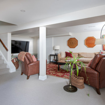 Lagois Design Build Renovate
Living in place with flex:
The mother of the homeowner needed a home that is fully accessible for living in place, so we created a barrier-free entry and installed grab bars. The new suite contains a full bedroom and bath and a small living room with a kitchenette.
One of the homeowners especially loves to cook. Now he has a new kitchen with more space, more storage, and better functionality.
Fresh paint, wallpaper and a new look:
We refinished the hardwood floors throughout and gave the whole home a fresh new look. We updated a powder room with paint, new tile, new fixtures, new lighting, and wallpaper.
Kitchen with space, flow, and storage:
The kitchen was cut off from the rest of the home. It had a long peninsula with awkward flow around the kitchen that just didn’t work. We removed the peninsula and instead created a large island with seating for three. With the new island, counter space is much more usable now. We put hidden cupboards underneath for added storage. The island also holds the built-in microwave with a steel drawer front below for continuity. We used banked drawers rather than cupboards for ease of access. We also installed new large appliances.
Coffee station, cookbooks, and spices:
We removed two clumsy closed pantries and an unused main door, and this allowed space for more cabinetry. We added an open shelf section with herringbone tile and a counter for a coffee station and cookbooks. Other features were a waste bin pullout with garbage bag storage and a tall spice pullout drawer.
The kitchen now has a big double-wide appliance garage where all small appliances are stored and organized in a big pantry with a light inside. All the appliances are front and centre (rather than buried in the back somewhere), yet hidden behind a door.
Flex space means other new spaces for everyone:
In creating a flex space for the mother on the main floor, the homeowners lost their space for a family room, although there is still a formal living and dining room on that floor. We solved it by creating a new finished basement with a family room to replace the one upstairs. This gives the family and the mother their own spaces and at the same time comfortable places for all of them.

 Nar Design Group
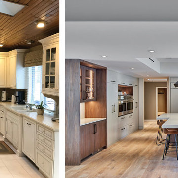
This mid-century modern kitchen was developed with the original architectural elements of its mid-century shell at the heart of its design. Throughout the space, the kitchen’s repetition of alternating dark walnut and light wood uses in the cabinetry and framework reflect the contrast of the dark wooden beams running along the white ceiling. The playful use of two tones intentionally develops unified work zones using all modern day elements and conveniences. For instance, the 5’ galley workstation stands apart with grain-matched walnut cabinetry and stone wrap detail for a furniture-like feeling. The mid-century architecture continued to be an emphasis through design details such as a flush venting system within a drywall structure that conscientiously disappears into the ceiling affording the existing post-and-beams structures and clerestory windows to stand in the forefront.
Along with celebrating the characteristic of the mid-century home the clients wanted to bring the outdoors in. We chose to emphasis the view even more by incorporating a large window centered over the galley kitchen sink. The final result produced a translucent wall that provokes a dialog between the outdoor elements and the natural color tones and materials used throughout the kitchen. While the natural light and views are visible because of the spacious windows, the contemporary kitchens clean geometric lines emphasize the newly introduced natural materials and further integrate the outdoors within the space.
The clients desired to have a designated area for hot drinks such as coffee and tea. To create a station that could house all the small appliances & accessories and was easily accessible we incorporated two aluminum tambours together with integrated power lift doors. One tambour acting as the hot drink station and the other acting as an appliance garage. Overall, this minimalistic kitchen is nothing short of functionality and mid-century character.
Photo Credit: Fred Donham of PhotographerLink
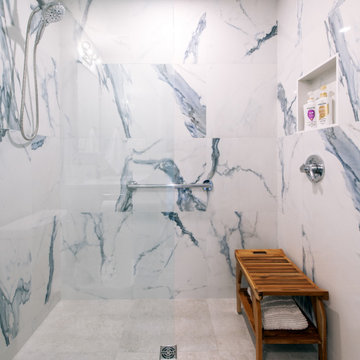 Lagois Design Build Renovate
Living in place with flex:
The mother of the homeowner needed a home that is fully accessible for living in place, so we created a barrier-free entry and installed grab bars. The new suite contains a full bedroom and bath and a small living room with a kitchenette.
One of the homeowners especially loves to cook. Now he has a new kitchen with more space, more storage, and better functionality.
Fresh paint, wallpaper and a new look:
We refinished the hardwood floors throughout and gave the whole home a fresh new look. We updated a powder room with paint, new tile, new fixtures, new lighting, and wallpaper.
Kitchen with space, flow, and storage:
The kitchen was cut off from the rest of the home. It had a long peninsula with awkward flow around the kitchen that just didn’t work. We removed the peninsula and instead created a large island with seating for three. With the new island, counter space is much more usable now. We put hidden cupboards underneath for added storage. The island also holds the built-in microwave with a steel drawer front below for continuity. We used banked drawers rather than cupboards for ease of access. We also installed new large appliances.
Coffee station, cookbooks, and spices:
We removed two clumsy closed pantries and an unused main door, and this allowed space for more cabinetry. We added an open shelf section with herringbone tile and a counter for a coffee station and cookbooks. Other features were a waste bin pullout with garbage bag storage and a tall spice pullout drawer.
The kitchen now has a big double-wide appliance garage where all small appliances are stored and organized in a big pantry with a light inside. All the appliances are front and centre (rather than buried in the back somewhere), yet hidden behind a door.
Flex space means other new spaces for everyone:
In creating a flex space for the mother on the main floor, the homeowners lost their space for a family room, although there is still a formal living and dining room on that floor. We solved it by creating a new finished basement with a family room to replace the one upstairs. This gives the family and the mother their own spaces and at the same time comfortable places for all of them.
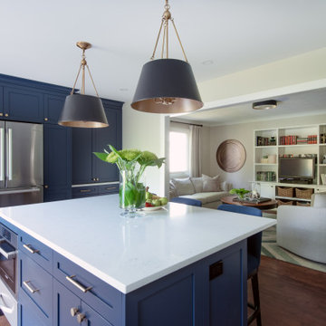 Lagois Design Build Renovate
Living in place with flex:
The mother of the homeowner needed a home that is fully accessible for living in place, so we created a barrier-free entry and installed grab bars. The new suite contains a full bedroom and bath and a small living room with a kitchenette.
One of the homeowners especially loves to cook. Now he has a new kitchen with more space, more storage, and better functionality.
Fresh paint, wallpaper and a new look:
We refinished the hardwood floors throughout and gave the whole home a fresh new look. We updated a powder room with paint, new tile, new fixtures, new lighting, and wallpaper.
Kitchen with space, flow, and storage:
The kitchen was cut off from the rest of the home. It had a long peninsula with awkward flow around the kitchen that just didn’t work. We removed the peninsula and instead created a large island with seating for three. With the new island, counter space is much more usable now. We put hidden cupboards underneath for added storage. The island also holds the built-in microwave with a steel drawer front below for continuity. We used banked drawers rather than cupboards for ease of access. We also installed new large appliances.
Coffee station, cookbooks, and spices:
We removed two clumsy closed pantries and an unused main door, and this allowed space for more cabinetry. We added an open shelf section with herringbone tile and a counter for a coffee station and cookbooks. Other features were a waste bin pullout with garbage bag storage and a tall spice pullout drawer.
The kitchen now has a big double-wide appliance garage where all small appliances are stored and organized in a big pantry with a light inside. All the appliances are front and centre (rather than buried in the back somewhere), yet hidden behind a door.
Flex space means other new spaces for everyone:
In creating a flex space for the mother on the main floor, the homeowners lost their space for a family room, although there is still a formal living and dining room on that floor. We solved it by creating a new finished basement with a family room to replace the one upstairs. This gives the family and the mother their own spaces and at the same time comfortable places for all of them.
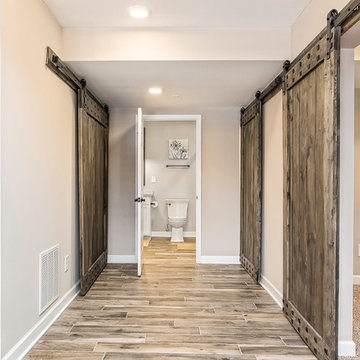
Sponsored
Sunbury, OH

J.Holderby - Renovations
Franklin County's Leading General Contractors - 2X Best of Houzz!
 Lagois Design Build Renovate
Living in place with flex:
The mother of the homeowner needed a home that is fully accessible for living in place, so we created a barrier-free entry and installed grab bars. The new suite contains a full bedroom and bath and a small living room with a kitchenette.
One of the homeowners especially loves to cook. Now he has a new kitchen with more space, more storage, and better functionality.
Fresh paint, wallpaper and a new look:
We refinished the hardwood floors throughout and gave the whole home a fresh new look. We updated a powder room with paint, new tile, new fixtures, new lighting, and wallpaper.
Kitchen with space, flow, and storage:
The kitchen was cut off from the rest of the home. It had a long peninsula with awkward flow around the kitchen that just didn’t work. We removed the peninsula and instead created a large island with seating for three. With the new island, counter space is much more usable now. We put hidden cupboards underneath for added storage. The island also holds the built-in microwave with a steel drawer front below for continuity. We used banked drawers rather than cupboards for ease of access. We also installed new large appliances.
Coffee station, cookbooks, and spices:
We removed two clumsy closed pantries and an unused main door, and this allowed space for more cabinetry. We added an open shelf section with herringbone tile and a counter for a coffee station and cookbooks. Other features were a waste bin pullout with garbage bag storage and a tall spice pullout drawer.
The kitchen now has a big double-wide appliance garage where all small appliances are stored and organized in a big pantry with a light inside. All the appliances are front and centre (rather than buried in the back somewhere), yet hidden behind a door.
Flex space means other new spaces for everyone:
In creating a flex space for the mother on the main floor, the homeowners lost their space for a family room, although there is still a formal living and dining room on that floor. We solved it by creating a new finished basement with a family room to replace the one upstairs. This gives the family and the mother their own spaces and at the same time comfortable places for all of them.
 Lagois Design Build Renovate
Living in place with flex:
The mother of the homeowner needed a home that is fully accessible for living in place, so we created a barrier-free entry and installed grab bars. The new suite contains a full bedroom and bath and a small living room with a kitchenette.
One of the homeowners especially loves to cook. Now he has a new kitchen with more space, more storage, and better functionality.
Fresh paint, wallpaper and a new look:
We refinished the hardwood floors throughout and gave the whole home a fresh new look. We updated a powder room with paint, new tile, new fixtures, new lighting, and wallpaper.
Kitchen with space, flow, and storage:
The kitchen was cut off from the rest of the home. It had a long peninsula with awkward flow around the kitchen that just didn’t work. We removed the peninsula and instead created a large island with seating for three. With the new island, counter space is much more usable now. We put hidden cupboards underneath for added storage. The island also holds the built-in microwave with a steel drawer front below for continuity. We used banked drawers rather than cupboards for ease of access. We also installed new large appliances.
Coffee station, cookbooks, and spices:
We removed two clumsy closed pantries and an unused main door, and this allowed space for more cabinetry. We added an open shelf section with herringbone tile and a counter for a coffee station and cookbooks. Other features were a waste bin pullout with garbage bag storage and a tall spice pullout drawer.
The kitchen now has a big double-wide appliance garage where all small appliances are stored and organized in a big pantry with a light inside. All the appliances are front and centre (rather than buried in the back somewhere), yet hidden behind a door.
Flex space means other new spaces for everyone:
In creating a flex space for the mother on the main floor, the homeowners lost their space for a family room, although there is still a formal living and dining room on that floor. We solved it by creating a new finished basement with a family room to replace the one upstairs. This gives the family and the mother their own spaces and at the same time comfortable places for all of them.

 Corinthian Fine Homes
This homeowner came to us with her basic design ready for us to execute for her kitchen, but also asked us to design and update her entry, sunroom and fireplace. Her kitchen was 80’s standard builder grade cabinetry and laminate countertops and she had a knee wall separating her kitchen from the family room. We removed that wall and installed a custom cabinetry buffet to complement the cabinetry of the kitchen, allowing for access from all sides. We removed a desk area in the kitchen and converted it to a closed organization station complete with a charging station for phones and computers. Calcutta Quartzite countertops were used throughout and continued seamlessly up the walls as a backsplash to create a wow factor. We converted a closet into a pantry cabinet, and new stainless appliances, including a microwave drawer completed this renovation.
Additionally, we updated her sunroom by removing the “popcorn” textured ceiling and gave it a fresh updated coat of paint. We installed 12x24 tile floor giving the room a simple classic transformation. Finally, we renewed the fireplace area, by building a custom mantle and adding wood paneling and trim to soften the marble fireplace face and a simple coat of paint in the entry and a new chandelier brought a lighter and fresher impact upon entering the home.

 Eminent Interior Design
Built by L. Cramer and Architect Kathy Alexander, Brandi was excited to design this charming new build on Lake Minnetonka. Situated on a narrow lot with unparalleled lake access, this project was all about maximizing every last inch of square footage! There are no formal spaces in this home; every finish was carefully considered and needed to be functional, durable, and family-friendly. The interior reflects the relaxed, calm pace of lake life. Soft lighting, warm tones, and bright natural colors all add to the sense of peace and understated elegance. The heart of the main floor is the cozy, connected great room. Design highlights include the glass and cable rail wine storage, reclaimed wood beams, large windows, a centerpiece kitchen island and range hood, and a hidden prep kitchen for hosting with ease. Brandi enjoyed helping this lovely family make the most of their beautiful home and its gorgeous setting!
Sponsored
Columbus, OH
Free consultation for landscape design!
Peabody Landscape Group
Columbus' Reliable Landscape Design & Contracting


 Travis Mark Photography
Travis Mark
Inspiration for a contemporary straight staircase remodel in New York
Inspiration for a contemporary straight staircase remodel in New York

 Chapman Design Group, Inc.
Mark Hoyle
Originally, this 3700 SF two level eclectic farmhouse from the mid 1980’s underwent design changes to reflect a more colonial style. Now, after being completely renovated with additional 2800 SF living space, it’s combined total of 6500 SF boasts an Energy Star certification of 5 stars.
Approaching this completed home, you will meander along a new driveway through the dense buffer of trees until you reach the clearing, and then circle a tiered fountain on axis with the front entry accentuating the symmetrical main structure. Many of the exterior changes included enclosing the front porch and rear screened porch, replacing windows, replacing all the vinyl siding with and fiber cement siding, creating a new front stoop with winding brick stairs and wrought iron railings as will as other additions to the left and rear of the home.
The existing interior was completely fro the studs and included modifying uses of many of the existing rooms such as converting the original dining room into an oval shaped theater with reclining theater seats, fiber-optic starlight ceiling and an 80” television with built-in surround sound. The laundry room increased in size by taking in the porch and received all new cabinets and finishes. The screened porch across the back of the house was enclosed to create a new dining room, enlarged the kitchen, all of which allows for a commanding view of the beautifully landscaped pool. The upper master suite begins by entering a private office then leads to a newly vaulted bedroom, a new master bathroom with natural light and an enlarged closet.
The major portion of the addition space was added to the left side as a part time home for the owner’s brother. This new addition boasts an open plan living, dining and kitchen, a master suite with a luxurious bathroom and walk–in closet, a guest suite, a garage and its own private gated brick courtyard entry and direct access to the well appointed pool patio.
And finally the last part of the project is the sunroom and new lagoon style pool. Tucked tightly against the rear of the home. This room was created to feel like a gazebo including a metal roof and stained wood ceiling, the foundation of this room was constructed with the pool to insure the look as if it is floating on the water. The pool’s negative edge opposite side allows open views of the trees beyond. There is a natural stone waterfall on one side of the pool and a shallow area on the opposite side for lounge chairs to be placed in it along with a hot tub that spills into the pool. The coping completes the pool’s natural shape and continues to the patio utilizing the same stone but separated by Zoysia grass keeping the natural theme. The finishing touches to this backyard oasis is completed utilizing large boulders, Tempest Torches, architectural lighting and abundant variety of landscaping complete the oasis for all to enjoy.
145