
Search results for "Continuous improvement" in Home Design Ideas
 Thyme & Place Design LLC
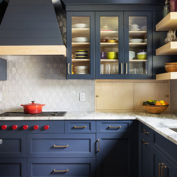
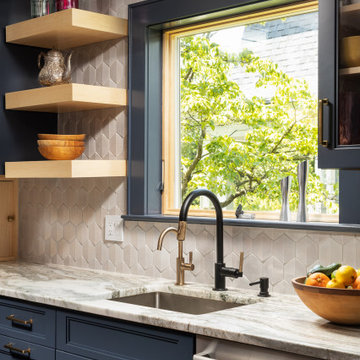
The client requested a kitchen that would not only provide a great space to cook and enjoy family meals but one that would fit in with her unique design sense. An avid collector of contemporary art, she wanted something unexpected in her 100-year-old home in both color and finishes but still providing a great layout with improved lighting, storage, and superior cooking abilities. The existing kitchen was in a closed off space trapped between the family room and the living. If you were in the kitchen, you were isolated from the rest of the house. Making the kitchen an integrated part of the home was a paramount request.
Step one, remove the wall separating the kitchen from the other rooms in the home which allowed the new kitchen to become an integrated space instead of an isolation room for the cook. Next, we relocated the pantry access which was in the family room to the kitchen integrating a poorly used recess which had become a catch all area which did not provide any usable space for storage or working area. To add valuable function in the kitchen we began by capturing unused "cubbies", adding a walk-in pantry from the kitchen, increasing the storage lost to un-needed drop ceilings and bring light and design to the space with a new large awning window, improved lighting, and combining interesting finishes and colors to reflect the artistic attitude of the client.
A bathroom located above the kitchen had been leaking into the plaster ceiling for several years. That along with knob and tube wiring, rotted beams and a brick wall from the back of the fireplace in the adjacent living room all needed to be brought to code. The walls, ceiling and floors in this 100+ year old home were completely out of level and the room’s foot print could not be increased.
The choice of a Sub-Zero wolf product is a standard in my kitchen designs. The quality of the product, its manufacturing and commitment to food preservation is the reason I specify Sub Zero Wolf. For the cook top, the integrated line of the contemporary cooktop and the signature red knobs against the navy blue of the cabinets added to the design vibe of the kitchen. The cooking performance and the large continuous grate on the cooktop makes it an obvious choice for a cook looking for a great cook top with professional results in a more streamlined profile. We selected a Sharp microwave drawer for the island, an XO wine refrigerator, Bosch dishwasher and Kitchen Aid double convection wall ovens to round out the appliance package.
A recess created by the fireplace was outfitted with a cabinet which now holds small appliances within easy reach of my very petite client. Natural maple accents were used inside all the wall cabinets and repeated on the front of the hood and for the sliding door appliance cabinet and the floating shelves. This allows a brighter interior for the painted cabinets instead of the traditional same interior as exterior finish choice. The was an amazing transformation from the old to the new.
The final touches are the honey bronze hardware from Top Knobs, Mitzi pendants from Hudson Valley Lighting group,
a fabulous faucet from Brizo. To eliminate the old freestanding bottled water cooler, we specified a matching water filter faucet.
 Cardinal Home Improvement
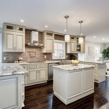
Example of a mid-sized classic u-shaped dark wood floor enclosed kitchen design in DC Metro with a farmhouse sink, raised-panel cabinets, white cabinets, granite countertops, multicolored backsplash, stone tile backsplash, stainless steel appliances and an island
 Interiors by Popov
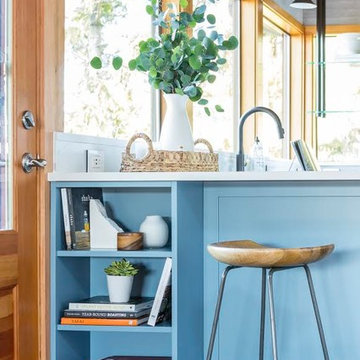
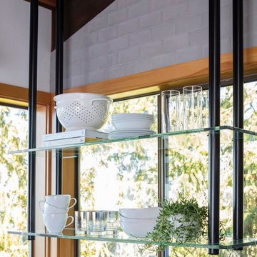
When we drove out to Mukilteo for our initial consultation, we immediately fell in love with this house. With its tall ceilings, eclectic mix of wood, glass and steel, and gorgeous view of the Puget Sound, we quickly nicknamed this project "The Mukilteo Gem". Our client, a cook and baker, did not like her existing kitchen. The main points of issue were short runs of available counter tops, lack of storage and shortage of light. So, we were called in to implement some big, bold ideas into a small footprint kitchen with big potential. We completely changed the layout of the room by creating a tall, built-in storage wall and a continuous u-shape counter top. Early in the project, we took inventory of every item our clients wanted to store in the kitchen and ensured that every spoon, gadget, or bowl would have a dedicated "home" in their new kitchen. The finishes were meticulously selected to ensure continuity throughout the house. We also played with the color scheme to achieve a bold yet natural feel.This kitchen is a prime example of how color can be used to both make a statement and project peace and balance simultaneously. While busy at work on our client's kitchen improvement, we also updated the entry and gave the homeowner a modern laundry room with triple the storage space they originally had.
End result: ecstatic clients and a very happy design team. That's what we call a big success!
John Granen.
Find the right local pro for your project
 Housetrends Magazine
Since moving into her Dublin home two and a half years ago, Nancy Sanford has been peeling off the decades—quite literally. Built in the 1980s, the home was “very well-maintained, but very little had been done to it” in terms of updating the finishes or style, Sanford says. Plush white carpet ran from wall-to-wall-to-wall, almond-colored laminate coated the kitchen cabinets and wallpaper ran rampant—even covering some ceilings.
Despite her efforts, Sanford knew it was going to take more than cosmetic editing to shake the ‘80s and make the home her own. Although she lives in the traditional-leaning Muirfield community, Sanford adores a minimalist, contemporary style—and admits to devouring design magazines “ad nauseam.”
To implement her thoroughly modern vision, Sanford turned to Brigid Norton, an interior designer and family friend, and Kristi Youles, a kitchen designer with The JAE Company. Working together, the trio created a carefully considered contemporary design that’s easy on the eyes, and the body.
In addition to improving the flow of the kitchen—by removing a V-shaped peninsula that angled out into the room—and adding appliances like a stainless steel refrigerator, Sanford’s short list of must-haves included clean, uncluttered lines and no wall cabinets over the countertops. “I’ve found as I’ve aged, I’ve gotten shorter and just don’t use the upper cabinets,” Sanford explains.
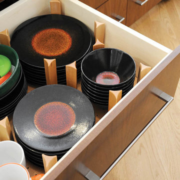
Easy-access, smooth-slide drawers with clean slab fronts were the answer—resulting in strong visual lines, an open, airy feel and enhanced ergonomics. Starting with a “needs assessment,” Youles and Norton designed the space quite literally around Nancy. By looking at factors such as her height and which items she uses most frequently, they were able to determine the optimum placement for everything from canned goods in the pantry to cutlery, pans and plates in the customized drawers, all of which helped to achieve the ultimate kitchen organization.
But there’s more to the kitchen cabinets smooth façade than clean-lined storage. Walnut drawer fronts—found on the oven and the base of the island—are book-matched, allowing the grain to continue from drawer to drawer. And even in spaces where drawers weren’t feasible, beneath the sink and in a desk area, the designers continued the look with cabinet doors crafted to resemble drawers.
The visual continuity of these lines might not be as impactful if it weren’t for the careful selection of contrasting finishes. The designers filled the space with pure, glossy white—using a specific type of quartz, White Cliff by Cambria, to accent the bold rectangular design of the island. Then, to break up the expanse of accompanying white painted drawers, walnut was selected to bring the contrasting warmth and grain of wood without red undertones. It is commonly found in modern furniture design, as well as current productions of mid-century designs like the iconic Eames Lounge Chair from Herman Miller, Youles says.
 Joni Spear Interior Design
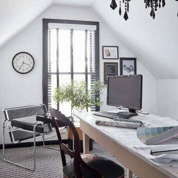
The antique farm style garden table doubles as a desk in this third floor home office.
Large transitional freestanding desk carpeted and blue floor home office library photo in St Louis with white walls
Large transitional freestanding desk carpeted and blue floor home office library photo in St Louis with white walls
 Thyme & Place Design LLC
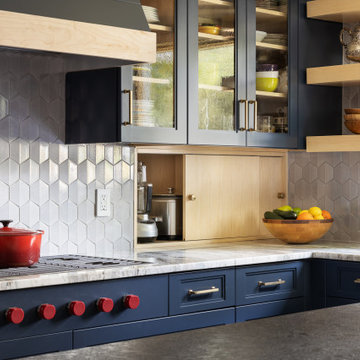
The client requested a kitchen that would not only provide a great space to cook and enjoy family meals but one that would fit in with her unique design sense. An avid collector of contemporary art, she wanted something unexpected in her 100-year-old home in both color and finishes but still providing a great layout with improved lighting, storage, and superior cooking abilities. The existing kitchen was in a closed off space trapped between the family room and the living. If you were in the kitchen, you were isolated from the rest of the house. Making the kitchen an integrated part of the home was a paramount request.
Step one, remove the wall separating the kitchen from the other rooms in the home which allowed the new kitchen to become an integrated space instead of an isolation room for the cook. Next, we relocated the pantry access which was in the family room to the kitchen integrating a poorly used recess which had become a catch all area which did not provide any usable space for storage or working area. To add valuable function in the kitchen we began by capturing unused "cubbies", adding a walk-in pantry from the kitchen, increasing the storage lost to un-needed drop ceilings and bring light and design to the space with a new large awning window, improved lighting, and combining interesting finishes and colors to reflect the artistic attitude of the client.
A bathroom located above the kitchen had been leaking into the plaster ceiling for several years. That along with knob and tube wiring, rotted beams and a brick wall from the back of the fireplace in the adjacent living room all needed to be brought to code. The walls, ceiling and floors in this 100+ year old home were completely out of level and the room’s foot print could not be increased.
The choice of a Sub-Zero wolf product is a standard in my kitchen designs. The quality of the product, its manufacturing and commitment to food preservation is the reason I specify Sub Zero Wolf. For the cook top, the integrated line of the contemporary cooktop and the signature red knobs against the navy blue of the cabinets added to the design vibe of the kitchen. The cooking performance and the large continuous grate on the cooktop makes it an obvious choice for a cook looking for a great cook top with professional results in a more streamlined profile. We selected a Sharp microwave drawer for the island, an XO wine refrigerator, Bosch dishwasher and Kitchen Aid double convection wall ovens to round out the appliance package.
A recess created by the fireplace was outfitted with a cabinet which now holds small appliances within easy reach of my very petite client. Natural maple accents were used inside all the wall cabinets and repeated on the front of the hood and for the sliding door appliance cabinet and the floating shelves. This allows a brighter interior for the painted cabinets instead of the traditional same interior as exterior finish choice. The was an amazing transformation from the old to the new.
The final touches are the honey bronze hardware from Top Knobs, Mitzi pendants from Hudson Valley Lighting group,
a fabulous faucet from Brizo. To eliminate the old freestanding bottled water cooler, we specified a matching water filter faucet.
 E_ Designs
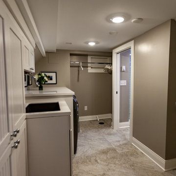
Tired of doing laundry in an unfinished rugged basement? These homeowner's were as well! They contacted Castle to help them with their basement planning and build for a finished laundry space and new bathroom with shower.
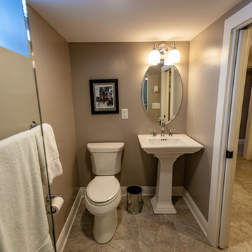
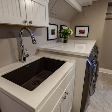
After the designer and client walked through ideas to improve flow of space, we decided to eliminate the existing 1/2 bath in the family room, and move the new bathroom into the existing laundry room. The full laundry room was finished to include new walls, ceilings, new plumbing, new Adura luxury vinyl tile flooring, beautiful shaker style cabinetry with beadboard panel, Glossy white Cultured marble countertops, a new Blanco composite sink, and Kohler Bellera faucet.
In the new bathroom space, we continued the Adura luxury vinyl flooring. Finishes in the bathroom include Kohler Memoirs pedestal sink, Kohler Archer faucet, custom hex tile shower floor, subway tile walls, and custom frameless glass shower enclosure.
Additional improvements were made to improve the health of the home including asbestos tile abatement, new drain tile and sump pump, new spray foam insulation, new glass block window, and a new Panasonic bathroom fan. We also decided to save and restore some original pieces in the home like their existing 5-panel doors and repurposing one salvaged door into a pocket door for the new bathroom.
The homeowner completed the basement finish with new carpeting in the family room. The whole basement feels fresh, new, and has a great flow. They will enjoy their happy and healthy home for years to come.

 Thyme & Place Design LLC
The client requested a kitchen that would not only provide a great space to cook and enjoy family meals but one that would fit in with her unique design sense. An avid collector of contemporary art, she wanted something unexpected in her 100-year-old home in both color and finishes but still providing a great layout with improved lighting, storage, and superior cooking abilities. The existing kitchen was in a closed off space trapped between the family room and the living. If you were in the kitchen, you were isolated from the rest of the house. Making the kitchen an integrated part of the home was a paramount request.
Step one, remove the wall separating the kitchen from the other rooms in the home which allowed the new kitchen to become an integrated space instead of an isolation room for the cook. Next, we relocated the pantry access which was in the family room to the kitchen integrating a poorly used recess which had become a catch all area which did not provide any usable space for storage or working area. To add valuable function in the kitchen we began by capturing unused "cubbies", adding a walk-in pantry from the kitchen, increasing the storage lost to un-needed drop ceilings and bring light and design to the space with a new large awning window, improved lighting, and combining interesting finishes and colors to reflect the artistic attitude of the client.
A bathroom located above the kitchen had been leaking into the plaster ceiling for several years. That along with knob and tube wiring, rotted beams and a brick wall from the back of the fireplace in the adjacent living room all needed to be brought to code. The walls, ceiling and floors in this 100+ year old home were completely out of level and the room’s foot print could not be increased.
The choice of a Sub-Zero wolf product is a standard in my kitchen designs. The quality of the product, its manufacturing and commitment to food preservation is the reason I specify Sub Zero Wolf. For the cook top, the integrated line of the contemporary cooktop and the signature red knobs against the navy blue of the cabinets added to the design vibe of the kitchen. The cooking performance and the large continuous grate on the cooktop makes it an obvious choice for a cook looking for a great cook top with professional results in a more streamlined profile. We selected a Sharp microwave drawer for the island, an XO wine refrigerator, Bosch dishwasher and Kitchen Aid double convection wall ovens to round out the appliance package.
A recess created by the fireplace was outfitted with a cabinet which now holds small appliances within easy reach of my very petite client. Natural maple accents were used inside all the wall cabinets and repeated on the front of the hood and for the sliding door appliance cabinet and the floating shelves. This allows a brighter interior for the painted cabinets instead of the traditional same interior as exterior finish choice. The was an amazing transformation from the old to the new.
The final touches are the honey bronze hardware from Top Knobs, Mitzi pendants from Hudson Valley Lighting group,
a fabulous faucet from Brizo. To eliminate the old freestanding bottled water cooler, we specified a matching water filter faucet.
 E_ Designs
Tired of doing laundry in an unfinished rugged basement? These homeowner's were as well! They contacted Castle to help them with their basement planning and build for a finished laundry space and new bathroom with shower.
After the designer and client walked through ideas to improve flow of space, we decided to eliminate the existing 1/2 bath in the family room, and move the new bathroom into the existing laundry room. The full laundry room was finished to include new walls, ceilings, new plumbing, new Adura luxury vinyl tile flooring, beautiful shaker style cabinetry with beadboard panel, Glossy white Cultured marble countertops, a new Blanco composite sink, and Kohler Bellera faucet.
In the new bathroom space, we continued the Adura luxury vinyl flooring. Finishes in the bathroom include Kohler Memoirs pedestal sink, Kohler Archer faucet, custom hex tile shower floor, subway tile walls, and custom frameless glass shower enclosure.
Additional improvements were made to improve the health of the home including asbestos tile abatement, new drain tile and sump pump, new spray foam insulation, new glass block window, and a new Panasonic bathroom fan. We also decided to save and restore some original pieces in the home like their existing 5-panel doors and repurposing one salvaged door into a pocket door for the new bathroom.
The homeowner completed the basement finish with new carpeting in the family room. The whole basement feels fresh, new, and has a great flow. They will enjoy their happy and healthy home for years to come.
 Interiors by Popov
When we drove out to Mukilteo for our initial consultation, we immediately fell in love with this house. With its tall ceilings, eclectic mix of wood, glass and steel, and gorgeous view of the Puget Sound, we quickly nicknamed this project "The Mukilteo Gem". Our client, a cook and baker, did not like her existing kitchen. The main points of issue were short runs of available counter tops, lack of storage and shortage of light. So, we were called in to implement some big, bold ideas into a small footprint kitchen with big potential. We completely changed the layout of the room by creating a tall, built-in storage wall and a continuous u-shape counter top. Early in the project, we took inventory of every item our clients wanted to store in the kitchen and ensured that every spoon, gadget, or bowl would have a dedicated "home" in their new kitchen. The finishes were meticulously selected to ensure continuity throughout the house. We also played with the color scheme to achieve a bold yet natural feel.This kitchen is a prime example of how color can be used to both make a statement and project peace and balance simultaneously. While busy at work on our client's kitchen improvement, we also updated the entry and gave the homeowner a modern laundry room with triple the storage space they originally had.
End result: ecstatic clients and a very happy design team. That's what we call a big success!
John Granen.
 E_ Designs
Tired of doing laundry in an unfinished rugged basement? These homeowner's were as well! They contacted Castle to help them with their basement planning and build for a finished laundry space and new bathroom with shower.
After the designer and client walked through ideas to improve flow of space, we decided to eliminate the existing 1/2 bath in the family room, and move the new bathroom into the existing laundry room. The full laundry room was finished to include new walls, ceilings, new plumbing, new Adura luxury vinyl tile flooring, beautiful shaker style cabinetry with beadboard panel, Glossy white Cultured marble countertops, a new Blanco composite sink, and Kohler Bellera faucet.
In the new bathroom space, we continued the Adura luxury vinyl flooring. Finishes in the bathroom include Kohler Memoirs pedestal sink, Kohler Archer faucet, custom hex tile shower floor, subway tile walls, and custom frameless glass shower enclosure.
Additional improvements were made to improve the health of the home including asbestos tile abatement, new drain tile and sump pump, new spray foam insulation, new glass block window, and a new Panasonic bathroom fan. We also decided to save and restore some original pieces in the home like their existing 5-panel doors and repurposing one salvaged door into a pocket door for the new bathroom.
The homeowner completed the basement finish with new carpeting in the family room. The whole basement feels fresh, new, and has a great flow. They will enjoy their happy and healthy home for years to come.
 Studio 1200
Design work for this eclectic 1900’s home in Maplewood started with making infrastructure improvements throughout the house. The new owners wanted systems that would be energy efficient and ecologically friendly. We installed a very high efficiency HVAC system, replaced the piping and plumbing throughout, and specified new super high efficiency windows. Other exterior improvements included new leaders and gutters, insulation, and new siding in some locations. These upgrades were balanced with maintaining as many as the original details of the house as possible.
When you walk into the house, you still sense the original character and charm of the house, but are surrounded by modern amenities and environmentally sensitive finishes. Specific renovations include updated and reconfigured bathrooms throughout, a new kitchen, finishing of the basement, and repurposing of several rooms so the house would have better flow.
In 2011 the family moved back to New York City, and new owners purchased this Maplewood home. We had the pleaser of working with them to design further improvements to the house necessitated by their growing family. We added a porte cochere, a family-room, and increased the ceiling height in their master bedroom. These improvements augmented our design work previously completed in 2008, and the house continues to be a blend of traditional old-house details with modern, contemporary furnishings that perfectly suite a family with young children.
 Studio 1200
Design work for this eclectic 1900’s home in Maplewood started with making infrastructure improvements throughout the house. The new owners wanted systems that would be energy efficient and ecologically friendly. We installed a very high efficiency HVAC system, replaced the piping and plumbing throughout, and specified new super high efficiency windows. Other exterior improvements included new leaders and gutters, insulation, and new siding in some locations. These upgrades were balanced with maintaining as many as the original details of the house as possible.
When you walk into the house, you still sense the original character and charm of the house, but are surrounded by modern amenities and environmentally sensitive finishes. Specific renovations include updated and reconfigured bathrooms throughout, a new kitchen, finishing of the basement, and repurposing of several rooms so the house would have better flow.
In 2011 the family moved back to New York City, and new owners purchased this Maplewood home. We had the pleaser of working with them to design further improvements to the house necessitated by their growing family. We added a porte cochere, a family-room, and increased the ceiling height in their master bedroom. These improvements augmented our design work previously completed in 2008, and the house continues to be a blend of traditional old-house details with modern, contemporary furnishings that perfectly suite a family with young children.
 Milgard Windows & Doors
The Kiguchi family moved into their Austin, Texas home in 1994. Built in the 1980’s as part of a neighborhood development, they happily raised their family here but longed for something more contemporary. Once they became empty nesters, they decided it was time for a major remodel. After spending many years visiting Austin AIA Home Tours that highlight contemporary residential architecture, they had a lot of ideas and in 2013 were ready to interview architects and get their renovation underway.
The project turned into a major remodel due to an unstable foundation. Architects Ben Arbib and Ed Hughey, of Arbib Hughey Design were hired to solve the structural issue and look for inspiration in the bones of the house, which sat on top of a hillside and was surrounded by great views.
Unfortunately, with the old floor plan, the beautiful views were hidden by small windows that were poorly placed. In order to bring more natural light into the house the window sizes and configurations had to be addressed, all while keeping in mind the homeowners desire for a modern look and feel.
To achieve a more contemporary and sophisticated front of house, a new entry was designed that included removing a two-story bay window and porch. The entrance of the home also became more integrated with the landscape creating a template for new foliage to be planted. Older exterior materials were updated to incorporate a more muted palette of colors with a metal roof, dark grey siding in the back and white stucco in the front. Deep eaves were added over many of the new large windows for clean lines and sun protection.
“Inside it was about opening up the floor plan, expanding the views throughout the house, and updating the material palette to get a modern look that was also warm and inviting,” said Ben from Arbib Hughey Design. “Prior to the remodel, the house had the typical separation of rooms. We removed the walls between them and changed all of the windows to Milgard Thermally Improved Aluminum to connect the inside with the outside. No matter where you are you get nice views and natural light.”
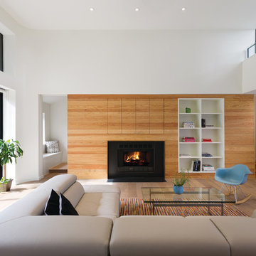
The architects wanted to create some drama, which they accomplished with the window placement and opening up the interior floor plan to an open concept approach. Cabinetry was used to help delineate intimate spaces. To add warmth to an all-white living room, white-washed oak wood floors were installed and pine planks were used around the fireplace. The large windows served as artwork bringing the color of nature into the space.
An octagon shaped, elevated dining room, (named “the turret”), had a big impact on the design of the house. They architects rounded the corners and added larger window openings overlooking a new sunken garden. The great room was also softened by rounding out the corners and that circular theme continued throughout the house, being picked up in skylight wells and kitchen cabinetry. A staircase leading to a catwalk was added and the result was a two-story window wall that flooded the home with natural light.
When asked why Milgard® Thermally Improved Aluminum windows were selected, the architectural team listed many reasons:
1) Aesthetics: “We liked the slim profiles and narrow sightlines. The window frames never get in the way of the view and that was important to us. They also have a very contemporary look that went well with our design.”
2) Options: “We liked that we could get large sliding doors that matched the windows, giving us a very cohesive look and feel throughout the project.”
3) Cost Effective: “Milgard windows are affordable. You get a good product at a good price.”
4) Custom Sizes: “Milgard windows are customizable, which allowed us to get the right window for each location.”
Ready to take on your own traditional to modern home remodeling project? Arbib Hughey Design advises, “Work with a good architect. That means picking a team that is creative, communicative, listens well and is responsive. We think it’s important for an architect to listen to their clients and give them something they want, not something the architect thinks they should have. At the same time you want an architect who is willing and able to think outside the box and offer up design options that you may not have considered. Design is about a lot of back and forth, trying out ideas, getting feedback and trying again.”
The home was completely transformed into a unique, contemporary house perfectly integrated with its site. Internally the home has a natural flow for the occupants and externally it is integrated with the surroundings taking advantage of great natural light. As a side note, it was highly praised as part of the Austin AIA homes tour.
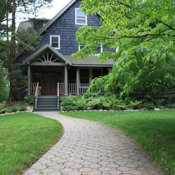 Studio 1200
Design work for this eclectic 1900’s home in Maplewood started with making infrastructure improvements throughout the house. The new owners wanted systems that would be energy efficient and ecologically friendly. We installed a very high efficiency HVAC system, replaced the piping and plumbing throughout, and specified new super high efficiency windows. Other exterior improvements included new leaders and gutters, insulation, and new siding in some locations. These upgrades were balanced with maintaining as many as the original details of the house as possible.
When you walk into the house, you still sense the original character and charm of the house, but are surrounded by modern amenities and environmentally sensitive finishes. Specific renovations include updated and reconfigured bathrooms throughout, a new kitchen, finishing of the basement, and repurposing of several rooms so the house would have better flow.
In 2011 the family moved back to New York City, and new owners purchased this Maplewood home. We had the pleaser of working with them to design further improvements to the house necessitated by their growing family. We added a porte cochere, a family-room, and increased the ceiling height in their master bedroom. These improvements augmented our design work previously completed in 2008, and the house continues to be a blend of traditional old-house details with modern, contemporary furnishings that perfectly suite a family with young children.
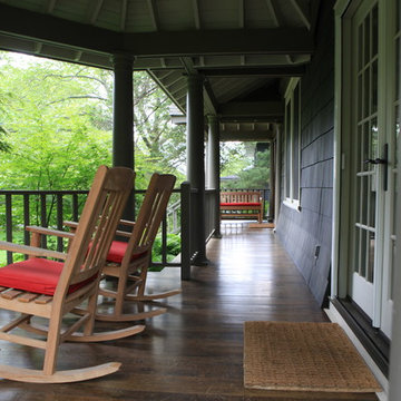 Studio 1200
Design work for this eclectic 1900’s home in Maplewood started with making infrastructure improvements throughout the house. The new owners wanted systems that would be energy efficient and ecologically friendly. We installed a very high efficiency HVAC system, replaced the piping and plumbing throughout, and specified new super high efficiency windows. Other exterior improvements included new leaders and gutters, insulation, and new siding in some locations. These upgrades were balanced with maintaining as many as the original details of the house as possible.
When you walk into the house, you still sense the original character and charm of the house, but are surrounded by modern amenities and environmentally sensitive finishes. Specific renovations include updated and reconfigured bathrooms throughout, a new kitchen, finishing of the basement, and repurposing of several rooms so the house would have better flow.
In 2011 the family moved back to New York City, and new owners purchased this Maplewood home. We had the pleaser of working with them to design further improvements to the house necessitated by their growing family. We added a porte cochere, a family-room, and increased the ceiling height in their master bedroom. These improvements augmented our design work previously completed in 2008, and the house continues to be a blend of traditional old-house details with modern, contemporary furnishings that perfectly suite a family with young children.
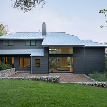 Milgard Windows & Doors
The Kiguchi family moved into their Austin, Texas home in 1994. Built in the 1980’s as part of a neighborhood development, they happily raised their family here but longed for something more contemporary. Once they became empty nesters, they decided it was time for a major remodel. After spending many years visiting Austin AIA Home Tours that highlight contemporary residential architecture, they had a lot of ideas and in 2013 were ready to interview architects and get their renovation underway.
The project turned into a major remodel due to an unstable foundation. Architects Ben Arbib and Ed Hughey, of Arbib Hughey Design were hired to solve the structural issue and look for inspiration in the bones of the house, which sat on top of a hillside and was surrounded by great views.
Unfortunately, with the old floor plan, the beautiful views were hidden by small windows that were poorly placed. In order to bring more natural light into the house the window sizes and configurations had to be addressed, all while keeping in mind the homeowners desire for a modern look and feel.
To achieve a more contemporary and sophisticated front of house, a new entry was designed that included removing a two-story bay window and porch. The entrance of the home also became more integrated with the landscape creating a template for new foliage to be planted. Older exterior materials were updated to incorporate a more muted palette of colors with a metal roof, dark grey siding in the back and white stucco in the front. Deep eaves were added over many of the new large windows for clean lines and sun protection.
“Inside it was about opening up the floor plan, expanding the views throughout the house, and updating the material palette to get a modern look that was also warm and inviting,” said Ben from Arbib Hughey Design. “Prior to the remodel, the house had the typical separation of rooms. We removed the walls between them and changed all of the windows to Milgard Thermally Improved Aluminum to connect the inside with the outside. No matter where you are you get nice views and natural light.”
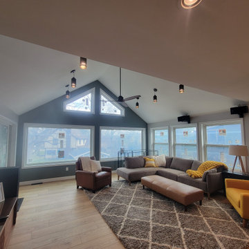
The architects wanted to create some drama, which they accomplished with the window placement and opening up the interior floor plan to an open concept approach. Cabinetry was used to help delineate intimate spaces. To add warmth to an all-white living room, white-washed oak wood floors were installed and pine planks were used around the fireplace. The large windows served as artwork bringing the color of nature into the space.
An octagon shaped, elevated dining room, (named “the turret”), had a big impact on the design of the house. They architects rounded the corners and added larger window openings overlooking a new sunken garden. The great room was also softened by rounding out the corners and that circular theme continued throughout the house, being picked up in skylight wells and kitchen cabinetry. A staircase leading to a catwalk was added and the result was a two-story window wall that flooded the home with natural light.
When asked why Milgard® Thermally Improved Aluminum windows were selected, the architectural team listed many reasons:
1) Aesthetics: “We liked the slim profiles and narrow sightlines. The window frames never get in the way of the view and that was important to us. They also have a very contemporary look that went well with our design.”
2) Options: “We liked that we could get large sliding doors that matched the windows, giving us a very cohesive look and feel throughout the project.”
3) Cost Effective: “Milgard windows are affordable. You get a good product at a good price.”
4) Custom Sizes: “Milgard windows are customizable, which allowed us to get the right window for each location.”
Ready to take on your own traditional to modern home remodeling project? Arbib Hughey Design advises, “Work with a good architect. That means picking a team that is creative, communicative, listens well and is responsive. We think it’s important for an architect to listen to their clients and give them something they want, not something the architect thinks they should have. At the same time you want an architect who is willing and able to think outside the box and offer up design options that you may not have considered. Design is about a lot of back and forth, trying out ideas, getting feedback and trying again.”
The home was completely transformed into a unique, contemporary house perfectly integrated with its site. Internally the home has a natural flow for the occupants and externally it is integrated with the surroundings taking advantage of great natural light. As a side note, it was highly praised as part of the Austin AIA homes tour.
 Thyme & Place Design LLC
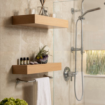
The clients, a young professional couple had lived with this bathroom in their townhome for 6 years. They finally could not take it any longer. The designer was tasked with turning this ugly duckling into a beautiful swan without relocating walls, doors, fittings, or fixtures in this principal bathroom. The client wish list included, better storage, improved lighting, replacing the tub with a shower, and creating a sparkling personality for this uninspired space using any color way except white.
The designer began the transformation with the wall tile. Large format rectangular tiles were installed floor to ceiling on the vanity wall and continued behind the toilet and into the shower. The soft variation in tile pattern is very soothing and added to the Zen feeling of the room. One partner is an avid gardener and wanted to bring natural colors into the space. The same tile is used on the floor in a matte finish for slip resistance and in a 2” mosaic of the same tile is used on the shower floor. A lighted tile recess was created across the entire back wall of the shower beautifully illuminating the wall. Recycled glass tiles used in the niche represent the color and shape of leaves. A single glass panel was used in place of a traditional shower door.
Continuing the serene colorway of the bath, natural rift cut white oak was chosen for the vanity and the floating shelves above the toilet. A white quartz for the countertop, has a small reflective pattern like the polished chrome of the fittings and hardware. Natural curved shapes are repeated in the arch of the faucet, the hardware, the front of the toilet and shower column. The rectangular shape of the tile is repeated in the drawer fronts of the cabinets, the sink, the medicine cabinet, and the floating shelves.
The shower column was selected to maintain the simple lines of the fittings while providing a temperature, pressure balance shower experience with a multi-function main shower head and handheld head. The dual flush toilet and low flow shower are a water saving consideration. The floating shelves provide decorative and functional storage. The asymmetric design of the medicine cabinet allows for a full view in the mirror with the added function of a tri view mirror when open. Built in LED lighting is controllable from 2500K to 4000K. The interior of the medicine cabinet is also mirrored and electrified to keep the countertop clear of necessities. Additional lighting is provided with recessed LED fixtures for the vanity area as well as in the shower. A motion sensor light installed under the vanity illuminates the room with a soft glow at night.
The transformation is now complete. No longer an ugly duckling and source of unhappiness, the new bathroom provides a much-needed respite from the couples’ busy lives. It has created a retreat to recharge and replenish, two very important components of wellness.
 Flavin Architects
New Additions to Hoover + Hill
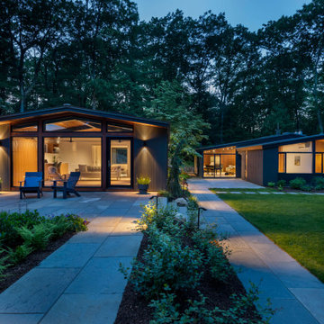
This project is a continuation of the renovation and updating work Flavin Architects had previously completed at the 1958 Wales house, designed by architect Henry Hoover and Walter Hill. Our clients, a young family, desired more space for guests, a home office, a yoga studio, and covered car parking. The challenge was to respect the architects’ original vision and not to interfere with the perfect cruciform plan of the house. To accomplish these goals, we converted the existing garage/workshop structure into a guest house and then designed a new, separate carport/storage building.
The new carport building shares the low-slope gable of the original Hoover structure. The post and beam structure characteristic of Hoover’s design is updated through the use of galvanized steel posts and I beams. The galvanized beams cantilever to support a sheltered walkway leading from the parking to a guest house terrace defined in relationship to the three structures surrounding it. The terrace is paved in slate with a central rain garden. Wood lattice clads the carport, providing good ventilation and letting the building glow like a lantern at night. Our guest house renovation celebrates the unique structural timber ceiling of the original garage. We replaced opaque plywood trusses with a slender cable truss structurally engineered by Webb Structural Services. This cable truss allows for a view of the timber ceiling. A wall of glass facing the courtyard replaced the original garage door. A murphy bed in the rear room enables quick conversion from guest quarters to weight room.
 Interiors by Popov
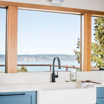
When we drove out to Mukilteo for our initial consultation, we immediately fell in love with this house. With its tall ceilings, eclectic mix of wood, glass and steel, and gorgeous view of the Puget Sound, we quickly nicknamed this project "The Mukilteo Gem". Our client, a cook and baker, did not like her existing kitchen. The main points of issue were short runs of available counter tops, lack of storage and shortage of light. So, we were called in to implement some big, bold ideas into a small footprint kitchen with big potential. We completely changed the layout of the room by creating a tall, built-in storage wall and a continuous u-shape counter top. Early in the project, we took inventory of every item our clients wanted to store in the kitchen and ensured that every spoon, gadget, or bowl would have a dedicated "home" in their new kitchen. The finishes were meticulously selected to ensure continuity throughout the house. We also played with the color scheme to achieve a bold yet natural feel.This kitchen is a prime example of how color can be used to both make a statement and project peace and balance simultaneously. While busy at work on our client's kitchen improvement, we also updated the entry and gave the homeowner a modern laundry room with triple the storage space they originally had.
End result: ecstatic clients and a very happy design team. That's what we call a big success!
John Granen.
13