
Search results for "Continuous improvement" in Home Design Ideas
 Revolve Design Shop
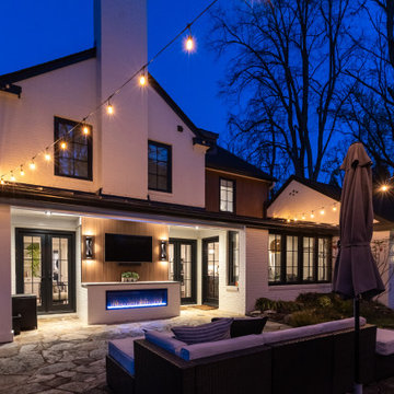
This exterior renovation aimed to revitalize a charming 1960s Southern colonial-style brick home while preserving its timeless appeal. The skilled design team at Revolve embraced the client's vision of a "Transitional Contemporary" style, skillfully blending classic and modern elements to create a truly unique outcome.
Revolve updated the home’s curved features, such as the classical columns and rounded bay windows, to achieve this beautiful transformation. They incorporated sleek lines and contemporary materials that exude sophistication. The removal of shutters and the enlargement of existing windows with modern frames and thermal glass enhanced the home’s visual appeal, increased interior natural light, and improved energy efficiency, contributing to the overall well-being of the homeowners. Gone are the days of painted-shut windows; the new windows now open smoothly, bringing a refreshing change!
In keeping with the original design of the house, Revolve maintained the existing second-floor porch along the front, eliminating the picket railing and traditional molding. These elements were replaced with square columns and a minimalist custom horizontal metal railing system. Additionally, the team thoughtfully enhanced the continuous masonry façade by removing sections of brick and replacing them with a contemporary wood rainscreen. This adjustment added depth to what was previously a flat elevation and tied together areas of the house that were re-clad from vinyl siding to wood plank. The design team also redefined the geometry of the multiple rooflines and third-floor dormers to create a cohesive overall design. Carefully selected paint and stain colors added warmth and dimension to the updated exterior.
Modern elements were introduced into the outdoor space, resulting in a cozy outdoor living area complete with a gas-powered fireplace and a large-screen TV—perfect for enjoying Ravens games with friends and family.
 Lee Meier Interiors
Design Firm - Lee Meier Interiors
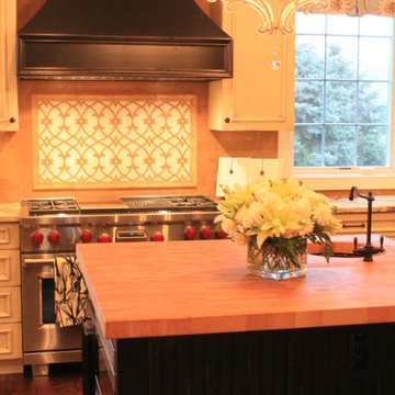
Once a small enclosed kitchen, this spacious kitchen became absolutely amazing once we removed the wall between the kitchen and laundry room. Moving the laundry room to the second level allowed for two islands and appliances any family of five would love. The two requests my client had was to make their kitchen organized and family friendly. I created zones throughout the kitchen to make the ease of use much more efficient. The prep island with butcher block has all of the cooking essentials close by. The refrigerator and microwave were strategically placed so that the children may access at anytime, while others may continue cooking. The large island allows for plenty of seating on one side, storage for cookbooks on both ends and a baking station opposite of the seating. Separated from the everyday action is a wonderful bar area for the adults in the home. I designed the space to not only have separate zones with cabinetry, but also with lighting. Each space has specific lighting to improve on the tasks at hand. The butlers pantry was designed to give storage and counter space leading into the dining room. To add more function to the area, the top drawer has a built in charging station with enough space for all tablets and phones. This fun family of fives kitchen is not only beautiful to look at, but serves well the heart of the home!
 Tectonic Design Build
Design:
This 1955 , Old North Boulder home carried the kind of architectural character you simply don’t recreate. From the beginning, the goal of this Boulder home remodel was not to erase its history, but to honor it.
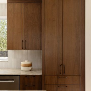
We partnered closely with the homeowners to curate a Mid-Century Modern aesthetic that felt authentic to the era while supporting their current lifestyle. The design leaned into clean lines, rich materials, and intentional restraint. Sleek walnut cabinetry became the foundation, paired with black and chrome accents for contrast and subtle sophistication.
Handcrafted Taj Mahal honed countertops added warmth and an earthy, organic quality that softened the modern edges. Every selection was made to feel cohesive, preserving the soul of the home while elevating it for daily living.
Build:
Functionality and spaciousness were the primary drivers of the build. As a design build Boulder team, we reworked the layout to create better flow through the kitchen, laundry, mini-mudroom, bathroom, and secondary bedrooms. Opening these spaces allowed the home to breathe while maintaining its mid-century integrity.
Custom walnut elements, including a built-in dining table, floating bench, and integrated shelving were thoughtfully crafted to echo the cabinetry and create continuity throughout the interior. These pieces not only enhance the design language but also add purposeful, everyday usability.
New windows and doors introduced abundant natural light while improving energy efficiency, calling our Passive Haus certification into play. Sustainability remained top of mind throughout the project, from material selection to execution, ensuring the home performs as beautifully as it looks.
The result is a Boulder home remodel that feels timeless, a respectful evolution of a 1950s classic, designed and built to serve this family for decades to come.
Find the right local pro for your project
 Klopf Architecture
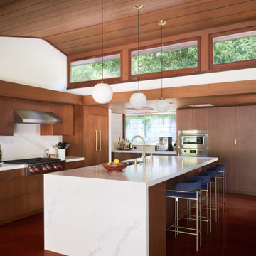
Nestled in the hills of Orinda, California, this 1951 residence is one of only seven extant homes, now known as “The Magnificent Seven”, designed by architect Olof Dahlstrand, a protégé of Frank Lloyd Wright. With its low-slung rooflines, natural materials, and deep integration with the sloping landscape, the home is a pristine example of mid-century modern design inspired by Wright’s organic principles. Over the years, prior homeowners have emphasized preservation, ensuring that the house remained relatively untouched. Each owner has respected the original architecture and stayed true to Dahlstrand’s intent. When a family of five—two college-aged sons and a middle school-aged daughter—acquired the property, they were captivated by its history, legacy of care, and architectural significance. While they appreciated Dahlstrand’s original vision, they also recognized the need to adapt the home for contemporary living while preserving its design integrity.
The remodel was conceived as a thoughtful response to the past—an effort to bring the house into the 21st century without compromising its soul. The primary mandate was to maintain architectural continuity while improving the functionality, comfort, and livability for a modern family. The design team—architects and contractor alike—worked with a shared reverence for the original architecture, allowing that mindset to guide even the most technical or pragmatic decisions.
A key objective was to increase natural light in the kitchen—a departure from Wrightian principles of enclosed, intimate cooking spaces—while maintaining the home’s architectural language. The kitchen was reconfigured to foster a stronger connection to adjacent living spaces while retaining the underlying concept of spatial separation. One of the most transformative architectural changes was the removal of a ridge beam that was originally planned to remain visible through the kitchen. During construction, the team collaborated on a better solution: a wide-flanged steel beam concealed within the roof envelope. This subtle move preserved the clean lines and ceiling continuity, a modern update carried out with utmost respect for the existing framework.
The home’s original powder room, previously accessible only through the kitchen, was relocated for better flow and privacy. A new powder room was carved out of former kitchen cabinetry—a narrow, interior space that could have felt dark and enclosed. To avoid this, the design extended the line of original transom windows into the new powder room and added a skylight above the vanity. The result is a bright and airy space that feels consistent with the rest of the home. Other updates included the installation of new solid-core interior doors with veneers carefully matched to the original mahogany, enhancing the continuity of the interiors. Even smaller decisions, such as placing the door knobs at 42 inches high, mirrored the original proportions. Every choice reflected a shared belief between the architect, contractor, and client: that new work should serve the integrity of the old.
The home’s extensive interior redwood millwork and paneling was meticulously restored. Where new materials were introduced—such as the replacement redwood soffit paneling—the contractor took pains to find finish nails that matched the original, rather than using modern equivalents. This level of craftsmanship and collaboration defined the project. It extended even to the detailing of a blind door to the new powder room, which had to disappear into the existing redwood board-and-batten wall. It was a team effort: the owner found a suitable handle, the architects devised the custom in-swing mechanism, and the contractor executed it so the door aligned precisely with the battens. Throughout, the homeowners were deeply engaged in the design process. One, a meticulous design enthusiast, focused on aesthetic integrity and historic detail. The other brought a practical and function-driven perspective, ensuring that new fixtures and materials would be durable and require minimal maintenance.
While the home’s location posed no major site challenges, sustainability was a key concern. The team upgraded the roof insulation, installed solar panels with battery storage, and added ductless mini-split cooling systems. Lighting was another area where modern technology was woven into a historic framework: new square LED fixtures echo the original custom perimeter soffit lights, maintaining the design language while offering advanced performance.
A planned expansion of a bedroom into suite with a bathroom had to be shelved due to budget constraints and the high cost of below-grade foundation work. Still, the team focused their efforts on making the most of the existing footprint, resolving constraints through design ingenuity rather than adding square footage. This renovation represents a collaborative achievement in preserving and evolving a historically significant home. Every decision was shaped by a shared ethos among clients, architects, and contractor: to maintain the home’s architectural soul while updating it for contemporary life. The result is a timeless modernist residence that continues Olof Dahlstrand’s legacy, remaining grounded in nature, craftsmanship, and human-scale design.
Klopf Architecture Team: John Klopf, AIA, Klara Kevane, Fernanda Bernardes
Interior Architectural Design: Klopf Architecture
Structural Engineer: Daniel Bastiao
Contractor: Don Larwood, Larwood Construction
Photography: Mariko Reed
Year Completed: 2022
 Michael Nash Design, Build & Homes
Living the dream on their estate home, this couple wanted to improve their ability to the home they built 12 years ago in the quiet suburb of Nokesville, VA.
Their vision for the master bathroom suite and adjacent closet space changed over the years.
They wanted direct access from master bathroom into the closet, which was not possible due to the spiral staircase. We removed this spiral staircase and moved bathroom wall by a foot into the closet, then built a wrap-around staircase allowing access to the upper level closet space. We installed wood flooring to continue bedroom and adjacent hallway floor into closet space.
The entire bathroom was gutted, redesigned to have a state of new art whirlpool tub which was placed under a new arch picture window facing scenery of the side yard. The tub was decked in solid marble and surrounded with matching wood paneling as used for custom vanities.
All plumbing was moved to create L-shape vanity spaces and make up area, with hidden mirrors behind hanging artwork.
A large multiple function shower with custom doors and floor to ceiling marble was placed on south side of this bathroom, and a closed water closet area was placed on the left end.
Using large scale marble tile floors with decorative accent tiles, crown, chair rail and fancy high-end hardware make this master suite a serene place for retiring in. The cream and gold color combination serves as a classic symbol of luxury.
 Driftwood Builders Roofing
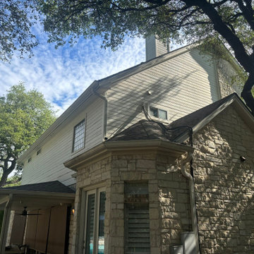
Just wrapped up a beautiful standing seam metal roof project in Westlake for a homeowner looking to upgrade both the appearance and performance of their roofing system. The previous roof was beginning to show signs of age and weather wear, so the new metal roofing system was selected for its durability, clean modern look, and ability to better withstand Central Texas storms.
The installation included a full roof replacement with upgraded synthetic underlayment, custom flashing work, ventilation improvements, and premium metal panels engineered for long-term weather resistance. Special attention was given to waterproofing details, roof transitions, valleys, and ventilation to help maximize the lifespan and efficiency of the system.
Metal roofing continues to be a strong option for homes in Westlake and throughout Austin because it offers excellent resistance to hail, wind, UV exposure, and heavy rain while also reducing maintenance needs over time. Standing seam systems are especially popular on custom and luxury homes due to their sleek architectural style and long-lasting performance.
Our team worked closely with the homeowner throughout the process to ensure the project stayed organized, clean, and professionally managed from inspection through final walkthrough. If you are searching for standing seam metal roofing in Westlake, luxury roof replacement in Austin, energy-efficient roofing systems, or premium metal roof contractors near you, a professionally installed metal roof can provide both long-term protection and elevated curb appeal.
 Katie Hutchison Studio
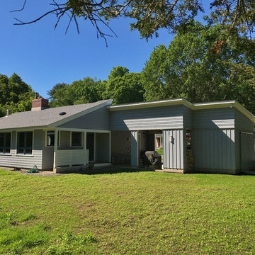
Constructed in two phases, this renovation, with a few small additions, touched nearly every room in this late ‘50’s ranch house. The owners raised their family within the original walls and love the house’s location, which is not far from town and also borders conservation land. But they didn’t love how chopped up the house was and the lack of exposure to natural daylight and views of the lush rear woods. Plus, they were ready to de-clutter for a more stream-lined look. As a result, KHS collaborated with them to create a quiet, clean design to support the lifestyle they aspire to in retirement.
To transform the original ranch house, KHS proposed several significant changes that would make way for a number of related improvements. Proposed changes included the removal of the attached enclosed breezeway (which had included a stair to the basement living space) and the two-car garage it partially wrapped, which had blocked vital eastern daylight from accessing the interior. Together the breezeway and garage had also contributed to a long, flush front façade. In its stead, KHS proposed a new two-car carport, attached storage shed, and exterior basement stair in a new location. The carport is bumped closer to the street to relieve the flush front facade and to allow access behind it to eastern daylight in a relocated rear kitchen. KHS also proposed a new, single, more prominent front entry, closer to the driveway to replace the former secondary entrance into the dark breezeway and a more formal main entrance that had been located much farther down the facade and curiously bordered the bedroom wing.
Inside, low ceilings and soffits in the primary family common areas were removed to create a cathedral ceiling (with rod ties) over a reconfigured semi-open living, dining, and kitchen space. A new gas fireplace serving the relocated dining area -- defined by a new built-in banquette in a new bay window -- was designed to back up on the existing wood-burning fireplace that continues to serve the living area. A shared full bath, serving two guest bedrooms on the main level, was reconfigured, and additional square footage was captured for a reconfigured master bathroom off the existing master bedroom. A new whole-house color palette, including new finishes and new cabinetry, complete the transformation. Today, the owners enjoy a fresh and airy re-imagining of their familiar ranch house.
Photos by Katie Hutchison
Sponsored
Columbus, OH

EverHome Improvement & Design
Top Choice for Reliable Tile & Stone | Franklin County, Ohio
 Jarrett Design
Jarrett Design is grateful for repeat clients, especially when they have impeccable taste.
In this case, we started with their guest bath. An antique-inspired, hand-pegged vanity from our Nest collection, in hand-planed quarter-sawn cherry with metal capped feet, sets the tone. Calcutta Gold marble warms the room while being complimented by a white marble top and traditional backsplash. Polished nickel fixtures, lighting, and hardware selected by the client add elegance. A special bathroom for special guests.
Next on the list were the laundry area, bar and fireplace. The laundry area greets those who enter through the casual back foyer of the home. It also backs up to the kitchen and breakfast nook. The clients wanted this area to be as beautiful as the other areas of the home and the visible washer and dryer were detracting from their vision. They also were hoping to allow this area to serve double duty as a buffet when they were entertaining. So, the decision was made to hide the washer and dryer with pocket doors. The new cabinetry had to match the existing wall cabinets in style and finish, which is no small task. Our Nest artist came to the rescue. A five-piece soapstone sink and distressed counter top complete the space with a nod to the past.
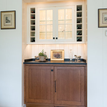
Our clients wished to add a beverage refrigerator to the existing bar. The wall cabinets were kept in place again. Inspired by a beloved antique corner cupboard also in this sitting room, we decided to use stained cabinetry for the base and refrigerator panel. Soapstone was used for the top and new fireplace surround, bringing continuity from the nearby back foyer.
Last, but definitely not least, the kitchen, banquette and powder room were addressed. The clients removed a glass door in lieu of a wide window to create a cozy breakfast nook featuring a Nest banquette base and table. Brackets for the bench were designed in keeping with the traditional details of the home. A handy drawer was incorporated. The double vase pedestal table with breadboard ends seats six comfortably.
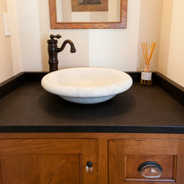
The powder room was updated with another antique reproduction vanity and beautiful vessel sink.
While the kitchen was beautifully done, it was showing its age and functional improvements were desired. This room, like the laundry room, was a project that included existing cabinetry mixed with matching new cabinetry. Precision was necessary. For better function and flow, the cooking surface was relocated from the island to the side wall. Instead of a cooktop with separate wall ovens, the clients opted for a pro style range. These design changes not only make prepping and cooking in the space much more enjoyable, but also allow for a wood hood flanked by bracketed glass cabinets to act a gorgeous focal point. Other changes included removing a small desk in lieu of a dresser style counter height base cabinet. This provided improved counter space and storage. The new island gave better storage, uninterrupted counter space and a perch for the cook or company. Calacatta Gold quartz tops are complimented by a natural limestone floor. A classic apron sink and faucet along with thoughtful cabinetry details are the icing on the cake. Don’t miss the clients’ fabulous collection of serving and display pieces! We told you they have impeccable taste!
 Skyline Sunrooms & Patio Covers
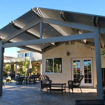
Skyline Sunrooms & Patio Covers: Our Skyline patio covers are all about creating an outdoor environment that enhances your lifestyle and improves and protects your home. We offer many styles of solid or lattice covers, either attached to your home or as a freestanding pergola or trellis in your yard.
We are experts at designing and building patio covers with the best aluminum products in the industry that look like premium grade wood but will never warp, crack, dry rot, burn or become infested with termites. They will never need to be re-painted or re-stained because they are factory painted in several colors with finishes that last for the lifetime of the product.
 John R. Schroeder, AIA
Photo by Jody Dole
This charming farmhouse sits atop a grassy hill overlooking a serene Connecticut River Estuary. The new design reformulated the first floor plan making it much more functional and visually exciting. It encompassed the reorganization of multiple spaces including the Mudroom, Kitchen, Dining Room, Family Room, Sun Room, Laundry, Bathroom, and Master Closet. The design also added, deleted, and relocated windows and French doors to greatly enhance exterior views, draw in more natural light, and seamlessly upgrade the articulation of exterior elevations. Improvements to the plumbing and mechanical systems were also made. The overall feeling is both sophisticated and yet very much down to earth.
John R. Schroeder, AIA is a professional design firm specializing in architecture, interiors, and planning. We have over 30 years experience with projects of all types, sizes, and levels of complexity. Because we love what we do, we approach our work with enthusiasm and dedication. We are committed to the highest level of design and service on each and every project. We engage our clients in positive and rewarding collaborations. We strive to exceed expectations through our attention to detail, our understanding of the “big picture”, and our ability to effectively manage a team of design professionals, industry representatives, and building contractors. We carefully analyze budgets and project objectives to assist clients with wise fund allocation.
We continually monitor and research advances in technology, materials, and construction methods, both sustainable and otherwise, to provide a responsible, well-suited, and cost effective product. Our design solutions are highly functional using both innovative and traditional approaches. Our aesthetic style is flexible and open, blending cues from client desires, building function, site context, and material properties, making each project unique, personalized, and enduring.
 STUDIO TASHIMA
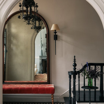
Keyes Road is a two-storey, semi-detached red brick house dating to around 1890-1910. The focus of our work was on the ground floor where we were asked to improve the layout and use of the main living areas of the house, for an active family of four. Important to the design was to maximise the quality and amount of light as well as connection to the garden and flow to the rest of the house.
Our proposal introduces three single storey extensions, comprising a central, large space that extends the main outrigger of the house. To each side are smaller volumes, affording a full width kitchen. While defining a series of discrete volumes, it was important for us to ensure that the kitchen, living, family and dining rooms that are interconnecting and continuous. The result is a big space punctuated by a series of differently sized arches, defining spaces to ensure their intimacy.
It was important for our client to have a sense of warmth and comfort - perhaps not dissimilar to the qualities of a hotel lobby. The colour scheme of the rooms are warm white painted plaster, natural wood flooring with black, bronze and brass accents. Indirect and carefully placed light fittings pulls together the atmosphere of the rooms - particularly in the evenings.
Externally, we felt it important to differentiate the extensions from the main house by using a dark, charcoal grey brick. This sets up a contrasting yet complimentary relationship to the rich red coloured brick house. The facets of the brick play with light and depth as do the graduated brick arches.
During the design process, we grappled with floor levels, the direction of sunlight, and care to not encroach on the neighbouring properties. As the house is in a conservation area, we worked closely with our trusted planning advisor. Throughout, we pursued a sensitive design strategy, using pitched roofs, matching materials and careful detailing. Internally, many of the original details are intact. This has enabled us to create an eclectic ensemble of elements, colours and materials varying in age and period.
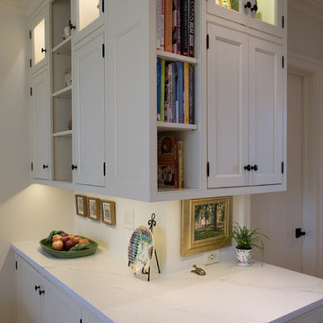 Jarrett Design
Jarrett Design is grateful for repeat clients, especially when they have impeccable taste.
In this case, we started with their guest bath. An antique-inspired, hand-pegged vanity from our Nest collection, in hand-planed quarter-sawn cherry with metal capped feet, sets the tone. Calcutta Gold marble warms the room while being complimented by a white marble top and traditional backsplash. Polished nickel fixtures, lighting, and hardware selected by the client add elegance. A special bathroom for special guests.
Next on the list were the laundry area, bar and fireplace. The laundry area greets those who enter through the casual back foyer of the home. It also backs up to the kitchen and breakfast nook. The clients wanted this area to be as beautiful as the other areas of the home and the visible washer and dryer were detracting from their vision. They also were hoping to allow this area to serve double duty as a buffet when they were entertaining. So, the decision was made to hide the washer and dryer with pocket doors. The new cabinetry had to match the existing wall cabinets in style and finish, which is no small task. Our Nest artist came to the rescue. A five-piece soapstone sink and distressed counter top complete the space with a nod to the past.
Our clients wished to add a beverage refrigerator to the existing bar. The wall cabinets were kept in place again. Inspired by a beloved antique corner cupboard also in this sitting room, we decided to use stained cabinetry for the base and refrigerator panel. Soapstone was used for the top and new fireplace surround, bringing continuity from the nearby back foyer.
Last, but definitely not least, the kitchen, banquette and powder room were addressed. The clients removed a glass door in lieu of a wide window to create a cozy breakfast nook featuring a Nest banquette base and table. Brackets for the bench were designed in keeping with the traditional details of the home. A handy drawer was incorporated. The double vase pedestal table with breadboard ends seats six comfortably.
The powder room was updated with another antique reproduction vanity and beautiful vessel sink.
While the kitchen was beautifully done, it was showing its age and functional improvements were desired. This room, like the laundry room, was a project that included existing cabinetry mixed with matching new cabinetry. Precision was necessary. For better function and flow, the cooking surface was relocated from the island to the side wall. Instead of a cooktop with separate wall ovens, the clients opted for a pro style range. These design changes not only make prepping and cooking in the space much more enjoyable, but also allow for a wood hood flanked by bracketed glass cabinets to act a gorgeous focal point. Other changes included removing a small desk in lieu of a dresser style counter height base cabinet. This provided improved counter space and storage. The new island gave better storage, uninterrupted counter space and a perch for the cook or company. Calacatta Gold quartz tops are complimented by a natural limestone floor. A classic apron sink and faucet along with thoughtful cabinetry details are the icing on the cake. Don’t miss the clients’ fabulous collection of serving and display pieces! We told you they have impeccable taste!
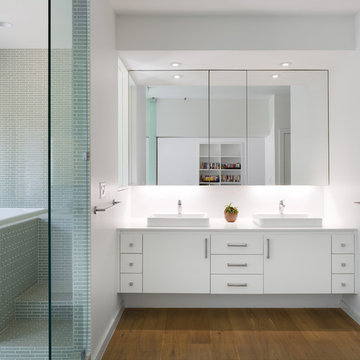
 Milgard Windows & Doors
The Kiguchi family moved into their Austin, Texas home in 1994. Built in the 1980’s as part of a neighborhood development, they happily raised their family here but longed for something more contemporary. Once they became empty nesters, they decided it was time for a major remodel. After spending many years visiting Austin AIA Home Tours that highlight contemporary residential architecture, they had a lot of ideas and in 2013 were ready to interview architects and get their renovation underway.
The project turned into a major remodel due to an unstable foundation. Architects Ben Arbib and Ed Hughey, of Arbib Hughey Design were hired to solve the structural issue and look for inspiration in the bones of the house, which sat on top of a hillside and was surrounded by great views.
Unfortunately, with the old floor plan, the beautiful views were hidden by small windows that were poorly placed. In order to bring more natural light into the house the window sizes and configurations had to be addressed, all while keeping in mind the homeowners desire for a modern look and feel.
To achieve a more contemporary and sophisticated front of house, a new entry was designed that included removing a two-story bay window and porch. The entrance of the home also became more integrated with the landscape creating a template for new foliage to be planted. Older exterior materials were updated to incorporate a more muted palette of colors with a metal roof, dark grey siding in the back and white stucco in the front. Deep eaves were added over many of the new large windows for clean lines and sun protection.
“Inside it was about opening up the floor plan, expanding the views throughout the house, and updating the material palette to get a modern look that was also warm and inviting,” said Ben from Arbib Hughey Design. “Prior to the remodel, the house had the typical separation of rooms. We removed the walls between them and changed all of the windows to Milgard Thermally Improved Aluminum to connect the inside with the outside. No matter where you are you get nice views and natural light.”
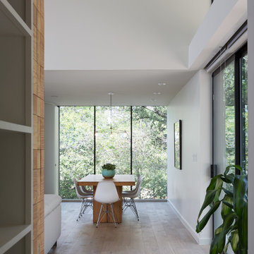
The architects wanted to create some drama, which they accomplished with the window placement and opening up the interior floor plan to an open concept approach. Cabinetry was used to help delineate intimate spaces. To add warmth to an all-white living room, white-washed oak wood floors were installed and pine planks were used around the fireplace. The large windows served as artwork bringing the color of nature into the space.
An octagon shaped, elevated dining room, (named “the turret”), had a big impact on the design of the house. They architects rounded the corners and added larger window openings overlooking a new sunken garden. The great room was also softened by rounding out the corners and that circular theme continued throughout the house, being picked up in skylight wells and kitchen cabinetry. A staircase leading to a catwalk was added and the result was a two-story window wall that flooded the home with natural light.
When asked why Milgard® Thermally Improved Aluminum windows were selected, the architectural team listed many reasons:
1) Aesthetics: “We liked the slim profiles and narrow sightlines. The window frames never get in the way of the view and that was important to us. They also have a very contemporary look that went well with our design.”
2) Options: “We liked that we could get large sliding doors that matched the windows, giving us a very cohesive look and feel throughout the project.”
3) Cost Effective: “Milgard windows are affordable. You get a good product at a good price.”
4) Custom Sizes: “Milgard windows are customizable, which allowed us to get the right window for each location.”
Ready to take on your own traditional to modern home remodeling project? Arbib Hughey Design advises, “Work with a good architect. That means picking a team that is creative, communicative, listens well and is responsive. We think it’s important for an architect to listen to their clients and give them something they want, not something the architect thinks they should have. At the same time you want an architect who is willing and able to think outside the box and offer up design options that you may not have considered. Design is about a lot of back and forth, trying out ideas, getting feedback and trying again.”
The home was completely transformed into a unique, contemporary house perfectly integrated with its site. Internally the home has a natural flow for the occupants and externally it is integrated with the surroundings taking advantage of great natural light. As a side note, it was highly praised as part of the Austin AIA homes tour.
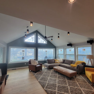

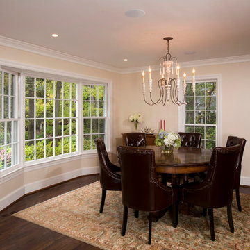
 Braswell Design+Build
This client sought to update their recently purchased home in Alexandria. A gourmet kitchen that complemented the size of the home and property was a top priority. They wanted more light-filled and connected living spaces for their growing family. Updating the finishes throughout the home was also a necessity.
Design challenges included an existing utility space that occupied a large portion of the kitchen footprint, making the kitchen cramped and narrow. In addition, the foyer was dark, confined and uninviting as a result of its organization and enclosed nature of the main stair.
To overcome the challenges, we relocated the utilities, creating a more usable footprint for the kitchen. The aging furnace was replaced with a high efficiency furnace located in a newly insulated and conditioned crawl space. A new hot water heater was placed in the finished attic, and the electrical panel was also relocated. Then, we designed a portion of the kitchen to mask the need for dropped structural headers: the refrigerator, freezer and pantry were placed under the area that necessitated a drop bulkhead, creating a sleek built-in area for the appliances.
Once the utilities were moved, the kitchen could be opened up to a large family room and designed with a much-improved layout. Two new four-panel exterior doors replaced small doors at the family room to connect the main living space with the beautiful yard. In addition, white bead board was added to the family room ceiling, creating more visual continuity with the adjacent white kitchen.
To transform the foyer into a grand and welcoming entry, a small amount of space was taken from a large second floor bedroom, and the entire second floor structure was supported with a series of flush beams to allow the stair to be opened and expose the rail. New glass doors to the den, relocated at an angle from the main stair provide the foyer with more natural light and a wider, more inviting path to the kitchen.
In the master suite, the bedroom and bathroom entry doors were relocated to improve the room’s layout and offer more bathroom privacy and space for a walk-in closet. A room forgotten by the previous owner was turned into a family mudroom with built-ins and wainscoting to keep the family organized in style.
Photography by Greg Hadley
 John R. Schroeder, AIA
Photo by Jody Dole
This charming farmhouse sits atop a grassy hill overlooking a serene Connecticut River Estuary. The new design reformulated the first floor plan making it much more functional and visually exciting. It encompassed the reorganization of multiple spaces including the Mudroom, Kitchen, Dining Room, Family Room, Sun Room, Laundry, Bathroom, and Master Closet. The design also added, deleted, and relocated windows and French doors to greatly enhance exterior views, draw in more natural light, and seamlessly upgrade the articulation of exterior elevations. Improvements to the plumbing and mechanical systems were also made. The overall feeling is both sophisticated and yet very much down to earth.
John R. Schroeder, AIA is a professional design firm specializing in architecture, interiors, and planning. We have over 30 years experience with projects of all types, sizes, and levels of complexity. Because we love what we do, we approach our work with enthusiasm and dedication. We are committed to the highest level of design and service on each and every project. We engage our clients in positive and rewarding collaborations. We strive to exceed expectations through our attention to detail, our understanding of the “big picture”, and our ability to effectively manage a team of design professionals, industry representatives, and building contractors. We carefully analyze budgets and project objectives to assist clients with wise fund allocation.
We continually monitor and research advances in technology, materials, and construction methods, both sustainable and otherwise, to provide a responsible, well-suited, and cost effective product. Our design solutions are highly functional using both innovative and traditional approaches. Our aesthetic style is flexible and open, blending cues from client desires, building function, site context, and material properties, making each project unique, personalized, and enduring.
 Milgard Windows & Doors
The Kiguchi family moved into their Austin, Texas home in 1994. Built in the 1980’s as part of a neighborhood development, they happily raised their family here but longed for something more contemporary. Once they became empty nesters, they decided it was time for a major remodel. After spending many years visiting Austin AIA Home Tours that highlight contemporary residential architecture, they had a lot of ideas and in 2013 were ready to interview architects and get their renovation underway.
The project turned into a major remodel due to an unstable foundation. Architects Ben Arbib and Ed Hughey, of Arbib Hughey Design were hired to solve the structural issue and look for inspiration in the bones of the house, which sat on top of a hillside and was surrounded by great views.
Unfortunately, with the old floor plan, the beautiful views were hidden by small windows that were poorly placed. In order to bring more natural light into the house the window sizes and configurations had to be addressed, all while keeping in mind the homeowners desire for a modern look and feel.
To achieve a more contemporary and sophisticated front of house, a new entry was designed that included removing a two-story bay window and porch. The entrance of the home also became more integrated with the landscape creating a template for new foliage to be planted. Older exterior materials were updated to incorporate a more muted palette of colors with a metal roof, dark grey siding in the back and white stucco in the front. Deep eaves were added over many of the new large windows for clean lines and sun protection.
“Inside it was about opening up the floor plan, expanding the views throughout the house, and updating the material palette to get a modern look that was also warm and inviting,” said Ben from Arbib Hughey Design. “Prior to the remodel, the house had the typical separation of rooms. We removed the walls between them and changed all of the windows to Milgard Thermally Improved Aluminum to connect the inside with the outside. No matter where you are you get nice views and natural light.”
The architects wanted to create some drama, which they accomplished with the window placement and opening up the interior floor plan to an open concept approach. Cabinetry was used to help delineate intimate spaces. To add warmth to an all-white living room, white-washed oak wood floors were installed and pine planks were used around the fireplace. The large windows served as artwork bringing the color of nature into the space.
An octagon shaped, elevated dining room, (named “the turret”), had a big impact on the design of the house. They architects rounded the corners and added larger window openings overlooking a new sunken garden. The great room was also softened by rounding out the corners and that circular theme continued throughout the house, being picked up in skylight wells and kitchen cabinetry. A staircase leading to a catwalk was added and the result was a two-story window wall that flooded the home with natural light.
When asked why Milgard® Thermally Improved Aluminum windows were selected, the architectural team listed many reasons:
1) Aesthetics: “We liked the slim profiles and narrow sightlines. The window frames never get in the way of the view and that was important to us. They also have a very contemporary look that went well with our design.”
2) Options: “We liked that we could get large sliding doors that matched the windows, giving us a very cohesive look and feel throughout the project.”
3) Cost Effective: “Milgard windows are affordable. You get a good product at a good price.”
4) Custom Sizes: “Milgard windows are customizable, which allowed us to get the right window for each location.”
Ready to take on your own traditional to modern home remodeling project? Arbib Hughey Design advises, “Work with a good architect. That means picking a team that is creative, communicative, listens well and is responsive. We think it’s important for an architect to listen to their clients and give them something they want, not something the architect thinks they should have. At the same time you want an architect who is willing and able to think outside the box and offer up design options that you may not have considered. Design is about a lot of back and forth, trying out ideas, getting feedback and trying again.”
The home was completely transformed into a unique, contemporary house perfectly integrated with its site. Internally the home has a natural flow for the occupants and externally it is integrated with the surroundings taking advantage of great natural light. As a side note, it was highly praised as part of the Austin AIA homes tour.
 SabaRehman Abdulrehman
In today’s world of smart interiors and luxury-inspired home décor, LED Mirror backlit designs have become a defining trend. From elegant bathrooms to sophisticated dressing areas and premium commercial spaces, LED Mirrors are now more than just reflective surfaces—they are statement pieces that combine technology, style, and functionality.
Whether you are renovating your home, upgrading a salon, designing a hotel, or creating a modern workspace, investing in a high-quality LED mirror can instantly elevate the atmosphere. The perfect balance of illumination and aesthetics makes these mirrors one of the most sought-after interior additions in contemporary architecture.
This blog explores everything you need to know about LED Mirror backlit solutions, their benefits, applications, features, and why they are becoming essential in modern living spaces.
What Is an LED Mirror Backlit Design?
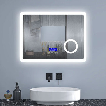
An LED Mirror backlit system refers to a mirror equipped with LED lighting installed behind the mirror surface. Instead of visible front-facing bulbs, the light gently radiates from the rear edges, producing a soft halo effect around the mirror.
This indirect illumination creates a luxurious and ambient glow while providing practical lighting for everyday tasks such as grooming, makeup application, shaving, and skincare routines.
Unlike traditional mirrors, LED Mirrors offer:
- Energy-efficient illumination
- Elegant visual appeal
- Better light distribution
- Enhanced functionality
- Modern smart features
- Bathrooms
- Bedrooms
- Dressing rooms
- Salons
- Hotels
- Restaurants
- Retail stores
- Reduces harsh shadows
- Improves visibility
- Enhances facial clarity
- Creates a comfortable lighting experience
- Reduce energy bills
- Lower electricity usage
- Support eco-friendly living
- Increase long-term savings
- Turn lights on/off
- Adjust brightness
- Change color temperature
- Bright white light for makeup application
- Warm soft light for relaxation
- Neutral lighting for everyday grooming
- Bluetooth speakers
- Digital clocks
- Temperature displays
- Voice control
- Motion sensors
- Better lighting for shaving and makeup
- Enhanced bathroom aesthetics
- Increased property value
- Luxurious visual appeal
- Salons
- Spas
- Hotels
- Restaurants
- Retail stores
- Compact rectangular mirrors work best
- Oversized backlit mirrors create a dramatic statement
- Rectangular
- Oval
- Round
- Square
- Custom geometric designs
- Warm White (cozy ambiance)
- Cool White (bright and crisp)
- Natural White (balanced daylight effect)
- Improve visual appeal
- Increase perceived luxury
- Enhance property value
- Small bathrooms
- Compact apartments
- Narrow dressing areas
Sponsored
Columbus, OH
EverHome Improvement & Design
Top Choice for Reliable Tile & Stone | Franklin County, Ohio
 Katie Hutchison Studio
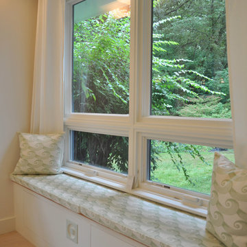
Constructed in two phases, this renovation, with a few small additions, touched nearly every room in this late ‘50’s ranch house. The owners raised their family within the original walls and love the house’s location, which is not far from town and also borders conservation land. But they didn’t love how chopped up the house was and the lack of exposure to natural daylight and views of the lush rear woods. Plus, they were ready to de-clutter for a more stream-lined look. As a result, KHS collaborated with them to create a quiet, clean design to support the lifestyle they aspire to in retirement.
To transform the original ranch house, KHS proposed several significant changes that would make way for a number of related improvements. Proposed changes included the removal of the attached enclosed breezeway (which had included a stair to the basement living space) and the two-car garage it partially wrapped, which had blocked vital eastern daylight from accessing the interior. Together the breezeway and garage had also contributed to a long, flush front façade. In its stead, KHS proposed a new two-car carport, attached storage shed, and exterior basement stair in a new location. The carport is bumped closer to the street to relieve the flush front facade and to allow access behind it to eastern daylight in a relocated rear kitchen. KHS also proposed a new, single, more prominent front entry, closer to the driveway to replace the former secondary entrance into the dark breezeway and a more formal main entrance that had been located much farther down the facade and curiously bordered the bedroom wing.
Inside, low ceilings and soffits in the primary family common areas were removed to create a cathedral ceiling (with rod ties) over a reconfigured semi-open living, dining, and kitchen space. A new gas fireplace serving the relocated dining area -- defined by a new built-in banquette in a new bay window -- was designed to back up on the existing wood-burning fireplace that continues to serve the living area. A shared full bath, serving two guest bedrooms on the main level, was reconfigured, and additional square footage was captured for a reconfigured master bathroom off the existing master bedroom. A new whole-house color palette, including new finishes and new cabinetry, complete the transformation. Today, the owners enjoy a fresh and airy re-imagining of their familiar ranch house.
Photos by Katie Hutchison
 Milgard Windows & Doors
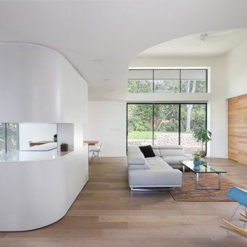
The Kiguchi family moved into their Austin, Texas home in 1994. Built in the 1980’s as part of a neighborhood development, they happily raised their family here but longed for something more contemporary. Once they became empty nesters, they decided it was time for a major remodel. After spending many years visiting Austin AIA Home Tours that highlight contemporary residential architecture, they had a lot of ideas and in 2013 were ready to interview architects and get their renovation underway.
The project turned into a major remodel due to an unstable foundation. Architects Ben Arbib and Ed Hughey, of Arbib Hughey Design were hired to solve the structural issue and look for inspiration in the bones of the house, which sat on top of a hillside and was surrounded by great views.
Unfortunately, with the old floor plan, the beautiful views were hidden by small windows that were poorly placed. In order to bring more natural light into the house the window sizes and configurations had to be addressed, all while keeping in mind the homeowners desire for a modern look and feel.
To achieve a more contemporary and sophisticated front of house, a new entry was designed that included removing a two-story bay window and porch. The entrance of the home also became more integrated with the landscape creating a template for new foliage to be planted. Older exterior materials were updated to incorporate a more muted palette of colors with a metal roof, dark grey siding in the back and white stucco in the front. Deep eaves were added over many of the new large windows for clean lines and sun protection.
“Inside it was about opening up the floor plan, expanding the views throughout the house, and updating the material palette to get a modern look that was also warm and inviting,” said Ben from Arbib Hughey Design. “Prior to the remodel, the house had the typical separation of rooms. We removed the walls between them and changed all of the windows to Milgard Thermally Improved Aluminum to connect the inside with the outside. No matter where you are you get nice views and natural light.”
The architects wanted to create some drama, which they accomplished with the window placement and opening up the interior floor plan to an open concept approach. Cabinetry was used to help delineate intimate spaces. To add warmth to an all-white living room, white-washed oak wood floors were installed and pine planks were used around the fireplace. The large windows served as artwork bringing the color of nature into the space.
An octagon shaped, elevated dining room, (named “the turret”), had a big impact on the design of the house. They architects rounded the corners and added larger window openings overlooking a new sunken garden. The great room was also softened by rounding out the corners and that circular theme continued throughout the house, being picked up in skylight wells and kitchen cabinetry. A staircase leading to a catwalk was added and the result was a two-story window wall that flooded the home with natural light.
When asked why Milgard® Thermally Improved Aluminum windows were selected, the architectural team listed many reasons:
1) Aesthetics: “We liked the slim profiles and narrow sightlines. The window frames never get in the way of the view and that was important to us. They also have a very contemporary look that went well with our design.”
2) Options: “We liked that we could get large sliding doors that matched the windows, giving us a very cohesive look and feel throughout the project.”
3) Cost Effective: “Milgard windows are affordable. You get a good product at a good price.”
4) Custom Sizes: “Milgard windows are customizable, which allowed us to get the right window for each location.”
Ready to take on your own traditional to modern home remodeling project? Arbib Hughey Design advises, “Work with a good architect. That means picking a team that is creative, communicative, listens well and is responsive. We think it’s important for an architect to listen to their clients and give them something they want, not something the architect thinks they should have. At the same time you want an architect who is willing and able to think outside the box and offer up design options that you may not have considered. Design is about a lot of back and forth, trying out ideas, getting feedback and trying again.”
The home was completely transformed into a unique, contemporary house perfectly integrated with its site. Internally the home has a natural flow for the occupants and externally it is integrated with the surroundings taking advantage of great natural light. As a side note, it was highly praised as part of the Austin AIA homes tour.
 Sub-Zero, Wolf, and Cove Showroom Philadelphia
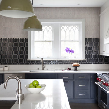
"I strove to accentuate the historic character, intricate millwork and details of the original house, while implementing a more updated aesthetic in the kitchen. We chose a fresh palette that modernized the kitchen's style, added a workhorse engineered-stone countertop and island, custom cabinetry, sophisticated tile, and superior appliances."
Mindy O'Connor
Melinda Kelson O’Connor Design, LLC
70