
Search results for "Craving" in Home Design Ideas
 FBC Remodel
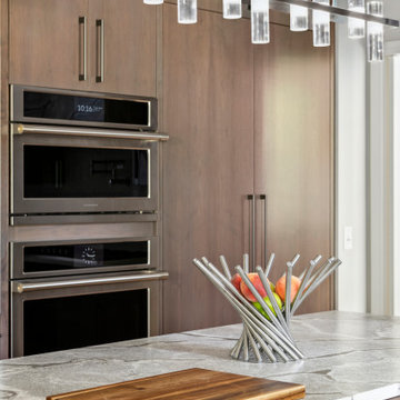
Seamless Pantry and Appliance Wall for a Sleek, Modern Kitchen
Blending form and function, this custom pantry and appliance wall is a masterclass in clean-lined design. Floor-to-ceiling cabinetry in warm wood tones creates a seamless look, offering abundant hidden storage while keeping the kitchen's aesthetic streamlined and sophisticated.
Hidden behind tall, paneled doors is a fully integrated refrigerator and freezer, cleverly disguised to maintain a cohesive flow with the surrounding cabinetry. Adjacent to the pantry, sleek built-in stainless steel appliances—including a double oven and microwave—are perfectly aligned for efficiency and ease of use.
Slim, matte black hardware adds a subtle modern edge, tying in with the kitchen’s overall contemporary vibe. The uninterrupted cabinetry faces the dramatic stone island, creating a visually balanced backdrop that enhances the kitchen's open, airy feel.
This thoughtful design is ideal for homeowners who crave a polished, minimalist look without sacrificing practicality or storage.
 Precision Homecrafters, LLC
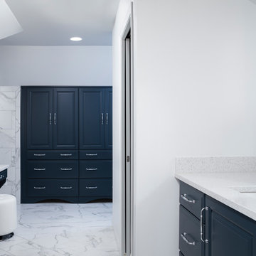
The Inverness Bathroom remodel had these goals: to complete the work while allowing the owner to continue to use their workshop below the project's construction, to provide a high-end quality product that was low-maintenance to the owners, to allow for future accessibility, more natural light and to better meet the daily needs of both the husband's and wife's lifestyles.
The first challenge was providing the required structural support to continue to clear span the two cargarage below which housed a workshop. The sheetrock removal, framing and sheetrock repairs and painting were completed first so the owner could continue to use his workshop, as requested. The HVAC supply line was originally an 8" duct that barely fit in the roof triangle between the ridge pole and ceiling. In order to provide the required air flow to additional supply vents in ceiling, a triangular duct was fabricated allowing us to use every square inch of available space. Since every exterior wall in the space adjoined a sloped ceiling, we installed ventilation baffles between each rafter and installed spray foam insulation.This project more than doubled the square footage of usable space. The new area houses a spaciousshower, large bathtub and dressing area. The addition of a window provides natural light. Instead of a small double vanity, they now have a his-and-hers vanity area. We wanted to provide a practical and comfortable space for the wife to get ready for her day and were able to incorporate a sit down make up station for her. The honed white marble looking tile is not only low maintenance but creates a clean bright spa appearance. The custom color vanities and built in linen press provide the perfect contrast of boldness to create the WOW factor. The sloped ceilings allowed us to maximize the amount of usable space plus provided the opportunity for the built in linen press with drawers at the bottom for additional storage. We were also able to combine two closets and add built in shelves for her. This created a dream space for our client that craved organization and functionality. A separate closet on opposite side of entrance provided suitable and comfortable closet space for him. In the end, these clients now have a large, bright and inviting master bath that will allow for complete accessibility in the future.
 The Tailored Closet & PremierGarage of Greater DC
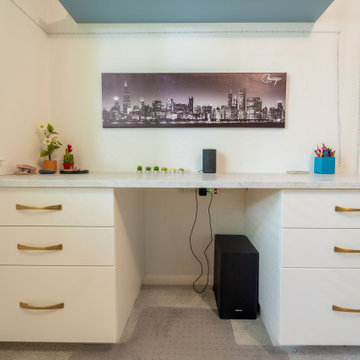
More and more families these days are choosing to remodel their homes versus move. So why not think more creatively about your space? One of the bedrooms in this beautiful home in Reston was given a full update with the addition of one of our Murphy beds as well as an accompanying set of built-ins and desk area. The result is a space that can be used functionally at all times of day and night and has given our clients the solution they craved.
Find the right local pro for your project
 The Cabinet Store + Culina Design
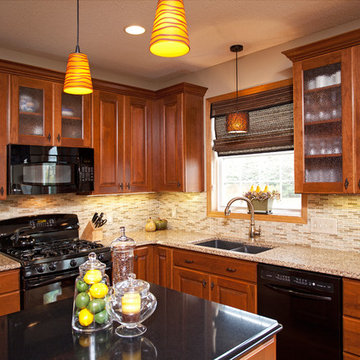
This project had both visual and practical components. The family was not only interested in updating the look of their kitchen, but also in creating a more efficient cabinet solution.
Over the course of a month we installed several cabinets from the Showplace Wood product line, replacing the family’s existing oak, builder grade cabinets. The clients opted for the Covington W door style with a full overlay composed of cherry wood in autumn stain. This combination gave the kitchen a warm and welcoming feel, while still maintaining the modern aesthetic the family craved.
Next, we replaced the family’s outdated Corian counters with beautiful Cambria countertops. They chose contrasting colors, placing Brownhill on the room’s perimeter spaces and Cambrian Black on the kitchen island. All of the countertops were finished with a three centimeter FS edge.
In the end we walked away from the home very proud of the transformation that we had completed. We were even more proud to learn that the happy homeowners shared our pride and excitement over their beautiful new space!
 Style In Form
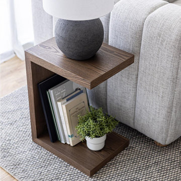
Introducing the Oscar C Table in dark oak, your new go-to tables that redefine versatility. These little wonders effortlessly slide under most sofas, bringing practicality to your living space.
The Oscar C table isn't limited to just one function. Use it as a side table, or double the charm by combining two to create a versatile coffee table. The choice is yours! Flexibility is the name of the game. Need to switch up the layout or move it around? No problem! The Oscar C table is designed for easy mobility, giving you the convenience you crave in every corner of your home.The possibilities truly are endless.
While these tables may not demand the spotlight, their dark oak allure adds a touch of sophistication to any room. Their crisp and functional charm will win you over in no time. Once you experience their everyday convenience, you'll wonder how you ever lived without them.
 Millworks Construction Services, LLC
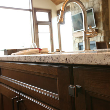
A duplex located across from Winter Park Ski Resort that still feels like it has that mountain rustic cabin feel that so many of our clients are craving.
 User
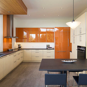
UserThis hillside home in Piedmont, CA was remodeled to change the style from a 1940's rancher with eight foot ceilings and dark interiors, into a modern geometric composition with vast white interiors for casual living and generous daylighting for displaying the artist-owner's works.
In a city known for rigorous and difficult design review, an addition, two variances, and a full stylistic change were unanimously approved on the first round. All sloped roofs and attics were eliminated and replaced by a series of stacked and overlapping flat roofs. This made the house taller on the inside and shorter on the outside, which helped earn design review cooperation in the community. Windows were concentrated toward the rear yard views or moved up high on the side walls for daylight and privacy, benefitting the owners as well as the neighbors.
At the start, the owner husband was so enthusiastic and engaged in transforming his house into something modern that he presented the architect with a scaled foamcore model, rather than the usual magazine clippings and wish list. He participated in the design decisions throughout the process. The owner wife is the artist who did all the artwork in the house. She had been craving a display space with large walls and good natural light. Both of them loved the location and great views.
The project was an opportunity to transform the style of an older traditional home into a modern one, while solving numerous problems. By rebuilding the 1800 ft2 top of the 3-story home it was possible to change the style of the whole building, since the lower floors were a neutral base, and also to change the lifestyle of the owners, who wanted to move their master suite upstairs and live primarily on the top floor as empty nesters.
Going into the project, the architect knew there were multiple encroachments into the setbacks and potential privacy issues with close by neighbors. He approached this as a complex puzzle made up of architectural and political pieces which all had to fit together elegantly. It took many careful moves, small and large, to arrive at a serene and cohesive result that tied old and new together seamlessly.
The design-build contractor worked closely with the owners and handled all of the construction phase documents and design adjustments, adding ideas of their own to make the project really sing.
The project was a collaboration in three acts. The owner had a strong design concept from the start. The architect developed it into a realistic project and garnered the design approvals. Then the contractor executed brilliantly.

Sponsored
Columbus, OH

Wannemacher Interiors
Customized Award-Winning Interior Design Solutions in Franklin Cnty OH
 Laura Yeager Smith Home & Design
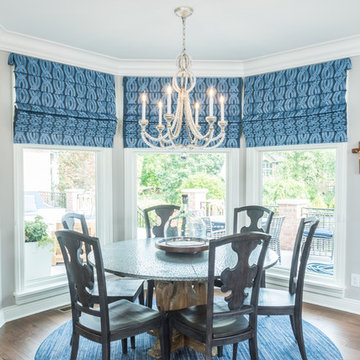
This project was a major renovation in collaboration with Payne & Payne Builders and Peninsula Architects. The dated home was taken down to the studs, reimagined, reconstructed and completely furnished for modern-day family life. A neutral paint scheme complemented the open plan. Clean lined cabinet hardware with accented details like glass and contrasting finishes added depth. No detail was spared with attention to well scaled furnishings, wall coverings, light fixtures, art, accessories and custom window treatments throughout the home. The goal was to create the casual, comfortable home our clients craved while honoring the scale and architecture of the home.
 My Inside Designer
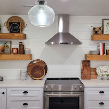
This basement kitchen felt cold and empty, so we installed custom floating wood shelves and added texture & warmth with accessories. The warm wood tones balance the white and stainless to give cohesion and wow factor that this homeowner was craving.
 Millworks Construction Services, LLC
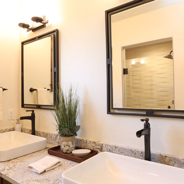
A duplex located across from Winter Park Ski Resort that still feels like it has that mountain rustic cabin feel that so many of our clients are craving.
 Laura Yeager Smith Home & Design
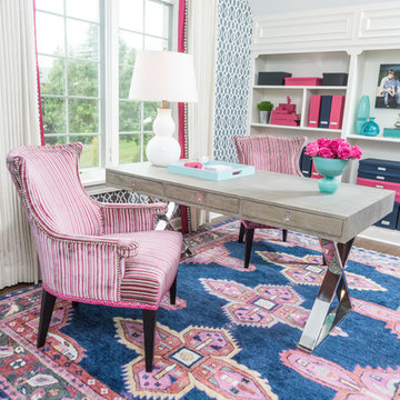
This project was a major renovation in collaboration with Payne & Payne Builders and Peninsula Architects. The dated home was taken down to the studs, reimagined, reconstructed and completely furnished for modern-day family life. A neutral paint scheme complemented the open plan. Clean lined cabinet hardware with accented details like glass and contrasting finishes added depth. No detail was spared with attention to well scaled furnishings, wall coverings, light fixtures, art, accessories and custom window treatments throughout the home. The goal was to create the casual, comfortable home our clients craved while honoring the scale and architecture of the home.

 Bennett Contracting, Inc.
Prepare to be wowed by this next renovation! These homeowners wanted it all: an updated layout, more space and a sleek, modern look. Project Manager, George Griffin, and Designer, Sarah McDonald, paired up for the overhaul of the home. We started by putting an addition onto the existing kitchen for more space. We then built a brand new deck and railing system outside to create an area for entertaining and enjoying the landscape. Inside, they craved ample storage, so we anchored the kitchen with a spacious island which crafted the perfect blend of symmetry and balance. Adding to the balance of the space was the custom ventilation hood that extended up into the vaulted ceiling area. Slab white doors meet quarter-sawn oak in a light gray wash, creating a harmonious palette that’s inviting for family and guests. Hidden storage and clever power solutions make this space perfect for gatherings and cozy meals alike. Flooring was redone throughout the bottom floor to make sure the space remained cohesive. Don’t miss the show-stopping light fixture on your way out to the new deck – it’s the cherry on top of this stunning renovation. Proof that dreams really do come true!
 Grand River Kitchens & Woodworking, Inc.
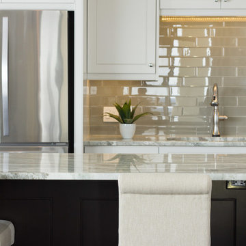
A cozy space, with comfortable seating will having you craving a cup of tea at this immaculate island.
Example of a mid-sized trendy l-shaped eat-in kitchen design in Toronto with an undermount sink, granite countertops, metallic backsplash, glass tile backsplash, stainless steel appliances, an island, recessed-panel cabinets and white cabinets
Example of a mid-sized trendy l-shaped eat-in kitchen design in Toronto with an undermount sink, granite countertops, metallic backsplash, glass tile backsplash, stainless steel appliances, an island, recessed-panel cabinets and white cabinets
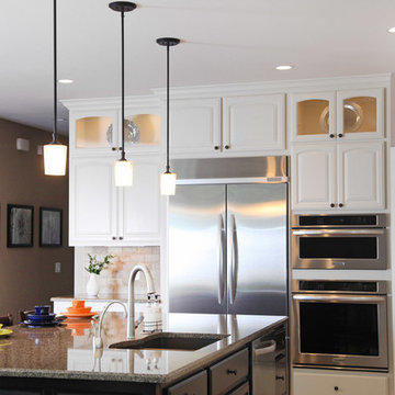
 Madison Lighting
Sometimes we crave the white kitchen with a bit more substance. Here we love the mocha painted walls, the varied tile backsplash, and the mix of dark wood cabbies with white ones. The deep bronze pendant lighting ties the rich cabinets, barstools and framed photos together. Photo by Shanna Wolf, S Photography.
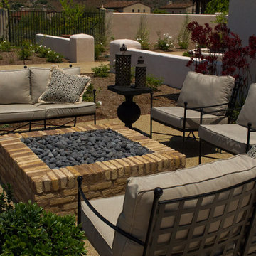
 Evoscapes, Luxury Landscape Design and Build
We brought the essence of a Spanish-style resort right to this Rancho Santa Fe home. Our clients craved a luxurious, low-maintenance space with all the amenities of a high-end retreat, and we delivered. From the drought-tolerant plants and dry riverbed in the front yard to the spacious fire pit and panoramic views in the side yard, every corner exudes relaxation. And of course, a grand pool in the backyard, transforming the space into the ultimate personal retreat for the homeowners.
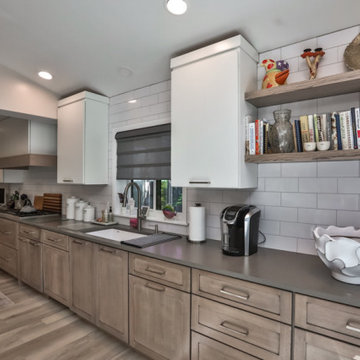 Bennett Contracting, Inc.
Prepare to be wowed by this next renovation! These homeowners wanted it all: an updated layout, more space and a sleek, modern look. Project Manager, George Griffin, and Designer, Sarah McDonald, paired up for the overhaul of the home. We started by putting an addition onto the existing kitchen for more space. We then built a brand new deck and railing system outside to create an area for entertaining and enjoying the landscape. Inside, they craved ample storage, so we anchored the kitchen with a spacious island which crafted the perfect blend of symmetry and balance. Adding to the balance of the space was the custom ventilation hood that extended up into the vaulted ceiling area. Slab white doors meet quarter-sawn oak in a light gray wash, creating a harmonious palette that’s inviting for family and guests. Hidden storage and clever power solutions make this space perfect for gatherings and cozy meals alike. Flooring was redone throughout the bottom floor to make sure the space remained cohesive. Don’t miss the show-stopping light fixture on your way out to the new deck – it’s the cherry on top of this stunning renovation. Proof that dreams really do come true!
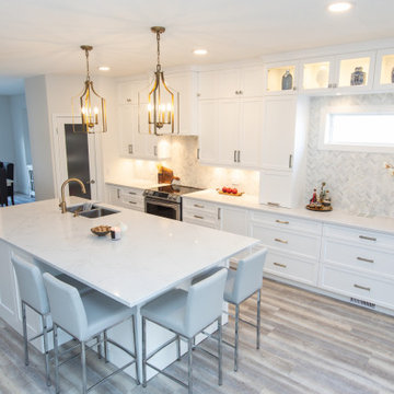
 Hammerdown Home Reno. & General Construction Inc.
There is nothing more timeless than a white transitional kitchen and this gleaming example is proof! Our clients started with a builder grade kitchen that was dark and dated for their taste. We installed new flooring throughout the main floor to reinforce the lighter colour palette they craved. The new cabinetry with double stacked uppers highlights their 9’ ceilings, and a grand island provides ample counter space. The previous layout included an unused “eat-in” area which we incorporated into the kitchen by extending the island and using the wall space to include a bar area and beautifully lit display cabinets. Brushed nickel hardware with touches of gold in the faucet and eye-catching lantern chandeliers bring warmth to the space. Our clients can’t wait to gather friends and family around the island in their new showstopping kitchen!
 Green Door Interiors
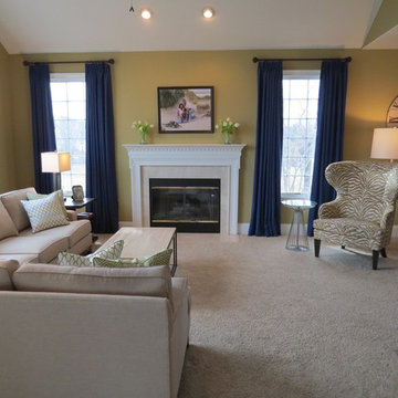
Sectional oatmeal linen sofa accented with green geometric fabric custom made pillows. The Cobalt Blue draperies are made from a luxe wool sateen and add that punch of color the homeowner was craving.
 GARY DUFF DESIGNS,LTD
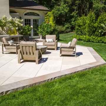
This outdoor seating area was inspired by the palatial pools at Caesar’s Palace in Las Vegas, these homeowners craved their own piece of paradise closer to home. From grand columns and diamond inlays to intricate balustrades and Techo Bloc's Travertina, Gary Duff Designs delivered a dreamy design right to their backyard. Revamped patios, featuring additional seating and a hospitable outdoor kitchen keeps the entire outdoor space feeling just as inviting as it is inspiring. The backyard’s classic old-world charm will leave you thinking of faraway places under the Tuscan sun.
 Laura Yeager Smith Home & Design
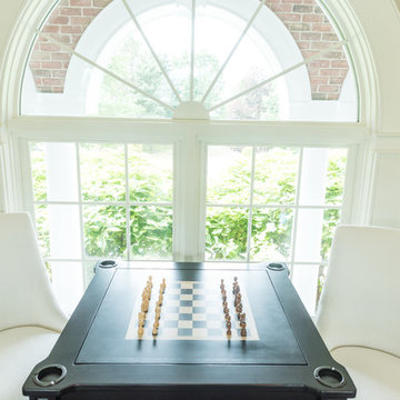
This project was a major renovation in collaboration with Payne & Payne Builders and Peninsula Architects. The dated home was taken down to the studs, reimagined, reconstructed and completely furnished for modern-day family life. A neutral paint scheme complemented the open plan. Clean lined cabinet hardware with accented details like glass and contrasting finishes added depth. No detail was spared with attention to well scaled furnishings, wall coverings, light fixtures, art, accessories and custom window treatments throughout the home. The goal was to create the casual, comfortable home our clients craved while honoring the scale and architecture of the home.
40