Search results for "Creating" in Home Design Ideas
Tucked neatly into an existing bay of the barn, the open kitchen is a comfortable hub of the home. Rather than create a solid division between the kitchen and the children's TV area, Franklin finished only the lower portion of the post-and-beam supports.
The ladder is one of the original features of the barn that Franklin could not imagine ever removing. Cleverly integrated into the support post, its original function allowed workers to climb above large haystacks and pick and toss hay down a chute to the feeding area below. Franklin's children, 10 and 14, also enjoy this aspect of their home. "The kids and their friends run, slide, climb up the ladder and have a ton of fun," he explains, "It’s a barn! It is a place to share with friends and family."
Adrienne DeRosa Photography

Tricia Shay Photography
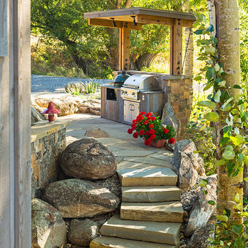
Large trendy courtyard concrete patio photo in Milwaukee with no cover

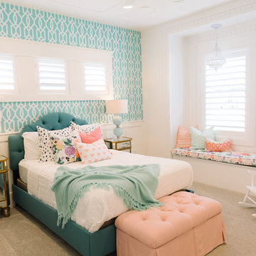
Kids' bedroom - coastal dark wood floor kids' bedroom idea in Boston with white walls
Find the right local pro for your project
I was honored to work with these homeowners again, now to fully furnish this new magnificent architectural marvel made especially for them by Lake Flato Architects. Creating custom furnishings for this entire home is a project that spanned over a year in careful planning, designing and sourcing while the home was being built and then installing soon thereafter. I embarked on this design challenge with three clear goals in mind. First, create a complete furnished environment that complimented not competed with the architecture. Second, elevate the client’s quality of life by providing beautiful, finely-made, comfortable, easy-care furnishings. Third, provide a visually stunning aesthetic that is minimalist, well-edited, natural, luxurious and certainly one of kind. Ultimately, I feel we succeeded in creating a visual symphony accompaniment to the architecture of this room, enhancing the warmth and livability of the space while keeping high design as the principal focus.
The centerpiece of this modern sectional is the collection of aged bronze and wood faceted cocktail tables to create a sculptural dynamic focal point to this otherwise very linear space.
From this room there is a view of the solar panels installed on a glass ceiling at the breezeway. Also there is a 1 ton sliding wood door that shades this wall of windows when needed for privacy and shade.

The property is one of the original farm houses located on the main street of a small town. It has been in the family for many years and our client just inherited the property. They were trying to have balance of preserving the old while realizing modern day living has its benefits too. The house had a large addition added using mostly old style materials, but designed with function and modern day luxuries. Our goal was to carry that theme to the outside.
Our first problem we had to address was how to transition between the first floor elevation changes. The lower room was the husband’s office. He stated in the future he may have clients over and it would be nice to have an area to sit outside. The wife’s main concern was to renew the four corner garden. She also felt it was very important to be able to see it from the kitchen area. Finally there was an old wishing well stuck right outside the kitchen. They both felt it would be neat to be able to incorporate this in some how. They wanted a patio area with a built in grill to accommodate there family and friends. They also wanted to keep a large play area for the kids.
We were able to pull this off successfully. We addressed the first issue by having a small lower level flagstone area. This area is large enough for 1 to 2 people to sit comfortably. It also provides a transition from his office to the larger patio area. We installed a simple small gravel sitting area opposite of the main patio. This provides our client a secluded place to relax or do business. Mrs.... told me she is amazed how much her and her husband enjoys this area. It is so peaceful looking at the small creek over a glass of wine.
We built a natural limestone retaining wall to create the patio terrace. The stone was chosen to extend the houses architectural elements into the landscape. Irregular broken flagstone was used to give it a more casual feel. We installed three Serviceberries into the patio terrace to replace some trees that were taken down during the remodeling. She was very concern that they would block the view of the four corner garden. We new they were crucial to nestle in the terrace, so we placed them for a couple days for her to decide. Fortunately she agreed they not only kept the view open, but helped frame the garden.
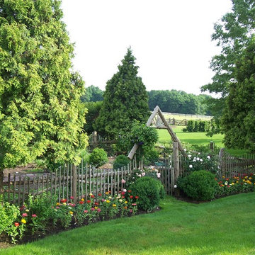
The four corner garden was designed to be viewed from afar and experienced up close. We wanted the space to have some formal structure while keeping with the casual farm house feel. Another natural limestone retaining wall was created. This leveled the garden terrace and helped associate it with the rest of the property. The four corner garden is nestled into the existing woods edge. This provides three distinct experiences to entering the garden; a more formal from the driveway, an open feel from the lower lawn, and a more natural / casual experience from the wooded area. The Plymouth brown gravel was used for the center of the garden. This helped highlight the stone post that was found during construction. The gravel also brings the sense of sound into the garden space. Lamb’s ear was chosen as a fun way to get kids interest in horticulture.
The balance of using the new to create the old feel is what makes this project a success. The property has already hosted a local historical society event and won an award for its preservation efforts. When Mrs.... can’t find her husband, she knows he is either reading the newspaper by the grill or resting in the hammock along the wood’s path.

Matthew Millman
Living room - transitional living room idea in San Francisco with a stone fireplace and white walls

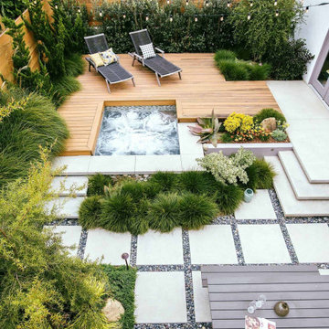
A contrasting palette of grey concrete pavers meanders through the backyard of this Casey Key residence. The floating fence panels provide privacy while offering glimpses of the gulf frontage beyond. The opposing angle of each panel creates a visual chevron pattern.

Sponsored
Delaware, OH
Buckeye Basements, Inc.
Central Ohio's Basement Finishing ExpertsBest Of Houzz '13-'21

Small eclectic loft-style light wood floor and beige floor living room photo in Los Angeles with multicolored walls, a corner fireplace, a plaster fireplace and a wall-mounted tv

Our clients had just recently closed on their new house in Stapleton and were excited to transform it into their perfect forever home. They wanted to remodel the entire first floor to create a more open floor plan and develop a smoother flow through the house that better fit the needs of their family. The original layout consisted of several small rooms that just weren’t very functional, so we decided to remove the walls that were breaking up the space and restructure the first floor to create a wonderfully open feel.
After removing the existing walls, we rearranged their spaces to give them an office at the front of the house, a large living room, and a large dining room that connects seamlessly with the kitchen. We also wanted to center the foyer in the home and allow more light to travel through the first floor, so we replaced their existing doors with beautiful custom sliding doors to the back yard and a gorgeous walnut door with side lights to greet guests at the front of their home.
Living Room
Our clients wanted a living room that could accommodate an inviting sectional, a baby grand piano, and plenty of space for family game nights. So, we transformed what had been a small office and sitting room into a large open living room with custom wood columns. We wanted to avoid making the home feel too vast and monumental, so we designed custom beams and columns to define spaces and to make the house feel like a home. Aesthetically we wanted their home to be soft and inviting, so we utilized a neutral color palette with occasional accents of muted blues and greens.
Dining Room
Our clients were also looking for a large dining room that was open to the rest of the home and perfect for big family gatherings. So, we removed what had been a small family room and eat-in dining area to create a spacious dining room with a fireplace and bar. We added custom cabinetry to the bar area with open shelving for displaying and designed a custom surround for their fireplace that ties in with the wood work we designed for their living room. We brought in the tones and materiality from the kitchen to unite the spaces and added a mixed metal light fixture to bring the space together
Kitchen
We wanted the kitchen to be a real show stopper and carry through the calm muted tones we were utilizing throughout their home. We reoriented the kitchen to allow for a big beautiful custom island and to give us the opportunity for a focal wall with cooktop and range hood. Their custom island was perfectly complimented with a dramatic quartz counter top and oversized pendants making it the real center of their home. Since they enter the kitchen first when coming from their detached garage, we included a small mud-room area right by the back door to catch everyone’s coats and shoes as they come in. We also created a new walk-in pantry with plenty of open storage and a fun chalkboard door for writing notes, recipes, and grocery lists.
Office
We transformed the original dining room into a handsome office at the front of the house. We designed custom walnut built-ins to house all of their books, and added glass french doors to give them a bit of privacy without making the space too closed off. We painted the room a deep muted blue to create a glimpse of rich color through the french doors
Powder Room
The powder room is a wonderful play on textures. We used a neutral palette with contrasting tones to create dramatic moments in this little space with accents of brushed gold.
Master Bathroom
The existing master bathroom had an awkward layout and outdated finishes, so we redesigned the space to create a clean layout with a dream worthy shower. We continued to use neutral tones that tie in with the rest of the home, but had fun playing with tile textures and patterns to create an eye-catching vanity. The wood-look tile planks along the floor provide a soft backdrop for their new free-standing bathtub and contrast beautifully with the deep ash finish on the cabinetry.

David Lauer Photography
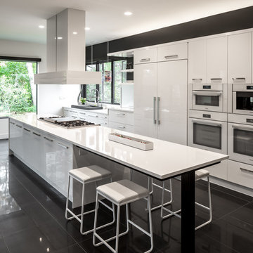
Inspiration for a mid-century modern kitchen remodel in Denver

These homeowners came to us wanting to upgrade the curb appeal of their home and improve the layout of the interior. They hoped for an entry that would welcome guests to their home both inside and out, while also creating more defined and purposeful space within the home. The main goals of the project were to add a covered wrap around porch, add more windows for natural light, create a formal entry that housed the client’s baby grand piano, and add a home office for the clients to work from home.
With a dated exterior and facade that lacked dimension, there was little charm to be had. The front door was hidden from visitors and a lack of windows made the exterior unoriginal. We approached the exterior design pulling inspiration from the farmhouse style, southern porches, and craftsman style homes. Eventually we landed on a design that added numerous windows to the front façade, reminiscent of a farmhouse, and turned a Dutch hipped roof into an extended gable roof, creating a large front porch and adding curb appeal interest. By relocating the entry door to the front of the house and adding a gable accent over this new door, it created a focal point for guests and passersby. In addition to those design elements, we incorporated some exterior shutters rated for our northwest climate that echoed the southern style homes our client loved. A greige paint color (Benjamin Moore Cape May Cobblestone) accented with a white trim (Benjamin Moore Swiss Coffee) and a black front door, shutters, and window box (Sherwin Williams Black Magic) all work together to create a charming and welcoming façade.
On the interior we removed a half wall and coat closet that separated the original cramped entryway from the front room. The front room was a multipurpose space that didn’t have a designated use for the family, it became a catch-all space that was easily cluttered. Through the design process we came up with a plan to split the spaces into 2 rooms, a large open semi-formal entryway and a home office. The semi-formal entryway was intentionally designed to house the homeowner’s baby grand piano – a real showstopper. The flow created by this entryway is welcoming and ushers you into a beautifully curated home.
A new office now sits right off the entryway with beautiful French doors, built-in cabinetry, and an abundance of natural light – everything that one dreams of for their home office. The home office looks out to the front porch and front yard as well as the pastural side yard where the children frequently play. The office is an ideal location for a moment of inspiration, reflection, and focus. A warm white paint (Benjamin Moore Swiss Coffee) combined with the newly installed light oak luxury vinyl plank flooring runs throughout the home, creating continuity and a neutral canvas. Traditional and schoolhouse style statement light fixtures coordinate with the black door hardware for an added level of contrast.
There is one more improvement that made a big difference to this family. In the family room, we added a built-in window seat. This created a cozy nook that is used by all for reading and extra seating. This relatively small improvement had a big impact on how the family uses and enjoys the space.

Sponsored
Delaware, OH
Buckeye Basements, Inc.
Central Ohio's Basement Finishing ExpertsBest Of Houzz '13-'21

Example of a mid-sized trendy formal and open concept light wood floor and brown floor living room design in Denver with white walls, a standard fireplace, a tile fireplace and no tv

The Roger Lee designed house from 1962 was purchased by the current homeowners in almost original condition, as the previous owners elected to defer most maintenance projects over the years. The clients were able to see beyond the dated materials and finishes, single-paned glass and uninsulated walls and they approached Klopf Architecture to help them expand and update the entire home, one the family could settle into and enjoy for years to come. It was important that the new designs were aligned with Lee's original intent not only because of the client's appreciation for mid-century modern architecture, but also because the house was deemed historical. The Stanford Real Estate Office requires a stringent design review which safeguards the integrity of the community, which Klopf Architecture was happy to oblige going into their updated designs.
As with many original mid-century modern homes, the house was scaled to the 1960s lifestyle where rooms were smaller and openings to views were limited and tightly framed. The original conditions defined the direction the family of four would take in updating the house and making it comfortable for their modern lifestyle. Klopf designed a full gut remodel and major addition to bring the house into the 21st century and provide the living area needed for the client's family. The newly expanded house added just about 1,100 sf to create an airy, comfortable and family friendly house, taking full advantage of the beautiful southwestern views that extend out to the hills beyond. The enclosed garage created an additional 240 sf of covered space for long-term storage.
A cracked swimming pool created an eyesore taking up a majority of the backyard landscape, so it was one of the first elements to go during the transformation. Working with Outer Space Landscape Architects, the family asked for a mix of relaxing outdoor patio spaces that eventually blend into the native landscaping, extending their views outward toward the natural greenery of the trees beyond their property. Filling in the old pool was a smart way to expand the living spaces outward. The orientation of the house was designed to enjoy the views, but the original architecture provided the first homeowners with mere glimpses of the landscape outside.
Klopf was able to broaden those views, continuing and extending on the original architecture to take full advantage of the unobstructed natural views across the rear facade of the house. Small horizontal openings in the primary bedroom and office were replaced with much taller windows that now follow the angled roof line upward, extending across almost all of the facade. We worked with Western Windows, whose designs included an oblique-shaped, operable casement that allowed our design to rise with the slope. A new corner office added to the primary suite, offers a bright and functional work-from-home solution that looks out at the distant views and added natural light from the expanded window configuration that now wraps around the corner.
The existing lower level was designed by Lee as a utilitarian space, serving as a wet pool room with a drain in the center of the floor, bathroom, laundry and storage areas. Without the need for a pool room, Klopf was able to convert the area into a much more comfortable and functional living space with a new family room and guest suite. The new spaces enjoy easy access to a new outdoor patio through floor to ceiling, full-width glass sliders.
Continuing along the rear facade, a previously exposed deck extending from the living room and hallway provided access to the backyard through a single set of stairs leading toward the side of the house which made sense when the pool was in place. The new deck was re-envisioned as an extension of the main living room and now serves as a second outdoor living room. A new slatted pergola above provides the homeowners welcome relief from the hot afternoon sun. A second set of stairs now creates a better connection to the redesigned lower level. Klopf was able to reconfigure the spaces, extending the living room outward toward the views, where the family now claims it as the heart of the home, spending a large majority of their time outdoors.
Back inside, the original wood-burning Malm fireplace was beautifully restored and a gas burner installed to comply with California's strict air standards. It now rests in front of a wall of Heath accent tiles where a dated red brick wall used to stand. A new taller window brings more light and views into the refreshed interior living room. The original glass doors opposite the fireplace were replaced by larger sliders that when fully opened, create a seamless transition to the new outdoor living area so the two spaces feel like one connected space. The original utilitarian kitchen was needlessly tucked into the far back corner and closed-off, out of sight from the living room, so the clients asked Klopf to open it up and expand the kitchen forward so it felt more connected. Today the much larger kitchen is connected to the living area where a short wall with a cutout offers a visual glimpse into the kitchen and a handy pass-through counter for serving guests. A new breakfast nook was also added to create another spot where the family can gather for casual meals. Just outside, a new built-in outdoor grill and prep area extends the kitchen outside and connects to a new outdoor dining spot nestled amongst the trees, taking advantage of the views out back.
Klopf was able to expand the other two bedrooms, add a new laundry room and half-bath and convert the carport to an enclosed garage to add more storage areas which was lost when the pool house was converted to the family and guest room.
To maintain a historical connection to the original designs, the exterior siding was repeated on all exterior walls, a full-height stained glass window at the front entryway restored, and an interior slatted screen element repeated outside at the exterior entry courtyard and over the new outdoor living room to create a shade trellis. The new house stands proudly and shines against it's new landscaping features, while respecting and expanding on the original intent of Roger Lee's designs epitomizing the comforts of indoor-outdoor living in Northern California.
Completion year: 2020
Klopf Architecture project team: John Klopf, Klara Kevane, Noel Andrade
Contractor: ORB Construction, Brendan O'Reilly
Structural engineer: Sezen and Moon
Landscape architect: Outer space
Furnishings and decoration: Urbanism Designs
Photographer: Mariko Reed

The opening to the left of the server leads to the Kitchen.
Photo by Glen Grayson, AIA
Example of an arts and crafts medium tone wood floor dining room design in New York with beige walls

Example of a trendy l-shaped concrete floor and gray floor eat-in kitchen design in San Francisco with an undermount sink, shaker cabinets, light wood cabinets, gray backsplash, stainless steel appliances, an island and gray countertops

Sponsored
Delaware, OH
Buckeye Basements, Inc.
Central Ohio's Basement Finishing ExpertsBest Of Houzz '13-'21

Download our free ebook, Creating the Ideal Kitchen. DOWNLOAD NOW
As with most projects, it all started with the kitchen layout. The home owners came to us wanting to upgrade their kitchen and overall aesthetic in their suburban home, with a combination of fresh paint, updated finishes, and improved flow for more ease when doing everyday activities.
A monochromatic, earth-toned palette left the kitchen feeling uninspired. It lacked the brightness they wanted from their space. An eat-in table underutilized the available square footage. The butler’s pantry was out of the way and hard to access, and the dining room felt detached from the kitchen.
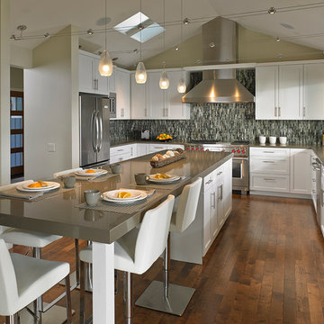
Lead Designer, Stephanie Cole, saw an improved layout for the spaces that were no longer working for this family. By eliminating an existing wall between the kitchen and dining room, and relocating the bar area to the dining room, we opened up the kitchen, providing all the space we needed to create a dreamy and functional layout. A new perimeter configuration promoted circulation while also making space for a large and functional island loaded with seating – a must for any family. Because an island that isn’t big enough for everyone (and a few more) is a recipe for disaster. The light white cabinetry is fresh and contrasts with the deeper tones in the wood flooring, creating a modern aesthetic that is elevated, yet approachable for everyday living.
With better flow as the overarching goal, we made some structural changes too. To remove a bottleneck in the entryway, we angled one of the dining room walls to create more natural separation between rooms and facilitate ease of movement throughout the large space.
At The Kitchen Studio, we believe a well-designed kitchen uses every square inch to the fullest. By starting from scratch, it was possible to rethink the entire kitchen layout and design the space according to how it is used, because the kitchen shouldn’t make it harder to feed the family. A new location for the existing range, flanked by a new column refrigerator and freezer on each side, worked to anchor the space. The very large and very spacious island (a dream island if we do say so ourselves) now houses the primary sink and provides ample space for food prep and family gathering.
The new kitchen table and coordinating banquette seating provide a cozy nook for quick breakfasts before school or work, and evening homework sessions. Elegant gold details catch the natural light, elevating the aesthetic.
The dining room was transformed into one of this client’s favorite spaces and we couldn’t agree more. We saw an opportunity to give the dining room a more distinguished identity by closing off the entrance from the foyer. The relocated wet bar enhances the sophisticated vibe of this gathering space, complete with beautiful antique mirror tiles and open shelving encased by moody built-in cabinets.
Updated furnishings add warmth. A rich walnut table is paired with custom chairs in a muted coral fabric. The large, transitional chandelier grounds the room, pairing beautifully with the gold finishes prevalent in the faucet and cabinet hardware. Linen-inspired wallpaper and cream-toned window treatments add to the glamorous feel of this entertainment space.
There is no way around it. The laundry room was cramped. The large washer and dryer blocked access to the sink and left little room for the space to serve its other essential function – as a mudroom. Because we reworked the kitchen layout to create more space overall, we could rethink the mudroom too – an essential for any busy family. The first step was moving the washer and dryer to an existing area on the second floor, where most of the family’s laundry lives (no one wants to carry laundry up and down the stairs if they don’t have to anyway). This is a more functional solution and opened up the space for all the mudroom necessities – including the existing kitchen refrigerator, loads of built-in cubbies, and a bench.
It’s hard to not fall in love with every detail of a new space, especially when it serves your day-to-day life. But that doesn’t mean the clients didn’t have their favorite features they use on the daily. This remodel was focused largely on function with a new kitchen layout. And it’s the functional features that have the biggest impact. The large island provides much needed workspace in the kitchen and is a spot where everyone gathers together – it grounds the space and the family. And the custom counter stools are the icing on the cake. The nearby mudroom has everything their previous space was lacking – ample storage, space for everyone’s essentials, and the beloved cement floor tiles that are both durable and artistic.

Patio - mid-sized french country gravel patio idea in San Francisco with a fire pit and a pergola

Photo: Adrienne DeRosa © 2015 Houzz
Save for a few refinements, the layout of the space took shape exactly as Weiss had envisioned it from day one. Knowing that they were looking to design a loft-like environment, the couple kept to an open layout for the majority of the living space.
One of the most fantastic features of the space is a bank of clerestory windows that flood the interior with seemingly endless amounts of daylight. Originally added back when the building served as an artist studio, Weiss and Carpenter agreed that keeping them was a must. "The only original part of the house is the ceiling and the existing skylights and clerestory," Weiss describes. "We basically changed everything else."
The ceiling compliments the contents of the environment, but also continues the story of the homeowners' design philosophy. "We loved the original wood and steel ceiling, including steel beams forged at the Carnegie Steel Works," Carpenter explains. "In coming up with our design approach, we wanted to reflect some of the previous uses of the structure ... Keeping elements from the past not only
interested us aesthetically." he says, "It was important to us to reuse structures and objects in ways that are close to their originally intended use."
31