
Search results for "Critical figure" in Home Design Ideas


 Metropolis Drafting and Construction Inc
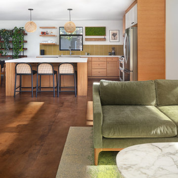
A Modern home that wished for more warmth...
An addition and reconstruction of approx. 750sq. area.
That included new kitchen, office, family room and back patio cover area.
The custom-made kitchen cabinets are semi-inset / semi-frameless combination.
The door style was custom build with a minor bevel at the edge of each door.
White oak was used for the frame, drawers and most of the cabinet doors with some doors paint white for accent effect.
The island "legs" or water fall sides if you wish and the hood enclosure are Tambour wood paneling.
These are 3/4" half round wood profile connected together for a continues pattern.
These Tambour panels, the wicker pendant lights and the green live walls inject a bit of an Asian fusion into the design mix.
The floors are polished concrete in a dark brown finish to inject additional warmth vs. the standard concrete gray most of us familiar with.
A huge 16' multi sliding door by La Cantina was installed, this door is aluminum clad (wood finish on the interior of the door).

 Kristin Hoaglund Design
This beautiful French Provincial home is set on 10 acres, nestled perfectly in the oak trees. The original home was built in 1974 and had two large additions added; a great room in 1990 and a main floor master suite in 2001. This was my dream project: a full gut renovation of the entire 4,300 square foot home! I contracted the project myself, and we finished the interior remodel in just six months. The exterior received complete attention as well. The 1970s mottled brown brick went white to completely transform the look from dated to classic French. Inside, walls were removed and doorways widened to create an open floor plan that functions so well for everyday living as well as entertaining. The white walls and white trim make everything new, fresh and bright. It is so rewarding to see something old transformed into something new, more beautiful and more functional.
Find the right local pro for your project
 User
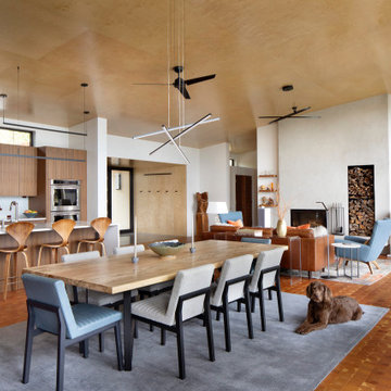
The interior of the home is immediately welcoming with the anterior of the home clad in full-height windows, beckoning you into the home with views and light. The open floor plan leads you into the family room, adjoined by the dining room and in-line kitchen. A balcony is immediately off the dining area, providing a quick escape to the outdoor refuge of Whitefish. Glo’s A5 double pane windows were used to create breathtaking views that are the crown jewels of the home’s design. Furthermore, the full height curtain wall windows and 12’ lift and slide doors provide views as well as thermal performance. The argon-filled glazing, multiple air seals, and larger thermal break make these aluminum windows durable and long-lasting.

 Zelaya Properties LLC
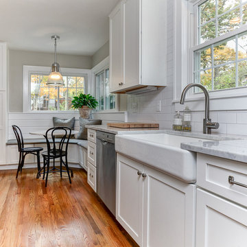
We used: Custom cherry cabinetry in Arts & Crafts Shaker style by Kabinart in Boulder and Espresso stains. Liberty Hardware Venetian bronze 1-1/2" cabinet knobs. KitchenAid Architect II Series 22 CF counter-depth French door refrigerator. KitchenAid Architect Series II 27" convection single wall oven. KitchenAid 36" 6-burner dual fuel freestanding commercial-style range. KitchenAid Architect II Series 24" dishwasher. Sharp Insight Pro Series 24" built-in microwave drawer (Model #KB6524PS). Crystorama Solaris 12" wide pendant lights in English bronze. Granite countertops in Brown Fantasy. 3"x6" polished marble backsplash.
Paint colors:
Walls: Glidden Silver Cloud 30YY 63/024
Ceilings/Trims/Doors: Glidden Swan White GLC23
Robert B. Narod Photography

 Moderne Builders
Gorgeous master bath with dramatic retro "wave" tile. Peak Photography
Example of a 1950s bathroom design in Los Angeles
Example of a 1950s bathroom design in Los Angeles

 Moss Yaw Design studio
Engineered cedar siding creates beautiful gray-blue tones at the exterior of the home, while adding a textural element to activate the simple exterior design.
Sponsored
Columbus, OH

Hope Restoration & General Contracting
Columbus Design-Build, Kitchen & Bath Remodeling, Historic Renovations


 Neumann & Rudy Architecture
**I. Spatial Composition & Architectural Volume**
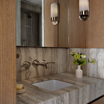
The image frames a primary bathroom vanity zone through a deliberately compressed aperture — the vertical edge of a rift-sawn oak door jamb occupying the left third of the frame, functioning as a proscenium that stages the composition beyond. This device establishes a layered sightline sequence: foreground threshold, mid-ground vanity plane, and a tertiary reflected depth revealed in the mirrored cabinetry, where a travertine-clad shower enclosure and polished nickel showerhead appear as a spatial echo. The result is an interior that reads as considerably more expansive than its actual footprint, a classic strategy of volumetric borrowing through specular surfaces.
Architecturally, the wall is resolved as a single continuous joinery composition — a full-height run of flush-fronted oak millwork with mirrored upper cabinet fronts, articulated only by hairline reveals rather than applied hardware or framing. This shadow-gap detailing establishes rhythm through negation, allowing the plane to remain monolithic while acknowledging its constituent modules. The vanity itself is conceived as a solid stone monolith, a thick-slab plinth with a generous mitred apron that cantilevers over recessed oak drawer fronts below, the base set back to create a shadowed float line. Geometry throughout is orthogonal and rectilinear: the square undermount basin, the deck's stepped perimeter, the horizontal datum of the backsplash terminating precisely at the mirror's lower edge. The only curvilinear intrusions are the capsule-form sconces and the ceramic vessel, deliberate soft counterpoints within an otherwise strictly Cartesian field.
**II. Materiality, Color & Texture**
The palette is a study in tonal adjacency rather than contrast — a restrained duet of oak and veined stone, held within a narrow chromatic band of taupe, greige, and warm sand. The joinery appears to be quarter- or rift-sawn white oak in a matte, open-grain finish, its tight vertical figure reading as a subtle striation that lends verticality and tactile warmth without pattern-making. Against this, the stone — a silver travertine or vein-cut quartzite with pronounced linear striation — provides the composition's dominant graphic energy. Crucially, the fabricator has book-matched and continued the veining from backsplash to deck to apron, so the stone's fluvial banding reads as a single geological event rather than assembled panels. This vein-matching is the project's most consequential craft decision.
Textural interplay is calibrated across three registers: the low-sheen absorbency of the oak, the honed, slightly chalky matte of the stone, and the high-specularity of polished nickel fittings. The wall-mounted lever taps and spout, with their crisp escutcheons and knurl-free tapered levers, introduce a jewel-like precision — cool-toned metal against warm mineral. The white porcelain basin functions as a chromatic pause, the palette's only true neutral. Accent moments are equally disciplined: a ribbed ceramic soap dish holding a block of butter-yellow soap, and a matte bone-white bottle vase carrying hellebores in acid-green — a single saturated note that activates the surrounding earth tones through complementary tension.
**III. Lighting, Atmosphere & Style Profile**
Natural light enters obliquely and is largely inferred rather than depicted: a soft, diffuse wash across the upper mirror and a pale ceiling plane glimpsed in reflection suggest a clerestory or adjacent glazing beyond the frame. The primary illumination is architectural and task-oriented — two opal glass capsule sconces in polished nickel, surface-mounted directly to the mirrored fronts. Their pill-shaped diffusers emit a soft, omnidirectional glow that flatters skin tones and, critically, provides cross-lighting at facial height rather than the unflattering top-down wash of downlights. The reflected sconce in the mirror doubles the light count perceptually, reinforcing the sense of symmetry and depth. Shadow is used compositionally: the recessed toe of the vanity, the reveal lines in the joinery, and the raking light across the stone's striation all rely on controlled darkness to describe form.
The resulting atmosphere is one of hushed, tactile luxury — sensory rather than declarative. Stylistically, the project sits within a contemporary Warm Minimalism, inflected with the material gravity of Milanese modernism and traces of a Japandi sensibility in its reverence for grain, joinery reveals, and the studied placement of a single floral gesture. There is nothing decorative in the additive sense; ornament is entirely subsumed into material and detail. The design's authority derives from restraint and fabrication rigor — the mitre, the reveal, the vein-match — positioning it as a mature exercise in what might be called quiet monumentality: a small room made consequential through the discipline of its surfaces.

 Didonè Comacchio Architects
Staircase - mid-sized contemporary wooden l-shaped staircase idea in Venice with metal risers
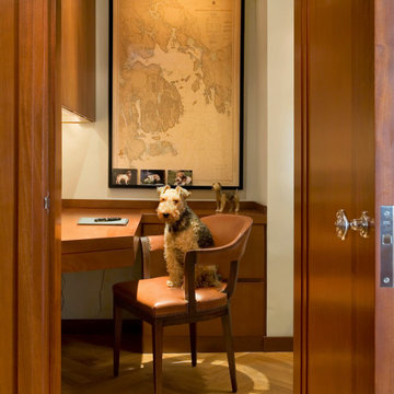 Neumann & Rudy Architecture
This image performs an act of deliberate spatial framing: we are positioned as intruders in a threshold, the photograph's foreground bracketed by two monumental slabs of mahogany-toned door leaf and jamb that compress the visual field into a portal roughly one-third the width of the frame. The composition is therefore a study in *enfilade* logic — a controlled, telescoping sightline that draws the eye through a narrow aperture into a recessed alcove, a purpose-built writing niche carved from what appears to be a corridor or dressing-room vestibule. The niche itself is architecturally modest in footprint but generous in vertical proportion; the ceiling reads as a plain plastered plane, unadorned save for a surface-mounted linear picture light on a slender drop stem, and the wall is treated as a full-height field for a single dominant object. The joinery is the true architecture here: a continuous run of casework establishes a horizontal datum at desk height, with a cantilevered writing surface returning perpendicular to the left-hand wall and a lower bank of drawers and a shallow ledge running right. That ledge functions as a *cimaise* or picture shelf, resolving the base of the framed nautical chart and giving the composition a plinth. Above, an integrated soffit or upper cabinet with concealed under-lighting terminates the left elevation, reinforcing the sense of an inhabited, tailored recess rather than a room. The herringbone parquet in the foreground introduces a diagonal geometry that runs counter to the orthogonal grid of doors, casework and picture frame, and this friction — chevron against rectilinear — animates what would otherwise be a static, axial composition. The single chair, canted slightly off-axis and pulled away from the desk, is the compositional pivot: it breaks the symmetry, occupies the exact center of the aperture, and converts an architectural vignette into a narrative one.
The palette is a disciplined exercise in the warm end of the spectrum, essentially monochromatic in hue and differentiated almost entirely by value, sheen and grain. The dominant material is timber, deployed in at least three distinct registers: the foreground door and jamb in a deeply saturated, red-brown mahogany or sapele with a high-build lacquer or French-polish sheen that catches light in long vertical highlights; the desk and casework in a lighter, honeyed figured wood — quartered cherry or anigre — finished to a satin rather than gloss, so that the eye reads it as a working surface rather than a ceremonial one; and finally the pale, blond oak of the herringbone floor, cerused or naturally oxidized to a straw tonality that lifts the lower register of the frame. Against this timber triad, the walls provide a chalky, low-saturation ground: a limewashed or flat-emulsion cream with a distinctly yellow-warm undertone that absorbs rather than reflects. The upholstery is the room's chromatic keynote — a saddle-tan or cognac leather, semi-aniline, already developing patina and slight slouch at the seat, its edge articulated by a close-set brass or antique-nickel nailhead trim that reads as a stitched seam of tiny metallic points. Metals are used sparingly and with historical precision: the polished chrome rosette and knob of the door with its heavy escutcheon and mortise strike plate, the slim brushed housing of the picture light. Texturally, the room stages a dialogue between the hard, reflective and the soft, absorbent: lacquer against limewash, taut leather against the friable, foxed paper of the antique chart. That chart — a hydrographic survey rendered in ochre, sepia and faded aqua, its ebonized frame supplying the composition's only true black — is the material anchor, its aged paper introducing a granular, time-worn texture that no new surface in the room could supply. The terrier, coincidentally or not, participates in this material scheme: a wiry tan-and-black coat that reads as a textile in its own right, tonally identical to the leather beneath it.
The lighting design is layered, warm-Kelvin and almost entirely artificial in its narrative effect, though the scene depends on a critical unseen source. A shaft of low, raking daylight enters from the right — presumably a window outside the frame — and lands as a hard-edged parallelogram across the parquet and the chair's front rail, creating the image's strongest contrast and lending the floor a sense of temporal specificity: late afternoon, low sun. Against this, three artificial layers operate. The surface-mounted picture light washes the nautical chart in an even, slightly amber flood, functioning as accent lighting that establishes the chart as the room's hierarchical focus. Concealed strip lighting beneath the upper casework grazes the left-hand desk return, providing task illumination and articulating the millwork's shadow line. Ambient fill is minimal and deliberately so; the corners of the niche fall into soft, unresolved shadow, and the whole tableau is rendered in a narrow tonal band of amber and umber that suppresses cool light almost entirely. The resulting atmosphere is one of burnished interiority — hushed, crepuscular, protective. Stylistically, the room resists easy categorization but sits most comfortably within a contemporary *Warm Traditionalism* or refined **Anglo-American Modern Classic** idiom: the vocabulary is unmistakably tailored-traditional (nailhead-trimmed leather, mortise hardware, framed cartography, a Deco-inflected barrel-back desk chair), yet the detailing is stripped of ornament — no cornice, no panel molding, no applied millwork profile — and the casework is resolved with the flush, planar minimalism of a mid-century yacht interior. It is, in essence, a *cabinet de travail* reimagined through the discipline of modern joinery: a room that borrows the emotional register of the club library while adopting the reductive geometry of contemporary architecture. The dog, unhurried and centrally enthroned, is the final aesthetic argument — evidence that the space is not a set piece but a lived, occupied, and evidently affectionate interior.

Sponsored
Columbus, OH
Hope Restoration & General Contracting
Columbus Design-Build, Kitchen & Bath Remodeling, Historic Renovations

 Dana King Design Build Remodeling
A fun, hip kitchen with a mid-century modern vibe. The homeowners wanted a kitchen to make them happy. We think you can't help but smile!
NEXT Project Studio
Jerry Voloski

 Heritage Construction Companies, LLC.
Example of a huge trendy metal floating open staircase design in Minneapolis

 Hueber Industries
This railing was the first planned update of the Fort Collins, CO couples home renovation. The wavy lines give the room a natural feel. Design and fabrication by Hueber Industries LLC. Photo: Rory Schaar.


 DANE AUSTIN INTERIOR DESIGN Boston & Cambridge
This chic couple from Manhattan requested for a fashion-forward focus for their new Boston condominium. Textiles by Christian Lacroix, Faberge eggs, and locally designed stilettos once owned by Lady Gaga are just a few of the inspirations they offered.
Project designed by Boston interior design studio Dane Austin Design. They serve Boston, Cambridge, Hingham, Cohasset, Newton, Weston, Lexington, Concord, Dover, Andover, Gloucester, as well as surrounding areas.
For more about Dane Austin Design, click here: https://daneaustindesign.com/
To learn more about this project, click here:
https://daneaustindesign.com/seaport-high-rise


 Mayita Dinos Garden Design
mayitadinosphotography.com
Design ideas for a tropical landscaping in Los Angeles.
Design ideas for a tropical landscaping in Los Angeles.
2