
Search results for "Cutting process" in Home Design Ideas

 Sarah Greenman
Photo: Sarah Greenman © 2013 Houzz
Craft room - contemporary built-in desk light wood floor craft room idea in Dallas with gray walls
Craft room - contemporary built-in desk light wood floor craft room idea in Dallas with gray walls

 Twelve Stones Designs, LLC
The owners of this kitchen had spent the money to upgrade the finishes in their kitchen upon building the home 12 years ago, but after living in the space for several years they realized how nonfunctional the layout really was. The (then) two preschool aged children had grown into busy, hungry teenagers with many friends who also liked to hang out at the house. So the family needed a more functional kitchen with better traffic flow, space for daily activities revolving around the kitchen at different times of day, and a kitchen that could accommodate cooking for and serving large groups. Furthermore, the dark, traditional finishes no longer reflected the homeowners’ style. They requested a brighter, more relaxed, coastal style that reflected their love of the seaside cities they like to visit.
Originally, the kitchen was U-shaped with a narrow island in the middle. The island created narrow aisles that bottle-necked at the dishwasher, refrigerator, and cooktop areas. There was a pass-through from the foyer into the kitchen, but the owners never liked that the pass-through was also located so close to the powder room. The awkward proximity was unappealing and made guests feel uncomfortable.
The kitchen’s storage was made up of lots of narrow cabinets, apothecary drawers, clipped corner units, and very few drawers. It lacked useful storage for the larger items the family used on a daily basis. And the kitchen’s only pantry was small closet that had only builder-grade, narrow shelving with no illumination to be able to see the contents inside.
Overall, the kitchen’s lighting plan was poorly executed. Only six recessed cans illuminated the entire kitchen and nook areas. The under cabinet lighting was not evenly distributed either. In fact, the builder had mis-placed the under cabinet lighting around the decorative pilasters which made for choppy, dark cubbies. Further, the builder didn’t include any lighting over the sink or the bar area, which meant whoever was doing the dishes was always in their own shadow. That, coupled with the steep overhang of the game room above made the bar area feel like a dim, cavernous space that wasn’t inviting or task oriented. The kitchen looked out into the main living space, but the raised bar and a narrow wall (which held the only large cabinet in the kitchen) created more of a barrier than a relationship to the living room or breakfast nook. In fact, one couldn’t even see the breakfast nook from the cooktop or sink areas due to its orientation. The raised bar top was too narrow to comfortably sit to either dine at or chat from due to the lack of knee space. The the homeowners confided that the kitchen felt more like a dark, dirty prison than place where the family, or their guests, wanted to gather and commune.
The clients' needs and desires were:
➢ to create a kitchen that would be a space the family loved to be in; to relate to the adjacent spaces all around, and to have better flow for entertaining large groups
➢ to remove the walls between the breakfast nook and living area and to be able to utilize the natural light from the windows in both those areas
➢ to incorporate a functional chopping block for prepping fresh food for home cooked meals, an island with a large sink and drain board, 2 pull out trash cans, and seating for at least the 2 teens to eat or do homework
➢ to design a kitchen and breakfast nook with an airy, coastal, relaxed vibe that blended with the rest of the house's coastal theme
➢ to integrate a layered lighting plan which would include ample general illumination, specific task lighting, decorative lighting, and lots of illuminated storage
➢ to design a kitchen with not only more storage for all the husband’s kitchen gadgets and collection of oils and spices, but smart storage, including a coffee/breakfast bar and a place to store and conceal the toaster oven and microwave
➢ to find a way to utilize the large open space between the kitchen, pantry area, and breakfast nook
Twelve Stones Designs achieved the owner's goals by:
➢ removing the walls between the kitchen and living room to allow the natural light to filter in from the adjacent rooms and to create a connection between the kitchen, nook, and living spaces for a sense of unity and communion
➢ removing the existing pantry and designing 3 large pantry style cabinets with LED tape lights and rollout drawers to house lots of kitchen appliances, gadgets, and tons of groceries. We also took the cabinets all the way up to the 9’ ceiling for additional storage for seasonal items and bulk storage.
➢ designing 2 islands - 1 with a gorgeous black walnut chopping block that houses a drawer for chopping and carving knives and a custom double pull out trash unit for point of use utilization - and 1 that houses the dishwasher, a large Blanco Gourmet sink with integrated drain board, woven baskets for fresh root vegetables and kitchen towels, plenty of drawer storage for kitchen items, and bar seating for up to 4 diners.
➢ closing off the space between the kitchen and the powder room to create a beautiful new private alcove for the powder room as well as adding some decorative storage. This also gave us space to include more tall storage near the new range for precision placement of the husband’s extensive oil and spice collection as well as a location for a combo-steam oven the wife wanted for baking and cooking healthy meals.
The project is enhanced functionally by:
➢ incorporated USB and standard receptacles for the kids’ laptops and phone charging in the large island
➢ designing the small island to include additional open shelving for items used on a daily basis such as a variety of bowls, plates, and colanders. This set up also works well for the husband who prefers to “plate” his dinners in restaurant-style fashion before presenting them to the table.
➢ the integration of specific storage units, such as double stacked cutlery drawers, a custom spice pull-out, a Kuerig coffee and tea pod drawer, and custom double stacked utensil drawers
➢ moving the refrigerator to the old oven location - this eliminated the bottle neck as well as created a better relationship to the eating table. It also utilizes the floor space between the pantry, nook, and kitchen
➢ creating a banquet style breakfast nook - this banquette seating not only doubles the amount of seating for large gatherings but it better utilizes the odd space between the kitchen and the previous nook area. It also helps to create a distinct pathway from the mudroom room through the pantry area, kitchen, nook, and living room.
➢ the coffee/breakfast bar area which includes the perfect location for the concealed microwave and toaster oven, convenient storage for the coffee pods and tea accoutrements. Roll-out drawers below also house the smoothie maker, hot water kettle, and a plethora of smoothie-making ingredients such as protein powders, smoothie additives, etc. Furthermore, the drawers below the Keurig house measuring utensil, cutlery, baking supplies and tupperware storage.
➢ incorporating lots of wide drawers and pullouts to accommodate large cookware.
➢ utilizing as much vertical space as possible by building storage to the ceiling which accommodates the family’s abundant amount of serving platters, baking sheets, bakeware, casserole dishes, and additional cutting boards.
The project is enhanced aesthetically by:
➢ new 5-piece Versailles pattern porcelain tile that now seamlessly joins the entire down stairs area together creating a bright, cohesiveness feeling instead of choppy separated spaces - it also adds a coastal feeling
➢ designing a cabinet to conceal the microwave and toaster oven
➢ the coastal influenced light fixtures over the nook table and island
➢ the sandy colors of the Langdon Cambria countertops. The swirling pattern and sparkling quartz pieces remind the homeowner of black-and-tan sandy beaches
➢ the striped banquet seating whose creamy white background and blue-green stripes were the inspiration for the cabinet and wall colors.
➢ All the interior doors were painted black to coordinate with the blacks and grays in the backsplash tile and countertop. This also adds a hint of tailored formality to an otherwise casual space.
➢ the use of WAC's Oculux small aperture LED units for the overhead lighting complimented with Diode LED strips for task lighting under the cabinets and inside the pantry and glass wall cabinets. All of the lighting applications are on separate dimmer switches.
Innovative uses of materials or construction methods by Realty Restoration LLC:
➢ Each 1-1/2” x 3” block of reclaimed end-grain black walnut that makes up the center island chopping block was hand milled and built in the shop. It was designed to look substantial and proportional to the surrounding elements, executed by creating the 4 inch tall top with a solid wood chamfered edge band.
➢ The metal doors on either side of the vent hood were also custom designed for this project and built in the Realty Restoration LLC shop. They are made 1x2, 11-gauge mild steel with ribbed glass. Weighing 60 lbs a piece, heavy duty cabinet hinges were added to support the weight of the door and keep them from sagging.
➢ Under-cabinet receptacles were added along the range wall in order to have a clean, uninterrupted backsplash.
Design obstacles to overcome:
➢ Because we were removing the demising walls between the kitchen and living room, we had to find a way to plumb and vent the new island. We did this by tunneling through the slab (the slab had post tension cables which prevented us from just trenching) to run a new wet vent through a nearby structural wall. We pulled the existing hot and cold lines between upper floor joists and ran them down the structural wall as well and up through a conduit in the tunnel.
➢ Since we were converting from wall overs to a gas range it allowed us to utilize the 220 feed for the wall ovens to provide a new sub panel for all the new kitchen circuits
➢ Due to framing deficiencies inherited from the original build there was a 1-1/2” differential in the floor-to-ceiling height over a 20 foot span; by utilizing the process of cutting and furring coupled with the crown moulding details on the cabinet elevations we were able to mask the problem and provide seamless transitions between the cabinet components.
Evidence of superior craftsmanship:
➢ uniquely designed, one-of-a-kind metal “X” end panels on the large island. The end panels were custom made in the Realty Restoration LLC shop and fitted to the exact dimensions of the island. The welding seams are completely indistinguishable - the posts look like they are cut from a single sheet of metal
➢ square metal posts on the small island were also custom made and designed to compliment and carry through the metal element s throughout the kitchen
➢ the beautiful, oversized end panels on the pantry cabinets which give the breakfast nook a tailored look
➢ integrating a large format 5 piece Versailles tile pattern to seamlessly flow from the existing spaces into the new kitchen space
➢ By constructing a custom cabinet that jogged around a corner we could not remodel (housing the entry way coat closet) we were able to camouflage the adjacent wall offset within the upper and lower cabinets. By designing around the existing jog in the structural walls we accomplished a few things: we were able to find the space to house, and hide, the microwave and toaster oven yet still have a clean cohesive appearance from the kitchen side. Additionally, the owners were able to keep their much needed coat closet and we didn’t have to increase the budget with unnecessary structural work.
 Locale Design Build
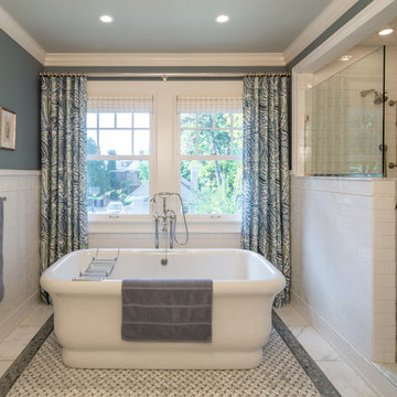
Inspiration for a timeless master white tile and subway tile bathroom remodel in Minneapolis with white cabinets
Find the right local pro for your project
 Ellen McKenna Design
Photographed by Kyle Caldwell
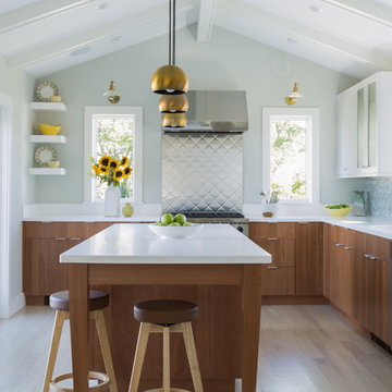
Eat-in kitchen - large modern l-shaped light wood floor and brown floor eat-in kitchen idea in Salt Lake City with white cabinets, solid surface countertops, multicolored backsplash, mosaic tile backsplash, stainless steel appliances, an island, white countertops, an undermount sink and flat-panel cabinets
Eat-in kitchen - large modern l-shaped light wood floor and brown floor eat-in kitchen idea in Salt Lake City with white cabinets, solid surface countertops, multicolored backsplash, mosaic tile backsplash, stainless steel appliances, an island, white countertops, an undermount sink and flat-panel cabinets
 User
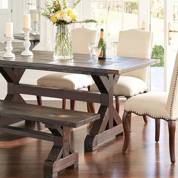
UserThe Carmody Table features a sturdy planked top and trestle legs, and provides comfortable seating for six.
Customize your tabletop and legs, available in either our classic Espresso or White Distressed finish. Optional hammered steel corner brackets in Black or Copper can be added. Light assembly required (comes assembled for local pickup).
All of our tables are handcrafted from solid wood in our woodworking shop in Fort Mill, South Carolina. Our furniture is finished with a multi-step process of distressing and hand-applying layers of varnish to give each piece the look of a cherished antique. Each of our works showcase the natural characteristics of wood, including variations in color, mineral streaks, knots and burls. In addition, our finishing process highlights the organic texture of wood with its pores, ridges, slits and grooves; each piece is a tactile work of art that is truly meant to be appreciated by touch. Every decorative bracket is made from steel, hand-cut and meticulously hammered to create a one-of-a-kind rustic accent for our wood furniture.
Available for local pickup or shipment within 5-7 business days.
DIMENSIONS:
Overall: 72" long x 36" wide x 30" high
Tabletop: 1.5" thick
Apron: 1.5" high
Distance between legs: 48" outside; 42" inside
Weight: 151.6 pounds
CARE AND MAINTENANCE:
Dust with a soft, dry lint-free cloth.
Soak up any water immediately with a soft, dry cloth.
Avoid the use of harsh chemicals or abrasive cleaners.
Photo Credit: Michael Blevins
 Urbanology Designs
A captivating transformation in the coveted neighborhood of University Park, Dallas
The heart of this home lies in the kitchen, where we embarked on a design endeavor that would leave anyone speechless. By opening up the main kitchen wall, we created a magnificent window system that floods the space with natural light and offers a breathtaking view of the picturesque surroundings. Suspended from the ceiling, a steel-framed marble vent hood floats a few inches from the window, showcasing a mesmerizing Lilac Marble. The same marble is skillfully applied to the backsplash and island, featuring a bold combination of color and pattern that exudes elegance.
Adding to the kitchen's allure is the Italian range, which not only serves as a showstopper but offers robust culinary features for even the savviest of cooks. However, the true masterpiece of the kitchen lies in the honed reeded marble-faced island. Each marble strip was meticulously cut and crafted by artisans to achieve a half-rounded profile, resulting in an island that is nothing short of breathtaking. This intricate process took several months, but the end result speaks for itself.
To complement the grandeur of the kitchen, we designed a combination of stain-grade and paint-grade cabinets in a thin raised panel door style. This choice adds an elegant yet simple look to the overall design. Inside each cabinet and drawer, custom interiors were meticulously designed to provide maximum functionality and organization for the day-to-day cooking activities. A vintage Turkish runner dating back to the 1960s, evokes a sense of history and character.
The breakfast nook boasts a stunning, vivid, and colorful artwork created by one of Dallas' top artist, Kyle Steed, who is revered for his mastery of his craft. Some of our favorite art pieces from the inspiring Haylee Yale grace the coffee station and media console, adding the perfect moment to pause and loose yourself in the story of her art.
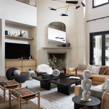
The project extends beyond the kitchen into the living room, where the family's changing needs and growing children demanded a new design approach. Accommodating their new lifestyle, we incorporated a large sectional for family bonding moments while watching TV. The living room now boasts bolder colors, striking artwork a coffered accent wall, and cayenne velvet curtains that create an inviting atmosphere. Completing the room is a custom 22' x 15' rug, adding warmth and comfort to the space. A hidden coat closet door integrated into the feature wall adds an element of surprise and functionality.
This project is not just about aesthetics; it's about pushing the boundaries of design and showcasing the possibilities. By curating an out-of-the-box approach, we bring texture and depth to the space, employing different materials and original applications. The layered design achieved through repeated use of the same material in various forms, shapes, and locations demonstrates that unexpected elements can create breathtaking results.
The reason behind this redesign and remodel was the homeowners' desire to have a kitchen that not only provided functionality but also served as a beautiful backdrop to their cherished family moments. The previous kitchen lacked the "wow" factor they desired, prompting them to seek our expertise in creating a space that would be a source of joy and inspiration.
Inspired by well-curated European vignettes, sculptural elements, clean lines, and a natural color scheme with pops of color, this design reflects an elegant organic modern style. Mixing metals, contrasting textures, and utilizing clean lines were key elements in achieving the desired aesthetic. The living room introduces bolder moments and a carefully chosen color scheme that adds character and personality.
The client's must-haves were clear: they wanted a show stopping centerpiece for their home, enhanced natural light in the kitchen, and a design that reflected their family's dynamic. With the transformation of the range wall into a wall of windows, we fulfilled their desire for abundant natural light and breathtaking views of the surrounding landscape.
Our favorite rooms and design elements are numerous, but the kitchen remains a standout feature. The painstaking process of hand-cutting and crafting each reeded panel in the island to match the marble's veining resulted in a labor of love that emanates warmth and hospitality to all who enter.
In conclusion, this tastefully lux project in University Park, Dallas is an extraordinary example of a full gut remodel that has surpassed all expectations. The meticulous attention to detail, the masterful use of materials, and the seamless blend of functionality and aesthetics create an unforgettable space. It serves as a testament to the power of design and the transformative impact it can have on a home and its inhabitants.
Project by Texas' Urbanology Designs. Their North Richland Hills-based interior design studio serves Dallas, Highland Park, University Park, Fort Worth, and upscale clients nationwide.
 Hearthstone Inc
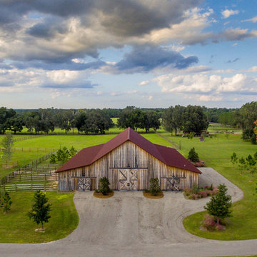
Richard Herman is in the hospitality business and owns several upscale hotels in Florida and in other states as well as cattle ranches in both Florida and Missouri. Their farm in Ocala is by farm their most unique. The property serves as a 4-H demonstration project for the purpose of children’s education. They have been working with the Academy Prep of St. Pete which is dedicated to inner-city youths that are selected on the basis of need and achievement. Wife Diane spends her time on the farm raising Gypsy Vanners, a diminutive draft horse named after the job they did in Eastern Europe, pulling the wagons (vans) for gypsies that wandered across the continent. On the Ocala farm, there are several mules with a unique profession.
Richard had visited the Hearthstone display at a Log & Timber Home Shows at the Orlando Convention Center many years ago. He was impressed that Hearthstone had stayed in touch with him over the years by mailings, invitations to shows, and periodic phone calls. When the time came to start serious consideration of the design of barn, Hearthstone responded promptly and professionally to Richard and Diane’s requests for information and a review of their ideas for their barn, which would serve as the centerpiece for their new farm.
They wanted a multipurpose facility that could accommodate an educational environment and a large hall suitable for the fundraising events for his charities. Richard wanted a barn that reflected the look and feel of barns built at the dawn of the 20th century. Besides the rustic chicken houses and vegetable gardens, they have completely renovated a 1020’s era farmhouse to be as historically correct as possible and serves as the entry to the farm.
“They very careful to feel us out, get comfortable with our capabilities, and be convinced that we could perform as promised,” said Project Manager John Ricketson of Hearthstone.
Design Process
There were some initial drawings that gave us a start on the basic shape and size of the barn. From there, it was a process of narrowing down the uses of each area and the spans that could be achieved. The barn was going to have the traditional “board & batten” exterior siding and a metal roof. There is a cantilevered ‘hay hood” on the north gable end above the large sliding barn doors that open into the foyer and horse stalls. The wings house a combination of areas, beginning with the large restrooms to accommodate crowds for events. Other parts of the wings have garage areas for the farm vehicles, feed room, tack room, wash rack, storage, offices, and smaller restrooms.
Keeping with the look and feel of the turn of the century, Hearthstone developed a process for giving the timbers a surface texture that mimicked the circular cuts of timbers that had just come out of an old sawmill. This was easier said than done. Randy Giles guided his millwright (Wolfgang) in designing a machine that would do this effectively.
The barn was delivered in October of 2014 and was erected over the course of two weeks, thanks to a hardworking crew (Eric Foster) and near-perfect weather. After the Hearthstone crew completed the erection and roof dry-in, it was time for the local carpenters to step up and install some light conventional framing on the gable ends before applying the roof fascia and exterior board & batten siding. Next came the big sliding barn doors, plumbing, electrical, heating, and cooling. Large rustic fixtures were hung from the great hall roof timbers.
Exterior
The board & batten siding was cypress and allowed to turn color naturally as rain hit it and the sun started working on it with UV rays. This method causes a much grayer look closer to the ground and less so where the roof overhang provides protection. The North end has some large limestone boulders and planters arranged around the pad with tall pampas grass. The planters provide casual seating before events and during outside receptions. The entire area was sodded with lush St. Augustine grass and split rail fences were added to enclose the barn area. The corrugated metal roof was a special order material that immediately rusted after being exposed to moisture. The layer of rust protects the metal from the elements.
Interior
The board & batten theme was carried throughout most of the interior with the timbers left natural to show off the circular saw texture. All of the tongue & groove decking was shipped in advance to allow the local painter to pre-stain it with a dark brown transparent stain that is a beautiful background to the light color Eastern White Pine timbers.
“Everything was unique in this project” said Project Manager John Ricketson. “The setting on a small demonstration farm close to Ocala, the multipurpose design, the circular saw texture on the timbers.”
The Hermans are very proud of their farm’s outcome. Richard sent a note to Randy Giles, owner of Hearthstone: “The Barn is fantastic, not a single problem, period. Next month, we have Jo Dee Messina coming in to help with a fundraiser for a local center for abused kids. Folks love the farm, ...... but that barn gets all of the attention. I would encourage you to use me as a reference for your sales team, feel free to extend my cell phone to any prospective purchasers.”

Sponsored
Columbus, OH

Hope Restoration & General Contracting
Columbus Design-Build, Kitchen & Bath Remodeling, Historic Renovations
 The Working Kitchen, Ltd.
Photo: Vicki Bodine
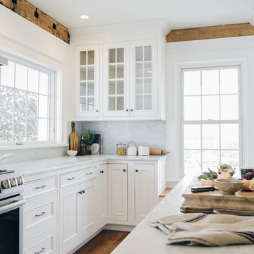
Inspiration for a large country l-shaped medium tone wood floor kitchen remodel in New York with beaded inset cabinets, white cabinets, marble countertops, gray backsplash, stainless steel appliances, an island and gray countertops
Inspiration for a large country l-shaped medium tone wood floor kitchen remodel in New York with beaded inset cabinets, white cabinets, marble countertops, gray backsplash, stainless steel appliances, an island and gray countertops
 Keuka Studios, Inc
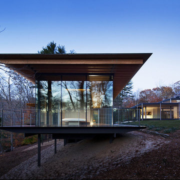
Sleek lines.Slender cable railings ny Keuka Studios, inc.
Example of a minimalist exterior home design in New York
Example of a minimalist exterior home design in New York
 Twelve Stones Designs, LLC
The owners of this kitchen had spent the money to upgrade the finishes in their kitchen upon building the home 12 years ago, but after living in the space for several years they realized how nonfunctional the layout really was. The (then) two preschool aged children had grown into busy, hungry teenagers with many friends who also liked to hang out at the house. So the family needed a more functional kitchen with better traffic flow, space for daily activities revolving around the kitchen at different times of day, and a kitchen that could accommodate cooking for and serving large groups. Furthermore, the dark, traditional finishes no longer reflected the homeowners’ style. They requested a brighter, more relaxed, coastal style that reflected their love of the seaside cities they like to visit.
Originally, the kitchen was U-shaped with a narrow island in the middle. The island created narrow aisles that bottle-necked at the dishwasher, refrigerator, and cooktop areas. There was a pass-through from the foyer into the kitchen, but the owners never liked that the pass-through was also located so close to the powder room. The awkward proximity was unappealing and made guests feel uncomfortable.
The kitchen’s storage was made up of lots of narrow cabinets, apothecary drawers, clipped corner units, and very few drawers. It lacked useful storage for the larger items the family used on a daily basis. And the kitchen’s only pantry was small closet that had only builder-grade, narrow shelving with no illumination to be able to see the contents inside.
Overall, the kitchen’s lighting plan was poorly executed. Only six recessed cans illuminated the entire kitchen and nook areas. The under cabinet lighting was not evenly distributed either. In fact, the builder had mis-placed the under cabinet lighting around the decorative pilasters which made for choppy, dark cubbies. Further, the builder didn’t include any lighting over the sink or the bar area, which meant whoever was doing the dishes was always in their own shadow. That, coupled with the steep overhang of the game room above made the bar area feel like a dim, cavernous space that wasn’t inviting or task oriented. The kitchen looked out into the main living space, but the raised bar and a narrow wall (which held the only large cabinet in the kitchen) created more of a barrier than a relationship to the living room or breakfast nook. In fact, one couldn’t even see the breakfast nook from the cooktop or sink areas due to its orientation. The raised bar top was too narrow to comfortably sit to either dine at or chat from due to the lack of knee space. The the homeowners confided that the kitchen felt more like a dark, dirty prison than place where the family, or their guests, wanted to gather and commune.
The clients' needs and desires were:
➢ to create a kitchen that would be a space the family loved to be in; to relate to the adjacent spaces all around, and to have better flow for entertaining large groups
➢ to remove the walls between the breakfast nook and living area and to be able to utilize the natural light from the windows in both those areas
➢ to incorporate a functional chopping block for prepping fresh food for home cooked meals, an island with a large sink and drain board, 2 pull out trash cans, and seating for at least the 2 teens to eat or do homework
➢ to design a kitchen and breakfast nook with an airy, coastal, relaxed vibe that blended with the rest of the house's coastal theme
➢ to integrate a layered lighting plan which would include ample general illumination, specific task lighting, decorative lighting, and lots of illuminated storage
➢ to design a kitchen with not only more storage for all the husband’s kitchen gadgets and collection of oils and spices, but smart storage, including a coffee/breakfast bar and a place to store and conceal the toaster oven and microwave
➢ to find a way to utilize the large open space between the kitchen, pantry area, and breakfast nook
Twelve Stones Designs achieved the owner's goals by:
➢ removing the walls between the kitchen and living room to allow the natural light to filter in from the adjacent rooms and to create a connection between the kitchen, nook, and living spaces for a sense of unity and communion
➢ removing the existing pantry and designing 3 large pantry style cabinets with LED tape lights and rollout drawers to house lots of kitchen appliances, gadgets, and tons of groceries. We also took the cabinets all the way up to the 9’ ceiling for additional storage for seasonal items and bulk storage.
➢ designing 2 islands - 1 with a gorgeous black walnut chopping block that houses a drawer for chopping and carving knives and a custom double pull out trash unit for point of use utilization - and 1 that houses the dishwasher, a large Blanco Gourmet sink with integrated drain board, woven baskets for fresh root vegetables and kitchen towels, plenty of drawer storage for kitchen items, and bar seating for up to 4 diners.
➢ closing off the space between the kitchen and the powder room to create a beautiful new private alcove for the powder room as well as adding some decorative storage. This also gave us space to include more tall storage near the new range for precision placement of the husband’s extensive oil and spice collection as well as a location for a combo-steam oven the wife wanted for baking and cooking healthy meals.
The project is enhanced functionally by:
➢ incorporated USB and standard receptacles for the kids’ laptops and phone charging in the large island
➢ designing the small island to include additional open shelving for items used on a daily basis such as a variety of bowls, plates, and colanders. This set up also works well for the husband who prefers to “plate” his dinners in restaurant-style fashion before presenting them to the table.
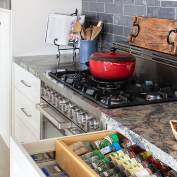
➢ the integration of specific storage units, such as double stacked cutlery drawers, a custom spice pull-out, a Kuerig coffee and tea pod drawer, and custom double stacked utensil drawers
➢ moving the refrigerator to the old oven location - this eliminated the bottle neck as well as created a better relationship to the eating table. It also utilizes the floor space between the pantry, nook, and kitchen
➢ creating a banquet style breakfast nook - this banquette seating not only doubles the amount of seating for large gatherings but it better utilizes the odd space between the kitchen and the previous nook area. It also helps to create a distinct pathway from the mudroom room through the pantry area, kitchen, nook, and living room.
➢ the coffee/breakfast bar area which includes the perfect location for the concealed microwave and toaster oven, convenient storage for the coffee pods and tea accoutrements. Roll-out drawers below also house the smoothie maker, hot water kettle, and a plethora of smoothie-making ingredients such as protein powders, smoothie additives, etc. Furthermore, the drawers below the Keurig house measuring utensil, cutlery, baking supplies and tupperware storage.
➢ incorporating lots of wide drawers and pullouts to accommodate large cookware.
➢ utilizing as much vertical space as possible by building storage to the ceiling which accommodates the family’s abundant amount of serving platters, baking sheets, bakeware, casserole dishes, and additional cutting boards.
The project is enhanced aesthetically by:
➢ new 5-piece Versailles pattern porcelain tile that now seamlessly joins the entire down stairs area together creating a bright, cohesiveness feeling instead of choppy separated spaces - it also adds a coastal feeling
➢ designing a cabinet to conceal the microwave and toaster oven
➢ the coastal influenced light fixtures over the nook table and island
➢ the sandy colors of the Langdon Cambria countertops. The swirling pattern and sparkling quartz pieces remind the homeowner of black-and-tan sandy beaches
➢ the striped banquet seating whose creamy white background and blue-green stripes were the inspiration for the cabinet and wall colors.
➢ All the interior doors were painted black to coordinate with the blacks and grays in the backsplash tile and countertop. This also adds a hint of tailored formality to an otherwise casual space.
➢ the use of WAC's Oculux small aperture LED units for the overhead lighting complimented with Diode LED strips for task lighting under the cabinets and inside the pantry and glass wall cabinets. All of the lighting applications are on separate dimmer switches.
Innovative uses of materials or construction methods by Realty Restoration LLC:
➢ Each 1-1/2” x 3” block of reclaimed end-grain black walnut that makes up the center island chopping block was hand milled and built in the shop. It was designed to look substantial and proportional to the surrounding elements, executed by creating the 4 inch tall top with a solid wood chamfered edge band.
➢ The metal doors on either side of the vent hood were also custom designed for this project and built in the Realty Restoration LLC shop. They are made 1x2, 11-gauge mild steel with ribbed glass. Weighing 60 lbs a piece, heavy duty cabinet hinges were added to support the weight of the door and keep them from sagging.
➢ Under-cabinet receptacles were added along the range wall in order to have a clean, uninterrupted backsplash.
Design obstacles to overcome:
➢ Because we were removing the demising walls between the kitchen and living room, we had to find a way to plumb and vent the new island. We did this by tunneling through the slab (the slab had post tension cables which prevented us from just trenching) to run a new wet vent through a nearby structural wall. We pulled the existing hot and cold lines between upper floor joists and ran them down the structural wall as well and up through a conduit in the tunnel.
➢ Since we were converting from wall overs to a gas range it allowed us to utilize the 220 feed for the wall ovens to provide a new sub panel for all the new kitchen circuits
➢ Due to framing deficiencies inherited from the original build there was a 1-1/2” differential in the floor-to-ceiling height over a 20 foot span; by utilizing the process of cutting and furring coupled with the crown moulding details on the cabinet elevations we were able to mask the problem and provide seamless transitions between the cabinet components.
Evidence of superior craftsmanship:
➢ uniquely designed, one-of-a-kind metal “X” end panels on the large island. The end panels were custom made in the Realty Restoration LLC shop and fitted to the exact dimensions of the island. The welding seams are completely indistinguishable - the posts look like they are cut from a single sheet of metal
➢ square metal posts on the small island were also custom made and designed to compliment and carry through the metal element s throughout the kitchen
➢ the beautiful, oversized end panels on the pantry cabinets which give the breakfast nook a tailored look
➢ integrating a large format 5 piece Versailles tile pattern to seamlessly flow from the existing spaces into the new kitchen space
➢ By constructing a custom cabinet that jogged around a corner we could not remodel (housing the entry way coat closet) we were able to camouflage the adjacent wall offset within the upper and lower cabinets. By designing around the existing jog in the structural walls we accomplished a few things: we were able to find the space to house, and hide, the microwave and toaster oven yet still have a clean cohesive appearance from the kitchen side. Additionally, the owners were able to keep their much needed coat closet and we didn’t have to increase the budget with unnecessary structural work.
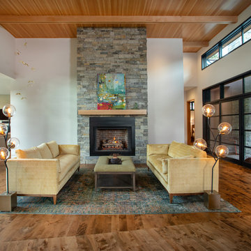
 Edgewater Design Group
As written in Northern Home & Cottage by Elizabeth Edwards
Sara and Paul Matthews call their head-turning home, located in a sweet neighborhood just up the hill from downtown Petoskey, “a very human story.” Indeed it is. Sara and her husband, Paul, have a special-needs son as well as an energetic middle-school daughter. This home has an answer for everyone. Located down the street from the school, it is ideally situated for their daughter and a self-contained apartment off the great room accommodates all their son’s needs while giving his caretakers privacy—and the family theirs. The Matthews began the building process by taking their thoughts and
needs to Stephanie Baldwin and her team at Edgewater Design Group. Beyond the above considerations, they wanted their new home to be low maintenance and to stand out architecturally, “But not so much that anyone would complain that it didn’t work in our neighborhood,” says Sara. “We
were thrilled that Edgewater listened to us and were able to give us a unique-looking house that is meeting all our needs.” Lombardy LLC built this handsome home with Paul working alongside the construction crew throughout the project. The low maintenance exterior is a cutting-edge blend of stacked stone, black corrugated steel, black framed windows and Douglas fir soffits—elements that add up to an organic contemporary look. The use of black steel, including interior beams and the staircase system, lend an industrial vibe that is courtesy of the Matthews’ friend Dan Mello of Trimet Industries in Traverse City. The couple first met Dan, a metal fabricator, a number of years ago, right around the time they found out that their then two-year-old son would never be able to walk. After the couple explained to Dan that they couldn’t find a solution for a child who wasn’t big enough for a wheelchair, he designed a comfortable, rolling chair that was just perfect. They still use it. The couple’s gratitude for the chair resulted in a trusting relationship with Dan, so it was natural for them to welcome his talents into their home-building process. A maple floor finished to bring out all of its color-tones envelops the room in warmth. Alder doors and trim and a Doug fir ceiling reflect that warmth. Clearstory windows and floor-to-ceiling window banks fill the space with light—and with views of the spacious grounds that will
become a canvas for Paul, a retired landscaper. The couple’s vibrant art pieces play off against modernist furniture and lighting that is due to an inspired collaboration between Sara and interior designer Kelly Paulsen. “She was absolutely instrumental to the project,” Sara says. “I went through
two designers before I finally found Kelly.” The open clean-lined kitchen, butler’s pantry outfitted with a beverage center and Miele coffee machine (that allows guests to wait on themselves when Sara is cooking), and an outdoor room that centers around a wood-burning fireplace, all make for easy,
fabulous entertaining. A den just off the great room houses the big-screen television and Sara’s loom—
making for relaxing evenings of weaving, game watching and togetherness. Tourgoers will leave understanding that this house is everything great design should be. Form following function—and solving very human issues with soul-soothing style.
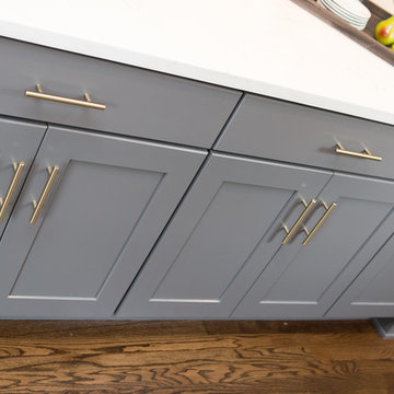
 Advance Design Studio, Ltd.
After six years of living in their Huntley IL home, Chris and Meghan were tired of their dark, dingy, outdated kitchen and it was finally time for a long-anticipated change. “The kitchen is the place where we live, it’s where we do everything,” Meghan said. “It was important that it be a space where we wanted to be.” Meghan loves cooking and enjoys including their girls in healthy meal prepping, this led them to want a brighter, more enjoyable kitchen with increased functionality and improved storage.
For Chris especially, the laundry room was an entirely dysfunctional eyesore. “We had a washer and a dryer, but it was all kind-of cobbled together!” Chris said. “There were always laundry piles everywhere, we weren’t really sure what we wanted to do in there, but it was time for us to make a change.” The mess of the space was stressful every time they walked in the door from the garage each day. Kids’ backpacks and shoes piled up haphazardly in the makeshift boot-bench closet left the family feeling disorganized and stressed. They needed space for folding clothes and locker cubbies to help keep the family organized.
Having known Christine and Todd in the Huntley community for years, Chris and Meghan were familiar with their work. “We already trusted them personally and having seen their projects for years we knew they did top notch work. After we reviewed the initial round of designs, we knew that hiring them was definitely the right choice,” Meghan and Chris said. Although Chris had done a lot of work in their home himself, the kitchen and laundry room renovation was such a large undertaking that he didn’t want to steal time away from his family to spend what would surely be many long weekends doing the job himself. “That would not have been a wise choice for us,” Chris laughed.
“Our designer, Michelle was very, very, easy to work with; anything we wanted to see or weren’t sure about, she went above and beyond to make this easy for us. She was easy to get hold of and always quick to respond,” the couple said. Michelle pulled ideas that mirrored the couple’s taste and style and was adept at directing the couple to limited choices that didn’t overwhelm them and kept the process moving. “I have a hard time making decisions. Michelle made the decision-making process so easy. I loved how she listened to what I liked and then presented three great options for me to choose from,” Meghan said.
The main objectives for the kitchen were better storage solutions, they wanted the space to reflect their lifestyle and taste, and they wanted it to last for years with low maintenance. One of the first steps in creating a more functional kitchen was relocating the refrigerator, creating an improved workflow for the busy family.
“We didn’t know that we could even move the refrigerator to a new location where it is now, that was something that we never would have thought of,” Chris said. “The new refrigerator location makes the kitchen feel so much bigger. We didn’t add any space, but our whole kitchen with the new design just seems like it’s so much larger than before!” Meghan said.
The perimeter mist colored cabinets helped warm and brighten the entire room, while the graphite colored cabinets on the island added contrast. Using this fresh, clean color palette satisfied the couple’s desire for a bright space that was the exact opposite of what they had before. Organization accessories were also added to the cabinets such as a spice drawer tray and roll outs to create hidden convenience.
“I absolutely love the hidden spices – it makes cooking so much more enjoyable!” Chris said. “And all the pull outs, and the double trash bin, who would think you could get so excited about organization!” the couple said in unison.
One thing they hated in their original kitchen was how dark the space felt. Added lighting on the ceiling with the new light fixtures combined with the lighter cabinetry colors throughout solved this problem. “Our new kitchen has this warm, almost cozy feeling that our old kitchen never had, it’s just a space that I love spending my time in now,” Meghan said. The light airy feeling was accentuated with the use of floating white shelves on either side of the decorative range hood. “We have so much cabinetry space, the new design is amazing we actually have more storage space than we will ever need,” Meghan said.
The island was extended to create more work surface and added space for stool seating. “The new island changes how we live. Now the kids can be in the kitchen with us, doing homework, eating breakfast, and the three of us have special dinners there when Chris is working late,” Meghan said.
The Carrara Marmi Quartz countertops were chosen because they are, not only beautiful, but are made from hard-working material that doesn’t require maintenance. The white subway tile backsplash that wraps to the ceiling behind the focal point cooktop range/hood compliments the crisp white countertops perfectly, while brushed brass hardware and light fixtures keep the design fresh and new.
The couple had a few fears at the beginning of the project, as most homeowners do. Their biggest fear was being out of their kitchen and laundry room for an extended time. The crew made it very easy for the family to work in a limited space keeping the washer and dryer hooked up the majority of the time, and also getting appliances working with minimal downtime.
“They above and beyond accommodated us to get us through the process,” Meghan said. “They did a great job making sure we were as comfortable as possible throughout the process,” Chris added.
“Our project manager DJ did a great job. He was very good at updating us on schedule changes, getting guys in as quickly as possible. Everyone that stepped in the house was nice and did great work,” said Chris. They thought Advance’s carpenter was phenomenal and were impressed when he took a conceptual idea from a photograph and worked with designer Michelle to create a one of a kind range/hood that has become the topic of conversation with friends and family who visit the new kitchen. “He was in our house literally every day for several weeks. He was easy to work with and good at what he did,” Meghan and Chris said.
The focal point of the kitchen; a hand-crafted, custom-built ventilation hood was clad with handpicked reclaimed barnwood. Advance Design’s carpenter built the framework and the cladding to create a one-of-a-kind design element that the couple loves.
“I think it was especially fun for him to create something unique from scratch, showcasing his talent in this area,” Meghan said. “I love that my kitchen is not like everyone else’s. I got to pick out the wood on my hood and watch it being built and was able to choose what pieces of wood went where on it. It’s totally unique.”
Red Oak flooring was toothed-in throughout the kitchen and the rest of the first floor anywhere changes were made. Then the whole floor was refinished to tone down the orange undertones in the existing floor stain, ultimately changing the color complexion of the entire first floor. The result is a completely new feeling to the entire home.
Renovating the laundry room was extremely important to Meghan and Chris, but they had trouble visualizing what the possibilities were for the seemingly small space. Michelle produced beautiful 3D illustrations that helped them envision the space in a whole new way.
“I must have told Michelle 100 times that I am a visual person, seeing the designs in 3D made it so easy to make decisions and see what we could really do with our space,” Meghan said.
A dividing wall and doorway were removed between the existing laundry room and hallway formerly containing a coat closet, providing space to design specialized graphite colored cabinetry matching the kitchen island to house custom storage cubbies for each family member. Adding the tall utility cabinetry in the new laundry area helped solve the storage issue, tucking away cleaning supplies, household items, and even the cat got its own cubby.
“I love how everything is now hidden in its own space. I can’t tell you how much I hated coming home and seeing everything sitting around on counters,” Chris said.
Electrical outlets were planned for the inside of utility cabinets, so devices could charge in hidden locations. Stacking the washer and dryer allowed for wider countertop space to provide a folding area and a special space for clothes to hang. “The way I do laundry has been completely transformed! I can actually fold clothes and hang them now right out of the washer and dryer,” Meghan said.
“The end result in the kitchen and the laundry/mud room was an updated light and bright space, with a smarter work flow that better meets the needs of this family,” Michelle said.
“I would totally recommend Advance Design,” Meghan said. “Sometimes I sit and just look at my kitchen and laundry room and think ‘Wow, I can’t believe I get to live here!’ It’s an understatement to say we love our new space.”
 Twelve Stones Designs, LLC
The owners of this kitchen had spent the money to upgrade the finishes in their kitchen upon building the home 12 years ago, but after living in the space for several years they realized how nonfunctional the layout really was. The (then) two preschool aged children had grown into busy, hungry teenagers with many friends who also liked to hang out at the house. So the family needed a more functional kitchen with better traffic flow, space for daily activities revolving around the kitchen at different times of day, and a kitchen that could accommodate cooking for and serving large groups. Furthermore, the dark, traditional finishes no longer reflected the homeowners’ style. They requested a brighter, more relaxed, coastal style that reflected their love of the seaside cities they like to visit.
Originally, the kitchen was U-shaped with a narrow island in the middle. The island created narrow aisles that bottle-necked at the dishwasher, refrigerator, and cooktop areas. There was a pass-through from the foyer into the kitchen, but the owners never liked that the pass-through was also located so close to the powder room. The awkward proximity was unappealing and made guests feel uncomfortable.
The kitchen’s storage was made up of lots of narrow cabinets, apothecary drawers, clipped corner units, and very few drawers. It lacked useful storage for the larger items the family used on a daily basis. And the kitchen’s only pantry was small closet that had only builder-grade, narrow shelving with no illumination to be able to see the contents inside.
Overall, the kitchen’s lighting plan was poorly executed. Only six recessed cans illuminated the entire kitchen and nook areas. The under cabinet lighting was not evenly distributed either. In fact, the builder had mis-placed the under cabinet lighting around the decorative pilasters which made for choppy, dark cubbies. Further, the builder didn’t include any lighting over the sink or the bar area, which meant whoever was doing the dishes was always in their own shadow. That, coupled with the steep overhang of the game room above made the bar area feel like a dim, cavernous space that wasn’t inviting or task oriented. The kitchen looked out into the main living space, but the raised bar and a narrow wall (which held the only large cabinet in the kitchen) created more of a barrier than a relationship to the living room or breakfast nook. In fact, one couldn’t even see the breakfast nook from the cooktop or sink areas due to its orientation. The raised bar top was too narrow to comfortably sit to either dine at or chat from due to the lack of knee space. The the homeowners confided that the kitchen felt more like a dark, dirty prison than place where the family, or their guests, wanted to gather and commune.
The clients' needs and desires were:
➢ to create a kitchen that would be a space the family loved to be in; to relate to the adjacent spaces all around, and to have better flow for entertaining large groups
➢ to remove the walls between the breakfast nook and living area and to be able to utilize the natural light from the windows in both those areas
➢ to incorporate a functional chopping block for prepping fresh food for home cooked meals, an island with a large sink and drain board, 2 pull out trash cans, and seating for at least the 2 teens to eat or do homework
➢ to design a kitchen and breakfast nook with an airy, coastal, relaxed vibe that blended with the rest of the house's coastal theme
➢ to integrate a layered lighting plan which would include ample general illumination, specific task lighting, decorative lighting, and lots of illuminated storage
➢ to design a kitchen with not only more storage for all the husband’s kitchen gadgets and collection of oils and spices, but smart storage, including a coffee/breakfast bar and a place to store and conceal the toaster oven and microwave
➢ to find a way to utilize the large open space between the kitchen, pantry area, and breakfast nook
Twelve Stones Designs achieved the owner's goals by:
➢ removing the walls between the kitchen and living room to allow the natural light to filter in from the adjacent rooms and to create a connection between the kitchen, nook, and living spaces for a sense of unity and communion
➢ removing the existing pantry and designing 3 large pantry style cabinets with LED tape lights and rollout drawers to house lots of kitchen appliances, gadgets, and tons of groceries. We also took the cabinets all the way up to the 9’ ceiling for additional storage for seasonal items and bulk storage.
➢ designing 2 islands - 1 with a gorgeous black walnut chopping block that houses a drawer for chopping and carving knives and a custom double pull out trash unit for point of use utilization - and 1 that houses the dishwasher, a large Blanco Gourmet sink with integrated drain board, woven baskets for fresh root vegetables and kitchen towels, plenty of drawer storage for kitchen items, and bar seating for up to 4 diners.
➢ closing off the space between the kitchen and the powder room to create a beautiful new private alcove for the powder room as well as adding some decorative storage. This also gave us space to include more tall storage near the new range for precision placement of the husband’s extensive oil and spice collection as well as a location for a combo-steam oven the wife wanted for baking and cooking healthy meals.
The project is enhanced functionally by:
➢ incorporated USB and standard receptacles for the kids’ laptops and phone charging in the large island
➢ designing the small island to include additional open shelving for items used on a daily basis such as a variety of bowls, plates, and colanders. This set up also works well for the husband who prefers to “plate” his dinners in restaurant-style fashion before presenting them to the table.
➢ the integration of specific storage units, such as double stacked cutlery drawers, a custom spice pull-out, a Kuerig coffee and tea pod drawer, and custom double stacked utensil drawers
➢ moving the refrigerator to the old oven location - this eliminated the bottle neck as well as created a better relationship to the eating table. It also utilizes the floor space between the pantry, nook, and kitchen
➢ creating a banquet style breakfast nook - this banquette seating not only doubles the amount of seating for large gatherings but it better utilizes the odd space between the kitchen and the previous nook area. It also helps to create a distinct pathway from the mudroom room through the pantry area, kitchen, nook, and living room.
➢ the coffee/breakfast bar area which includes the perfect location for the concealed microwave and toaster oven, convenient storage for the coffee pods and tea accoutrements. Roll-out drawers below also house the smoothie maker, hot water kettle, and a plethora of smoothie-making ingredients such as protein powders, smoothie additives, etc. Furthermore, the drawers below the Keurig house measuring utensil, cutlery, baking supplies and tupperware storage.
➢ incorporating lots of wide drawers and pullouts to accommodate large cookware.
➢ utilizing as much vertical space as possible by building storage to the ceiling which accommodates the family’s abundant amount of serving platters, baking sheets, bakeware, casserole dishes, and additional cutting boards.
The project is enhanced aesthetically by:
➢ new 5-piece Versailles pattern porcelain tile that now seamlessly joins the entire down stairs area together creating a bright, cohesiveness feeling instead of choppy separated spaces - it also adds a coastal feeling
➢ designing a cabinet to conceal the microwave and toaster oven
➢ the coastal influenced light fixtures over the nook table and island
➢ the sandy colors of the Langdon Cambria countertops. The swirling pattern and sparkling quartz pieces remind the homeowner of black-and-tan sandy beaches
➢ the striped banquet seating whose creamy white background and blue-green stripes were the inspiration for the cabinet and wall colors.
➢ All the interior doors were painted black to coordinate with the blacks and grays in the backsplash tile and countertop. This also adds a hint of tailored formality to an otherwise casual space.
➢ the use of WAC's Oculux small aperture LED units for the overhead lighting complimented with Diode LED strips for task lighting under the cabinets and inside the pantry and glass wall cabinets. All of the lighting applications are on separate dimmer switches.
Innovative uses of materials or construction methods by Realty Restoration LLC:
➢ Each 1-1/2” x 3” block of reclaimed end-grain black walnut that makes up the center island chopping block was hand milled and built in the shop. It was designed to look substantial and proportional to the surrounding elements, executed by creating the 4 inch tall top with a solid wood chamfered edge band.
➢ The metal doors on either side of the vent hood were also custom designed for this project and built in the Realty Restoration LLC shop. They are made 1x2, 11-gauge mild steel with ribbed glass. Weighing 60 lbs a piece, heavy duty cabinet hinges were added to support the weight of the door and keep them from sagging.
➢ Under-cabinet receptacles were added along the range wall in order to have a clean, uninterrupted backsplash.
Design obstacles to overcome:
➢ Because we were removing the demising walls between the kitchen and living room, we had to find a way to plumb and vent the new island. We did this by tunneling through the slab (the slab had post tension cables which prevented us from just trenching) to run a new wet vent through a nearby structural wall. We pulled the existing hot and cold lines between upper floor joists and ran them down the structural wall as well and up through a conduit in the tunnel.
➢ Since we were converting from wall overs to a gas range it allowed us to utilize the 220 feed for the wall ovens to provide a new sub panel for all the new kitchen circuits
➢ Due to framing deficiencies inherited from the original build there was a 1-1/2” differential in the floor-to-ceiling height over a 20 foot span; by utilizing the process of cutting and furring coupled with the crown moulding details on the cabinet elevations we were able to mask the problem and provide seamless transitions between the cabinet components.
Evidence of superior craftsmanship:
➢ uniquely designed, one-of-a-kind metal “X” end panels on the large island. The end panels were custom made in the Realty Restoration LLC shop and fitted to the exact dimensions of the island. The welding seams are completely indistinguishable - the posts look like they are cut from a single sheet of metal
➢ square metal posts on the small island were also custom made and designed to compliment and carry through the metal element s throughout the kitchen
➢ the beautiful, oversized end panels on the pantry cabinets which give the breakfast nook a tailored look
➢ integrating a large format 5 piece Versailles tile pattern to seamlessly flow from the existing spaces into the new kitchen space
➢ By constructing a custom cabinet that jogged around a corner we could not remodel (housing the entry way coat closet) we were able to camouflage the adjacent wall offset within the upper and lower cabinets. By designing around the existing jog in the structural walls we accomplished a few things: we were able to find the space to house, and hide, the microwave and toaster oven yet still have a clean cohesive appearance from the kitchen side. Additionally, the owners were able to keep their much needed coat closet and we didn’t have to increase the budget with unnecessary structural work.
Sponsored
Columbus, OH
Hope Restoration & General Contracting
Columbus Design-Build, Kitchen & Bath Remodeling, Historic Renovations
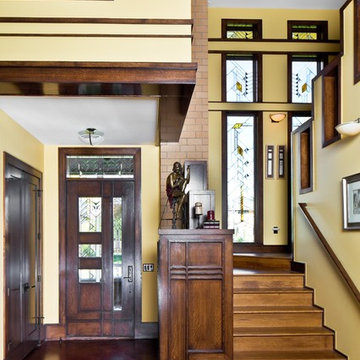
 Porchfront Homes
Porchfront Homes
Example of an arts and crafts entryway design in Denver with yellow walls
Example of an arts and crafts entryway design in Denver with yellow walls
 Twelve Stones Designs, LLC
The owners of this kitchen had spent the money to upgrade the finishes in their kitchen upon building the home 12 years ago, but after living in the space for several years they realized how nonfunctional the layout really was. The (then) two preschool aged children had grown into busy, hungry teenagers with many friends who also liked to hang out at the house. So the family needed a more functional kitchen with better traffic flow, space for daily activities revolving around the kitchen at different times of day, and a kitchen that could accommodate cooking for and serving large groups. Furthermore, the dark, traditional finishes no longer reflected the homeowners’ style. They requested a brighter, more relaxed, coastal style that reflected their love of the seaside cities they like to visit.
Originally, the kitchen was U-shaped with a narrow island in the middle. The island created narrow aisles that bottle-necked at the dishwasher, refrigerator, and cooktop areas. There was a pass-through from the foyer into the kitchen, but the owners never liked that the pass-through was also located so close to the powder room. The awkward proximity was unappealing and made guests feel uncomfortable.
The kitchen’s storage was made up of lots of narrow cabinets, apothecary drawers, clipped corner units, and very few drawers. It lacked useful storage for the larger items the family used on a daily basis. And the kitchen’s only pantry was small closet that had only builder-grade, narrow shelving with no illumination to be able to see the contents inside.
Overall, the kitchen’s lighting plan was poorly executed. Only six recessed cans illuminated the entire kitchen and nook areas. The under cabinet lighting was not evenly distributed either. In fact, the builder had mis-placed the under cabinet lighting around the decorative pilasters which made for choppy, dark cubbies. Further, the builder didn’t include any lighting over the sink or the bar area, which meant whoever was doing the dishes was always in their own shadow. That, coupled with the steep overhang of the game room above made the bar area feel like a dim, cavernous space that wasn’t inviting or task oriented. The kitchen looked out into the main living space, but the raised bar and a narrow wall (which held the only large cabinet in the kitchen) created more of a barrier than a relationship to the living room or breakfast nook. In fact, one couldn’t even see the breakfast nook from the cooktop or sink areas due to its orientation. The raised bar top was too narrow to comfortably sit to either dine at or chat from due to the lack of knee space. The the homeowners confided that the kitchen felt more like a dark, dirty prison than place where the family, or their guests, wanted to gather and commune.
The clients' needs and desires were:
➢ to create a kitchen that would be a space the family loved to be in; to relate to the adjacent spaces all around, and to have better flow for entertaining large groups
➢ to remove the walls between the breakfast nook and living area and to be able to utilize the natural light from the windows in both those areas
➢ to incorporate a functional chopping block for prepping fresh food for home cooked meals, an island with a large sink and drain board, 2 pull out trash cans, and seating for at least the 2 teens to eat or do homework
➢ to design a kitchen and breakfast nook with an airy, coastal, relaxed vibe that blended with the rest of the house's coastal theme
➢ to integrate a layered lighting plan which would include ample general illumination, specific task lighting, decorative lighting, and lots of illuminated storage
➢ to design a kitchen with not only more storage for all the husband’s kitchen gadgets and collection of oils and spices, but smart storage, including a coffee/breakfast bar and a place to store and conceal the toaster oven and microwave
➢ to find a way to utilize the large open space between the kitchen, pantry area, and breakfast nook
Twelve Stones Designs achieved the owner's goals by:
➢ removing the walls between the kitchen and living room to allow the natural light to filter in from the adjacent rooms and to create a connection between the kitchen, nook, and living spaces for a sense of unity and communion
➢ removing the existing pantry and designing 3 large pantry style cabinets with LED tape lights and rollout drawers to house lots of kitchen appliances, gadgets, and tons of groceries. We also took the cabinets all the way up to the 9’ ceiling for additional storage for seasonal items and bulk storage.
➢ designing 2 islands - 1 with a gorgeous black walnut chopping block that houses a drawer for chopping and carving knives and a custom double pull out trash unit for point of use utilization - and 1 that houses the dishwasher, a large Blanco Gourmet sink with integrated drain board, woven baskets for fresh root vegetables and kitchen towels, plenty of drawer storage for kitchen items, and bar seating for up to 4 diners.
➢ closing off the space between the kitchen and the powder room to create a beautiful new private alcove for the powder room as well as adding some decorative storage. This also gave us space to include more tall storage near the new range for precision placement of the husband’s extensive oil and spice collection as well as a location for a combo-steam oven the wife wanted for baking and cooking healthy meals.
The project is enhanced functionally by:
➢ incorporated USB and standard receptacles for the kids’ laptops and phone charging in the large island
➢ designing the small island to include additional open shelving for items used on a daily basis such as a variety of bowls, plates, and colanders. This set up also works well for the husband who prefers to “plate” his dinners in restaurant-style fashion before presenting them to the table.
➢ the integration of specific storage units, such as double stacked cutlery drawers, a custom spice pull-out, a Kuerig coffee and tea pod drawer, and custom double stacked utensil drawers
➢ moving the refrigerator to the old oven location - this eliminated the bottle neck as well as created a better relationship to the eating table. It also utilizes the floor space between the pantry, nook, and kitchen
➢ creating a banquet style breakfast nook - this banquette seating not only doubles the amount of seating for large gatherings but it better utilizes the odd space between the kitchen and the previous nook area. It also helps to create a distinct pathway from the mudroom room through the pantry area, kitchen, nook, and living room.
➢ the coffee/breakfast bar area which includes the perfect location for the concealed microwave and toaster oven, convenient storage for the coffee pods and tea accoutrements. Roll-out drawers below also house the smoothie maker, hot water kettle, and a plethora of smoothie-making ingredients such as protein powders, smoothie additives, etc. Furthermore, the drawers below the Keurig house measuring utensil, cutlery, baking supplies and tupperware storage.
➢ incorporating lots of wide drawers and pullouts to accommodate large cookware.
➢ utilizing as much vertical space as possible by building storage to the ceiling which accommodates the family’s abundant amount of serving platters, baking sheets, bakeware, casserole dishes, and additional cutting boards.
The project is enhanced aesthetically by:
➢ new 5-piece Versailles pattern porcelain tile that now seamlessly joins the entire down stairs area together creating a bright, cohesiveness feeling instead of choppy separated spaces - it also adds a coastal feeling
➢ designing a cabinet to conceal the microwave and toaster oven
➢ the coastal influenced light fixtures over the nook table and island
➢ the sandy colors of the Langdon Cambria countertops. The swirling pattern and sparkling quartz pieces remind the homeowner of black-and-tan sandy beaches
➢ the striped banquet seating whose creamy white background and blue-green stripes were the inspiration for the cabinet and wall colors.
➢ All the interior doors were painted black to coordinate with the blacks and grays in the backsplash tile and countertop. This also adds a hint of tailored formality to an otherwise casual space.
➢ the use of WAC's Oculux small aperture LED units for the overhead lighting complimented with Diode LED strips for task lighting under the cabinets and inside the pantry and glass wall cabinets. All of the lighting applications are on separate dimmer switches.
Innovative uses of materials or construction methods by Realty Restoration LLC:
➢ Each 1-1/2” x 3” block of reclaimed end-grain black walnut that makes up the center island chopping block was hand milled and built in the shop. It was designed to look substantial and proportional to the surrounding elements, executed by creating the 4 inch tall top with a solid wood chamfered edge band.
➢ The metal doors on either side of the vent hood were also custom designed for this project and built in the Realty Restoration LLC shop. They are made 1x2, 11-gauge mild steel with ribbed glass. Weighing 60 lbs a piece, heavy duty cabinet hinges were added to support the weight of the door and keep them from sagging.
➢ Under-cabinet receptacles were added along the range wall in order to have a clean, uninterrupted backsplash.
Design obstacles to overcome:
➢ Because we were removing the demising walls between the kitchen and living room, we had to find a way to plumb and vent the new island. We did this by tunneling through the slab (the slab had post tension cables which prevented us from just trenching) to run a new wet vent through a nearby structural wall. We pulled the existing hot and cold lines between upper floor joists and ran them down the structural wall as well and up through a conduit in the tunnel.
➢ Since we were converting from wall overs to a gas range it allowed us to utilize the 220 feed for the wall ovens to provide a new sub panel for all the new kitchen circuits
➢ Due to framing deficiencies inherited from the original build there was a 1-1/2” differential in the floor-to-ceiling height over a 20 foot span; by utilizing the process of cutting and furring coupled with the crown moulding details on the cabinet elevations we were able to mask the problem and provide seamless transitions between the cabinet components.
Evidence of superior craftsmanship:
➢ uniquely designed, one-of-a-kind metal “X” end panels on the large island. The end panels were custom made in the Realty Restoration LLC shop and fitted to the exact dimensions of the island. The welding seams are completely indistinguishable - the posts look like they are cut from a single sheet of metal
➢ square metal posts on the small island were also custom made and designed to compliment and carry through the metal element s throughout the kitchen
➢ the beautiful, oversized end panels on the pantry cabinets which give the breakfast nook a tailored look
➢ integrating a large format 5 piece Versailles tile pattern to seamlessly flow from the existing spaces into the new kitchen space
➢ By constructing a custom cabinet that jogged around a corner we could not remodel (housing the entry way coat closet) we were able to camouflage the adjacent wall offset within the upper and lower cabinets. By designing around the existing jog in the structural walls we accomplished a few things: we were able to find the space to house, and hide, the microwave and toaster oven yet still have a clean cohesive appearance from the kitchen side. Additionally, the owners were able to keep their much needed coat closet and we didn’t have to increase the budget with unnecessary structural work.
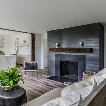
 Blansfield Builders, Inc.
Jim Fuhrmann, Beinfield Architecture PC
Example of a mid-sized country open concept living room design in New York with a standard fireplace and gray walls
Example of a mid-sized country open concept living room design in New York with a standard fireplace and gray walls
 H2D Architecture + Design
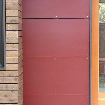
Close up detail of the painted fibercement siding with an open rain screen assembly.
Design by Heidi Helgeson
Bray Hayden Photography and H2D Architecture + Design
 Sarah Greenman
Photo: Sarah Greenman © 2013 Houzz
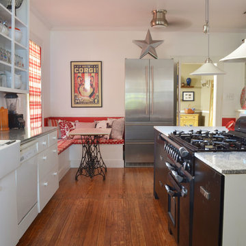
Eat-in kitchen - traditional eat-in kitchen idea in Dallas with a farmhouse sink, flat-panel cabinets, white cabinets and stainless steel appliances
Eat-in kitchen - traditional eat-in kitchen idea in Dallas with a farmhouse sink, flat-panel cabinets, white cabinets and stainless steel appliances
 Lisa Gildar Interior Spaces
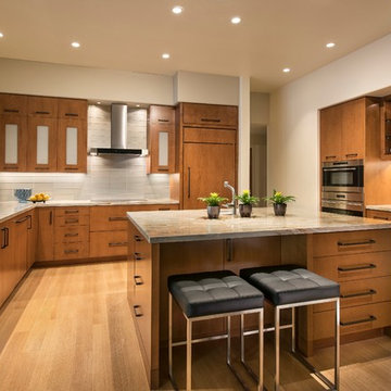
Example of a mid-sized trendy u-shaped medium tone wood floor eat-in kitchen design in Phoenix with an undermount sink, flat-panel cabinets, medium tone wood cabinets, white backsplash, stainless steel appliances, an island and quartzite countertops
 Janvrin & Co.
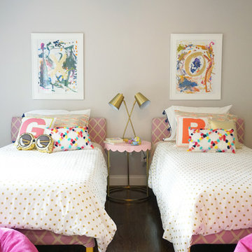
We transformed this plain Jane nursery into the a funky fresh and colorful toddler bedroom using DIY know-how, smarty shopping, kids art and current trends. We share our must-haves, steals & deals, and oh yeah see all the details of this super fresh and fun big girl bedroom on our on our blog, including this IKEA bed frame hack using Serena & Lily fabric.
6