
Search results for "D i y path" in Home Design Ideas
 Thomas Roszak Architecture, LLC
Photo credit: Scott McDonald @ Hedrich Blessing
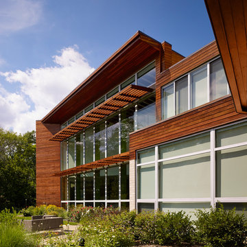
7RR-Ecohome:
The design objective was to build a house for a couple recently married who both had kids from previous marriages. How to bridge two families together?
The design looks forward in terms of how people live today. The home is an experiment in transparency and solid form; removing borders and edges from outside to inside the house, and to really depict “flowing and endless space”. The house floor plan is derived by pushing and pulling the house’s form to maximize the backyard and minimize the public front yard while welcoming the sun in key rooms by rotating the house 45-degrees to true north. The angular form of the house is a result of the family’s program, the zoning rules, the lot’s attributes, and the sun’s path. We wanted to construct a house that is smart and efficient in terms of construction and energy, both in terms of the building and the user. We could tell a story of how the house is built in terms of the constructability, structure and enclosure, with a nod to Japanese wood construction in the method in which the siding is installed and the exposed interior beams are placed in the double height space. We engineered the house to be smart which not only looks modern but acts modern; every aspect of user control is simplified to a digital touch button, whether lights, shades, blinds, HVAC, communication, audio, video, or security. We developed a planning module based on a 6-foot square room size and a 6-foot wide connector called an interstitial space for hallways, bathrooms, stairs and mechanical, which keeps the rooms pure and uncluttered. The house is 6,200 SF of livable space, plus garage and basement gallery for a total of 9,200 SF. A large formal foyer celebrates the entry and opens up to the living, dining, kitchen and family rooms all focused on the rear garden. The east side of the second floor is the Master wing and a center bridge connects it to the kid’s wing on the west. Second floor terraces and sunscreens provide views and shade in this suburban setting. The playful mathematical grid of the house in the x, y and z axis also extends into the layout of the trees and hard-scapes, all centered on a suburban one-acre lot.
Many green attributes were designed into the home; Ipe wood sunscreens and window shades block out unwanted solar gain in summer, but allow winter sun in. Patio door and operable windows provide ample opportunity for natural ventilation throughout the open floor plan. Minimal windows on east and west sides to reduce heat loss in winter and unwanted gains in summer. Open floor plan and large window expanse reduces lighting demands and maximizes available daylight. Skylights provide natural light to the basement rooms. Durable, low-maintenance exterior materials include stone, ipe wood siding and decking, and concrete roof pavers. Design is based on a 2' planning grid to minimize construction waste. Basement foundation walls and slab are highly insulated. FSC-certified walnut wood flooring was used. Light colored concrete roof pavers to reduce cooling loads by as much as 15%. 2x6 framing allows for more insulation and energy savings. Super efficient windows have low-E argon gas filled units, and thermally insulated aluminum frames. Permeable brick and stone pavers reduce the site’s storm-water runoff. Countertops use recycled composite materials. Energy-Star rated furnaces and smart thermostats are located throughout the house to minimize duct runs and avoid energy loss. Energy-Star rated boiler that heats up both radiant floors and domestic hot water. Low-flow toilets and plumbing fixtures are used to conserve water usage. No VOC finish options and direct venting fireplaces maintain a high interior air quality. Smart home system controls lighting, HVAC, and shades to better manage energy use. Plumbing runs through interior walls reducing possibilities of heat loss and freezing problems. A large food pantry was placed next to kitchen to reduce trips to the grocery store. Home office reduces need for automobile transit and associated CO2 footprint. Plan allows for aging in place, with guest suite than can become the master suite, with no need to move as family members mature.
 Tracy deShazo Interiors
Bryan Chavez Photography
River City Custom Homes - RounTrey - 2015 Homearama
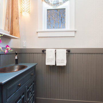
Farmhouse with a Modern Vibe
Gold Winner - Master Suite
Aware of the financial investment clients put into their homes, I combine my business and design expertise while working with each client to understand their taste, enhance their style and create spaces they will enjoy for years to come.
It’s been said that I have a “good” eye. I won’t discount that statement and I’d add I have an affinity to people, places and things that tell a story. My clients benefit from my passion and ability to turn their homes into finely curated spaces through the use of beautiful textiles, amazing lighting and furniture pieces that are as timeless as they are wonderfully unique. I enjoy the creative process and work with people who are building their dream homes, remodeling existing homes or desire a fresh take on a well lived-in space.
I see the client–designer relationship as a partnership with a desire to deliver an end result that exceeds my client’s expectations. I approach each project with professionalism, unparalleled excitement and a commitment for designing homes that are as livable as they are beautiful.
 Ulrich Inc
Ulrich Designer: Tom Santarsiero
Photography by Peter Rymwid
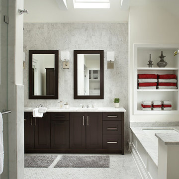
This is a master bath with subtle sophistication and understated elegance. The cabinets were custom designed by Tom, with straight, simple lines, and custom built by Draper DBS of walnut, with a deep, rich brown finish. The richness of the dark cabinetry juxtaposed with the elegance of the white carrara marble on the countertop, wall and floors contributes to the room's sophistication. Ample storage is found in the large vanity and an armoire style cabinet, designed to mimic a free-standing furniture piece, that is positioned behind the door. Architectural beams placed across the vaulted ceiling bring a sense of scale to the room and invite natural light in through the skylight.
Find the right local pro for your project
 Chris Edwards Photography
Chris Edwards
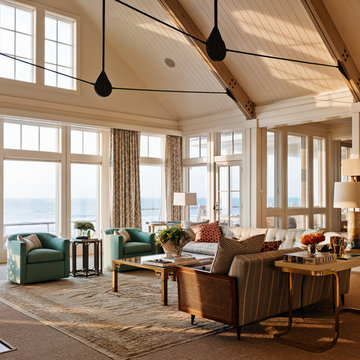
Living room - large coastal formal and open concept medium tone wood floor living room idea in Charlotte with beige walls
Living room - large coastal formal and open concept medium tone wood floor living room idea in Charlotte with beige walls
 Phương Nam Cons
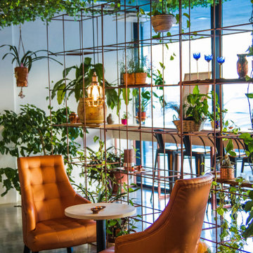
Sơn Epoxy là một vật liệu rất được sử dụng phổ biến trong công nghiệp xây dựng hiện nay. Sơn Epoxy có tính bám dính và chống các tác động môi trường tốt nên có thể bảo vệ bề mặt vật liệu, làm tăng tuổi thọ công trình.
Tự hào là đối tác số một trong ngành thi công sơn epoxy cũng như đại lý phân phối chính thức của các hãng sơn epoxy lớn nhất tại Việt Nam. Sơn epoxy Phương Nam Cons chúng tôi hi vọng sẽ là đơn vị đồng hành cùng những công trình với quý khách. Tự hào là đối tác số một trong ngành thi công sơn epoxy cũng như đại lý phân phối chính thức của các hãng sơn epoxy lớn nhất tại Việt Nam. Sơn epoxy Phương Nam Cons chúng tôi hi vọng sẽ là đơn vị đồng hành cùng những công trình với quý khách trong Sơn sàn Epoxy, Sơn nền Epoxy.
Báo giá thi công Sơn Epoxy https://phuongnamcons.vn/son-epoxy/
Công ty TNHH dịch vụ giải pháp xây dựng Phương Nam - Phương Nam Cons - chuyên thi công dịch vụ chống thấm , chống thấm dột, sika chống thấm, chống thấm sân thượng, chống thấm sàn , chống thấm tường, chống thấm bể nước,chống thấm tầng hầm, Chống thấm ngược, chống thấm bể bơi, Sơn Epoxy, Sơn giả đá cẩm thạch, gia cố kết cấu bê tông, Jet Grouting, Phá dỡ công trình, Xử lý sự cố công trình xây dựng hiệu quả, uy tín nhất tại TpHCM, Hà Nội, Đà Nẵng và toàn quốc.
Công ty TNHH dịch vụ giải pháp xây dựng Phương Nam - Phương Nam Cons
Trụ Sở : Bcons Tower, 4A/167A Đường Nguyễn Văn Thương (D1 cũ), Phường 25, Quận Bình Thạnh, TP Hồ Chí Minh.
Phone : 0906448474 - 0906393386
Email : info@phuongnamcons.vn
Website : https://phuongnamcons.vn/
Phương Nam Cons trên Google Maps: https://g.page/phuongnamcons?gm
Tự hào là đối tác số một trong ngành thi công sơn epoxy cũng như đại lý phân phối chính thức của các hãng sơn epoxy lớn nhất tại Việt Nam. Sơn epoxy Phương Nam Cons chúng tôi hi vọng sẽ là đơn vị đồng hành cùng những công trình với quý khách. Tự hào là đối tác số một trong ngành thi công sơn epoxy cũng như đại lý phân phối chính thức của các hãng sơn epoxy lớn nhất tại Việt Nam. Sơn epoxy Phương Nam Cons chúng tôi hi vọng sẽ là đơn vị đồng hành cùng những công trình với quý khách trong Sơn sàn Epoxy, Sơn nền Epoxy.
Báo giá thi công Sơn Epoxy https://phuongnamcons.vn/son-epoxy/
Công ty TNHH dịch vụ giải pháp xây dựng Phương Nam - Phương Nam Cons - chuyên thi công dịch vụ chống thấm , chống thấm dột, sika chống thấm, chống thấm sân thượng, chống thấm sàn , chống thấm tường, chống thấm bể nước,chống thấm tầng hầm, Chống thấm ngược, chống thấm bể bơi, Sơn Epoxy, Sơn giả đá cẩm thạch, gia cố kết cấu bê tông, Jet Grouting, Phá dỡ công trình, Xử lý sự cố công trình xây dựng hiệu quả, uy tín nhất tại TpHCM, Hà Nội, Đà Nẵng và toàn quốc.
Công ty TNHH dịch vụ giải pháp xây dựng Phương Nam - Phương Nam Cons
Trụ Sở : Bcons Tower, 4A/167A Đường Nguyễn Văn Thương (D1 cũ), Phường 25, Quận Bình Thạnh, TP Hồ Chí Minh.
Phone : 0906448474 - 0906393386
Email : info@phuongnamcons.vn
Website : https://phuongnamcons.vn/
Phương Nam Cons trên Google Maps: https://g.page/phuongnamcons?gm
 Carrick Custom Home Design
Built by Highland Custom Homes
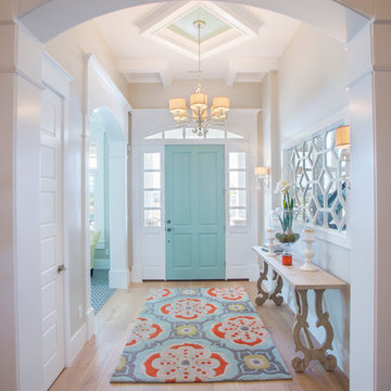
Entryway - mid-sized transitional medium tone wood floor and beige floor entryway idea in Salt Lake City with beige walls and a blue front door
Entryway - mid-sized transitional medium tone wood floor and beige floor entryway idea in Salt Lake City with beige walls and a blue front door
 Advance Design Studio, Ltd.
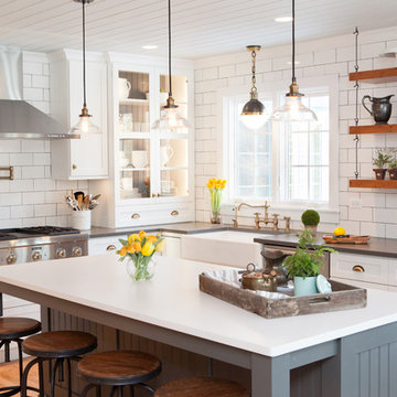
When this suburban family decided to renovate their kitchen, they knew that they wanted a little more space. Advance Design worked together with the homeowner to design a kitchen that would work for a large family who loved to gather regularly and always ended up in the kitchen! So the project began with extending out an exterior wall to accommodate a larger island and more moving-around space between the island and the perimeter cabinetry.
Style was important to the cook, who began collecting accessories and photos of the look she loved for months prior to the project design. She was drawn to the brightness of whites and grays, and the design accentuated this color palette brilliantly with the incorporation of a warm shade of brown woods that originated from a dining room table that was a family favorite. Classic gray and white cabinetry from Dura Supreme hits the mark creating a perfect balance between bright and subdued. Hints of gray appear in the bead board detail peeking just behind glass doors, and in the application of the handsome floating wood shelves between cabinets. White subway tile is made extra interesting with the application of dark gray grout lines causing it to be a subtle but noticeable detail worthy of attention.
Suede quartz Silestone graces the countertops with a soft matte hint of color that contrasts nicely with the presence of white painted cabinetry finished smartly with the brightness of a milky white farm sink. Old melds nicely with new, as antique bronze accents are sprinkled throughout hardware and fixtures, and work together unassumingly with the sleekness of stainless steel appliances.
The grace and timelessness of this sparkling new kitchen maintains the charm and character of a space that has seen generations past. And now this family will enjoy this new space for many more generations to come in the future with the help of the team at Advance Design Studio.
Photographer: Joe Nowak
Dura Supreme Cabinetry

Sponsored
Sunbury, OH

J.Holderby - Renovations
Franklin County's Leading General Contractors - 2X Best of Houzz!
 Constructa Inc.
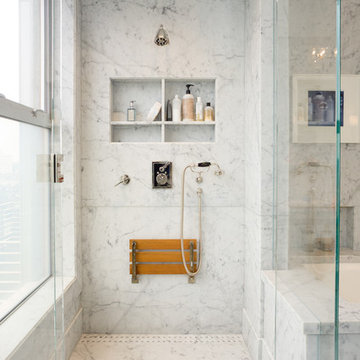
Inspiration for a mid-sized transitional master bathroom remodel in San Francisco with an undermount tub, gray walls, an undermount sink, marble countertops, a hinged shower door and a niche

 FineLine Kitchens, Inc.
Hi everyone, I'm Sarah and Ogun we are here with fine line kitchens. So we are a couple working together. I do the interior design and remodeling of the space material selection meeting with the clients. And I handled operations outside, you know meaning all the construction work that is taking place the inside. The houses that we work in. I handle all the aspects of the construction, so today's project is very special. We're in Vienna and the client had a very big family. It's a family of seven that lives here. So we had a few aspects that we needed to keep in mind while designing this one. Having everybody be able to sit on the island. So we wanted plenty of seating all the way around. We didn't want anybody standing or anything like that. So what we did is we maximize the space. The center island is the biggest part of the kitchen. We use a natural stone to kind of give it a beautiful texture versus quartz. It's kind of standard white or kind of fabricated, so I wanted something very natural. We did this because I took my inspiration from the outside, so the inspiration if you look at the view right in front of me is there are so many greens there's a lot of brass accents and I wanted to bring this. Into this kitchen while designing it for my clients. She is very warm very. She wanted a very homey, comfy kind of look for the kitchen. So that's what we did today. As you can see, the cabinets are sage green, very light, so I still think it's a neutral, but it's a lighter color that again brings the outside in and we combine that with the oak right behind me so it's a slightly warm oak. It's not very dark. It's not very light. It's a medium brown and the same color went on the island. To kind of tie these two in and the backsplash, my favorite part is where you can see a little bit of design. It is, in my opinion still classic, but includes a pattern so the outside part is as we said in the beginning, is handled by my husband. I'd like him to speak a little bit about that. Thanks, Sarah, I want to talk to you guys a little bit about the construction part of this project. Originally this kitchen was located mostly in this area. They had their stove there sing. It was more of a peninsula layout in Sarah's and the customer vision they wanted. They wanted to get rid of the peninsula and they want to be able to have a huge island that can at least sit seven people because they're familiar with seven. So we wanted to make sure that we can achieve this design and bring it to life so that they can be happy with this layout. Some of the challenges we had, the house, the home being, you know, old home. There were a lot of you know the older electrical and plumbing that had to be replaced. We had to relocate the stove from here to this area. Over here we had put a nice foot fan that we had to relocate all the ductwork and the plumbing. Was being on the peninsula area. We had to relocate it to the center islands. So we achieved all this and kind of like bring it to bring in this kitchen up to date it looks beautiful. That's true, so yes, the old layout did not function for my clients because everything was kind of gathered on one side of the kitchen. So there was like a peninsula right there. So the end of this island kind of continued straight. And that was just the L shape. Kind of where everything was and there used to be another big table here, so they were using only kind of half of the space. So like I said at the beginning, our vision was to kind of feed everybody at the island, create some symmetry. 'cause I love that. So as you can see behind me, this is kind of the focal point symmetrical. Everything is kind of even we wanted to also panel the fridge here so it mimics the pantry and another size. So when you're looking at it, it is bringing again that symmetry back again. I hope you enjoyed this kitchen and this video and I'll see you soon. So how do you think this project turned out? It's nice. I like the color. I think it turned out nice. It's kind of like a little bit different color than what we always do. So I realize. Are you giving me a little bit of credit here that I did something different? Are you proud? I'm so proud of you. Other than that I like it. That they have kind of like a two sink. So if this was our kitchen, if we ever like you can have your own. I can have mine if we ever get into a fight then this can be like my own kitchen. Why are we gonna bring in a fight right now? So I'm cooking anyway. You're grilling most of the time, So what are you even talking about? My kitchen? That's my kitchen. You can just take the small sink. That's fine. It's always good to have your own space right there, so anyways. Thank you guys for watching. We hope to see you soon and if you have any questions please click the link below. It'll lead you to our website, house, YouTube and all of the social media is so nice to have you guys. We'll see you soon. Thanks bye bye-bye.
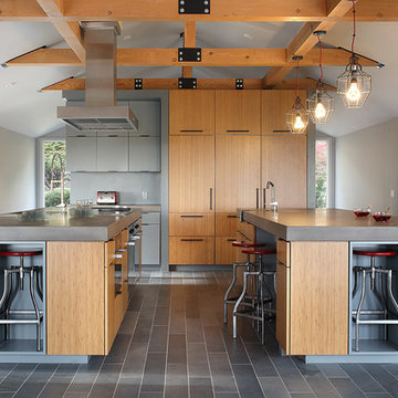
 SEK Architects
Image by Peter Rymwid Architectural Photography
Kitchen - large contemporary cement tile floor and gray floor kitchen idea in New York with an integrated sink, flat-panel cabinets, light wood cabinets, concrete countertops, paneled appliances, two islands and gray countertops
Kitchen - large contemporary cement tile floor and gray floor kitchen idea in New York with an integrated sink, flat-panel cabinets, light wood cabinets, concrete countertops, paneled appliances, two islands and gray countertops
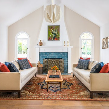
 National Association of the Remodeling Industry
A Plus Design & Remodeling, Van Nuys, California, 2018 Regional CotY Award Winner, Residential Historical Renovation/ Restoration Under $250,000
Inspiration for a transitional medium tone wood floor and brown floor living room remodel in Los Angeles with beige walls, a standard fireplace and a tile fireplace
Inspiration for a transitional medium tone wood floor and brown floor living room remodel in Los Angeles with beige walls, a standard fireplace and a tile fireplace
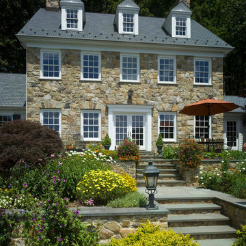
 Susan M. Rochelle, A.I.A., Architect
David Van Scott, Photography
Architectural design by Susan M. Rochelle, A.I.A., Architect, Hunterdon County, NJ
Inspiration for a country two-story stone exterior home remodel in New York
Inspiration for a country two-story stone exterior home remodel in New York

 Besch Architecture
Master bath with a free standing tub, wall mounted faucet and controls. Cedar planked wall divider with glass doors each side to access the shower and toilet room
Peter Nilson

Sponsored
Sunbury, OH
J.Holderby - Renovations
Franklin County's Leading General Contractors - 2X Best of Houzz!
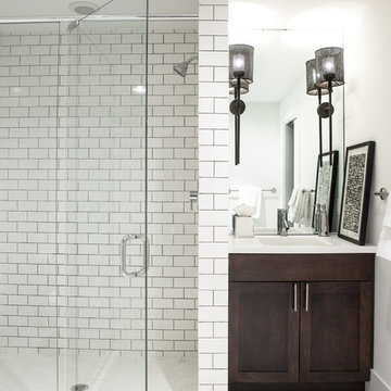
 Cure Design Group
Cure Design Group (636) 294-2343 https://curedesigngroup.com/
Designed by Cure Design Group and Town and Style Magazine feature 5/2013. This space was a total renovation! Designed for a young family that wanted it to be cozy, casual with the ability to entertain and lounge without feeling like they are in the "basement"
 Mariani Landscape
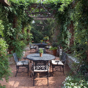
A stunning landscape filled with traditional elements throughout. Knot gardens, formal boxwood gardens with a water feature at the center, dining under a plush pergola, and seating from front to back to enjoy every space. Multiple levels are created in the landscape with raised beds and views from the upper terrace. Extensive perennial beds fill the distance with color and texture.
Photo Credit: Linda Oyama Bryan
 Advance Design Studio, Ltd.
After six years of living in their Huntley IL home, Chris and Meghan were tired of their dark, dingy, outdated kitchen and it was finally time for a long-anticipated change. “The kitchen is the place where we live, it’s where we do everything,” Meghan said. “It was important that it be a space where we wanted to be.” Meghan loves cooking and enjoys including their girls in healthy meal prepping, this led them to want a brighter, more enjoyable kitchen with increased functionality and improved storage.
For Chris especially, the laundry room was an entirely dysfunctional eyesore. “We had a washer and a dryer, but it was all kind-of cobbled together!” Chris said. “There were always laundry piles everywhere, we weren’t really sure what we wanted to do in there, but it was time for us to make a change.” The mess of the space was stressful every time they walked in the door from the garage each day. Kids’ backpacks and shoes piled up haphazardly in the makeshift boot-bench closet left the family feeling disorganized and stressed. They needed space for folding clothes and locker cubbies to help keep the family organized.
Having known Christine and Todd in the Huntley community for years, Chris and Meghan were familiar with their work. “We already trusted them personally and having seen their projects for years we knew they did top notch work. After we reviewed the initial round of designs, we knew that hiring them was definitely the right choice,” Meghan and Chris said. Although Chris had done a lot of work in their home himself, the kitchen and laundry room renovation was such a large undertaking that he didn’t want to steal time away from his family to spend what would surely be many long weekends doing the job himself. “That would not have been a wise choice for us,” Chris laughed.
“Our designer, Michelle was very, very, easy to work with; anything we wanted to see or weren’t sure about, she went above and beyond to make this easy for us. She was easy to get hold of and always quick to respond,” the couple said. Michelle pulled ideas that mirrored the couple’s taste and style and was adept at directing the couple to limited choices that didn’t overwhelm them and kept the process moving. “I have a hard time making decisions. Michelle made the decision-making process so easy. I loved how she listened to what I liked and then presented three great options for me to choose from,” Meghan said.
The main objectives for the kitchen were better storage solutions, they wanted the space to reflect their lifestyle and taste, and they wanted it to last for years with low maintenance. One of the first steps in creating a more functional kitchen was relocating the refrigerator, creating an improved workflow for the busy family.
“We didn’t know that we could even move the refrigerator to a new location where it is now, that was something that we never would have thought of,” Chris said. “The new refrigerator location makes the kitchen feel so much bigger. We didn’t add any space, but our whole kitchen with the new design just seems like it’s so much larger than before!” Meghan said.
The perimeter mist colored cabinets helped warm and brighten the entire room, while the graphite colored cabinets on the island added contrast. Using this fresh, clean color palette satisfied the couple’s desire for a bright space that was the exact opposite of what they had before. Organization accessories were also added to the cabinets such as a spice drawer tray and roll outs to create hidden convenience.
“I absolutely love the hidden spices – it makes cooking so much more enjoyable!” Chris said. “And all the pull outs, and the double trash bin, who would think you could get so excited about organization!” the couple said in unison.
One thing they hated in their original kitchen was how dark the space felt. Added lighting on the ceiling with the new light fixtures combined with the lighter cabinetry colors throughout solved this problem. “Our new kitchen has this warm, almost cozy feeling that our old kitchen never had, it’s just a space that I love spending my time in now,” Meghan said. The light airy feeling was accentuated with the use of floating white shelves on either side of the decorative range hood. “We have so much cabinetry space, the new design is amazing we actually have more storage space than we will ever need,” Meghan said.
The island was extended to create more work surface and added space for stool seating. “The new island changes how we live. Now the kids can be in the kitchen with us, doing homework, eating breakfast, and the three of us have special dinners there when Chris is working late,” Meghan said.
The Carrara Marmi Quartz countertops were chosen because they are, not only beautiful, but are made from hard-working material that doesn’t require maintenance. The white subway tile backsplash that wraps to the ceiling behind the focal point cooktop range/hood compliments the crisp white countertops perfectly, while brushed brass hardware and light fixtures keep the design fresh and new.
The couple had a few fears at the beginning of the project, as most homeowners do. Their biggest fear was being out of their kitchen and laundry room for an extended time. The crew made it very easy for the family to work in a limited space keeping the washer and dryer hooked up the majority of the time, and also getting appliances working with minimal downtime.
“They above and beyond accommodated us to get us through the process,” Meghan said. “They did a great job making sure we were as comfortable as possible throughout the process,” Chris added.
“Our project manager DJ did a great job. He was very good at updating us on schedule changes, getting guys in as quickly as possible. Everyone that stepped in the house was nice and did great work,” said Chris. They thought Advance’s carpenter was phenomenal and were impressed when he took a conceptual idea from a photograph and worked with designer Michelle to create a one of a kind range/hood that has become the topic of conversation with friends and family who visit the new kitchen. “He was in our house literally every day for several weeks. He was easy to work with and good at what he did,” Meghan and Chris said.
The focal point of the kitchen; a hand-crafted, custom-built ventilation hood was clad with handpicked reclaimed barnwood. Advance Design’s carpenter built the framework and the cladding to create a one-of-a-kind design element that the couple loves.
“I think it was especially fun for him to create something unique from scratch, showcasing his talent in this area,” Meghan said. “I love that my kitchen is not like everyone else’s. I got to pick out the wood on my hood and watch it being built and was able to choose what pieces of wood went where on it. It’s totally unique.”
Red Oak flooring was toothed-in throughout the kitchen and the rest of the first floor anywhere changes were made. Then the whole floor was refinished to tone down the orange undertones in the existing floor stain, ultimately changing the color complexion of the entire first floor. The result is a completely new feeling to the entire home.
Renovating the laundry room was extremely important to Meghan and Chris, but they had trouble visualizing what the possibilities were for the seemingly small space. Michelle produced beautiful 3D illustrations that helped them envision the space in a whole new way.
“I must have told Michelle 100 times that I am a visual person, seeing the designs in 3D made it so easy to make decisions and see what we could really do with our space,” Meghan said.
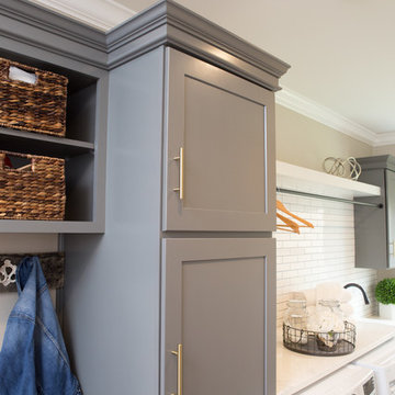
A dividing wall and doorway were removed between the existing laundry room and hallway formerly containing a coat closet, providing space to design specialized graphite colored cabinetry matching the kitchen island to house custom storage cubbies for each family member. Adding the tall utility cabinetry in the new laundry area helped solve the storage issue, tucking away cleaning supplies, household items, and even the cat got its own cubby.
“I love how everything is now hidden in its own space. I can’t tell you how much I hated coming home and seeing everything sitting around on counters,” Chris said.
Electrical outlets were planned for the inside of utility cabinets, so devices could charge in hidden locations. Stacking the washer and dryer allowed for wider countertop space to provide a folding area and a special space for clothes to hang. “The way I do laundry has been completely transformed! I can actually fold clothes and hang them now right out of the washer and dryer,” Meghan said.
“The end result in the kitchen and the laundry/mud room was an updated light and bright space, with a smarter work flow that better meets the needs of this family,” Michelle said.
“I would totally recommend Advance Design,” Meghan said. “Sometimes I sit and just look at my kitchen and laundry room and think ‘Wow, I can’t believe I get to live here!’ It’s an understatement to say we love our new space.”
 Kristina Crestin Design
Photography by Jared Kuzia
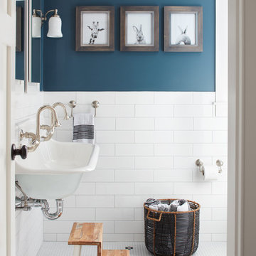
Inspiration for a farmhouse mosaic tile floor bathroom remodel in Boston with blue walls and a trough sink
Inspiration for a farmhouse mosaic tile floor bathroom remodel in Boston with blue walls and a trough sink
Sponsored
Sunbury, OH
J.Holderby - Renovations
Franklin County's Leading General Contractors - 2X Best of Houzz!
 Change Your Bathroom©
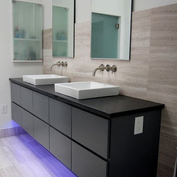
The goal of this project was to upgrade the builder grade finishes and create an ergonomic space that had a contemporary feel. This bathroom transformed from a standard, builder grade bathroom to a contemporary urban oasis. This was one of my favorite projects, I know I say that about most of my projects but this one really took an amazing transformation. By removing the walls surrounding the shower and relocating the toilet it visually opened up the space. Creating a deeper shower allowed for the tub to be incorporated into the wet area. Adding a LED panel in the back of the shower gave the illusion of a depth and created a unique storage ledge. A custom vanity keeps a clean front with different storage options and linear limestone draws the eye towards the stacked stone accent wall.
Houzz Write Up: https://www.houzz.com/magazine/inside-houzz-a-chopped-up-bathroom-goes-streamlined-and-swank-stsetivw-vs~27263720
The layout of this bathroom was opened up to get rid of the hallway effect, being only 7 foot wide, this bathroom needed all the width it could muster. Using light flooring in the form of natural lime stone 12x24 tiles with a linear pattern, it really draws the eye down the length of the room which is what we needed. Then, breaking up the space a little with the stone pebble flooring in the shower, this client enjoyed his time living in Japan and wanted to incorporate some of the elements that he appreciated while living there. The dark stacked stone feature wall behind the tub is the perfect backdrop for the LED panel, giving the illusion of a window and also creates a cool storage shelf for the tub. A narrow, but tasteful, oval freestanding tub fit effortlessly in the back of the shower. With a sloped floor, ensuring no standing water either in the shower floor or behind the tub, every thought went into engineering this Atlanta bathroom to last the test of time. With now adequate space in the shower, there was space for adjacent shower heads controlled by Kohler digital valves. A hand wand was added for use and convenience of cleaning as well. On the vanity are semi-vessel sinks which give the appearance of vessel sinks, but with the added benefit of a deeper, rounded basin to avoid splashing. Wall mounted faucets add sophistication as well as less cleaning maintenance over time. The custom vanity is streamlined with drawers, doors and a pull out for a can or hamper.
A wonderful project and equally wonderful client. I really enjoyed working with this client and the creative direction of this project.
Brushed nickel shower head with digital shower valve, freestanding bathtub, curbless shower with hidden shower drain, flat pebble shower floor, shelf over tub with LED lighting, gray vanity with drawer fronts, white square ceramic sinks, wall mount faucets and lighting under vanity. Hidden Drain shower system. Atlanta Bathroom.
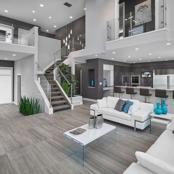
 ProRail Systems Ltd
Inspiration for a contemporary open concept gray floor living room remodel in Edmonton with gray walls
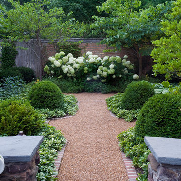 Mariani Landscape
The transition to several garden rooms, a gravel path leads from the rear terrace to the many spaces. The entry is flanked by the New England fieldstone seat wall, capped in blue stone. The path is lined with cushwa brick outlining the formal garden filled with boxwood, pachysandra ground cover, hydrangea, magnolia, and eastern redbud. Photo Credit: Linda Oyama Bryan
24