
Search results for "Daily express" in Home Design Ideas
 KCBR Design | Remodel
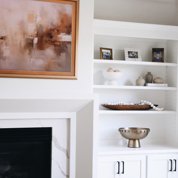
This main floor remodel in Lenexa, Kansas, was the third phase of a full-home transformation for our longtime clients. After previously renovating their basement and primary bathroom, they invited us back to reimagine the heart of their home with fresh perspective and elevated function.
The entryway was completely transformed from a builder-basic pass-through into a bright, welcoming focal point that sets the tone for the entire main floor. In the kitchen, we reworked the layout to improve flow and maximize storage, while introducing timeless finishes and thoughtful details that now carry throughout the home.
The family room was redesigned to feel warm, cohesive, and connected—complete with custom built-ins and a refreshed fireplace. We also converted the former laundry room into a fully functional prep kitchen, and redesigned the mudroom to meet the demands of daily life without compromising style.
This project reflects a balance of beauty, utility, and personal expression, with every space tailored to support how this family lives and gathers in their home.
 Mark D. Williams Custom Homes, Inc.
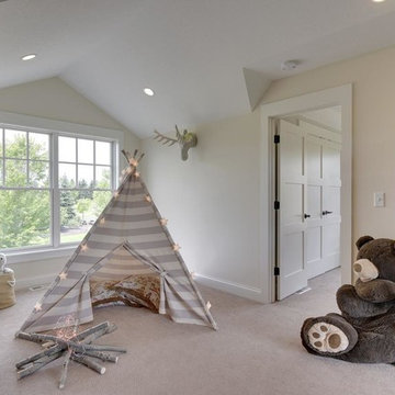
Inspiration for a transitional gender-neutral carpeted kids' room remodel in Minneapolis with beige walls
 KCBR Design | Remodel
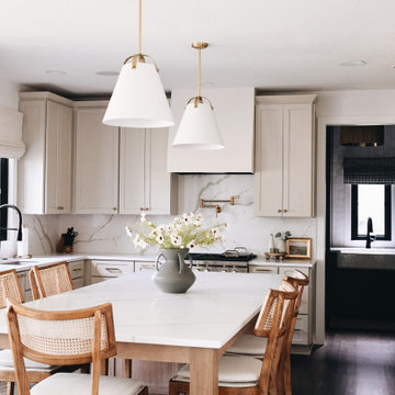
This main floor remodel in Lenexa, Kansas, was the third phase of a full-home transformation for our longtime clients. After previously renovating their basement and primary bathroom, they invited us back to reimagine the heart of their home with fresh perspective and elevated function.
The entryway was completely transformed from a builder-basic pass-through into a bright, welcoming focal point that sets the tone for the entire main floor. In the kitchen, we reworked the layout to improve flow and maximize storage, while introducing timeless finishes and thoughtful details that now carry throughout the home.
The family room was redesigned to feel warm, cohesive, and connected—complete with custom built-ins and a refreshed fireplace. We also converted the former laundry room into a fully functional prep kitchen, and redesigned the mudroom to meet the demands of daily life without compromising style.
This project reflects a balance of beauty, utility, and personal expression, with every space tailored to support how this family lives and gathers in their home.
Find the right local pro for your project
 Margot Hartford Photography
Photo: Margot Hartford © 2017 Houzz
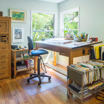
Home office - home office idea in Other
Home office - home office idea in Other
 Drewett Works
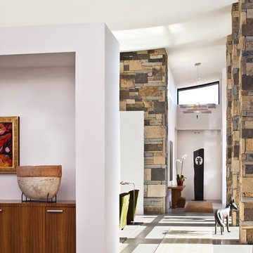
Designed to embrace an extensive and unique art collection including sculpture, paintings, tapestry, and cultural antiquities, this modernist home located in north Scottsdale’s Estancia is the quintessential gallery home for the spectacular collection within. The primary roof form, “the wing” as the owner enjoys referring to it, opens the home vertically to a view of adjacent Pinnacle peak and changes the aperture to horizontal for the opposing view to the golf course. Deep overhangs and fenestration recesses give the home protection from the elements and provide supporting shade and shadow for what proves to be a desert sculpture. The restrained palette allows the architecture to express itself while permitting each object in the home to make its own place. The home, while certainly modern, expresses both elegance and warmth in its material selections including canterra stone, chopped sandstone, copper, and stucco.
Project Details | Lot 245 Estancia, Scottsdale AZ
Architect: C.P. Drewett, Drewett Works, Scottsdale, AZ
Interiors: Luis Ortega, Luis Ortega Interiors, Hollywood, CA
Publications: luxe. interiors + design. November 2011.
Featured on the world wide web: luxe.daily
Photos by Grey Crawford
 Drewett Works
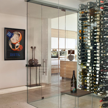
Designed to embrace an extensive and unique art collection including sculpture, paintings, tapestry, and cultural antiquities, this modernist home located in north Scottsdale’s Estancia is the quintessential gallery home for the spectacular collection within. The primary roof form, “the wing” as the owner enjoys referring to it, opens the home vertically to a view of adjacent Pinnacle peak and changes the aperture to horizontal for the opposing view to the golf course. Deep overhangs and fenestration recesses give the home protection from the elements and provide supporting shade and shadow for what proves to be a desert sculpture. The restrained palette allows the architecture to express itself while permitting each object in the home to make its own place. The home, while certainly modern, expresses both elegance and warmth in its material selections including canterra stone, chopped sandstone, copper, and stucco.
Project Details | Lot 245 Estancia, Scottsdale AZ
Architect: C.P. Drewett, Drewett Works, Scottsdale, AZ
Interiors: Luis Ortega, Luis Ortega Interiors, Hollywood, CA
Publications: luxe. interiors + design. November 2011.
Featured on the world wide web: luxe.daily
Photos by Grey Crawford
 KCBR Design | Remodel
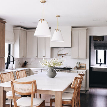
This main floor remodel in Lenexa, Kansas, was the third phase of a full-home transformation for our longtime clients. After previously renovating their basement and primary bathroom, they invited us back to reimagine the heart of their home with fresh perspective and elevated function.
The entryway was completely transformed from a builder-basic pass-through into a bright, welcoming focal point that sets the tone for the entire main floor. In the kitchen, we reworked the layout to improve flow and maximize storage, while introducing timeless finishes and thoughtful details that now carry throughout the home.
The family room was redesigned to feel warm, cohesive, and connected—complete with custom built-ins and a refreshed fireplace. We also converted the former laundry room into a fully functional prep kitchen, and redesigned the mudroom to meet the demands of daily life without compromising style.
This project reflects a balance of beauty, utility, and personal expression, with every space tailored to support how this family lives and gathers in their home.
 KCBR Design | Remodel
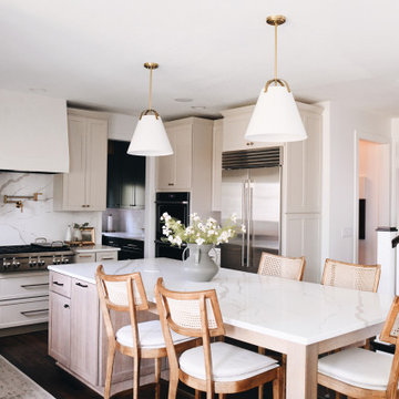
This main floor remodel in Lenexa, Kansas, was the third phase of a full-home transformation for our longtime clients. After previously renovating their basement and primary bathroom, they invited us back to reimagine the heart of their home with fresh perspective and elevated function.
The entryway was completely transformed from a builder-basic pass-through into a bright, welcoming focal point that sets the tone for the entire main floor. In the kitchen, we reworked the layout to improve flow and maximize storage, while introducing timeless finishes and thoughtful details that now carry throughout the home.
The family room was redesigned to feel warm, cohesive, and connected—complete with custom built-ins and a refreshed fireplace. We also converted the former laundry room into a fully functional prep kitchen, and redesigned the mudroom to meet the demands of daily life without compromising style.
This project reflects a balance of beauty, utility, and personal expression, with every space tailored to support how this family lives and gathers in their home.
 Valentini Kids Furniture Brooklyn NY
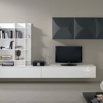
Modern Italian Wall Unit Exential Y13 by Spar
Made in Italy
Exential by Spar is an italian modular wall unit line that could be an excellent design solution for any modern or contemporary styled living room, especially if the space is limited. Individual units allow to organize functionally only those areas you need, which is impossible to do with the joint wall unit compositions. This italian entertainment center will complement your home and the areas of your daily life, not only as an aesthetic, but also as a functional addition, featuring an abundance of storage space, both hidden and exposed, to aid you with the organization of all your belongings, bringing the elegance into your interior. The most impressive feature, making this wall unit composition single out among others, is definitely a three-dimensional development of the doors of the hanging units, that are amusing with the harmonies between lights and shadows, making the whole composition extremely expressive.
The Wall Unit Composition Exential Y13 is shown in the next colors/finishes:
Structure - White Gloss lacquer;
Front - Anthracite and White Gloss lacquers.
PLEASE NOTE: The Exential is a modular wall unit line offering a wide variety of units in different sizes. You can order this wall unit either as a complete composition, as shown in the main picture, or build your own composition according to your own dimensions and preferences. Please contact our office about details on the customization of this wall unit.
MATERIAL/CONSTRUCTION:
Structure: Made with particle board of wood, covered with E1 melamine finishes or high gloss lacquer
Drawers: Made with panels of wood particles in E1-coated finish PVC beech. Metal runners with fine race to fall
Glass: 4mm glass
The starting price is for the Exential Wall Unit Composition Y13 as shown in the main picture.
Dimensions:
Wall Unit Composition: W141.7" x D15" x H72"
 Field Architecture
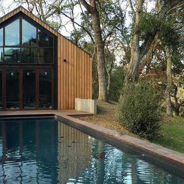
Portola Valley has a heritage of horse ranching among pristine native woodland / grassland habitats. This situation gave rise to an architectural expression that perpetuates this culture, while fostering a responsible cohabitation of the land.
With enough time on site, we were able to trace the game paths that traversed the site from East to West. These daily and seasonal routes connected the site to the bigger landscape of Canyon and its eventual merge with the Portola Valley. We situated all the habitable structures on one horizontal contour that threaded through four Northern California mature oak species on the steeply sloping site. This enabled the stables and pasture to inhabit the grassland meadow below protecting the slope, and restoring the grasslands to their native splendor.
 KCBR Design | Remodel
This main floor remodel in Lenexa, Kansas, was the third phase of a full-home transformation for our longtime clients. After previously renovating their basement and primary bathroom, they invited us back to reimagine the heart of their home with fresh perspective and elevated function.
The entryway was completely transformed from a builder-basic pass-through into a bright, welcoming focal point that sets the tone for the entire main floor. In the kitchen, we reworked the layout to improve flow and maximize storage, while introducing timeless finishes and thoughtful details that now carry throughout the home.
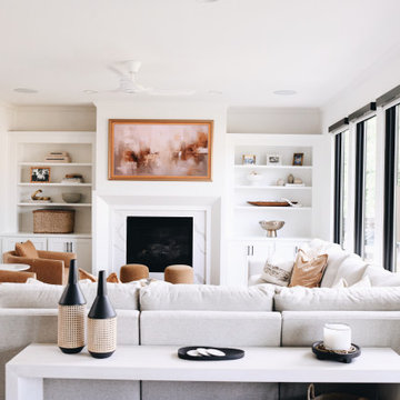
The family room was redesigned to feel warm, cohesive, and connected—complete with custom built-ins and a refreshed fireplace. We also converted the former laundry room into a fully functional prep kitchen, and redesigned the mudroom to meet the demands of daily life without compromising style.
This project reflects a balance of beauty, utility, and personal expression, with every space tailored to support how this family lives and gathers in their home.
 Drewett Works
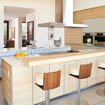
Bulthaup cabinets
Miele appliances
Designed to embrace an extensive and unique art collection including sculpture, paintings, tapestry, and cultural antiquities, this modernist home located in north Scottsdale’s Estancia is the quintessential gallery home for the spectacular collection within. The primary roof form, “the wing” as the owner enjoys referring to it, opens the home vertically to a view of adjacent Pinnacle peak and changes the aperture to horizontal for the opposing view to the golf course. Deep overhangs and fenestration recesses give the home protection from the elements and provide supporting shade and shadow for what proves to be a desert sculpture. The restrained palette allows the architecture to express itself while permitting each object in the home to make its own place. The home, while certainly modern, expresses both elegance and warmth in its material selections including canterra stone, chopped sandstone, copper, and stucco.
Project Details | Lot 245 Estancia, Scottsdale AZ
Architect: C.P. Drewett, Drewett Works, Scottsdale, AZ
Interiors: Luis Ortega, Luis Ortega Interiors, Hollywood, CA
Publications: luxe. interiors + design. November 2011.
Featured on the world wide web: luxe.daily
Photos by Grey CrawfordGrey Crawford
 San Luis Kitchen Co.
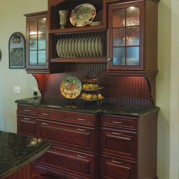
Recently, this Victorian style home welcomed its new owners with open arms – the only glitch in the budding relationship, the kitchen. The U shaped kitchen huddled in just half of the nice large room available to it – a long peninsula bisecting the space creating an awkward divide between the work area and the cramped breakfast nook/serving area.
The new owners enjoy cooking and they needed space for both of them to work in the kitchen at the same time. The old U shape did not accommodate this. The sink was too close to the range, the peninsula hemmed them in without providing a focused workstation, and the refrigerator sat at the end competing with people entering the space. And finally, the kitchen just lacked style – it did not fit with the Victorian style architecture and décor of the home.
San Luis Kitchen to the rescue! After attending a few of our monthly design seminars, the homeowners decided to take the remodeling plunge. They brought us a sketch of the space, explained their need for a more functional 2-cook space, and expressed interest in replacing the peninsula with an island. After visiting the home, we identified some other areas of design opportunity/constraint – an exterior door that was seldom used, an existing wood floor that extended throughout the house, a beautiful view from the breakfast nook windows, and a large existing pantry.
Our first thought for the new kitchen was to provide a visual focal point. The homeowners were excited by the idea of a “mantle” type wood hood which we situated facing out toward the formal dining room as the opening statement for the kitchen. We also added an island set at 90 degrees to the prior location of the peninsula – decorative open shelves face out from the island creating more visual interest. The new island not only reinforces the focal point of the hood, but also, working with the new built-in hutch, embraces the breakfast nook and integrates it with the rest of the kitchen. (Changing the peninsula to an island did create a need to patch the hardwood floor – thankfully the homeowner was able to find a source for replacement flooring that was almost a seamless blend)
Working with both the homeowners and their interior designer, we decided to combine a creamy white finish for the main cabinets with a cordovan maple stain for the island and hutch. The goal of this color scheme was a bright happy kitchen (the white) with a formal furniture feel to the cabinetry (the dark red maple pieces). Often, in Victorian or other classic style spaces, we see different pieces brought together (over time or as a planned design) to form a cohesive but diverse whole.
As functional considerations for the design, the main sink was moved to the island and a prep sink was added in the corner between the new cook-top and a designated bake center/prep station located where the old range had been. This gives space for both homeowners to work in the kitchen simultaneously using multiple workstations. We added a built-in refrigerator with decorative door panels (to blend comfortably with the cabinets), a wall oven/microwave combo – both of which are now in the space that used to have the redundant exterior door – expanding the kitchen all the way to the far wall. And lastly, keeping the basic structure of the existing pantry, we refaced it with matching doors and added rollout shelves for convenience.
The new kitchen gracefully meets all of the homeowners needs both as a showpiece and as a backdrop to their daily lives. Now they are comfortably ensconced in their entire home, including the kitchen!
 KCBR Design | Remodel
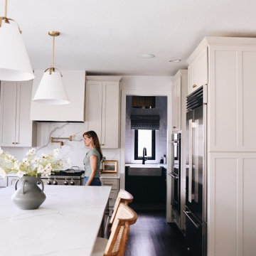
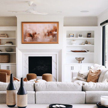
This main floor remodel in Lenexa, Kansas, was the third phase of a full-home transformation for our longtime clients. After previously renovating their basement and primary bathroom, they invited us back to reimagine the heart of their home with fresh perspective and elevated function.
The entryway was completely transformed from a builder-basic pass-through into a bright, welcoming focal point that sets the tone for the entire main floor. In the kitchen, we reworked the layout to improve flow and maximize storage, while introducing timeless finishes and thoughtful details that now carry throughout the home.
The family room was redesigned to feel warm, cohesive, and connected—complete with custom built-ins and a refreshed fireplace. We also converted the former laundry room into a fully functional prep kitchen, and redesigned the mudroom to meet the demands of daily life without compromising style.
This project reflects a balance of beauty, utility, and personal expression, with every space tailored to support how this family lives and gathers in their home.
 KCBR Design | Remodel
This main floor remodel in Lenexa, Kansas, was the third phase of a full-home transformation for our longtime clients. After previously renovating their basement and primary bathroom, they invited us back to reimagine the heart of their home with fresh perspective and elevated function.
The entryway was completely transformed from a builder-basic pass-through into a bright, welcoming focal point that sets the tone for the entire main floor. In the kitchen, we reworked the layout to improve flow and maximize storage, while introducing timeless finishes and thoughtful details that now carry throughout the home.
The family room was redesigned to feel warm, cohesive, and connected—complete with custom built-ins and a refreshed fireplace. We also converted the former laundry room into a fully functional prep kitchen, and redesigned the mudroom to meet the demands of daily life without compromising style.
This project reflects a balance of beauty, utility, and personal expression, with every space tailored to support how this family lives and gathers in their home.
 Kitchen Design Concepts
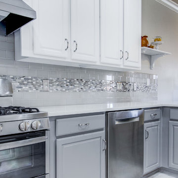
When we initially met with our clients, they expressed the need for modernization and updating. The original kitchen had good quality cabinetry but had standard finishes and lacked a little bit of design. With utilizing this kitchen already good bones, and a “few” updates, it’s almost as if it’s a brand new kitchen! This included a fresh new finish for the cabinetry, new countertops, backsplash, and fixtures. Want to learn more about how we transformed this kitchen? Continue reading below!
Cabinetry
As mentioned above, the kitchen already had great bones. Refinishing cabinetry is not only a great way to save money but a wonderful way to recycle and revamping what you already have. All, we needed to do was remove the door and drawer fronts, paint the cabinet boxes and paint the fronts. Voila! We have a two-tone white and grey kitchen! Already the space was looking fresh and brand new. However, no stopping there. While we were at it, we updated some other stuff as well. Keep reading below!
Countertops
Having lived with laminate tops for a while, our clients were starting to notice the wear and tear from its daily use. So, they wanted something that would not only last but also is easy to maintain. There’s no better choice than quartz! They decided on a 3cm Caesarstone in Nougat – a great pairing with newly finished cabinetry!
Backsplash
Having had 12×12 standard tiles as the backsplash, there were lots left to be desired. With tons of options of tile out there, we decided on utilizing two different tile styles as the backsplash. For the main field tile, we have a 3×6 H-line in Pumice, and an accent tile in Daltile Frost Snow marble. Simple, classic, and clean!
Fixtures
Lastly, the finishing touches of the kitchen, are not just finishing touches. They provide functionality to the space! The sink and faucet are not only beautiful pieces but something you use every single day, so they must be something that works for our client’s space. Our clients decided on a Blanco Quattrus super single bowl in stainless steel, and a Blanco faucet and soap dispenser.
 Morris Black Designs
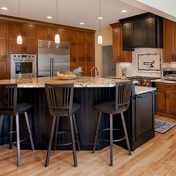
Sometimes the design solutions we come up for a homeowner extend beyond their kitchen — as was the case at the Burfeind residence. Julia Burfeind was unhappy that her home’s nearly 20-year-old kitchen was not well suited to entertain guests, which is something she’s been doing more of recently. She was also not satisfied with how the adjacent sunroom and mud/laundry rooms were laid out and being used (or in the case of the sunroom, not being used) by the family. Julia was recommended to Morris Black Designs whom she was told would be excellent at resolving all three issues.
“Our house was built in ‘98 I believe, so the kitchen was in need of a facelift but more importantly its setup was not particularly helpful for socializing,” explains Julia. “Among other things, there was a small island in the kitchen which was not suitable for accommodating guests.
“In addition, our kitchen was attached to a “sunroom” which was essentially a stepdown separate room that was attached to the kitchen but really wasn’t part of the kitchen — and so it felt like a lot of wasted space for us,” she continues. “We had our kids’ art supplies and the dog bed out there. The space was kinda useless. We didn’t like that setup particularly.”
“And then thirdly, we had a room attached to the kitchen that served as both a mudroom and a laundry room but didn’t do a good job of being either. I’ve got two active young kids that play a lot of sports. There wasn’t enough room in there for all their stuff. And not enough room to do the laundry. The problems we had with all three spaces convinced us to renovate.”
Julia met with one of our designers in her home to discuss and show first-hand the issues that were plaguing the kitchen area of the home. Initial designs were created and approved quickly. The need to address three distinct areas required a bit more planning and time to go from initial ideas to installation than typical kitchen-only projects, but when it was all finally said and done, Julia had three rooms that now meet her needs much better than they did before.
“By itself the kitchen would be fantastic,” she happily expresses. “We have a really large island now where we have four comfortable stools where people can sit and relax while others cook which is exactly what we wanted. You know the kitchen is always the central part of your home and when you entertain, which we do fairly often, people always end up in the kitchen so this big new island works great for us.”
“And now the area that was called a sunroom is incorporated with the kitchen — it was brought physically up to the same level as the kitchen which opened the two rooms up to each other as much as they can be so it’s really all one room now. We now have a dining room table out in that area and a wet bar where we have our bar stuff and our coffee makers and all of that. So those areas now work together great.”
“We completed a small addition to bump the laundry room out behind the kitchen. We then had Morris Black Designs build four big storage lockers in our mudroom for the kids’ gym bags and sports stuff. They’re not like gym lockers; they’re more like nice cabinets with wooden doors which we keep closed to hide the mess inside each — so it looks very nice in that room despite having all of my kids’ gym bags secretly piled up in there. And we have the great big, beautiful, sunny laundry room with a door and a window and a skylight and a big granite countertop where I can fold clothes.”
As much as she loves the distinct improvements made to each individual space, Burfeind will quickly tell you, however, that this project is truly an example of when the whole is greater than the sum of its parts
“The whole house is just much more usable now,” she surmises. “The work done by Morris Black Designs has really increased our daily satisfaction of being in the house which is fun and makes it all worthwhile.”
 Field Architecture
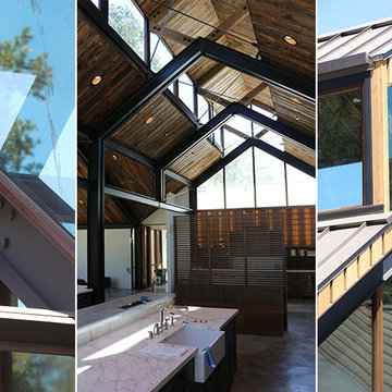
Portola Valley has a heritage of horse ranching among pristine native woodland / grassland habitats. This situation gave rise to an architectural expression that perpetuates this culture, while fostering a responsible cohabitation of the land.
With enough time on site, we were able to trace the game paths that traversed the site from East to West. These daily and seasonal routes connected the site to the bigger landscape of Canyon and its eventual merge with the Portola Valley. We situated all the habitable structures on one horizontal contour that threaded through four Northern California mature oak species on the steeply sloping site. This enabled the stables and pasture to inhabit the grassland meadow below protecting the slope, and restoring the grasslands to their native splendor.
 Nautilus Homes
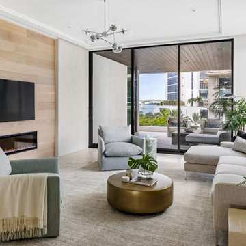
En Pointe is a masterstroke in design, brought to life by the visionary Echt-Architects and elevated by the sophisticated touch of Angela Rodriguez Interiors. Each residence is a refined embodiment of impeccable craftsmanship and modern elegance. The primary suite, a tranquil retreat, features a generous walk-in closet, dual vanities, an expansive shower, and a freestanding soaking tub. The suite’s private sunset terrace presents sweeping northwest views, while the south-facing primary bath, awash in natural light, offers a serene space for relaxation. Opposite this, the sunrise terrace, thoughtfully connected to the dining room, enhances the residence’s connection to its natural surroundings.
At the core of the design, the kitchen anchors the open floor plan, creating a fluid transition between the dining room and the living room, which opens onto the sunset terrace. This harmonious layout elevates daily living into an art form, where every space is both purposeful and exquisitely connected to its surroundings.
En Pointe stands as a timeless expression of architectural mastery and luxurious living—an extraordinary confluence of style, sophistication, and an unmatched sense of belonging.
 Reborn Cabinets Inc.
If you haven’t heard the term “aging in place” already, you’re going to hear it more and more in the next ten years. The term as emerged as more and more adults expressed their desire to stay in their own homes for as long as possible. Rather than moving into a community built around increased accessibility needs, home owners are looking to the kitchen and bath remodeling industry to innovate the spaces in their home where they perform the most important tasks.
As most long-time home owners realize, the need for accessibility and safety first presents itself in the bathroom. If balance is becoming an issue for a homeowner, the first concern that tends to arise is an exponentially increased fall-risk in the bathroom. Each year, one-third of individuals report a fall, and two thirds of those who fall will fall again in the next six months. Finally, falls are the leading cause of death from injury for people over 65. Individuals coping with injury, recovering from surgery, arthritis and other similar health issues are at an even higher risk of falling. In other words, every day, more and more people are finding the act of bathing or showering difficult, worrisome or even painful!
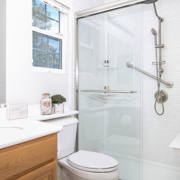
For those seeking to age in place, this is where acrylic tub-to-shower conversions, like Reborn Cabinets Bath Solutions, are incredibly helpful, and can dramatically improve a person’s quality of life. Highly customizable to meet anyone’s daily bathing needs, acrylic tub-to-shower conversions give home owners the option to add benches, safety rails, and even the ability to install a barrier-free design—easy entry for those who require wheelchairs or walkers.
But the aging in place-crowd isn’t simply looking for strictly functional solutions to their daily routine. Since these innovations are changing their already-existing bathroom, there is a need to move these accessible spaces beyond function and keep them stylish. Again, aging in place is all about keeping your house a home—not a “facility.”
Reborn Bath Solutions is a versatile product, allowing home-owners to choose from a great selection of colors and a wide array of fixtures. Sure, the “bathroom of your dreams” may look a little different these days, but you deserve it! Give us a call, and we’ll help you stay in your home and keep your daily sense of confidence!
3