
Search results for "Data someplace" in Home Design Ideas
 Kingbird Design LLC
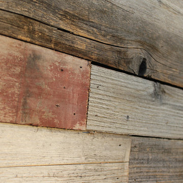
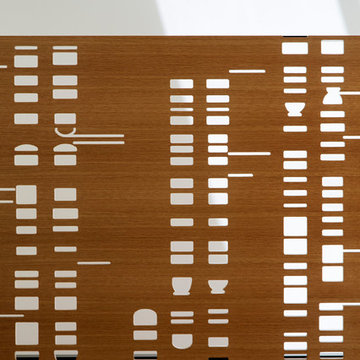
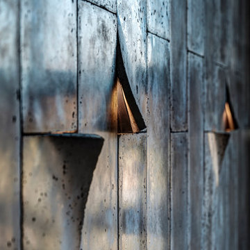
Siding is reclaimed cedar from an old fence.
Example of a minimalist home design design in Salt Lake City
Example of a minimalist home design design in Salt Lake City



Find the right local pro for your project



 Ollin Stone
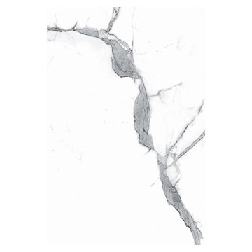
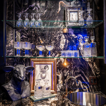
The distinguishing trait of the I Naturali series is soil. A substance which on the one hand recalls all things primordial and on the other the possibility of being plied. As a result, the slab made from the ceramic lends unique value to the settings it clads.


 Jetton Construction, Inc.
Tucked into the Claremont Canyon, this early modern home was completely remodeled. The update maximized the beautiful views of the San Francisco Bay and surrounding wildlife. Many unique details were added to make this house a home.
This project was featured on the 2015 AIA East Bay Home Tour.
Kuth | Ranieri Architects
Matthew Millman Photography





 KURV Architecture DPC (Alex Hughes Architects)
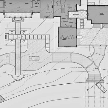
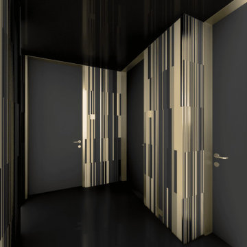
Located in the heart of Manhattan’s Lower East Side, the building was erected on a shallow commercial lot between two 120 year old masonry buildings and a new residential rental building. 330 Grand Street is a mix of 725 SF 1BRs and 1050 SF 2BR apartments. It also contains a 1100 SF two story duplex as well as private and public rooftop space, large private balconies for most units and two large private terraces for the ground floor units.
330 Grand Street was originally designed and approved at the NYC DOB as a prefabricated modular building. During the pandemic, as shipping costs skyrocketed putting the project at risk, we suggested redesigning the building as a reinforced cast-in-place concrete structure. Concrete was readily available and prices had not been affected by the demand increase that many other materials suffered in the pandemic. We took this opportunity to raise floor to ceiling heights, enlarge high performance windows and redistribute the buildings MEPFS and Structural Systems to create very open floor plans.
The challenge was to create a luxurious sensorial living experience with very limited means. In a city with very high construction costs, low cost residential buildings in the area are usually devoid of good quality, design and character. Our approach was to aim high for the end user, prioritizing natural light, open space with long visual perspectives, high ceilings and as always, rejecting the use of predefined building templates.
Our biggest challenge was to ensure that the small spaces feel as clean cut, large and bright as possible. Several unique design decisions were made to ensure low cost and high quality;
Floor plans were laid out so that spaces were wide open and free of clutter from mechanical or structural interruptions. Therefore all infrastructure was placed in lateral demising walls, which in turn act as the unit’s storage and kitchen. The apartments feel wide open, are super quiet and have more storage space than any other comparable apartment in the city.
To solve the problem of the site’s shallow commercial lot which is typically prone to dark interior spaces we focused our attention on the building’s envelope. Instead of the usual small punched window openings, oversized high performance windows were designed to ensure that light penetrated as far as possible into the units. In the smaller 1BR units, the full 50’ depth of the lot is perceived by partitioning spaces with sliding pocket doors that can be retracted to allow deep visual perspectives, making the sight lines in the space feel longer, larger, more ample than normal. In addition to the full height glazing, each unit above the 2nd floor receives a 7 foot covered balcony, adding 120 to 240 sf to each apartment, something unusual in New York City buildings. The space is large enough for a full size dining table, when the weather permits being outside.
We also worked hard to ensure modularity. For example, all kitchen units are all identical throughout the building. The idea of modularity and the economy of the repetitive unit is exercised to the maximum through the building.
Hardware, appliances, flooring, wall coverings and material finishes are all carefully selected to feel bespoke, high quality and unique.
It was important to KURV that the result of this work manifest into something that would deeply connect with the end user and sustain relationships with the consumers of this space.
All images by KURV Architecture ©

 Skelly Build
Mid-sized transitional black tile porcelain tile and green floor alcove shower photo in Austin with shaker cabinets, black cabinets, white walls, an undermount sink, quartzite countertops, a hinged shower door and white countertops


 Art Dallas
Another Key Feature of the booth this year was the giant mural on the outside of the booth! We loved the bright colors of this beautiful work and made it tradeshow specific by adding our famous hashtags #MakeItArtful & #ArtDallas to the edge of the work we then scaled the work to roughly 10 feet by 10 feet. Printed in the Art Dallas print shop the work of art made visible the kind of unique artwork on can find in our gallery!


 Water's Edge Outdoor Living
© Javier Guillen Photo
Example of a small trendy backyard stone and rectangular pool fountain design in Houston
Example of a small trendy backyard stone and rectangular pool fountain design in Houston
32