
Search results for "Decade ago" in Home Design Ideas
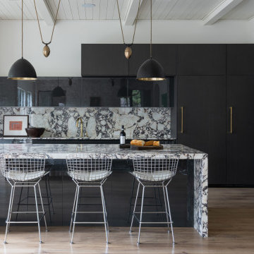
 Cantoni Irvine
From the street, it’s an impeccably designed English manor. Once inside, the best of that same storied architecture seamlessly meshes with modernism. This blend of styles was exactly the vibe three-decades-running Houston homebuilder Chris Sims, founder and CEO of Sims Luxury Builders, wanted to convey with the $5.2 million show-home in Houston’s coveted Tanglewood neighborhood. “Our goal was to uniquely combine classic and Old World with clean and modern in both the architectural design as well as the interior finishes,” Chris says.
Their aesthetic inspiration is clearly evident in the 8,000-square-foot showcase home’s luxurious gourmet kitchen. It is an exercise in grey and white—and texture. To achieve their vision, the Sims turned to Cantoni. “We had a wonderful experience working with Cantoni several years ago on a client’s home, and were pleased to repeat that success on this project,” Chris says.
Cantoni designer Amy McFall, who was tasked with designing the kitchen, promptly took to the home’s beauty. Situated on a half-acre corner lot with majestic oak trees, it boasts simplistic and elegant interiors that allow the detailed architecture to shine. The kitchen opens directly to the family room, which holds a brick wall, beamed ceilings, and a light-and-bright stone fireplace. The generous space overlooks the outdoor pool. With such a large area to work with, “we needed to give the kitchen its own, intimate feel,” Amy says.
To that end, Amy integrated dark grey, high-gloss lacquer cabinetry from our Atelier Collection. by Aster Cucine with dark grey oak cabinetry, mixing finishes throughout to add depth and texture. Edginess came by way of custom, heavily veined Calacatta Viola marble on both the countertops and backsplash.
The Sims team, meanwhile, insured the layout lent itself to minimalism. “With the inclusion of the scullery and butler’s pantry in the design, we were able to minimize the storage needed in the kitchen itself,” Chris says. “This allowed for the clean, minimalist cabinetry, giving us the creative freedom to go darker with the cabinet color and really make a bold statement in the home.”
It was exactly the look they wanted—textural and interesting. “The juxtaposition of ultra-modern kitchen cabinetry and steel windows set against the textures of the wood floors, interior brick, and trim detailing throughout the downstairs provided a fresh take on blending classic and modern,” Chris says. “We’re thrilled with the result—it is showstopping.”
They were equally thrilled with the design process. “Amy was incredibly responsive, helpful and knowledgeable,” Chris says. “It was a pleasure working with her and the entire Cantoni team.”
Check out the kitchen featured in Modern Luxury Interiors Texas’ annual “Ode to Texas Real Estate” here.
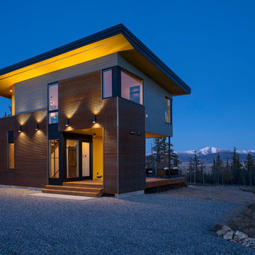
 SALA Architects
For more than a decade the owners of this property dreamed of replacing a well-worn trailer, parked by a previous owner onto a forested corner of the site, with a permanent structure that took advantage of breathtaking views across South Park basin. Accompanying a mutual friend nearly as long ago, the architect visited the site as a guest and years later could easily recall the inspiration inherent in the site. Ultimately dream and inspiration met to create this weekend retreat. With a mere 440 square feet planted in the ground, and just 1500 square feet combined across three levels, the design creates indoor and outdoor spaces to frame distant range views and protect inhabitants from the intense Colorado sun and evening chill with minimal impact on its surroundings.
Designed by Bryan Anderson
Construction by Mountain View Homes
Photographs by Troy Thies

Find the right local pro for your project
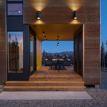 SALA Architects
For more than a decade the owners of this property dreamed of replacing a well-worn trailer, parked by a previous owner onto a forested corner of the site, with a permanent structure that took advantage of breathtaking views across South Park basin. Accompanying a mutual friend nearly as long ago, the architect visited the site as a guest and years later could easily recall the inspiration inherent in the site. Ultimately dream and inspiration met to create this weekend retreat. With a mere 440 square feet planted in the ground, and just 1500 square feet combined across three levels, the design creates indoor and outdoor spaces to frame distant range views and protect inhabitants from the intense Colorado sun and evening chill with minimal impact on its surroundings.
Designed by Bryan Anderson
Construction by Mountain View Homes
Photographs by Troy Thies
 Donald Lococo Architects
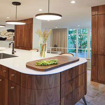
The kitchen was designed two years ago and was then erased and redesigned when the world became a different place a year later. As everyone attempted to flatten the curve, our goal in this regard was to create a kitchen that looked forward to a sharp curve down and of a happier time To that promise for happier times, the redesign, a goal was to make the kitchen brighter and more optimistic. This was done by using simple, primary shapes and circular pendants and emphasizing them in contrast, adding a playful countenance. The selection of a dynamic grain of figured walnut also contributes as this once-living material and its sinuous grain adds motion, rhythm, and scale.
Proud of their 1970s home, one challenge of the design was to balance a 1970's feel and stay current. However, many ‘70s references looked and felt outdated. The first step was a changed mindset. Just like the return of the ‘40s bath and the retro movement a few years ago, every era returns in some way. Chronologically, the '70s will soon be here. Our design looked to era-specific furniture and materials of the decade. Figured walnut was so pervasive in the era: this motif was used on car exteriors such as the 1970 Town and Country Station Wagon, which debuted the same year the existing home was built. We also looked at furniture specific to the decade. The console stereo is referenced not only by high legs on the island but also by the knurled metal cabinet knobs reminiscent of often-used stereo dials. Knurled metalwork is also used on the kitchen faucet. The design references the second piece of '70s furniture in our modern TV tray, which is angled to face the television in the family room. Its round pencil and mug holder cutouts follow the design of walnut consoles and dashboard of the station wagon and other elements of the time.
 White Sands Coastal Development
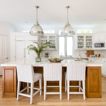
Our clients built their Manhattan dream house years ago, but a couple of decades in, the yellow and green palette seemed stale. We brightened the home with new paint and countertops, white oak flooring and updated carpet, custom fixtures and furniture, and new finishes, window treatments, and accessories.
For enhanced functionality, we added built-in storage throughout, reupholstered existing furniture and the breakfast nook in performance fabric, and created a custom dining table that seats a dozen. To keep the dining room coastal and informal, we paired plush head chairs with rattan-backed side chairs and accented with sea-foam and sandy-hued floor and window coverings.
The addition of a murphy bed, as well as shelving and file storage, made the office more suited to their growing family’s needs. In the second office, a standing desk, as well as a customized craft desk with built-ins for specific supplies, transformed the area into a completely personalized and effective space.
New furniture and a ceiling-length fireplace facade of soft ivory and gray stone transformed the family room into a cozy and welcoming retreat.
The overall effect is a home that feels spacious, beachy, and comfortable.
 Donald Lococo Architects
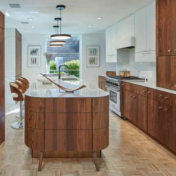
The kitchen was designed two years ago and was then erased and redesigned when the world became a different place a year later. As everyone attempted to flatten the curve, our goal in this regard was to create a kitchen that looked forward to a sharp curve down and of a happier time To that promise for happier times, the redesign, a goal was to make the kitchen brighter and more optimistic. This was done by using simple, primary shapes and circular pendants and emphasizing them in contrast, adding a playful countenance. The selection of a dynamic grain of figured walnut also contributes as this once-living material and its sinuous grain adds motion, rhythm, and scale.
Proud of their 1970s home, one challenge of the design was to balance a 1970's feel and stay current. However, many ‘70s references looked and felt outdated. The first step was a changed mindset. Just like the return of the ‘40s bath and the retro movement a few years ago, every era returns in some way. Chronologically, the '70s will soon be here. Our design looked to era-specific furniture and materials of the decade. Figured walnut was so pervasive in the era: this motif was used on car exteriors such as the 1970 Town and Country Station Wagon, which debuted the same year the existing home was built. We also looked at furniture specific to the decade. The console stereo is referenced not only by high legs on the island but also by the knurled metal cabinet knobs reminiscent of often-used stereo dials. Knurled metalwork is also used on the kitchen faucet. The design references the second piece of '70s furniture in our modern TV tray, which is angled to face the television in the family room. Its round pencil and mug holder cutouts follow the design of walnut consoles and dashboard of the station wagon and other elements of the time.


 Donald Lococo Architects
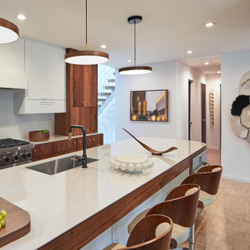
The kitchen was designed two years ago and was then erased and redesigned when the world became a different place a year later. As everyone attempted to flatten the curve, our goal in this regard was to create a kitchen that looked forward to a sharp curve down and of a happier time To that promise for happier times, the redesign, a goal was to make the kitchen brighter and more optimistic. This was done by using simple, primary shapes and circular pendants and emphasizing them in contrast, adding a playful countenance. The selection of a dynamic grain of figured walnut also contributes as this once-living material and its sinuous grain adds motion, rhythm, and scale.
Proud of their 1970s home, one challenge of the design was to balance a 1970's feel and stay current. However, many ‘70s references looked and felt outdated. The first step was a changed mindset. Just like the return of the ‘40s bath and the retro movement a few years ago, every era returns in some way. Chronologically, the '70s will soon be here. Our design looked to era-specific furniture and materials of the decade. Figured walnut was so pervasive in the era: this motif was used on car exteriors such as the 1970 Town and Country Station Wagon, which debuted the same year the existing home was built. We also looked at furniture specific to the decade. The console stereo is referenced not only by high legs on the island but also by the knurled metal cabinet knobs reminiscent of often-used stereo dials. Knurled metalwork is also used on the kitchen faucet. The design references the second piece of '70s furniture in our modern TV tray, which is angled to face the television in the family room. Its round pencil and mug holder cutouts follow the design of walnut consoles and dashboard of the station wagon and other elements of the time.
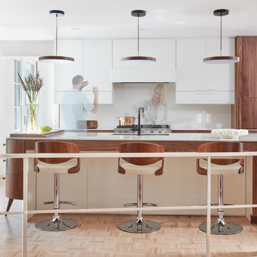 Donald Lococo Architects
The kitchen was designed two years ago and was then erased and redesigned when the world became a different place a year later. As everyone attempted to flatten the curve, our goal in this regard was to create a kitchen that looked forward to a sharp curve down and of a happier time To that promise for happier times, the redesign, a goal was to make the kitchen brighter and more optimistic. This was done by using simple, primary shapes and circular pendants and emphasizing them in contrast, adding a playful countenance. The selection of a dynamic grain of figured walnut also contributes as this once-living material and its sinuous grain adds motion, rhythm, and scale.
Proud of their 1970s home, one challenge of the design was to balance a 1970's feel and stay current. However, many ‘70s references looked and felt outdated. The first step was a changed mindset. Just like the return of the ‘40s bath and the retro movement a few years ago, every era returns in some way. Chronologically, the '70s will soon be here. Our design looked to era-specific furniture and materials of the decade. Figured walnut was so pervasive in the era: this motif was used on car exteriors such as the 1970 Town and Country Station Wagon, which debuted the same year the existing home was built. We also looked at furniture specific to the decade. The console stereo is referenced not only by high legs on the island but also by the knurled metal cabinet knobs reminiscent of often-used stereo dials. Knurled metalwork is also used on the kitchen faucet. The design references the second piece of '70s furniture in our modern TV tray, which is angled to face the television in the family room. Its round pencil and mug holder cutouts follow the design of walnut consoles and dashboard of the station wagon and other elements of the time.
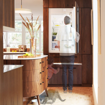 Donald Lococo Architects
The kitchen was designed two years ago and was then erased and redesigned when the world became a different place a year later. As everyone attempted to flatten the curve, our goal in this regard was to create a kitchen that looked forward to a sharp curve down and of a happier time To that promise for happier times, the redesign, a goal was to make the kitchen brighter and more optimistic. This was done by using simple, primary shapes and circular pendants and emphasizing them in contrast, adding a playful countenance. The selection of a dynamic grain of figured walnut also contributes as this once-living material and its sinuous grain adds motion, rhythm, and scale.
Proud of their 1970s home, one challenge of the design was to balance a 1970's feel and stay current. However, many ‘70s references looked and felt outdated. The first step was a changed mindset. Just like the return of the ‘40s bath and the retro movement a few years ago, every era returns in some way. Chronologically, the '70s will soon be here. Our design looked to era-specific furniture and materials of the decade. Figured walnut was so pervasive in the era: this motif was used on car exteriors such as the 1970 Town and Country Station Wagon, which debuted the same year the existing home was built. We also looked at furniture specific to the decade. The console stereo is referenced not only by high legs on the island but also by the knurled metal cabinet knobs reminiscent of often-used stereo dials. Knurled metalwork is also used on the kitchen faucet. The design references the second piece of '70s furniture in our modern TV tray, which is angled to face the television in the family room. Its round pencil and mug holder cutouts follow the design of walnut consoles and dashboard of the station wagon and other elements of the time.
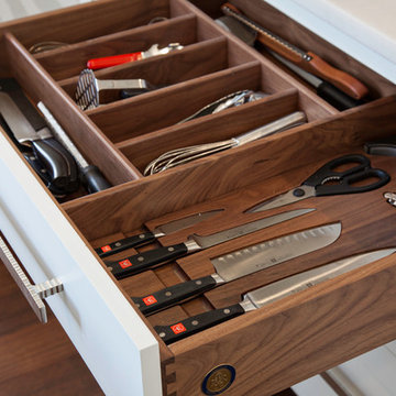
 Pennville Custom Cabinetry
Karen Swanson of New England Design Works Designed this Pennville Kitchen for her own home, and it won not only the regional Sub-Zero award, but also the National Kitchen & Bath Association's medium kitchen of the year. Karen is located in Manchester, MA and can be reached at nedesignworks@gmail.com or 978.500.1096.

 NanaWall
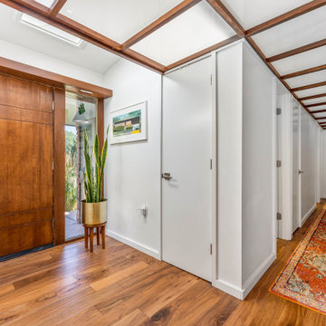
Vision for Renewal: Embracing Modernity While Honoring History
Built in the heart of a community renowned for its dedication to Mid-Century Modern architecture, this home has stood the test of time. Its original design, characterized by open spaces, flat planes, and vast use of single-paned glass, aimed to merge indoor and outdoor living. However, decades had taken their toll. The home featured inefficient materials and outdated layouts that no longer met the needs of modern homeownership. The renovation aimed to preserve the home’s unique architectural features but update its functionality for modern living. The homeowner, Stacy Kosis of Nook Design Collective, is a seasoned designer with over 19 years in the industry. She deeply appreciates Mid-Century Modern aesthetics and served as Director of Design with a Colorado custom home builder before branching out on her own two years ago. Kosis embarked on this ambitious project to breathe new life into a structure many saw beyond repair. The complete gut renovation was done in 8 months which is a huge testament to the Kosis’ skill and knowledge in design and construction. Her background experience and knowledge of NanaWall systems reliability and performance in previous projects were instrumental in her approach.

 threshold interiors
Location: Nantucket, MA, USA
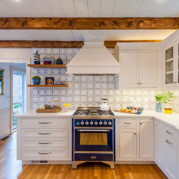
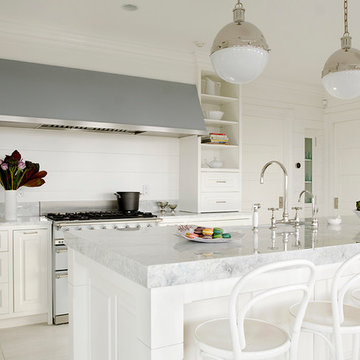
This classic Nantucket home had not been renovated in several decades and was in serious need of an update. The vision for this summer home was to be a beautiful, light and peaceful family retreat with the ability to entertain guests and extended family. The focal point of the kitchen is the La Canche Chagny Range in Faience with custom hood to match. We love how the tile backsplash on the Prep Sink wall pulls it all together and picks up on the spectacular colors in the White Princess Quartzite countertops. In a nod to traditional Nantucket Craftsmanship, we used Shiplap Panelling on many of the walls including in the Kitchen and Powder Room. We hope you enjoy the quiet and tranquil mood of these images as much as we loved creating this space. Keep your eye out for additional images as we finish up Phase II of this amazing project!
Photographed by: Jamie Salomon
 White Sands Coastal Development
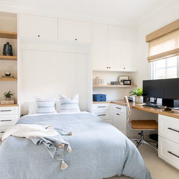
Our clients built their Manhattan dream house years ago, but a couple of decades in, the yellow and green palette seemed stale. We brightened the home with new paint and countertops, white oak flooring and updated carpet, custom fixtures and furniture, and new finishes, window treatments, and accessories.
For enhanced functionality, we added built-in storage throughout, reupholstered existing furniture and the breakfast nook in performance fabric, and created a custom dining table that seats a dozen. To keep the dining room coastal and informal, we paired plush head chairs with rattan-backed side chairs and accented with sea-foam and sandy-hued floor and window coverings.
The addition of a murphy bed, as well as shelving and file storage, made the office more suited to their growing family’s needs. In the second office, a standing desk, as well as a customized craft desk with built-ins for specific supplies, transformed the area into a completely personalized and effective space.
New furniture and a ceiling-length fireplace facade of soft ivory and gray stone transformed the family room into a cozy and welcoming retreat.
The overall effect is a home that feels spacious, beachy, and comfortable.
 SHED Architecture & Design
Mark Woods
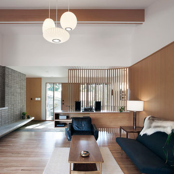
Living room - large 1960s open concept light wood floor and brown floor living room idea in Seattle with brown walls, a standard fireplace, no tv and a stone fireplace
Living room - large 1960s open concept light wood floor and brown floor living room idea in Seattle with brown walls, a standard fireplace, no tv and a stone fireplace
 Restoring Texas
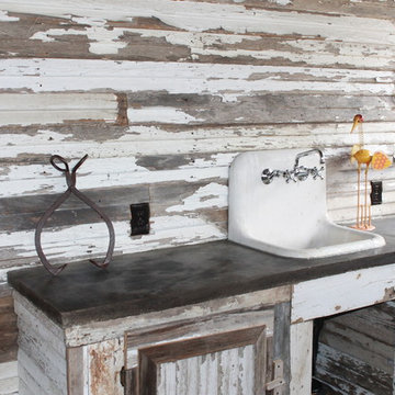
Appearing as though this structure has stood in it's current spot for decades, this amazing pool house was created by Restoring Texas using mostly reclaimed materials harvested from local dilapidated Texas historical structures. Particularly, the siding, columns, doors, windows and many of other elements were salvaged from a Texas Craftsman style sharecropper home built in 1930. The tin was taken from the roofs of an early 1900's Texas barn. Historic signs such as the "Poss Pool Palace" sign bearing the name of its owners are reproduced and personalized by a local artist. Restoring Texas works closely with skilled builders and designers, and of course the home owners, throughout Texas to build these amazing works of art.


 The New Amity Workshop, LLC
I took pause a couple of weeks ago to head out with my children to the edges of our meadow. We had a special task at hand that day, to collect milkweed seeds for my Aunt and Uncle’s cabin in the Catskills. It’s a place I’ve been visiting for decades and a place my children now visit. We simply refer to it as “The Cabin”.
That afternoon we gathered milkweed pods and settled into the simple joy of watching the ethereal seeds travel on a puff of air. Seasons ago, my children began to make “wishes” on the seeds, inspired by their lightness and grace as they journeyed high into the clouds. In this spirit, we conjure our wishes each fall in hopes that they will take root and thrive next spring after our winter of inwardness has passed. I have the suspicion that many unclaimed wishes made their way into our basket that afternoon and are eagerly awaiting their new place at The Cabin.
 Lee Kimball
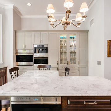
Nearly forty years ago the homeowners installed a "state of the art" kitchen complete with built-in refrigeration and contemporary metal cabinets. The once cutting edge look and function of the space served them well for almost 4 decades, but it grew tired. Our clients came to us wanting a kitchen design that would fit the period of their home while providing all of the modern benefits of a new kitchen.
The table and banquet seating that served their growing family well for many years was no longer needed. A functional island was designed with enough comfortable seating for these ‘empty-nesters”, their friends and family. The wife loves to cook and on occasion so does her husband, but his main job is cleaning. The previous layout was cramped, leaving them often in each other’s way. The new wall oven and island allows for substantially more counter space. The island seating works perfectly for dining, socializing or food preparation. The gray painted cabinets on the perimeter provides a wonderful contrast with the ebony stained cherry island and bay cabinets. The elegance of the Wicked White Quartzite counters and backsplash blends beautifully with the cabinetry, while complimenting the original wood flooring which was newly sanded and stained complete with original visible nails. The final design fits nicely into this wonderful Brownstone home, which our homeowners plan to enjoy for decades to come.
Photo Credit: Edua Wilde
 Lee Kimball
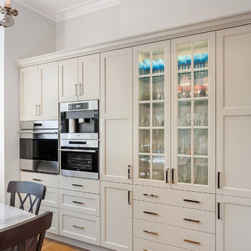
Nearly forty years ago the homeowners installed a "state of the art" kitchen complete with built-in refrigeration and contemporary metal cabinets. The once cutting edge look and function of the space served them well for almost 4 decades, but it grew tired. Our clients came to us wanting a kitchen design that would fit the period of their home while providing all of the modern benefits of a new kitchen.
The table and banquet seating that served their growing family well for many years was no longer needed. A functional island was designed with enough comfortable seating for these ‘empty-nesters”, their friends and family. The wife loves to cook and on occasion so does her husband, but his main job is cleaning. The previous layout was cramped, leaving them often in each other’s way. The new wall oven and island allows for substantially more counter space. The island seating works perfectly for dining, socializing or food preparation. The gray painted cabinets on the perimeter provides a wonderful contrast with the ebony stained cherry island and bay cabinets. The elegance of the Wicked White Quartzite counters and backsplash blends beautifully with the cabinetry, while complimenting the original wood flooring which was newly sanded and stained complete with original visible nails. The final design fits nicely into this wonderful Brownstone home, which our homeowners plan to enjoy for decades to come.
Photo Credit: Edua Wilde
13