
Search results for "Deciding locations" in Home Design Ideas

 Sceltas Custom Homes
This fairly new home was built on Daniel Island right on beautiful Smythe Park. The homeowners purchased the five-year-old home because of its location and potential, but they had great plans to make it more modern and unique to their styles by incorporating transitional and modern design. They decided to go very white, creating a sleek, clean look while contrasting it against stained, dark hardwood floors.
The project included adding new hardware, applying a fresh coat of paint to the entire interior (walls and ceilings), adding new light fixtures, refinishing the floors throughout the home and remodeling the master bathroom, morning kitchen, main kitchen and butler’s pantry cabinetry with newly refinished cabinetry, countertops and fixtures. What a remarkable transformation! The family able to create a fresh new look while keeping the architectural bones of the home in tact.
Photography by: Brennan Wesley
 Studio TOOP
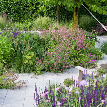
design: Carrie Preston (Studio TOOP) and Jasper Helmantel (Cruydt Hoeck), 2011
location: Appeltern, NL
status: built in 2012 by Appeltern Model Garden Complex
photos: Jolanthe Lalkens, June 2013
Designed as assignment from both the Dutch gardening magazine Groei & Bloei and the television and radio nature program Vara's Vroege Vogels, this garden serves as a model of how homeowners can incorporate lots of plant life and wildlife into the design but without sacrificing practicality or aesthetics. The garden is deliberately contemporary in its style to emphasize that nature-rich gardens need not look a certain way - insects and birds don't care if the lines are straight or curved.
At the same time the garden makes use of affordable, simple, no-nonsense materials. The 40x60 cm paving stones are one of the most common and affordable paving options in the Netherlands, available en masse for free on the Internet. Conceptually we imagined a garden completely paved with the tiles (as to many gardens are) and what would happen if took out some of these stones, used them to build benches and structure and added plants where the tiles had been. In the construction of the benches we include other materials such as bamboo sticks and insulation bricks that create habitat for insects such as solitary bees.
The plant palette is based on a selection of native and host plants in combination with the 26 plants plan set up by Groei & Boei -- a list of plants aimed at making the use of more plants in gardens accessible and less intimidating. The choice for the number 26 corresponds with the number of letters in the alphabet in line with the famous Dutch garden designer Mien Ruy's comment that if we only need 26 letters to create a whole language, we should be able to combine and mix 26 plants to express far more than we think.

 TVL Creative Ltd.
Our clients had just recently closed on their new house in Stapleton and were excited to transform it into their perfect forever home. They wanted to remodel the entire first floor to create a more open floor plan and develop a smoother flow through the house that better fit the needs of their family. The original layout consisted of several small rooms that just weren’t very functional, so we decided to remove the walls that were breaking up the space and restructure the first floor to create a wonderfully open feel.
After removing the existing walls, we rearranged their spaces to give them an office at the front of the house, a large living room, and a large dining room that connects seamlessly with the kitchen. We also wanted to center the foyer in the home and allow more light to travel through the first floor, so we replaced their existing doors with beautiful custom sliding doors to the back yard and a gorgeous walnut door with side lights to greet guests at the front of their home.
Living Room
Our clients wanted a living room that could accommodate an inviting sectional, a baby grand piano, and plenty of space for family game nights. So, we transformed what had been a small office and sitting room into a large open living room with custom wood columns. We wanted to avoid making the home feel too vast and monumental, so we designed custom beams and columns to define spaces and to make the house feel like a home. Aesthetically we wanted their home to be soft and inviting, so we utilized a neutral color palette with occasional accents of muted blues and greens.
Dining Room
Our clients were also looking for a large dining room that was open to the rest of the home and perfect for big family gatherings. So, we removed what had been a small family room and eat-in dining area to create a spacious dining room with a fireplace and bar. We added custom cabinetry to the bar area with open shelving for displaying and designed a custom surround for their fireplace that ties in with the wood work we designed for their living room. We brought in the tones and materiality from the kitchen to unite the spaces and added a mixed metal light fixture to bring the space together
Kitchen
We wanted the kitchen to be a real show stopper and carry through the calm muted tones we were utilizing throughout their home. We reoriented the kitchen to allow for a big beautiful custom island and to give us the opportunity for a focal wall with cooktop and range hood. Their custom island was perfectly complimented with a dramatic quartz counter top and oversized pendants making it the real center of their home. Since they enter the kitchen first when coming from their detached garage, we included a small mud-room area right by the back door to catch everyone’s coats and shoes as they come in. We also created a new walk-in pantry with plenty of open storage and a fun chalkboard door for writing notes, recipes, and grocery lists.
Office
We transformed the original dining room into a handsome office at the front of the house. We designed custom walnut built-ins to house all of their books, and added glass french doors to give them a bit of privacy without making the space too closed off. We painted the room a deep muted blue to create a glimpse of rich color through the french doors
Powder Room
The powder room is a wonderful play on textures. We used a neutral palette with contrasting tones to create dramatic moments in this little space with accents of brushed gold.
Master Bathroom
The existing master bathroom had an awkward layout and outdated finishes, so we redesigned the space to create a clean layout with a dream worthy shower. We continued to use neutral tones that tie in with the rest of the home, but had fun playing with tile textures and patterns to create an eye-catching vanity. The wood-look tile planks along the floor provide a soft backdrop for their new free-standing bathtub and contrast beautifully with the deep ash finish on the cabinetry.
Find the right local pro for your project

 Sharer Design Group LLC
House hunting for the perfect home is never easy. Our recent clients decided to make the search a bit easier by enlisting the help of Sharer Design Group to help locate the best “canvas” for their new home. After narrowing down their list, our designers visited several prospective homes to determine each property’s potential for our clients’ design vision. Once the home was selected, the Sharer Design Group team began the task of turning the canvas into art.
The entire home was transformed from top to bottom into a modern, updated space that met the vision and needs of our clients. The kitchen was updated using custom Sharer Cabinetry with perimeter cabinets painted a custom grey-beige color. The enlarged center island, in a contrasting dark paint color, was designed to allow for additional seating. Gray Quartz countertops, a glass subway tile backsplash and a stainless steel hood and appliances finish the cool, transitional feel of the room.
The powder room features a unique custom Sharer Cabinetry floating vanity in a dark paint with a granite countertop and vessel sink. Sharer Cabinetry was also used in the laundry room to help maximize storage options, along with the addition of a large broom closet. New wood flooring and carpet was installed throughout the entire home to finish off the dramatic transformation. While finding the perfect home isn’t easy, our clients were able to create the dream home they envisioned, with a little help from Sharer Design Group.
 Breathe Design Studio: San Francisco
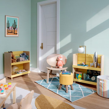
Our Austin studio decided to go bold with this project by ensuring that each space had a unique identity in the Mid-Century Modern style bathroom, butler's pantry, and mudroom. We covered the bathroom walls and flooring with stylish beige and yellow tile that was cleverly installed to look like two different patterns. The mint cabinet and pink vanity reflect the mid-century color palette. The stylish knobs and fittings add an extra splash of fun to the bathroom.
The butler's pantry is located right behind the kitchen and serves multiple functions like storage, a study area, and a bar. We went with a moody blue color for the cabinets and included a raw wood open shelf to give depth and warmth to the space. We went with some gorgeous artistic tiles that create a bold, intriguing look in the space.
In the mudroom, we used siding materials to create a shiplap effect to create warmth and texture – a homage to the classic Mid-Century Modern design. We used the same blue from the butler's pantry to create a cohesive effect. The large mint cabinets add a lighter touch to the space.

 kimberly peck architect
This Dutch Renaissance Revival style Brownstone located in a historic district of the Crown heights neighborhood of Brooklyn was built in 1899. The brownstone was converted to a boarding house in the 1950’s and experienced many years of neglect which made much of the interior detailing unsalvageable with the exception of the stairwell. Therefore the new owners decided to gut renovate the majority of the home, converting it into a four family home. The bottom two units are owner occupied, the design of each includes common elements yet also reflects the style of each owner. Both units have modern kitchens with new high end appliances and stone countertops. They both have had the original wood paneling restored or repaired and both feature large open bathrooms with freestanding tubs, marble slab walls and radiant heated concrete floors. The garden apartment features an open living/dining area that flows through the kitchen to get to the outdoor space. In the kitchen and living room feature large steel French doors which serve to bring the outdoors in. The garden was fully renovated and features a deck with a pergola. Other unique features of this apartment include a modern custom crown molding, a bright geometric tiled fireplace and the labyrinth wallpaper in the powder room. The upper two floors were designed as rental units and feature open kitchens/living areas, exposed brick walls and white subway tiled bathrooms.

 tayyab
Our clients and their three teenage kids had outgrown the footprint of their existing home and felt they needed some space to spread out. They came in with a couple of sets of drawings from different architects that were not quite what they were looking for, so we set out to really listen and try to provide a design that would meet their objectives given what the space could offer.
We started by agreeing that a bump out was the best way to go and then decided on the size and the floor plan locations of the mudroom, powder room and butler pantry which were all part of the project. We also planned for an eat-in banquette that is neatly tucked into the corner and surrounded by windows providing a lovely spot for daily meals.
The kitchen itself is L-shaped with the refrigerator and range along one wall, and the new sink along the exterior wall with a large window overlooking the backyard. A large island, with seating for five, houses a prep sink and microwave. A new opening space between the kitchen and dining room includes a butler pantry/bar in one section and a large kitchen pantry in the other. Through the door to the left of the main sink is access to the new mudroom and powder room and existing attached garage.
White inset cabinets, quartzite countertops, subway tile and nickel accents provide a traditional feel. The gray island is a needed contrast to the dark wood flooring. Last but not least, professional appliances provide the tools of the trade needed to make this one hardworking kitchen.


 Cantoni Los Angeles
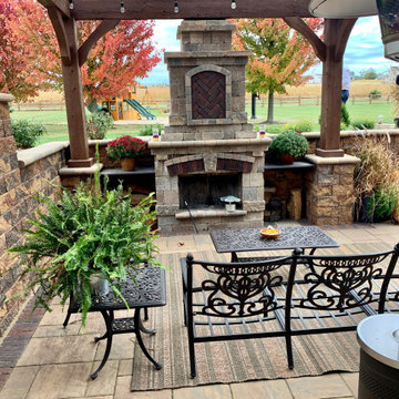
It’s warm in Southern California, and that’s exactly the feeling Andy and Liz sought to maintain inside their new Tuscan-style home as they embarked on a modern interior makeover. After all, the couple had two small children and a dog to consider. Empty and austere simply wasn’t a good fit for the young family whose interests include photography, art and lots of Lego’s.
Andy, an engineer, became intrigued with Cantoni after driving past the Irvine location on his daily commute. It wasn’t long before he and Liz decided to venture into the Los Angeles showroom, and that’s where they met Bernadette. By all accounts, the trio made for great collaboration, and the project that began in February 2012 is still a work in progress today.
“We were impressed by Bernadette,” says Andy. “We liked her and her work, and she won us over.”
The project began with pictures sent and an in-home walk-through where measurements were taken. The couple knew they wanted furnishings for the living, dining and family rooms, as well as the media room and a study. They were open to art and accent pieces, and hoped to incorporate natural elements into the mix. Bernadette set to work.
“It was fun touring our LA showroom and listening to Liz and Andy discuss their likes and dislikes. One thing was for sure,” she adds, “the Laguna Sectional was going in their theater room even if we needed to knock out a wall!”
UpstairsPhase I of the job is complete (as you can see from the stunning images), but instead of parting ways, Andy and Liz decided to have Bernadette help re-imagine the master bedroom and kitchen, next. The ongoing nature of this project illustrates a trend we see with most of our clients: we build trusted, long-term relationships. It’s not about the transaction, but about great design, the design process, and the ability of our talented staff to help clients create the lifestyles they want.
As always, there’s plenty to love about the products seen in our feature stories. To help you shop the look, we’re introducing a Featured Products page via a link to the images in each story. We’ve also redesigned our site to make sourcing and finding that just-right piece a breeze.
 Vampio Design Inc.
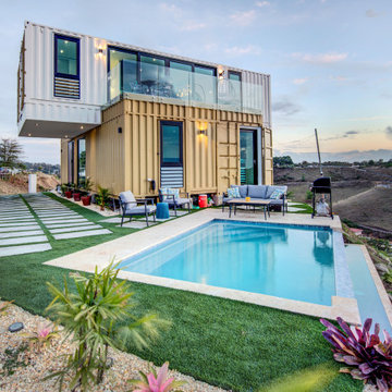
The project consists of a two-story private residence and involves the use of four deliberately not new containers, two for each floor, perpendicular to each other to form a Latin cross.
My interest in houses built with shipping containers began around 2015, when the use of containers as building materials became increasingly popular thanks to their resistance, wide availability, low cost and eco-friendliness.
Always passionate about eco-friendly and sustainable architecture, in 2016 I decided to design my own house using shipping containers with the hope of one day being able to realize my dream: building a residence designed by myself and which reflects what I am passionate about and in which I believe from an architectural point of view.
Since at the time I created the project I did not yet have land on which to build, the design was designed to be totally flexible, since the two floors can be reversed according to the needs of the land, without compromising the design and/or the livability of the house.
In 2019 I bought the land where the house was built, a 1,500 m² property with a 360 degree view of the sea and hills without, however, a flat area.
The containers were perfect for this type of terrain: being very light structures, they do not require large foundations and, consequently, the preparation of the ground is much quicker and much less invasive.
Considering the exposure and shape of the land, as well as the 360 degree view of the same, I decided to locate the two bedrooms on the first floor, with a complete bathroom and the walk-in closet for the master bedroom, while on the second floor we find an open space with kitchen, dining area and living room, a complete bathroom with laundry and two terraces.
Outside, the house is surrounded by concrete slabs over artificial grass, and there is also an infinity pool that overlooks the sea view.
The external appearance of the containers was deliberately left "raw", without covering them or eliminating traces of time and their journey, such as dents.
The interior, however, contrasts with the attention to detail and the use of designer materials, lamps, furniture and other elements.
The floor was covered with an epoxy resin and different techniques were used on the walls to create accents, such as marmorino, Venetian plaster, wallpaper, murals and rough stucco.
The entrance and corridor on the first floor also serve as an art gallery, with works by local artists, to support the local economy.
Both bathrooms are covered in porcelain tiles from the Mirage line, the taps are Graff brand and the bathroom furniture is by Lago Design, with Depth sinks in transparent glass, made from a carved trunk of century-old Wildwood oak. The heat treatment applied to the wood allows for total impermeability to water and very high resistance.
A floating iron staircase passes above the office area with Punt furniture and leads to the second floor, where the Lube brand kitchen with Dekton worktops, Smeg appliances and sink are located.
The dining table is P&J by Lago Design, the Lodes lamp with Diesel and the living room furniture are from the Spanish brand Fama. Finally, the outdoor furniture is designed by Roda, Tecninova and DKL.
Construction, which began at the end of 2021, was completed in November 2022.
 Breathe Design Studio
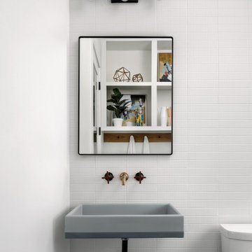
Our Austin studio decided to go bold with this project by ensuring that each space had a unique identity in the Mid-Century Modern style bathroom, butler's pantry, and mudroom. We covered the bathroom walls and flooring with stylish beige and yellow tile that was cleverly installed to look like two different patterns. The mint cabinet and pink vanity reflect the mid-century color palette. The stylish knobs and fittings add an extra splash of fun to the bathroom.
The butler's pantry is located right behind the kitchen and serves multiple functions like storage, a study area, and a bar. We went with a moody blue color for the cabinets and included a raw wood open shelf to give depth and warmth to the space. We went with some gorgeous artistic tiles that create a bold, intriguing look in the space.
In the mudroom, we used siding materials to create a shiplap effect to create warmth and texture – a homage to the classic Mid-Century Modern design. We used the same blue from the butler's pantry to create a cohesive effect. The large mint cabinets add a lighter touch to the space.
 Breathe Design Studio: San Francisco
Our Austin studio decided to go bold with this project by ensuring that each space had a unique identity in the Mid-Century Modern style bathroom, butler's pantry, and mudroom. We covered the bathroom walls and flooring with stylish beige and yellow tile that was cleverly installed to look like two different patterns. The mint cabinet and pink vanity reflect the mid-century color palette. The stylish knobs and fittings add an extra splash of fun to the bathroom.
The butler's pantry is located right behind the kitchen and serves multiple functions like storage, a study area, and a bar. We went with a moody blue color for the cabinets and included a raw wood open shelf to give depth and warmth to the space. We went with some gorgeous artistic tiles that create a bold, intriguing look in the space.
In the mudroom, we used siding materials to create a shiplap effect to create warmth and texture – a homage to the classic Mid-Century Modern design. We used the same blue from the butler's pantry to create a cohesive effect. The large mint cabinets add a lighter touch to the space.

 Creative Spaces Interior Design, Inc.
We were hired to select all new fabric, space planning, lighting, and paint colors in this three-story home. Our client decided to do a remodel and to install an elevator to be able to reach all three levels in their forever home located in Redondo Beach, CA.
We selected close to 200 yards of fabric to tell a story and installed all new window coverings, and reupholstered all the existing furniture. We mixed colors and textures to create our traditional Asian theme.
We installed all new LED lighting on the first and second floor with either tracks or sconces. We installed two chandeliers, one in the first room you see as you enter the home and the statement fixture in the dining room reminds me of a cherry blossom.
We did a lot of spaces planning and created a hidden office in the family room housed behind bypass barn doors. We created a seating area in the bedroom and a conversation area in the downstairs.
I loved working with our client. She knew what she wanted and was very easy to work with. We both expanded each other's horizons.
Tom Queally Photography

 Signature Custom Homes
This three home project in Seattle was a creative challenge we were excited to tackle. The lot sizes were long and narrow, so we decided to create a compact contemporary space. Our design team chose light solid surface elements and a dark flooring for a warmer mix.
Photographer: Layne Freedle
 Breathe Design Studio: San Francisco
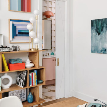
Our Austin studio decided to go bold with this project by ensuring that each space had a unique identity in the Mid-Century Modern style bathroom, butler's pantry, and mudroom. We covered the bathroom walls and flooring with stylish beige and yellow tile that was cleverly installed to look like two different patterns. The mint cabinet and pink vanity reflect the mid-century color palette. The stylish knobs and fittings add an extra splash of fun to the bathroom.
The butler's pantry is located right behind the kitchen and serves multiple functions like storage, a study area, and a bar. We went with a moody blue color for the cabinets and included a raw wood open shelf to give depth and warmth to the space. We went with some gorgeous artistic tiles that create a bold, intriguing look in the space.
In the mudroom, we used siding materials to create a shiplap effect to create warmth and texture – a homage to the classic Mid-Century Modern design. We used the same blue from the butler's pantry to create a cohesive effect. The large mint cabinets add a lighter touch to the space.
 Cantoni Los Angeles
It’s warm in Southern California, and that’s exactly the feeling Andy and Liz sought to maintain inside their new Tuscan-style home as they embarked on a modern interior makeover. After all, the couple had two small children and a dog to consider. Empty and austere simply wasn’t a good fit for the young family whose interests include photography, art and lots of Lego’s.
Andy, an engineer, became intrigued with Cantoni after driving past the Irvine location on his daily commute. It wasn’t long before he and Liz decided to venture into the Los Angeles showroom, and that’s where they met Bernadette. By all accounts, the trio made for great collaboration, and the project that began in February 2012 is still a work in progress today.
“We were impressed by Bernadette,” says Andy. “We liked her and her work, and she won us over.”
The project began with pictures sent and an in-home walk-through where measurements were taken. The couple knew they wanted furnishings for the living, dining and family rooms, as well as the media room and a study. They were open to art and accent pieces, and hoped to incorporate natural elements into the mix. Bernadette set to work.
“It was fun touring our LA showroom and listening to Liz and Andy discuss their likes and dislikes. One thing was for sure,” she adds, “the Laguna Sectional was going in their theater room even if we needed to knock out a wall!”
UpstairsPhase I of the job is complete (as you can see from the stunning images), but instead of parting ways, Andy and Liz decided to have Bernadette help re-imagine the master bedroom and kitchen, next. The ongoing nature of this project illustrates a trend we see with most of our clients: we build trusted, long-term relationships. It’s not about the transaction, but about great design, the design process, and the ability of our talented staff to help clients create the lifestyles they want.
As always, there’s plenty to love about the products seen in our feature stories. To help you shop the look, we’re introducing a Featured Products page via a link to the images in each story. We’ve also redesigned our site to make sourcing and finding that just-right piece a breeze.
 kimberly peck architect
This Dutch Renaissance Revival style Brownstone located in a historic district of the Crown heights neighborhood of Brooklyn was built in 1899. The brownstone was converted to a boarding house in the 1950’s and experienced many years of neglect which made much of the interior detailing unsalvageable with the exception of the stairwell. Therefore the new owners decided to gut renovate the majority of the home, converting it into a four family home. The bottom two units are owner occupied, the design of each includes common elements yet also reflects the style of each owner. Both units have modern kitchens with new high end appliances and stone countertops. They both have had the original wood paneling restored or repaired and both feature large open bathrooms with freestanding tubs, marble slab walls and radiant heated concrete floors. The garden apartment features an open living/dining area that flows through the kitchen to get to the outdoor space. In the kitchen and living room feature large steel French doors which serve to bring the outdoors in. The garden was fully renovated and features a deck with a pergola. Other unique features of this apartment include a modern custom crown molding, a bright geometric tiled fireplace and the labyrinth wallpaper in the powder room. The upper two floors were designed as rental units and feature open kitchens/living areas, exposed brick walls and white subway tiled bathrooms.
 Breathe Design Studio: San Francisco
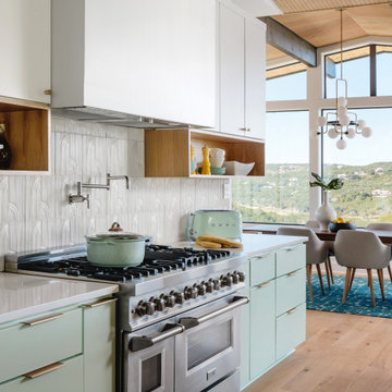
Our Austin studio decided to go bold with this project by ensuring that each space had a unique identity in the Mid-Century Modern style bathroom, butler's pantry, and mudroom. We covered the bathroom walls and flooring with stylish beige and yellow tile that was cleverly installed to look like two different patterns. The mint cabinet and pink vanity reflect the mid-century color palette. The stylish knobs and fittings add an extra splash of fun to the bathroom.
The butler's pantry is located right behind the kitchen and serves multiple functions like storage, a study area, and a bar. We went with a moody blue color for the cabinets and included a raw wood open shelf to give depth and warmth to the space. We went with some gorgeous artistic tiles that create a bold, intriguing look in the space.
In the mudroom, we used siding materials to create a shiplap effect to create warmth and texture – a homage to the classic Mid-Century Modern design. We used the same blue from the butler's pantry to create a cohesive effect. The large mint cabinets add a lighter touch to the space.
Sponsored
Columbus, OH
Free consultation for landscape design!

Peabody Landscape Group
Franklin County's Reliable Landscape Design & Contracting
 Breathe Design Studio
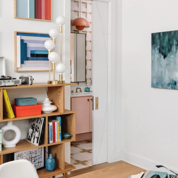
Our Austin studio decided to go bold with this project by ensuring that each space had a unique identity in the Mid-Century Modern style bathroom, butler's pantry, and mudroom. We covered the bathroom walls and flooring with stylish beige and yellow tile that was cleverly installed to look like two different patterns. The mint cabinet and pink vanity reflect the mid-century color palette. The stylish knobs and fittings add an extra splash of fun to the bathroom.
The butler's pantry is located right behind the kitchen and serves multiple functions like storage, a study area, and a bar. We went with a moody blue color for the cabinets and included a raw wood open shelf to give depth and warmth to the space. We went with some gorgeous artistic tiles that create a bold, intriguing look in the space.
In the mudroom, we used siding materials to create a shiplap effect to create warmth and texture – a homage to the classic Mid-Century Modern design. We used the same blue from the butler's pantry to create a cohesive effect. The large mint cabinets add a lighter touch to the space.
 Breathe Design Studio: San Francisco
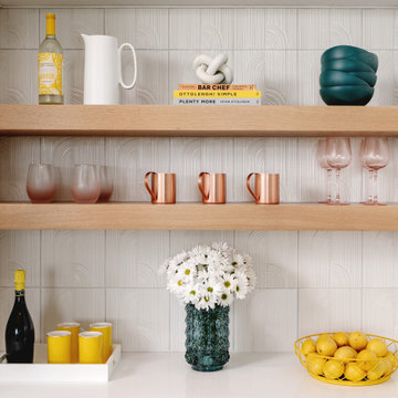
Our Austin studio decided to go bold with this project by ensuring that each space had a unique identity in the Mid-Century Modern style bathroom, butler's pantry, and mudroom. We covered the bathroom walls and flooring with stylish beige and yellow tile that was cleverly installed to look like two different patterns. The mint cabinet and pink vanity reflect the mid-century color palette. The stylish knobs and fittings add an extra splash of fun to the bathroom.
The butler's pantry is located right behind the kitchen and serves multiple functions like storage, a study area, and a bar. We went with a moody blue color for the cabinets and included a raw wood open shelf to give depth and warmth to the space. We went with some gorgeous artistic tiles that create a bold, intriguing look in the space.
In the mudroom, we used siding materials to create a shiplap effect to create warmth and texture – a homage to the classic Mid-Century Modern design. We used the same blue from the butler's pantry to create a cohesive effect. The large mint cabinets add a lighter touch to the space.
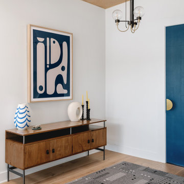 Breathe Design Studio: San Francisco
Our Austin studio decided to go bold with this project by ensuring that each space had a unique identity in the Mid-Century Modern style bathroom, butler's pantry, and mudroom. We covered the bathroom walls and flooring with stylish beige and yellow tile that was cleverly installed to look like two different patterns. The mint cabinet and pink vanity reflect the mid-century color palette. The stylish knobs and fittings add an extra splash of fun to the bathroom.
The butler's pantry is located right behind the kitchen and serves multiple functions like storage, a study area, and a bar. We went with a moody blue color for the cabinets and included a raw wood open shelf to give depth and warmth to the space. We went with some gorgeous artistic tiles that create a bold, intriguing look in the space.
In the mudroom, we used siding materials to create a shiplap effect to create warmth and texture – a homage to the classic Mid-Century Modern design. We used the same blue from the butler's pantry to create a cohesive effect. The large mint cabinets add a lighter touch to the space.
80