
Search results for "Deciding locations" in Home Design Ideas

 Cantoni Los Angeles
It’s warm in Southern California, and that’s exactly the feeling Andy and Liz sought to maintain inside their new Tuscan-style home as they embarked on a modern interior makeover. After all, the couple had two small children and a dog to consider. Empty and austere simply wasn’t a good fit for the young family whose interests include photography, art and lots of Lego’s.
Andy, an engineer, became intrigued with Cantoni after driving past the Irvine location on his daily commute. It wasn’t long before he and Liz decided to venture into the Los Angeles showroom, and that’s where they met Bernadette. By all accounts, the trio made for great collaboration, and the project that began in February 2012 is still a work in progress today.
“We were impressed by Bernadette,” says Andy. “We liked her and her work, and she won us over.”
The project began with pictures sent and an in-home walk-through where measurements were taken. The couple knew they wanted furnishings for the living, dining and family rooms, as well as the media room and a study. They were open to art and accent pieces, and hoped to incorporate natural elements into the mix. Bernadette set to work.
“It was fun touring our LA showroom and listening to Liz and Andy discuss their likes and dislikes. One thing was for sure,” she adds, “the Laguna Sectional was going in their theater room even if we needed to knock out a wall!”
UpstairsPhase I of the job is complete (as you can see from the stunning images), but instead of parting ways, Andy and Liz decided to have Bernadette help re-imagine the master bedroom and kitchen, next. The ongoing nature of this project illustrates a trend we see with most of our clients: we build trusted, long-term relationships. It’s not about the transaction, but about great design, the design process, and the ability of our talented staff to help clients create the lifestyles they want.
As always, there’s plenty to love about the products seen in our feature stories. To help you shop the look, we’re introducing a Featured Products page via a link to the images in each story. We’ve also redesigned our site to make sourcing and finding that just-right piece a breeze.
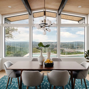
 Breathe Design Studio
Our Austin studio decided to go bold with this project by ensuring that each space had a unique identity in the Mid-Century Modern style bathroom, butler's pantry, and mudroom. We covered the bathroom walls and flooring with stylish beige and yellow tile that was cleverly installed to look like two different patterns. The mint cabinet and pink vanity reflect the mid-century color palette. The stylish knobs and fittings add an extra splash of fun to the bathroom.
The butler's pantry is located right behind the kitchen and serves multiple functions like storage, a study area, and a bar. We went with a moody blue color for the cabinets and included a raw wood open shelf to give depth and warmth to the space. We went with some gorgeous artistic tiles that create a bold, intriguing look in the space.
In the mudroom, we used siding materials to create a shiplap effect to create warmth and texture – a homage to the classic Mid-Century Modern design. We used the same blue from the butler's pantry to create a cohesive effect. The large mint cabinets add a lighter touch to the space.


Find the right local pro for your project
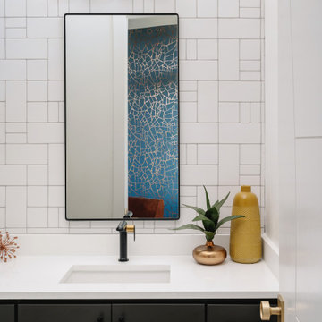
 Breathe Design Studio: San Francisco
Our Austin studio decided to go bold with this project by ensuring that each space had a unique identity in the Mid-Century Modern style bathroom, butler's pantry, and mudroom. We covered the bathroom walls and flooring with stylish beige and yellow tile that was cleverly installed to look like two different patterns. The mint cabinet and pink vanity reflect the mid-century color palette. The stylish knobs and fittings add an extra splash of fun to the bathroom.
The butler's pantry is located right behind the kitchen and serves multiple functions like storage, a study area, and a bar. We went with a moody blue color for the cabinets and included a raw wood open shelf to give depth and warmth to the space. We went with some gorgeous artistic tiles that create a bold, intriguing look in the space.
In the mudroom, we used siding materials to create a shiplap effect to create warmth and texture – a homage to the classic Mid-Century Modern design. We used the same blue from the butler's pantry to create a cohesive effect. The large mint cabinets add a lighter touch to the space.

 kimberly peck architect
This Dutch Renaissance Revival style Brownstone located in a historic district of the Crown heights neighborhood of Brooklyn was built in 1899. The brownstone was converted to a boarding house in the 1950’s and experienced many years of neglect which made much of the interior detailing unsalvageable with the exception of the stairwell. Therefore the new owners decided to gut renovate the majority of the home, converting it into a four family home. The bottom two units are owner occupied, the design of each includes common elements yet also reflects the style of each owner. Both units have modern kitchens with new high end appliances and stone countertops. They both have had the original wood paneling restored or repaired and both feature large open bathrooms with freestanding tubs, marble slab walls and radiant heated concrete floors. The garden apartment features an open living/dining area that flows through the kitchen to get to the outdoor space. In the kitchen and living room feature large steel French doors which serve to bring the outdoors in. The garden was fully renovated and features a deck with a pergola. Other unique features of this apartment include a modern custom crown molding, a bright geometric tiled fireplace and the labyrinth wallpaper in the powder room. The upper two floors were designed as rental units and feature open kitchens/living areas, exposed brick walls and white subway tiled bathrooms.

 Barn Pros
This off-grid mountain barn home located in the heart of the Rockies sits at 7,500 feet and has expansive, beautiful views of the foothills below. The model is a Barn Pros 36 ft. x 36 ft. Denali barn apartment with a partially enclosed shed roof on one side for outdoor seating and entertainment area. The deck off the back of the building is smaller than the standard 12 ft. x 12 ft. deck included in the Denali package. Roll-up garage doors like the one shown at the front of the home are an add-on option for nearly any Barn Pros kit.
Inside, the finish is decidedly rustic modern where sheetrock walls contrast handsomely with the exposed posts and beams throughout the space. The owners incorporated garage parking, laundry, kitchenette with wood-burning stove oven, bathroom, workout area and a pool table all on the first floor. The upper level houses the main living space where contemporary décor and finished are combined with natural wood flooring and those same exposed posts and beams. Lots of natural light fills the space from the 18 ft. vaulted ceilings, dormer windows and French doors off the living room. The owners added a partial loft for additional sleeping and a functional storage area.

 Sceltas Custom Homes
This fairly new home was built on Daniel Island right on beautiful Smythe Park. The homeowners purchased the five-year-old home because of its location and potential, but they had great plans to make it more modern and unique to their styles by incorporating transitional and modern design. They decided to go very white, creating a sleek, clean look while contrasting it against stained, dark hardwood floors.
The project included adding new hardware, applying a fresh coat of paint to the entire interior (walls and ceilings), adding new light fixtures, refinishing the floors throughout the home and remodeling the master bathroom, morning kitchen, main kitchen and butler’s pantry cabinetry with newly refinished cabinetry, countertops and fixtures. What a remarkable transformation! The family able to create a fresh new look while keeping the architectural bones of the home in tact.
Photography by: Brennan Wesley
Sponsored
Columbus, OH

Structural Remodeling
Franklin County's Heavy Timber Specialists | Best of Houzz 2020!

 Signature Kitchen & Bath Design Inc.
For this kitchen remodel, the clients opted to maintain the location and footprint of the original kitchen in their 1960’s ranch style home. That meant we had our work cut out for us to maximize the counter space while providing enough storage for this growing family. We ultimately decided to maximize the working counter space by the sink and range and added a large pantry wall in the adjacent dining room for bulky items and food storage. We chose a lightly stained slab style cabinet to capture the era of the home but paired it with white high-gloss upper cabinets and white quartz to make the space also look fresh and functional. A light green paint helps pull in the accent color featured in the backsplash while adding warmth to the home. We finished the space with a unique light fixture and a perfectly modern dining table.
Interior Design by Bennett Design Co.
Photo by Mike Kaskel

 River Valley Landscapes
The property is one of the original farm houses located on the main street of a small town. It has been in the family for many years and our client just inherited the property. They were trying to have balance of preserving the old while realizing modern day living has its benefits too. The house had a large addition added using mostly old style materials, but designed with function and modern day luxuries. Our goal was to carry that theme to the outside.
Our first problem we had to address was how to transition between the first floor elevation changes. The lower room was the husband’s office. He stated in the future he may have clients over and it would be nice to have an area to sit outside. The wife’s main concern was to renew the four corner garden. She also felt it was very important to be able to see it from the kitchen area. Finally there was an old wishing well stuck right outside the kitchen. They both felt it would be neat to be able to incorporate this in some how. They wanted a patio area with a built in grill to accommodate there family and friends. They also wanted to keep a large play area for the kids.
We were able to pull this off successfully. We addressed the first issue by having a small lower level flagstone area. This area is large enough for 1 to 2 people to sit comfortably. It also provides a transition from his office to the larger patio area. We installed a simple small gravel sitting area opposite of the main patio. This provides our client a secluded place to relax or do business. Mrs.... told me she is amazed how much her and her husband enjoys this area. It is so peaceful looking at the small creek over a glass of wine.
We built a natural limestone retaining wall to create the patio terrace. The stone was chosen to extend the houses architectural elements into the landscape. Irregular broken flagstone was used to give it a more casual feel. We installed three Serviceberries into the patio terrace to replace some trees that were taken down during the remodeling. She was very concern that they would block the view of the four corner garden. We new they were crucial to nestle in the terrace, so we placed them for a couple days for her to decide. Fortunately she agreed they not only kept the view open, but helped frame the garden.
The four corner garden was designed to be viewed from afar and experienced up close. We wanted the space to have some formal structure while keeping with the casual farm house feel. Another natural limestone retaining wall was created. This leveled the garden terrace and helped associate it with the rest of the property. The four corner garden is nestled into the existing woods edge. This provides three distinct experiences to entering the garden; a more formal from the driveway, an open feel from the lower lawn, and a more natural / casual experience from the wooded area. The Plymouth brown gravel was used for the center of the garden. This helped highlight the stone post that was found during construction. The gravel also brings the sense of sound into the garden space. Lamb’s ear was chosen as a fun way to get kids interest in horticulture.
The balance of using the new to create the old feel is what makes this project a success. The property has already hosted a local historical society event and won an award for its preservation efforts. When Mrs.... can’t find her husband, she knows he is either reading the newspaper by the grill or resting in the hammock along the wood’s path.

 Design Fixation [Faith Provencher]
Photo: Faith Towers © 2017 Houzz
Example of an eclectic deck design in Boston
Example of an eclectic deck design in Boston

 Signature Stagers - Luxury Home Staging
There are a small number of cities in the world where luxury and lifestyle enthusiasts would aim to live. One of them is Dubai, a realm of high end living, glamour and complexity. Possessing a luxury address in this culturally rich city is for sure a exceptional treat. For those of you who can actually afford one, this penthouse which is Signature Stagers’ end of the year work of art is a very engaging proposal.
This penthouse we staged at the start of November 2015 has been lingering on the market for about 2 years prior to our meeting the owner. It is located in the exclusive Dubai Marina district among a few other select buildings and is currently for sale with Verzun on a POA (Price on application) basis due to its unique stature and lifestyle element which removes it from the “square foot” mentality and elevates it from its competition within the same building.
The penthouse was renovated prior to staging, and the apartment itself displays a fresh and modern look whilst keeping its classic and initial fit out and design.
Although a few key elements of the penthouse’s original architecture were retained, this neo-classical approach we decided on contributed to the dwellings select and sophisticated appeal numerous novel and sharply modern features which are also present around the residence, thus safeguarding its uniqueness and extremely fascinating form.
Swaggering 14,000 square feet this splendid home is apposite to a family as much as it is for the traveling executive who desires an exclusive and ultra-private address in Dubai. Enjoying 5 bedrooms all en-suite including a master bedroom with a sunset that decorates the floor to ceiling windows with a purple-orange and that by itself is a deal closer!
Photo credit: Mo Younes

 Van Kirk & Sons Pools and Spas
When the Grossman’s located in Miami area decided it was time to transform their tired, old pool into the tranquil retreat they’ve always wanted, Van Kirk & Sons was there every step of the transformation process. At the end of a long day the family can enjoy unwinding in their spa, or simply listening to the serene sounds of the cleanly designed, floating water fountain. This stunning water feature also doubles as a unique, refreshing waterbed for sprawling out on in the sun. On the weekends, the Grossmans can finally entertain their friends by the pool, and by the looks of it, they’ll never want to leave.
 kimberly peck architect
This Dutch Renaissance Revival style Brownstone located in a historic district of the Crown heights neighborhood of Brooklyn was built in 1899. The brownstone was converted to a boarding house in the 1950’s and experienced many years of neglect which made much of the interior detailing unsalvageable with the exception of the stairwell. Therefore the new owners decided to gut renovate the majority of the home, converting it into a four family home. The bottom two units are owner occupied, the design of each includes common elements yet also reflects the style of each owner. Both units have modern kitchens with new high end appliances and stone countertops. They both have had the original wood paneling restored or repaired and both feature large open bathrooms with freestanding tubs, marble slab walls and radiant heated concrete floors. The garden apartment features an open living/dining area that flows through the kitchen to get to the outdoor space. In the kitchen and living room feature large steel French doors which serve to bring the outdoors in. The garden was fully renovated and features a deck with a pergola. Other unique features of this apartment include a modern custom crown molding, a bright geometric tiled fireplace and the labyrinth wallpaper in the powder room. The upper two floors were designed as rental units and feature open kitchens/living areas, exposed brick walls and white subway tiled bathrooms.
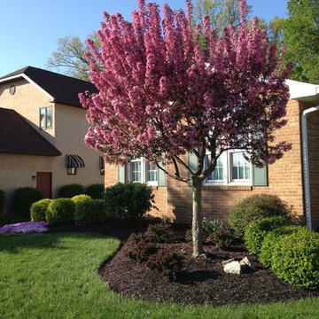

 Signature Kitchen & Bath Design Inc.
For this kitchen remodel, the clients opted to maintain the location and footprint of the original kitchen in their 1960’s ranch style home. That meant we had our work cut out for us to maximize the counter space while providing enough storage for this growing family. We ultimately decided to maximize the working counter space by the sink and range and added a large pantry wall in the adjacent dining room for bulky items and food storage. We chose a lightly stained slab style cabinet to capture the era of the home but paired it with white high-gloss upper cabinets and white quartz to make the space also look fresh and functional. A light green paint helps pull in the accent color featured in the backsplash while adding warmth to the home. We finished the space with a unique light fixture and a perfectly modern dining table.
Interior Design by Bennett Design Co.
Photo by Mike Kaskel

 Kaplan Architects, AIA
Location: Oakland, CA, USA
We were asked by the client to design an addition to their existing two story Cape Cod style house. The existing house had two bedrooms with one bath on the second level. They wanted to create an in-law type space for aging parents that would be easily accessible from the main level of the house. We looked at various ways to develop the extra space they wanted, including a separate detached in-law unit. They went with a scheme that has the new space attached to the back of the house. During the planning stage, they also decided to add a second level over the new addition which converted one of the existing bedrooms into a master bedroom suite. The final scheme has a new in-law suite at the ground level and a master bedroom, bath, walk-in closet, and bonus craft room on the second level.
We designed the addition to look like it was part of the original house construction and detailed the interior and exterior with that approach in mind.
New two story addition at the rear of the existing house.
Mitch Shenker Photography
 kimberly peck architect
This Dutch Renaissance Revival style Brownstone located in a historic district of the Crown heights neighborhood of Brooklyn was built in 1899. The brownstone was converted to a boarding house in the 1950’s and experienced many years of neglect which made much of the interior detailing unsalvageable with the exception of the stairwell. Therefore the new owners decided to gut renovate the majority of the home, converting it into a four family home. The bottom two units are owner occupied, the design of each includes common elements yet also reflects the style of each owner. Both units have modern kitchens with new high end appliances and stone countertops. They both have had the original wood paneling restored or repaired and both feature large open bathrooms with freestanding tubs, marble slab walls and radiant heated concrete floors. The garden apartment features an open living/dining area that flows through the kitchen to get to the outdoor space. In the kitchen and living room feature large steel French doors which serve to bring the outdoors in. The garden was fully renovated and features a deck with a pergola. Other unique features of this apartment include a modern custom crown molding, a bright geometric tiled fireplace and the labyrinth wallpaper in the powder room. The upper two floors were designed as rental units and feature open kitchens/living areas, exposed brick walls and white subway tiled bathrooms.
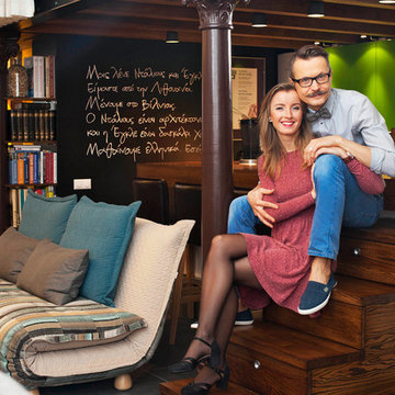
 Dalius & Greta Design
Architect Dalius Regelskis
DGD / Dalius & Greta Design
Vilnius, Lithuania
Home design - eclectic home design idea
Home design - eclectic home design idea
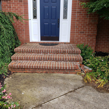

 McCabe By Design LLC
A beautiful location is worthy of a beautiful bath. With a water and mountain view just beyond, it was decided that the soaking tub was to be placed under the window for maximum enjoyment of the water/mountain view by day and the twinkle of city lights by night. However, the view is equally captured by the shower at the opposite end of the room. The homeowners requested two vanity sinks, linen storage, a make-up vanity and clutter free counters.
All of this was achieved and more! The linen tower stores a compliment of towels and toiletries while housing a concealed outlet for charging personal grooming appliances (hence the clutter free counters!). The floating shelves on either end of the tub do dual duty of providing a landing space for wine glasses as well as offering the homeowners a place for decorative self expression. One feature not captured in the photos is the fact that the beatiful tumbled beach glass vertical deco tiles in the shower are reflected in each mirror and from the moment you first step into the room.
Photos by A Kitchen That Works LLC

 G. Christianson Construction, Inc.
Can you believe that this Kitchen used to be four separate rooms with a closet in the center that housed the furnace? Years ago, this client came to us, wanting to explore the idea of demolishing the house and starting new. After further discussion, we decided the best decision was to remodel the interior to make it exactly as they wanted, housing the clients and her mother. The clients found these awesome schoolhouse pendants that we up-cycled to add charm to this eclectic Kitchen. The themes of this Kitchen truly reflect the beautiful outdoor garden that the client loves to tend to in her spare time, blurring the line between the outdoor and indoors.
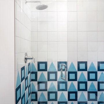 Breathe Design Studio: San Francisco
Our Austin studio decided to go bold with this project by ensuring that each space had a unique identity in the Mid-Century Modern style bathroom, butler's pantry, and mudroom. We covered the bathroom walls and flooring with stylish beige and yellow tile that was cleverly installed to look like two different patterns. The mint cabinet and pink vanity reflect the mid-century color palette. The stylish knobs and fittings add an extra splash of fun to the bathroom.
The butler's pantry is located right behind the kitchen and serves multiple functions like storage, a study area, and a bar. We went with a moody blue color for the cabinets and included a raw wood open shelf to give depth and warmth to the space. We went with some gorgeous artistic tiles that create a bold, intriguing look in the space.
In the mudroom, we used siding materials to create a shiplap effect to create warmth and texture – a homage to the classic Mid-Century Modern design. We used the same blue from the butler's pantry to create a cohesive effect. The large mint cabinets add a lighter touch to the space.
81