
Search results for "Deciding locations" in Home Design Ideas

 kimberly peck architect
This Dutch Renaissance Revival style Brownstone located in a historic district of the Crown heights neighborhood of Brooklyn was built in 1899. The brownstone was converted to a boarding house in the 1950’s and experienced many years of neglect which made much of the interior detailing unsalvageable with the exception of the stairwell. Therefore the new owners decided to gut renovate the majority of the home, converting it into a four family home. The bottom two units are owner occupied, the design of each includes common elements yet also reflects the style of each owner. Both units have modern kitchens with new high end appliances and stone countertops. They both have had the original wood paneling restored or repaired and both feature large open bathrooms with freestanding tubs, marble slab walls and radiant heated concrete floors. The garden apartment features an open living/dining area that flows through the kitchen to get to the outdoor space. In the kitchen and living room feature large steel French doors which serve to bring the outdoors in. The garden was fully renovated and features a deck with a pergola. Other unique features of this apartment include a modern custom crown molding, a bright geometric tiled fireplace and the labyrinth wallpaper in the powder room. The upper two floors were designed as rental units and feature open kitchens/living areas, exposed brick walls and white subway tiled bathrooms.

 Creative Spaces Interior Design, Inc.
We were hired to select all new fabric, space planning, lighting, and paint colors in this three-story home. Our client decided to do a remodel and to install an elevator to be able to reach all three levels in their forever home located in Redondo Beach, CA.
We selected close to 200 yards of fabric to tell a story and installed all new window coverings, and reupholstered all the existing furniture. We mixed colors and textures to create our traditional Asian theme.
We installed all new LED lighting on the first and second floor with either tracks or sconces. We installed two chandeliers, one in the first room you see as you enter the home and the statement fixture in the dining room reminds me of a cherry blossom.
We did a lot of spaces planning and created a hidden office in the family room housed behind bypass barn doors. We created a seating area in the bedroom and a conversation area in the downstairs.
I loved working with our client. She knew what she wanted and was very easy to work with. We both expanded each other's horizons.
Tom Queally Photography

 Kaplan Architects, AIA
Location: Oakland, CA, USA
We were asked by the client to design an addition to their existing two story Cape Cod style house. The existing house had two bedrooms with one bath on the second level. They wanted to create an in-law type space for aging parents that would be easily accessible from the main level of the house. We looked at various ways to develop the extra space they wanted, including a separate detached in-law unit. They went with a scheme that has the new space attached to the back of the house. During the planning stage, they also decided to add a second level over the new addition which converted one of the existing bedrooms into a master bedroom suite. The final scheme has a new in-law suite at the ground level and a master bedroom, bath, walk-in closet, and bonus craft room on the second level.
We designed the addition to look like it was part of the original house construction and detailed the interior and exterior with that approach in mind.
View from the hallway of the new in law suite looking into the bedroom area straight ahead with the door into the bathroom to the left and exterior sliding door to the deck to the right.
Mitch Shenker Photography
Find the right local pro for your project
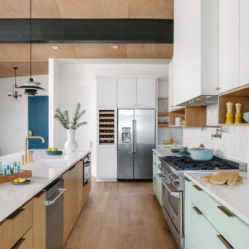
 Breathe Design Studio: San Francisco
Our Austin studio decided to go bold with this project by ensuring that each space had a unique identity in the Mid-Century Modern style bathroom, butler's pantry, and mudroom. We covered the bathroom walls and flooring with stylish beige and yellow tile that was cleverly installed to look like two different patterns. The mint cabinet and pink vanity reflect the mid-century color palette. The stylish knobs and fittings add an extra splash of fun to the bathroom.
The butler's pantry is located right behind the kitchen and serves multiple functions like storage, a study area, and a bar. We went with a moody blue color for the cabinets and included a raw wood open shelf to give depth and warmth to the space. We went with some gorgeous artistic tiles that create a bold, intriguing look in the space.
In the mudroom, we used siding materials to create a shiplap effect to create warmth and texture – a homage to the classic Mid-Century Modern design. We used the same blue from the butler's pantry to create a cohesive effect. The large mint cabinets add a lighter touch to the space.
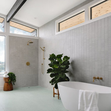
 Breathe Design Studio
Our Austin studio decided to go bold with this project by ensuring that each space had a unique identity in the Mid-Century Modern style bathroom, butler's pantry, and mudroom. We covered the bathroom walls and flooring with stylish beige and yellow tile that was cleverly installed to look like two different patterns. The mint cabinet and pink vanity reflect the mid-century color palette. The stylish knobs and fittings add an extra splash of fun to the bathroom.
The butler's pantry is located right behind the kitchen and serves multiple functions like storage, a study area, and a bar. We went with a moody blue color for the cabinets and included a raw wood open shelf to give depth and warmth to the space. We went with some gorgeous artistic tiles that create a bold, intriguing look in the space.
In the mudroom, we used siding materials to create a shiplap effect to create warmth and texture – a homage to the classic Mid-Century Modern design. We used the same blue from the butler's pantry to create a cohesive effect. The large mint cabinets add a lighter touch to the space.
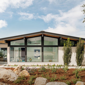 Breathe Design Studio: San Francisco
Our Austin studio decided to go bold with this project by ensuring that each space had a unique identity in the Mid-Century Modern style bathroom, butler's pantry, and mudroom. We covered the bathroom walls and flooring with stylish beige and yellow tile that was cleverly installed to look like two different patterns. The mint cabinet and pink vanity reflect the mid-century color palette. The stylish knobs and fittings add an extra splash of fun to the bathroom.
The butler's pantry is located right behind the kitchen and serves multiple functions like storage, a study area, and a bar. We went with a moody blue color for the cabinets and included a raw wood open shelf to give depth and warmth to the space. We went with some gorgeous artistic tiles that create a bold, intriguing look in the space.
In the mudroom, we used siding materials to create a shiplap effect to create warmth and texture – a homage to the classic Mid-Century Modern design. We used the same blue from the butler's pantry to create a cohesive effect. The large mint cabinets add a lighter touch to the space.
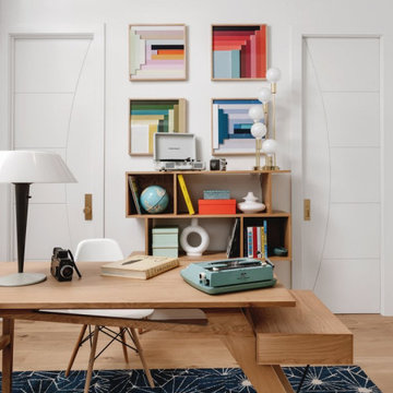 Breathe Design Studio
Our Austin studio decided to go bold with this project by ensuring that each space had a unique identity in the Mid-Century Modern style bathroom, butler's pantry, and mudroom. We covered the bathroom walls and flooring with stylish beige and yellow tile that was cleverly installed to look like two different patterns. The mint cabinet and pink vanity reflect the mid-century color palette. The stylish knobs and fittings add an extra splash of fun to the bathroom.
The butler's pantry is located right behind the kitchen and serves multiple functions like storage, a study area, and a bar. We went with a moody blue color for the cabinets and included a raw wood open shelf to give depth and warmth to the space. We went with some gorgeous artistic tiles that create a bold, intriguing look in the space.
In the mudroom, we used siding materials to create a shiplap effect to create warmth and texture – a homage to the classic Mid-Century Modern design. We used the same blue from the butler's pantry to create a cohesive effect. The large mint cabinets add a lighter touch to the space.

 Builddirect
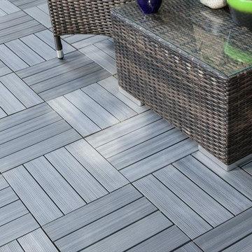
The striking and multi-tonal nature of real wood in an easily installed composite deck tile is yours in this series on the Kontiki label. This is your way to transform a drab outdoor living surface or a transitioning indoor one in a matter of hours, and do it yourself. For patios, balconies and beyond, creating a stylish space is as easy as can be.
Each composite deck tile is the product of post-consumer and post-industrial manufacturing innovation. The colors and grain patterns are realistic, and are also made to resist the most common types of wear to which any outdoor surface is exposed; fading, scratching, and staining. These are practical outdoor living space surfaces that do not off-gas, do not leech, and are designed to look great for the long-term.
Stylish composite deck tiles you can install yourself – easily
Making the transition between “before” and “after” is very easily done with this series of composite deck tiles. Simply snap them together using a 4-way interlocking system over a stable and flat surface; no special tools, no fuss, right out of the box. When you’re done, you’ll have a low-maintenance surface that’s designed to look great for a long time.
The locking system is raised to allow for maximum drainage during inclement weather, which is one of the keys to their enduring performance. And if you ever decide to re-locate your tiles, that’s easy too; it’s as easy as installing them. This adds another yet level of re-use and long-lasting surfaces.
Composite deck tiles at best prices
 Breathe Design Studio: San Francisco
Our Austin studio decided to go bold with this project by ensuring that each space had a unique identity in the Mid-Century Modern style bathroom, butler's pantry, and mudroom. We covered the bathroom walls and flooring with stylish beige and yellow tile that was cleverly installed to look like two different patterns. The mint cabinet and pink vanity reflect the mid-century color palette. The stylish knobs and fittings add an extra splash of fun to the bathroom.
The butler's pantry is located right behind the kitchen and serves multiple functions like storage, a study area, and a bar. We went with a moody blue color for the cabinets and included a raw wood open shelf to give depth and warmth to the space. We went with some gorgeous artistic tiles that create a bold, intriguing look in the space.
In the mudroom, we used siding materials to create a shiplap effect to create warmth and texture – a homage to the classic Mid-Century Modern design. We used the same blue from the butler's pantry to create a cohesive effect. The large mint cabinets add a lighter touch to the space.
 Breathe Design Studio: San Francisco
Our Austin studio decided to go bold with this project by ensuring that each space had a unique identity in the Mid-Century Modern style bathroom, butler's pantry, and mudroom. We covered the bathroom walls and flooring with stylish beige and yellow tile that was cleverly installed to look like two different patterns. The mint cabinet and pink vanity reflect the mid-century color palette. The stylish knobs and fittings add an extra splash of fun to the bathroom.
The butler's pantry is located right behind the kitchen and serves multiple functions like storage, a study area, and a bar. We went with a moody blue color for the cabinets and included a raw wood open shelf to give depth and warmth to the space. We went with some gorgeous artistic tiles that create a bold, intriguing look in the space.
In the mudroom, we used siding materials to create a shiplap effect to create warmth and texture – a homage to the classic Mid-Century Modern design. We used the same blue from the butler's pantry to create a cohesive effect. The large mint cabinets add a lighter touch to the space.

 Ebanista
A vibrant and decidedly feminine residence focusing on exquisite furnishings, each with their own couture-like attitude and detailing for the modern woman. Featuring Villandry Daybed, Francesca Cocktail Table, Cerchio Mirror, and Custom Area Rug all by Ebanista.

 Kathleen Jennison
An Arts & Crafts Bungalow is one of my favorite styles of homes. We have quite a few of them in our Stockton Mid-Town area. And when C&L called us to help them remodel their 1923 American Bungalow, I was beyond thrilled.
As per usual, when we get a new inquiry, we quickly Google the project location while we are talking to you on the phone. My excitement escalated when I saw the Google Earth Image of the sweet Sage Green bungalow in Mid-Town Stockton. "Yes, we would be interested in working with you," I said trying to keep my cool.
But what made it even better was meeting C&L and touring their home, because they are the nicest young couple, eager to make their home period perfect. Unfortunately, it had been slightly molested by some bad house-flippers, and we needed to bring the bathroom back to it "roots."
We knew we had to banish the hideous brown tile and cheap vanity quickly. But C&L complained about the condensation problems and the constant fight with mold. This immediately told me that improper remodeling had occurred and we needed to remedy that right away.
The Before: Frustrations with a Botched Remodel
The bathroom needed to be brought back to period appropriate design with all the functionality of a modern bathroom. We thought of things like marble countertop, white mosaic floor tiles, white subway tile, board and batten molding, and of course a fabulous wallpaper.
This small (and only) bathroom on a tight budget required a little bit of design sleuthing to figure out how we could get the proper look and feel. Our goal was to determine where to splurge and where to economize and how to complete the remodel as quickly as possible because C&L would have to move out while construction was going on.
The Process: Hard Work to Remedy Design and Function
During our initial design study, (which included 2 hours in the owners’ home), we noticed framed images of William Morris Arts and Crafts textile patterns and knew this would be our design inspiration. We presented C&L with three options and they quickly selected the Pimpernel Design Concept.
We had originally selected the Black and Olive colors with a black vanity, mirror, and black and white floor tile. C&L liked it but weren’t quite sure about the black, We went back to the drawing board and decided the William & Co Pimpernel Wallpaper in Bayleaf and Manilla color with a softer gray painted vanity and mirror and white floor tile was more to their liking.
After the Design Concept was approved, we went to work securing the building permit, procuring all the elements, and scheduling our trusted tradesmen to perform the work.
We did uncover some shoddy work by the flippers such as live electrical wires hidden behind the wall, plumbing venting cut-off and buried in the walls (hence the constant dampness), the tub barely balancing on two fence boards across the floor joist, and no insulation on the exterior wall.
All of the previous blunders were fixed and the bathroom put back to its previous glory. We could feel the house thanking us for making it pretty again.
The After Reveal: Cohesive Design Decisions
We selected a simple white subway tile for the tub/shower. This is always classic and in keeping with the style of the house.
We selected a pre-fab vanity and mirror, but they look rich with the quartz countertop. There is much more storage in this small vanity than you would think.
The Transformation: A Period Perfect Refresh
We began the remodel just as the pandemic reared and stay-in-place orders went into effect. As C&L were already moved out and living with relatives, we got the go-ahead from city officials to get the work done (after all, how can you shelter in place without a bathroom?).
All our tradesmen were scheduled to work so that only one crew was on the job site at a time. We stayed on the original schedule with only a one week delay.
The end result is the sweetest little bathroom I've ever seen (and I can't wait to start work on C&L's kitchen next).
Thank you for joining me in this project transformation. I hope this inspired you to think about being creative with your design projects, determining what works best in keeping with the architecture of your space, and carefully assessing how you can have the best life in your home.

 Showcase Kitchens and Baths
Request Cabinet Quote from Showcase KitchensThe focal point of this Neo-Classical kitchen was designed to be the custom hood area. It’s the first thing you see when walking down the main hallway. The hand chiseled, custom stone hood was originally designed to be made out of wood. We decided on using stone, which was made in Italy, for a more dramatic approach and in the end was more cost effective.
This spacious kitchen was designed to be highly functional for entertaining. The double islands, each having their own sink, allow for plenty of room and separate stations for prepping, organizing and cleaning. The kitchen also features a butler’s pantry which includes a custom farmhouse marble sink and a 30” Thermador double electric wall oven.
Another area that is inviting and operates as a gathering location, is the bar. Ernesto and his team chose a pyramid style door panel and curved legs at the end of the bar. These were inspired from some old furniture pieces the team had come across. Unique, subtle scroll work added to the legs was done by a local artist.
Unique Features
The Bentwood custom cabinets, from the kitchen to the laundry room, were truly unique as well. Ernesto and his team worked closely with the engineers and finishers, even traveling to Dallas, to make sure the colors and door details were perfect.
A chevron oak flooring finished this kitchen off nicely adding detail and depth to the overall look. The Thermador built in refrigerator and freezer were placed in an optimal location that is easily accessible. The cooking area consists of a 48” Thermador unit with a Sharp microwave drawer.
Even in the laundry room, no detail was overlooked. With plenty of space and storage, it features pull-down laundry hangers, large laundry bins, and a folding station.
Sponsored
Columbus, OH
Free consultation for landscape design!

Peabody Landscape Group
Columbus' Reliable Landscape Design & Contracting

 Van Kirk & Sons Pools and Spas
When the Grossman’s located in Miami area decided it was time to transform their tired, old pool into the tranquil retreat they’ve always wanted, Van Kirk & Sons was there every step of the transformation process. At the end of a long day the family can enjoy unwinding in their spa, or simply listening to the serene sounds of the cleanly designed, floating water fountain. This stunning water feature also doubles as a unique, refreshing waterbed for sprawling out on in the sun. On the weekends, the Grossmans can finally entertain their friends by the pool, and by the looks of it, they’ll never want to leave.

 Signature Stagers - Luxury Home Staging
There are a small number of cities in the world where luxury and lifestyle enthusiasts would aim to live. One of them is Dubai, a realm of high end living, glamour and complexity. Possessing a luxury address in this culturally rich city is for sure a exceptional treat. For those of you who can actually afford one, this penthouse which is Signature Stagers’ end of the year work of art is a very engaging proposal.
This penthouse we staged at the start of November 2015 has been lingering on the market for about 2 years prior to our meeting the owner. It is located in the exclusive Dubai Marina district among a few other select buildings and is currently for sale with Verzun on a POA (Price on application) basis due to its unique stature and lifestyle element which removes it from the “square foot” mentality and elevates it from its competition within the same building.
The penthouse was renovated prior to staging, and the apartment itself displays a fresh and modern look whilst keeping its classic and initial fit out and design.
Although a few key elements of the penthouse’s original architecture were retained, this neo-classical approach we decided on contributed to the dwellings select and sophisticated appeal numerous novel and sharply modern features which are also present around the residence, thus safeguarding its uniqueness and extremely fascinating form.
Swaggering 14,000 square feet this splendid home is apposite to a family as much as it is for the traveling executive who desires an exclusive and ultra-private address in Dubai. Enjoying 5 bedrooms all en-suite including a master bedroom with a sunset that decorates the floor to ceiling windows with a purple-orange and that by itself is a deal closer!
Photo credit: Mo Younes
 Breathe Design Studio: San Francisco
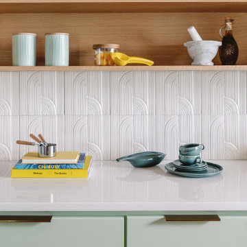
Our Austin studio decided to go bold with this project by ensuring that each space had a unique identity in the Mid-Century Modern style bathroom, butler's pantry, and mudroom. We covered the bathroom walls and flooring with stylish beige and yellow tile that was cleverly installed to look like two different patterns. The mint cabinet and pink vanity reflect the mid-century color palette. The stylish knobs and fittings add an extra splash of fun to the bathroom.
The butler's pantry is located right behind the kitchen and serves multiple functions like storage, a study area, and a bar. We went with a moody blue color for the cabinets and included a raw wood open shelf to give depth and warmth to the space. We went with some gorgeous artistic tiles that create a bold, intriguing look in the space.
In the mudroom, we used siding materials to create a shiplap effect to create warmth and texture – a homage to the classic Mid-Century Modern design. We used the same blue from the butler's pantry to create a cohesive effect. The large mint cabinets add a lighter touch to the space.
 DEANE Inc | Distinctive Design & Cabinetry
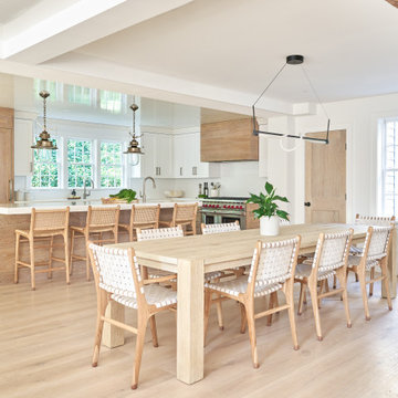
These owners wanted to update their historic 1860s home with modern amenities while still honoring Nantucket style influences. They had worked with DEANE on three previous projects, and the vision for this collaboration was a stylish, yet low-key kitchen that would host endless vacation gatherings. A family of seven who loved to cook together, it was key to create multiple work and seating areas that were functional but still beautiful. DEANE designed a two-toned effect with white oak lower cabinetry for durability and Chantilly Lace upper wall cabinetry for contrast. The clients decided to panel the appliances for a cohesive visual line. The understated white Quartz countertops and simple ceramic tile backsplash allow the cool wood tones of the cabinetry to be the focal point, while the high-gloss lacquer shiplap ceiling casts a glow.
Sponsored
Columbus, OH
Free consultation for landscape design!
Peabody Landscape Group
Columbus' Reliable Landscape Design & Contracting

 TKS Design Group
Free ebook, Creating the Ideal Kitchen. DOWNLOAD NOW
Our clients moved into their house two years’ ago “in spite of the bathrooms”, intent on remodeling them sometime in the near future. The house is lovely a midcentury ranch set on a sprawling lot. They had saved some photos to Pinterest as inspiration as a starting point so we set out to put all those pieces together.
Notice all the wasted space in the hallway by the closet in the before picture? Well, we decided to incorporate that area into the bathroom itself so that we could have extra room for cabinets as well as the light and view from the window to the great outdoors.
We mixed metals — chrome fixtures and lighting and black hardware and mirrors. We kept the rest of the materials neutral since it’s a smaller space. The homeowners needed storage, so we did a double vanity with a linen cabinet at one end. We installed an acrylic tub with simple white subway tile and a storage niche for shampoo. The end result is fresh, clean and functional.
Designed by: Susan Klimala, CKD, CBD
Photography by: Michael Alan Kaskel
For more information on kitchen and bath design ideas go to: www.kitchenstudio-ge.com

 TVL Creative Ltd.
Our clients had just recently closed on their new house in Stapleton and were excited to transform it into their perfect forever home. They wanted to remodel the entire first floor to create a more open floor plan and develop a smoother flow through the house that better fit the needs of their family. The original layout consisted of several small rooms that just weren’t very functional, so we decided to remove the walls that were breaking up the space and restructure the first floor to create a wonderfully open feel.
After removing the existing walls, we rearranged their spaces to give them an office at the front of the house, a large living room, and a large dining room that connects seamlessly with the kitchen. We also wanted to center the foyer in the home and allow more light to travel through the first floor, so we replaced their existing doors with beautiful custom sliding doors to the back yard and a gorgeous walnut door with side lights to greet guests at the front of their home.
Living Room
Our clients wanted a living room that could accommodate an inviting sectional, a baby grand piano, and plenty of space for family game nights. So, we transformed what had been a small office and sitting room into a large open living room with custom wood columns. We wanted to avoid making the home feel too vast and monumental, so we designed custom beams and columns to define spaces and to make the house feel like a home. Aesthetically we wanted their home to be soft and inviting, so we utilized a neutral color palette with occasional accents of muted blues and greens.
Dining Room
Our clients were also looking for a large dining room that was open to the rest of the home and perfect for big family gatherings. So, we removed what had been a small family room and eat-in dining area to create a spacious dining room with a fireplace and bar. We added custom cabinetry to the bar area with open shelving for displaying and designed a custom surround for their fireplace that ties in with the wood work we designed for their living room. We brought in the tones and materiality from the kitchen to unite the spaces and added a mixed metal light fixture to bring the space together
Kitchen
We wanted the kitchen to be a real show stopper and carry through the calm muted tones we were utilizing throughout their home. We reoriented the kitchen to allow for a big beautiful custom island and to give us the opportunity for a focal wall with cooktop and range hood. Their custom island was perfectly complimented with a dramatic quartz counter top and oversized pendants making it the real center of their home. Since they enter the kitchen first when coming from their detached garage, we included a small mud-room area right by the back door to catch everyone’s coats and shoes as they come in. We also created a new walk-in pantry with plenty of open storage and a fun chalkboard door for writing notes, recipes, and grocery lists.
Office
We transformed the original dining room into a handsome office at the front of the house. We designed custom walnut built-ins to house all of their books, and added glass french doors to give them a bit of privacy without making the space too closed off. We painted the room a deep muted blue to create a glimpse of rich color through the french doors
Powder Room
The powder room is a wonderful play on textures. We used a neutral palette with contrasting tones to create dramatic moments in this little space with accents of brushed gold.
Master Bathroom
The existing master bathroom had an awkward layout and outdated finishes, so we redesigned the space to create a clean layout with a dream worthy shower. We continued to use neutral tones that tie in with the rest of the home, but had fun playing with tile textures and patterns to create an eye-catching vanity. The wood-look tile planks along the floor provide a soft backdrop for their new free-standing bathtub and contrast beautifully with the deep ash finish on the cabinetry.
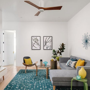 Breathe Design Studio
Our Austin studio decided to go bold with this project by ensuring that each space had a unique identity in the Mid-Century Modern style bathroom, butler's pantry, and mudroom. We covered the bathroom walls and flooring with stylish beige and yellow tile that was cleverly installed to look like two different patterns. The mint cabinet and pink vanity reflect the mid-century color palette. The stylish knobs and fittings add an extra splash of fun to the bathroom.
The butler's pantry is located right behind the kitchen and serves multiple functions like storage, a study area, and a bar. We went with a moody blue color for the cabinets and included a raw wood open shelf to give depth and warmth to the space. We went with some gorgeous artistic tiles that create a bold, intriguing look in the space.
In the mudroom, we used siding materials to create a shiplap effect to create warmth and texture – a homage to the classic Mid-Century Modern design. We used the same blue from the butler's pantry to create a cohesive effect. The large mint cabinets add a lighter touch to the space.
78