
Search results for "Deciding locations" in Home Design Ideas

 Dream Kitchens
The kitchen in this contemporary style home seemed to be an afterthought. While the rest of the house is open and expansive, the kitchen was small and detached, especially for a couple who loves to entertain. The very large and adjacent dining room seemed a more likely location for a kitchen, but they resisted the thought of swapping the two spaces. So their designer created a layout that allowed for a second – and larger – opening to the dining room and the expansive, light-filled living space beyond.
A peninsula attaches to the wall that remained between the two openings. There the sink is located so that during food preparation or cleanup there is a view through the windows and the opportunity to socialize with people gathered at the countertop. The seating area is curved to encourage people to gather and chat. The granite countertop choice was a case of love at first sight for this homeowner since it brought his favorite shade of blue into the kitchen.
The cooking center is spread out along the wall at the back of the house. There the eye-catching stainless steel hood creates a focal point above the sleek, low-profile cooktop. Glass tile pulls color from the countertops onto the wall where it glimmers in the light. One oven combined with a microwave/convection oven meet their cooking needs and the stainless steel adds brightness to the room.
The stainless steel refrigerator is just a few steps away from the work center and the seating area and is easily accessible from other parts of the house. The original kitchen featured only one small window in addition to the sliding glass doors. Since it was almost new and the house had been resided, a second window was joined to the first, and cabinetry beneath them anchors them in the space. A tall pantry cabinet completes the kitchen, providing high quality storage and visual balance in this redesign.
Sleek cherry cabinets give this kitchen a decidedly contemporary style. They were stained just enough to add warmth and color and are enhanced with oversized stainless steel pulls.
From this redesigned space you can see into the main house and see out through the many windows there. When combined with a new layout that provides better traffic flow, there’s a new feeling of spaciousness to the kitchen. It’s no longer an afterthought. It’s an integral part of this home’s living space, enhancing the home and the lifestyle of its owners.
Photography By Scott Sherman
 Alair Homes Plano
This 1964 Preston Hollow home was in the perfect location and had great bones but was not perfect for this family that likes to entertain. They wanted to open up their kitchen up to the den and entry as much as possible, as it was small and completely closed off. They needed significant wine storage and they did want a bar area but not where it was currently located. They also needed a place to stage food and drinks outside of the kitchen. There was a formal living room that was not necessary and a formal dining room that they could take or leave. Those spaces were opened up, the previous formal dining became their new home office, which was previously in the master suite. The master suite was completely reconfigured, removing the old office, and giving them a larger closet and beautiful master bathroom. The game room, which was converted from the garage years ago, was updated, as well as the bathroom, that used to be the pool bath. The closet space in that room was redesigned, adding new built-ins, and giving us more space for a larger laundry room and an additional mudroom that is now accessible from both the game room and the kitchen! They desperately needed a pool bath that was easily accessible from the backyard, without having to walk through the game room, which they had to previously use. We reconfigured their living room, adding a full bathroom that is now accessible from the backyard, fixing that problem. We did a complete overhaul to their downstairs, giving them the house they had dreamt of!
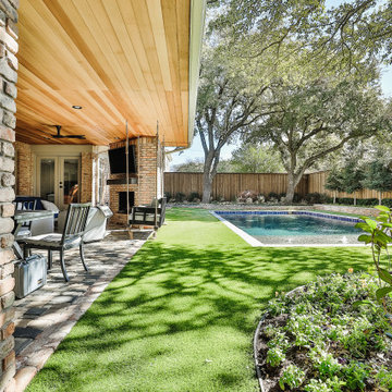
As far as the exterior is concerned, they wanted better curb appeal and a more inviting front entry. We changed the front door, and the walkway to the house that was previously slippery when wet and gave them a more open, yet sophisticated entry when you walk in. We created an outdoor space in their backyard that they will never want to leave! The back porch was extended, built a full masonry fireplace that is surrounded by a wonderful seating area, including a double hanging porch swing. The outdoor kitchen has everything they need, including tons of countertop space for entertaining, and they still have space for a large outdoor dining table. The wood-paneled ceiling and the mix-matched pavers add a great and unique design element to this beautiful outdoor living space. Scapes Incorporated did a fabulous job with their backyard landscaping, making it a perfect daily escape. They even decided to add turf to their entire backyard, keeping minimal maintenance for this busy family. The functionality this family now has in their home gives the true meaning to Living Better Starts Here™.

 Design Fixation [Faith Provencher]
Photo: Faith Towers © 2017 Houzz
Example of an eclectic dining room design in Boston
Example of an eclectic dining room design in Boston
Find the right local pro for your project

 Custom Design & Construction
This design / build project in Redondo Beach, CA. focused on a family’s hall bathroom. There were multiple reasons that the homeowners decided to start this project but the issue that was most pressing was water damage from the shower. The homeowners knew it needed to be addressed ASAP. As long as a remodel was going to be completed they felt that it was time to address the layout as well. It was not efficient in its original state. Since bathrooms work so hard it was important that the remodel resolve this issue as well. The homeowners were also interested in new finishes.
Desiring something more light and fresh with a coastal feel we began reimagining the layout. The before and after pictures explain it best but basically the new shower was placed against the wall where there previously was a toilet and window. The location and size of the window was changed as well. The shower is now a three wall alcove with grab bars to allow the homeowners to age in place. The white subway tile is accented by a mosaic tile in the homeowners’ favorite coastal shades. The light and beachy feel is reinforced with the grey ceramic tile floor. The vanity is a furniture-style with details like decorative feet. The space is tied together with a backsplash that matches the border in the shower.

 Barn Pros
This off-grid mountain barn home located in the heart of the Rockies sits at 7,500 feet and has expansive, beautiful views of the foothills below. The model is a Barn Pros 36 ft. x 36 ft. Denali barn apartment with a partially enclosed shed roof on one side for outdoor seating and entertainment area. The deck off the back of the building is smaller than the standard 12 ft. x 12 ft. deck included in the Denali package. Roll-up garage doors like the one shown at the front of the home are an add-on option for nearly any Barn Pros kit.
Inside, the finish is decidedly rustic modern where sheetrock walls contrast handsomely with the exposed posts and beams throughout the space. The owners incorporated garage parking, laundry, kitchenette with wood-burning stove oven, bathroom, workout area and a pool table all on the first floor. The upper level houses the main living space where contemporary décor and finished are combined with natural wood flooring and those same exposed posts and beams. Lots of natural light fills the space from the 18 ft. vaulted ceilings, dormer windows and French doors off the living room. The owners added a partial loft for additional sleeping and a functional storage area.
 Stairworks
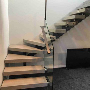
We were asked by a house builder to build a steel staircase as the centrepiece for their new show home in Auckland. Although they had already decided on the central mono-stringer style staircase (also known as a floating staircase), with solid oak treads and glass balustrades, when we met with them we also made some suggestions. This was in order to help nest the stairs in their desired location, which included having to change the layout to avoid clashing with the existing structure.
The stairs lead from a reception area up to a bedroom, so one of our first suggestions, was to have the glass balustrade on the side of the staircase finishing, and finish at the underside of the ground-floor ceiling, and then building an independent balustrade in the bedroom. The intention behind this was to give some separation between the living and sleeping areas, whilst maximising the full width of the opening for the stairs. Additionally, this also helps hide the staircase from inside the bedroom, as you don’t see the balustrade coming up from the floor below.
We also recommended the glass on the first floor was face fixed directly to the boundary beam, and the fixings covered with a painted fascia panel. This was in order to avoid using a large floor fixed glazing channel or reduce the opening width with stand-off pin fixings.

 TKS Design Group
Download our free ebook, Creating the Ideal Kitchen. DOWNLOAD NOW
This homeowner’s daughter originally contacted us on behalf of her parents who were reluctant to begin the remodeling process in their home due to the inconvenience and dust. Once we met and they dipped their toes into the process, we were off to the races. The existing bathroom in this beautiful historical 1920’s home, had not been updated since the 70’/80’s as evidenced by the blue carpeting, mirrored walls and dropped ceilings. In addition, there was very little storage, and some health setbacks had made the bathroom difficult to maneuver with its tub shower.
Once we demoed, we discovered everything we expected to find in a home that had not been updated for many years. We got to work bringing all the electrical and plumbing up to code, and it was just as dusty and dirty as the homeowner’s anticipated! Once the space was demoed, we got to work building our new plan. We eliminated the existing tub and created a large walk-in curb-less shower.
An existing closet was eliminated and in its place, we planned a custom built in with spots for linens, jewelry and general storage. Because of the small space, we had to be very creative with the shower footprint, so we clipped one of the walls for more clearance behind the sink. The bathroom features a beautiful custom mosaic floor tile as well as tiled walls throughout the space. This required lots of coordination between the carpenter and tile setter to make sure that the framing and tile design were all properly aligned. We worked around an existing radiator and a unique original leaded window that was architecturally significant to the façade of the home. We had a lot of extra depth behind the original toilet location, so we built the wall out a bit, moved the toilet forward and then created some extra storage space behind the commode. We settled on mirrored mullioned doors to bounce lots of light around the smaller space.
We also went back and forth on deciding between a single and double vanity, and in the end decided the single vanity allowed for more counter space, more storage below and for the design to breath a bit in the smaller space. I’m so happy with this decision! To build on the luxurious feel of the space, we added a heated towel bar and heated flooring.
One of the concerns the homeowners had was having a comfortable floor to walk on. They realized that carpet was not a very practical solution but liked the comfort it had provided. Heated floors are the perfect solution. The room is decidedly traditional from its intricate mosaic marble floor to the calacutta marble clad walls. Elegant gold chandelier style fixtures, marble countertops and Morris & Co. beaded wallpaper provide an opulent feel to the space.
The gray monochromatic pallet keeps it feeling fresh and up-to-date. The beautiful leaded glass window is an important architectural feature at the front of the house. In the summertime, the homeowners love having the window open for fresh air and ventilation. We love it too!
The curb-less shower features a small fold down bench that can be used if needed and folded up when not. The shower also features a custom niche for storing shampoo and other hair products. The linear drain is built into the tilework and is barely visible. A frameless glass door that swings both in and out completes the luxurious feel.
Designed by: Susan Klimala, CKD, CBD
Photography by: Michael Kaskel
For more information on kitchen and bath design ideas go to: www.kitchenstudio-ge.com
Sponsored
Columbus, OH

Hope Restoration & General Contracting
Columbus Design-Build, Kitchen & Bath Remodeling, Historic Renovations
 TKS Design Group
Free ebook, Creating the Ideal Kitchen. DOWNLOAD NOW
This client wanted a complete update of their kitchen and came to us with several objectives. They wanted a larger island and easier access to the dining room. They also wanted to eliminate the existing cooktop location from the island and make the island larger. Because the existing space was not able to accommodate all those requests, we decided to eliminate the breakfast area and incorporate that space into the kitchen. By eliminating an existing bay window and making the kitchen sink window larger, we were able to make the new layout work without sacrificing any natural light. A French door to the newly added and adjoining sunroom and casual outdoor dining spot still allows for multiple dining options. And by enlarging the opening to the dining room, it allows for easier access to this space on a daily basis versus for special occasions only.
The client already had a large desk in the kitchen and spends a lot of time at this area. We were able to make the new desk even larger by moving the refrigerator to another area. The refrigerator is covered in decorative panels so that it blends nicely into the furniture look of the room. The larger island can now seat several people comfortably.
The room’s traditional feel was achieved by providing different finishes on the perimeter, island and desk cabinetry. Handmade gray backsplash tile, a combination of soapstone and Carrera marble give the space a classic appeal. Details provide interest – custom glass mullions, decorative wood hood and bronze hardware give the space character and charm.
Designed by: Susan Klimala, CKD, CBD
Interior Design by: Rachel Alcorn
Architect: Rick Rearick
Contractor: KJN Renovations
Photography by: Mike Kaskel
For more information on kitchen and bath design ideas go to: www.kitchenstudio-ge.com
 Alair Homes Plano
These clients debated moving from their dated 1979 house but decided to remodel since they loved their neighborhood and location of their home. We did a whole house interior and exterior remodel for them and they are so happy with their decision. The homeowners felt that reading floorplans was not so easy, so they loved our ability to provide 3D renderings and our personal touches and suggestions from our in-house designers.
The general layout of the home stayed the same with a few minor changes. We took the 38 year old home down to the studs and transformed it completely. The only thing that remains unchanged is the address. The popcorn texture was removed from the ceiling, removed all soffits, replaced all cabinets, flooring and countertops throughout the home. The wet bar was removed from the living room opening the space. The kitchen layout remained the same, but the cook surface was moved. Unneeded space was removed from the laundry room, giving them a larger pantry.
The master suite remained the same but additional lighting was added for reading. We made major improvements in the master bath by adding a rain shower, more storage and a bench to their new shower and gave them a larger bathtub.
All new cedar siding was replaced on the exterior of the home and a fresh coat of paint makes this 1979 home look brand new!
Design/Remodel by Hatfield Builders & Remodelers | Photography by Versatile Imaging

 VFLA Architecture + Interiors
On this spectacular mountain site, the clients wanted to build a 4,200-square-foot residence that did not appear to be a big, prestigious house. They didn’t want a McMansion; they wanted a living space integrated into the landscape – a home nestled among the trees and rock outcroppings.
The clients decided to demolish an existing farmhouse on the site, but they also sought to recreate the views afforded by that older home. Siting the fireplace and living room at the same location, the new residence was built on a similar footprint, but with a focus on energy efficiency.
The rambling, rustic Montana-lodge style exterior belies the technology inside. The fireplace – with help from the geothermal radiant heat system – is enough to keep the clients warm and toasty through the worst winter gales. A natural ventilation system also keeps the home allergen-free.
Careful coordination with the engineer allowed the structure to appear hunkered into the site, creating a humble front façade. The house’s floor plan strategically winds its way around the trees and boulders – framing intimate views of the landscape from the master bedroom and offering magnificent vistas from the deck.
Through attention to design and careful construction, the project saved nearly all of the more than 30 mature trees directly adjacent to the building footprint. Blasting of the some larger rocks was required to make room for the driveway, but the completed home now looks and functions as an established part of the landscape.
 VFLA Architecture + Interiors
On this spectacular mountain site, the clients wanted to build a 4,200-square-foot residence that did not appear to be a big, prestigious house. They didn’t want a McMansion; they wanted a living space integrated into the landscape – a home nestled among the trees and rock outcroppings.
The clients decided to demolish an existing farmhouse on the site, but they also sought to recreate the views afforded by that older home. Siting the fireplace and living room at the same location, the new residence was built on a similar footprint, but with a focus on energy efficiency.
The rambling, rustic Montana-lodge style exterior belies the technology inside. The fireplace – with help from the geothermal radiant heat system – is enough to keep the clients warm and toasty through the worst winter gales. A natural ventilation system also keeps the home allergen-free.
Careful coordination with the engineer allowed the structure to appear hunkered into the site, creating a humble front façade. The house’s floor plan strategically winds its way around the trees and boulders – framing intimate views of the landscape from the master bedroom and offering magnificent vistas from the deck.
Through attention to design and careful construction, the project saved nearly all of the more than 30 mature trees directly adjacent to the building footprint. Blasting of the some larger rocks was required to make room for the driveway, but the completed home now looks and functions as an established part of the landscape.
 TKS Design Group
This project is a good example of what can be done with a little refresh. Sometimes parts of your space work well and parts don’t, so a full gut and replace might not make sense. That was the case here.
After living with it for a decade or so realized they would really prefer two sinks in the vanity. Since there were two windows in the bathroom, we decided to eliminate the window to the left of the current vanity and replace with it with a longer run of cabinets.
The other window is to the right of the vanity let’s in beautiful morning light. The window we removed was a northern exposure and its location under an eave didn’t allow for much light, so it was the perfect solution!
In addition to the new vanity, we also changed out the countertop, added new mirrors and lighting, and changed out the tile floor to a larger hex with fewer grout lines. This adds a brighter more modern look while still maintaining the vintage feel of the room.
The shower was in great shape, so we left that as is except for swapping out the shower floor tile to match the main floor and adding a more updated decorative mosaic tile. We added a new toilet and for a bit of luxury a heated towel bar.
Designed by: Susan Klimala, CKD, CBD
Photography by: LOMA Studios
For more information on kitchen and bath design ideas go to: www.kitchenstudio-ge.com
Project Year: 2020
 Architexture Interior Design
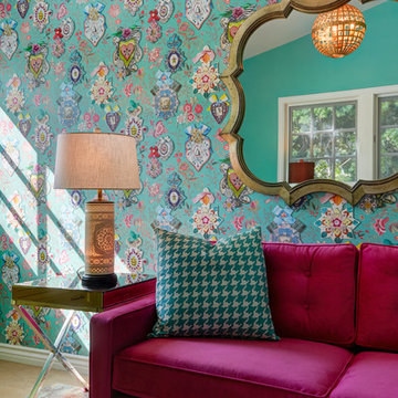
What a wonderful place for imagination to flourish. The colors and patterns create vibrancy and excitement. The boldness is matched by the fanciful accents in the birdcate light fixture, the Alice in Wonderland mirror, the light from the inside lamp and the fuzzy ottoman!
Sponsored
Columbus, OH
Free consultation for landscape design!

Peabody Landscape Group
Franklin County's Reliable Landscape Design & Contracting

 San Luis Kitchen Co.
Recently, this Victorian style home welcomed its new owners with open arms – the only glitch in the budding relationship, the kitchen. The U shaped kitchen huddled in just half of the nice large room available to it – a long peninsula bisecting the space creating an awkward divide between the work area and the cramped breakfast nook/serving area.
The new owners enjoy cooking and they needed space for both of them to work in the kitchen at the same time. The old U shape did not accommodate this. The sink was too close to the range, the peninsula hemmed them in without providing a focused workstation, and the refrigerator sat at the end competing with people entering the space. And finally, the kitchen just lacked style – it did not fit with the Victorian style architecture and décor of the home.
San Luis Kitchen to the rescue! After attending a few of our monthly design seminars, the homeowners decided to take the remodeling plunge. They brought us a sketch of the space, explained their need for a more functional 2-cook space, and expressed interest in replacing the peninsula with an island. After visiting the home, we identified some other areas of design opportunity/constraint – an exterior door that was seldom used, an existing wood floor that extended throughout the house, a beautiful view from the breakfast nook windows, and a large existing pantry.
Our first thought for the new kitchen was to provide a visual focal point. The homeowners were excited by the idea of a “mantle” type wood hood which we situated facing out toward the formal dining room as the opening statement for the kitchen. We also added an island set at 90 degrees to the prior location of the peninsula – decorative open shelves face out from the island creating more visual interest. The new island not only reinforces the focal point of the hood, but also, working with the new built-in hutch, embraces the breakfast nook and integrates it with the rest of the kitchen. (Changing the peninsula to an island did create a need to patch the hardwood floor – thankfully the homeowner was able to find a source for replacement flooring that was almost a seamless blend)
Working with both the homeowners and their interior designer, we decided to combine a creamy white finish for the main cabinets with a cordovan maple stain for the island and hutch. The goal of this color scheme was a bright happy kitchen (the white) with a formal furniture feel to the cabinetry (the dark red maple pieces). Often, in Victorian or other classic style spaces, we see different pieces brought together (over time or as a planned design) to form a cohesive but diverse whole.
As functional considerations for the design, the main sink was moved to the island and a prep sink was added in the corner between the new cook-top and a designated bake center/prep station located where the old range had been. This gives space for both homeowners to work in the kitchen simultaneously using multiple workstations. We added a built-in refrigerator with decorative door panels (to blend comfortably with the cabinets), a wall oven/microwave combo – both of which are now in the space that used to have the redundant exterior door – expanding the kitchen all the way to the far wall. And lastly, keeping the basic structure of the existing pantry, we refaced it with matching doors and added rollout shelves for convenience.
The new kitchen gracefully meets all of the homeowners needs both as a showpiece and as a backdrop to their daily lives. Now they are comfortably ensconced in their entire home, including the kitchen!
 VFLA Architecture + Interiors
On this spectacular mountain site, the clients wanted to build a 4,200-square-foot residence that did not appear to be a big, prestigious house. They didn’t want a McMansion; they wanted a living space integrated into the landscape – a home nestled among the trees and rock outcroppings.
The clients decided to demolish an existing farmhouse on the site, but they also sought to recreate the views afforded by that older home. Siting the fireplace and living room at the same location, the new residence was built on a similar footprint, but with a focus on energy efficiency.
The rambling, rustic Montana-lodge style exterior belies the technology inside. The fireplace – with help from the geothermal radiant heat system – is enough to keep the clients warm and toasty through the worst winter gales. A natural ventilation system also keeps the home allergen-free.
Careful coordination with the engineer allowed the structure to appear hunkered into the site, creating a humble front façade. The house’s floor plan strategically winds its way around the trees and boulders – framing intimate views of the landscape from the master bedroom and offering magnificent vistas from the deck.
Through attention to design and careful construction, the project saved nearly all of the more than 30 mature trees directly adjacent to the building footprint. Blasting of the some larger rocks was required to make room for the driveway, but the completed home now looks and functions as an established part of the landscape.
 Stairworks
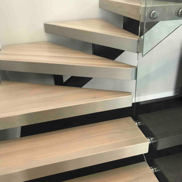
We were asked by a house builder to build a steel staircase as the centrepiece for their new show home in Auckland. Although they had already decided on the central mono-stringer style staircase (also known as a floating staircase), with solid oak treads and glass balustrades, when we met with them we also made some suggestions. This was in order to help nest the stairs in their desired location, which included having to change the layout to avoid clashing with the existing structure.
The stairs lead from a reception area up to a bedroom, so one of our first suggestions, was to have the glass balustrade on the side of the staircase finishing, and finish at the underside of the ground-floor ceiling, and then building an independent balustrade in the bedroom. The intention behind this was to give some separation between the living and sleeping areas, whilst maximising the full width of the opening for the stairs. Additionally, this also helps hide the staircase from inside the bedroom, as you don’t see the balustrade coming up from the floor below.
We also recommended the glass on the first floor was face fixed directly to the boundary beam, and the fixings covered with a painted fascia panel. This was in order to avoid using a large floor fixed glazing channel or reduce the opening width with stand-off pin fixings.

 Creative Spaces Interior Design, Inc.
We were hired to select all new fabric, space planning, lighting, and paint colors in this three-story home. Our client decided to do a remodel and to install an elevator to be able to reach all three levels in their forever home located in Redondo Beach, CA.
We selected close to 200 yards of fabric to tell a story and installed all new window coverings, and reupholstered all the existing furniture. We mixed colors and textures to create our traditional Asian theme.
We installed all new LED lighting on the first and second floor with either tracks or sconces. We installed two chandeliers, one in the first room you see as you enter the home and the statement fixture in the dining room reminds me of a cherry blossom.
We did a lot of spaces planning and created a hidden office in the family room housed behind bypass barn doors. We created a seating area in the bedroom and a conversation area in the downstairs.
I loved working with our client. She knew what she wanted and was very easy to work with. We both expanded each other's horizons.
Tom Queally Photography
Sponsored
Columbus, OH
Free consultation for landscape design!
Peabody Landscape Group
Franklin County's Reliable Landscape Design & Contracting
 KitchenLab Interiors
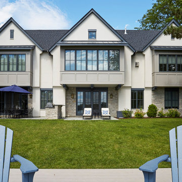
’ first, entirely new construction project in collaboration with GTH architects who designed the residence. KLI was responsible for all interior finishes, fixtures, furnishings, and design including the stairs, casework, interior doors, moldings and millwork. KLI also worked with the client on selecting the roof, exterior stucco and paint colors, stone, windows, and doors. The homeowners had purchased the existing home on a lakefront lot of the Valley Lo community in Glenview, thinking that it would be a gut renovation, but when they discovered a host of issues including mold, they decided to tear it down and start from scratch. The minute you look out the living room windows, you feel as though you're on a lakeside vacation in Wisconsin or Michigan. We wanted to help the homeowners achieve this feeling throughout the house - merging the causal vibe of a vacation home with the elegance desired for a primary residence. This project is unique and personal in many ways - Rebekah and the homeowner, Lorie, had grown up together in a small suburb of Columbus, Ohio. Lorie had been Rebekah's babysitter and was like an older sister growing up. They were both heavily influenced by the style of the late 70's and early 80's boho/hippy meets disco and 80's glam, and both credit their moms for an early interest in anything related to art, design, and style. One of the biggest challenges of doing a new construction project is that it takes so much longer to plan and execute and by the time tile and lighting is installed, you might be bored by the selections of feel like you've seen them everywhere already. “I really tried to pull myself, our team and the client away from the echo-chamber of Pinterest and Instagram. We fell in love with counter stools 3 years ago that I couldn't bring myself to pull the trigger on, thank god, because then they started showing up literally everywhere", Rebekah recalls. Lots of one of a kind vintage rugs and furnishings make the home feel less brand-spanking new. The best projects come from a team slightly outside their comfort zone. One of the funniest things Lorie says to Rebekah, "I gave you everything you wanted", which is pretty hilarious coming from a client to a designer.
 Alair Homes Plano
These clients debated moving from their dated 1979 house but decided to remodel since they loved their neighborhood and location of their home. We did a whole house interior and exterior remodel for them and they are so happy with their decision. The homeowners felt that reading floorplans was not so easy, so they loved our ability to provide 3D renderings and our personal touches and suggestions from our in-house designers.
The general layout of the home stayed the same with a few minor changes. We took the 38 year old home down to the studs and transformed it completely. The only thing that remains unchanged is the address. The popcorn texture was removed from the ceiling, removed all soffits, replaced all cabinets, flooring and countertops throughout the home. The wet bar was removed from the living room opening the space. The kitchen layout remained the same, but the cook surface was moved. Unneeded space was removed from the laundry room, giving them a larger pantry.
The master suite remained the same but additional lighting was added for reading. We made major improvements in the master bath by adding a rain shower, more storage and a bench to their new shower and gave them a larger bathtub.
All new cedar siding was replaced on the exterior of the home and a fresh coat of paint makes this 1979 home look brand new!
Design/Remodel by Hatfield Builders & Remodelers | Photography by Versatile Imaging

 Sceltas Custom Homes
This fairly new home was built on Daniel Island right on beautiful Smythe Park. The homeowners purchased the five-year-old home because of its location and potential, but they had great plans to make it more modern and unique to their styles by incorporating transitional and modern design. They decided to go very white, creating a sleek, clean look while contrasting it against stained, dark hardwood floors.
The project included adding new hardware, applying a fresh coat of paint to the entire interior (walls and ceilings), adding new light fixtures, refinishing the floors throughout the home and remodeling the master bathroom, morning kitchen, main kitchen and butler’s pantry cabinetry with newly refinished cabinetry, countertops and fixtures. What a remarkable transformation! The family able to create a fresh new look while keeping the architectural bones of the home in tact.
Photography by: Brennan Wesley
87