
Search results for "Definitive difference" in Home Design Ideas
 Amy Wolff Interiors
TMP Imaging LLC
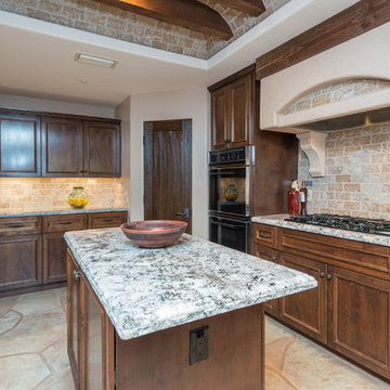
Inspiration for a large rustic slate floor eat-in kitchen remodel in Phoenix with a farmhouse sink, raised-panel cabinets, dark wood cabinets, granite countertops, beige backsplash, stone tile backsplash, paneled appliances and an island
Inspiration for a large rustic slate floor eat-in kitchen remodel in Phoenix with a farmhouse sink, raised-panel cabinets, dark wood cabinets, granite countertops, beige backsplash, stone tile backsplash, paneled appliances and an island
 Drury Design
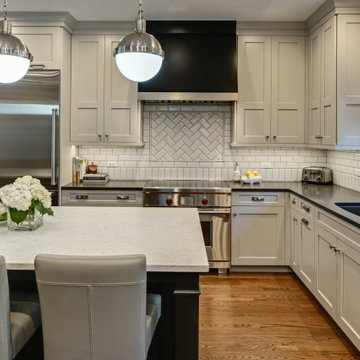
The existing kitchen was closed off, which necessitated several space-related compromises that affected many aspects of daily life.
Design Objectives:
• Open the tiny kitchen to living space
• Maintain the dining area
• Create a family room/TV space
• Increase kitchen storage and work surface
• Improve lighting
• Upgrade appliances to ‘chef grade’
Biggest Design Challenge:
• Our main challenge was to add a family room/TV area while maintaining a dining space. Prior to the remodel, the homeowners were using a TV room on their third floor, which was less than ideal.
Taking down the kitchen wall and opening up the area to the adjacent living space made a big difference. The repurposed former dining room works well as a TV space. The former breakfast nook was updated with a new table that allows for casual dining on a daily basis, but is expandable for parties and holidays. Kitchen storage was expanded with island and ceiling-height cabinetry. Kitchen island seating and the open floor plan have definitely changed the quality of day-to-day life – the cook no longer feels isolated and now enjoys preparing meals while spending time with friends.


Find the right local pro for your project
 Classic Kitchens Designs & Renovations Ltd.
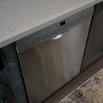
Creating new kitchens are something we really enjoy, and this wonderful example is another reason why! The old kitchen was more than ready to be put out to pasture, as most are, so we took the opportunity to change it up and add an island to create more functionality and a better traffic flow. New cabinets painted with Benjamin Moore paint finish, Quartz countertops, and a textured backsplash were combined to create a different ambiance in this kitchen. The homeowner chose a "tile look" Duraceramic floor, which offers the look of tile, but is softer and warmer to the foot. A new fridge was still in the works as of these pictures being taken, but the end result is a definite breath of fresh air for this kitchen. Awesome!
 Traditions In Tile At Brier Creek
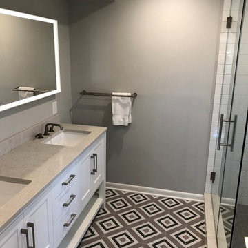
Cement tile is all the rage in homes these days. There are endless patterns and colors that can really catch you eye. Some homeowners look at cement like they do natural stone and do not want to have to maintain it. In this case, the homeowner chose a 7X7 decorative tile that looks like cement (and the collection is called cement) but it's a porcelain! There is no sealing required and the material is extremely durable! The cool thing about it is that the individual pieces can be laid multiple ways to create several different patterns. In this case, the homeowner decided on a diamond shape and it looks incredible - definitely one of a kind. The shower walls are a white 4X16 subway tile on a brick lay. As usual, a 2X2 porcelain mosaic is used for the shower floor. All these elements play nicely together but there's no doubt about it - the floor steals the show!
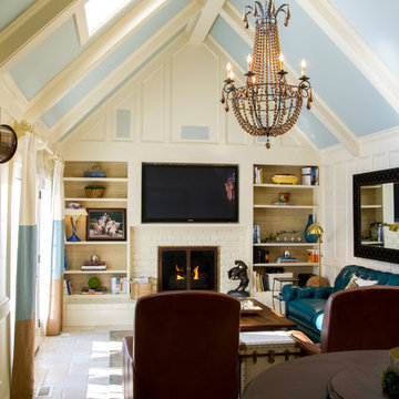
 LaMantia Design and Remodeling
Our empty nester clients purchased a lovely Burr Ridge cottage with the plan to create their dream home. Their main objective when they first met with LaMantia architectural designer Jackie Prazak was to create a kitchen large enough to accommodate their extended (and now grown) family. After several design revisions the clients agreed to give up a Bedroom and a Powder Room to gain the enlarged Kitchen, Walk-in Master Closet and a separate double-entry Laundry Room they so desired.
By moving the kitchen wall 3’ we were able to accommodate the large Kitchen and Island the clients so desired.
The main entry to the Kitchen was both moved and enlarged to enhance the arrival and the view into the enlarged space.
We were also able to reclaim attic space and create the volume ceiling with added beams to continue the theme of the Living and Dining Room ceilings. At this point LaMantia kitchen designer Katie Suva, CKD, CBD joined the team to begin the detailing of the cabinet layout.
The Family Room, with its new large stone flooring was recreated with specialties galore; including a walk-up wet Bar. We were also able to re-purpose the existing Study into a Guest Bedroom with built-in closets and cabinetry. What was once a laundry space now became a new large Laundry Room accessed from both the Master Walk-in Closet and the hallway.
In the Master Bedroom the exterior entry door was replaced with large open glass window panels. The Master Bath ceiling was reworked to accommodate a soaring Master Shower. And then there was the enlarged Master Closet that speaks for itself!
The existing Solarium took on a different personality with a re-aligned entry door and built-in cabinetry. This room now houses all the home office and craft activities.
The scope of this project included every room in the residence, with the utmost attention paid to every detail, and the outcome is definitely worthy of the Professional Remodeling 2014 Gold Award it just won!
Follow the link below to read about the designer of this project Jackie Prazak http://lamantia.com/designers/jackie-prazak/
 Advance Design Studio, Ltd.
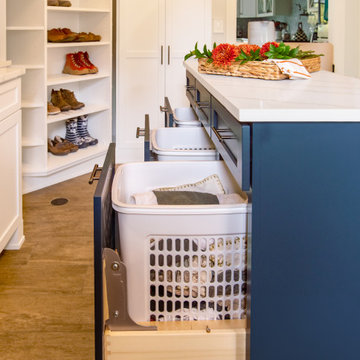
Laundry rooms and mudrooms can be a headache for many homeowners. They are usually cramped with poor functionality and little storage space. Joe and Kristin suffered all those aches and more, as their laundry room lacked clothing storage. Shoes were crammed in every corner. There was nowhere to fold clothes without taking them to the kitchen. They were ready for a complete laundry room remodel project.
Joe and Kristin interviewed several local remodeling companies but didn’t connect with anyone who could understand their vision. During the summer, when they were attending their son’s race venue, they noticed fellow kart racers Todd and Christine Jurs’ sponsor banner for their remodeling company, Advance Design Studio. Immediately they were thrilled that they knew someone they trusted who could handle the renovation.
“We wanted someone that we actually knew, who has a little bit more invested than an outside person that we don’t have any ties to,” Kristin said.
Project Designer Nicole Ryan came to their home in Warrenville for the initial consultation. Kristin, an avid HGTV viewer, brought her ideas to Nicole. Throughout the design process, they worked together designing the space, selecting materials, and choosing colors. Nicole made sure to incorporate Kristin’s must-haves into the finished laundry room remodel.
“It was really easy. Nicole made the transition very easy,” Kristin said of Nicole’s work in the design phase of the project. With the materials selected and the drawings finalized, it was time to begin construction. Kristin and Joe were impressed with how quickly and cleanly this phase went.
“Everyone that came in was very respectful, very neat, and that was a big part for me because I didn’t want dust going through the rest of my house,” Kristin said.
The new combination mudroom/laundry room is everything Kristin and Joe hoped. There is plenty of storage, three pull-out laundry hampers for presorting laundry, a large central island for folding clothes, a designated bar to hang dry, and even a unique rotating shoe rack to keep shoes from cluttering the space.
“My rotating shoe rack,” Kristin said when asked what her favorite part of her new laundry room was. “We have four kids. We have a lot of shoes and sporting events. So it makes sense to have all that space for shoes.”
The center island has an exceptional feature as well. It has wheels. Kristin wanted to be able to move the island out of the way for different functions in the room. An island with wheels can be placed wherever needed in the space.
The two existing closets were reconfigured with built-in closet storage systems to make them more functional than before with shelves for baskets holding gloves and hats, umbrellas, and coats.
“They love it,” Project Designer Nicole Ryan said. “They had a vision of how they wanted the space to function but didn’t know exactly how to get it there. My design took all their needs and used the most efficient products to get them the desired outcome. Tons of function, while still looking beautiful!”
The “White” Hudson Panel Dura Supreme cabinetry on the perimeter brightens the space and contrasts the popular blue “Gale Force” Dura Supreme cabinetry of the rolling island. The black and white encaustic design porcelain tile backsplash adds visual interest to the room above the white quartz countertops. Additionally, an oil-rubbed bronze bar for hanging clothes is conveniently located above the washer/dryer, and a stainless-steel under-mount sink with a matching Kohler faucet offers perfect functionality.
“I would definitely recommend Advance Design; they’ve been wonderful. They were so helpful. Any little changes we had, they were able to accommodate,” Kristin said.

Sponsored
Columbus, OH

Hope Restoration & General Contracting
Columbus Design-Build, Kitchen & Bath Remodeling, Historic Renovations
 Tile Doctor Ltd
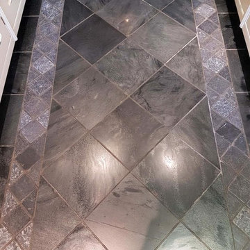
I was recently asked to survey an unusual stone floor at a house in in Harrogate comprising of Slate inlaid with Granite. The client advised that it had not been cleaned properly for 20 years and wanted it renovating! It was now definitely overdue a deep clean and professional attention. Fortunately, having worked on these floors for many years I knew I could make a substantial impact and transform its appearance. Fossilized slate is a beautiful stone when cleaned and sealed correctly.
The owner confessed they had actually been sealing the floor every two years but without a deep clean first, so they were effectively sealing in the dirt each time. I discussed with them the process I would use to clean and re-seal the floor and we agreed a price to carry to out the work.
To remove the layers of old sealer and dirt used a set of Tile Doctor Diamond Burnishing pads. The pads are attached to a rotary floor machine starting with the coarse 400-grit pad which was lubricated with a dilution of Tile Doctor Remove and Go to help strip the floor of dirt and layers of sealer. After rinsing and extracting the soil I worked through the different grades of pads in sequence finishing with the 1500-grit and this time using just water for lubrication.
A set of diamond handheld burnishing blocks were then used to clean up the edges and corners where the large 17” pads struggle to reach. This ensures all areas are treated and free of dirt and old sealer.
The floor was then rinsed and extracted again to remove the remaining soil. I find a wet vacuum is an invaluable tool for this. The floor was then left to dry out overnight ready for sealing the next day.
I returned the next day to seal the floor, first checking with a damp meter that the floor was dry, and the moisture reading was below the acceptable level. These results were fine, so I had a green light to continue and seal the stone.
The customer wanted a shine on the floor so rather than apply a satin sealer which I felt wouldn’t adhere to the stone properly I decided to polish the floor further with a the last of the four burnishing pads which is a very fine 3000-grit pad. You don’t need to use a lot of water with this last pad just a small amount sprayed onto the floor using a technique we refer to as a ‘Spray Burnish’.
To seal the floor, two coats of Tile Doctor Colour Grow were applied. This is an impregnating matt sealer which intensifies the natural colours of this beautiful stone and provides long lasting durable protection.
Even I was impressed with the finished result but more importantly the client was over the moon. To keep the floor looking its best I recommended they use Tile Doctor Stone Soap which is pH neutral. You should always read the label in detail when choosing a floor cleaning product as many are too strong and not recommended for sealed stone surfaces as they will prematurely erode the sealer.
Nigel Stoker
North West Yorkshire Tile Doctor
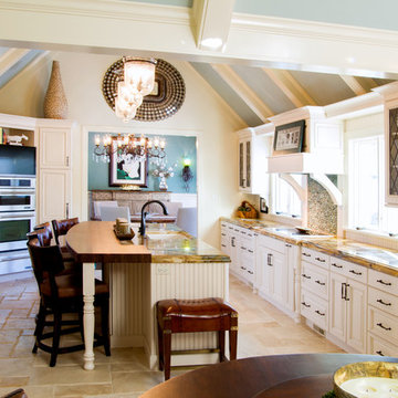 LaMantia Design and Remodeling
Our empty nester clients purchased a lovely Burr Ridge cottage with the plan to create their dream home. Their main objective when they first met with LaMantia architectural designer Jackie Prazak was to create a kitchen large enough to accommodate their extended (and now grown) family. After several design revisions the clients agreed to give up a Bedroom and a Powder Room to gain the enlarged Kitchen, Walk-in Master Closet and a separate double-entry Laundry Room they so desired.
By moving the kitchen wall 3’ we were able to accommodate the large Kitchen and Island the clients so desired.
The main entry to the Kitchen was both moved and enlarged to enhance the arrival and the view into the enlarged space.
We were also able to reclaim attic space and create the volume ceiling with added beams to continue the theme of the Living and Dining Room ceilings. At this point LaMantia kitchen designer Katie Suva, CKD, CBD joined the team to begin the detailing of the cabinet layout.
The Family Room, with its new large stone flooring was recreated with specialties galore; including a walk-up wet Bar. We were also able to re-purpose the existing Study into a Guest Bedroom with built-in closets and cabinetry. What was once a laundry space now became a new large Laundry Room accessed from both the Master Walk-in Closet and the hallway.
In the Master Bedroom the exterior entry door was replaced with large open glass window panels. The Master Bath ceiling was reworked to accommodate a soaring Master Shower. And then there was the enlarged Master Closet that speaks for itself!
The existing Solarium took on a different personality with a re-aligned entry door and built-in cabinetry. This room now houses all the home office and craft activities.
The scope of this project included every room in the residence, with the utmost attention paid to every detail, and the outcome is definitely worthy of the Professional Remodeling 2014 Gold Award it just won!
Follow the link below to read about the designer of this project Jackie Prazak http://lamantia.com/designers/jackie-prazak/
 User
UserReference: BB502EW-US
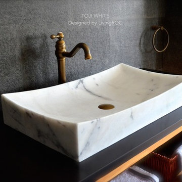
Model: TOJI WHITE
Color: White
Shape: rectangular
Finish: honed inside and outside
US Dimensions: 27.5" x 15.75" x 4.75"
EU Dimensions: 70 x 40 x 12cm
US Drain size: standard hole size (1.5")
Material: Marble
Shipping: CA=$39 - NY=$79 - FL=$73 - IL=$51...
Weight: 97 Lbs - 44 Kgs
TOJI WHITE is a 27"x16"X5" genuine interior DECO Guangxi White marble stone. The "Exceptional" cut in the block without any comparison with plastic and other chemical resin market often unaffordable. You will definitely not let anyone feel indifferent with this 100% natural stone unique in the US and exclusively available on Living'ROC.net.
Imagine creating a beautiful bathroom made from White polished marble. Discover the well-being and the restful feeling TOJI WHITE can give you. Its slim and sleek lines invite calm and serenity. Its four curved edges allow a large amount of water. This creation will give your bathroom a stunning look. Its grey color and its irresistible look make it one of the most incredible basins of the moment.
At LivingRoc we have chosen the most beautiful stones. All our bathroom sink are made from high quality, pure genuine materials that will last for years to come. Granite, Basalt, Marble are materials perfectly adapted to bathroom use.
TOJI WHITE is the creation of a combined group of talented masons dedicated to the idea of creating bathware made from natural material, which is environmentally friendly. Waterproofed TOJI WHITE is ready to use, sitting on a vanity counter top.
Our creation is delivered without an overflow drain (not included) - every US drains models you can find on the market will fit perfectly on Living'ROC vessel sink. This model is ready to use over the countertop.
The photos you see online have been taken with extreme care by our Founder CEO - Florent LEPVREAU to give our visitors an idea on how it might looks like. However product may vary from block to block as only mother nature decides what you may receive because each sink is unique. Therefore, we invite you to browse on our product portfolio to see the differences in each piece. We also draw your attention to the fact that veining, crystallization, that may appear to be cracks, but are actually indigenous to the stone, and other variations of colors up to 30% and more sometime (often on marble and onyx) and various stone features make all the charm of the stone and distinguish it from non-natural materials! Torrence White , Bali White, Toji White, Pegasus white, tahiti White, Rondo White are all made and carved from the same Guangxi White Marble and it can't be considered as a pure white as you can see. Our Quality Control photos shown on our portfolio are not available to choose by numbers.
 RNR Designs
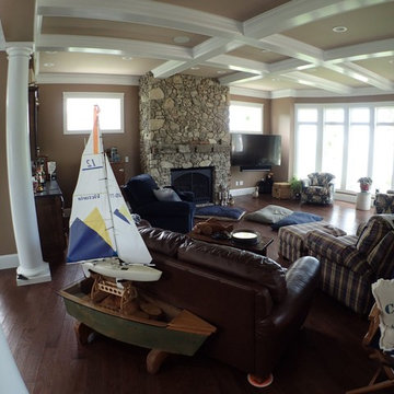
Lakeside home rendered in a simple Catawba Coastal style, takes advantage of challenging site while focusing interior views on long range lake views to west and northeast. Sited on a craggy geological outcropping of (2) different limestone types, this site was dismissed as unbuildable for years. Creating this classic from studying J.H. Bellows , a turn-of-the-century developer and architect on Catawba Island, meant use of simple elements with a touch of panache. This unique site, required out-of-the-box thinking to meld casual living with the marvelous views. Open spaces; 1st floor Owner Suite; ease of access; unique guest suites highlight the design features. Tuscan columns create area definition.
 My Kitchen And Bath
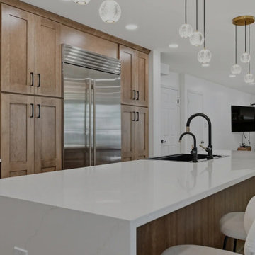
A complete kitchen and powder room remodel in Herndon, Virginia, designed around two clear priorities: open up the kitchen to the rest of the main level, and create an experience that felt warm and timeless rather than trendy.
The original layout had a wall separating the kitchen from the dining room and an awkward fridge wall that limited both storage and traffic flow. Our solution involved removing the dividing wall (confirmed non-load-bearing), tightening the new dining room opening to 66 inches, and extending the fridge wall 25 inches into the kitchen to create a proper full-height pantry run. The result is a kitchen that breathes — open to the dining and living areas, with clear sight lines from the island to the bay windows at the far end.
Design Approach
The clients came in knowing they didn't want white. They didn't want navy. They wanted something with real wood character — the kind of finish that ages well and looks more like furniture than stock kitchen cabinetry. Cherry was the answer to that question.
We anchored the room around contrast: warm cherry cabinetry against clean white walls and white quartz, black hardware grounding the cherry's warmth, and a single waterfall island acting as the architectural focal point. Stainless appliances, brushed gold pendant accents, and the herringbone hardwood floor pull the room together without any one element shouting for attention.
The Cabinetry
Medallion Gold Line Sonoma Cappuccino — a stained cherry finish that catches light differently throughout the day. All-plywood box construction, solid wood doors and drawer fronts, soft close everywhere, US-made with a lifetime warranty. Four pull-out drawers built into the pantry bottoms keep the deep storage actually usable rather than a black hole.
Cabinet hardware is Top Knobs Riverside Pulls in flat black — 40 pulls across drawers and doors, plus three longer pulls on the 36-inch base drawers. The black was a deliberate decision: with cherry and stainless already providing warm and cool tones, brass or gold would have been one warm tone too many. Black grounds the cabinetry and gives the kitchen its architectural definition.
The Island and Countertops
MSI Calacatta Miraggio Gold quartz throughout — perimeter counters, island, waterfall ends, and the powder room. The Gold variant has subtle warm veining that pairs with cherry where cooler whites would have fought the wood tone.
The island gets a full waterfall edge — slabs book-matched, miters precise, the finished edge essentially seamless. Treating the island as architectural sculpture rather than just functional storage. The black undermount farmhouse-style sink ties back to the hardware throughout the rest of the kitchen.
The Backsplash
MSI Metro Gold tile — small format white and gold tiles in a herringbone-adjacent pattern with intermittent gold accents. Full height, continuous behind the floating shelves and behind the hood.
Four custom floating shelves are spaced above a 3-inch countertop ledge: first shelf 18 inches above the ledge, second shelf 9 inches above that, third 18 inches above the second. The shelves are stained to match the cabinetry. The backsplash continues behind the shelves and behind the hood, so the wall reads as a continuous textured surface that the shelves and hood float in front of.
The Appliances
This is a serious cooking kitchen. The clients chose a 48-inch Wolf gas range, a Sub-Zero built-in refrigerator integrated into the cherry cabinet wall, a Wolf microwave drawer in the island base, and a Bosch dishwasher. For ventilation, we installed a 1200 CFM hood paired with a make-up air system to balance the negative pressure that hood pulls. New ducting was routed through the exterior siding on the side of the house.
The Flooring
MSI engineered hardwood throughout the entire main level — approximately 800 square feet — installed in a Bramlett herringbone pattern. Herringbone adds roughly 15-20 percent to material and labor costs because of the angled cuts and waste factor, but the result is a floor that reads as more considered and luxurious than standard plank flooring. Finished with 4.5-inch white wood baseboards throughout.
The Powder Room
A small room with a big personality. The clients chose a deep blue and teal scallop pattern wallpaper (client-supplied, we installed) and paired it with the same Sonoma Cappuccino cherry vanity used in the kitchen — material continuity between the spaces.
Powder room countertop is the same MSI Calacatta Miraggio Gold quartz from the kitchen with a rectangular white undermount sink. Hardware on the powder room vanity is Top Knobs Riverside in honey bronze rather than the kitchen's flat black — the warm bronze pulls the brass tones from the faucet into the millwork and complements the wallpaper. New sconce, kept the existing toilet (refinishing or replacing a working toilet is wasted money in a powder room remodel), and a Panasonic Whisper Green exhaust fan.
Project Specs
Location: Herndon, Virginia
Project type: Combined kitchen and powder room remodel
Project duration: Approximately 4 to 6 weeks
Style: Transitional, Modern Farmhouse, Warm Wood Contemporary
Color palette: Cherry, white, black, brushed gold, deep blue (powder room)
Materials
Cabinetry (kitchen and powder room): Medallion Gold Line Sonoma Cappuccino cherry, Shaker-style, all-plywood box construction, lifetime warranty
Kitchen hardware: Top Knobs Riverside Pulls in flat black (TK1014BLK and TK1017BLK)
Powder room hardware: Top Knobs Riverside Pulls in honey bronze (TK1012HB)
Counter tops: MSI Calacatta Miraggio Gold Quartz, pencil edge, waterfall island
Backsplash: MSI Metro Gold tile, full height
Floating shelves: 4 custom shelves at 48" by 9", stained to match cabinets
Range: 48-inch Wolf gas range
Refrigerator: Sub-Zero built-in
Microwave: Wolf microwave drawer (island base)
Hood: 1200 CFM with make-up air system
Kitchen sink: Kohler farmhouse-style, 36-inch base, black
Kitchen faucet: Brizo (homeowner-supplied)
Flooring: MSI engineered hardwood in Bramlett herringbone pattern, approximately 800 sq ft
Baseboards: 4.5-inch white wood throughout
Powder room wallpaper: Client-supplied scallop pattern in blues and teals
Powder room exhaust fan: Panasonic Whisper Green
Paint: Benjamin Moore
Designed and built by My Kitchen and Bath out of our Herndon showroom at 285 Sunset Park Drive. We've been designing and building kitchens, bathrooms, and full home renovations across Northern Virginia and the DMV since 1994.
 Murals and Decorative Painting by Shannon Geis
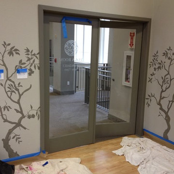
I love these matching chinoiserie trees. They could go almost anywhere. Silhouette is a pretty fast way to do chinoiserie. There is a bit of texture on the leaves as I watered down the paint a bit so you could see some brush definition/direction.

 Robin's Nest Interiors
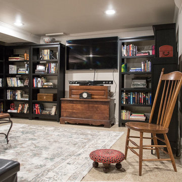
For the second phase, we moved down to the Basement. We kept the friendly sloth – what better way to invite folks on down?
Again we lightened up the walls and created different sections in the large open area. We were able to display some wonderful antiques and art pieces in this Landing. The antique dresser is the perfect for the sloped ceiling and a great source for storage.
We repositioned the loveseat along the longest wall and created a built-in effect with the homeowner’s bookcases.
The homeowners are avid readers so we organized their book collection and mixed in found objects like an old radio and typewriter to keep the shelving interesting.
The homeowners told me that they rarely used their Basement prior to the redesign, and now it is one of their favorite spots in the home. That’s definitely what we like to hear! Enjoy!

 User
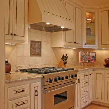
UserWhen it came time to remodel their kitchen, a Napa couple knew exactly who to call. Having previously worked with Castle Rock Construction on a basement renovation, the homeowners chose Castle Rock.
Although it had served them well, the homeowners wanted something different for their kitchen—something that exemplified their sense of style and had an open floor plan.
Starting with a spark of an idea, they were looking for talented craftsmen to make their French Country dream kitchen a reality. That’s where the artistry and craftsmanship of Tim Metcalfe and Jay Coleman from Castle Rock’s custom cabinet shop came into the picture.
“This isn’t your basic Shopsmith kitchen,” Tim said. “With our complete cabinet shop, we were able to meet all the challenges a project like this presents.”
Tim and Jay created one-of-a-kind kitchen elements that matched pre-existing furniture pieces. The custom wood stove hood, and wood refrigerator door cover look remarkably like an armoire the homeowners already possessed.
“Legs and feet on furniture are fairly common place,” Tim said, “but we managed to round out the homeowners’ look by creating them for the island and the sink areas. We even created top rails with a radius.”
Castle Rock credits Napco Finishing for the final, installed look. In the two months it took to complete the project, the kitchen was completely renovated, a pantry was created with cupboards strategically placed to hide a pesky staircase to the basement, and a new entry staircase was constructed to take advantage of the light and lines of the existing foyer.
“Having our cabinet shop is definitely an advantage when meeting our clients’ needs. It gives our clients many more options that they are not likely to find elsewhere,” Jim Pitcher, president of Castle Rock, said. “It allows us to finish a remodel with truly unique products that simply aren’t available from big box outlets.”
The cabinet shop is just one of the many ways Castle Rock Construction delivers the highest quality of construction to discriminating homeowners. With an entire cadre of trade professionals, there’s little that can be imagined, that can’t be delivered.
 Alair Homes Plano
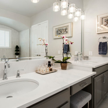
Our clients came to us wanting to update their Heather Ridge Estates 2006 Frisco home. They had lived in the home for over 10 years and were ready for a change but didn’t want to move. They lived directly across from Cottonwood Park, so they definitely weren’t going to find that view anywhere else! They wanted to lighten up the kitchen without removing or painting the beautiful dark wood cabinets and they wanted to update two bathrooms. In the master bathroom, they wanted to keep the cabinets but paint them but wanted to gut and replace everything else. They wanted to do the same in the guest bath, which was very traditional. They wanted something more modern with clean lines.
In the kitchen, we installed sleek Silestone Calacatta Gold Quartz- polished countertops with a timeless Emser Motif in Lace White 4x12 backsplash. Class stainless Moen Arbor MotionSense Wave High Arc Kitchen Faucet was installed above their Blanco Silgranit double bowl undermount sink. The existing floors remained as is and they kept their existing pendant lights that hung over the kitchen peninsula but it all looks different now. Before, this kitchen was much darker, but now, it is classic and timeless.
In the master bathroom, the cabinets were painted Sherwin Williams Elephant Ear and topped them with polished Silestone Calacatta Gold Quartz. Greyson vanity lights in polished chrome were installed above each his and hers sinks. Two Kohler Caxton Oval 17x14 under-mount bathroom sinks were installed with polished chrome Kohler Archer sink faucet. The shower was completely gutted and redone. The shower floor is a cool Bedrosians Hemisphere Floor & Wall Mosaic in Balboa tile. Shower sidewalls, as well as the main floor tile, is Purestone 12x24 tile in Bianco Matte Finish. Kohler Artifacts Showerhead with Katalyst Spray in Polished Chrome was installed, as well as a shower arm. Kohler Archer Deck-mount bath faucet in polished chrome was installed. The tub deck was changed to the Purestone 12x24 tile in Bianco with a Matte Finish. Purestone 12x24 tile in Bianco Muretto Textured Finish was used for the Tub/Shower Accent Back Wall.
In their guest bath, everything except the bathtub was replaced. We started with a Shaker style Chiffon painted finish single vanity by Quality Cabinets, topped with polished Silestone Calacatta Gold Quartz. Our clients chose a Kohler Caxton Oval 17x14 under-mount bathroom sink and Kohler Archer Sink Faucet keeping consistency throughout their house. Kohler Archer hardware was also used in the bathtub/shower combo. An Ashton 3 Light 23" wide vanity light with clear glass shades in polished chrome was installed above the 25.6” Travis Round Wood Accent Mirror to finish it off. This bathroom is completely renewed and classic, as is the master bathroom and their kitchen!


 MIG Furniture Design, Inc.
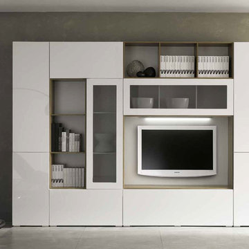
Italian Wall Unit Kubo 09 by Artigian Mobili. Kubo wall unit collection is definitely something unique! Kubo is a mixture of modern design, art, functionality that is complemented by your creative individuality. These wall unit compositions offer lots of customization options that can only be limited by your imagination. Great selection of units that are available in different sizes and can be ordered in ANY RAL COLOR you need! You can select from our pre-designed compositions or build your own according to your own scratches or interior design projects.
Please contact our office regarding customization of this wall unit composition.
MATERIAL/CONSTRUCTION:
Structure - 18 mm thick wooden particles melamine panels
Doors and drawers are made of 18 mm thick MDF with Polymeric Finish
Soft closing slow-motion hardware in nickel-plated steel
Handles and base socket in anodized aluminum
Optional Lights CE marked and comply with the directives 93/68/EEC and 92/31/EEC
The starting price is for the Wall Unit Composition as shown in the main picture in Matt White Lacquer / Gray Oak Finish (Structure) and White Gloss Polymeric Finish / Gray Glass with Gloss White Frame (Fronts). The Lights are not included in the price!
Dimensions:
Wall Unit: W124" x D14.5" x H90.2"
TV Space: W52" x H34"
 User
UserWhen it came time to remodel their kitchen, a Napa couple knew exactly who to call. Having previously worked with Castle Rock Construction on a basement renovation, the homeowners chose Castle Rock.
Although it had served them well, the homeowners wanted something different for their kitchen—something that exemplified their sense of style and had an open floor plan.
Starting with a spark of an idea, they were looking for talented craftsmen to make their French Country dream kitchen a reality. That’s where the artistry and craftsmanship of Tim Metcalfe and Jay Coleman from Castle Rock’s custom cabinet shop came into the picture.
“This isn’t your basic Shopsmith kitchen,” Tim said. “With our complete cabinet shop, we were able to meet all the challenges a project like this presents.”
Tim and Jay created one-of-a-kind kitchen elements that matched pre-existing furniture pieces. The custom wood stove hood, and wood refrigerator door cover look remarkably like an armoire the homeowners already possessed.
“Legs and feet on furniture are fairly common place,” Tim said, “but we managed to round out the homeowners’ look by creating them for the island and the sink areas. We even created top rails with a radius.”
Castle Rock credits Napco Finishing for the final, installed look. In the two months it took to complete the project, the kitchen was completely renovated, a pantry was created with cupboards strategically placed to hide a pesky staircase to the basement, and a new entry staircase was constructed to take advantage of the light and lines of the existing foyer.
“Having our cabinet shop is definitely an advantage when meeting our clients’ needs. It gives our clients many more options that they are not likely to find elsewhere,” Jim Pitcher, president of Castle Rock, said. “It allows us to finish a remodel with truly unique products that simply aren’t available from big box outlets.”
The cabinet shop is just one of the many ways Castle Rock Construction delivers the highest quality of construction to discriminating homeowners. With an entire cadre of trade professionals, there’s little that can be imagined, that can’t be delivered.
 ASP - America's Swimming Pool Company of Dallas
Darren Kesler, Pool Renovation Manager, 214.503.7171
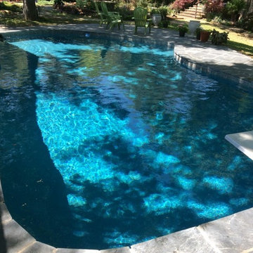
Pool - contemporary pool idea in Dallas
Pool - contemporary pool idea in Dallas
53