
Search results for "Deliberation" in Home Design Ideas
 Klopf Architecture
Built for the Bluff, A Sea Ranch Home is Remade from the Inside Out
The house had always been grounded, on an ocean bluff at The Sea Ranch. It sits unencumbered, adjacent to one of the most dramatic stretches of the Sonoma coast with protected commons meadow to the east, uninterrupted Pacific views to the west, and a bluff trail running alongside. What it lacked was the feeling of home, one that could hold up its own against the natural landscape.
The owners are entrepreneurs with deep involvement across tech, real estate, and development and they know how things are built. The Sea Ranch house had been in their lives for years, a second residence and a place for family to gather. Built for a different time, it felt more compromising than comfortable. Sitting in a closed off nook, the kitchen fit one cook at a time and turned its back on the rest of the house. The entry was dim and compressed, divided by a structural column that presented itself at exactly the wrong moment. The primary suite was small relative to the view outside it. A large rear bedroom sat behind a lowered ceiling with a bathroom that had never been added. The house was certainly worth the trouble of doing it right.
What followed was not one project but four, each with its own design challenge, each addressed over a period of time.
Where the House Meets the Ocean
The most complex piece of the project, in both structural and spatial terms, was the kitchen expansion. The existing room was a single-person galley squeezed in as an afterthought with no meaningful connection to the dining room, the living space, or the deck outside. To make it useful for a family that cooks and gathers, it needed to grow outward into an existing patio and flow into the rooms around it.
A big challenge was the roofline. Several planes at different pitches and angles converged directly where additional volume was needed. A new form had to join that geometry without reading as a correction. The solution found the simplest possible connection between the existing angles, a roofline that from outside the structure, appears entirely original. From the bluff trail where the addition is visible, there is no discernible seam.
Inside, the kitchen is now open to the living and dining rooms without interruption. A large sliding glass door connects the space onto the rear deck. The deck itself was expanded and oriented so that the body of the house shields it from the coastal wind which is a common consideration that determines whether outdoor space at The Sea Ranch actually gets used. The result is a room that works for large family gatherings where no one feels cutoff, and one that makes the boundary between being inside and outside easy to ignore.
Welcoming Light
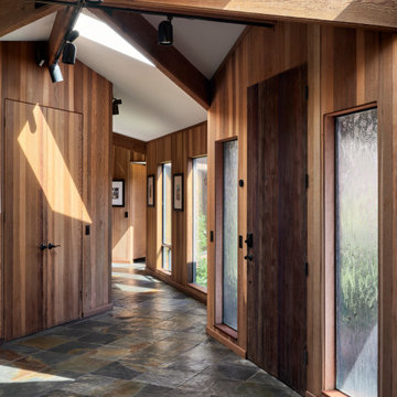
A structural column stood at the convergence of eight distinct roof planes in the entry. It was load-bearing, but it was also the reason the entry had always felt like a hallway rather than a welcoming arrival.
With the structural engineer, a custom steel connector was designed to receive beams from six separate directions, redistributing the load through a single new continuous beam. The column was surgically removed. Three triangular skylights were then cut into the roof above, their shapes drawn from the
existing geometry of the planes around them. The entry is now bright and open. The skylights feel native to the structure because they follow the logic already present in the roof.
Two Suites, Two Views
At opposite ends of the house, the two bedroom suites were each reconfigured, and each found a different way to introduce more of the landscape into the room.
An addition to the primary suite extended the structure outward to create a wraparound plan with a loop from the bedroom through bath and closet that had not been possible before. The expansion opened a slot view from the tub and shower toward the ocean. The view is precise and private. The ocean view is present and deliberate.
The rear bedroom absorbed an adjacent storage room to transform it into a full second suite with a vaulted ceiling, a large bathroom with a tub, a shower, and a sauna. A private fenced garden courtyard sits just beyond the glass bringing the outdoors inside. The tub was placed so that, looking past the courtyard and through the bedroom beyond, the ocean is visible at the far end. It is a long view and it makes the room feel larger and more settled than its footprint would suggest.
Glass on Four Sides, Fire at the Center
The main living and gathering room had always been caught between two competing facts: glass on four sides meant exceptional views but at The Sea Ranch, it also meant a cold room. A 360-degree cylindrical fireplace was added at the center on a raised stone base, providing radiant heat in every direction and giving the room a focal point around which a group naturally orients itself, whether that means two people at the end of the day or the whole family after dinner.
Owners Who Picked Up the Tools
The owner was not a passive client. they came with construction knowledge, specific ideas, and the desire to be an active part of the process, a dynamic that other architects may had found difficult, which Klopf Architecture accepted as an asset. They took it upon themselves to complete some of the work during construction, including the installation of a new radiant heating system beneath the floors.
The radiant system added to the older and less-desirable forced-air setup. At The Sea Ranch, that change matters as the house sits close enough to the ocean and moving air competes with the sound of it, where radiant heat does not. Solar panels were added to the roof as part of the new system. Insulation was upgraded throughout the walls, roof, and crawl space. The house that had always had the right setting now holds warmth the way a house on the bluff should.
They were also deeply involved in the design and selections throughout, and the finished house reflects both of them in ways that are specific rather than generic. The process took longer and moved through more iterations than a more arms-length relationship might have allowed. The result is more defined and personal because of it.
The Landscape Holds Priority
Every exterior decision was shaped by The Sea Ranch Design Standards, which require that buildings defer to the landscape around them rather than compete with it. Because this house sits on the bluff and is visible from the public trail, the additions faced a close review. Existing materials were matched. Geometries were resolved. The additions had to become indistinguishable from the original building.
From the trail, the house reads exactly as it always has — low, cedar-clad, secondary to the meadow and the water. The setting holds priority. Inside, the house has been remade.
Klopf Architecture Project Team: Geoff Campen and Trenton Jewett
Contractor: Shawn Bettega Construction
Photography: ©2025 Mariko Reed
Year Completed: 2023
Location: The Sea Ranch, CA
 Klopf Architecture
Built for the Bluff, A Sea Ranch Home is Remade from the Inside Out
The house had always been grounded, on an ocean bluff at The Sea Ranch. It sits unencumbered, adjacent to one of the most dramatic stretches of the Sonoma coast with protected commons meadow to the east, uninterrupted Pacific views to the west, and a bluff trail running alongside. What it lacked was the feeling of home, one that could hold up its own against the natural landscape.
The owners are entrepreneurs with deep involvement across tech, real estate, and development and they know how things are built. The Sea Ranch house had been in their lives for years, a second residence and a place for family to gather. Built for a different time, it felt more compromising than comfortable. Sitting in a closed off nook, the kitchen fit one cook at a time and turned its back on the rest of the house. The entry was dim and compressed, divided by a structural column that presented itself at exactly the wrong moment. The primary suite was small relative to the view outside it. A large rear bedroom sat behind a lowered ceiling with a bathroom that had never been added. The house was certainly worth the trouble of doing it right.
What followed was not one project but four, each with its own design challenge, each addressed over a period of time.
Where the House Meets the Ocean
The most complex piece of the project, in both structural and spatial terms, was the kitchen expansion. The existing room was a single-person galley squeezed in as an afterthought with no meaningful connection to the dining room, the living space, or the deck outside. To make it useful for a family that cooks and gathers, it needed to grow outward into an existing patio and flow into the rooms around it.
A big challenge was the roofline. Several planes at different pitches and angles converged directly where additional volume was needed. A new form had to join that geometry without reading as a correction. The solution found the simplest possible connection between the existing angles, a roofline that from outside the structure, appears entirely original. From the bluff trail where the addition is visible, there is no discernible seam.
Inside, the kitchen is now open to the living and dining rooms without interruption. A large sliding glass door connects the space onto the rear deck. The deck itself was expanded and oriented so that the body of the house shields it from the coastal wind which is a common consideration that determines whether outdoor space at The Sea Ranch actually gets used. The result is a room that works for large family gatherings where no one feels cutoff, and one that makes the boundary between being inside and outside easy to ignore.
Welcoming Light
A structural column stood at the convergence of eight distinct roof planes in the entry. It was load-bearing, but it was also the reason the entry had always felt like a hallway rather than a welcoming arrival.
With the structural engineer, a custom steel connector was designed to receive beams from six separate directions, redistributing the load through a single new continuous beam. The column was surgically removed. Three triangular skylights were then cut into the roof above, their shapes drawn from the
existing geometry of the planes around them. The entry is now bright and open. The skylights feel native to the structure because they follow the logic already present in the roof.
Two Suites, Two Views
At opposite ends of the house, the two bedroom suites were each reconfigured, and each found a different way to introduce more of the landscape into the room.
An addition to the primary suite extended the structure outward to create a wraparound plan with a loop from the bedroom through bath and closet that had not been possible before. The expansion opened a slot view from the tub and shower toward the ocean. The view is precise and private. The ocean view is present and deliberate.
The rear bedroom absorbed an adjacent storage room to transform it into a full second suite with a vaulted ceiling, a large bathroom with a tub, a shower, and a sauna. A private fenced garden courtyard sits just beyond the glass bringing the outdoors inside. The tub was placed so that, looking past the courtyard and through the bedroom beyond, the ocean is visible at the far end. It is a long view and it makes the room feel larger and more settled than its footprint would suggest.
Glass on Four Sides, Fire at the Center
The main living and gathering room had always been caught between two competing facts: glass on four sides meant exceptional views but at The Sea Ranch, it also meant a cold room. A 360-degree cylindrical fireplace was added at the center on a raised stone base, providing radiant heat in every direction and giving the room a focal point around which a group naturally orients itself, whether that means two people at the end of the day or the whole family after dinner.
Owners Who Picked Up the Tools
The owner was not a passive client. they came with construction knowledge, specific ideas, and the desire to be an active part of the process, a dynamic that other architects may had found difficult, which Klopf Architecture accepted as an asset. They took it upon themselves to complete some of the work during construction, including the installation of a new radiant heating system beneath the floors.
The radiant system added to the older and less-desirable forced-air setup. At The Sea Ranch, that change matters as the house sits close enough to the ocean and moving air competes with the sound of it, where radiant heat does not. Solar panels were added to the roof as part of the new system. Insulation was upgraded throughout the walls, roof, and crawl space. The house that had always had the right setting now holds warmth the way a house on the bluff should.
They were also deeply involved in the design and selections throughout, and the finished house reflects both of them in ways that are specific rather than generic. The process took longer and moved through more iterations than a more arms-length relationship might have allowed. The result is more defined and personal because of it.
The Landscape Holds Priority
Every exterior decision was shaped by The Sea Ranch Design Standards, which require that buildings defer to the landscape around them rather than compete with it. Because this house sits on the bluff and is visible from the public trail, the additions faced a close review. Existing materials were matched. Geometries were resolved. The additions had to become indistinguishable from the original building.
From the trail, the house reads exactly as it always has — low, cedar-clad, secondary to the meadow and the water. The setting holds priority. Inside, the house has been remade.
Klopf Architecture Project Team: Geoff Campen and Trenton Jewett
Contractor: Shawn Bettega Construction
Photography: ©2025 Mariko Reed
Year Completed: 2023
Location: The Sea Ranch, CA
 Ward+Blake Architects
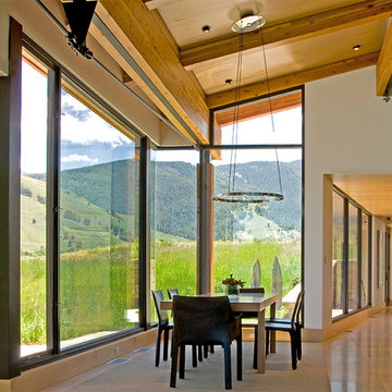
Located on a flat, open, grass-covered site amid wraparound views of the Teton and Gros Ventre ranges, the deliberately unobtrusive Tennican residence facilitates a clear dialogue between enclosed and natural space. Designed by Ward+Blake Architects in Jackson, Wyoming.
Photo Credit: Douglas Khan
Find the right local pro for your project
 Century Stair Company
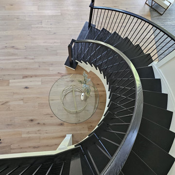
A single curve does a lot of work here. Rising from the main level to a wraparound balcony above, this staircase earns its place at the center of the home — not just structurally, but visually. Black iron balusters and handrails push against crisp white risers in a contrast that feels deliberate rather than decorative. The open floor plan gives it room to breathe, letting the curve read as architecture rather than furniture. The result is a staircase that creates movement even when no one is on it.
1976-2026 © Century Stair Company
 Studio41 Home Design Showroom
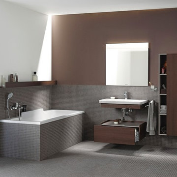
DURASTYLE. NEW FREEDOM IN THE BATHROOM. | An understated ambience creates a sense of serenity, giving one a moment to breathe deep and relax. Like DuraStyle: designed by Matteo Thun & Partners, the bathroom series is deliberately understated – and therefore able to blend harmoniously into any environment. It is its simplicity of form that makes DuraStyle so unique: a narrow, elegant ceramic edge and the mixture of open and closed furniture units with different decor finishes and real wood for the furniture accessories defines that individuality. With Design, variety and an attractive price / performance ratio Durastyle sets a new standard in the bathroom, in the Home as well as in the Project area. | Available at www.ShopStudio41.com
 Century Stair Company
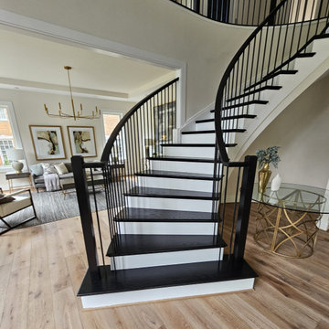
A single curve does a lot of work here. Rising from the main level to a wraparound balcony above, this staircase earns its place at the center of the home — not just structurally, but visually. Black iron balusters and handrails push against crisp white risers in a contrast that feels deliberate rather than decorative. The open floor plan gives it room to breathe, letting the curve read as architecture rather than furniture. The result is a staircase that creates movement even when no one is on it.
1976-2026 © Century Stair Company
 EAG Studio
Reimagining an Urban Classic
Perched high above San Francisco’s Cow Hollow neighborhood, this meticulously reimagined residence represents a thoughtful transformation of a classic urban home into a contemporary, light-filled sanctuary. The project involved a comprehensive renovation paired with both vertical and horizontal expansion, dramatically increasing the home’s footprint while enhancing its relationship to sweeping views of the Bay, the Palace of Fine Arts, and the surrounding hillside neighborhoods.
The design strategy focused on opening the home to light, air, and vistas—elements often constrained in the dense urban fabric of San Francisco. By extending the structure upward and outward, the architects created a dynamic four-level residence that unfolds gradually, culminating in expansive living spaces and rooftop terraces oriented toward panoramic city and water views.
Architecture that Frames the View
At the heart of the design is a careful orchestration of sightlines and natural light. Large black-framed windows punctuate the façade and interior spaces, deliberately positioned to capture iconic San Francisco vistas while flooding the home with daylight. The architecture prioritizes openness, allowing rooms to flow seamlessly while maintaining a strong visual connection to the surrounding landscape.
A dramatic skylight above the central stairwell anchors the vertical circulation of the home. This architectural gesture not only brings daylight deep into the interior but also reinforces the sense of spatial continuity between floors.
Warm Modern Interiors
Inside, the home balances architectural clarity with warm materiality. Wide-plank oak floors run throughout the residence, creating visual cohesion and grounding the interiors with natural warmth. Custom walnut millwork—integrated shelving, cabinetry, and wall panels—introduces depth and texture while complementing the clean lines of the architecture.
The interiors are intentionally restrained yet richly layered. Contemporary furnishings, sculptural lighting, and curated artwork add personality while maintaining the calm, sophisticated palette that defines the home.
The Social Heart of the Home
The main living level serves as the social centerpiece of the residence. An open-plan kitchen, dining area, and lounge space unfold toward the view, creating an environment that feels both expansive and intimate.
A sculptural marble island anchors the kitchen, functioning as both workspace and gathering hub. Surrounded by walnut cabinetry and professional-grade appliances, the kitchen merges elegance with functionality. Above, a cascading chandelier introduces a sense of vertical movement, reflecting the home’s emphasis on light and architectural rhythm.
Living areas are arranged to encourage conversation and connection. Generous seating, layered rugs, and thoughtful lighting define distinct zones within the open plan while maintaining uninterrupted sightlines toward the cityscape beyond.
Private Retreats Above the City
Upper levels of the home are dedicated to quieter, more intimate spaces. The primary suite is conceived as a private retreat, where expansive windows frame treetop views and invite natural light throughout the day.
The accompanying bathroom continues the home’s refined material palette. Marble surfaces, warm wood cabinetry, and brushed brass fixtures create a spa-like environment that balances luxury with tranquility.
Additional bedrooms and flexible living spaces offer comfort for family and guests, each designed with the same attention to light, proportion, and material richness.
Spaces for Entertaining
Lower levels provide additional areas for gathering and entertaining. A lounge and bar area offer a relaxed setting for hosting, while custom wine storage adds a sophisticated touch for collectors and enthusiasts.
These spaces transition easily to outdoor areas, reinforcing the home’s emphasis on indoor-outdoor living.
A Rooftop Above the Neighborhood
The transformation extends beyond the interior to include thoughtfully designed outdoor spaces. A landscaped rear yard introduces greenery and privacy at ground level, offering a serene urban escape.
Above it all, the rooftop terrace becomes the crown jewel of the residence. Elevated above the neighborhood, it provides sweeping views of the San Francisco Bay and the Palace of Fine Arts. Comfortable seating areas, lush planters, and open sky create an ideal setting for outdoor entertaining, sunset gatherings, or quiet moments overlooking the city.
A Contemporary Urban Sanctuary
The completed residence demonstrates the power of thoughtful renovation and expansion within a historic urban neighborhood. By combining contemporary architecture, warm materiality, and an intentional relationship to the surrounding landscape, the project transforms a traditional San Francisco home into a modern sanctuary above the city.
 Lola Cwikowski Studio
An Ohio family in search of a place to enjoy the Portuguese coast acquired a four-bedroom apartment just outside the center of Cascais. Our studio was engaged to turn a compartmented interior into a holiday residence for a household that gathers in numbers: one that could seat everyone at once and still hold the ease and lightness of a home by the beach.
The original plan included a kitchen and laundry room sealed off from the living room, floor finishes and levels that changed from threshold to threshold, and bathrooms in varying styles. Work began by redefining the alignments and circulation. The principal transformation was the opening of the kitchen, creating a more generous social setting centered on a bespoke island fitted with storage and seating.
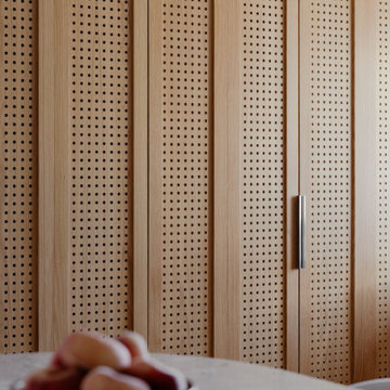
The interior takes its cues from the building’s geometric façade, which projects and recedes in volumes and voids. Bespoke joinery in oak and lacquer carries continuity and order through the apartment. Concealed storage runs throughout: at the entrance, in the dining area, along the living area, and beneath built-in benches. The laundry is merged into the kitchen behind perforated doors for ventilation while keeping the service area discreet. Behind the sofa, a console slips a workspace into the living area without conceding its openness.
Curved elements answer the rectilinear architecture; artisanal glazed vertical tiles repeat from the backsplashes onto custom side tables. The palette stays deliberately narrow; the muted oak and lacquer are joined by a softened timber floor, Portuguese Lioz stone, and walls painted to the color of bare plaster. Existing doors and baseboards were repainted in a warm light gray that draws the original elements into the language of the new interior. Upholstery and decorative accents hint at the terracotta, sky blue, and yellow of the façade.
The bedrooms are set with upholstered headboards on oak frames, bedside tables that extend those outlines, and wardrobes fit for a long stay. Locally made rugs, bedcovers, and throw pillows soften the composition. In the bathrooms, the plans were reorganized and the showers enlarged. Lioz was used for the counters and sinks, shelves, shower bases, and bathtub surround, with microcement bringing a soothing warmth to the walls, and storage in floating cabinets. Deeper in tone than the rest of the apartment yet never dim, they are quietly elegant rooms made for lingering — taking one’s time getting ready, or unwinding at the end of a day.
PHOTOGRAPHY: © ALEXANDER BOGORODSKIY
 JRP Design & Remodel
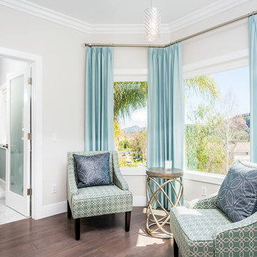
This transitional-meets-glam revival home blends hints of traditional inspiration with chic and glamorous details to create a timeless and class design. The clean, deliberate lines of the architectures meet ornate and organic shapes in the design elements to achieve a pristine yet comfortable environment. Mixing rich and contemporary materials-such as Carrera Marble with Caesarstone-along with glitzy lighting, furnishings and accessories result in a vision of vintage glamour and classic living.
Photographer: Clarified Studios
 Wendel Klein Builders, Inc.
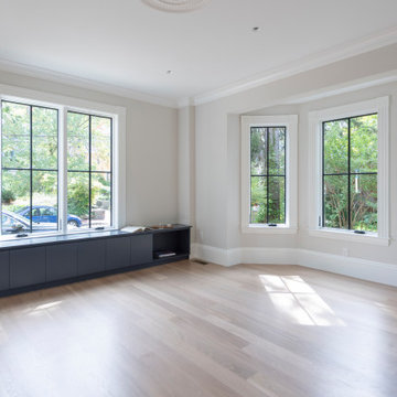
This expansive Cambridge residence was ready for a new chapter, and Wendel Klein Design Build was honored to lead the transformation. By meticulously remodeling both the interior and exterior, we struck a deliberate balance between modern functionality and historic charm. The result is a home that feels entirely current while honoring its original soul.
 Metropolis Drafting and Construction Inc
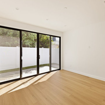
Today’s investment landscape in California features a surge in transforming single-family lots into vibrant multi-family residences, facilitated by recent SB9 and ADU laws. This project exemplifies how a modest 6,750-square-foot lot can accommodate a 1,500-square-foot primary home alongside a 2,500-square-foot duplex, seamlessly integrating design, functionality, and neighborhood aesthetics.
The primary residence underwent a meticulous interior transformation, evolving from a 3-bedroom, 1.5-bath layout into a spacious 4-bedroom, 2-bath home. Strategic reconfigurations centered around creating an expansive great room—an open-concept space adorned with vaulted ceilings—where the kitchen, dining, and living areas converge into a magnificent communal zone.
Exterior updates further distinguish the property. The front and side yards are enclosed with fencing and privacy hedges, linked by concrete pathways that enhance outdoor functionality while compensating for backyard space lost during renovations. The exterior façade was refreshed with darker tones, deliberately contrasting with the duplex to emphasize architectural separation.
Designed to preserve the suburban charm, the duplex visually mimics a single-family home from the street. Its facade creates an illusion of a two-story residence, maintaining harmony within the neighborhood fabric. The main unit, developed under SB9 guidelines, features three bedrooms and two bathrooms, with a luxurious parents’ suite situated upstairs. Downstairs, two bedrooms share a full bath, creating a balanced family-oriented layout.
The duplex’s interior boasts 9-foot ceilings throughout, elevating the sense of space and openness. The design thoughtfully places the kitchen at the front, inviting guests into the home, while stairs on the right lead to the private upstairs bedroom suite.
The ADU offers a two bedroom and two & half baths. the unit is accessible via a private side entrance with a dedicated walkway. Its layout includes a ground-floor living room, a galley kitchen, and a discreet powder room beneath the stairs, designed to contain guest traffic and maintain privacy upstairs. The upstairs bedrooms each feature luxurious bathrooms with expansive showers, adding an element of modern elegance.
Both units enjoy thoughtfully landscaped outdoor spaces—private patios, backyard areas, and gated front yards—creating welcoming environments for residents and visitors alike.
This project exemplifies innovative urban infill solutions, blending architectural elegance with legal compliance and community harmony—an inspiring blueprint for the future of residential development in California.
 Century Stair Company
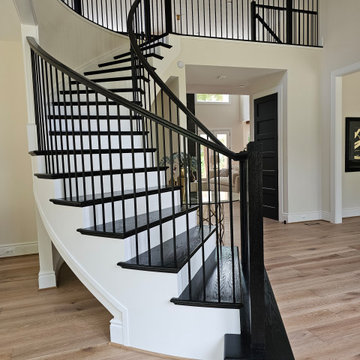
A single curve does a lot of work here. Rising from the main level to a wraparound balcony above, this staircase earns its place at the center of the home — not just structurally, but visually. Black iron balusters and handrails push against crisp white risers in a contrast that feels deliberate rather than decorative. The open floor plan gives it room to breathe, letting the curve read as architecture rather than furniture. The result is a staircase that creates movement even when no one is on it.
1976-2026 © Century Stair Company
 Eugene Pintail LLC
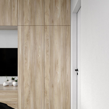
Demeter Apartment is an exploration of refined minimalism with a subtle eclectic edge. The design focuses on clarity and balance, creating a space that feels calm, deliberate, and highly livable.
Clean architectural lines and a restrained palette set the foundation, while carefully chosen accents add individuality without overwhelming the sense of order. Every detail—from the flow of light to the textures of surfaces—was designed with precision, giving the interior a timeless, intelligent character.
This project proves that minimalism doesn’t have to feel cold: it can be warm, layered, and deeply personal when executed with discipline and vision.
 EAG Studio
A little farm below a hillside resort-style off-the-grid view home, all offering unparalleled views of the Sonoma Valley and year-round sunsets from every corner of this truly special lot. State-of-the-art sustainable features are incorporated throughout the fully utilized 3 acres, emphasizing self-sufficiency and durability. This small compound property boasts multiple gathering spaces, playgrounds, and an extensive network of paths for communing with nature and slowing down the pace of life and promoting the healthiest of lifestyle in the heart of the Wine Country.
Ideal for both small and large-scale entertainment, every aspect of this freshly built, compound-like estate, thoughtfully designed and with no spared expenses in above and below-ground infrastructure, creating a truly unique property. Perfect for a family, a private couple retreat, or a recreational oasis, it offers dramatic and spectacular views from every level. The floor plan is very versatile and can accommodate multiple uses and configurations, but particular efforts were placed in spending time outside on the multiple decks or in the terraced gardens or tiered gathering spaces.
Developed with a strong emphasis on safety and self-sustenance, the property can operate off the grid, produce its own water, food, and energy, all with the latest technologies and smarthome features. Noble and durable materials are incorporated throughout, including water reuse systems, meticulous hydrology, and marvels of civil engineering to create a unique and peaceful promontory overlooking wineries and magically chiselled landscapes to create the perfect backdrop year round, featuring a dynamic that is just as interesting during the day, and different most days, and extraordinary at night both looking down in the valley and to gaze at the starry sky.
Save money and the environment, or withdraw from the world by utilizing self-sufficiency. Deliberate restraint was exercised to contain or eliminate any carbon footprint and promote indoor outdoor living at its finest. This view property is conveniently located minutes away from the town of Glen Ellen and straddles both Sonoma and Napa County, offering all the best of the Wine Country life, while being close to San Francisco as well.
 Wendel Klein Builders, Inc.
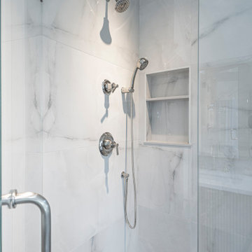
This expansive Cambridge residence was ready for a new chapter, and Wendel Klein Design Build was honored to lead the transformation. By meticulously remodeling both the interior and exterior, we struck a deliberate balance between modern functionality and historic charm. The result is a home that feels entirely current while honoring its original soul.
 Metropolis Drafting and Construction Inc
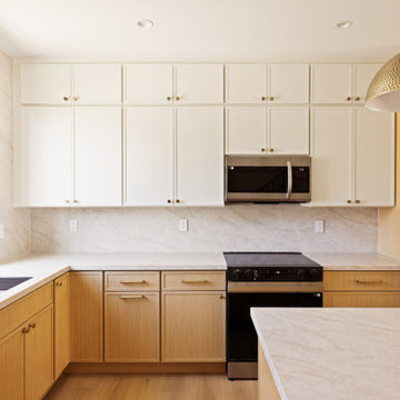
Today’s investment landscape in California features a surge in transforming single-family lots into vibrant multi-family residences, facilitated by recent SB9 and ADU laws. This project exemplifies how a modest 6,750-square-foot lot can accommodate a 1,500-square-foot primary home alongside a 2,500-square-foot duplex, seamlessly integrating design, functionality, and neighborhood aesthetics.
The primary residence underwent a meticulous interior transformation, evolving from a 3-bedroom, 1.5-bath layout into a spacious 4-bedroom, 2-bath home. Strategic reconfigurations centered around creating an expansive great room—an open-concept space adorned with vaulted ceilings—where the kitchen, dining, and living areas converge into a magnificent communal zone.
Exterior updates further distinguish the property. The front and side yards are enclosed with fencing and privacy hedges, linked by concrete pathways that enhance outdoor functionality while compensating for backyard space lost during renovations. The exterior façade was refreshed with darker tones, deliberately contrasting with the duplex to emphasize architectural separation.
Designed to preserve the suburban charm, the duplex visually mimics a single-family home from the street. Its facade creates an illusion of a two-story residence, maintaining harmony within the neighborhood fabric. The main unit, developed under SB9 guidelines, features three bedrooms and two bathrooms, with a luxurious parents’ suite situated upstairs. Downstairs, two bedrooms share a full bath, creating a balanced family-oriented layout.
The duplex’s interior boasts 9-foot ceilings throughout, elevating the sense of space and openness. The design thoughtfully places the kitchen at the front, inviting guests into the home, while stairs on the right lead to the private upstairs bedroom suite.
The ADU offers a two bedroom and two & half baths. the unit is accessible via a private side entrance with a dedicated walkway. Its layout includes a ground-floor living room, a galley kitchen, and a discreet powder room beneath the stairs, designed to contain guest traffic and maintain privacy upstairs. The upstairs bedrooms each feature luxurious bathrooms with expansive showers, adding an element of modern elegance.
Both units enjoy thoughtfully landscaped outdoor spaces—private patios, backyard areas, and gated front yards—creating welcoming environments for residents and visitors alike.
This project exemplifies innovative urban infill solutions, blending architectural elegance with legal compliance and community harmony—an inspiring blueprint for the future of residential development in California.
 CLB Architects
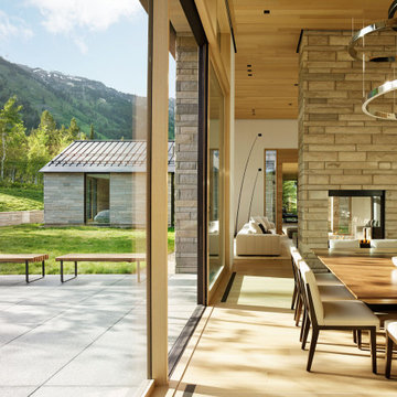
The formal proportions, material consistency, and painstaking craftsmanship in Five Shadows were all deliberately considered to enhance privacy, serenity, and a profound connection to the outdoors.
Architecture by CLB – Jackson, Wyoming – Bozeman, Montana. Interiors by Philip Nimmo Design.
 Ridgewood Home Construction
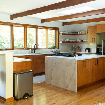
This mid-century modern Rockford home was updated in stages, and the kitchen needed a complete remodel. The homeowners desired a kitchen that felt current without breaking from the character that defined the rest of the house. That meant we needed to choose materials that fit the home and highlighted the home’s character.
Our team sourced pecky cypress and natural slate tile from non-traditional suppliers to get the exact look the home called for. The wood cabinetry was paired with a granite island, providing a gathering space in the kitchen without overpowering it. Because both materials required careful handling during installation, the crew worked more slowly and deliberately through this phase than a standard remodel. The result connected the kitchen directly to the living area, so the two spaces feel like one continuous room built in the same style as the rest of the home.
 Ancient Surfaces
Image provided by 'Ancient Surfaces'
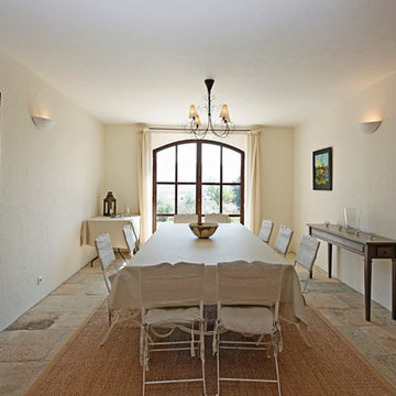
Product name: Specialty Lighting Complimenting our Antique Limestone.
Contacts: (212) 461-0245
Email: Sales@ancientsurfaces.com
Website: www.AncientSurfaces.com
Lighting or illumination is the deliberate use of light to achieve a practical or aesthetic effect. Lighting includes the use of both artificial light sources like lamps and light fixtures, as well as natural illumination by capturing daylight. Day-lighting (using windows, skylights, or light shelves) is sometimes used as the main source of light during daytime in buildings. Proper lighting can enhance task performance, improve the appearance of an area, or have positive psychological effects on occupants.
Indoor lighting is usually accomplished using light fixtures, and is a key part of interior design. Lighting can also be an intrinsic component of landscape projects.
 STUDIO KONDE | Konrad Idaszewski Architect
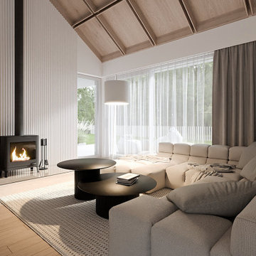
Komfoo house interior designed by STUDIO KONDE Konrad Idaszewski Architekt, an interior architecture project from Poznań focused on creating a comfortable contemporary home with a strong sense of warmth and carefully balanced proportions. Visit the full project: https://conde.pl/portfolio/gotowy-projekt-wnetrz-domu-komfoo/ As part of the Modelowedomy collection of three individually configurable houses, Komfoo offers a high living room with a mezzanine, while the kitchen and dining area are separated from the living space by a functional furniture wall, creating distinct zones while preserving the spacious character of the home.
This living room combines natural timber, soft neutral upholstery and carefully selected architectural details to create a warm and sophisticated interior. Generous glazing, a high vaulted ceiling and a freestanding wood-burning stove give the space a distinctive character, while the restrained palette of beige, cream, taupe and warm wood keeps the composition calm and cohesive.
A generous U-shaped sectional sofa upholstered in light beige fabric occupies the main seating zone, with deep cushions and broad chaise sections creating an inviting arrangement for relaxation. Several large cushions in matching neutral tones soften the substantial form of the sofa, while loosely folded throws add texture and a more relaxed residential character. In front of the seating, two overlapping round coffee tables introduce a contrasting dark element, with smooth black tops set on vertically fluted cylindrical bases.
The seating arrangement rests on a large woven rug with a pronounced looped texture and a subtle geometric pattern. Its warm cream and beige tones complement the light timber flooring and visually gather the sofa and coffee tables into a defined lounge area. A small stack of books on one of the tables provides a discreet everyday detail, while the dark furniture creates a clear contrast against the predominantly light interior.
One of the strongest features of the room is the fireplace zone positioned along the left-hand wall. A freestanding black wood-burning stove sits on a large light-coloured hearth, with the visible flames introducing a warm glow and a lively accent to the otherwise restrained interior. Beside it, a minimalist black metal log holder displays neatly stacked firewood, while slender fireplace tools stand nearby. The tall black flue rises from the stove towards the ceiling, emphasizing the impressive height of the living room.
Behind the fireplace, the wall is covered with narrow vertical white slats that create a finely textured surface and reinforce the room's vertical proportions. Above, the pitched ceiling is finished with large natural timber panels framed by visible wooden beams, bringing warmth and a subtle reference to the architecture of the house. The combination of ribbed wall cladding and exposed timber overhead creates a distinctive backdrop for the fireplace and seating area.
Full-height glazing occupies much of the rear façade, opening the living room towards the garden and filling the interior with soft daylight. Sheer vertical blinds filter the light across the windows, while long taupe-grey curtains frame the glazing and add depth to the neutral palette. Mature trees, lawn and a white garden fence are visible outside, providing a natural backdrop to the warm interior.
Suspended within the high ceiling volume, a simple cylindrical pendant adds a soft architectural lighting element above the seating area. Its clean white form remains deliberately understated against the timber structure and textured wall surfaces. Through the combination of the vaulted ceiling, natural wood, ribbed wall finish, sculptural coffee tables, generous sectional sofa and freestanding fireplace, the Komfoo living room achieves a comfortable and refined character that reflects the interior architecture approach of STUDIO KONDE and its work as an interior architect in Poznań.
35